3 Developing Your App
Getting to Know the Designer
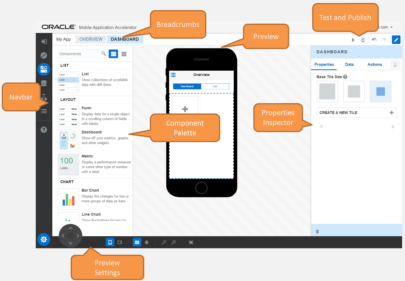
The Designer lets you add UI components like graphs and lists to your app and wire it to data. None of this requires any coding, just simple configuration.
The Navbar
| Icon | Tool | Uses |
|---|---|---|
|
|
Back to My Apps |
Takes you to the Application page, which is your landing page after your first visit to MAX. After you’ve created the first page of your app, you can open it from this page to continue working on it with the Designer. You can access all of your apps from this page. It’s also where you can add new ones, delete the ones that are no longer in use, and republish your apps. You can access import and export functions from this page, which can help you troubleshoot and debug apps. To find out more, see Managing Your Apps.
|
|
|
Application Screens |
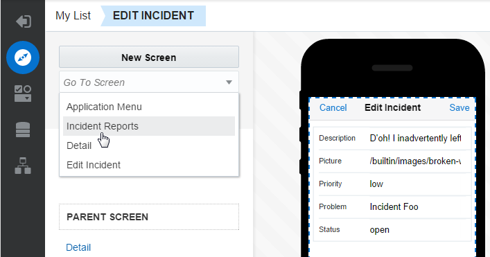
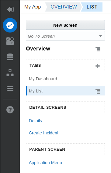
Explore, create, edit, and delete your app’s screens. You can add a screen to your app by clicking the New Screen button. To find out more, see Managing Your Screens. To access any screen in your app, first click the Application Screens icon. Next, choose a screen from the Go To Screen menu to open it in the Preview.
The Application Screen’s page provides configuration options that are specific to the screen that you select from the menu. It also describes the screen’s position within the hierarchy of the screen flow by listing the parent screen and detail screens. These related screens are represented as links. Clicking them opens the parent or detail page in the Preview and Properties Inspector.
|
|
|
Components |
Opens and closes the Components Palette. To find out more, see Configuring Graph, Chart, and Meter Components. |
|
|
Data |
Opens the Services Catalog, a repository for the services published by your development team. To find out more, see Enabling Your App to Display Content. |
|
|
Screen Flow |
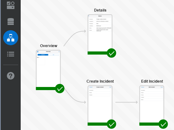
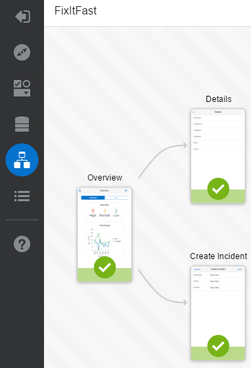
Lets you see how all of the screens in your app are related to each other in terms of the application flow. If your app has any errors that might prevent you from publishing it, you can quickly spot them here. Double-clicking a screen opens it in the Preview and the Properties Inspector. |
|
|
Application Settings |
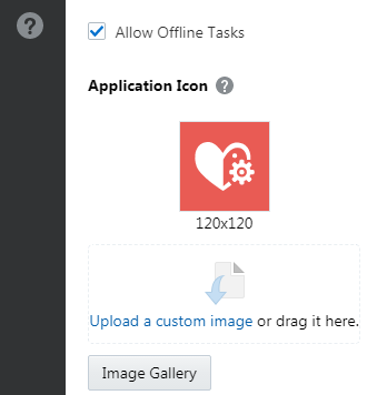
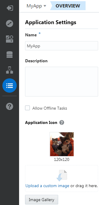
Change the basic information for your app. When you created your first screen, MAX added a default icon. If you want to change the image for this icon, you can do that here. You can also change your app’s name and add a description. For more information, see Managing Your Apps. To find out about changing the launch icon, see Using the Image Gallery. If your app doesn’t display time-critical data, then you can enable it for offline use by clicking Allow Offline Tasks. See Offline Sync. |
|
|
Help |
Opens the help center. You can refer to the user guide and revisit the MAX videos. |
|
|
Preview Settings |
Opens the Preview Settings tools, which let you change the appearance of the Preview. To find out more, see The Preview Settings. |
The Preview
The Preview allows you to approximate how your app looks on a device.
The Preview Settings
 ) or your mouse.
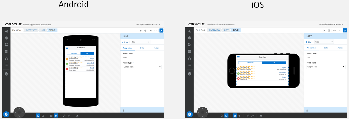
To see how your app looks in different orientations and as different platforms on an emulator (and how it works with live data), see Building and Testing Your Apps.
The Properties Inspector
Use the Properties Inspector to configure your UI.
-
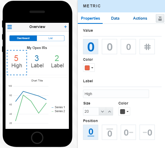
Properties—Use configuration options in this page to change the appearance of a component.
-
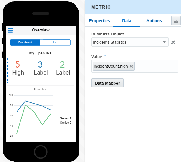
Data—This tab lets you bind your UI to data. Like the display and layout options, the options that display depend on the UI component that you’ve selected. To help you identify the data that you can display in a UI component, your development team creates models of data called business objects. After you’ve selected a business object for a UI component (that is, map the UI to the data that you want it to use), the Preview displays mock data. This isn’t the actual data that your app will use. Instead, it’s a representation, or placeholder, to help your data mapping. To find out more, see Taking a Look at the Data Mapper.
Note:
Be sure that you have a business object that supports the data requirement of the component. -
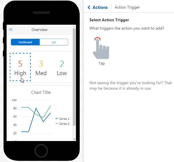
Actions—You can add a user gesture, like a tap, on a selected component. You can define the action that’s triggered by that gesture, which can be:
-
Navigating to (or back to) another screen in your app.
-
Actions defined by the business object used to return data to the app. These can include actions to refresh data, and actions that correlate to CRUD (create, read, update, and delete) operations. For example, you can configure a tap gesture to refresh the data for a counter.
-
-
QuickStarts—A set of wizards that speed up your app development. To find out more, see Using QuickStarts.
Testing and PublishingTools
The Designer has a set of tools that you can use to preview your app using live data, test it on a device, and publish it. To find out more, see Testing Your App and Sharing Your App.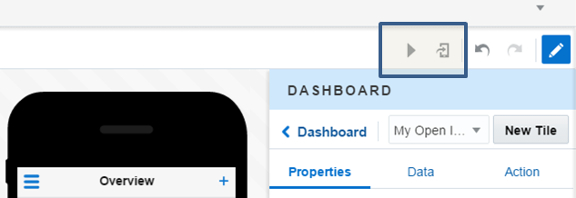
The Components Palette
MAX provides you with a set of UI components that are optimized for mobile apps. They include layouts for forms and itemized lists as well as data visualization tools like charts and graphs. You drag these components from the Components Palette into the Preview. You can then configure how they display and use data using the Properties Inspector.
List and Layout Components
| Component | How Do I Use It? |
|---|---|
| List |
Use it to organize content into a list. For information on configuring how your list displays, see Lists. To find out how you can enable users to drill down from a list to detail pages and update a list using create or update screens, see Using QuickStarts. |
| Form |
Use it to organize input and output fields. You can use forms as child pages of list. To find out more, see Forms. |
| Dashboard |
Use it to assemble high-level information, like KPIs, charts and graphs. You’d typically use a dashboard page as the first screen of your app. Before you add UI components to a dashboard, you need to lay down tiles for them first. To find out more, see Dashboards. |
| Card |
Use it as a small container for displaying summary information. To find out more, see Cards and Screen Summary. |
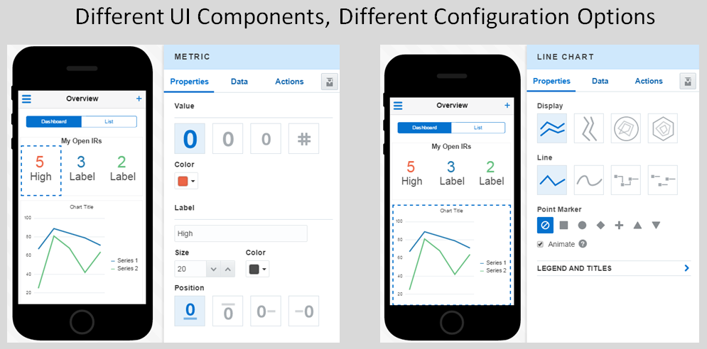
| Metric |
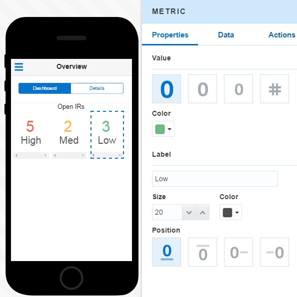
Use it to display a metric: a performance measure, or some other type of number with a label. |
Chart and Graph Components
You can visualize your data as various charts and graphs, like pie charts, scatter charts and bubble charts. See Configuring Graph, Chart, and Meter Components to find out more.
| Chart Type | How Do I Use It? |
|---|---|
|
Line |
Use a line graph to compare changes for two groups over time. For example, you can use this chart to compare the number of mystery novels sold by a bookstore from March to June and the number of romance novels sold during the same period. Line charts plot data points for the things that you want to measure on the vertical y-axis (like the number of books sold) against the horizontal the x-axis, which categorize this data. See How Do I Create a Line Chart? to find out more.
Tip: Use a bar chart instead of a line chart for data that shows greater changes (higher peaks and steeper valleys) between intervals, or that covers a long period. |
|
Bar |
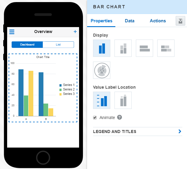
You can use a bar chart to see changes over time for different groups, or to compare different items in a related category.
Tip: Use a bar chart instead of a line chart if the data along the x axis is not continuous (that is, it represents things like categories or geographical regions).Bar charts have a vertical y axis and a horizontal x axis. To show the number of books sold by category, you’d populate the y axis with amounts (50, 100, 200, etc.) and the x axis with categories like mystery, non-fiction, science fiction, self-help, etc. See How Do I Create a Bar Chart? to find out more. |
|
Pie |
In a pie chart, different data points (represented as slices) are presented as parts of a whole. For a bookstore app, these slices might show the percentages of different categories of books (like mystery, romance, etc.) in terms of the bookstore’s entire bookstore’s inventory. See How Do I Create a Pie Chart? to find out more. |
|
Area |
You can use an area to track changes over time for two or more related groups. It’s similar to a line chart, but the areas beneath the lines are filled in to give you a picture of changes over time. Like a line chart, the area chart uses the vertical y axis to measure something (like sales amounts) and the horizontal x axis to display time periods. |
|
Scatter |
A scatter chart helps you to see the correlation between two different types of data. It helps you ascertain if these data sets change together. You plot this data on the x-y axis of the graph. For example, to show the relationship between site visits to book sales, you can plot the sales amounts along the vertical y axis ($100, $200, $300, and so on) and the number of site visits (1000, 2000, 3000, etc.) along the horizontal x-axis. See How Do I Create a Scatter Chart? to find out more. |
|
Funnel |
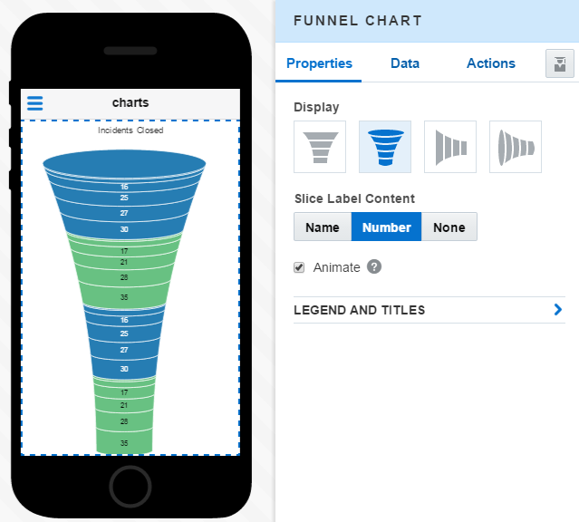
Funnel charts compare how many users start a workflow against how many complete it. Funnels segment the workflow into a sequence of steps that guide users to some goal. Typically, users drop off at each step. If your bookstore has an online shopping app, you can use a funnel to see how many users finish a checkout process compared to how many started it. You can see where the app is losing users. See How Do I Create a Funnel Chart? to find out more. |
|
Bubble |
A bubble chart has numeric values for both the x and y axes. Along these axes, you can plot related data for the bookstore, like sales data on the vertical y axis (25, 75, 100, etc.) and book prices on the horizontal x axis ($5, $10, $15 and so on). These points are depicted as bubbles, whose size conveys a third dimension. For the book store, the size might be gauged by the proportion of total sales. See How Do I Create a Scatter Chart? to find out more. |
|
Donut |
Like a pie chart, a donut chart show data sets in proportion to a total. You can compare data sets as concentric rings. |
Gauge Components
Tip:
Use gauges instead of charts to display a single data value.| Gauge Type | How Do I Use It? |
|---|---|
| Linear Status Meter |
To compare a current measure against another value. An inner rectangle shows the current level of a measurement against the ranges marked on an outer rectangle. The business object used to provide data for this component must provide minimum and maximum threshold values. The data also needs an update increment. See Getting to Know Business Objects to find out more. You can find out how you can add an image in a form field or list row in Field Types for Lists and Forms |
| Circular Status Meter |
Show a task's progress (like a download) as a numeric value, or percent complete, within a completing circle. |
| LED |
Show a measurement, such as a key performance indicator (KPI). |
| Rating |
Show ratings for products or services, such as the star rating for a movie. |
Media Components
| Media Type | Description |
|---|---|
|
Image |
You can spruce up your UI by adding an image from your data collection or from a local directory. You can images (including ones that users can replace) in various places, such as the fields of Form, Card, and List components. Images tells you about choosing a data source for an Image component, and how to size it. You can find out how you can add an image in a form field or list row in Field Types for Lists and Forms. |
|
Map |
Equip your mobile workforce with maps that display points of interest (POIs), such as customer locations or repair sites. To find out how to plot maps from your collection data, see Maps. |
Configuring Graph, Chart, and Meter Components
Like the other UI components, you add graphs, charts, and meters to your screens by dragging them from the Component Palette into the Preview. The Properties Inspector displays the configuration options that are specific to the UI component at hand, such as segment labels for a funnel chart or point markers for a line chart. In addition to these component-specific properties, The Properties Inspector also displays configuration options related to a category of data visualization components. When you add a chart component, for example, the Properties Inspector displays the chart-specific options, like legends, titles, and the ability to animate the chart when users first open a screen or whenever the data that backs the chart changes.
Legend and Titles
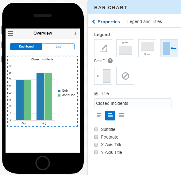
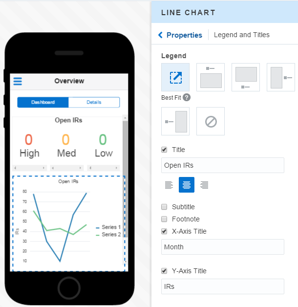
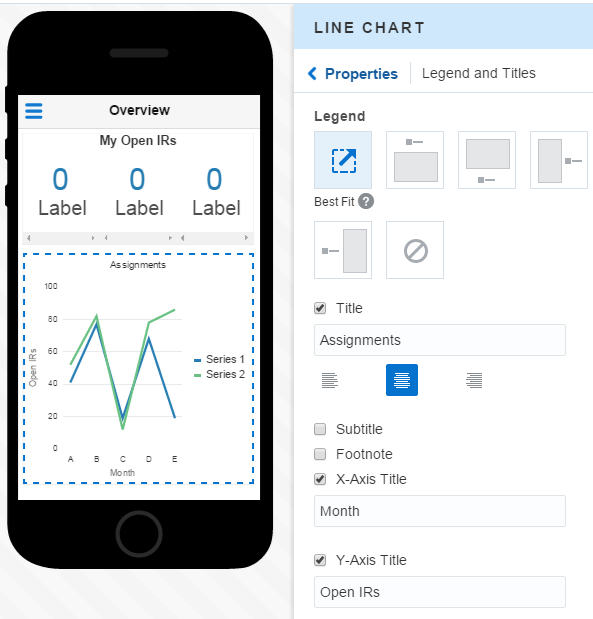
The Properties tab lets you add a descriptive text to your chart or gauge and also position the legends (or keys).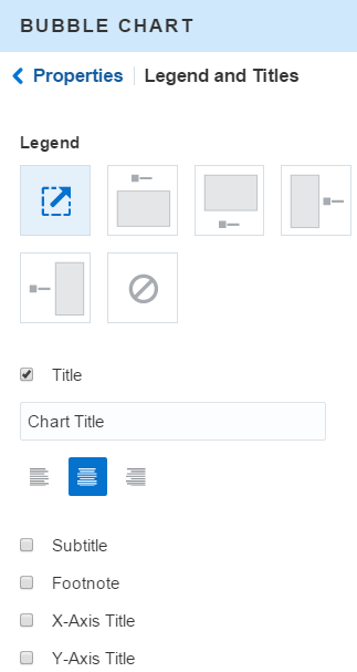
Description of the illustration pi_legends.png
Legend
The business object that you used to add data to your graph has attributes that describe the different data sets used by the data visualization component. These attributes display as legends (or keys), which tell you what each bar, line, point, bubble, or slice represents. Using the Properties tab, you can position the legend for your graph.
Titles
You can add a title to your UI component and also further describe it with a subtitle and a footnote. Depending on the chart style, you can also title a chart’s axes or data slices.
How Do I Create an Area Chart?
- In the Preview, double click Add Component (
 ) to open the Component Palette.
 - Drag the area chart component (
 ) from the Component Palette into the Preview.
 - Use Property tab of the Properties Inspector, to adjust the display.
- Add data by either using the Data Quickstart or by opening the Service Catalog from the Data tab of the Properties Inspector. From the Service Catalog, choose the service that has the business object that supports an area by providing at least two sets of data.
How Do I Create a Bubble Chart?
Use the Property Inspector to add data and configure the appearance of your bubble chart.
- In the Preview, double click Add Component (
 ) to open the Component Palette.
 - Drag the bubble chart component (
 ) into the Preview.
 - Use the Properties Inspector to configure the chart’s display properties and the data it consumes. See The Properties Inspector to find out more.
- Configure the orientation of the chart. You can plot the bubbles along x and y axes, or as a radar chart.
- Pick a location for the label.
- Add a title for the chart and pick a location for the legend.
- Add data to your chart using either the Add Data QuickStart or by clicking the Data tab and then selecting a service with the appropriate business objects from the Service Catalog.
- Using the descriptions created by your development team, choose the business object that can provide your bubble chart with three data sets that it needs. Ask your development team if you’re not sure which business object to use. Because a bubble chart requires three data sets, be sure to pick two fields for the y axis.
- Map the response by choosing the fields for the x and y axes. Since the bubble chart requires three data sets, be sure to pick two fields for the y axis.
How Do I Create a Donut Chart?
- In the Preview, double click Add Data (
 ) to open the Component Palette.
 - Drag the donut component (
 ) from the Component Palette into the Preview.
 - Use the Properties Inspector to configure the chart’s display properties and the data it consumes. Typically, chart components don’t trigger subsequent user interactions, so there are no options to configure in the Actions tab. See also The Properties Inspector.
- In the Properties tab, enter a name for the center of the donut. If you don’t use the Best Fit option (which is selected by default), you can pick the location for the labels for these slices (inside the chart, outside of it, or no labels at all).
- Choose the format for the labels: label the slices as numbers, percentages, or using names provided by the business object.
- Add a title for the chart and pick a location for the legend.
- Add data to your chart using either the Data QuickStart or by opening the Service Catalog from the Data tab.
- Using the descriptions created by your development team, choose the business object that can provide your pie chart with three data sets that it needs. Ask your development team if you’re not sure which business object to use.
How Do I Create a Funnel Chart?
A funnel chart represents data related to steps in a process.
How Do I Create a Scatter Chart?
- In the Preview, double click Add Component (
 ) to open the Component Palette.
 - Drag the scatter component (
 ) from the Component Palette into the Preview.
 - Use the Properties Inspector to configure the chart’s display properties and the data it consumes.
- Configure the orientation of the chart. You can plot the points along the x and y axes, or as a radar chart.
- Pick a location for the label.
- Add a title for the chart and pick a location for the legend.
- Add data to your chart using either the Data QuickStart or by opening the Service Catalog in the Data tab.
How Do I Create a Pie Chart?
- In the Preview, double click Add Component (
 ) to open the Component Palette.
 - Drag the pie component (
 ) into the Preview.
 - Use the Properties Inspector to configure the pie chart’s display properties and the data it consumes.
- In a pie chart, the data items are displayed as sections of a circle causing the circle to look like a sliced pie. In the Properties tab, if you don’t use the Best Fit option (which is selected by default), you can pick the location for the labels for these slices (inside the chart, outside of it, or no labels at all).
- Choose the format for the labels: label the slices as numbers, percentages, or using names provided by the business object.
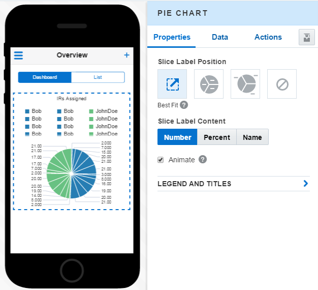
Description of the illustration pie_props.png - Add a title for the chart and pick a location for the legend.
- Add data to your chart using either the Data QuickStart or by opening the Service Catalog in the Data tab.
How Do I Configure Meters and Gauges?
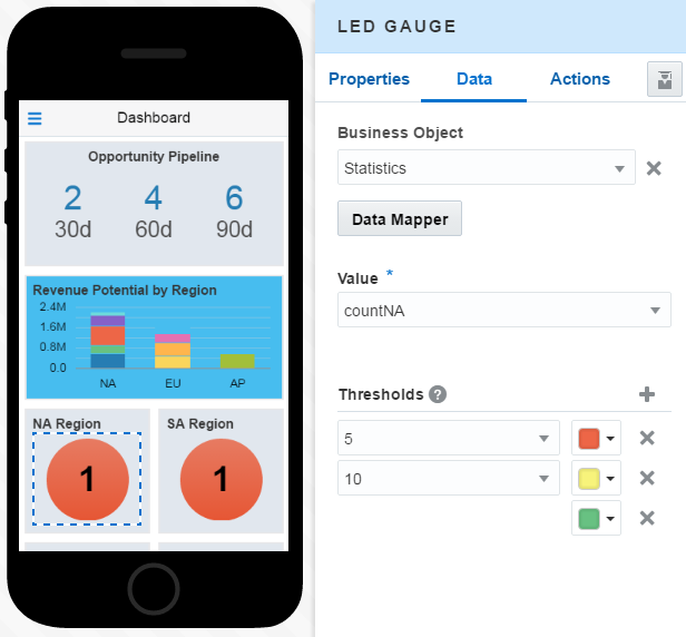
Because you use gauges and meters to measure a quantity or express a state, you need to define thresholds for them. Adding thresholds allows you to use colors to show various states, like high, medium, and low.
Screens
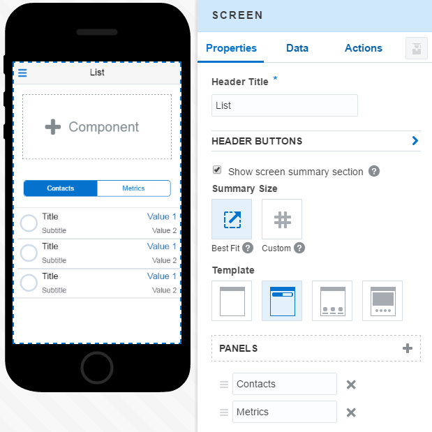
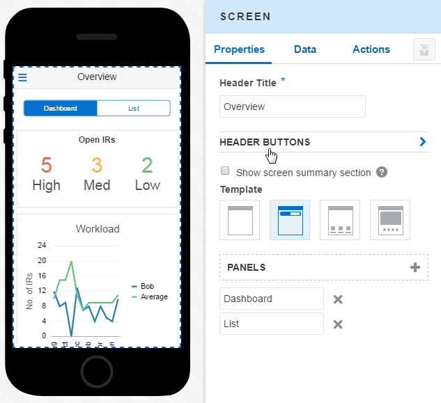
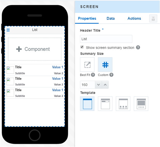
Use the Properties Inspector to change the appearance of the screen component.
-
Change the screen title.
-
Choose another screen template.
-
Add or hide a summary field.
Screen Actions
You can expand your application flow by creating your own screen actions.
 ), the Back action (
 ), and the Cancel, Save, Create, and Edit actions.
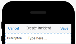
You can’t change these standard actions; their appearance, names, and behavior are baked in. If your app requires its users to perform some specific task, then you can add your own action using the Properties Inspector for the Screen component.
Screen Summary
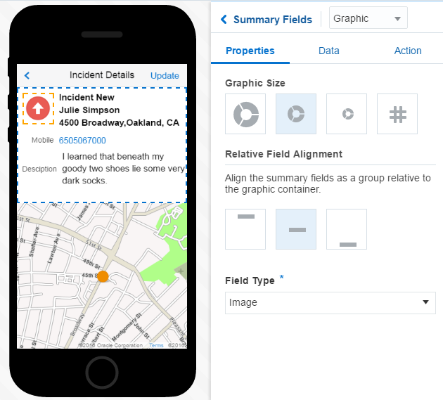
You can enhance your screens by adding a summary panel above the main content area.
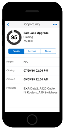
In terms of display, the summary panel is a constant feature in the screen, one that doesn’t scroll. By using the summary panel to present salient information, for example, you can create a point of reference for users while they view more detailed information in the screen’s tabs or pages.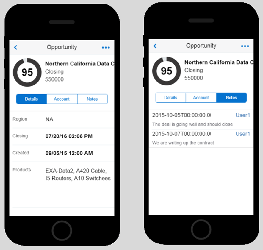
Description of the illustration summary_panel.png
Tip:
Whether you added summary panels at the outset, or added them later on, you can hide them by clearing the Show screen summary section option.What Type of Components Can I Add to a Summary Panel?
 ) to the summary panel.
Tip:
Because the card component re-sizes itself to fit the summary panel, you can fill the panel by populating the card component’s Summary and Detail fields.Sizing a Summary Panel
 ), MAX resizes the height of the summary panel to accommodate the component that you’ve added to it. For this option, MAX sizes the component using a 4:3 aspect ratio, which is based on screen width. While you can let MAX resize the summary panel for you, you can do this yourself by first choosing the Custom Fit option (
 ) and then entering the height, in pixels.
Note:
Keep in mind that this option keeps the summary panel at the height you’ve specified, which means that some components might not fit. And because the summary panel doesn’t scroll, they won’t display properly.Dashboards
You can give your users a bird’s-eye view of the information they need by creating assembling metrics, KPIs and data visualization tools into a single screen: a dashboard.
Typically, you’d position a dashboard as the first screen in your mobile app to give users a quick glimpse of their stats. MAX gets you started with a dashboard when you pick the dashboard template, or when you add a dashboard component to a blank page.
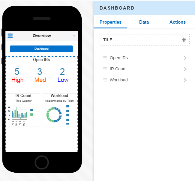
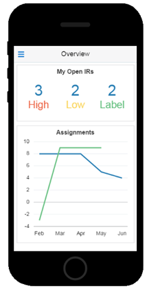
Your dashboard might be geared to sales, health care, or field service requests. MAX provides you with components for any use case. For example, for a sales organization, you might dress up a dashboard with a group of line and bar charts. A repair technician in the field might not need to see a bunch of charts. Instead, she might need a set of metrics for the open, closed, and pending IRs assigned to her. She might also want to see a line chart that compares her workload to that of other field repair techs. You can fashion a dashboard from the MAX component palette to suit your mobile use case as long as you have the business objects to back it up.
Working with Tiles
Important:
Before you can add metrics or other UI components to a dashboard, you first need to landscape it with tiles.Once you’ve added tiles to a dashboard, you then add UI components to the tiles themselves. Tiles are the containers for the UI components: they anchor the UI components in place, enabling them to maintain their positions in both landscape and portrait orientations.
Getting Started with Tiles
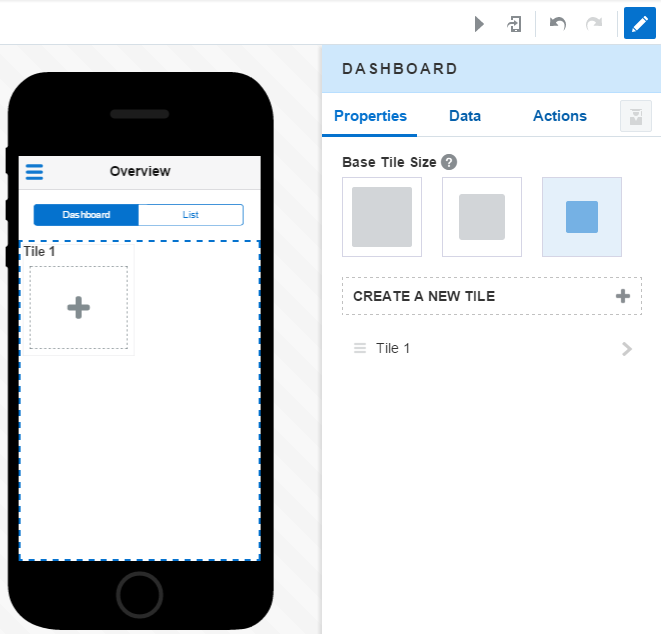
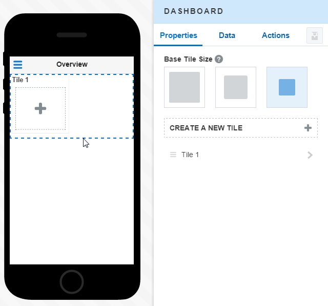
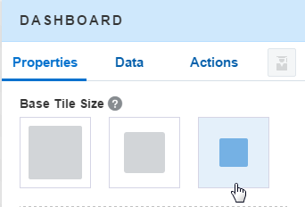
To begin, set the size for all of the tiles that comprise your dashboard. You can choose small, medium, or large (small is selected by default) from the Base Tile Size options. Because you’re setting this for the dashboard component (and not for an individual tile), the size that you select here applies to every tile. As a consequence, large tiles might sprawl and can’t be accommodated by the layout that you later select for an individual tile.
Use Case: Creating a Dashboard
-
To get started with setting the basic size and position of the tiles, click the dashboard component in the Preview.
-
In the Base Tile section of the Properties Inspector, choose small as the size for all of the tiles used in this dashboard.
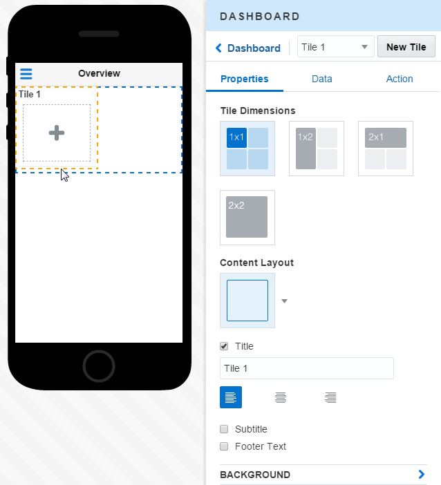
To get you started, the Dashboard component has a default tile called Tile 1. With the base tile size set, you’re now ready to use the Properties Inspector to rename this tile, position it in the dashboard, and choose its layout.
-
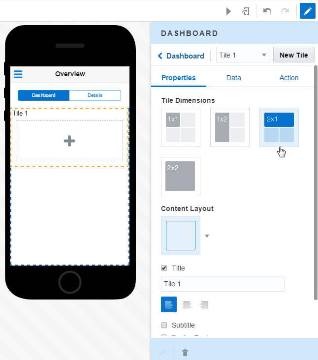
To open the Property Inspector, click the Tile 1 component in the Preview, or open Tile 1 in the Properties Inspector.
-
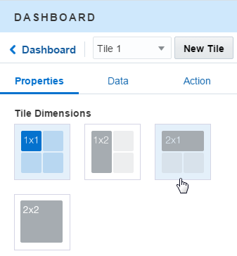
Because the metric counters occupy the top half of the screen, choose 2 x 1.
-
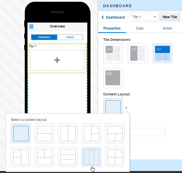
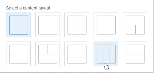
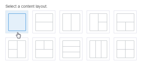
Because you’ll include three counters (high, medium, low) that display from left to right, pick the layout option that segments the tile into three areas, Layout 9.Choosing this option multiplies the tiles accordingly – you now have a tile for each counter.
-
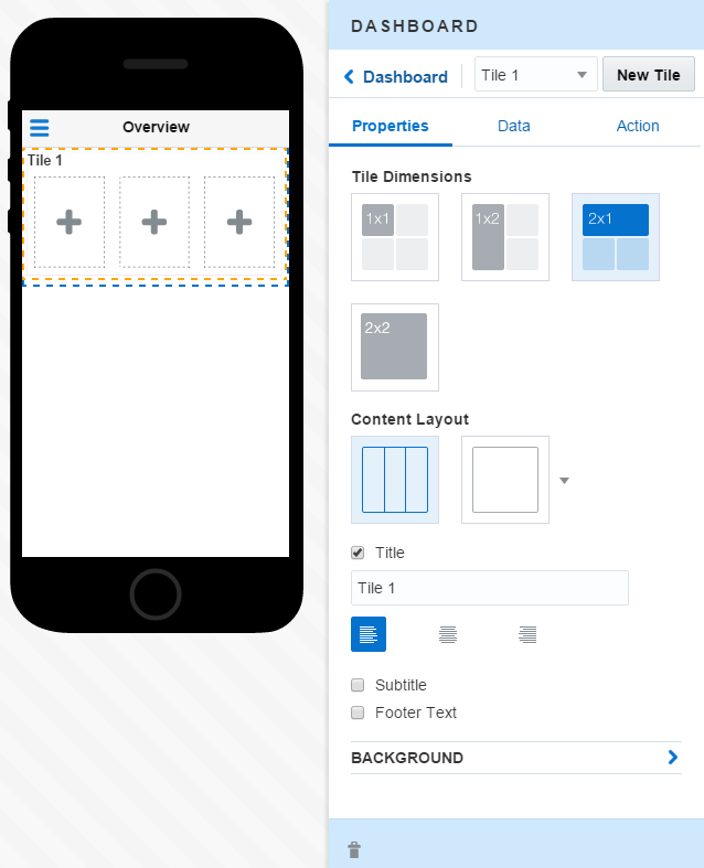
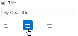
Change the name of Tile 1 by entering a new one (like My Open IRs ) in the Title field. Then center it over the tiles that will house the Metric components.
-
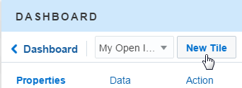
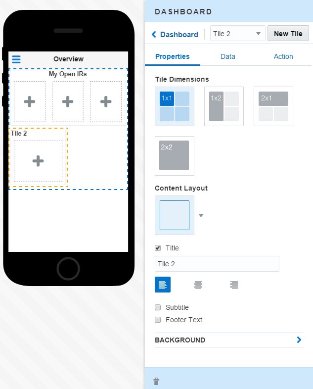
Next, create a tile to house the line graph by clicking New Tile.MAX creates Tile 2.
-
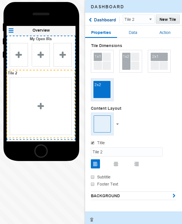
Because the line graph will occupy the remainder of the dashboard, choose 2 x 2 for its dimensions.
-
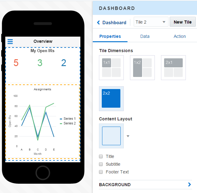
Tile 2 will hold only the line graph component, so choose the plain layout provided by Layout 1.The dashboard might look something like this:
-
The title is an optional component. The business object that backs a UI component might already provide enough information to make a title redundant. That’s the case here, so clear the Title option (
 ).
).
-
With the tiles configured, the UI components now have a place to go:
-
Drag a Metric component into each of the tiles at the top of the dashboard.
-
Drag the Line Chart component into its tile at the bottom of the dashboard.
After you’ve added all of the UI components, the dashboard might look something like this: -
-
After you’ve mapped the UI components and configured their display properties, the dashboard should look something like this in the Designer.
Cards
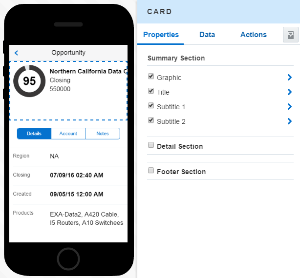
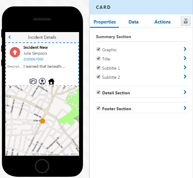
Use the card component if you want to display summary information within a small pane.
The Summary Section
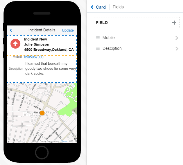
The Summary section also includes the boldface Title field, which is output text-only (you can’t change its field type). You can select any combination of the fields in the Summary section, but you can’t add any additional fields, nor can you rename these fields. Instead, you add field names by data mapping.
The Details Section
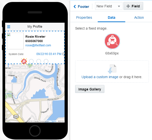
The Footer Section
Lists
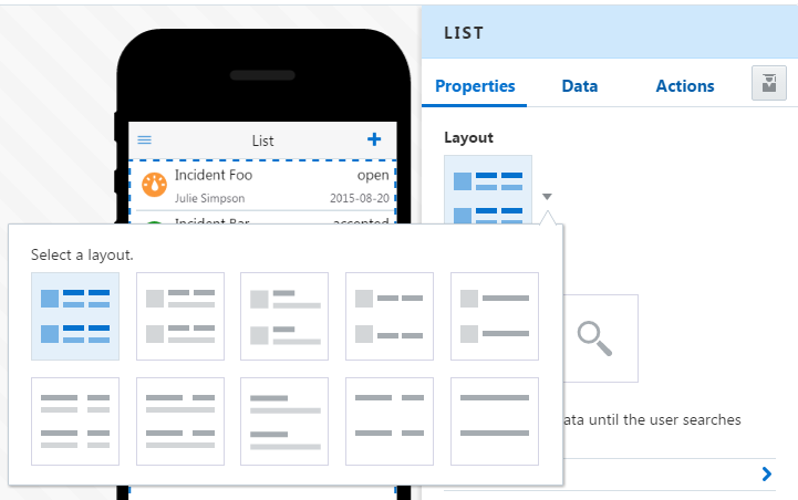
Using the Properties Inspector for the List component, you can choose the types of fields that best suit your data.
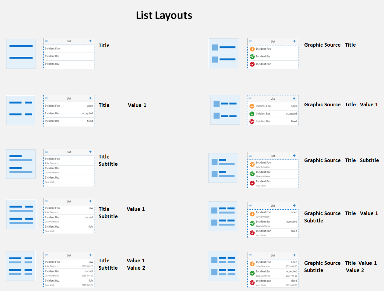
List Layouts
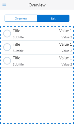
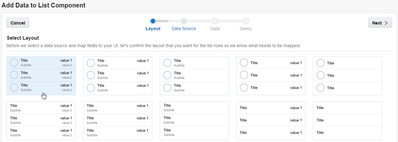
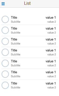
If your business object can populate each of these fields with data, then you can stick with this arrangement. But if, say, your business object doesn’t provide images for the graphic field, or you just want to pare down the number of fields, then you can pick a different layout that better suits for your needs.
List Field Types
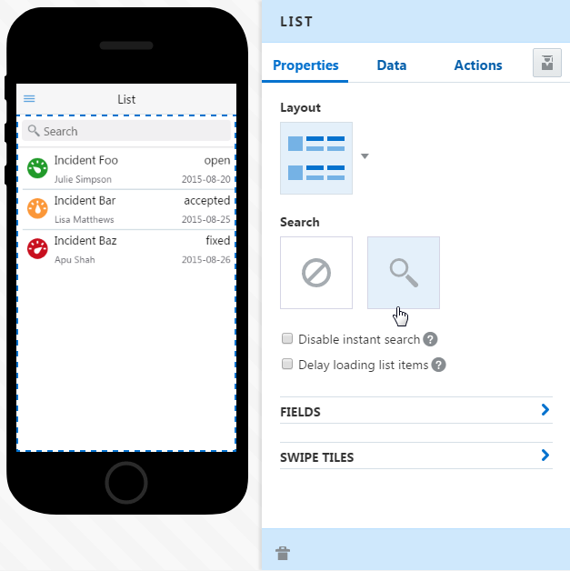
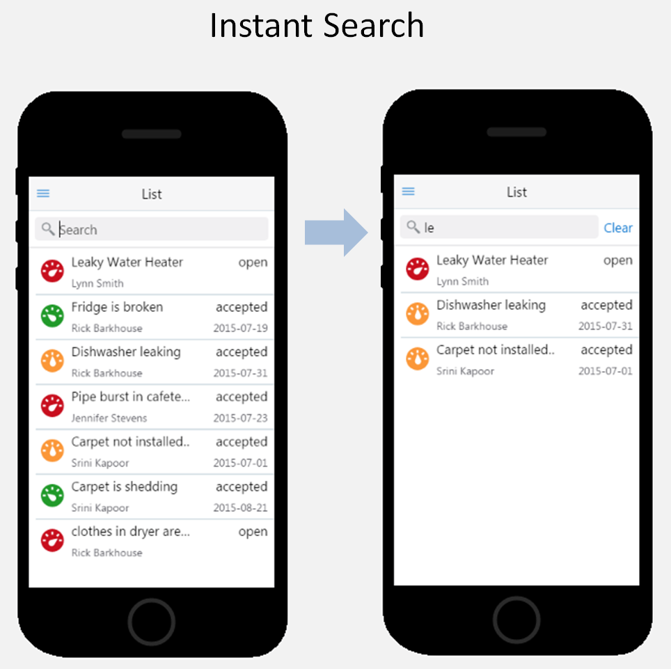
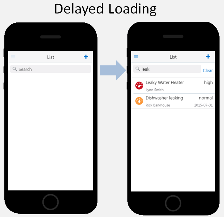
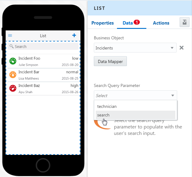
Adding a Search Field
If your service supports searching, then you can add a search field for a List component.
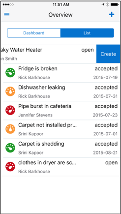
Adding Swipe Gestures
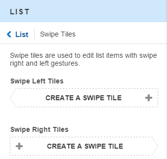
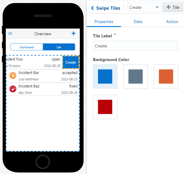
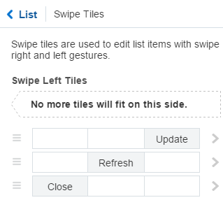
You can enable app users to update lists using left- and right-swipes using the Properties Inspector for the List component.
-
Select the List component.
-
In Properties tab, click Swipe Tiles.
-
Click Create a Swipe Tile.
-
Add a label and pick a color.
-
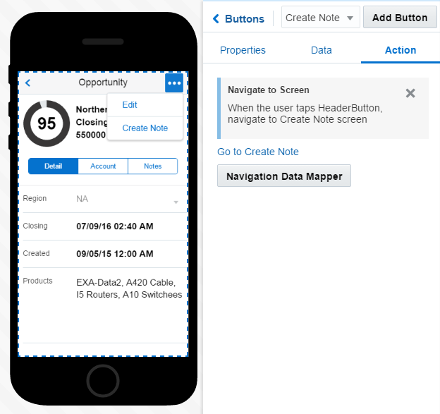
Open the Action tab of the Properties Inspector, click Add Action (Tap Tile), then add the action appropriate to the tile. You can pick from the business object-specific actions (like refresh, create, update, delete, etc.), and if needed, pick a navigation option (navigate back, or navigate to screen). The Navigation Mapper lets you choose the destination screen and a transition effect.
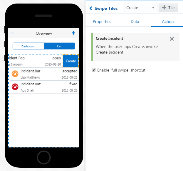
Description of the illustration swipe_tile_actions.pngIf your swipe tile action doesn’t navigate to another page, but instead updates a value, you can use the Navigation Data Mapper to pass a parameter from one screen of your app to another.
Tip:
Use the Move icon ( ) to rearrange tiles.
Forms
Forms enable you to create screens with fields that can accept user input, or can be read-only.
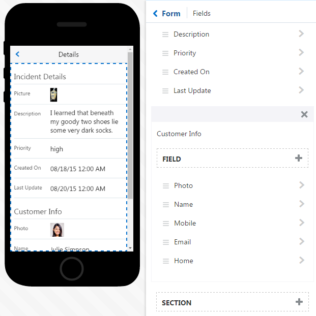
You can use the Form component in different ways. As you’ll see in Use Case: Creating a List Using QuickStarts, the Form component is flexible: it’s the framework for both the record detail screens that can only display data and the edit and create screens that have combinations of read-only and editable fields. Unlike a List component, the Form component is not a fixed pattern for fields and images. You can add as many fields (and field types) as you need. Your form’s content depends on your service. See Mapping Field Values to Forms.
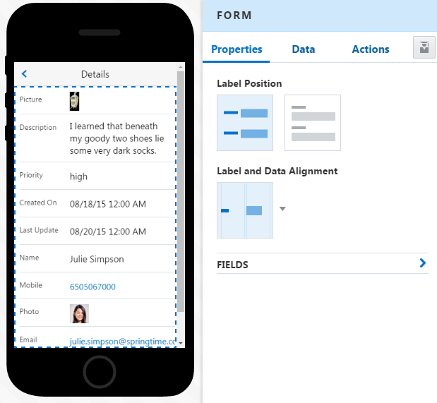
Description of the illustration form_pi.png
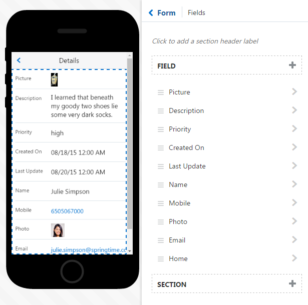
Description of the illustration form_field_page.png
-
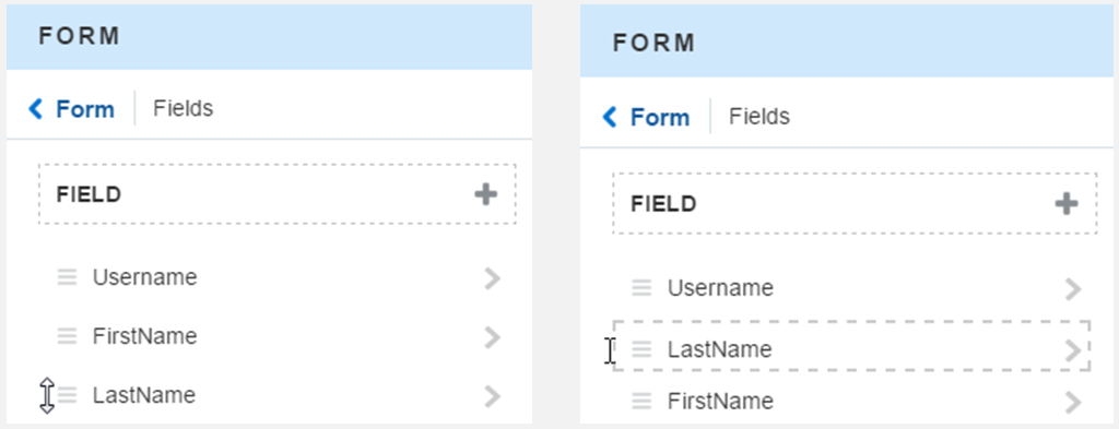
Reorder the form’s fields—Use the Move icon (
 ) to reorder fields.
-
Add a field—You can populate form fields by dragging and dropping business object fields in the Data Mapper, or by clicking Add Field (
 )in the Fields page, or the Add Field button (
 ) in the Properties Inspector for an individual field. After you add a field, MAX displays a badge over the Data tab (
 ), a signal that you need to map a value. To find out more, see Mapping Field Values to Forms.
-
Organize your fields into sections—Click Add Section (
 ) in the Fields page, enter a section name, and then organize the fields within the section using Move (
 ). You can move fields between sections.
-
Delete a field—Select a field and click Delete (
 ). You can also delete the entire form (and all of its fields) by clicking Delete in the Properties Inspector for the Form component.
Data Mapping for Forms and Form Fields
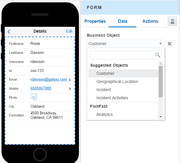
The Data tab lets you map a business object to the Form component itself and also change the values for the forms fields.
 ). To find out more, see Taking a Look at the Data Mapper.
Note:
If you enter a value into the field that doesn’t match any of the values that belong to the business object, then MAX considers this a fixed value.Tip:
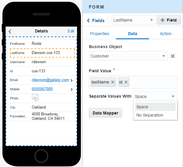
You can map more than one value to a field. The values display in the order that you added them. You can concatenate these values, or use a space to separate them.Field Types for Lists and Forms
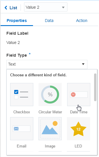
Your business object’s fields can return different types of data, like text strings, integers, or images. To allow your list and form fields to reflect your data mapping, you need to change their field types.
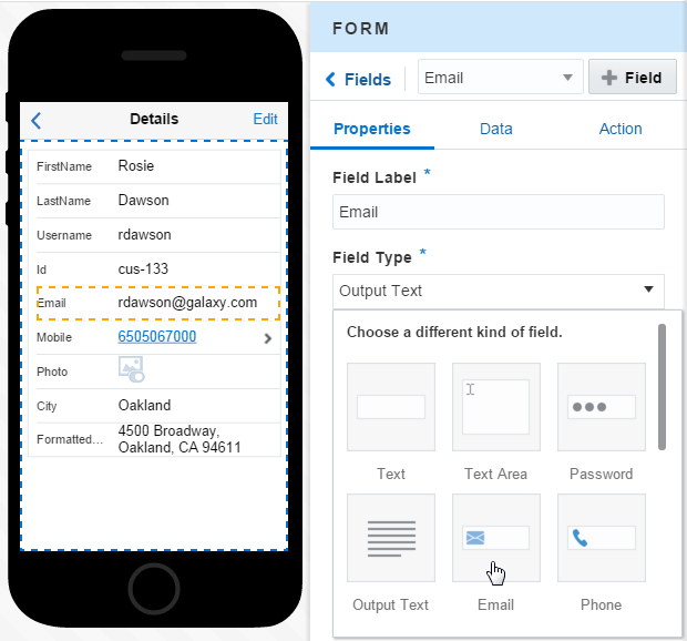
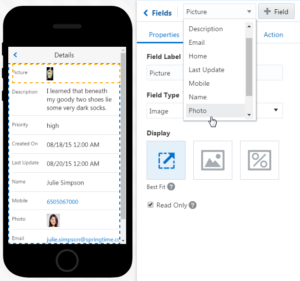
Description of the illustration form_field_types.png
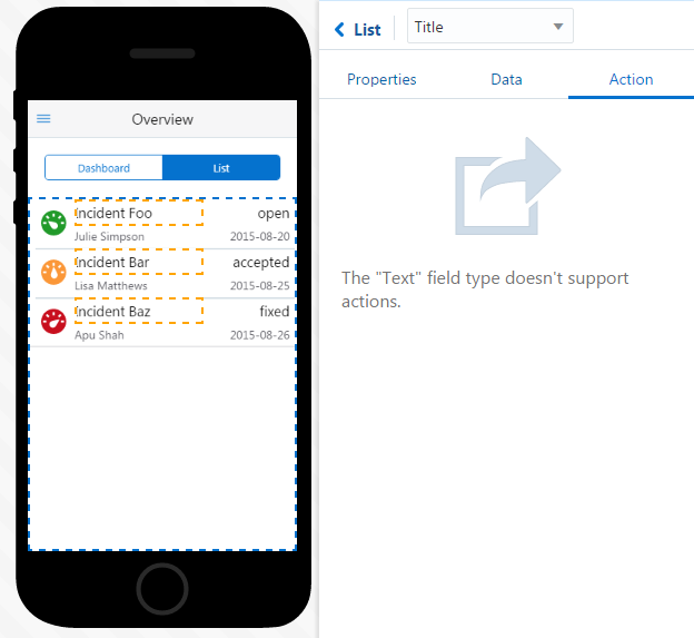
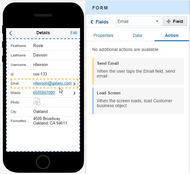
For example, if a field value displays an e-mail address as text string, you can make this field more meaningful (and useful) by transforming it from plain text into an active link to the e-mail account. To do this, you’d first select the field in the Preview and then pick Email from the Field Type menu in the Properties Inspector. With the field type changed, the Preview displays the value as a link. Clicking the Actions tab shows that MAX has added a tap gesture to the field, which triggers e-mail. You can find out more about data mapping in Enabling Your App to Display Content. By default, fields don’t accept user input because their Read Only option is switched on (
 ). If your service supports user input, you can switch this option off (
 ). When you create an edit screen using the QuickStarts, you’ll notice that this option is turned off by default (
 ).
).
| Field Type | Uses | Can I Make This Field Read Only? |
|---|---|---|
|
Text |
A short text field | Yes |
|
Text Area |
A long text field. You can adjust it to accommodate up to ten lines of text. | Yes |
|
Password |
A password entry field | Yes |
|
Checkbox |
Adds an options list. | Yes |
|
Date Time |
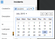
Displays a date picker. You can display this field in the following formats:
|
Yes |
|
Switch |
Displays a toggle switch. | Yes |
|
Link |
Displays a link that can open other pages in your app, or access external services. | N/A—The link field is always read only. |
|
Email |
Displays the text as an e-mail link. When you add this field type, MAX configures an action to open the device’s e-mail client. The To: field is populated with the address from the field. | N/A—The e-mail field is always read only. |
|
Phone |
Displays the text as a phone link. When you add this field type, MAX configures an action to open the device’s phone dialer. | N/A—The phone field is always read only. |
|
Select |
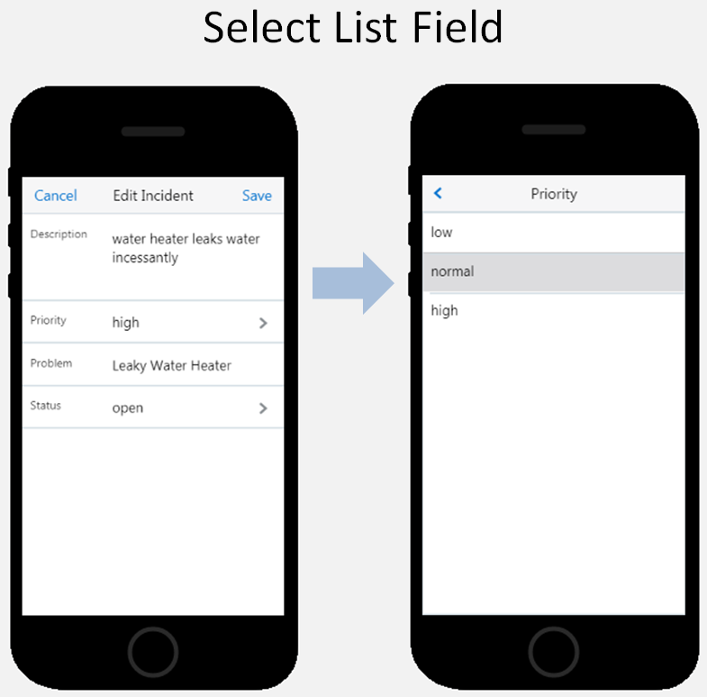
Creates a select list. See Select Lists to find out more. | Yes |
|
Image |
Displays the Image component. The field value that’s mapped to this component is an absolute URL to the image file. | Yes. Images describes how to add images that users can replace. |
|
Rating |
Displays a Rating component. To find out more about this component and its data requirements, see The Components Palette. | Yes |
|
Linear Meter |
Displays a linear status meter component. To find out more about this component and its data requirements, see The Components Palette. | Yes |
|
Circular Meter |
Displays a circular status meter, whose value can display as a number or as a percent complete. See How Do I Configure Meters and Gauges? to find out more about the data requirements for meters and configuring their threshold values. | Yes |
|
Slider |
Displays a slider component. | Yes. You can disable the slider by setting it to read only. |
Select Lists

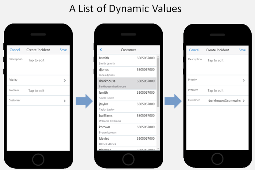
To create a dynamic list of values, your service must have reference (or peer-level) business object. The fields from these objects hold the list values that your users select.
Creating a List of Fixed Values
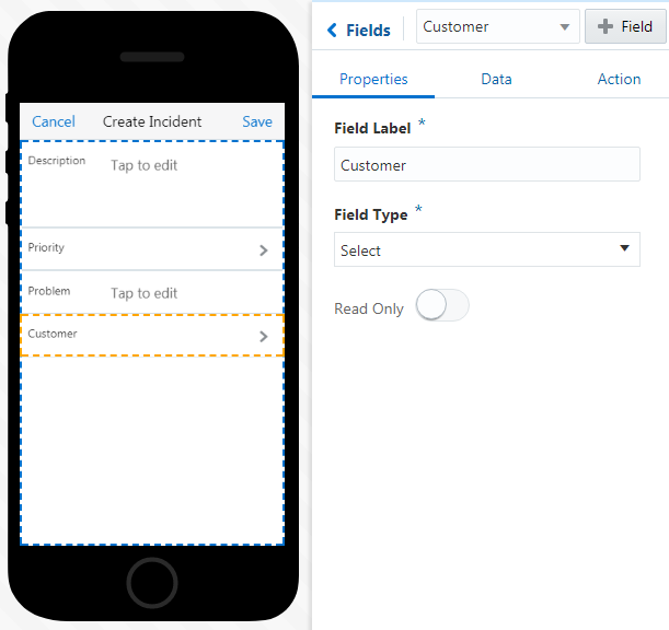
-
Select the field in the Preview or from the drop down list in the Properties inspector for the form.
-
In the Properties page, enter a field name.
-
If you haven’t already, choose Select from the Field Type menu.
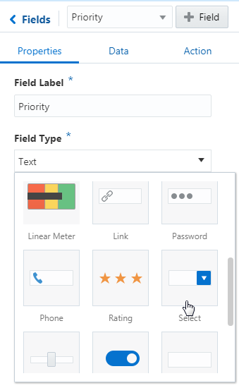
Note:
When you choose the Select field type for a data-bound field, the Read Only toggle is switched off ( ).
).
-
-
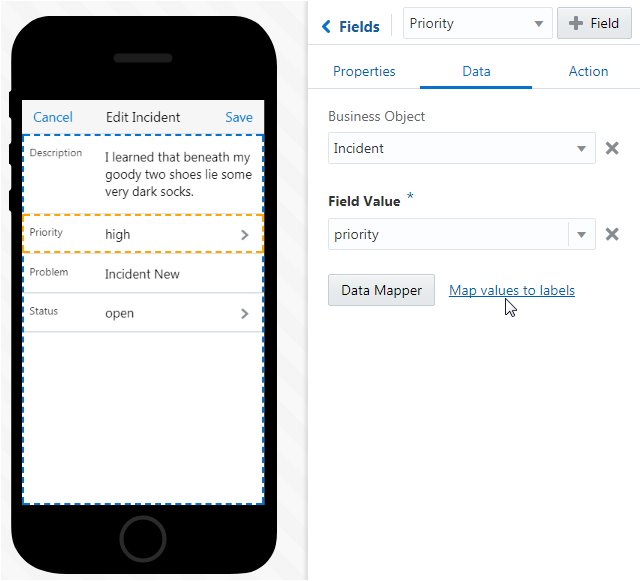
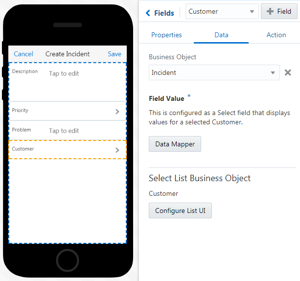
In the Data page, select business object and field value, or add a fixed value. To find our more, see Data Mapping for Forms and Form Fields. You can use a field that returns three values.
-
If needed, rename the list values or add new ones. To do this, click Fixed List of Values to open the Edit Fixed List of Values dialog.
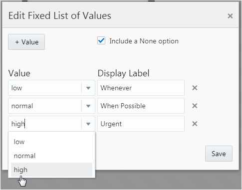
Description of the illustration edit_bo_lovs.pngYou can pick the value returned by the mapped field value, or click Add Value (
 ) to create a new one. Click Save when you’re done.
Creating a List of Dynamic Values
-
In the Data Mapper, select a reference business object.

-
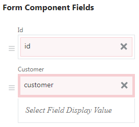
Drop the business object into a form field.
-
Drop one of the fields that belong to the related object into the Select Field Display Value slot. You can, for example, add the field (or fields), that will be the select list items.
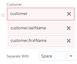
This is an optional step. If you don’t add this, then the field remains empty. -
After you complete the mapping, select the field in the Preview or from the Fields menu in the Properties Inspector. Clicking the Property tab reveals that MAX has configured this field as a Select.
-
If needed, Disable the Read Only option (
 ) to activate the tap action (like
  on iOS phones) that opens the list of options. After you switch this option off, the badge appears above the Data tab (
 ), indicating that you need to perform additional field mapping. In this case, you need map data to populate the select list.
-
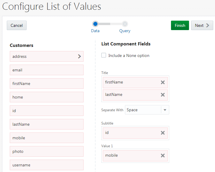
Open the Data tab and then click Configure List UI. The Configure List UI wizard opens. It’s Data page is similar to the data mapper for a list component, but instead of the various data source categories, you can only choose from the fields that belong to, or are themselves related to, the referenced business object that you selected earlier.
-
You don’t need to map all of the fields, but you do need to drop a value in the Title field, which holds the value that users select (it and displays in bold type). This mapping should match the Select Field Data Value mapping in the form component. The other fields add context, but users can’t select them. See Lists
Tip:
You can concatenate values in this field.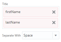
-
If needed, select Include a None option in case none of the list values satisfies the user.
-
Click Finish to complete the wizard.
Images
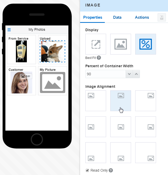
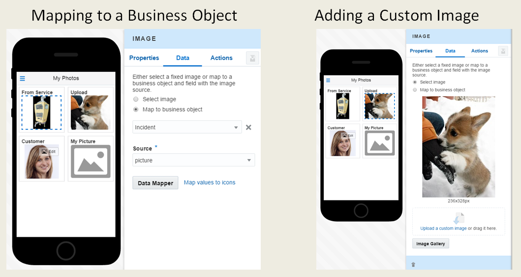
You can add an Image component to a dashboard tile or to a simple screen. To populate this component, you can upload an image or map a value from a business object. Users can’t update the images that you upload, but they can update the ones that are mapped from a business object.
The Properties Inspector for an Image component enables you to set the size for an image, select an image itself, and configure a tap action on the image.
Sizing the Image
| Option | Description |
|---|---|
Best Fit  |
MAX sets the size for you by calculating the longest side of the image against the corresponding axis. |
Percentage of Container Width  |
Set the size yourself by entering a value. You can adjust the size further using the spinner. |
Actual Size  |
Choose this option if your image already fits the container, or doesn’t need adjusting. |
Selecting the Image
-
Select an image—These are static images that users can’t update.
-
Map to business object—Users can replace these images, or they can remain as read-only. Business objects with upload actions allow access to photo galleries and cameras from within the mobile app.
Note:
The value returned from the service can be an absolute URL, a relative URL, or a base64-encoded image. For the latter, the value must start withdata:image/.... Also, check with your administrator to make sure that the business object supports binary streams.
-
Drag an Image component (
 ) from the Component Palette into your screen.
Note:
You can’t drag an Image component into a List or Form component. The Image field type is read only. -
Click Select an image.
-
Click Image Gallery (
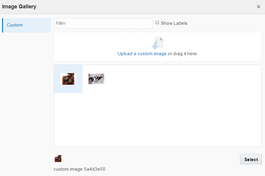
 ), choose an image from the gallery, and then click Select. Alternatively, you can upload an image to the Properties Inspector, or drag it in. (This also adds the image to the Custom category of the Image Gallery). See also Using the Image Gallery.
The Properties Inspector displays a thumbnail of the image that you’ve added, along with its dimensions (in pixels). The images that you upload are read-only and can’t be changed by app users.
-
Drag an Image component (
 ) from the Component Palette into your screen.
-
In the Properties Inspector for the Image component, click the Data tab and then select Map to business object.
-
Select from among the data options, like Data Source or Business Objects.
-
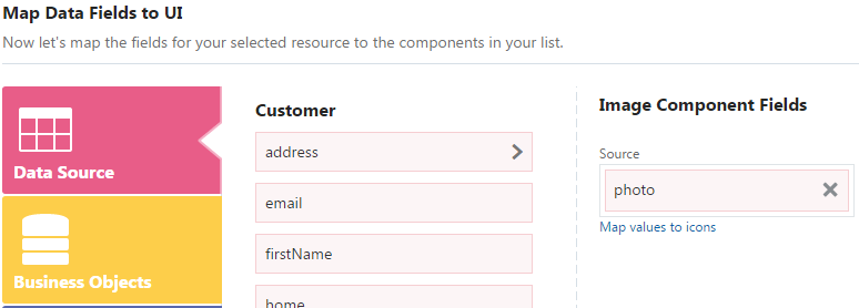
In the Data tab of the Data mapper, drag the value for the image into the Source field (located in the Image Components Fields section). You can only map a single value to this field. This value represents an absolute URL to the image file that’s returned from the service.
-
In the Query tab of the Data Mapper, choose your filter criteria and then click Finish.
See Taking a Look at the Data Mapper to find out more about selecting business objects and mapping field values.
-
If needed, select an image upload action.
-
To enable users to replace the image, clear the Read Only option in the Properties tab. MAX superimposes an overlay over the image that indicates that users can update the image. By tapping this overlay, users replace the image using the device camera or photo library.
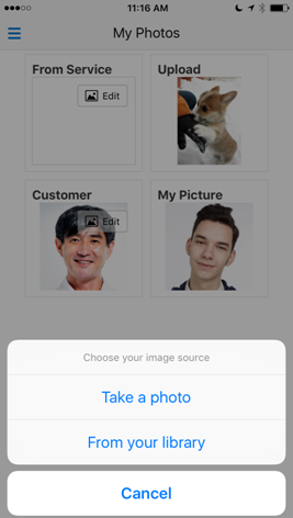
Description of the illustration image_camera.png
Tap Gestures
You can combine the tap gestures configured for the Image component (![]() ) with actions that are specific to a business object, or with standard navigation actions like Navigate to Screen or Navigate Back.
) with actions that are specific to a business object, or with standard navigation actions like Navigate to Screen or Navigate Back.
Maps
The Map component lets you create an interactive map, one that plots markers from addresses or geographic coordinates. Your users can explore these maps using standard gestures like pans or pinches to zoom in and out.
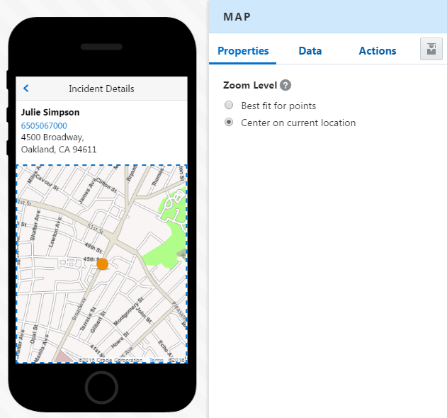
How Do I Set the Zoom Level?
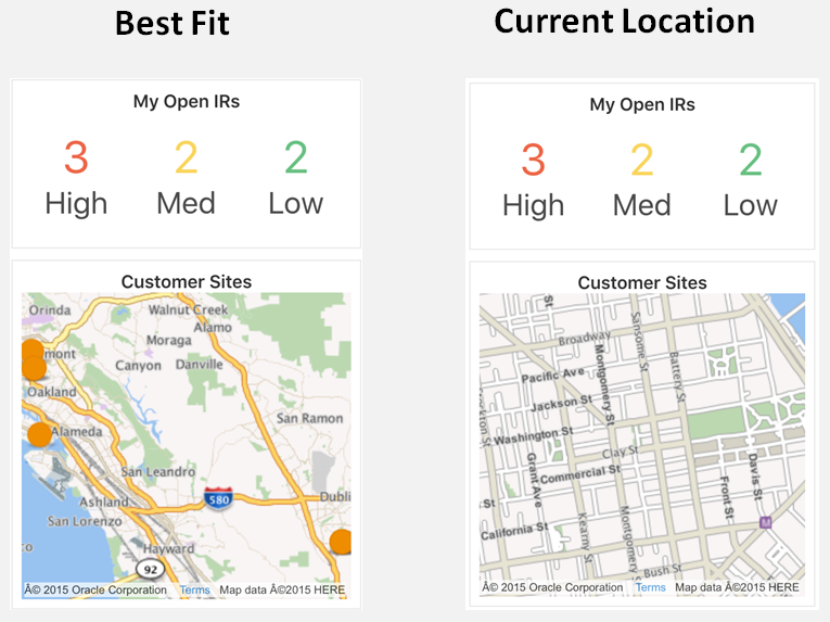
-
Best fit for points—MAX adjusts the zoom level so that all of the markers display in the center of the map view.
-
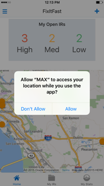
Center on current location—MAX displays the current location of the mobile app, which may not be near any markers. If you choose this option, users may not see any markers when they first land on the screen, so they’ll need to pan and adjust the zoom to find them.
Note:
MAX displays the app user’s current location by default when there’s no data mapping.
What Kind of Location Data Should I Use?
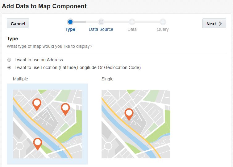
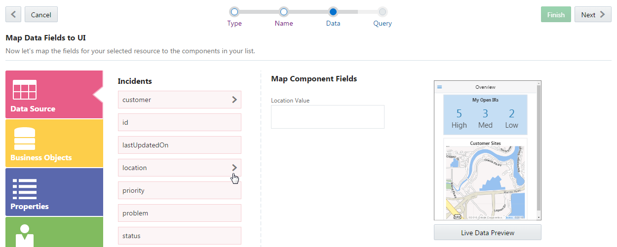
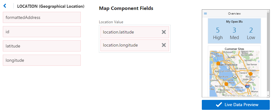
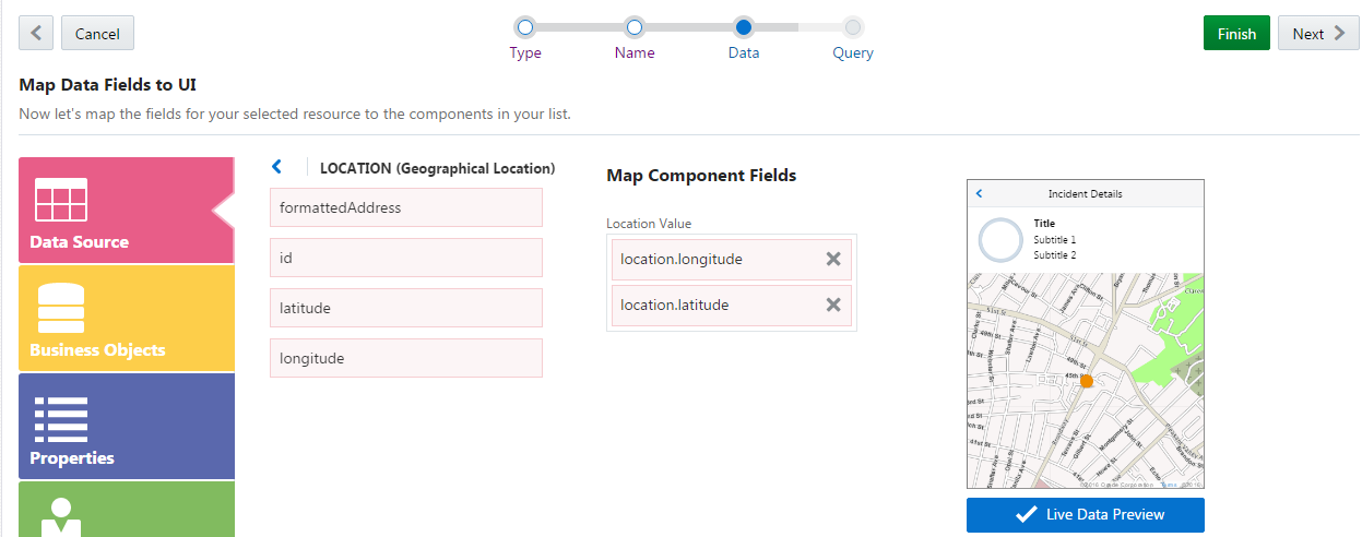
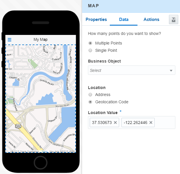
37.530673,-122.262446. Using the Data tab of the Properties Inspector, you can configure the Map component to display one or more points from data provided from a service, or from the addresses or geocoded locations that you enter yourself.
Note:
You need to enter these values separately, not as a single, comma-separated entry. In other words, parse your entries by clicking Return after you add each value to the Location Value field: it’s37.530673, then -122.262446, not 37.530673, -122.262446.
Use Case: Adding a Map Component
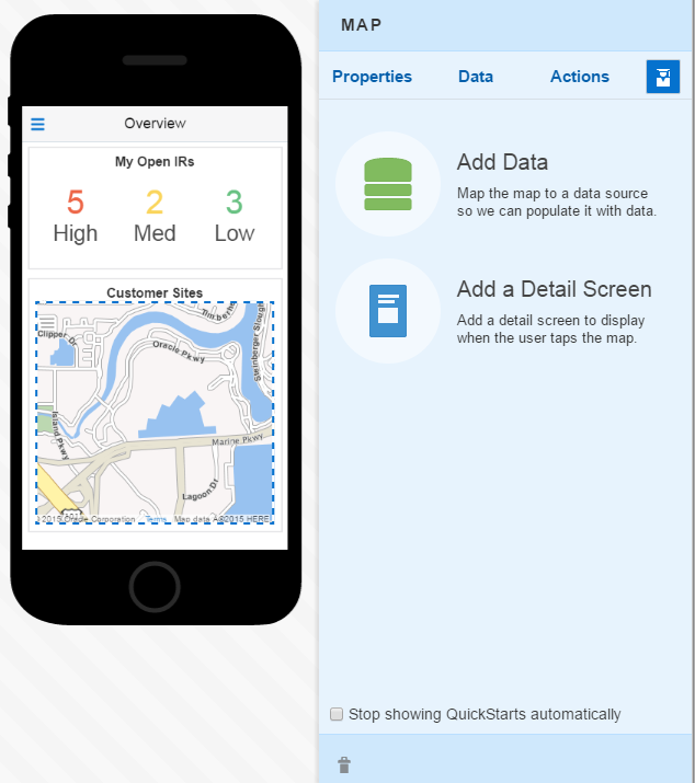
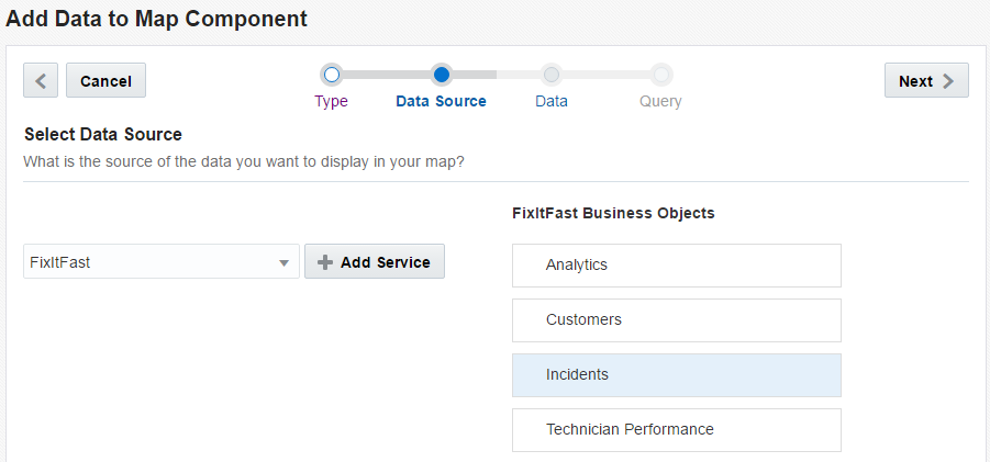
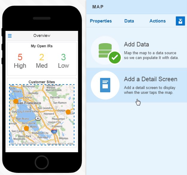
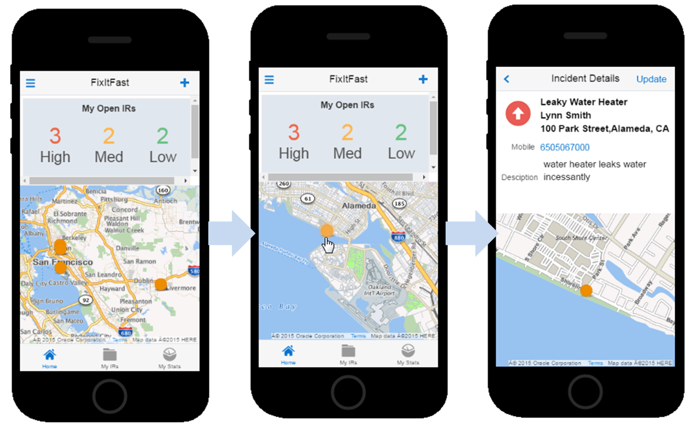
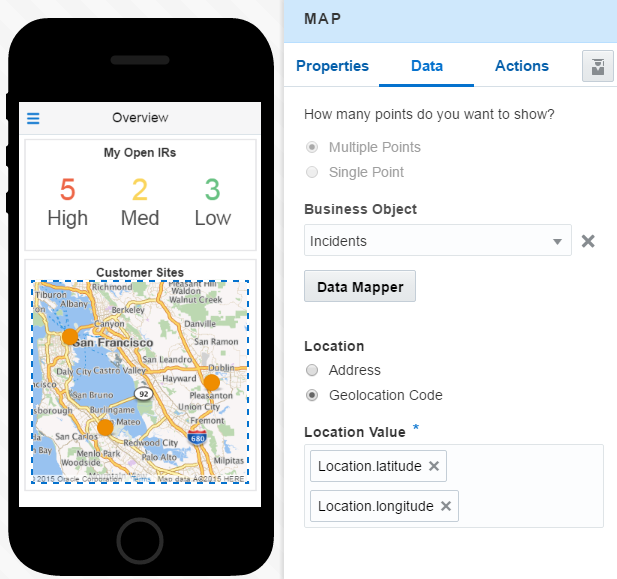
For this use case, we’re returning to our mobile technician app scenario. This time, we’re going to equip the team with a map that plots all of their active customer sites. They’ll drill down from a high-level view to get a closer look at a selected locale. The Map component’s QuickStarts will help us create maps that not only display data returned by business objects, but support tap gestures that open detail views.
Note:
This use case starts off after the dashboard has been created and its high, medium, and low priority Metric components have been mapped.To add the map:
Enabling Your App to Display Content
Your app might need to access servers that host your company’s data. It might also need information from the third-party providers, such as geolocation services. In planning your app, you might have discussed your app’s data requirements with your development team. In turn, they developed services that provide this data. They may have tailored a service for your app, or created services that address more general needs. Services group together business objects (which you’ll learn more about in Getting to Know Business Objects). Using services lets you enliven your app by allowing it to display data and react to user interactions. The specific task that enables your app to use data is data mapping. Like building your UI from the MAX screen templates and UI components, data mapping can be done quickly by drag and drop operations.
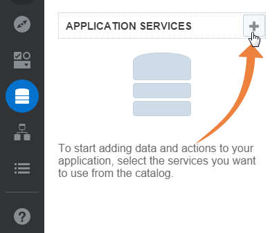
Exploring Services

You can also open the Service Catalog by clicking Data (
 ) in the navbar.
Getting to Know Business Objects
Business objects let you map your UI to data.
Business objects represent data as real-world entities like people, places, events, or business processes. They describe various aspects of the data and how (or where) it can be used. The business objects represent items in the data collection that support your mobile app. For example, say you’re creating a mobile app that enables field service technicians to both respond to and track customer incident reports (IRs). You’ll need the app to display the number of IRs assigned to a particular user. You’ll also want your app to show each user a list of assigned IRs and enable users to open forms to create new IRsl.
To allow your users to access data, your development team has created a service that includes a business object called Incident. To enable various aspects of IRs to display as a list in your UI, your development team has defined a set of fields for this business object which have names like Incident ID, Incident Description, and Priority. To allow users to update, create, and delete a business object, your development team has also created a set of actions. These actions enable you to add create, edit, and update pages. They also allow user gestures, like tap and tap-and-hold to trigger an action.
You can pick a service and explore its business objects using the Data Palette. To open the Data Palette:
-
Click Data (
 ) in the Designer’s navbar.
-
Choose the service that you want to make available to your app (along with the version) and then click Select.
-
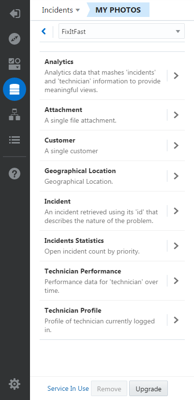
After you choose a service, the Data Palette opens. It lets you explore its business objects, which allow you to bind your UI to data.
Tip:
Click Remove Service ( ) if you’ve selected a service that’s not used by your app.
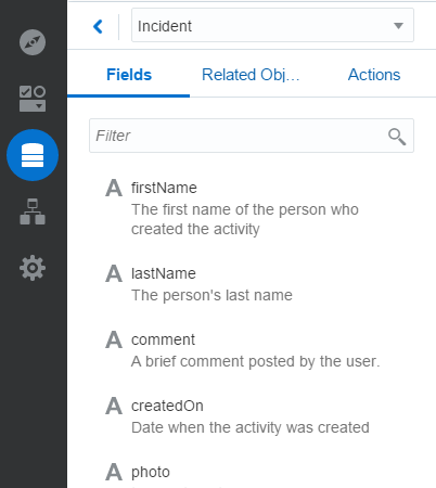
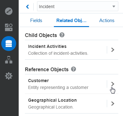
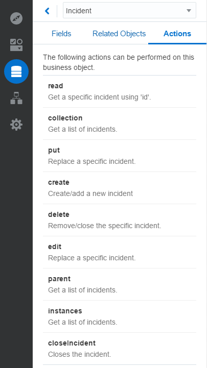
When your development team models the data into a business object, they also provide descriptions and hints about you can use that display in the Fields, Related Objects, and Actions tabs of the Data Palette. If you want to display a list, for example, your development team will document the business object accordingly by describing not only its purpose (like Incidents’ history and assignments by technician), but also the fields that you can use in your app (like Customer First Name, Last Name, Address, and so on). The Data Palette also tells you about the actions that your users can perform on the data represented by the business object.
Tip:
The Add Data QuickStart is the fastest way to map business objects to your UI components. Using the QuickStart wizards, MAX can infer how you might want to build your UI according to the business object that you choose. If you choose a business object that returns a list of items, for example, the QuickStarts will prompt you through populating the list view page. For create and edit pages, MAX selects the fields from the business object that can be used for data input. See Use Case: Creating a List Using QuickStarts to find out more.Field Values
Each business object has a set of fields, which represent how data can be delivered to the UI. Using the Fields tab, you can browse through your development team’s descriptions, such as the type of data it returns (like alphanumeric strings or numbers) and how this data is formatted (e-mail, URL, date, etc.) The developer’s descriptions might also tell you how you can use the field. For example, they might include such details as whether app users can update the field, or whether it can support searches. The descriptions might also tell you how the field supports the app by stating that it’s mandatory a field when users update or create records.
Related Objects
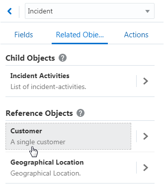
Business objects can have either direct or indirect relationships. They can be in peer relationships, or parent-child relationships. Child objects belong to their parent objects and can’t exist on their own. For example, a child object called Incident Activities, which provides details about the incidents described by its parent object, Incident, has no meaning outside of the context of the parent object. A business object can also be referenced by another object in a less direct relationship. For example, a Customer business object that includes fields describing customer contact information would be related to the Incident business object, as it provides complementary information. Unlike a child object, however, a related business object exists on its own.Actions
Business objects may also have a set of actions that manipulate the data returned by the field, or can be used to support user interactions, like swipe gestures. MAX provides a set of standard operations that enable fields to display data and allow user interactions:| Operation | Description |
|---|---|
| read | Returns an individual record. |
| collection | Returns a set of records. |
| create | Adds a new record. |
| delete | Removes a record. |
| edit | Updates a record. |
Service Upgrades
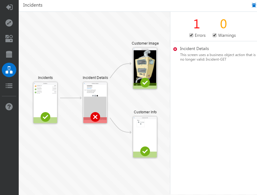
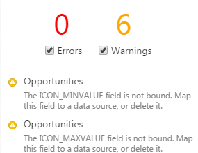
 ). But before you do that, check with the service developer to find out about the changes to the service and if they’ll prevent your app from making a graceful transition to the newer version. A newer version that addresses a bug fix, for example, could be backward compatible and not affect how your app consumes data. But in other cases, a newer version might include profound changes that require you to rework the data binding and other configurations: some fields currently in use might now expect different types of data, or may no longer exist. Query parameters can change, and entire business objects can be removed. When you upgrade a service, MAX checks your current bindings against the new service. MAX’s error reporting (
 ), lets you spot the broken data mappings within the screen flow (accessed by clicking
  in the left navbar). From there, you can begin making your repairs by clicking a snapshot to open an affected screen.
Note:
Before upgrading, save a copy of your app by exporting to your system. See Importing and Exporting Your Apps. Clicking Upgrade also lets you revert to the prior version of the service after you’ve upgraded.Re-Publishing Your Apps After Upgrades
If you’re upgrading the service for an app that you’ve already published, then you’ll need to publish that app again after you’ve tested its compatibility with the new version. This means that you’ll have to rebuild the app before you scan its test QR code. When you’ve completed your testing, you’ll need to re-publish the app and then inform users that they need to re-install the app by scanning the production QR code. If you don’t care about retaining the test and production QR codes, then you can perform the service upgrade and subsequent testing on a duplicate of the app that you’ve created using the Import and Export functions. In this case, your users can delete the version that runs the previous version of the service and install the new app, which has a different QR code. See Building and Testing Your Apps and Importing and Exporting Your Apps.
Taking a Look at the Data Mapper
Tip:
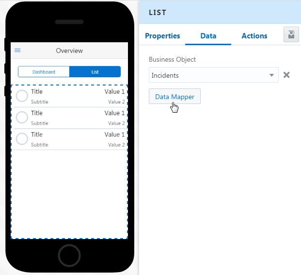
You can open the Data Mapper from the Data Page of the Properties Inspector, or through the Add Data Quickstart. This wizard provides the fastest route to adding data to a UI component.-
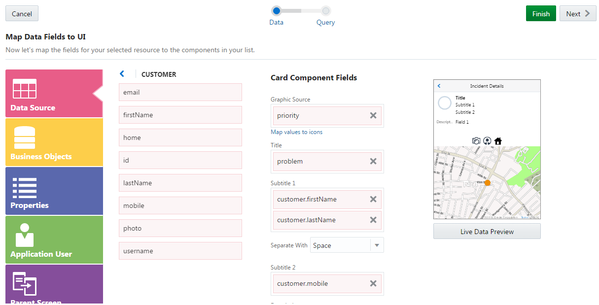
Data Source—The fields that belong to the business object currently in use. To find out more, see Getting to Know Business Objects.
-
Business Objects—Lets you select from among the business objects that belong to a service.
-
Properties—Lets you define an application-wide value for a query parameter. See Application Properties.
-
Application User—Information about the authenticated application user, including the user name, e-mail, and so on.
-
Device Services—The system date and the app user’s current geographic location.
-
Fixed Value—A specific value, or a value that enables the business object to return specific data.
-
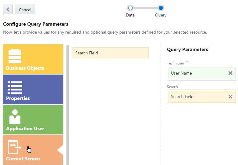
Current Screen—Use this category to map values that are passed between pages and components, including search fields. See Adding a Search Field.
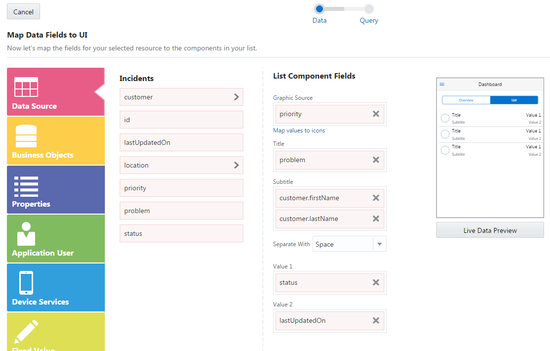
Description of the illustration data_mapper.png
Tip:
Choose Live Data Preview to help you map your values. The mock data (which is provided by the developer), guides you through your mapping. To find out more, see List Layouts and Use Case: Creating a List Using QuickStarts. To see how the images, field entries, or data visualization tools look using like data, see Previewing Your App.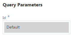
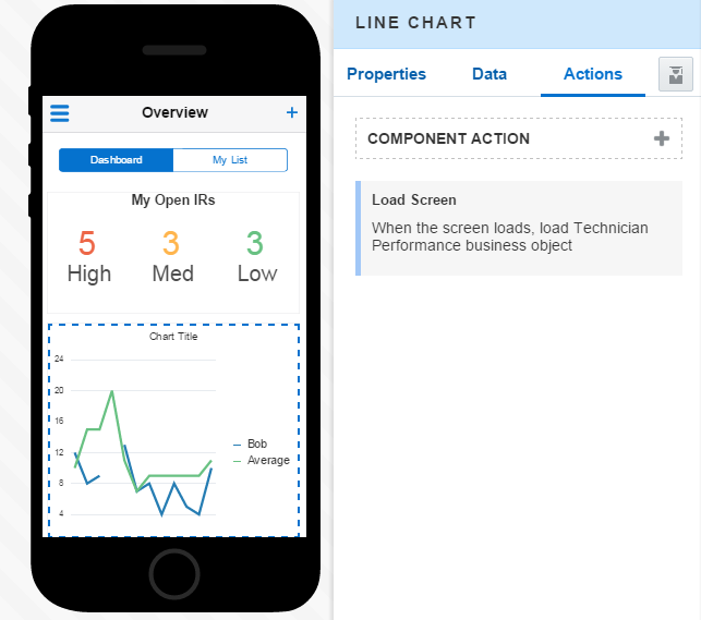
You can override this mapping if you want a different way of filtering the returned data. If you’ve mapped values, then MAX notes the service as In Use. You can’t remove this service without removing the mappings first. When you map a component to a business object, MAX creates an action that loads the business object when app users open the screen. For more information, see Use Case: Mapping Data to a Line Chart.
Mapping Field Values to Forms
You can add as many fields as you need to a form. After you map a value to a field, MAX adds a new field for you to populate. You can continue adding fields this way, or by clicking the Add All Fields button ( ) , which generates fields using all of the field values that belong to the selected business object. If you’ve already mapped one value from the object, then clicking Add All Fields button adds the remaining values. Use the Move icon (
 ) to reorder of the fields. For more information about adding and reordering fields using the Properties Inspector, see Forms.
Use Case: Mapping Data to a Line Chart
-
Open the Data tab of the Properties Inspector.
-
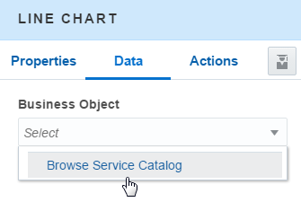
Click Browse Service Catalog from the Business Object menu.
-
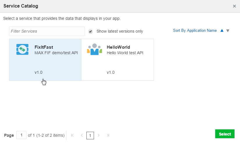
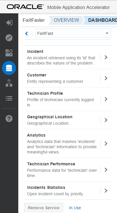
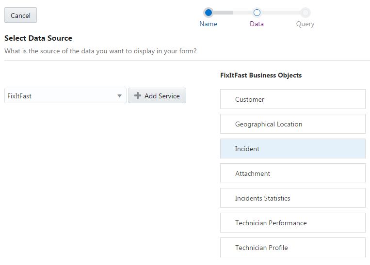
In the Service Catalog, click FixItFast, the service created by the development team to back the repair technician app with data. Then click Next.
-
The FixItFast service includes a set of business objects that provide different types of data. To find out which of these is best for this particular facet of the app, click Show object descriptions (
 ), to read the descriptions provided by your development team.
-
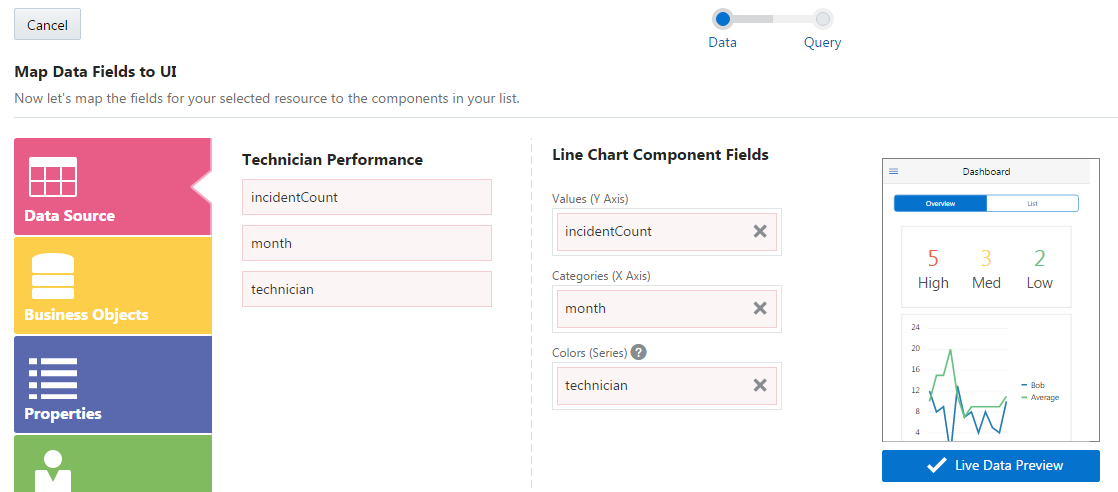
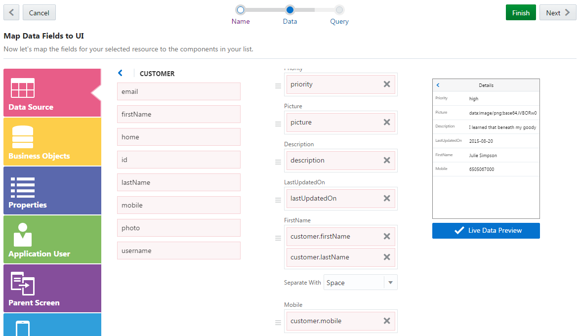
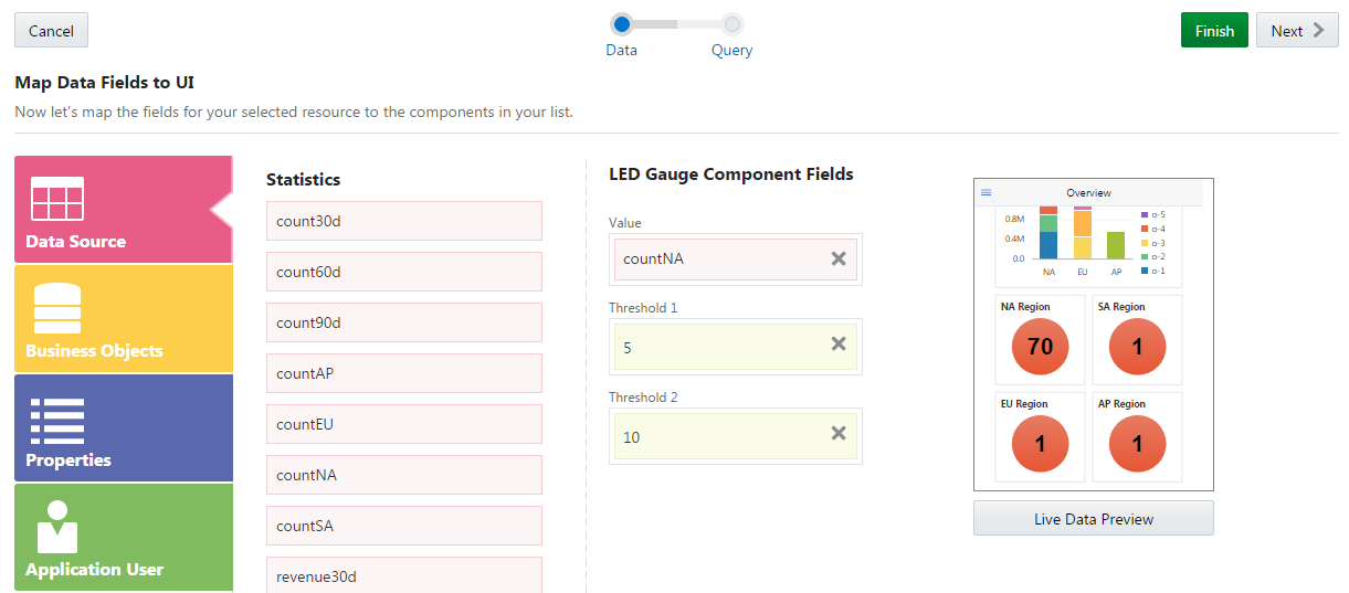
Because the line graph plots IRs by month, chose the Technician Performance business object. (In the Service Catalog its description in the reads “Performance data for technician over time”.) Click Next to go the Data Mapper. The Data Mapper’s Data Source category is open, showing the fields available from the business object currently in use, Technician Performance. The Data Mapper color codes the fields to the category. In this case, they’re pink because they belong to the Data Source Category.
-
Use the Data Mapper to first map the technician performance-related values to the line chart and then filter the data that’s returned from the FixItFast service.
-
To populate the chart’s x and y axes, and color code its plotted lines to differentiate the individual technician, you’d pick the following values:
-
Drag the Incident Count value into to Values (Y Axis) field.
-
Drag the month value to into the Categories (X Axis) field.
-
Drag the technician value into the Colors (Series) field.
Note:
While you can add more than one value for list and form fields, you can’t do this for graphs and charts. For these components, you can only map one value. -
-
Click Next to move the Query page of the Data Mapper.
-
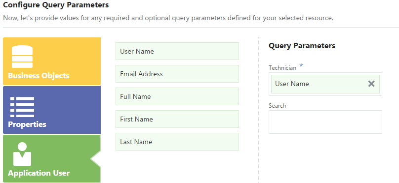
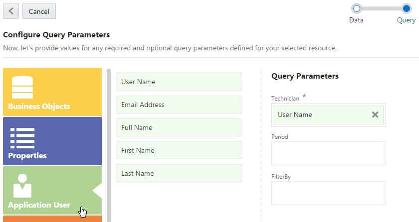
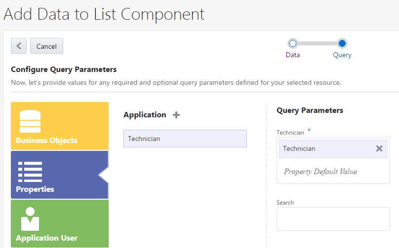
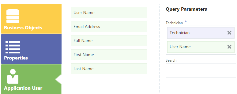
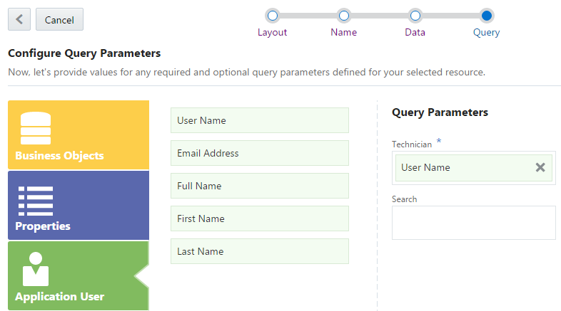
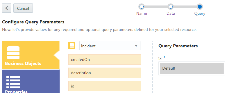
To ensure that the app’s user (the repair technician) sees only the IRs, customer information, and in this case, performance data that’s specific to her, you’d filter the returned data by user-specific criteria. To return this data, you need use the technician’s user name as a query parameter. To do that, you’d select the Application User category and then drag username into the Technician field (located under Query Parameters). Because this is the Application User category, the fields are green.
-
-
Now that you’ve completed the field mapping and set the query parameter, you can click Finish. Clicking the Actions tab in the Properties Inspector shows that MAX has added the action to load the Technician Performance business action.
-
See How Do I Create a Line Chart? to find out about configuring line type, orientation, and other display properties for a line chart.
Adding Actions
Use the Properties Inspector’s Actions tab to configure gestures and actions for a selected component.
| Action | Created by |
|---|---|
| Set Current Object | Mapping list or gauge components to a business object. This action, which appears at the start of the action chain, names the business object currently in use. The screen flows created using the list-related QuickStarts all have this action. |
| Load the screen. | Mapping a business object (using the Data Mapper or the Add Data QuickStart). |
| Open e-mail with a tap gesture. | Choosing Email as a field type for a Form component. |
| Open phone dialer with a tap gesture. | Choosing Phone as a field type for a Form component. |
| Navigate to the details screen. | Completing the Add a Detail Screen QuickStart |
| The application menu icon navigation | Completing the first page of your app. You can’t change this configuration. |
-
Selecting the component.
Note:
The Properties Inspector tells you if you can’t configure an action for a component. -
Selecting a tap gesture from the Actions panel.
Note:
A swipe gesture is already created for you if you’re configuring swipe tiles. To find out more, see Adding Swipe Gestures. -
Use the Configure Action panel to choose from the business object actions that apply to your components. These might include actions like refresh, create, update, and delete. To find out more, see Getting to Know Business Objects.
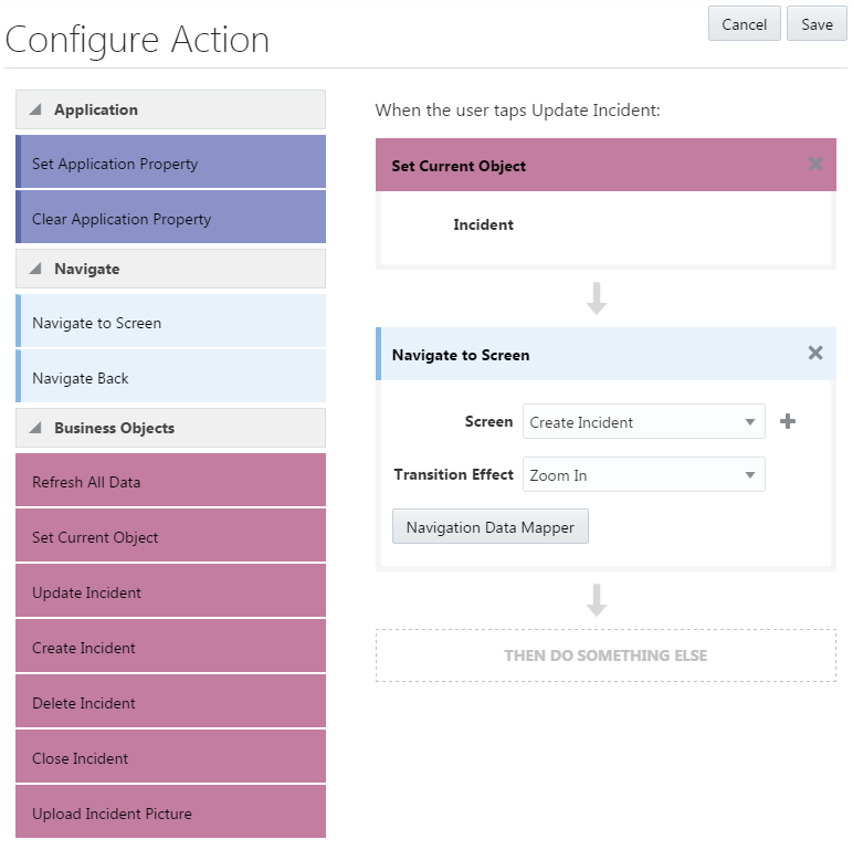
Build an action chain that’s triggered by the tap gesture by dragging and dropping actions into the DRAG AN ACTION HERE field. By combining these actions with the Navigate to Screen and Navigate Back options, you link your screens into a flow. You can enhance the navigation by choosing transition effects like flip right, flip left, or fade. If your app doesn’t yet have the destination screen you need, click Add ( ) and then complete the wizard that prompts you through creating a landing, detail, create, or edit page. You can continue to expand the action chain by clicking Add and then by dragging and dropping the navigation options or business actions into the THEN DO SOMETHING ELSE fields that appear after each action definition. You can add as many actions as you need. Click Delete (
 ) to remove the actions that you don’t need.
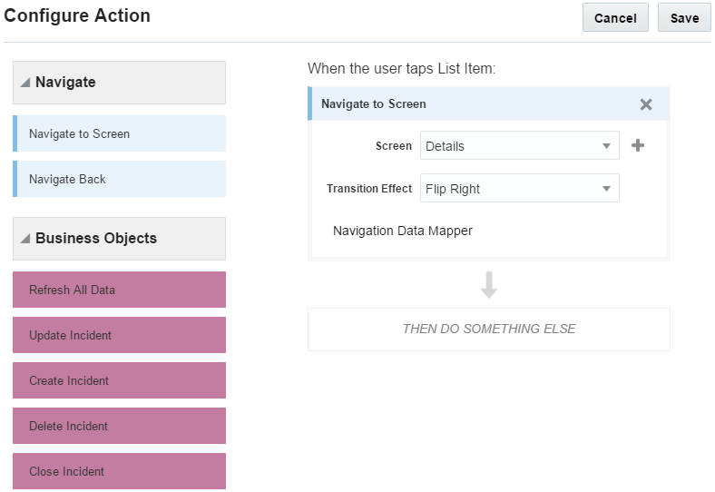
Description of the illustration configure_action.pngTip:
You can reorder the actions using the Move icon ( ).
).
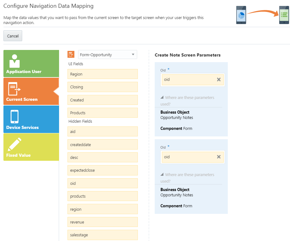
 ). Using the Configure Navigation Data Mapping screen, you can select the value and add it to the target screen. You can choose a value from the current screen, a fixed value, and values related to the application user or the device (like the system date). For more information, see Taking a Look at the Data Mapper. You can drag more than one value into a target field. You can’t delete a default value that’s populated in a target field, but you can replace it by dragging a new value on top of it. An asterisk (*) indicates a required value. Clicking Finish takes you back to the Configure Action panel.
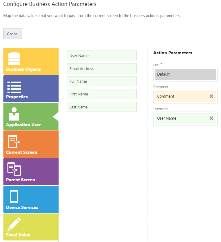
 ). In the Configure Action Business Action Parameters screen, you can not only select values from the current screen, but from the parent screen as well. Like the Data Mapper and Configure Navigation Data Mapping screens, you can also add a fixed value, an environment value, or an application user value.
Application Properties
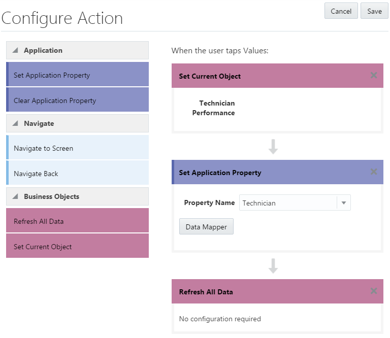
Setting an application property allows the components throughout your application flow to share the same data and collaborate.
How Do I Set Application Properties?
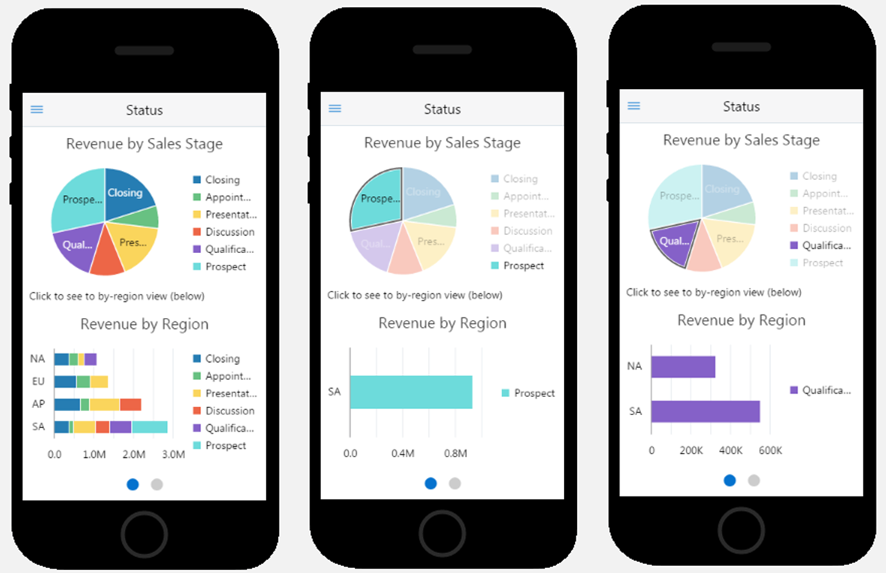
By including Set Application Property in the action chain, you can add dynamic displays to the various chart, graph, and list components in your app. But before you begin, keep in mind that application properties set values for the query parameters used by the business objects that belong to the service that backs your app. You can’t use a random name for your application properties, so be sure to name them after the query parameters. Check the Query page of the Data Mapper for these names, or ask your developer.
To set an application property:
- First, add a tap action to the source component that passes the parameter:
- Select a component in the Preview (one that’s been mapped to a business object).
- In the Properties Inspector, click Actions.
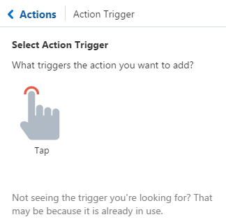
- Add a tap action by first clicking Add Component Action and then Tap (
 ).
).
- Add the application property to the action chain:
- In the Configure Action panel, drag and drop the Set Application Property action.
- Enter the name of the query parameter, or, if you’ve already added application properties in the Data Mapper, select one from the list. These properties must match up with the query parameters for the target component (the consumer of the parameter).
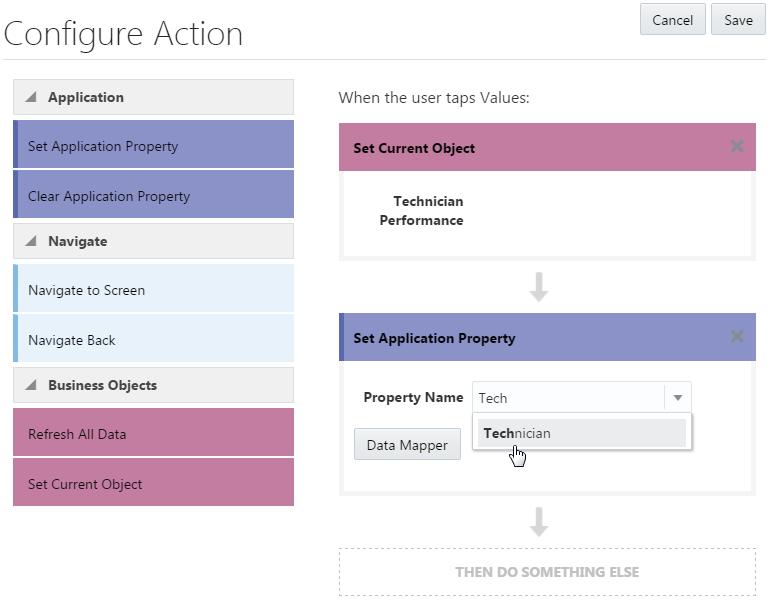
- Next, set the parameter value that this component will pass:
- Click Data Mapper (
 ).
). - In the Map Data page, choose the value mapping from among the data source categories.
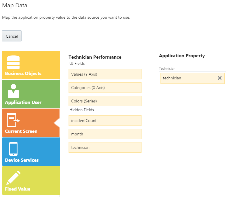
- Click Finish.
- If this component passes the parameter to another component within the same page, then drag and drop the Refresh All Data action and then click Save. Otherwise, you can omit this action and add a navigation option to the action chain. When you’ve completed the chain, click Save.
- Click Data Mapper (
- With the property value set, you now need to configure the component to consume the parameter. To do this:
Using QuickStarts
The QuickStart wizards help you out with your development tasks, like adding data to a UI component, or creating edit and detail screens.
| If you create... | ...Use these QuickStarts |
|---|---|
| Lists |
|
Forms Description of the illustration form.png |
|
| Charts, Gauges, Cards and Metrics |
Add Data |
Maps |
Use Case: Adding a Map Component describes how these QuickStarts help you to create a map with tap-to-zoom gestures. |
Use Case: Creating a List Using QuickStarts
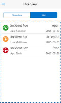
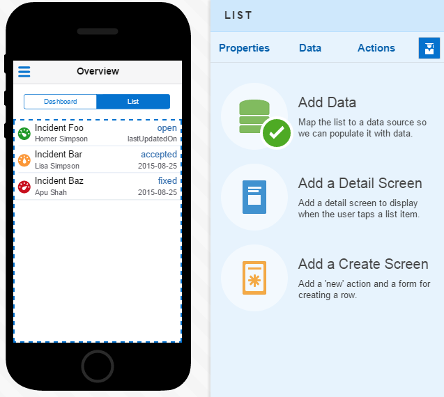
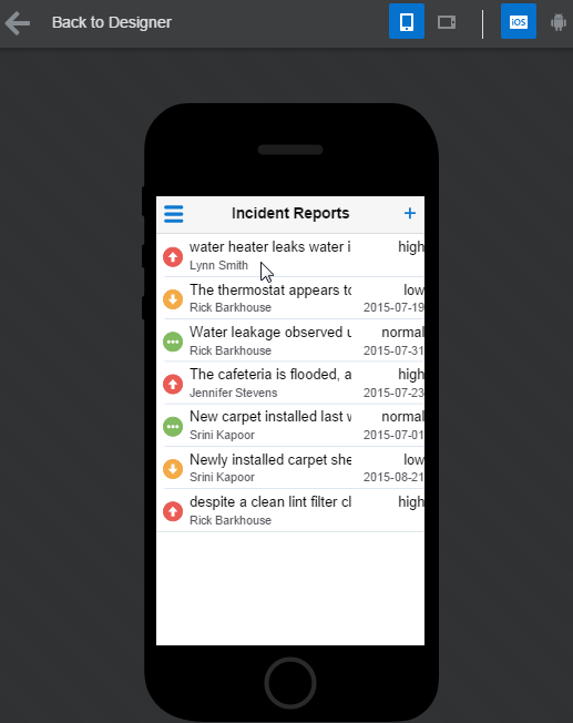
You can create a list that not only drills down to a detail screen, but also has create and update screens. This scenario illustrates using the QuickStarts to create a list of open incident reports (IRs) that are assigned to a repair technician. It shows you how to map data to a list that includes:
-
Images that identify incident’s priority (high, medium, and low).
-
A short description of the incident.
-
The status of the incident (open or closed).
-
The date that the IR was created.
-
The first and last name of the customer.
The repair technicians can create a new incident report from this screen. Clicking a row in this list opens a detail page, which provides a longer description of the incident and additional details. From this screen, users can update the IR using an edit screen.
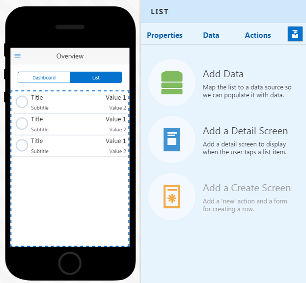
-
Add Data
-
Add a Detail Screen
-
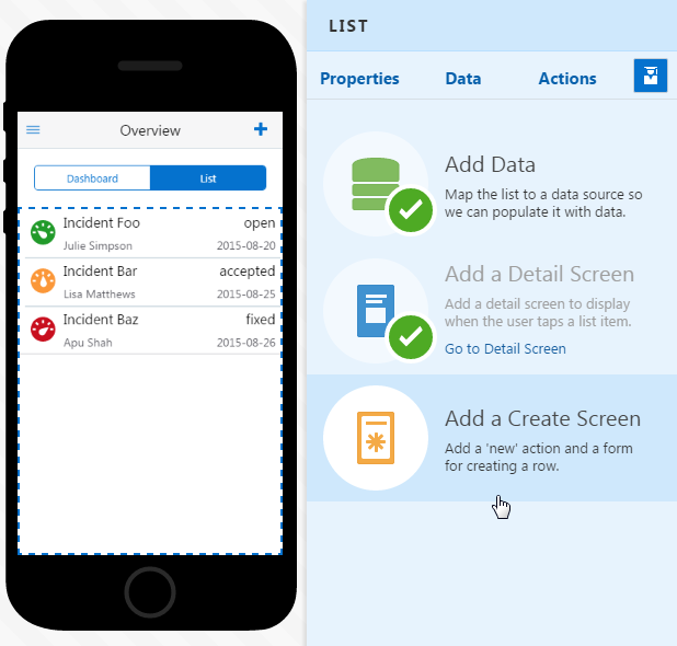
Add a Create Screen
Step 1: Bind the List to Data
-
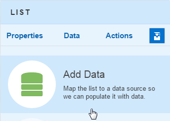
Click the Add Data QuickStart to open the wizard.
-
For a List component, the wizard’s first page presents list layout options. Because the mapping for the priority image, short description, and other information for the list requires all of the available fields described in List Layouts, the layout option with the Graphic, Title, Subtitle, Value 1 and Value 2 fields (which is the default layout) is your best choice. Clicking Next opens the Data Source page of the wizard.
-
Clicking Add Service (
 ) opens the Service Catalog. In this case, the service that provides the business objects needed to return data to the list and its child screens is FixItFast. The Incidents business object backs the field mappings of the list. This business object uses a collection action to return its records. It does not include all of the fields from service, or even all of the fields that describe an incident. Instead, it provides a subset of fields that is appropriate to the overview nature of a top-level list. With the service and business object selected, click Next to map the values using the Data page. The Incident object’s fields display in the Data page’s Data Source category, because it is the currently selected business object.
-
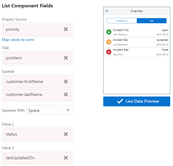
Drag values from the Incident section of the page to the List Component Fields section of the page. Start off by dragging the priority value into the Graphic Source field:
-
Click Map values to icons to open the Map Data Values to Icons dialog.
-
Clicking Add (
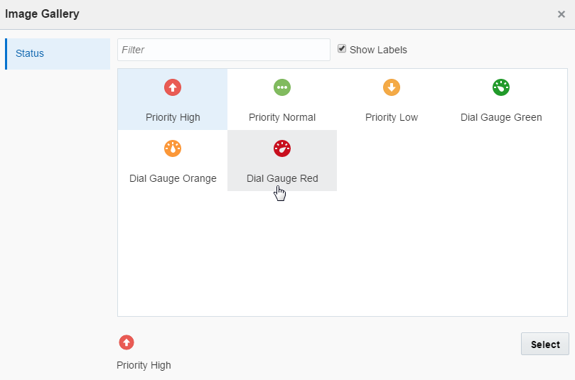
 ) opens the Image Gallery.
As noted in the Using the Image Gallery, the images available in the Gallery depend on context. Within the Data Mapper, the Image Gallery displays images provided by the business object.
Pick the images for the high, medium, and low values:
 -
The Incidents business object provides most of the values for the list. Within the FixitFast service, this business object also has some reference objects: Customer and Location, which are displayed in the Data page (and the Data Mapper). As described in Getting to Know Business Objects, these objects provide complementary information (in this case, the customer’s first and last name) and are peers.
Tip:
In this use case, the referenced objects provide the fields that we need to complete the screen from a single business object. However, this might not always be true of the business object that you’re currently using to populate your screen’s data. Because you can choose fields from other business objects (and other categories), your field mappings aren’t limited to the business object that you’ve chosen for the screen. Or, in the case of detail or other child screens, you don’t need to use the business object fields available to the parent screen.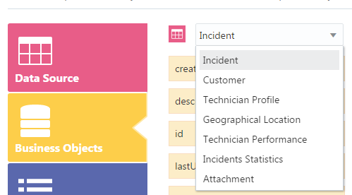
Business object Value Field Incidents problemTitle Incidents statusValue 1 Incidents lastUpdateOnValue 2 Customer (a referenced business object) firstname,lastname(two values, separated by a space)Subtitle 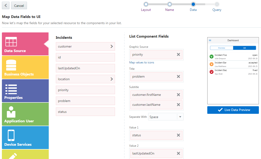
Description of the illustration mapped_list_live.png -
With the field mapping complete, click Next to choose the filter criteria. In this case, it’s user name, because the list returns IRs assigned to a particular field technician.
-
-
Clicking Finish completes the wizard. Back in the Properties Inspector, the Add Data QuickStart is checked off. You’re now ready for the next QuickStart wizard, Add a Detail Screen.
Step 2: Create the Detail Screen
-
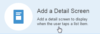
Click the Add a Detail Screen QuickStart.
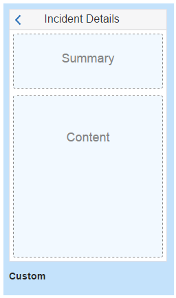
-
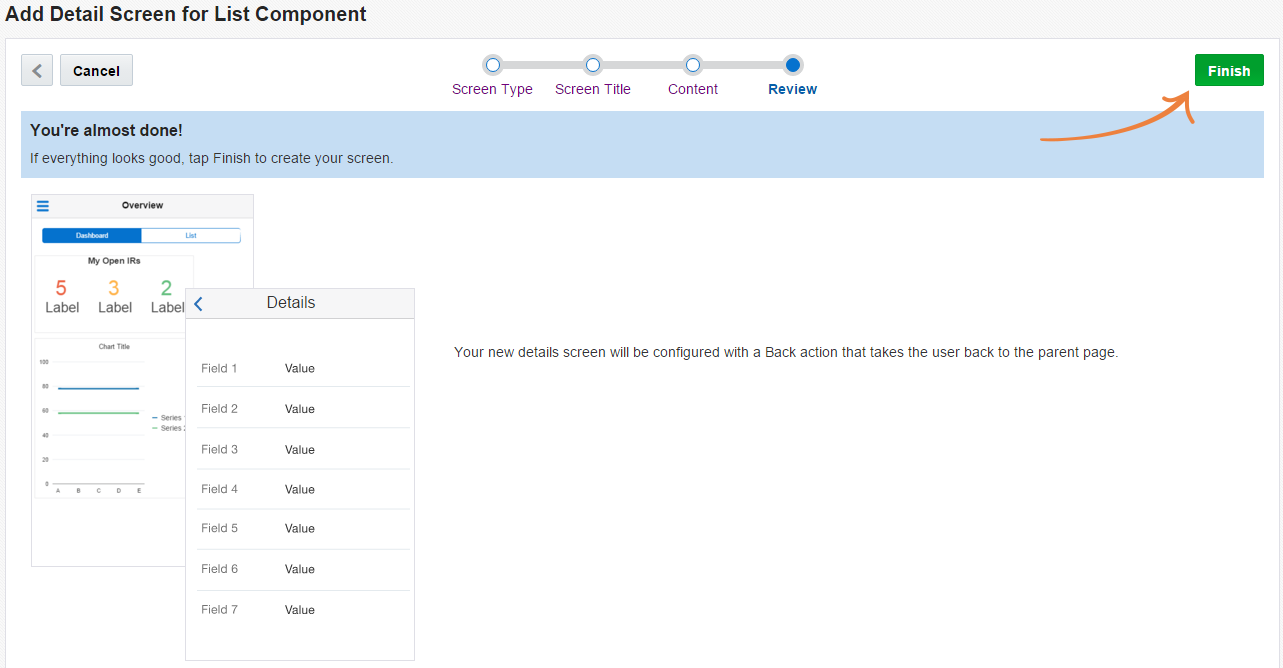
The QuickStart for a detail screen is a four-step wizard, similar to the one that you used to create the first screen of your app. This wizard steps you through creating the basic structure of the detail page by adding a name, setting the basic layout, and choosing how your content displays. You can choose from among a simple screen, a list, a dashboard, or a form. Because this detail page not only displays the full record of the item selected in the list (which wouldn’t work well in a list layout), but also serves as the source for the child create and edit pages, choose the Form layout. Click Finish.
-
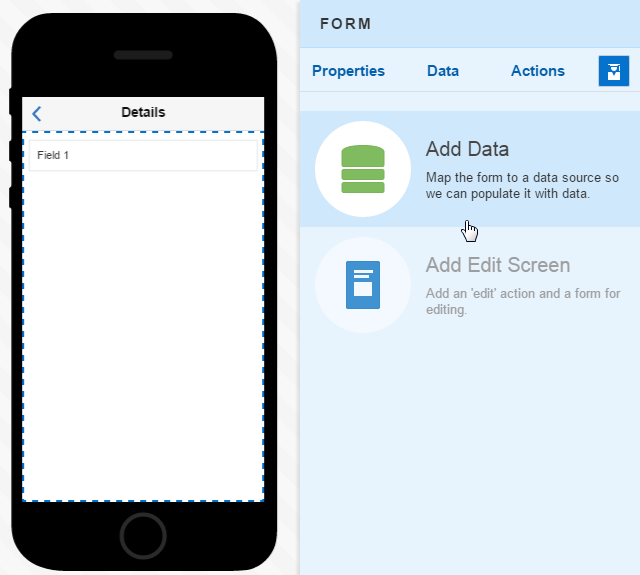
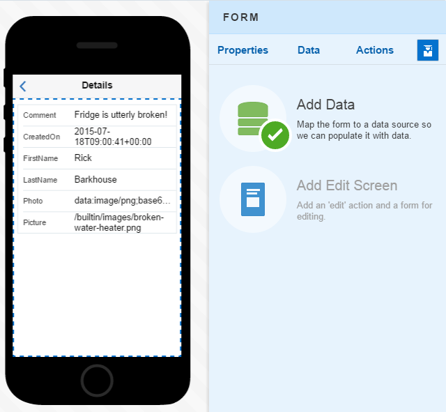
With the skeleton of the form completed, click Go to Detail Screen.
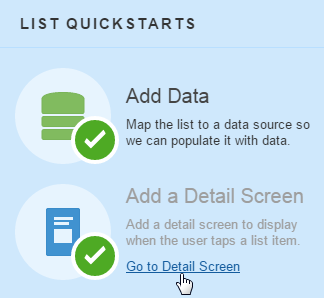
Description of the illustration click_go_to_detail.png -
Because you need to add the fields to your form that app users will view and update, click the Add Data QuickStart to add these fields using the Add Data wizard.
-
Since you already chose the FixitFast service when you created the list in the previous step, you can go straight to choosing a business object for the form. In this case, you’re going to choose additional fields from the Incident business object. While some of these fields will be read-only, others can be updated.
-
Map the Incident field values to the Form component fields. You can re-order these fields here or later on in the Properties Inspector. Keep in mind that you enable the fields to display properly by choosing the field type. When you're done with the field mapping, click Next to complete the Add Data wizard by selecting a filter.
Tip:
You can drag the properties individually to add as many fields to a Form component as you need, or click Add All Fields ( ). You can click Delete (
 ) to remove the fields that you don’t need. For more information on form fields, see Forms.
-
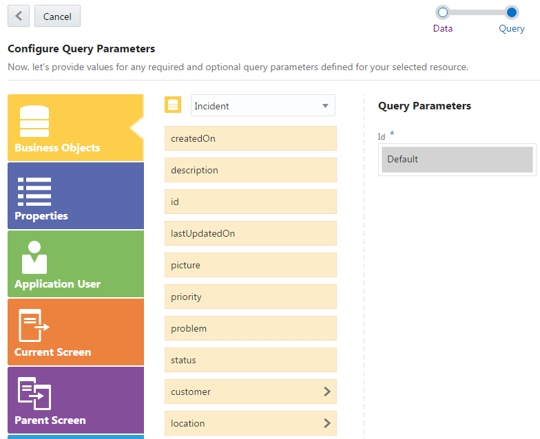
MAX volunteers the ID as the filter. In this case, the ID query parameter is provided by the service, so MAX notes it as Default. You could replace this value, but since the ID ties the incident fields that display in this screen to the row that users click in the list screen, you can accept this value by clicking Finish.The details screen, complete with a Back action (
 ), has been created. With the Add Data QuickStart checked off, you’re ready to create an edit page.
Step 3: Adding a Create Screen
-
Click Application Screens (
 ) in the left navbar.
-
From the Go to Screen menu, pick the list page. In the following illustration, the list page is called Incident Reports.
-
Now that you’re back to the list page, click the Add a Create Screen QuickStart.The list page now has a create action (
 ).
).
-
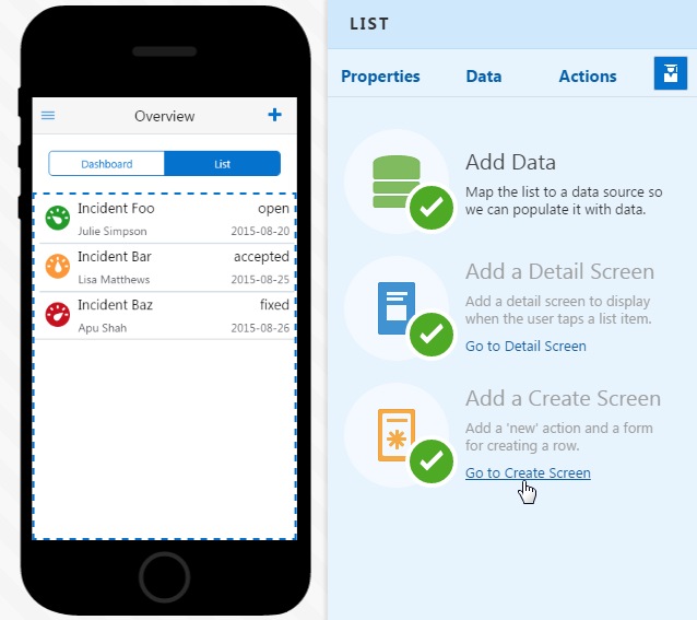
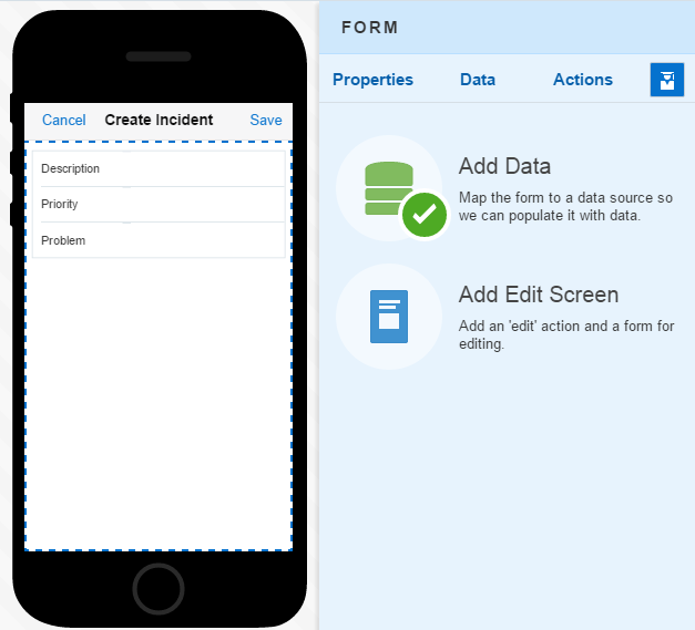
To open the create page, click Go to Create Screen.The create screen appears in the Preview, complete with Cancel and Save actions. The create screen is a Form component because it allows user input. You don’t have to add map data for this screen, because MAX populates it with the fields from the Incident Activities business object that accept user input, like Description, Priority, and Problem.
Note:
Because this screen is used for inputting data, there’s no need to wire it up to any data.
Step 4: Create the Edit Screen
With the create page added to the application flow, you can now add a corresponding edit page, a form that allows user input.
-
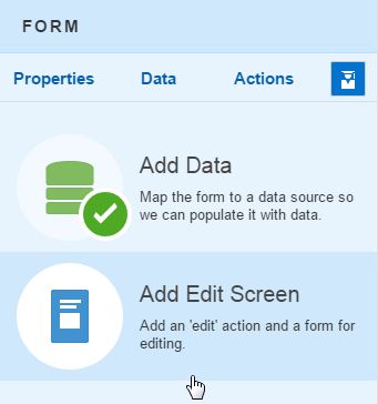
Add the page by clicking Add Edit Screen.
-
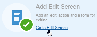
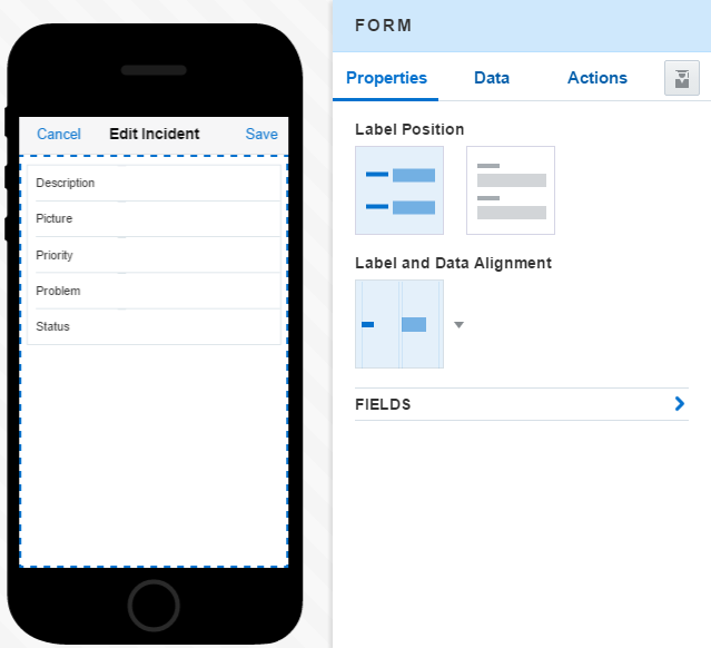
Open the edit screen by clicking Go to Edit Screen.MAX creates your edit page, which has Cancel and Save actions at the top. The edit page includes the fields selected for the details page, but only the ones that accept user input.
-
Take a look at the page flow you’ve just created by clicking Screen Flow (
 ) in the left nav bar.
Tip:
You can open a page in the Preview and Properties Inspector by double-clicking it. -
Click Test (
 ) to test your your app with live data and see how the Back, Edit, and Create actions work. To find out more, including logging in as a test user, see Previewing Your App
How Do I Add Another Create or Edit Screen?
Using the Image Gallery
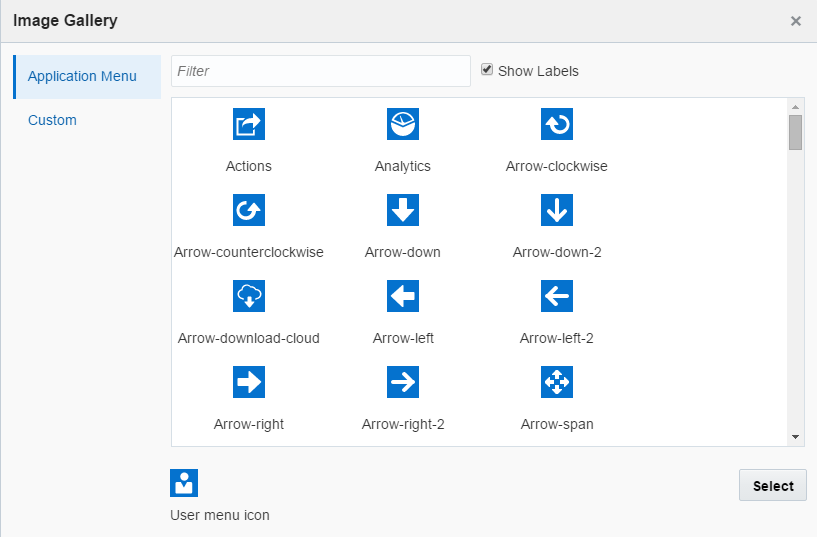
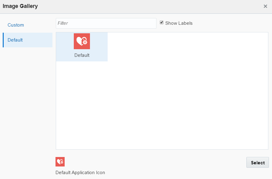
The Image Gallery is your repository for custom and default images.
-
The application launch icon
-
The application menu icon
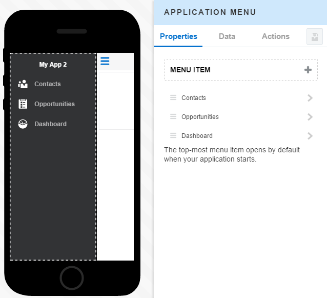
-
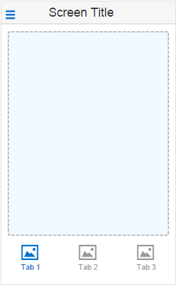
The tab icons
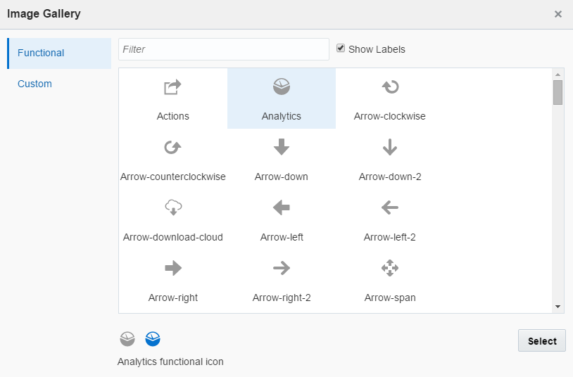
 ). You can also see the Custom tab, which opens the Custom page. You can use this page to add an image to replace the default launch icon image. When you open the Image Gallery from the Properties Inspector, you see only the Custom tab.
| Image Gallery Tab | Images | Where Can I Access These Images? |
|---|---|---|
|
These are images that you can add. |
You can access the Custom tab by:
|
|
|
Application Menu
|
Images used for the application menu.
|
You can replace the application menu with an image that you’ve added to the Custom page. |
|
Images used for the tabs lining the bottom of the Screen with Bottom Tabs template.
|
You can replace the application menu with an image that you’ve added from the Custom page. |
|
|
Shows the image for the launch icon that’s added when you created the first page of your app. For more information, see Creating the First Screen of Your App |
From the Application Settings page.
You can replace the default icon image with an image that you’ve added from the Custom page |
|
|
Business Object-Specific Images
|
The images returned by a business object. | From the Data Mapper. To find out more, see Use Case: Creating a List Using QuickStarts. |
Managing Your Screens
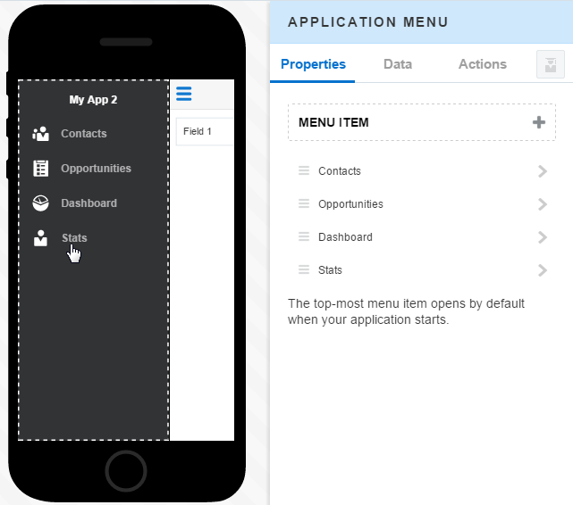
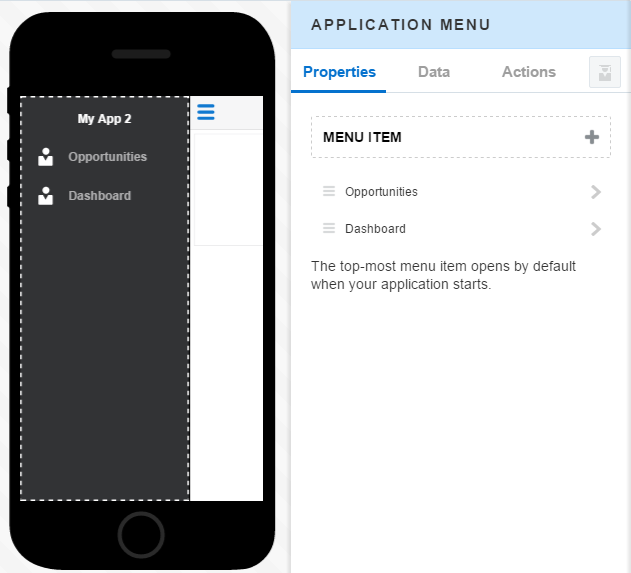
Use the Properties Inspector for the Application Menu component to add screens to your app and reorder them.
 ) in the Preview.
Adding Landing Screens to Your App
-
Click the menu (
 ) in the Preview to open the Application Menu component.
-
Click Add (
 ).
).
-
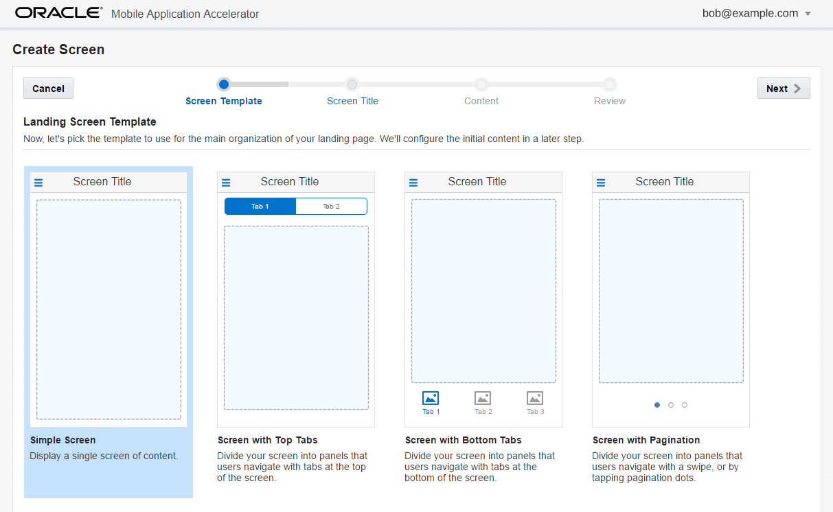
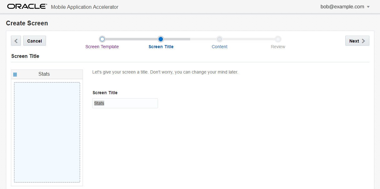
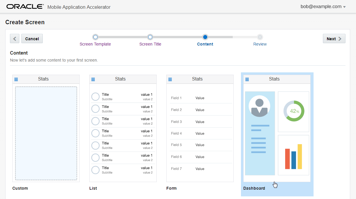
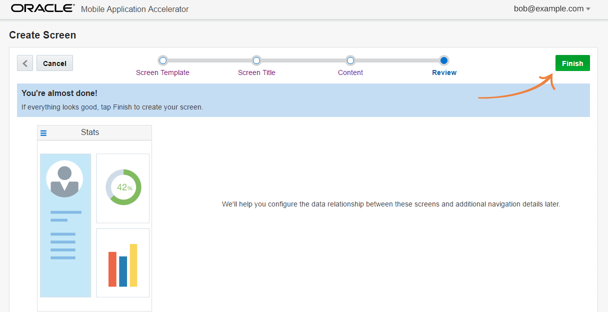
Complete the screen creation wizard:
-
Pick the basic format for the screen and then click Next.
-
Next, enter a title and then click Next.
Tip:
If your landing screen includes tabs, you can create them by replacing the Tab 1 , Tab 2, and Tab Title text in the Tabs fields with your own names. You can add up to five bottom tabs or four top tabs. -
Select the layout option for your content (that is, for the UI components you want to add and ultimately, for the data that they display). Click Next
-
-
Click Finish to complete the screen.
You can also add new landing screens to the Application Menu component by clicking Application Screens (Tip:
If you want to change something, click Previous ( ) or click one of the stops along the progress trail at the top of the page.
 ) icon in the left navbar to open the Application Screens page. Click New Screen and then complete the screen creation wizard.
-
After you complete the screen and return to the Designer, you can access the display options that let you change the name and icon for your new screen by either:
-
Selecting the screen in the Preview.
-
Selecting the screen in the Properties Inspector. You can also click Next (
 ).
).
-
-
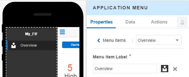
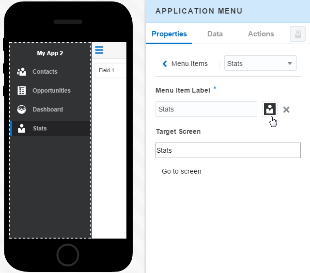
To change the display name of the screen, enter a new name in the Menu Item Label field. This is a required field.
-
To change the icon, click the menu click the menu item label icon (
 ) and then choose a new one from the Image Gallery. To find more, see Using the Image Gallery.
-
If needed, enter a new name in the Menu Item Label field. This is a required field.
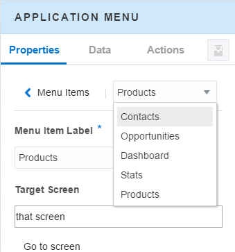
Clicking Go to screen ( ) opens the screen in the Preview and the Properties Inspector. From there, you can develop it further by adding components, data, and actions. You can change the icon and display name for other screens in your app by first selecting them from the Menu Items list and then using the options in this page.




 ) into the Preview.
 ) into the Preview.
 ) into the Preview.
 ) into the Preview.
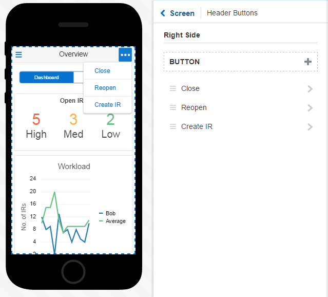
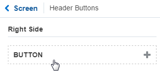
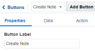
 ) appears in the Properties Inspector after you add your first button. You can add as many buttons as you need. Use
 ) to add the search field.
 ).
).




 ), from the Component Palette into the Preview.