Configure Tables

Use table controls to group multiple controls in a grid pattern into your form. You can use table controls to create dynamic content for your form.

To configure a table control:
  1. From the Advanced Palette, drag and drop a table control onto the canvas.

    By default the table control contains one column.

  2. Select the control and edit its properties on the Properties pane's General tab.
    Field Description

    Name

    An internal identifier that you will use to identify the control.

    Binding

    Defines a link between the control and a data attribute.

    Columns

    In the Columns field, click Add Add icon to add columns. Edit the labels of each column in their respective label fields. To hide a particular column from users, click Hide Hide Column icon beside its label field; you may require to hide a column initially and show it on occurrence of an event. Click the Delete icon to delete a column.

    Users can Add/Remove Rows

    Allows users to add or remove rows to the table.

    Multiple Selection

    Allows users to select multiple rows of the table.

    While using a table with multiple-selection enabled to define dynamic behavior or computed values, the options available (specific to multiple selection) in the Event or Computed Value window under the Which? field are listed here:
    • For Each Selected: Use to retrieve a value from another control to apply to each selected row of a table.

    • All Selected: Use to retrieve values from all selected rows of a table to apply to another control.

    Similarly, in a table with two columns, you can use these options to apply values from one column to another on occurrence of an event. In this case, when you chose to apply an action to each selected row (by selecting the For Each Selected option), an additional option is available to chose the value source:
    • Current Iteration Row: Use to retrieve the value from one cell of the current selected row and apply to another cell in the same row.

    Use Data from Connector

    Allows you to populate the table from a REST connector defined for the application.

    Specify the connector settings in the Connector, Resource and Operation fields and map response settings. See Work with Connectors.

    Events

    Specifies events that trigger actions and conditions. You can customize the control’s behavior by configuring events. See Add Dynamic Behavior to Forms.

    Note:

    While configuring events for a table, you can now add a condition based on number of rows present within the table using the Row Count property.
  3. On the Styling tab, edit the control's styling properties. You can specify column width in several ways:
    • Leave the Automatic column size checkbox selected so the table’s columns automatically resize to fit the device on which the form is viewed.
    • Deselect the Automatic column size checkbox and specify column sizes for different device sizes by entering a number from 1 to 12 in the column size fields that display for different devices.
    • In the Table Columns Width fields, specify an absolute width for each column such as 2in (inches), 5cm (centimeters), 100px (pixels), or 25% (percent). If the column widths together exceed the table width, a scroll bar displays, unless columns are defined with percentages. If percentages are specified but exceed 100%, column widths are displayed proportionally across the table.
  4. Drag and drop individual controls from the Basic or Advanced Palette into the columns.

    Each column can have one control.

  5. Configure general and styling properties for the controls inside your table control.

    See Configure Basic Controls and Configure Advanced Controls.

    Note:

    If you delete the table control, all the controls grouped under it get deleted.
  6. Click Preview to try out using the control.

Some Useful Event Actions for Tables

This section lists a few useful actions that you can apply to a table through the event window. To create an event action, see Specify Actions.

  • To retrieve a value from another control and apply it to each row of the table, use the For Each option under the Which? field.

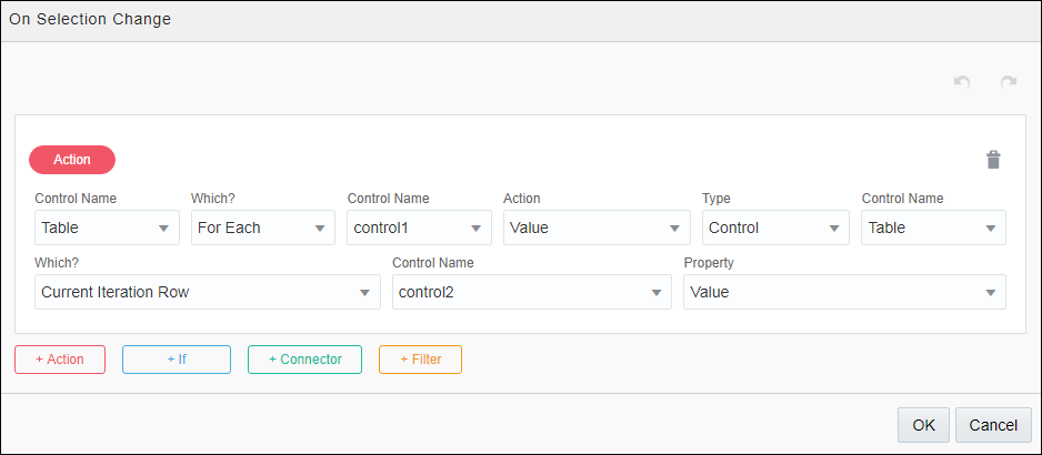
  • In a table with two columns, to copy values from one column to another (for each row) on occurrence of an event, use the For Each option along with an additional option called Current Iteration Row that is available to choose the value source. The Current Iteration Row option allows you to retrieve the value from one cell of a row and apply to another cell in the same row. The following figure shows an event action configuration for a table with two columns. The value of control2 (the control in table column 2) is copied into control1 (the control in table column 1) for each row of the table on occurrence of the specified event:

    Description of foreach-table.png follows
    Description of the illustration foreach-table.png

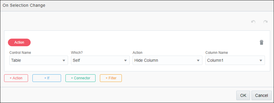
  • To hide a column within a table on occurrence of an event, select Self under the Which? field, choose Hide Column under Action, and specify the column to hide. The following figure shows an event action configuration to hide a table column:

    Description of tablecol-hide.png follows
    Description of the illustration tablecol-hide.png

  • Similarly, to show a previously hidden column—hidden either through Properties pane’s General tab or through an event action, select Self under the Which? field, choose Show Column under Action, and specify the column to show.