Control How a Field is Rendered with Templates

You can customize how fields in dynamic forms and tables are rendered on a page using field templates. You can use a field template to apply simple styling details to a field, but a template can also contain UI components, for example, text fields or images, and define their properties. Components in a template can access the variables and constants, even action chains and event listeners, defined in the Layout.

The Layout you're configuring might already define default templates for some fields, which are applied in every rule set layout, but you can override them if you want to apply your own templates. Suppose the Layout defines a field template called BoldType that is applied to the Update field. If you do nothing, the Update field will have the BoldType template applied in every rule set layout where it appears. However, you can create a field template called Italics and override the BoldType template, either in specific layouts or across all the layouts that you create. You can apply your Italics template to multiple fields, as long as they are part of the same Layout.

Create a Field Template

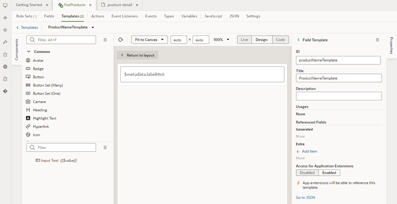
The template editor for creating a field template is similar to the Page Designer, with a Components palette, Structure view, canvas and Properties pane. You can add components to a template by dragging them onto the template editor canvas, and then configuring the component's properties. The components you add to your template can access the variables, constants, action chains and event listeners defined in the same Layout.

When you create a field template, you can also let other extensions use it when they are extending the same Layout. After they add your extension as a dependency, they can apply your template to fields in the Layout.

To create a field template for a form field:

  1. Open the Layout's Templates tab.

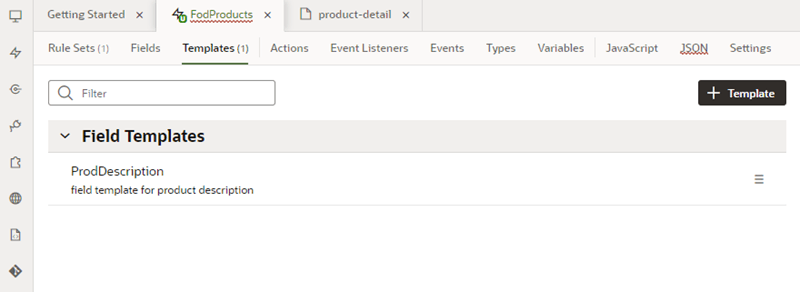
    The Templates tab displays a list of field and form templates that are already defined in the Layout. Templates defined in a dependency are labeled with the dependency's name.


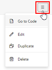
    If you want to duplicate a template that you've created, open the template's menu and select Duplicate. You can also use the menu to edit, delete, and view the code of templates you've created.


    You can also duplicate templates defined in dependencies, but only if the template only contains a fragment (or fragments).

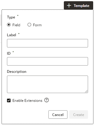
  2. Click Add Template and select Field in the dialog.


    Select Enable Extensions if you want to allow other extensions extending the Layout to use this field template in their rule set layouts, though they won't be able to edit the template. Selecting this will automatically make your extension extendable, which means other extensions can add it as a dependency.

  3. Specify the Label and ID. Click Create.

    Your new field template has an Input Text component that is generated automatically. This is used to display the data and display name when you apply the template to a field in a layout.


  4. In the template editor, add any other UI components you want to display in the template by dragging them from the Components palette onto the canvas or the Structure view.

    You can add more UI components above or below the Input Text component, or replace the Input Text component with a different one, for example, to render a field using a Rating Gauge component instead of an Input Text component.

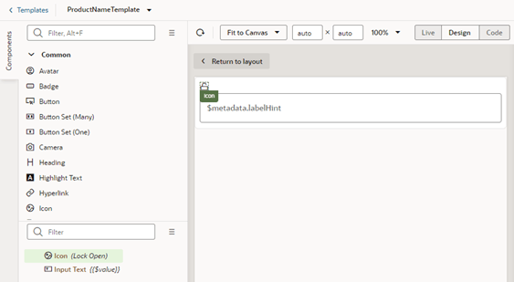
    In this image, you can see in the Structure view that the template contains an Icon component and an Input Text component:


  5. Select a component on the canvas or in the Structure view, then edit its properties in the Properties pane.

    Just like when you are working in the Page Designer, the Properties pane might contain several tabs for editing the component's properties. For example, if you add an Icon component to your template, you might decide to also create an event in the Events tab. If you did this, an event listener and action chain would be created for you, and you'd then need to edit the action chain in the Layout's Actions tab to define the behavior.


    Alternatively, you can edit a field template's code directly in the Code editor, and use the editor's code completion to help you.

    <template id="altNameTemplate">
      <span class="vb-icon vb-icon-image"></span>
      <oj-input-text value="{{ $value }}" label-hint="[[ $metadata.labelHint ]]"></oj-input-text>
    </template>

After creating the template, it's added to the list of field templates in the Templates tab. In the Templates tab, you can open and duplicate templates you've created.

Apply a Template to a Field

To apply a template to a field in a layout:

  1. In the Rule Sets editor, open the layout you want to work on and select the field in the center pane.

    The center pane of the layout editor lists the fields that will be displayed in the layout and the templates that are applied to them. If you duplicated an existing layout, your new layout might already list some fields, or have templates already applied to fields.

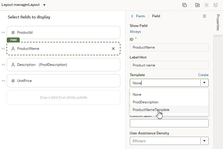
  2. Select a template from the Template dropdown list in the Properties pane.

    If no template has been applied to the field (as in this image), you can select a template in the list.


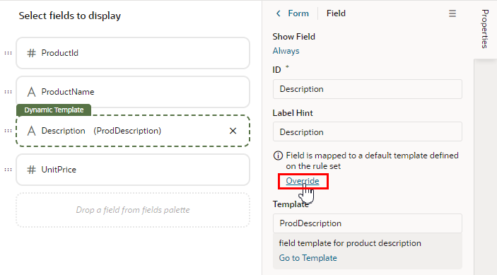
    If the field already has a field template applied to it (you'll see the template name next to the field name), you can still select a template in the list unless a default template has been defined for the field. You'll see a notification in the Properties pane and an Override button if a default field template has been defined.


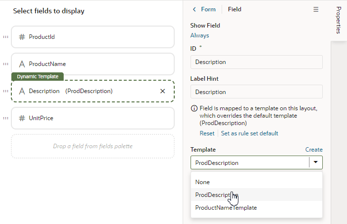
    If a default template has been defined for the field, click Override in the Properties pane, and then select the template from the dropdown list.


    At any time you can click Reset in the Properties pane if you want to re-apply the default template.

When you apply a template to a field, it's only applied to the field in the current layout. If you want the template applied to the field in every layout in the rule set, click Set as rule set default in the Properties pane, or open the template in the Templates tab and set it in the template's Properties pane.

Set the Default Template for a Field in a Layout

In addition to applying templates to fields in individual layouts, you can set the default field template that will apply to the rule set. The default field template will be applied to the field in every layout in the rule set. After setting a default field template for a field, you'll need to override it if you want to change the field's template in an individual layout.

To define a default field template for a field in a rule set:

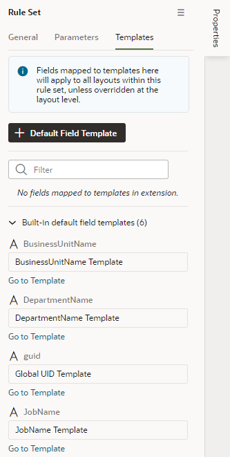
  1. Open a rule set in the editor, then open the Templates tab in its Properties pane.

    The Templates tab lists all the fields in the layout that have a default template applied to them. A field's default template might be defined in the Layout in the Unified Application (Built-in default field templates) or in the extension.


  2. Click + Default Field Template.
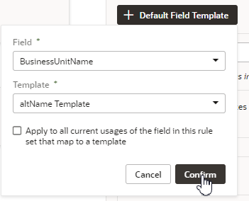
  3. Select the field that you want to apply the template to.

    You can select a field that already has a default field template applied to it if you want to override it.

  4. Select the template that you want to apply to the field. Click Confirm.

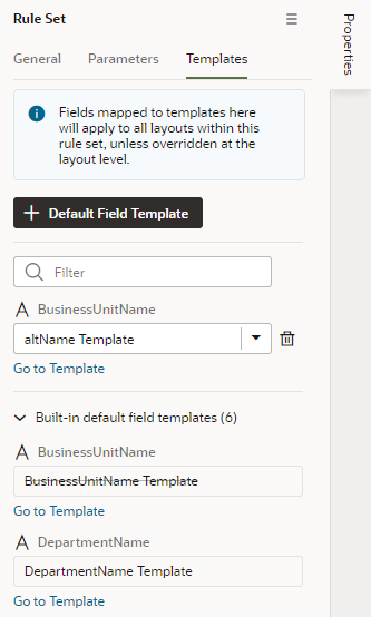
In the Templates tab, the new default field template mapped to the field is added to the list of default field templates defined in the extension. In this image, in the list of Built-in default field templates, the BusinessUnitName template is crossed out to show it's been overridden by a template defined in the extension. You can remove any default field template mappings that you create by clicking Delete icon next to the mapping in the list.


Add and Group Fields in Dynamic Form Layouts

When creating a layout for a dynamic form in the Rule Sets editor, you can group fields so that they are displayed together in a layout, so you can treat them as a single entity. For example, you might create an address group that contains the fields (for example, name, address, city, state, country and post code) that you want to be displayed as a group in your layout. You can then apply conditions to the group that control when the group is displayed. A group also makes it easy to add several fields to a different layout in one step, rather than adding them individually.

You can define properties for a group (for example, a group label) and for individual fields in a group (for example, to specify column spans for fields to create complex dynamic form layouts.)

To group fields in a dynamic form layout:

  1. In the Rule Sets editor, select the rule set of the dynamic form you want to work with, and then open the layout you want to edit.
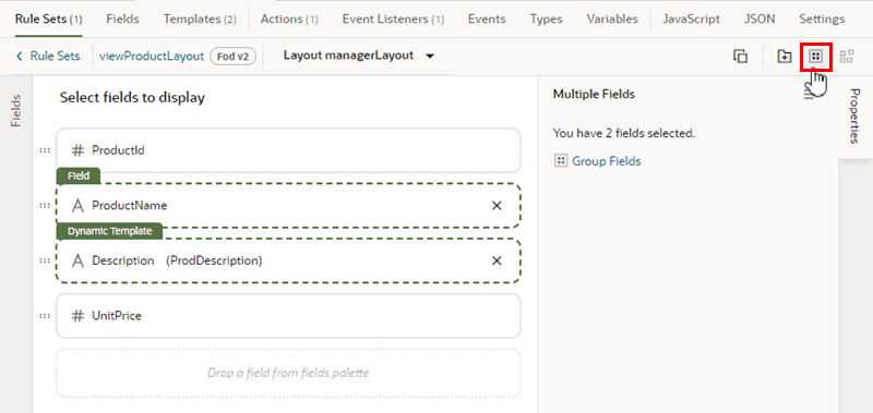
  2. Select the fields that you want to group together, either by holding down the CMD key (on macOS) or the Ctrl key (on Windows), and then click Group Fields in the Properties pane, or Group Fields in the toolbar.


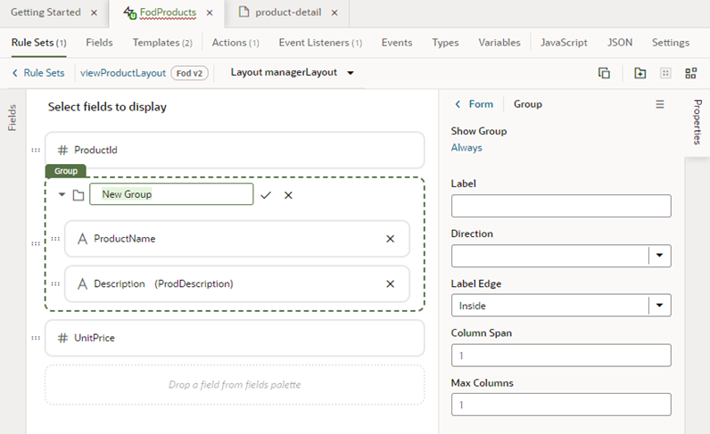
    The selected fields are grouped under a new folder in the layout diagram.

  3. Type a name for the new group by naming the folder in the layout editor. Click Save to save the group name.


    Optionally, use the Properties pane to set properties for the group. You might even click the Always link to set conditions that determine when the group is displayed in a layout. The default setting is to always display the group.

After a group is created, you can still use the handles for fields to drag them into and out of a group.

Add a Link to a Page in an App UI

When extending a dynamic component such as a dynamic form, you use field templates when you want to add links to pages in your extension or in other App UIs.

For example, let's say a page in one of your extension's dependencies contains a dynamic form, and you want to add a link in the form that navigates to an App UI page in your extension. To do this, you could create a field template that contains the link, and then create an action chain that navigates to your extension's page when that link is clicked.
  1. Create the field template where you want to add the link.
  2. In the template editor, drag an icon component from the Components palette onto the canvas. This icon will be the link.
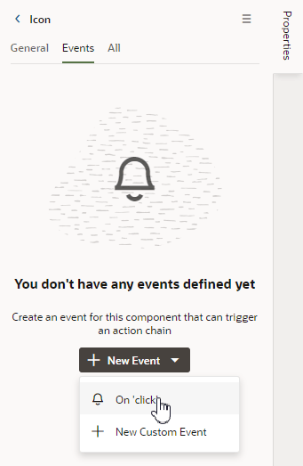
  3. In the component's Properties pane, open the Events tab, and then click + Event Listener. Click On 'click' in the dropdown list.

    Selecting On 'click' will add a component event to the component, and will create a new action chain that will be triggered by the event.

    The new action chain opens in the editor in the Layout's Actions tab.

  4. In the action chain editor, drag the Navigate action from the palette onto the action chain.
  5. Select the Navigate action in the action chain.
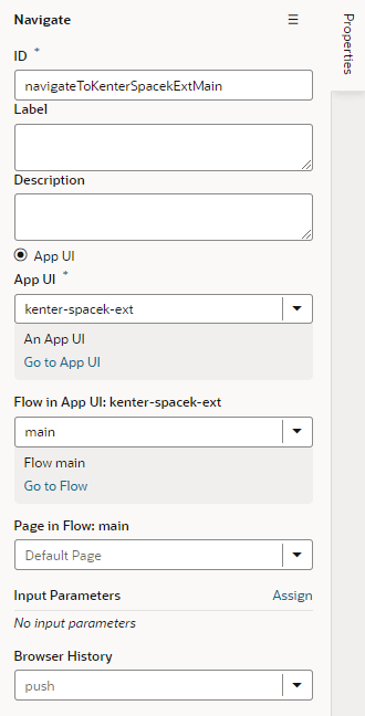
  6. In the action's Properties pane, select the page you want to link to:
    1. Select App UI (if not selected).
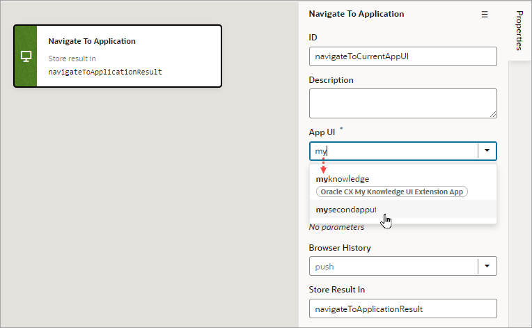
    2. In the App UI dropdown list, select the App UI containing the page you want to link to.

      The App UI can be an App UI in your extension, or in one of your extension's dependencies.


      In the dropdown list, the label next to the App UI name displays the name of the extension where the App UI is defined. In the image above, the kenter3_ext App UI has no label because it's defined in your extension, not in one added as a dependency.

      Note:

      In addition to App UIs in your extension, the dropdown list will contain the App UIs in your dependencies that are navigable by other App UIs, if any. This property is set by the App UI developers in the page- and flow-level Settings editors, so you can't change this setting in your dependencies. For more, see Navigate From Fragments and Layouts to Other App UIs.

    3. Select the flow and page in the App UI you want to navigate to, if available.

      If the App UI's developer has set any pages and flows as navigable, you'll be able to select them in the dropdown lists. If you can't or don't select a flow and page, navigation will be to the default page in the App UI's default flow.


  7. Apply the template to the field in your dynamic form.