Establish App UI Settings
Because an App UI can include multiple pages and flows, settings at the App UI level apply to all the pages and flows within it.
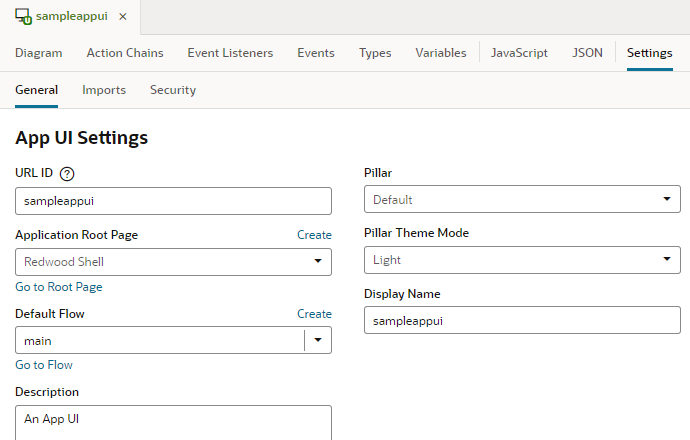
To configure an App UI's settings, open the App UI, then click Settings to open the Settings editor: 
Description of the illustration app-ui-settings.png
| Tab/Setting | Description |
|---|---|
| General tab | Contains general App UI settings: |
| URL ID | ID to use in the App UI's URL, as entered when the App UI was created. Most often, the App UI's ID and name are the same. The App UI's name is by default added to your Unified App's base URL to form its runtime URL, something like https://UnifiedAppName/redwood/AppUIName. If you don't want to use the App UI's name in the URL, enter an ID that will override the App UI name in the URL, as in https://UnifiedAppName/redwood/YourAppUiId. Make sure you retain the x- prefix, which is used to distinguish customer App UIs from those created by Oracle in case they have the same name.
|
| Application Root Page | Root page for the App UI. A root page is a special type of page which provides the entry point for an App UI. It typically contains a shell with common elements like headers, footers, and backgrounds, besides other navigation elements that appear on every page in your App UI.
The default root page for an App UI is the Unified App's If you want to use a different shell for your App UI, say to provide your own global header that will appear on all App UI pages, you need to define an alternate root page and make it available to your extension. See Brand Your App UI with a Custom Root Page. |
| Default Flow | Default flow used by the App UI. Every App UI has a default flow, and every flow has a default page. When you first create an App UI, the main flow is automatically created for you and set as the App UI's default flow. The main-start page, also created automatically in the main flow, is set as the flow's default page.
When you run the App UI, the default page in the default flow is rendered. If you create other flows and want the App UI to open to a page in a different flow, select that flow as the default. You can also click Create to create a flow directly from here, then select it as the default. To change the default page in the default flow, go to Flow Settings. Note: The default flow is always added to the Oracle Cloud Application or Ask Oracle Navigator menu (depending on the application you're extending), allowing users to directly access the default page in the default flow under the App UI when they open the menu. In addition, navigation from other App UIs is always enabled to the default page in the default flow. Make sure then that Default Flow reflects the flow (and the page) you want displayed in the Navigator menu. Changing the default flow automatically updates your entry in the Navigator menu. You can also add other flows alongside the default flow in the Navigator menu by selecting Add to Oracle Cloud Applications menu in that flow's settings. |
| Description | Description of the App UI. |
| Pillar | The App UI's product family or pillar (for example, HCM or CX in the Oracle Cloud Applications ecosystem), inherited from the Pillar setting at the extension level. |
| Pillar Theme Mode | Mode used by the selected pillar. Each pillar has a corresponding mode which changes the Redwood texture stripe. Select a mode, either Light or Mixed, to go with your pillar theme. |
| Display Name | Name displayed for the App UI in the Ask Oracle Navigator menu, if you mark a flow/page to show in the Ask Oracle menu. See Manage Flow Settings and Manage Page Settings. |
| Imports tab | Contains settings to manage resources such as custom CSS files, modules, and components imported at the App UI level, allowing you to create declarative references that can be shared between flows and pages in the App UI. See Create Declarative References to Imported Resources. |
| Security tab | Allows you to add permissions that control user access to the App UI (as well as individual flows and pages in the App UI). Only users granted one of the assigned permissions can navigate to the App UI, flow, or page. See Control Access to Your App UI. |