What Is the Designer?
Much of what you do in VB Studio is within the context of an extension, and almost everything you do within an extension takes place within the Designer. The Designer is divided into five main areas:
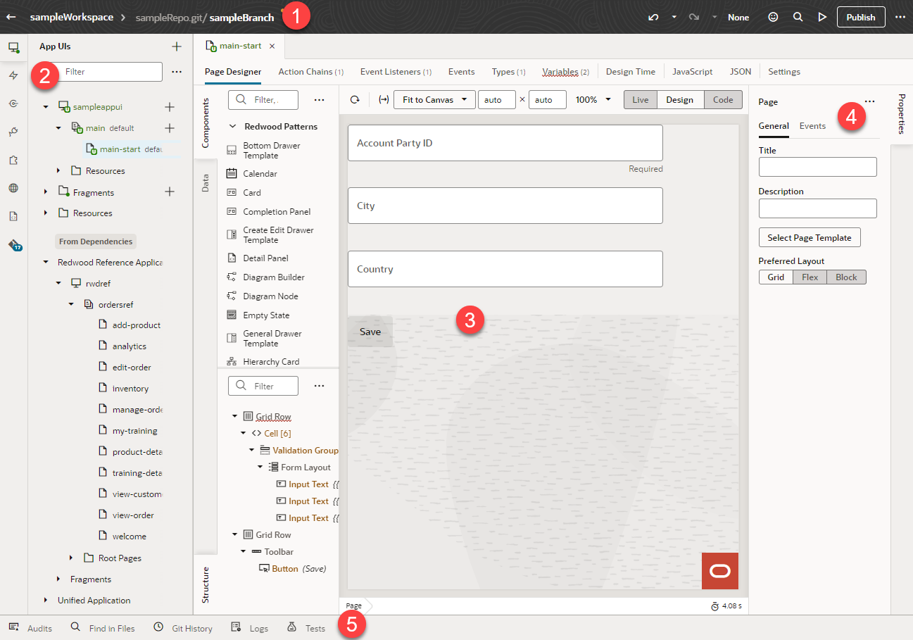
Description of the illustration designer2.png
- Header
- Navigator
- Canvas/Editors
- Properties pane
- Footer
Let’s take a look at each of these areas to learn more about what each one does. If you've used the Designer to create visual applications, you will notice slight but important differences between that version of the Designer and the one you use to work with App UIs.
The Header
The header contains information about your current VB Studio session, as well as access to the tools you need to move your extension through the development process.

Description of the illustration designerheader1.png
Here's what each element does:
| Label | Element | Description |
|---|---|---|
| A | Workspace | The name of your current workspace, which defines all the resources you need to create an extension.
You may have several active workspaces at any one time, one for each discrete body of work you’re responsible for. To switch to a new workspace, just click the workspace name and pick a new one. |
| B | Git repository/branch | VB Studio stores all the files for your extension in a Git repository. If you’re working with multiple people on the same extension, you’ll all work within the same repository, possibly—but not necessarily—in separate branches. If you see a yellow dot in the header next to the repository name, that means there are uncommitted changes in your workspace.
Click the repo name to see a list of commands you can use while working with your repository. If you don’t know much about Git repositories, this video can help you learn the basics, or read through Manage Your Extension with Git. |
| C | Undo | Undo one or more of your changes. To undo your most recent change, click the Undo icon (hover your cursor over the icon to view the action that will be undone). To undo multiple changes, click the Undo drop-down list and select the actions you want to undo. For example, selecting the Insert Heading action in this image will remove the heading and undo other changes you made after adding the heading: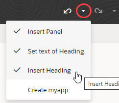 Tip: You can undo up to 10 of your changes at a time (your last 500 actions are stored in the browser and will be lost if you clear the browsing cache). To undo more than 10 actions, simply undo a few items, then open the drop-down list again. |
| D | Redo | Redo one or more changes after undoing them. To redo your most recent change, click the Redo icon (hover your cursor over the icon to view the action that will redone). To redo multiple changes, click the Redo drop-down list and select the actions you want to redo. For example, selecting the Set text of Heading action in this image will revert two of the previously undone actions: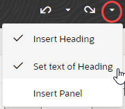 |
| E | Sandbox | If you require any underlying data model changes, you should use Application Composer to make them first in a sandbox, then use the Edit Page in Visual Builder Studio option to expose those changes in the UI with VB Studio.
Click the sandbox name to associate a new sandbox with your workspace. You might want to do this if another sandbox contains the data you need for the extension you’re working on. See Switch a Sandbox. |
| F | Feedback | Submit your feedback about VB Studio to Oracle. |
| G | Go to File | Search your project's sources by file name. When you first click Go to File, your most recently used files show. If the file you're looking for isn't listed, start typing the name of the name in the search box, then select the file you want in the suggestions. |
| H | Notifications | View notifications received over the past two days. To get your attention, notifications pop up instantly in the bottom right corner of your window, where info, confirmation, and warning messages clear automatically after five seconds but error messages stay until they are manually cleared. If you've missed a notification or want to review one again, click Notifications in the header to view all notifications from the last two days. Notifications older than two days are automatically cleared, or you can click Clear all to clear them yourself.
When you've got unread notifications, the Notifications icon is badged according to the type of notification received. Missed info, confirmation, and warning messages are badged with a blue dot |
| I | Preview | Before committing your changes to the branch, you can use the Preview action to see how your pages look and behave in a browser. |
| J | Publish | Commit changes in the current branch to your local repo, push them to the project's Git repo, and kick off package and deploy jobs to publish your branch to your development environment. (If you want to publish the entire extension, make sure you commit and push changes in all other branches before clicking Publish.) |
| K | Menu | Open a menu containing the Share, Import, and Export actions, as well as commands for opening the Settings editor and navigating to the Visual Builder Studio Help Center. |
Note:
At times, the header may also contain a toggle switch with the user modes "Express|Advanced". Express mode is a slimmed-down VB Studio experience, targeted to business users whose needs are well-defined, whereas Advanced mode provides access to the full Designer. This toggle appears only when the page you are working with comes from certain Oracle Cloud Applications, most notably those that use business rules to determine the logic governing runtime behavior. When working with such pages, one automatically lands in Express mode after clicking Edit Page in Visual Builder Studio, but Advanced mode is always available for more complex use cases. This book (the one you're reading) covers Advanced mode, while What Can You Do with Oracle Visual Builder Studio? explains how to use Express mode.The Navigator
The Navigator helps you move between the artifacts in your extension, and provides access to the VB Studio editors:
| Icon | Element | Description |
|---|---|---|
| App UIs | There's a lot going on in this section of the Navigator. You can:
|
|
| Layouts | A Layout represents a set of data fields that can appear in one or more related dynamic components, like a table or form. Create a new Layout here by choosing a data source, then defining the rule set that governs how that data looks and behaves. You can also view the Layouts provided by any App UI you may have as a dependency. | |
| Services | To access external REST APIs in your extension, you can create connections to the services that provide access to these API endpoints.
VB Studio also includes a catalog of predefined services in the form of an Oracle Cloud Applications backend. This backend exposes REST APIs—from Human Capital Management, Sales, and more—that your App UIs can consume right out of the box. You can also create custom service connections to access services that aren't listed in this catalog. See Add Service Connections to Your Extension for details. |
|
| Dependencies | When you add an extension as a dependency, you gain access to the resources that comes with the extension, like its service connections, Layouts, and more. Add a dependency when you want to configure one of the App UIs contained within the extension, or when you want to use the extension’s resources to build your own App UI.
The Dependencies panel shows you all the extensions containing an App UI that has at least one artifact flagged as extendable—a dynamic component, a variable, and so on. If an extension doesn’t have an extendable App UI, it won’t appear in this list. |
|
| Components | The Components tab helps you to install and manage the components that you download from the Component Exchange, a repository of components that can be installed in your VB Studio instance. | |
| Translations | To ease with translation, all text strings in an App UI—such as headings, labels, and messages—can be stored in a separate external file, rather than hard-coded in the App UI. This means that you can translate the App UI by simply downloading this file, translating it, and uploading a newly translated file. | |
| Source | Although the Designer is primarily a visual editor, you can always work in source code if you prefer. | |
| Git | Shows you the list of files you've changed, but haven't yet committed to your branch. If you have merge conflicts in your branch, you'll see them listed here. Click a conflicted file to open it in the conflict resolver tool so you can resolve any issues. |
By default, the App UI section displays only artifacts that you can extend, but you can use the options menu next to the Filter field to select items that have already been extended, or items available for extension: 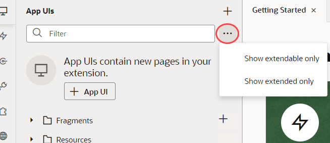
Description of the illustration filter-extend1.png
Tip:
If you need more real estate in the Designer, just click any of these icons to temporarily hide the Navigator entirely.The Canvas/Editors
The canvas, which appears to the right of the Navigator when you open a page, is where you do the bulk of your work in VB Studio. When you open a page, you'll see different editors along the top to help you modify and create artifacts used in the page, like Page Designer, Actions, Event Listeners, and so on: 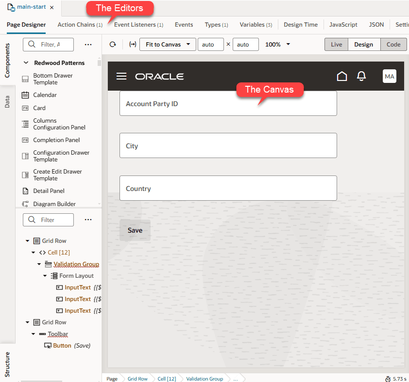
Description of the illustration designercanvasandeditors2.png
Depending on which aspect of the page you're customizing or building, VB Studio invokes the proper editor to provide the experience you need, and displays that editor in the canvas. Perhaps the most important editor is the Page Designer, described in detail in Use the Page Designer.
Note:
The JSON and JavaScript panes represent what will ultimately be checked into Git when you publish your extension. Therefore, if you look at these panes for an App UI you have added as a dependency, you won't see anything there—unless you have customized that App UI in some way.Tip:
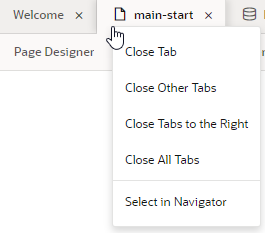
When working with multiple artifacts (pages, flows, layouts, and so on), each artifact opens as a separate tab on the tab bar. Here's how you can better manage these in your work area:- Right-click a tab to see options to close the particular tab, close other tabs, close tabs to the right, or close all tabs. You can also use this menu to select a particular tab in the Navigator:
If the tabs overflow available space on the tab bar, click
 at the edge of the tab bar and select the tab you want to open. Note that the active tab always stays in focus.
- Right-click the empty space on the tab bar and select the option to reopen closed tabs. Recently closed tabs are saved in session history, so you can keep reopening tabs until you get to the one you want.
The Properties Pane
As the name suggests, the Properties pane lets you specify the properties that control the appearance and behavior of whatever is currently selected in the canvas. While you're in the Variables editor, for example, you use the Properties pane to set the variable's default value, type, and other attributes. When you click a component on a page in the Page Designer, the Properties pane is immediately updated to reflect the component's properties. Depending on the component, the Properties pane might display additional tabs for modifying the component’s attributes or its behavior.
When you add a collection component to the canvas, like a table or list, you'll see a Quick Start tab added to the Properties pane: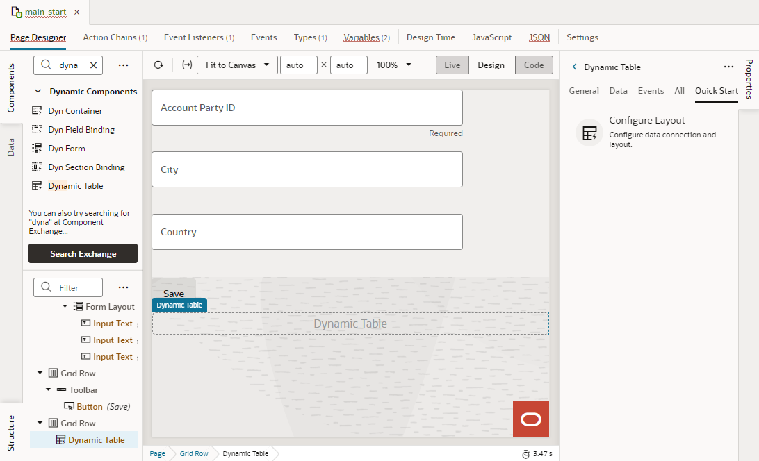
Description of the illustration propertiespanequickstart.png
Quick Start wizards help you add some actions and components that are typically associated with the component, such as mapping the collection to data and adding Create and Detail pages.
To hide or show the Properties pane, just click the tab itself.
The Footer
At the bottom of the Designer, you have several tools that can help you debug and streamline your extension:
| Element | Description |
|---|---|
| Audits | Scan the code in your extension for places containing errors, warnings, info and to-dos. Your code is scanned when you open the Audits pane. |
| Find in Files | Search your extension for a text string. |
| Git History | View a list of Git actions you have performed in your workspace. The window displays details about each action, including the type, date and files involved. |
| Logs | View build logs when your extension is shared or deployed. |
| Tests | View a list of all action chain tests. |
Color Theme
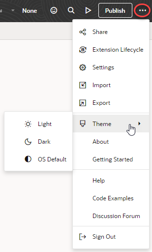
- Click Menu in the upper right corner.
- Select Theme, then choose an option:
- Select Dark to use a dark color display, more suited for low-light conditions. This option switches the background and text used in all the editors, except the Page Designer canvas, where application pages continue to display against a lighter background with dark text.
- Select OS Default to inherit the theme used in your operating system's settings. If your system settings are configured to use dark mode, the Designer will also use those settings.
- If you changed the default, select Light to switch back to a lighter background with dark text display.
Tip:
You can also control this setting from your preferences. Click Go to project page, click your avatar, select Preferences and General, then look for the Preferred color theme setting. See Set Your Preferred Color Theme.
No matter where you configure this setting, your preferred color theme takes effect for all pages in the user interface, including the Designer.
