Design Audience Insight charts
This topic explores the different types of charts you can design using Audience Insight. For basic information about creating projects and charts, see Get started with Audience Insight.
About Projects and charts
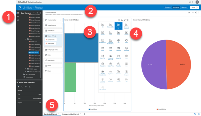
Projects are where you create charts (that is, visualizations), using the Audience Reporting data set. Project components are shown and described below.
 - Use these buttons to toggle between the Data Elements panel (for selecting measures and dimensions) the Visualization panel (for selecting chart types), and the Analytics panel.
 - The Filters section of the Project page is where you indicate which Audiences you want to analyze. For best results, limit the number of filters to five, and always specify an event date filter.
 - The Visualization tools enable you to select the chart type, select the Values and Categories, and to set other properties of the chart.
 - A variety of chart types help you choose a meaningful way to visualize your data.
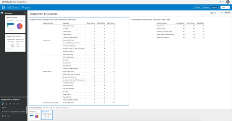
 - The page on which you design your visualizations is called a canvas. You can create multiple visualizations on a canvas. At the bottom of the Project page are the tabs for each canvas you have created in the project, and there is an Add button for adding additional canvases. Select a canvas name to view the page. Click Narrate in the Project header to view several canvases at a time.
reporting, Audience Insights, Audience Insight, audience insight, audience insights, insights, Insight, analysis, analytics, Insights, insight, charts, filters, Visualization, Data Elements, visualization, data elements, canvas, narrate, Narrate, filters, Filters, filter, Filter
Get started with Audience Insight
Learn about Audience Reporting attributes
Visualize Data from the Oracle Analytics Cloud Help Center
