Retail dashboards
When you enable the retail schema, you can access dashboards that visualize retail data.
Using the Retail dashboards
To access the Retail dashboards:
- From the navigation menu, select Audience Insight, and then select Retail Dashboards.
The Retail Dashboard opens in a new web browser window.
You can then analyze the different sections of the dashboard.
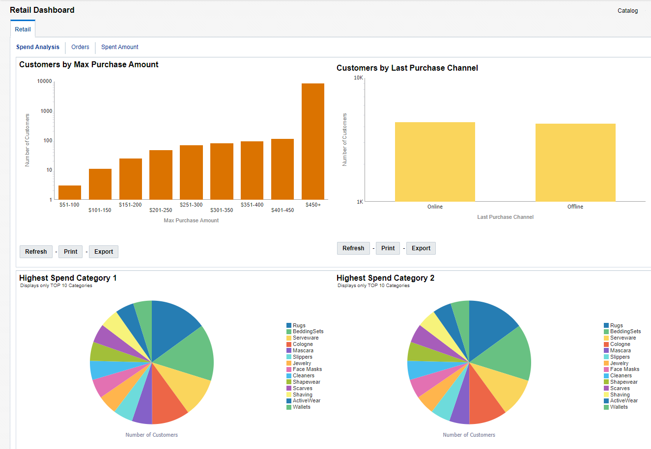
Analyzing spending data
The dashboard opens by default on the Spend Analysis tab, which displays data on spending behavior of your customers.
To analyze spending data:
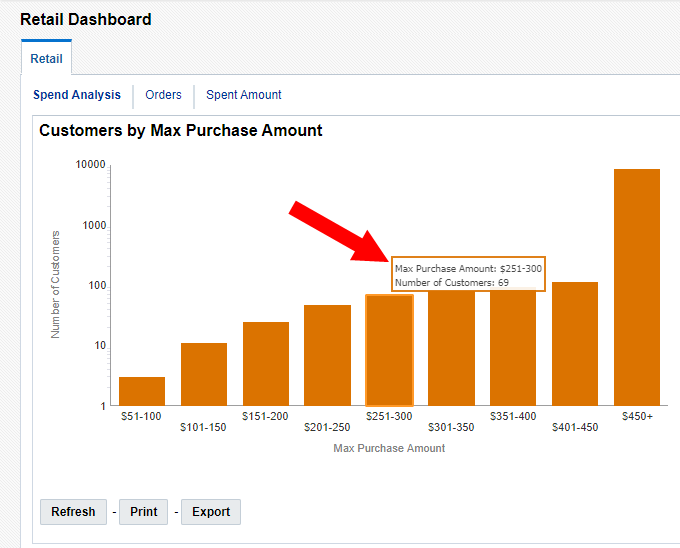
- Review the following spending data. Hover your mouse over data points to view specific values.
- Customers by Max Purchase Amount: Categorizes customers by their highest purchase amount.
- Customers by Last Purchase Channel: Categorizes the channel of the most recent purchases.
- Highest Spend Category 1: Displays order items that had the highest amount spent in product category 1.
- Highest Spend Category 2: Displays order items that had the highest amount spent in product category 2.
- Frequent Shopper: Displays the percentage of customers that are considered a frequent shopper. A frequent shopper is considered someone who has been a customer for at least three months and also averages one purchase or more a month.
- Highly Frequent Shopper: Displays the percentage of customers that are considered a highly frequent shopper. A highly frequent shopper is considered someone who has been a customer for at least three months and also averages two purchases or more a month.
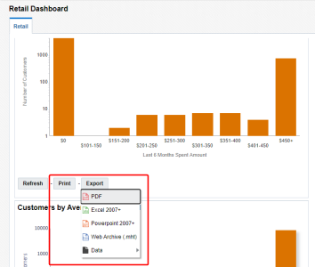
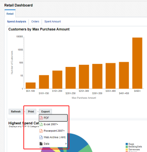
- Optionally, you can click Print to print the data. You can also click Export to export the data. For best results, we recommend exporting in Excel 2007+ or Data > CSV Format.

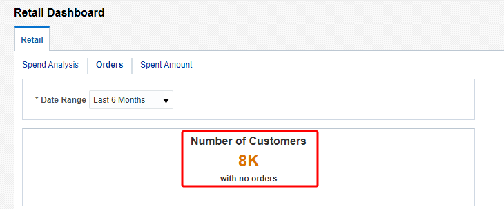
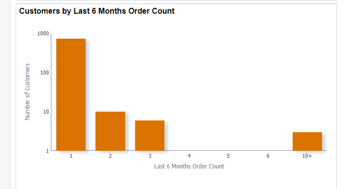
Analyzing order data
The dashboard displays data on customer orders based on the time period you select.
To analyze order data:
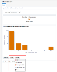
- Click the Orders tab.
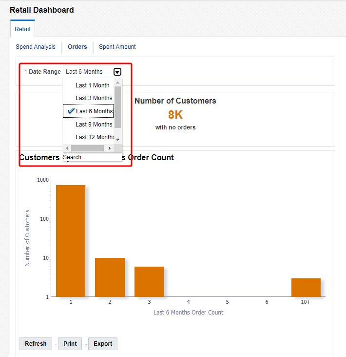
- Use the drop-down list for Date Range to select a time period:
- Last 1 Month
- Last 3 Months
- Last 6 Months
- Last 9 Months
- Last 12 Months
- Lifetime
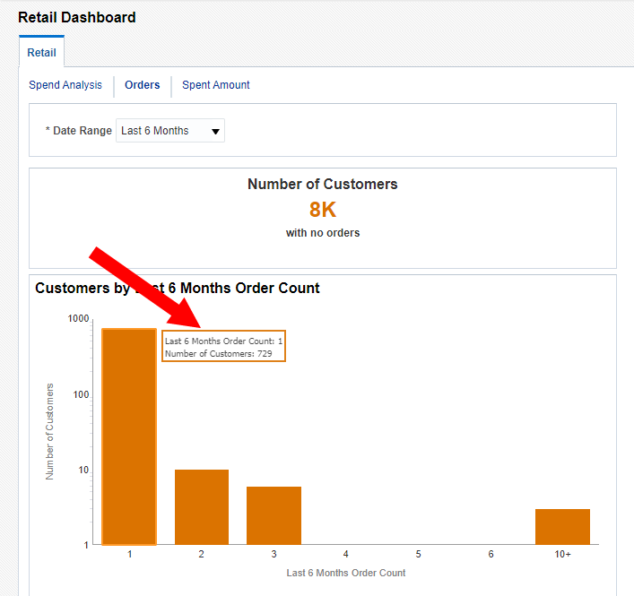
- Review the order data for the time period selected. Hover your mouse over data points to view specific values.
- Number of customers: Review the number of customers that have no orders within the time period selected.
- Customers order count: Categorizes customers by the number of orders within the time period selected.
- Optionally, you can click Print to print the data. You can also click Export to export the data. For best results, we recommend exporting in Excel 2007+ or Data > CSV Format.

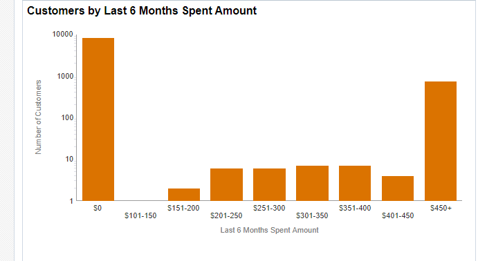
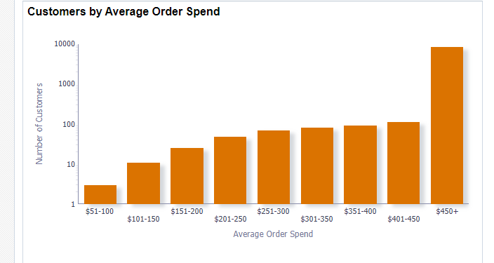
Analyzing amount spent data
The dashboard displays data on how much your customers are spending on orders.
To analyze amount spent data:
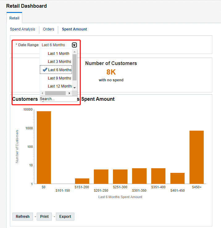
- Click the Spent Amount tab.
- Use the drop-down list for Date Range to select a time period:
- Last 1 Month
- Last 3 Months
- Last 6 Months
- Last 9 Months
- Last 12 Months
- Lifetime
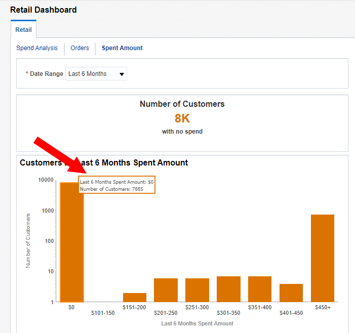
- Review the order data for the time period selected. Hover your mouse over data points to view specific values.
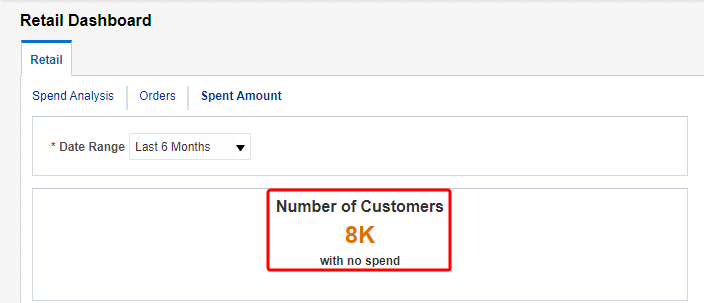
- Number of Customers: Review the number of customers that haven't spent on an order within the time period selected.
- Customers spent amount: Categorizes customers by the amount spent within the time period selected.
- Customers average order spend: Categorizes customers by the amount spent within the time period selected.
- Optionally, you can click Print to print the data. You can also click Export to export the data. For best results, we recommend exporting in Excel 2007+ or Data > CSV Format.