Configuring form fields in the Classic Design Editor
Important: You can no longer create new assets using the Classic Form Design editor or copy assets created in the Classic Form Design editor. All legacy form assets continue to be editable using the same Classic Form Design Editor. Additionally, classic forms will still function in their landing pages and capture form submission data. Customers can leverage the Save As and Save As Template features for their classic forms to save them as responsive forms in our new Design Editor. Learn more in our product notice.
After you add a field or field group, you can click it and configure it using the configuration menu.
See the following settings tab descriptions:
- Configuring the Field Settings tab
- Configuring the Validation tab
- Configuring the Pre-Population tab
- Configuring the Field Group Settings tab
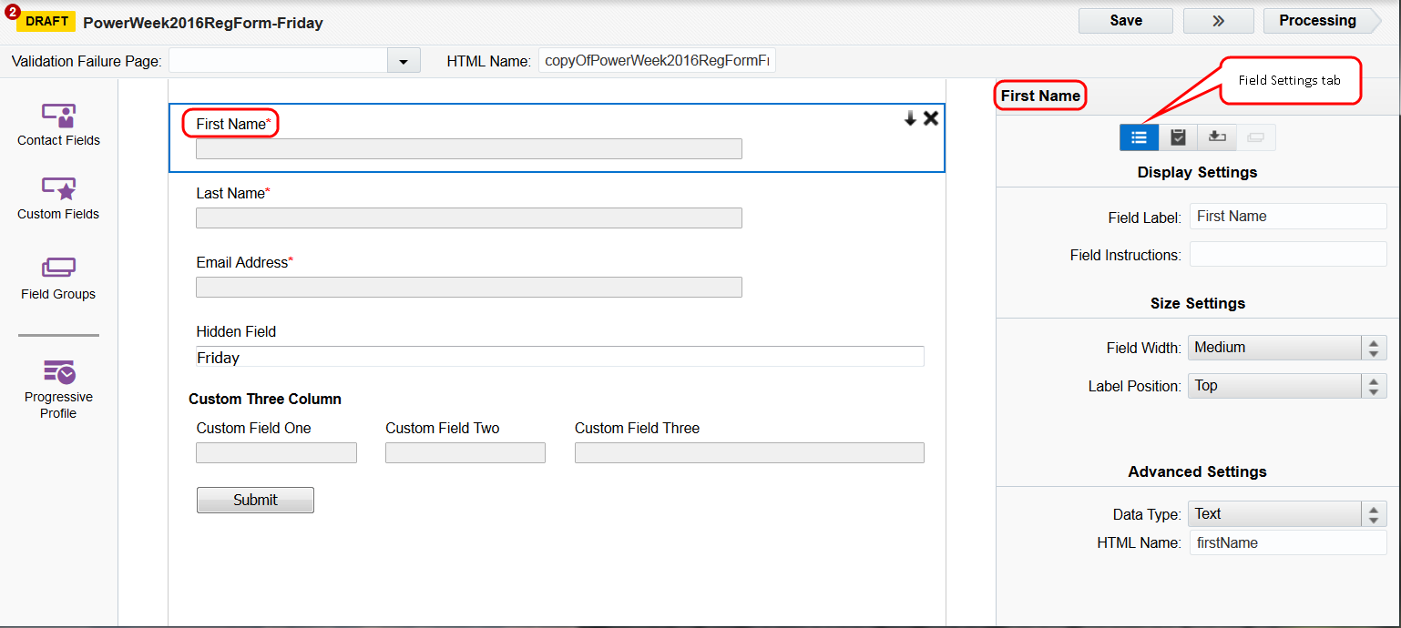
Configuring the Field Settings tab
Click a field in your form, then click  to open the Field Settings tab.
The following options vary depending on the selected field type (text field, check box, picklist):
-
Display Settings
- Field Label: The name that is shown next to or above the field.
- Field Instructions: Optional instructions that help the user fill in the field. This is shown as small text below the field.
-
Size & Position
- Field Width: The width of the field on the page.
- Label Position: The position of the text label relative to the form field it is labeling. You can position the label to the left of the field, or above the field.
-
Advanced Settings
- Data Type: Determines what can be entered in the field, and how it is formatted. You can choose from Text, Large Text, Date, or Numeric. A Text field can contain up to 100 characters, whereas a Large Text field can contain up to 1000.
- HTML Name: The name by which the application recognizes the form elements. The HTML name field can contain up to 50 characters.
-
Field Choices: This option is available only when the field selected presents the user with multiple choices. Click Select a List to open the Picklist window. You can create a new picklist, or select from a number of pre-configured picklists. In this window, you can:
- Add a list: Click
 below the left pane. Click the new item on the list and enter a name for it.
 - Add an item: Click below the right pane. Select the new item then enter a name for it.
- Rename a list or a list value: Double-click on the item you wish to change and type over what is currently shown, then click out of the editable area.
When you have selected a list, click Select and change the Field Label to accurately reflect the contents of the list. Depending on the list type, you may also have the option to format the list into one, two, or three columns.
- Add a list: Click
The following options appear when the Submit button field is selected:
-
Use a standard submit button: Select to include the default submit button in your form.
- Submit button label: Enter the text that appears on your submit button.
- Dimensions: Enter the size dimensions for your submit button.
- Use a custom image: Select to use a custom image for your submit button.
- Upload New Image: Click to upload a new image to be used as custom image for you submit button.
- Alt text: Enter alt text for your image. Typically, this would describe the function of the button or describe the image itself. This can help make your form more accessible to people with disabilities and help meet web accessibility standards.
- Align: Click the drop-down to set the alignment of the submit button.
Configuring the Validation tab
Click a field in your form, then click  to open the Validation tab.

The availability of the following options depends on Data Type selected in the Field Settings tab:
- This field is required: A red asterisk * appears next to the field label to indicate that it is a required field. You can customize the error message that is shown to users who submit the form without filling in this field. This message can be generic ("Please fill in all required fields") or specific to the field ("Please fill in the Business Phone field"). You can also easily mark progressively profiling fields as required in your forms when you don’t set a validation failure page.
- Must contain a valid email address: Use only if this field is expected to contain an email address value. This validation checks for the conventional email address format @. You can customize the error message that is displayed if the submitted value is not in standard email address format.
- Must contain a valid number of characters: Specify and enforce minimum and maximum character counts for text fields to help ensure consistent data format. This is useful for text fields you use to request data that adheres to a specific length, such as phone or account numbers. If you enable this option, form submitters who enter values outside of the specified character count range receive the message you enter in the Error Message box. The default error message is Invalid length for field value.
Important: Due to the potential for phishing attacks, Oracle Eloqua prompts you to confirm your setting change if you disable this option or set the maximum character count to more than 35. If you receive this warning prompt, click Yes to retain your setting changes, or click No to revert to the default enforcement of a 0 to 35 character count range to reduce the security risk. This applies to any single-line text field, including hidden text fields and hidden campaign ID fields.
- Must have a value within the numeric range: Validate numeric data values to ensure that they are in a particular range of values. Specify the minimum and maximum values after checking. Must have a value within the specified numeric range, then enter an error message to display if the value entered in this field is not within the limits specified. This option only appears if the Data Type is set to Numeric.
- Must contain a valid date format: Customize an error message to display if the value entered in this field is not in valid date format. This option only appears if the Data Type is set to Date.
-
Must not contain any URLs: Prevent data in the form field from being saved to the contact record if a URL is present. Allowing users to submit URLs in a form is a security risk. By default, Oracle Eloqua does not allow URLs to be submitted from text and large text fields, such as Single Line Text, Paragraph Text, Large Text, Hidden Fields, and Contact Fields that are text. However, you can override this security feature to allow URLs from those fields. You can also customize an error message to be displayed if a contact tries to submit the form with a URL in the field.
Important: Oracle Eloqua uses standard URL formatting as the URL-detection criteria. Updates to this criteria issued by Oracle are automatically applied to your existing forms, as well as to new forms you create.
-
Must not contain any HTML: Prevent data in the form field from being saved to the contact record if HTML is present. Allowing users to submit HTML in a form is a security risk. By default, Oracle Eloqua does not allow URLs to be submitted from text and large text fields, such as Single Line Text, Paragraph Text, Large Text, Hidden Fields, and Contact Fields that are text. However, you can override this security feature to allow HTML from those fields. You can also customize an error message to be displayed if a contact tries to submit the form with HTML in the field.
Note: You can also specify a Validation Failure Page. This is a landing page you create and to which the form submitter is re-directed if the form is not completed properly. For more information on specifying a Validation Failure Page, see Creating forms.
Tip: Warnings are displayed for probable errors due to misconfigurations for form processing steps caused by data type mismatch. For example, an error notification will appear if your form processing step relies on an email address, but the email address field is not validated on your form. We recommend you review and resolve the warnings before activating your form.
Configuring the Pre-Population tab
Click a field in the form, then click  to open the Pre-Population tab.
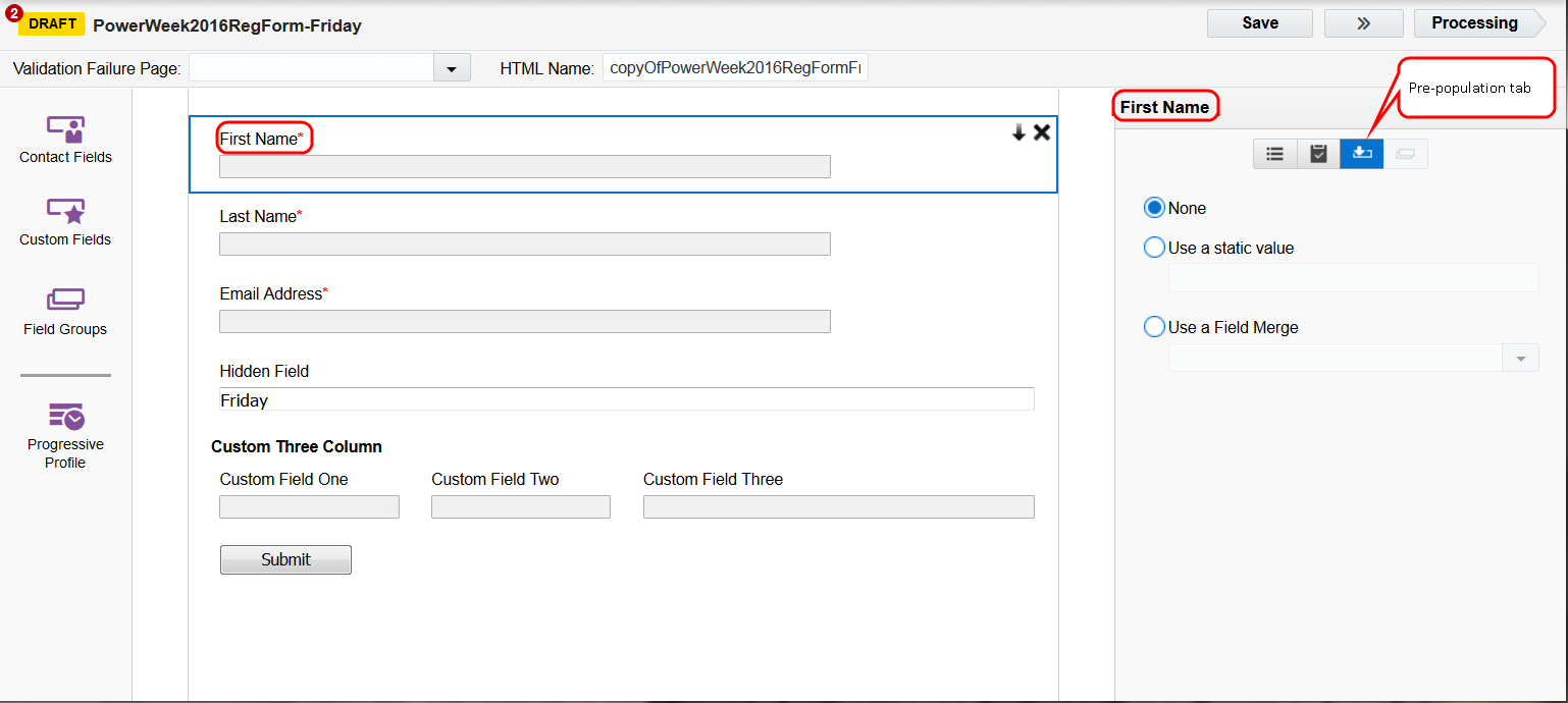
This tab allows you to pre-populate a form field with information that Oracle Eloqua has already collected about a contact.
Example: If a contact provides their regional information on one form, you can autocomplete that same form field on all forms. This is useful in a progressive profiling strategy. Another progressive profiling strategy may hide form fields that a contact previously completed. For more information on the second method, see Progressive profiles.
Choose one of the following options:
- None:The field is not pre-populated.
- Use a static value: Enter the value that is used by default for each submitter. Submitters may change this value.
Important: If you want to use different static values on multiple landing pages, you must create a separate form for each landing page.
- Use a Field Merge: Use an existing field merge to pre-populate the currently selected form field with data that exists in your contact record. You can search for the field merge by name, or with the drop-down list.
- Use Email Group: This setting lets you perform preference center management. Select an email group to populate the field with the submitter's subscription status for the group.
Note: To get the submitter's subscription status for multiple email groups, add a single check box for each group. To update subscription status in your contact record, the Email Group - Subscribe/Unsubscribe processing step is still required for each single check box field. Using multiple check boxes is useful for presenting contacts with many opt-in options for various subscriptions so they don’t opt out globally. This method may also encourage them to opt into other subscriptions (opt down/up). For more information, see Updating subscriptions when a form is submitted.
- Use Global Subscription Status: Pre-populate the field with the submitter's global subscription status.
Note: The Subscribe Contacts Globally and Unsubscribe Contacts Globally processing steps are still required to update global subscription status in the database if the submitter changes their current (pre-populated) status. For more information, see Updating subscriptions when a form is submitted.
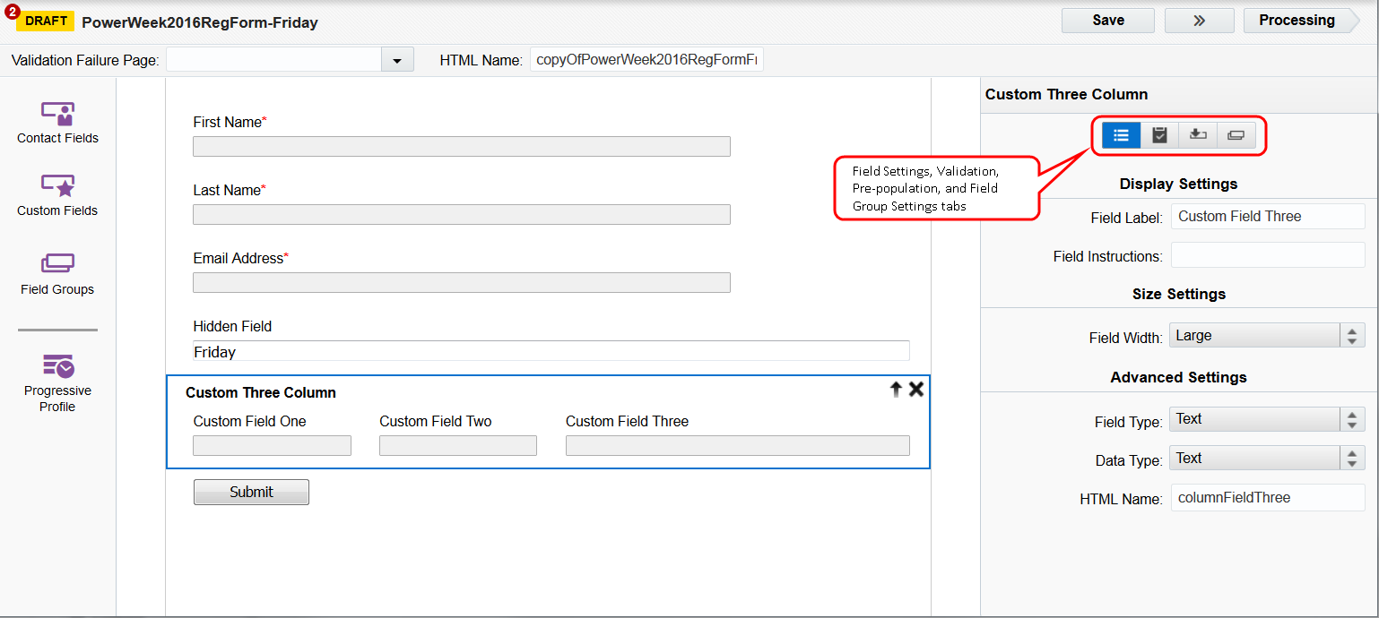
Configuring the Field Group Settings tab
Click a field group or progressive profile field in your form, then click  to open the Field Group Settings tab.
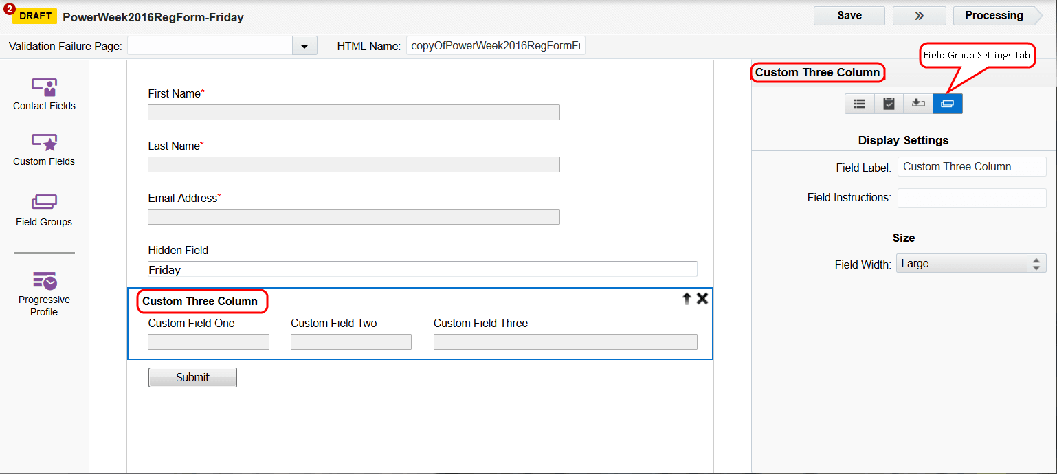
For field groups, you can specify:
- Field Label: The title for the field group.
- Field Instructions: Optional instructions that help the user fill in the fields in the group. This is shown as small text below the group of fields.
- Field Width: The width of the field group on the page.
For progressive profiles, you can configure how your form fields appear. Learn more about progressive profiles.