Classic Design Editor form field types
Important: You can no longer create new assets using the Classic Form Design editor or copy assets created in the Classic Form Design editor. All legacy form assets continue to be editable using the same Classic Form Design Editor. Additionally, classic forms will still function in their landing pages and capture form submission data. Customers can leverage the Save As and Save As Template features for their classic forms to save them as responsive forms in our new Design Editor. Learn more in our product notice.
There are four different types of form fields available in the forms editor, they are:
After these fields are added to a form, they can be configured to suit your needs. Learn more about configuring form fields.
Contact fields
Contact fields are the most commonly used fields in forms. These fields provide information about the contact such as their name and address. Many of these fields are mapped to the fields in contact records so that information can be re-used. Using field merges in contact fields allows Oracle Eloquato pre-populate forms with the information from a contact's record, or to show their current information so that they can update selected fields if needed.

The contact fields from which you can choose are created in the Setup > Fields and Views area. Learn more about creating contact fields.
Custom fields
Custom fields are used when you want to add additional fields for special functions. For example, if you want the form submitter to include a block of text such as a description, you can add a Paragraph Text field; or you can have the form submitter select one of several options using check boxes. You can also use a Hidden Field to add administrative information (such as a form ID number) that is not shown to the submitter.
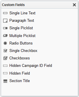
The following is a list of the types of custom fields available:
- Single Line Text: Inserts a field which allows users to enter short text data without being connected to existing contact data.
- Paragraph Text: Inserts a field which allows users to enter longer sections of text data (a paragraph) without being connected to existing contact data.
- Single Picklist: Inserts a drop-down list (picklist) from which the user can select one option.
- Multiple Picklist: Inserts a list of options from which users can choose one or more selections.
- Radio Buttons: Inserts a series of radio buttons from which users can select only one option.
- Single Checkbox: Inserts a single check box that a user can click. You can configure this field to be pre-populated with either the submitter's subscription status for a specific email group or their global subscription status.
- Checkboxes: Inserts a series of check boxes from which users can select more than one choice.
- Hidden Campaign ID Field: Inserts a hidden campaign ID field which will not appear for the user when submitting the form but can provide you with the opportunity to collect additional data that is relevant to your campaigns. The campaign ID can be obtained by viewing the URL for a specific campaign.
Example: The campaign ID in the following URL is 2781. https://qasecure.eloquacorp.com/Main.aspx#campaigns&id=2781
This information could be used to track the path that the contact took to arrive on your landing page. - Hidden Field: Inserts a hidden field which will not appear for the user when submitting the form but can provide you with valuable data. For example, a form number can be placed in the form so that it's submitted along with other form data.
- Section Title: Inserts a title for your field sections.
Field groups
If your form calls for a standard set of fields such as First Name, Last Name, Email Address and Postal/Zip Code, there are several pre-configured groups available that allow you to add the fields at once so you do not have to recreate the groupings each time you create a form.
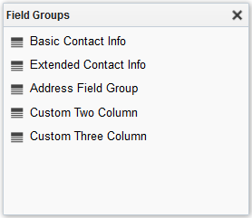
The following is a list of the available field groups:
- Basic Contact Info: First Name, Last Name, and Email Address
- Extended Contact Info: Title, First Name, Last Name, and Email Address
- Address Field Group: Address 1, Address 2, City, State or Province, Zip or Postal Code, and Country
- Custom Two Column: Two blank fields, one in each column
- Custom Three Column: Three blank fields, one in each column
Note: The Custom Two Column and Custom Three Column groups are available to make it easier for you to add a group of two (or three) fields side-by-side. For example, you can use the Custom Two Column group to position the City and County fields in your form side-by-side. Note that the custom Field Groups settings are valid only for that form, the settings are not saved for future use (you would have to recreate them). Individual fields in the group cannot be deleted, however they can be edited to suit your needs without making changes to the default settings.
Progressive Profile
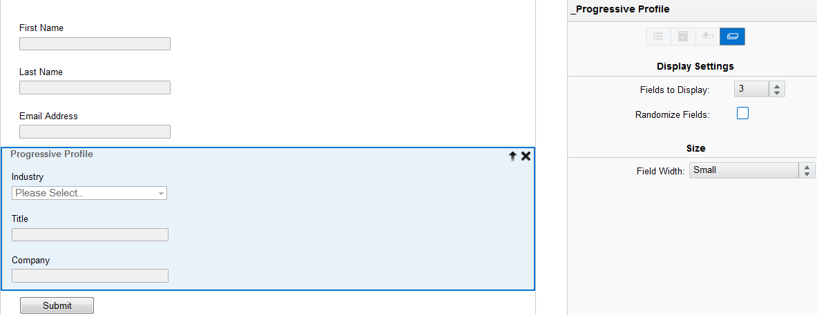
Selecting Progressive Profile creates a field group where you can drag and drop contact fields and custom fields. You can modify several field group settings including the number of fields to be displayed, whether the fields should be randomized, whether you want to display only empty fields, and field width. When viewed on a landing page, the set number of fields is displayed to allow for easier layout design and preview. Randomizing progressive profiling fields allows your contacts to always be presented with new form fields. Fields which are not in the Progressive Profile field group will always be displayed to your contacts. Individual form fields can be configured to suit your needs.
Learn more about configuring form fields.
Moving Classic Forms to the Design Editor