Setting Up Popup Trend Graphs
You set display options for popup trend graphs on the Popup Trend Graphs subtab of the Set Up Key Performance Indicators popup. These options apply to all popup trend graphs for both the Key Performance Indicators portlet and the KPI Scorecard portlet.
You can also reset the time interval for each graph's x-axis right in the trend graph popup.
For more information, see the following topics:
Making Popup Trend Graphs Available
-
To make popup trend graphs available from the Key Performance Indicators portlet, ensure that the portlet displays the KPI for which you want to view a popup trend graph, and that you have set up a date range comparison for the KPI. For information, see Setting Up the Key Performance Indicators Portlet.
-
Popup trend graphs are available for KPIs in a KPI Scorecard portlet that is set to display KPIs on the left. If your KPI Scorecard portlet is set to display date ranges on the left, you need to click Set Up in the portlet's menu and select the Show Trend Graph Icon box. For information, see Adding a KPI Scorecard Portlet to a Dashboard.
Setting Up Popup Trend Graph Display Options
You can define display options for popup trend graphs on the Popup Trend Graphs tab of the Set Up Key Performance Indicators window that is displayed when you click Set Up in the Key Performance Indicators portlet.
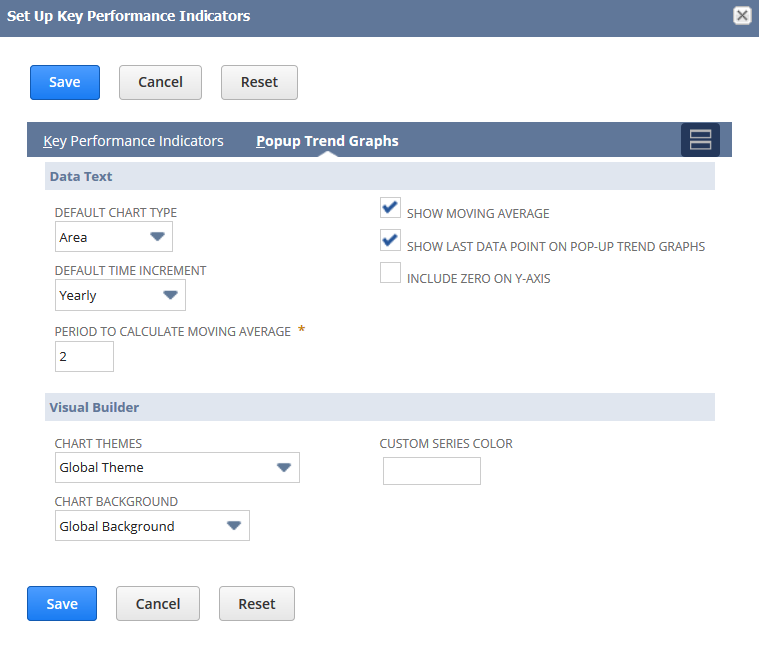
Note that the options you set here apply to ALL popup trend graphs available from both the Key Performance Indicators portlet and the KPI Scorecard portlet.
To set up a popup trend graph:
-
Click Set Up in the Key Performance Indicators portlet to open the Set Up Key Performance Indicators popup.
-
Click the Popup Trend Graphs subtab to set these options.
-
Select from the Default Chart Type list to set the default chart used for all popup trend graphs.
-
Chart type options are Area, Line, Bar, and Column.
-
You can click thumbnails in an individual trend graph to change its chart type from the default set here.
In addition to the set of four chart type thumbnails on the left, each popup trend graph includes two thumbnails that you can click to choose either a continuous or side-by-side comparison of data in the trend graph.
-
-
Select from the Default Time Increment list to set the default time interval used for all popup trend graph comparisons.
-
Choices usually include Daily, Weekly, Monthly, Quarterly, and Yearly.
-
You can change this default in an individual trend graph by selecting from its time interval dropdown list.
-
-
Review the following options, and check or clear boxes as needed.
-
If the Show Moving Average option is enabled, all popup trend graphs display a dotted line representing the rolling average of KPI data values. This option is enabled by default.
Trend graphs work with simple moving average (SMA). You can find more information about how SMA is calculated in the following link.
-
If the Show Last Data Point on Pop-Up Trend Graphs option is enabled, all popup trend graphs display the most recent KPI data point. Because the last point may not provide complete data, you may want to exclude this point from the graph to avoid a misleading display. This option is enabled by default.
-
If the Include Zero on Y-Axis option is enabled, the first y-axis value for all popup trend graphs is set to zero, rather than to the initial KPI data point. This option is disabled by default, to avoid showing misleadingly dramatic increases in initial trend graph data.
-
-
Enter a number in the Period to Calculate Moving Average field.
-
This number indicates the number of data points to use in calculating the slope of the moving average line in popup trend graphs.
-
Note that the lower the number here, the greater the slope of the line.
-
You can enter the number that represents the window of data you want to average based on the time increment selected. For example, if you select Monthly and enter 3 as your window, each data point on your Y-axis represents a 3 month average.
-
-
Select from the Chart Themes list to set a look and feel for popup trend graph data:
-
Global Theme - uses the chart theme selected at Home > Set Preferences.
-
Basic - provides limited color contrast.
-
Colorful - provides more color contrast.
-
Match Color Theme - Bold - harmonizes with your choices in the Colors section of the Set Preferences page using bolder shades.
-
Match Color Theme - Light - harmonizes with your choices in the Colors section of the Set Preferences page using lighter shades.
-
-
Select from the Chart Background list to set the display behind popup trend graph data:
-
Global Background - uses the chart background set at Home > Set Preferences.
-
Lines - provides lines that demarcate different levels along the Y-axis.
-
Bands - provides bands that demarcate different levels along the Y-axis.
-
Grid - provides a grid all throughout the Y-axis.
-
-
You can also specify a custom color for the trend graph line by typing its hexadecimal code in the Custom Series Color field or by clicking the palette button that appears when you hover over this field.
-
-
Click Save.
A custom KPI will not display properly in a popup trend graph if the saved search on which it is based does not meet related requirements. For information, see Displaying Custom KPI Results in Trend Graphs.