Trend Graphs
The dashboard trend graphs can be used to illustrate the differences in data over time for up to three KPIs.
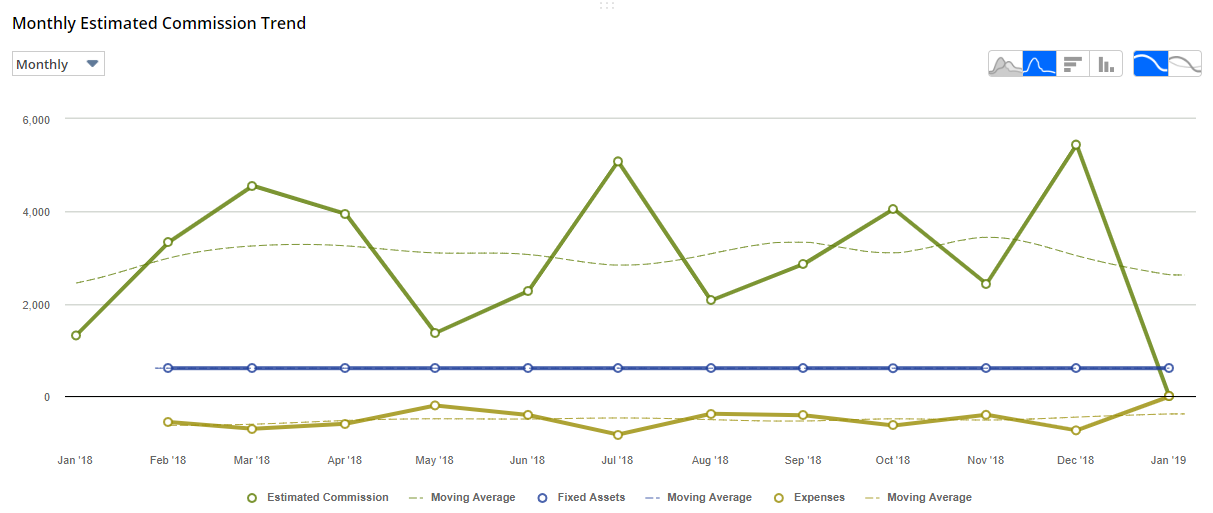
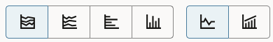
Trend graphs offer choices to display data in Area, Line, Bar, or Column charts, and to use continuous or side-by-side comparisons. You can click thumbnails to shift among these choices.
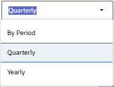
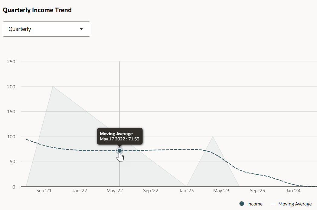
You can also use the dropdown list to set the time period for trend graph data.
When you roll over a point in a trend graph, its value displays:
Trend graphs are available in two display modes: popup trend graphs and trend graph portlets. You can set layout options for both types of trend graphs. Both also offer options to print charts, to download charts to PNG, JPG, PDF, and SVG files, and to export chart data to CSV files.
For more information, see the following topics:
Displaying Popup Trend Graphs
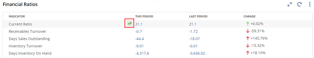
Popup trend graphs are available from clickable Trend Graph icons in the Key Performance Indicators portlet and the KPI Scorecard portlet.
-
To enable this icon for a KPI in the Key Performance Indicators portlet, you need to set up a time-based comparison for it in the Set Up Key Performance Indicators popup. For information, see Setting Up KPI Comparisons.
-
In KPI Scorecard portlets, trend graph icons are usually enabled when the portlet is set to display KPIs on the left. However, when the portlet is set to display date ranges on the left, you may need to click Set Up in the KPI Scorecard portlet to open the KPI Scorecard Setup popup and check the Show Trend Graph Icon box. For information, see Adding a KPI Scorecard Portlet to a Dashboard.
When you click a Trend Graph icon, a popup shows the trend graph data.
-
You can set display options for all popup trend graphs in the Popup Trend Graphs subtab of the Set Up window of the Key Performance Indicators portlet. For more information, see Setting Up Popup Trend Graphs.
-
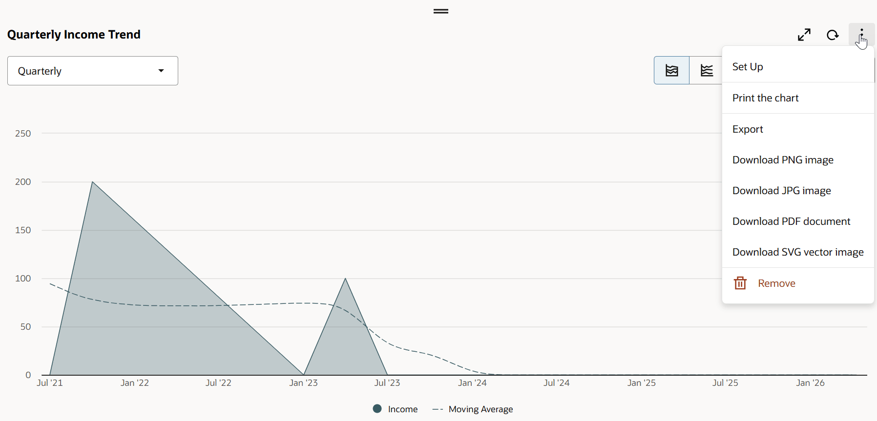
Each popup trend graph includes buttons you can click to print the trend graph chart, or to download it to a PNG, JPG, PDF, or SVG file, and Export you can click to export chart data to a CSV file.
Displaying Trend Graph Portlets
You can add up to five trend graph portlets to any standard or custom dashboard, by clicking Trend Graphs icons in the Personalize Dashboard panel or dragging them onto the dashboard. Each trend graph portlet includes a Set Up link that you can click to set display options for that trend graph only. For more information, see Setting Up Trend Graph Portlets. Additional menu options enable you to print the trend graph chart, to download it to a PNG, JPG, PDF, or SVG file, and to export chart data to a CSV file.
Displaying Custom KPI Results in Trend Graphs
-
A custom KPI can be displayed in a trend graph portlet if the saved search on which this custom KPI is based:
-
Doesn't include any date fields as filters on the Criteria subtab.
-
Has exactly one field with a summary type (such as group, sum, or count) defined on the Results subtab. The rest of the fields on the Results subtab should not use any summary types.
-
Has a date field defined as an available filter on the Available Filters subtab.
-
-
Custom KPIs can only be displayed in trend graph portlets on pages that include a Key Performance Indicators portlet.
-
When a KPI is set to Custom KPI #1-#10, the Default Trend Type dropdown shows saved searches that meet the trend graph criteria.
For more information, see Custom KPIs.