Working with Fields
This topic describes how to modify field attributes and add user-defined fields to your intake forms.
When end users are completing an application for a transaction, such as a permit, they enter the required information in fields. Fields can be added to intake forms by:
Adding user-defined fields to your form. You create user-defined fields manually according to the data you need to collect in your form.
-
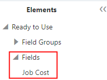
Adding predefined fields to your form. The predefined fields, such as the Job Cost field, are delivered by default in the Elements panel for use in your forms.
-
Adding predefined field groups to your form. Each field group is delivered with a set of fields.
Setting Field Attributes
Select a field to view the Field Attributes panel. Fields in predefined field groups and user-defined fields typically have the same set of attributes. Not all attributes apply to each field type.
The type of field you select determines the attributes appearing in the Field Attributes panel. For example, for a number field, you can set a default value and a placeholder value, but for a single-item check box, neither of these attributes apply and therefore don’t appear.
The following table describes the field attributes.
|
Page Element |
Description |
|---|---|
|
Remove |
Click to remove the selected field from the layout. The Remove button appears only for user-defined fields you added manually. You can’t remove fields from a delivered field group. Note: If your form has been
used in a production environment, rather than removing a field it
is recommended to hide the field. Removing a field that is already
storing production data can lead to unexpected results and data inconsistencies.
|
|
Label |
Add a custom label to the field. Note: In the case of a user-defined
field, the system forces the field ID value to match the Label value,
but removes any spaces. The field ID represents how the field appears
in the underlying data model. For example, a user-defined field with
the label Additional
Requests, will have a field ID value of AdditionalRequests_c.
For more information on working with field labels and field IDs, see the section below named "Working with Field Labels and Field IDs." |
|
Placeholder |
Add descriptive text to provide hints for entering data. For example, the placeholder text could read: Enter date in this format” MM/DD/YY, or simply MM/DD/YY. The placeholder value does not get saved to the database when a form is submitted. |
|
Default Value |
Enter a default value required for the field. The default value gets saved at runtime if the user does not change it. The control you use to set the default value is consistent with the field type you added to the intake form. For example, for the date field you use a date picker control, for a switch field you use a switch, and so on. Note: In cases where both
the Placeholder and Default Value attributes appear for a field type
and you have provided values for both, the default value supersedes
the placeholder value. That is, at runtime, users see the default
value, not the placeholder value, but if they delete the default value,
the placeholder value appears to help users enter a valid value.
|
|
Decimal Places |
Applies to number fields only. Set the number of decimal places for number fields, depending on what you are measuring and the precision you require. The limit is 10 decimal places. When adding decimal places to a number field, keep in mind that the number of digits contained within a number field can’t exceed 16. The total number of digits is the sum of all integer digits and decimal digits. For example, if a field has 2 decimal places, that field has 14 integer digits that can be entered without exceeding any limits. If this limit is reached, this can cause unexpected rounding results. |
|
Reusable |
Enable if you want to reuse a user-defined field on other intake forms. When you save the intake form, fields that are set to be reusable appear within the Ready to Use > Fields section in the Elements panel. Note: A reusable field can’t
be set to be required or hidden.
For more information, see the “Creating Reusable Fields” section below. |
|
Required |
Enable if this is a required field for which a user must enter a value. Note: A required field can’t
be hidden or reusable.
Note: You can’t delete a field
that has been set to be required. You must first turn off the Required
attribute, save the form layout, and then delete the field. Deleting
a required field from an intake form that has already been published
may affect forms submitted previously.
|
|
Hidden |
Hides the field from the user. If a predefined element contains fields that you do not need, select this option so the user does not have access to the field. Note: A hidden field can’t
be required or reusable.
|
|
Read-only |
Set user-defined fields to be read-only, including grid fields and reusable fields. Read-only fields can have the following behaviors:
The Read-only switch isn't available for:
Note: Read-only fields can't be set to be hidden or required.
|
|
Manage List |
Add values for fields containing a list of values, such as check boxes, lists, and so on. Note: Depending on the lookup
type, the location where you manage the lists differs. For existing
lookups delivered on predefined field groups, you use the Lookups
page. For lookups that you associate with a user-defined field, such
as a drop-down list, you use the Custom Lookups page. The Manage List button takes you to the appropriate page for the lookup type, with
the correct list displayed.
For more information, see Defining Fields Displaying a List of Values. |
|
Add Help |
Click to launch the Contextual Help page, which you can use to add help information to aid public users in completing the intake form. Help text added at the field level should apply specifically to that field. You can also add help to predefined elements, group boxes, and pages, depending on the scope of the help text. For more information on adding Contextual Help, see Adding Contextual Help to Forms. |
|
Add Logic |
Click to add scripting logic using the Groovy programming language. Note: For user-defined fields
that you have added to your intake form manually, the Add Logic button
appears only after you have saved your form.
For more information on adding logic to your forms, see Adding Logic. |
|
Edit |
Click to display the Rich Text Editor dialog box for entering formatted text to the application form. Appears only for rich text areas. For more information on rich text areas, see Adding Rich Text Areas. |
|
Full Width |
Expand the Display section to view the Full Width switch. Increases the visible area of certain field types so that users can view the content for fields containing larger amounts of information more easily. For more information, see the section below titled "Increasing the Display Area for Field Content." |
|
Control Display |
Expand the Display section to view the Control Display button. This option enables you to control the display of form elements based on the values entered or selected on other elements in the form. For more information, see Displaying Form Elements Conditionally. |
Using the Field Details Section
Under the main controls used to configure fields described above is the field details section. It provides additional information that you may need to know for various tasks such as reporting or writing business logic.
|
Page Element |
Description |
|---|---|
|
Business Object |
The business object to which this instance of a field belongs. |
|
Name |
Also referred to as the field ID. This value is the internal name of the field as it appears in the database view object, the REST request JSON, or how you’d refer to it in a Groovy script for example. |
|
Data Type |
The data type of the values the field stores, such as string or number. |
|
List ID |
Applies to lookup fields, containing a list of values (LOVs). Knowing this value can make it easier to confirm the lookup list you need to access if values on the list need to be updated. Note: Depending on the lookup
type, the location where you manage the lists differs. For existing
lookups delivered with the Fusion offering, you use the Lookups page.
For lookups that you associate with a user-defined field, such as
a drop-down list, you use the Custom Lookups page.
|
Adding User-Defined Fields
To add a user-defined field:
Expand the Add New section of the Elements panel.
Open the Layout list.
Add a group box to the current page.
Open the General list in the Add New section.
Select a field type, and drag and drop it in the desired group box.
Note: User-defined fields must be contained by a group box.Select the user-defined field you added, and use the Field Attributes panel to configure your field.
Note: User-defined fields and fields provided in predefined field groups use the same set of attributes.Save your changes.
Once saved, the system applies your user-defined field to the application data model so field data can be captured, stored, and retrieved.
Working with Field Labels and Field IDs
Fields are identified by the label and the field ID. The label is displayed on the user interface for the end users, and the field ID is used internally at the database level. In some cases, such as when working with reporting or when writing business logic, you will need to know a field’s label and the associated field ID.
All fields have a field ID whether they are field group fields or user-defined fields. A user-defined field has _c appended to the field ID to indicate that it is custom. The field IDs for user-defined fields are automatically generated by concatenating the label when they are first saved. For example, the field ID for the label My Field is MyField_c.
Use the Field Details section in the Field Attributes panel or the Field ID Search feature in the Groovy Script Editor to find the field ID for the selected field.
For more information on the Field Details section, see the "Using the Field Details Section” in this topic.
For more information on the Field ID search feature, see Adding Logic.
When adding a user-defined field, a default label and field ID is automatically assigned based on the order in which the field was added, such as Field 1 (Field1_c), Field 2 (Field2_c), and so on. When you first save a user-defined field, the field ID gets created at the database level and can’t be changed.
When you add a field and save it, that field gets created in the database, and remains in place regardless if you remove it from the form design later. If you remove a field from a form that has already been saved, the string - Retired is appended to the field ID, which helps you to identify and avoid them when setting up features like reports or audits, for example. These unused fields are considered orphaned fields because they are no longer mapped to a field in the intake form.
Because there are a limited number of user-defined fields that can be created for a single intake form (roughly 625), there is an internal process in place to manage orphaned fields. To conserve database resources, if you later create a field of the same name and the same data type as an orphaned field, the orphaned field may be assigned to the new field based on the following criteria:
Unique field IDs, such as IamaContractor_c, are reassigned if the orphaned field ID value and data type the same.
Default field IDs, such as Field1_c, are reassigned if the orphaned field ID is also default and the data type is the same.
Choosing User-Defined Field Types
Expand the Add New section in the Elements panel and open the General list to view the field types you can add to your forms.
|
Field Type |
Description |
|---|---|
|
Text field |
Adds a character field to hold text values. A text field is limited to a length of 200 characters. If you need to provide a field that enables users to enter more characters, consider a text area field. |
|
Number field |
Stores numeric values. The value can be an integer or it can contain decimals depending on how you set the Decimal Places attribute. Note: The total number of
digits allowed is 16.
|
|
Date field |
Stores date values, such as 09-26-2020. |
|
Date time field |
Stores date and time values, such as 09-26-2020 11:25 AM. |
|
Switch |
On-off field, such as an “active” field indicating whether an item is active or not, which would be either on or off (yes or no). |
|
Text area |
A long character field enabling the user to enter longer descriptions. A text area field is limited to a length of 1500 characters. |
|
Rich text area |
A long character field enabling the user to enter longer descriptions or instructional information that can be formatted using a rich text editor. For more information on rich text area fields, see Adding Rich Text Areas. |
|
Single-item check box |
Displays a single option for the end user to select, such as, "I have read the terms and conditions, and I agree to the terms and conditions." This is different from a check box set, which displays a list of multiple items for an end user to select. In the case of a single-item check box, the label of the field acts as the text the end user reads and responds to on the application form. |
|
Check box set |
A set of check boxes from which the end user can make multiple selections. For example, the label for the check box set might be Heating Source(s), with values such as Oil, Gas, Wood, Solar, and so on. This field needs to be associated with a list of lookup values. Note: If this field will be used to drive
fee calculations, then the fee model input should be configured as a list
type.
For more information, see Defining Fields Displaying a List of Values. |
|
Radio button set |
A set of radio buttons from which the end user can make a single selection. For example, the label for the check box set might be Fence Type, with values such as Stone, Wood, Vinyl, and so on. This fields needs to be associated with a list of lookup values. For more information, see Defining Fields Displaying a List of Values. |
|
Drop-down List |
A drop-down list allowing the user to select a single item. This field needs to be associated with a list of lookup values. For more information, see Defining Fields Displaying a List of Values. |
|
Multi-select List |
A drop-down list allowing the user to select multiple items. This field needs to be associated with a list of lookup values. Note: If this field will be used to drive
fee calculations, then the fee model input should be configured as a list
type.
For more information, see Defining Fields Displaying a List of Values. |
Creating Reusable Fields
You may want to include some user-defined fields on multiple intake forms. Rather than recreating the same field multiple times for each intake form, you can create the field on one intake form and set it to be reusable, which enables that field to be available to add to other intake forms for your agency.
Prior to setting a user-defined field to be reusable, consider these items:
|
Consideration |
Description |
|---|---|
|
Single instance |
Only one instance of a reusable field can be added to an intake form design. |
|
Fees |
Reusable fields, like other user-defined fields, can be incorporated in the fee calculations run through decision models defined in Oracle Integration Cloud. For more information on configuring fields to drive fee calculations, see Mapping Form Fields to Decision Model Attributes. |
|
Deletion |
Currently, you can’t delete reusable fields from the Fields list in the Elements panel, but you can remove unnecessary fields from the intake form. |
|
Limited quantity |
You can define up to 625 fields as being reusable. |
|
Required fields |
Currently, required fields can’t be set to be reusable and visa versa. |
|
Hidden fields |
Hidden fields can’t be set to be reusable and visa versa. |
|
Groovy |
You can add logic to reusable fields, however, the logic should be specific to that field only. If the logic applies to the transaction type level, such as a specific permit type, then add the logic at the transaction type level using the Add Logic button in the toolbar. |
|
Creation |
The reusable field is created, when you click Save. Note: Once the field is saved
with the Reusable switch turned on, the field is reusable, and the Reusable switch
becomes disabled. You can’t convert a reusable field to be a non-reusable
field. Likewise, you can’t convert a non-reusable field to be a reusable
field, once the intake form design including the field(s) has been
saved.
|
|
Updating |
Changing the label, placeholder, or default value on any reusable field will update those values for all transaction types using the field. |
|
Cloning |
When you clone a transaction type, reusable fields are also cloned. Note: During the cloning process,
the new intake form design is saved. The save process, disables the
Reusable switch for both reusable and non-reusable fields.
|
To make a user-defined field reusable:
Review the guidelines above and carefully determine if the field should be reusable.
Select the user-defined field.
Turn on the Reusable switch in the Field Attributes panel.
Click Save.
Confirm that the label for the reusable field appears in the Ready to Use > Fields section in the Elements panel.
Adding Predefined Fields
Predefined fields are delivered with the designer, and you can add them straight to a group box in your form design. Predefined fields are delivered:
-
with built-in validation and formatting.
-
ready to be incorporated into your fee calculations.
Find the predefined fields in the Elements panel in the by expanding the Ready to Use section and the Fields section.
Drag and drop the predefined fields into group boxes, just as you would a user-defined or reusable field.
Hiding Fields
In some cases, you may not want to display all of the fields associated with a delivered field group you've added to a form. You can hide unneeded fields so they do not appear to the user at runtime.
To hide fields:
Place your cursor in the field to select it.
Turn on the Hidden switch on the Field Attributes panel.
Once you have hidden a field, the design-time interface continues to display the field, but places a darkened background around the field to indicate it is a hidden field. The application does not display the field at runtime.
This example illustrates the shading around a field to indicate that is hidden during design time.
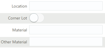
In this example of the design-time interface, Location and Material are not set to be hidden, but Corner Lot and Other Material are. Notice that the hidden fields display with the darkened background.
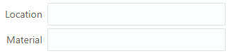
The following example of the runtime illustrates that the hidden fields do not display when an end user accesses the form. Only Location and Material render on the form at runtime, while Corner Lot and Other Material are not rendered.
This example illustrates the fields indicated as hidden in the previous example in design time do not appear on the form at runtime.
Increasing the Display Area for Field Content
In some cases, you may want to provide more field content visible to users filling out and managing intake forms. Examples include:
-
Text fields where users enter large amounts of information.
-
Drop-down lists containing longer phrases for users to select.
This example illustrates a Text area field type displaying the default amount of visible space.
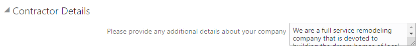
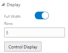
Use the Full Width and Rows field attributes to expand the display size of certain field types.
This example illustrates the Full Width and Rows display options. Details are in the surrounding text.
|
Page Element |
Description |
|---|---|
|
Full Width |
Select to increase the display area of these field types:
|
|
Rows |
Applies only to Text area field types. The value you enter for Rows determines the height of the viewable area in terms of rows of text. Enter a value between 1-20. Note: For text area fields, the
Rows value remains active once set regardless if container group
box has Flexible
Box Layout on or off.
|
This example illustrates a rich text field type with the Full Width option enabled and the Rows value set to 5 to display more field content for users.
