Add a Panel for Related Objects (Many-to-Many)
You can configure an object's detail page by adding panels for related objects. This makes it easy for users to see – on a single page – all pertinent information related to a record. This topic illustrates how to add a panel to an object's detail page (when the panel object is related via a many-to-many relationship). These instructions apply whether the panel object is a standard or custom object.
What's the Scenario?
In our example relationship, the Payment object has a many-to-many relationship with the Contact object. At runtime, users should be able to add a contact for a payment, and view those contacts on the Payment detail page. To enable this, we need to add a Contacts panel to the Payment detail page.
Setup Overview
To add a related object panel to a custom object's detail page, you must complete a few steps first. Here's an overview of the required steps.
-
Complete these steps for your related object, whether or not the object is a custom or standard object:
-
Confirm that the intersection object for your many-to-many relationship contains a custom field for the record name. This custom field will be used when creating layouts for the intersection object panel and subview, and for the edit intersection object layout.
For example, we have a scenario where a many-to-many relationship exists between the Payment and Contact objects. In this example, create a Contact Name field on the intersection object, as follows:
Record Name Field Configuration
Record Name Field
Record Name Value
Field Type
Formula
Name
<Object>Name
For example, ContactName
Display Type
Simple Text Box
Field Expression
Enter an expression that retrieves the contact name from the target object.
For example:
Person_Tgt_PersonToPaymentContactMMInter_c_Src?.PartyUniqueName -
Create the required add smart action for the related object in Application Composer.
For example, create the Add Contact smart action.
Users can access the Add Contact smart action from the Action Bar on both the Payment detail page or Contacts subview to add a contact to a payment.
See Create Smart Actions.
-
-
You can then add the Contact UI components to the Payment detail page so that users can add and view contacts for a payment record.
Add the Contact Panel to the Payment Detail Page
To add a new panel for contacts to the Payment detail page:
-
In Visual Builder Studio, click the App UIs tab.
-
Expand cx-custom > payment_c, then click the payment_c-detail node.
-
On the payment_c-detail tab, click the Page Designer subtab.
-
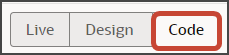
Click the Code button.
-
Confirm that you are viewing the page in Page Designer.
Remove the comment tags for the dynamic container components that contain the panels and any subviews.
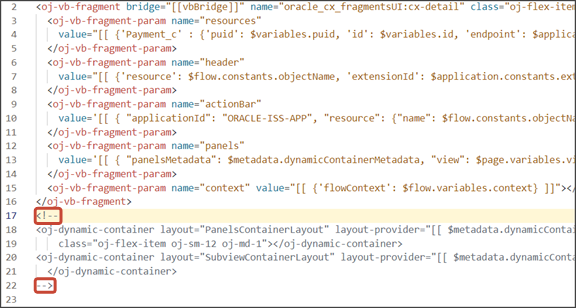
-
Highlight the
<oj-dynamic-container>tags for the panels.
-
On the Properties pane, in the Case 1 region, click the Add Section icon, and then click New Section.
-
In the Title field, enter a title for the section, such as
Contacts
                            Panel
. -
In the ID field, accept the value of
contactsPanel.Note: Don't use the REST object name for this ID because you'll use the REST object name when you create the subview. -
Click OK.
-
On the Properties pane, click the Contacts Panel section that you just added.
Page Designer navigates you to the template editor, still on the payment_c-detail tab, where you can design the Contacts panel template.
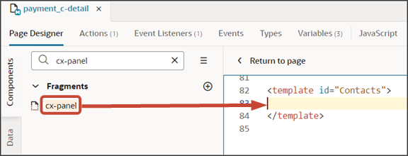
Click the Code button.
-
On the Components palette, in the Filter field, enter
cx-panel. -
Drag and drop the cx-panel fragment to the template editor, between the Contacts template tags.
-
Add the following parameters to the fragment code so that the code looks like the below sample. Be sure to replace
Payment__c_IdandPaymentContactMMInter_Src_Payment_cToPaymentContactMMInter_c_Tgtwith the appropriate values for your source object ID and intersection object name. Modify the translation bundle name, as well, if required.Note: The format of the intersection object's name is always<Relationship Name>_Src_<Source Object API Name>To<Relationship name>_Tgt. You can also retrieve the name by doing a REST describe of the source object (Payment).<template id="contactsPanel"> <oj-vb-fragment bridge="[[vbBridge]]" class="oj-sp-foldout-layout-panel" name="oracle_cx_fragmentsUI:cx-panel"> <oj-vb-fragment-param name="resource" value='[[ {"name": $flow.constants.objectName, "primaryKey": "Id", "endpoint": $application.constants.serviceConnection } ]]'> </oj-vb-fragment-param> <oj-vb-fragment-param name="sortCriteria" value='[[ [{"attribute": "LastUpdateDate","direction": "desc" }] ]]'> </oj-vb-fragment-param> <oj-vb-fragment-param name="query" value='[[ [{"type": "selfLink", "params": [{"key": "Payment__c_Id", "value": $variables.id }]}] ]]'> </oj-vb-fragment-param> <oj-vb-fragment-param name="child" value='[[ {"name": "PaymentContactMMInter_Src_Payment_cToPaymentContactMMInter_c_Tgt", "primaryKey": "Id", "relationship": "M2M"} ]]'></oj-vb-fragment-param> <oj-vb-fragment-param name="context" value="[[ {} ]]"></oj-vb-fragment-param> <oj-vb-fragment-param name="extensionId" value="{{ $application.constants.extensionId }}"></oj-vb-fragment-param> <oj-vb-fragment-param name="title" value="[[$translations.CustomBundle.Contacts()]]"></oj-vb-fragment-param> </oj-vb-fragment> </template>This table describes some of the parameters that you can provide for a custom panel.
Parameters for Custom Panel
Parameter Name Description sortCriteria Specify how to sort the data on the panel, such as sort by last updated date and descending order. query Include criteria for querying the data on the panel. -
In the previous step, you configured the panel template. Next, let's configure the layout for the panel.
First, create a new layout.
-
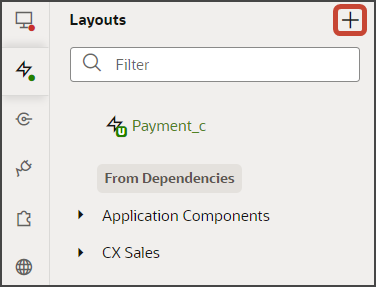
Click the Layouts tab, then click the Create Layout icon.
-
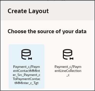
In the Create Layout dialog, click the REST resource for your intersection object with the Payment object as the source.
In our example, expand cx-custom and click Payment_c/PaymentContactMMInter_Src_Payment_cToPaymentContactMMInter_c_Tgt.
-
Click Create.
-
-
On the PaymentContactMMInter_Src_Payment_cToPaymentContactMMInter_c_Tgt tab, click + Rule Set to create a new rule set for the layout.
-
In the Create Rule Set dialog, in the Component field, select Dynamic Form.
-
In the Label field, enter exactly this value, which is case-sensitive: PanelCardLayout.
-
In the ID field, enter exactly this value, which is case-sensitive: PanelCardLayout.
-
Click Create.
-
-
Add the fields that you want to display on the panel.
-
Click the Open icon next to the default layout.
-
Click the cx-card fragment.
This fragment provides the format of the panel.
-
Each panel includes specific slots. From the list of fields, drag each field to the desired slot.
For example, drag and drop the ContactName_c field to the item1 slot.
Note: Fields for selection on a related object panel (related via a many-to-many relationship) are available only from the intersection object. To add custom fields to a layout, you must add those custom fields to the intersection object in Application Composer.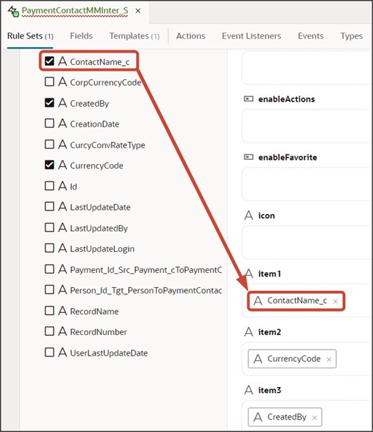
Drag and drop other desired fields to the appropriate slots.
-
On the Properties pane, click Go to Template.
-
-
On the Templates subtab, click the Code button.
-
Add the following parameters to the fragment code:
<oj-vb-fragment-param name="style" value="avatar-card"></oj-vb-fragment-param>
    <oj-vb-fragment-param name="enableActions" value="false"></oj-vb-fragment-param>
The template code should look like the below sample.
<!-- Contains Dynamic UI layout templates -->
<template id="defaultTemplate">
<oj-vb-fragment name="oracle_cx_fragmentsUI:cx-card" bridge="[[ vbBridge ]]">
    <oj-vb-fragment-param name="dynamicLayoutContext" value="{{ $dynamicLayoutContext }}"></oj-vb-fragment-param>
    <oj-vb-fragment-param name="item1" value="[[ $fields.ContactName_c.name ]]">
    </oj-vb-fragment-param>
    <oj-vb-fragment-param name="item2" value="[[ $fields.CurrencyCode.name ]]">
    </oj-vb-fragment-param>
    <oj-vb-fragment-param name="item3" value="[[ $fields.CreatedBy.name ]]">
    </oj-vb-fragment-param>
    <oj-vb-fragment-param name="style" value="avatar-card"></oj-vb-fragment-param>
    <oj-vb-fragment-param name="enableActions" value="false"></oj-vb-fragment-param>
  </oj-vb-fragment>
</template>
Note: Theavatar-cardstyle is specific to a Contacts panel only. If you're adding a panel for a different object, then you can omit the style parameter.You can add more fields by returning to the default layout and dragging and dropping, as you previously did.
Alternatively, you can add fields to the panel using the Properties pane. To do this, click the Fragment Container node in the Structure pane.
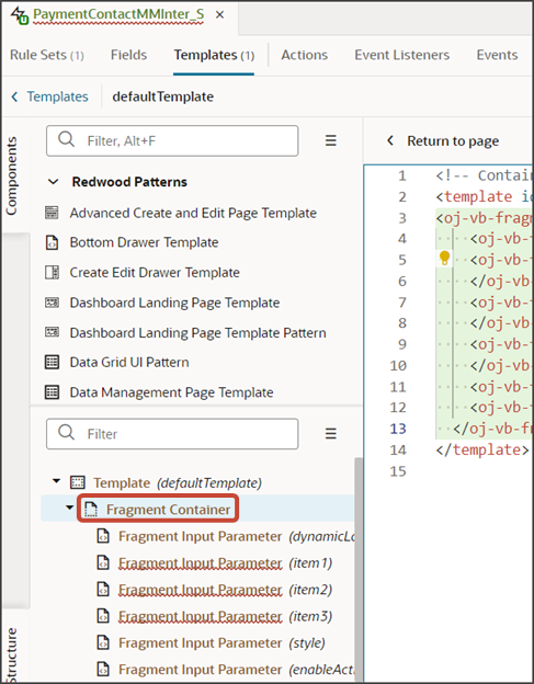
Then, add your desired related object fields using the Input Parameter fields on the Properties pane.
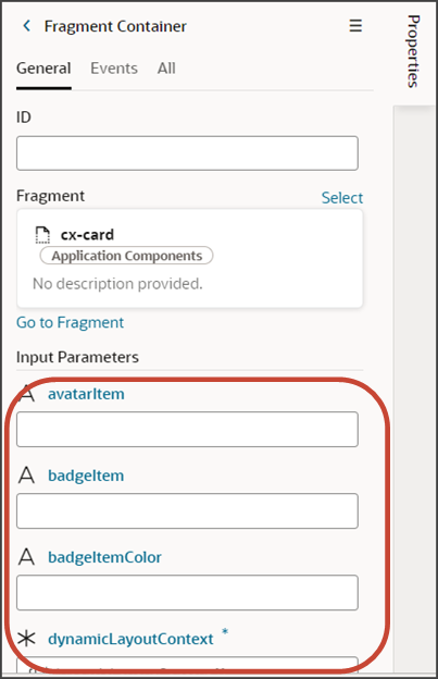
This table describes some of the parameters that you can provide for a custom panel.
Parameters for Custom Panel
Parameter Name Description style
Specify
"avatar-card"for the panels that you add to the detail page.enableActions
Panels can have actions when they display on a dashboard. Panels that display on a detail page typically don't need actions, however, so set this parameter to
"false". -
Manually update the template's JSON with the labelEdge property.
-
On the PaymentContactMMInter_Src_Payment_cToPaymentContactMMInter_c_Tgt tab, click the JSON subtab.
-
In the section for the PanelCardLayout's default layout, add the labelEdge property with a value of
"none".In our example, this is what the labelEdge property should look like:
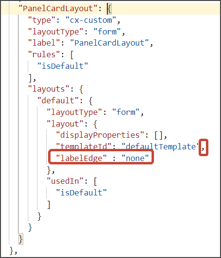
-
-
Finally, comment out the dynamic container components from the payment_c-detail page.
-
Click the payment_c-detail tab, then click the Page Designer subtab.
-
Click < Return to page.
-
Click the Code button.
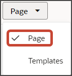
Select Page from the dropdown.
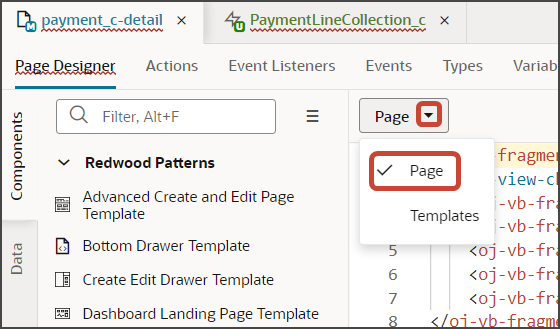
Comment out the dynamic container components that contain the panels and subviews.
Note: To add more panels to the panel region, you must first un-comment the dynamic container component so that you can add a new section for each desired panel.
-
You can test the panel after you add the subview. Let's do that next.