4.4 Styling a Map Layer

Spatial Studio allows you to explore different styling options for your map layers, in order to enhance visualization and analysis.

The styling options provided to you may vary depending on the type of data you are mapping.

The following sections describe a few styling techniques for the different data types:

4.4.1 Applying a Render Style For a Point Layer

You can render a point map layer using one of the following render style options:
  • Circle (default)
  • Symbol
  • Heatmap
  • Cluster

The following steps enable you to apply your preferred render style option.

The instructions assume that you have point map layer displayed on your Active Project page.
  1. Click Menu Icon against the map layer in the Layers tab of the Layers List.
  2. Select Settings in the context menu.
  3. Configure Style and select a Render Style option from the drop-down list.
    By default, a point map layer always uses Circle to represent the data points.

    Note:

    Each render style has its own settings.
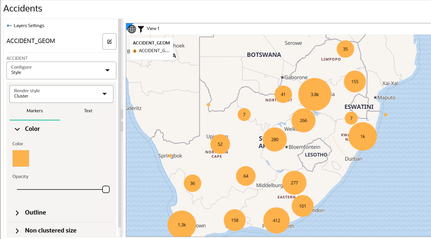
    • If you select Cluster as the render style option, the data points on your map are shown clustered depending on the cluster circle size.

      Figure 4-21 Applying a Cluster Style

      Description of Figure 4-21 follows
      Description of "Figure 4-21 Applying a Cluster Style"

      Optionally, you can change the color and the style of the text labels representing the number of points in each cluster.

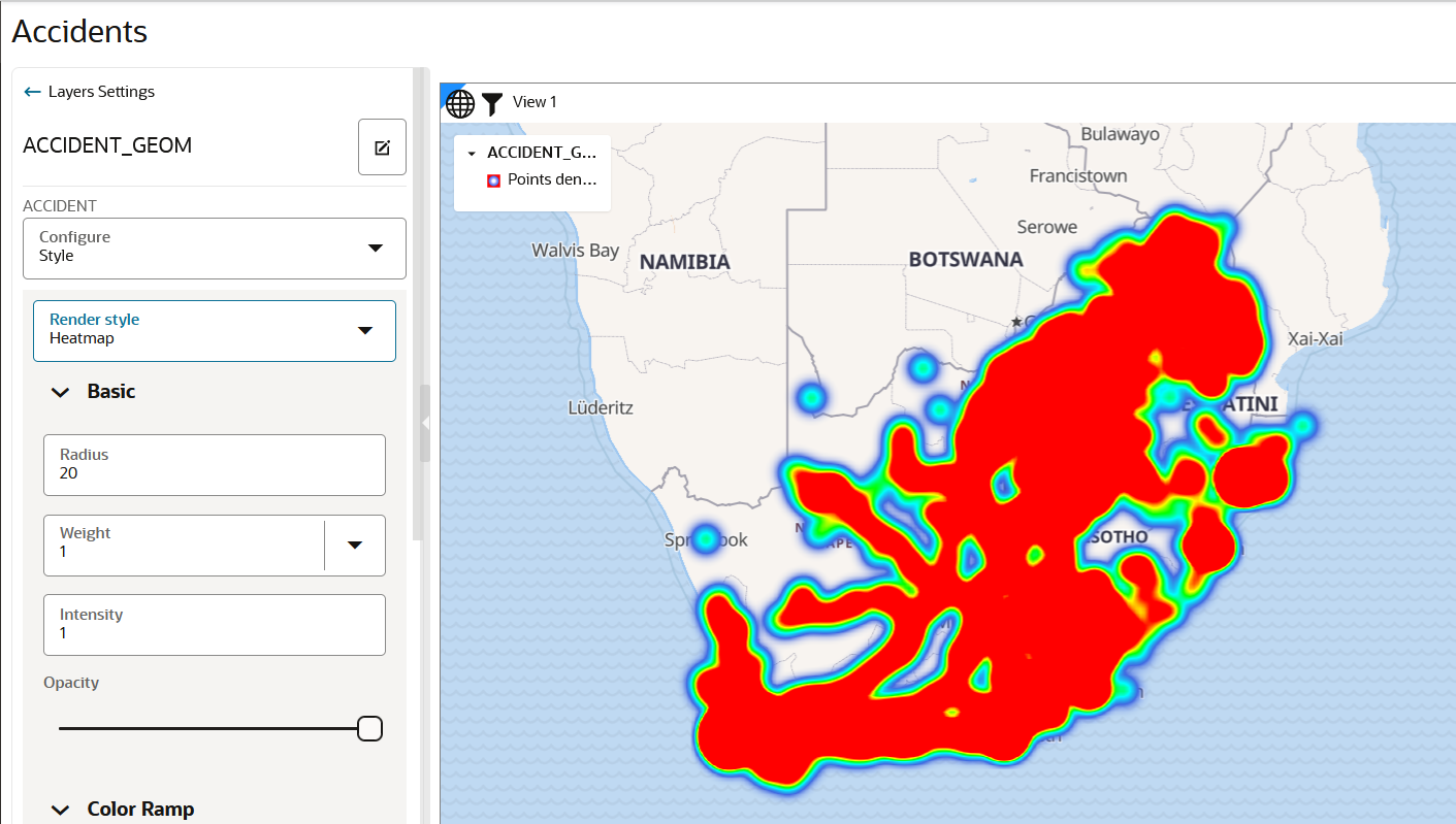
    • If you select Heatmap as the render style option, the data points on your map are rendered with continuous colors based on the concentration of points as shown:

      Note:

      Hot colors represent concentration of points, and cool colors represent sparsity of points.

      Figure 4-22 Applying a HeatMap Style

      Description of Figure 4-22 follows
      Description of "Figure 4-22 Applying a HeatMap Style"

      Also, you can further customize the Heatmap visualization by changing the Radius or Weight (or both) in the Basic settings panel shown in the preceding figure. The following describes more about these parameters:

      • Radius: This value defines (in pixel) how far each data point contributes to (influences) the heat of its surrounding area. Its contribution drops to zero for any area beyond this radius with the data point at the center.
      • Weight: This value defines how much weight a data point contributes to the heat. The default value is set to 1 which means all data points contribute equally to the heat. If you select a numeric column (with zero or positive values) in the Weight drop down list, then that value determines the weight contributed by a data point to the heat calculation. For instance, if a data point’s weight column has a value of 5, then it is contributing to the heat as if there are five data points at that location (each with the default weight of 1). However, if the weight column contains a negative value, then note that the result is not predictable.
      • Intensity: This value should always be 1.

      Tip:

      It is recommended that you reduce the default value of the Radius parameter to observe a more localized view of point concentrations.
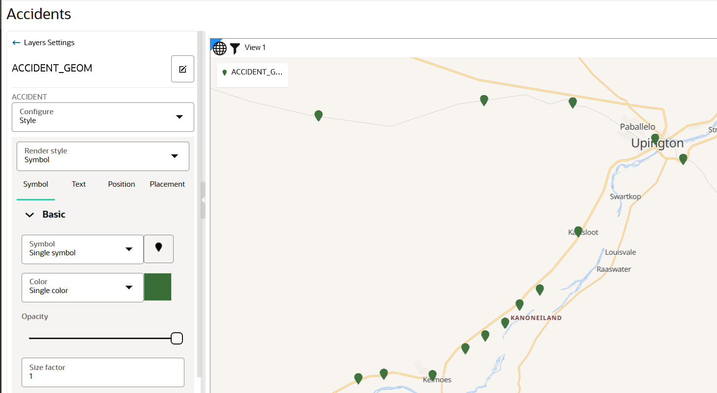
    • If you select Symbol as the render style option, the data points on your map are rendered with your chosen symbol as shown:

      Tip:

      You can optionally select a color for your symbol.

      Figure 4-23 Applying a Symbol Style

      Description of Figure 4-23 follows
      Description of "Figure 4-23 Applying a Symbol Style"

      You can customize the symbol used to represent the data points by clicking the image button next to the Symbol drop-down list. Spatial Studio provides several built-in sets of symbols and also supports custom map symbols (icons).

    The map layer gets rendered with the appropriate style.

4.4.2 Applying Style for a GeoRaster Layer

You can style a GeoRaster map layer using the following steps.
The instructions assume that you have a GeoRaster map layer displayed on your Active Project page.
  1. Click Menu Icon against the dataset in the Data tab of the Layers list.
  2. Select Settings in the context menu.
    The Layer Settings panel opens.
  3. Optionally, modify any of the following options in the Style:
    • Opacity
    • Maximum Brightness
    • Minimum Brightness
    • Saturation
    • Contrast
    • Hue Rotate
    • Fade Duration
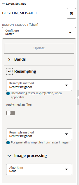
  4. Optionally, modify any of the following rendering options in the Raster tab:

    Figure 4-24 Raster Configuration for GeoRaster Map Layer

    Description of Figure 4-24 follows
    Description of "Figure 4-24 Raster Configuration for GeoRaster Map Layer"
    • Bands: Spatial Studio, by default supports the following bands:
      • Red
      • Blue
      • Green
      • Alpha

      For GeoRaster images that have more than three layers, you can choose which three layers you want to visualize.

    • Resampling: The following two types of resampling processes are supported:
      • Image Reprojection: This represents the interpolation method to be used when transforming an image from one SRS (Spatial Reference System) to another. This applies only if the SRS of the source image in the database table is different from Spatial Studio's base map projection.
      • Map Image Tile Generation: This represents the image interpolation value that determines how each image cell's value on a view port is interpolated using the original image pixels. During an image tile generation, resampling occurs (although the provided images are in the same SRS) as the spatial resolution of the two images may be different.

        The following interpolation algorithm options are supported:

        • NEAREST NEIGHBOR: This option has no interpolation by taking the nearest image pixel's value directly.
        • BI-LINEAR: This option will consider 4 neighboring pixels to determine the image cell's value.
        • CUBIC: This option uses cubic convolution function to estimate image cell's value. Since a 4x4 neighboring pixels participate in the interpolation, it results in a smoother image.
    • Image Processing: represents the subprogram to be used to enhance the visual quality of the images.
    The GeoRaster map layer is rendered with the updated settings.

4.4.3 Applying Data-Driven Style to a Map with H3 Aggregations

You can apply different resolutions to your H3 map layer to enhance your visualization.

In case of an H3 aggregation dataset, the hexagonal cells and the distribution of points in these hexagons automatically change at each resolution level, as you zoom in and out of the map. This implies that the color bins for one level might not be the same as for another level.

Spatial Studio provides an option to automatically calculate color bins as you alter your resolutions. You can also turn this option off if you want to test against a set of specific thresholds.

The following steps enable you to apply a data-driven styling option for your H3 map layer.

The instructions assume that you have a H3 map layer displayed on your Active Project page.
  1. Click Menu Icon against the map layer in the Layers tab of the Layers List list.
  2. Select Settings in the context menu.
  3. Configure Style.
  4. Select Based on Data for the Color value under Fill.
    The Style details panel is displayed.
  5. Select the Column to control styling.
  6. Switch on or off the Automatically adjust bin values toggle button.
    • If turned on, the bin values will automatically update as you zoom in or out on the map.
    • If turned off, Create value bins option appears.
  7. Assign colors to the bins based on data values.
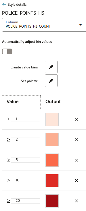
    The following figure shows the Style details panel options:

    Figure 4-25 Applying Data-Driven Color Styling for H3 Map Layer

    Description of Figure 4-25 follows
    Description of "Figure 4-25 Applying Data-Driven Color Styling for H3 Map Layer"
    The color bins on the H3 map layer gets rendered appropriately for different resolutions as shown in the preceding figure.

4.4.4 Applying Predefined Colors to a Map Layer

Using a column with predefined color codes or values, you can create accurate and consistent choropleth map layers.

You can store a color-coded value in a column of your dataset and then use this column property to color code your map.

The following steps enable you to color code your map layer.

The instructions assume that the map layer displayed on your Active Project page uses a dataset having a column property that contains color-coded values.
  1. Click Menu Icon against the map layer in the Layers tab of the Layers List.
  2. Select Settings in the context menu.
  3. Configure Style by selecting Column with color codes for the Color value under Fill.
  4. Select the Column that contains the color value.
    The following figure shows the styling of the map layer using the color variable in the dataset:

    Figure 4-26 Color Coding a Map Layer

    Description of Figure 4-26 follows
    Description of "Figure 4-26 Color Coding a Map Layer"

    The color code gets applied to the map layer.

4.4.5 Applying Predefined Symbols to a Map Layer

Using a column with predefined symbol values, you can apply data-driven symbol styling to your map layer.

However, the symbol must belong to one of the supported symbol sets. Symbols in Spatial Studio are grouped into three sets and each set is identified by a Symbol set id as described in the following table:

Table 4-1 Symbol Set

Symbol Set Symbol set id
Spatial Studio default studio
Oracle Redwood symbols oracle-redwood-symbols
Airfields airfields

You can store a symbol name and the symbol set to which it belongs in a column of your dataset and then use this column property to assign symbols to your map.

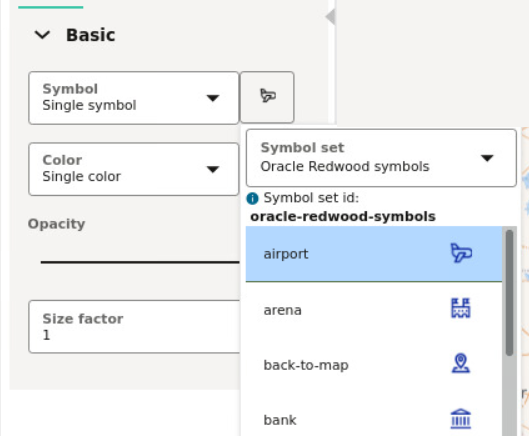
For example, assume you want to use the airport icon as shown in the following figure:

Figure 4-27 Symbols and Symbol Set

Description of Figure 4-27 follows
Description of "Figure 4-27 Symbols and Symbol Set"

You must then use oracle-redwood-symbols/airport as the symbol name in your dataset column. In this case:

  • oracle-redwood-symbols: is the symbol set id
  • airport: is the name for the icon to be used on the map layer

The following steps enable you to apply data driven symbol styling for your map layer.

The instructions assume that the map layer displayed on your Active Project page uses a dataset having a column property that contains symbol names following the convention as explained earlier in this section.
  1. Click Menu Icon against the map layer in the Layers tab of the Layers list.
  2. Select Settings in the context menu.
  3. Configure Style and select Symbol as the Render Style.
  4. Select Column with symbol names from the Symbol drop-down list in the Basic section of the Symbol tab.
  5. Select the Column that contains the symbol name value.
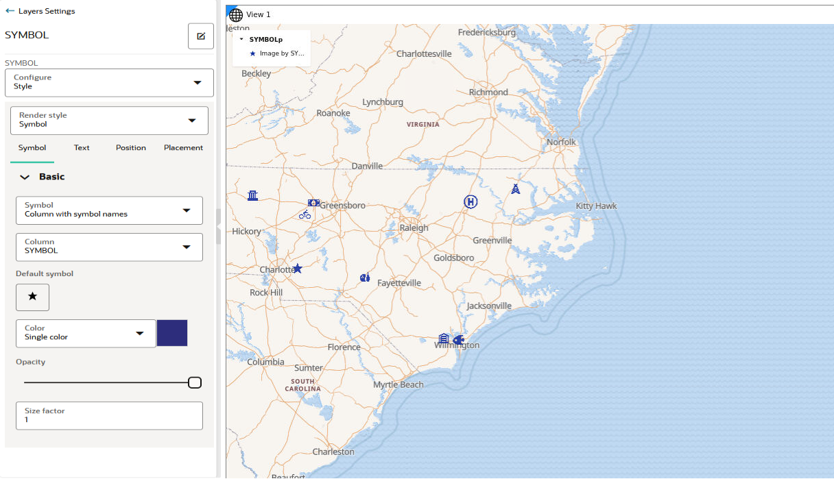
    The following figure shows the styling of the map layer using the symbol name variables in the dataset:

    Note:

    If incorrect symbol names are present in the dataset column, then for those data points, the Default symbol is displayed on the map layer.

    Figure 4-28 Custom Symbol Styling in Map Visualization

    Description of Figure 4-28 follows
    Description of "Figure 4-28 Custom Symbol Styling in Map Visualization"

    The symbols gets applied to the map layer.

4.4.6 Applying Predefined Colors to Symbols

You can color the symbols on a map layer by using an attribute column of the dataset that contains predefined color codes.

The following steps enable you to color code the symbols on a map layer.

The instructions assume that the map layer displayed on your Active Project page uses a dataset having a column property that contains color-coded values.
  1. Click Menu Icon against the map layer in the Layers tab of the Layers List.
  2. Select Settings in the context menu.
  3. Configure Style by selecting Column with color codes for the Color value in the Basic panel.
  4. Select the Column that contains the color value.

    Note that the color values in the column must be in #RGB notation with the # character included.

    The color code gets applied to the symbols on the map layer. The following figure shows the color-coded symbols on the map layer using the color variable in the dataset:

    Figure 4-29 Color-Coded Symbols

    Description of Figure 4-29 follows
    Description of "Figure 4-29 Color-Coded Symbols"

4.4.7 Applying Custom Map Symbols to a Map Layer

You can apply custom map symbols for styling your map layer.

However, note that if a point dataset is being styled by custom symbols, then it can no longer use any of the built-in symbols. Essentially, you cannot mix both custom and built-in symbols on a map layer in the map visualization.

Perform the following steps to style your map layer using custom map symbols.

The instructions assume that a map layer is displayed on the Active Project page and the custom map symbols are already added in Spatial Studio. See Uploading a Map Symbol for more information.
  1. Click Menu Icon against the map layer in the Layers tab of the Layers list.
  2. Select Settings in the context menu.
  3. Configure Style and select Symbol as the Render Style.
  4. Click the image button next to the Symbol drop-down list.
    The Symbol set drop-down appears.
  5. Select Custom under Custom symbols in the Symbol set drop-down list.
    The uploaded custom symbols list appears.
  6. Select the required custom symbol.
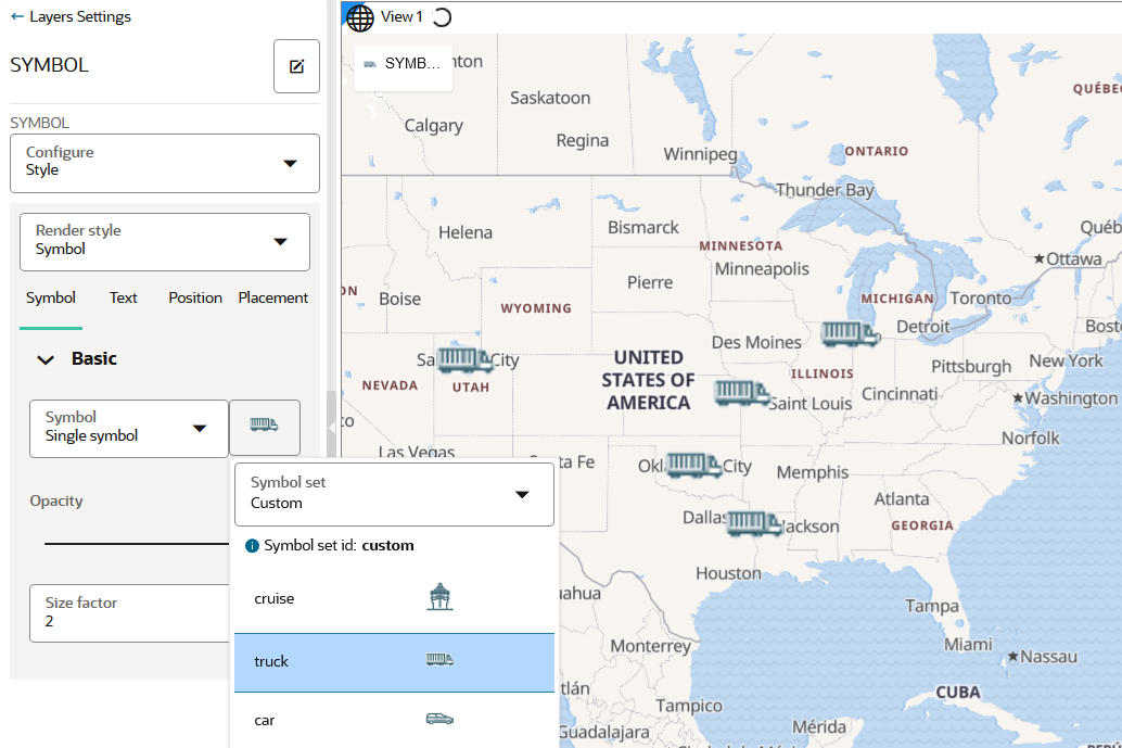
    The symbol gets applied to the map layer as shown in the following figure:

    Figure 4-30 Using a Custom Map Symbol in Visualization

    Description of Figure 4-30 follows
    Description of "Figure 4-30 Using a Custom Map Symbol in Visualization"

4.4.8 Applying an Animated Map Symbol to a Map Layer

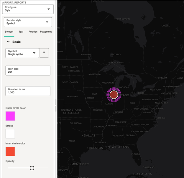
You can apply a circular animating (pulsing) symbol for styling point-type map layers.

Perform the following steps to apply an animating symbol to a map layer.

The instructions assume that a point map layer is already displayed on the map.

The new animating symbol is found in the Symbol render style or symbol picker.

  1. Click Menu Icon against the map layer in the Layers tab of the Layers list.
  2. Select Settings in the context menu.
  3. Configure Style and select Symbol as the Render Style.
  4. Click the image button next to the Symbol drop-down list.
    The Symbol set drop-down appears.
  5. Select the pulsing-dot symbol under the Animations section in the Symbol set drop-down list.
  6. Optionally, customize the animating symbol.

    This includes the overall Icon size, Inner circle color, Outer circle color, Stroke, and Opacity of the inner circle. Also, you can customize the animation speed by configuring the Duration in ms field.

    The following figure shows custom styling of an animated symbol on a map visualization.

    Figure 4-31 Animated Map Symbol


4.4.9 Applying Style to a CZML Cesium Map Layer

When using a CZML dataset in a Cesium map visualization, you can filter on a specific entity value or control the visibility (show or hide) for the displayed entities. Also, you can add an info window to enhance your map interaction.

The instructions assume that you have added a CZML dataset to a Cesium map on your Active Project page.
  1. Click Menu Icon against the CZML map layer in the Layers tab of the Layers List list.
  2. Select Settings in the context menu.
  3. Configure Interaction to set an Info window.
  4. Configure Filter Visibility and set the filter value for the required column name.

    Figure 4-32 Applying Filters for CZML Map layer

    Description of Figure 4-32 follows
    Description of "Figure 4-32 Applying Filters for CZML Map layer"
  5. Configure Toggle Visibility to show or hide the required entities on the map.

4.4.10 Applying Style to a Map Layer Using a GeoJSON URL Dataset

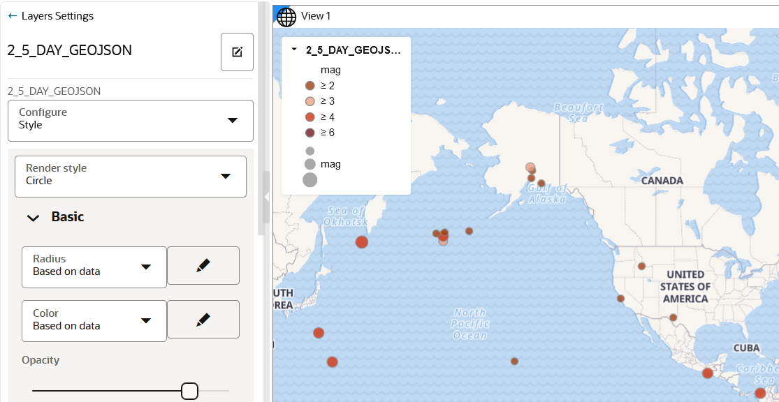
Spatial Studio supports data-driven styling for your GeoJSON URL dataset map layer. You can access the dataset columns that are sourced from the source URL and apply the desired styling for the map layer.

The instructions assume that you have added a GeoJSON URL dataset on your Active Project page.
  1. Click Menu Icon against the map layer in the Layers tab of the Layers List list.
  2. Select Settings in the context menu.
  3. Configure Style.
  4. Apply the radius or color styling based on data columns.
    • Styling based on data
      1. Select Based on Data in the Radius or Color drop down list.
      2. Click the Edit bind icon.
      3. Select the Column to control styling.
      4. Optionally, adjust the bin and the output values.
    • Applying predefined colors
      1. Select Column with color codes in the Color drop down list.
      2. Select the Column.
    The following figure shows the radius and color styling applied to a GeoJSON URL dataset map layer:

    Figure 4-33 Data-Driven Styling for GeoJSON URL Map Layer

    Description of Figure 4-33 follows
    Description of "Figure 4-33 Data-Driven Styling for GeoJSON URL Map Layer"

4.4.11 Setting Selection Tolerance on a Map Layer

Spatial Studio allows you to increase or decrease the selection tolerance on a map layer, so that selecting small and linear geometry features is easier.

The following steps enable you to adjust and set the selection tolerance on a map.

The instructions assume that a project is open on the Active Project page.
  1. Click Menu Icon against the dataset in the Data tab of the Layers list.
  2. Select Settings in the context menu and configure Interaction.
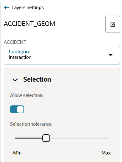
  3. Switch on the Allow selection toggle button.
  4. Adjust the Selection tolerance slider as required.
    The following figure shows the Selection section for setting the tolerance:

    Figure 4-34 Setting the Selection Tolerance

    Description of Figure 4-34 follows
    Description of "Figure 4-34 Setting the Selection Tolerance"

    The custom selection tolerance gets applied to the map layer.

4.4.12 Adding a Pin on a Map

The following steps enable you to inspect the current mouse pointer's latitude and longitude coordinates and pin a location on the map layer.

The instructions assume that you have a project opened on your Active Project page and the map layer is displayed for visualization.
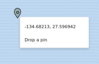
  1. Right-click on any area on the map layer.
    The coordinates for the location gets displayed as shown:

    Figure 4-35 Pin a Location on the Map

    Description of Figure 4-35 follows
    Description of "Figure 4-35 Pin a Location on the Map"
  2. Click Drop a pin to add a location marker.
    The pin gets displayed on the map. Additionally, you can also copy the coordinates by clicking on the marker and then clicking the Longitude, Latitude: click to copy icon.

4.4.13 Applying Map Backgrounds

Spatial Studio provides ready-to-use map backgrounds to enhance your visualization.

You can select one of the following map backgrounds for your project visualization:

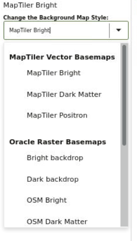
  • MapTiler Vector Basemaps
  • Oracle Raster Basemaps
  • Blank Basemaps
  • User-defined Basemaps

As an administrator, you can also register custom basemaps and use them in map visualizations. They may be raster or vector tiles that are typically hosted on third party servers, or they be created using a WMS OGC web service. See Spatial Studio Administration Page for more information on adding basemaps.

The default language for the MapTiler Vector Basemaps is English. However, you can change the language for these vector basemaps. See Configuring a Map Visualization for more information.

The following section describes how to apply a specific map background for your project:

4.4.13.1 Changing Map Backgrounds

The following steps enable you to apply different map backgrounds in your project visualization.

The instructions assume that you have a project opened on your Active Project page.
  1. Click Menu Icon in the Background tab of the Layers list.
  2. Select Settings in the context menu.
  3. Click the Change the Background Map Style drop-down and select your required background map as shown.

    Figure 4-36 Changing a Map Background

    Description of Figure 4-36 follows
    Description of "Figure 4-36 Changing a Map Background"

    All custom basemaps appear under User-defined Basemaps in the drop-down list.

    The selected map background gets applied to your project visualization.

4.4.14 Using the Redline Map Tool

Spatial Studio provides the Redline map tool for drawing and annotating different geometry shapes on your map.

In addition, you can edit, delete, or share these redline drawing sets by exporting it to a GeoJSON file.

Perform the following steps to get started with the Redline map tool. The instructions assume that you have a project opened on your Active Project page and the map layer is displayed for visualization.
  1. Click the Actions icon on the map tool bar.
  2. Select Redline from the drop-down menu.
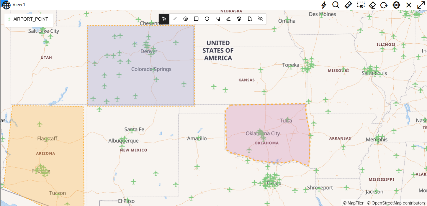
    The Redline map tool bar appears as shown:

    The tool bar provides the following options for defining or managing Redline objects on the map:

    • Select Feature (default): To select a Redline object for update or delete.
    • Draw Line: To define a Redline line.
    • Draw Point: To define a Redline point.
    • Draw Rectangle: To define a Redline rectangle.
    • Draw Circle: To define a Redline circle.
    • Draw Polygon: To define a Redline polygon.
    • Draw Freehand: To draw a Redline freehand.
    • Click to choose a color: To choose the default color for the Redline objects.
    • Export Features: To export the Redline objects to a GeoJSON file. You can later upload the file to create a Dataset which can be used in Map Visualizations. See Creating a Dataset by Uploading a File to upload a GeoJSON file.
    • Toggle Visibility: To hide or unhide the marked Redline objects.
  3. Click the desired drawing option and draw the corresponding shape on the map.
    For example, the following figure shows three Redline objects added to a map layer:

    Figure 4-38 Redlining Areas in Map Visualization

    Description of Figure 4-38 follows
    Description of "Figure 4-38 Redlining Areas in Map Visualization"
    Repeat this step to add as many Redline objects as required.

    Tip:

    You can duplicate and move a Redline object on the map.
  4. Optionally, perform any of the following actions on a defined Redline object.
    • Modify the Shape of the Redline Object
      1. Click Select Feature on the Redline map toolbar.
      2. Click the required Redline object.

        The existing vertices of the object are shown highlighted in red.

      3. Click along the object boundary to add new vertices (points) and adjust its shape as required.
      4. Optionally, move the entire object to the desired location on the map.
    • Edit Feature Properties
      1. Click Select Feature on the Redline map toolbar.
      2. Right-click and select Edit Feature Properties on the required Redline object.
      3. Add a Description to annotate the object.

        This description will be displayed as a tooltip when you mouse over a Redline object.

      4. Optionally, modify the Fill and Outline width.
    • Duplicate Feature
      1. Click Select Feature on the Redline map toolbar.
      2. Right-click and select Duplicate Feature on the required Redline object.
      3. Move the duplicated object to the desired area on the map.
    • Delete Feature
      1. Click Select Feature on the Redline map toolbar.
      2. Right-click and select Delete Feature on the required Redline object to be deleted.
  5. Optionally, export all the marked Redline objects to a GeoJSON file.
    1. Click Export Features on the Redline map toolbar.
    2. Click Download as GeoJson and save the .geojson file to your system.
      Also, note the following details regarding the exported GeoJSON file:
      • Each Redline object is automatically assigned a unique ID (UUID), which will be a exported.
      • Any description entered for a Redline object is exported.
      • Any styling information, such as custom colors and outline width are NOT exported.
  6. Click Save to save your project with the Redline drawings.
    The drawings will be persisted as a part of the project. Note that when you reopen an existing project with Redline drawings, the shapes are initially not editable. You must select the Redline tool again to "rehydrate" the tool with the drawings.