Property
A property is a data structure that represents the most granular level in UI. A component consumes one or more properties. The usage of a property is within the context of the component, for example, the result component defines which properties are shown in 'set 1' or as a title. Similarly, for a quick search component a property forms a search criterion.
Properties have the following settings:
| Setting | Mandatory | Description |
|---|---|---|
name |
yes |
Name of the property. This needs to correspond the name of the field in Rest API on the resource |
sequence |
yes |
The order in which the property is applied in the component. Properties are applied in ascending order of the sequence |
display |
no |
Indicates when the property should be displayed |
label |
no |
key to boilerplate key, use to override the default boilerplate text |
mandatory |
no |
When set to true indicates the property should be treated as mandatory |
readonly |
no |
When set to true indicates the property is read only even in create mode. |
nonupdatable |
no |
When set to true indicates the property cannot be updated once saved |
default |
no |
Applicable for boolean, enum, string and numeric properties |
refType |
no |
The LOV page to be used for-Selecting or changing values in Create and Edit mode -Displaying reference properties as descriptors in the View mode. |
displayType |
no |
Indicates how a property should be displayed. The following options exist per displayType
1. Object - This is applicable for special properties that have Object type as metadata and XML, JSON data
|
evaluateConditions |
no |
list of conditions that must be evaluated when the property value changes. |
setToNull |
no |
used along with conditional display. If the display is set to never, the system considers setToNull setting to determine if the value of the property should be set to null or not when the property is hidden in the UI. |
properties |
no |
To show additional descriptive columns, a property can refer to nested properties , e.g. multivalue list, reference properties. These reference properties will shown as separate fields in the page, separate from properties used by in the LOV |
"properties":[
  {
    "name": "name of the property",
    "sequence":"",
    "display":"",
    "label": "",
    "mandatory":""
    "readonly":
    "nonupdatable":
    "default":
    "properties":[]// Property can have nested properties  e.g. multi value list, reference properties
  }
]
| Nested properties must be defined as array of the top level property. That is a new array element from top level must not be created per nested property. |
Sequence
If more than one property is used, the sequence will determine the order in which the properties are displayed by the component.
"properties":[
  {
    "name":"benefitsInputDate",
    "sequence":1,
    ..
  },
  {
    "name":"benefitInputAmount",
    "sequence":2,
    ..
  }
]
The sequence attribute together with the type of the property (in relation to the resource) single value resource property, reference property, object, array determines the display of the property in the UI. Every property must specify a sequence attribute. Properties without a sequence number are given the lowest priority. The display order of the property can influence the label that is used in the UI. Refer to the section 'Boilerplate' for more details.
Display
For every property, the setting 'display' is available to indicate when the property should be displayed. This setting supports three options:
-
Always ("display":"always") - considered as default setting when this property is not specified
-
Never ("display":"never")
-
Only with value ("display":"notNull")
In the example below, field 'benefitsInputDate' is only displayed if the object has a value populated:
"properties":{
  "benefitsInputDate":{
    "display":"notNull"
     ...
  }
}
Mandatory, Readonly, and Nonupdatable
These attributes facilitate customization of the property in a form (region component) or table (table component).
The readonly and non updatable setting can only be made more restrictive at floor plan level. e.g, a non restricted field can be set to be readonly or nonupdatable true. These settings do not override metadata information i.e. a readonly field (as per metadata) cannot be made editable by setting readonly as false.
The setting mandatory can be use to override behaviour of a field at UI level. A mandatory field can be made non-mandatory from UI or vice versa However please note that setting a mandatory field to be nonmandatory does not surpass any mandatory data check when data is stored in the database.
Type of a Property
The rendering and behavior of a property in the UI is based on the field type in the REST API and the consuming component. For details on the property types refer to the Metadata (openAPI specification).
Every property supports view and edit. Depending on the state of the object and the consuming component, the property is rendered in the UI. Object state is driven by the user actions, for example, action 'Create' opens the object in the create state and all the object properties are thereby shown in the edit mode.
There is however an exception to this rule. Some of the object properties cannot be created by a user, such properties are rendered non editable within the component (example Region Component, Table Component) when the object is the 'Create' state. Likewise, some of the object properties are restricted for updates (example claim form on claim), and therefore cannot be updated by a user, such properties are displayed as read only when object is in 'Edit' state. Object metadata specifies which properties are editable and which are not for a given state of the object. Note that this exception does not apply to components that are used to filter and search object list. These components always show the properties in the edit mode.
Sort component, always displays the label of the property.
Single Value Properties
The single value fields are displayed with the attribute name and value within a component. Every record is displayed on a separate line.
| REST API Field Type | Read mode | Edit mode | Note |
|---|---|---|---|
Enum |
Text |
Radio buttons, checkbox or dropdown list based on display type |
Domain values are shown. In the region and filter component based on display type when specified (radiobutton, checkbox or dorpdown):
In the region and filter component, if the display type is not specified then the enum is displayed based on its nature (mandatory/optional).
When an enum is used in advanced search component it is shown as a drop down list with additional value null (no value), by default null (no value) is selected. When an enum is used in the table component it is always shown as a drop down list. If the enum is optional then an additional value null (no value) is available and is selected by default null (no value) if no default is specified in the floor plan. When an enum is used in the region, it is not possible to set display type as checkbox. For create form (create object mode) in region and table component, if a default is specified for the property in the floor plan then that is set. Note that domain code is set as default value and domain value is shown in the UI. |
String |
Text |
Textarea or input text box, along with a possiblity to open a editior for Xml, Json, or Groovy text. The editor can be specified by setting appropriate displayType |
If the size exceeds 100 characters it is recommended to use textarea as displayType allowing user to add multi-line text within the page i.e. without using the text editor In edit mode, the value entered is validated for maximum as specified by the metadata. For create form (create object mode) in region and table component, if a default is specified for the property in the floor plan then that is set. |
Integer |
Text |
Input number |
Numbers are always shown right aligned. If it supports decimals, it is shown along with decimals. Example number value '8' is shown as '8.00', if the property type supports up to two decimal places. In edit mode, the value is restricted by the min/max range as specified by the metadata. For create form (create object mode) in region and table component, if a default is specified for the property in the floor plan then that is set. |
Date |
Text |
Input date picker |
Date is formatted according to locale. Locale is set from the current language and country of the current user. |
Date time |
Text |
Date time picker |
|
Boolean |
Checkbox |
Checkbox or Dropdown |
In advanced search, booleans are shown as drop down with values - Null (no value), Yes and No. By default Null (no value) is selected. For create form (create object mode) in region and table component, if a default is specified for the property in the floor plan then that is set. |
OHI Money |
Money |
Money |
When metadata specifies specificity of two decimals: Currency Display Code + ",0.00". Amount value is restricted by the min/max range as specified by the metadata. When metadata specifies specificity of more than two decimals: Currency Display Code + ",0. \{specificity as specified by the system property 'UI Amount Scale"}. Amount value is restricted by the min/max range as specified by the system property. |
Flex code definition based properties |
Text |
as Reference Property |
|
Single value dynamic fields |
Text |
Based on the type either textbox/textarea or inputnumber or date |
|
Single value non time valid dynamic record |
multivalue |
Single value dynamic record is considered as multi value property. Refer to the section on multi value properties for details. |
|
Ref |
RefType |
RefType |
See the section of reference properties |
Money Properties
View Mode
A money object is displayed with its currency code and value displayed
on the same line. The amount is always right aligned. The currency is
displayed on the left side of the amount.
Edit Mode
The Currency field is non-editable if only one currency is configured, the amount field itself can be changed. If multiple currencies do exist, a drop down list is presented with the default currency preselected.

*Money Property in Table*
The currency and amount for money are shown under single column in the table
XML, JSON, Groovy Editor
By setting appropriate display type, an XML, JSON or Text editor can be used to view or edit a string property or an object property that hold XML, JSON, so formatted string data e.g. CSV .
When a display type is set to file or composite or json or xml, next to the string text area, an notepad icon is shown. On clicking of the icon appropriate editor opens in a pop-up window. Button 'Apply', and 'Close' are show in the edit mode. Button 'Close' is shown in the view mode.
For more complex types, setting display type as composite makes it possible for a user to select appropriate editor (drop down - Text, XML, JSON) in the pop-up at the time of display. By default the data is displayed as Text.
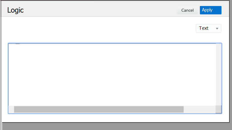
Selecting action 'Apply' triggers data format validation for XML and JSON editors. If the data format is correct the pop-up closes and the property value is updated.
Reference Properties
Some properties are not a literal value, but are a reference to a another resource. These properties are called Reference properties
In the floorplan a reference property requires additional information on how it is to be displayed. This information can be provided by means of a reference type (refType). Within the Reference type you can provide the search properties, title properties and popup tail properties that the reference type will provide
The structure of a reference property is given below:
"properties": [
  {
    "name":"name of the reference property",
    "sequence":1,
    "display":"",
    "properties":[
     ...
     ]
    "refType":{
      "type": "standard reference types e.g. person, provider, procedure etc.","filter":"",
      "filter":"filter condition"
    }
]
Structure of LOV floorplan template
{
     "search":{
        "properties":[
        ...
        ]
      },
      "title":{
        "properties":[
         ...
        ]
      },
      "popupTail":{
        "properties":[
         ...
        ]
      }
}
-
Search - List of all the properties that can be searched on in the LOV. By default only the first property will be enabled for search. The other properties can be 'Switched on' for search with the gear icon.
-
Title - The fields that are shown in view mode, and in create/edit mode when the a value has been selected. The first property will be shown inside of the LOV box, the subsequent values will be shown after the LOV box concatenated by ',' commas.
-
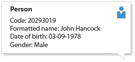
Popup tail. Popup tails can be used in forms and list views to get additional details of the referenced property. Refer below image for an artist impression for the popup tail :
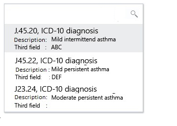
Results The search results show all the distinct Title and Search properties. The title property with sequence 1 and 2 are shown separated by a comma. If there are more properties with higher sequence, then they are shown in the subsequent row as Label - Value. Any search property that is not part of the title is also shown as Label - Value (after all the title properties).
Nested Properties
In addition, a reference property can define nested properties, these nested properties are displayed below the reference property as read only. The sequence attribute is used to determine the order of the property placement.
It is also possible to define a reference property with only nested properties. Consider the following example
"properties": [
  { "name":"" paymentReceiverProvider",
    "sequence":1,
    "display":"notNull",
    "properties":[
      {
        "name":"code",
        "sequence":1
       }
     ]
  }
]
Filter
The setting 'Filter' takes in criteria that is executed for all the searches as 'and' condition. This limits the result set on which the search is performed. The filter conditions can be set using HTTP Query API grammar.
Filters can be set on fixed values, example on function dynamic logic filter out only the signatures that have subtype 'COND' can be set up as signature.subtype.eq('COND'). Similarly, specifying filter as 'signature.name.eq('Classification Scheme (Claim)').and.signature.subtype.eq('COND')' will limit the LOV’s result set to the dynamic logic of type condition and name ''Classification Scheme (Claim)
Filters can also refer to information from the page’s parent (topmost level) resource. The page’s top level resource can be referenced using the keyword 'context'. While using context, a special construct $\{context.propertyName} must be used. This construct replaces the value of the property in the actual query. For Example, restricting the list of group accounts in an LOV on the group client bill allocation page so that the LOV shows only the group accounts are already attached to the group client can be specified as 'groupClient.code.eq($\{context .code}), in this case the context is groupclient
Example : Suppose the property servicedMember on the resource Claim is declared as :
{
  "properties": [
    {
      "name":"servicedMember",
      "sequence": 1,
      "refType": {
        "type":"person"
      }
      "properties": [
        { "name":"dateOfBirth",
          "sequence": 1
        },
        { "name":"gender",
          "sequence": 2
        }
      ]
    }
  ]
}
In this case, the system displays LOV for serviced member as defined by reference type - person, system also shows additional attributes - date of birth and gender - for the serviced member.
Reference to a Reference Property
It is possible to search on or display attributes of another ‘reference property’ from a reference property, for example - showing ‘Bank Account Number’ for a Payment receiver (Provider) in details for object Claims requires LOV template to be set up as:
  {
        "search": {
          "properties": [
            { "name":"code",
              "sequence": 1
            },
            {
              "name":"flexCodeDefinitionCode",
              "sequence": 2
            }
          ]
        },
        "title": {
          "properties": [
            { "name":"code",
              "sequence": 1
            },
            { "name":"name",
              "sequence": 2
            }
          ]
        },
        "popupTail": {
          "properties": [
            { "name":"flexCodeDefinitionCode",
              "sequence": 1
            },
            { "name":"bankAccountNumber",
              "sequence": 2,
              "properties": [
                { "name":"bankAccountNumber",
                  "sequence": 1
                }
              ]
            }
          ]
        }  }
| Above JSON is also an example when a reference implementation of 'provider' is not used. |
Along with the bank account number, if the bank name must be shown then the bankAccountNumber property must be declared as:
"popupTail": {
  "properties": [
    { "name":"flexCodeDefinitionCode",
      "sequence": 1
    },
    { "name":"bankAccountNumber",
      "sequence": 2,
      "properties": [
        { "name":bankAccountNumber,
          "sequence": 1
        },
        { "name":bank",
          "sequence": 2,
          "properties": [
            { "name":"name",
              "sequence:: 1
            }
          ]
        }
      ]
    }
  ]
}
A reference property may also refer to a multi value property. It is possible to show the details of a multi value property. A multi value property is shown in the details as described in the section multi value property having display type as multi value.
Reference Property and Quick Search Component
It is necessary to specify the exact attribute of the reference property (nested property) on which the search must be performed. Quick search component therefore takes in only the nested property structure of the reference property
Reference Property and Advanced Search component
In advanced search, if a reference property included reftype, then it is always shown in the edit mode (LOV). It is also possible to add additional attributes of the reference property. Each attributes (nested properties) that are specified form separate search criterion and are shown based on their type. Refer single value property section for details.
For the LOV, the additional title properties are not shown next to the text area once the object is selected.
Reference Property in Table Component
The following applies to a reference property in the table:
-
The nested properties are shown under separate columns next to the LOV.
Consider the below JSON to clarify: resource tagTypeMessageList
{
  "columns": {
    "properties": [
      { "name":"message",
        "sequence": 1,
        "refType": {
           "type":"messages"
        },
        "properties": [
          { "name": "message",
            "sequence": 1
          }
        ]
      }
    ]
  }
}
The message property will be displayed as shown in the image below:

Enable LOV on any String, Number and Date
To enable LOV on any string, number or date property, the refType setting must be used. The system selects the LOV floorplan based on refType type settings. The title property with sequence 1 gets persisted as value of the property on this LOV is enabled.
Note that, in the view mode, LOV gets the values by using query API on the resource as specified in the floorplan table. Additional properties and the pop-up tail are only possible if the title property with sequence 1 is also the unique key for the collection. That is, if only one record is returned is for the specified value then in the view mode (when configured) additional properties and the pop-up the tail are shown.
Example: To enable LOV on a dynamic field "field1" to show a list of persons, see JSON below.
{

    "properties": [
      { "name":"field1",
        "sequence": 1,
        "refType": {
           "type":"mypersonLOV"
        }
      }
    ]

}
The system selects the LOV floorplan based on refType type settings. Here the type "mypersonLOV" refers to the pagename in the floorplan table.
When "mypersonLOV" template gets configured as below, then the system persist the code of the person that is selected(from the list of value).
 {
        "search": {
          "properties": [
            { "name":"code",
              "sequence": 1
            }
          ]
        },
        "title": {
          "properties": [
            { "name":"code",
              "sequence": 1
            },
            { "name":"name",
              "sequence": 2
            }
          ]
        }
  }
Multi Value Properties
Multivalue properties are an array or object type of properties.
Display Type
A multi value property has an additional attribute, that specifies how a multi value list property will be rendered in the UI within a component. The following values are possible :
| Type | Description | Remarks |
|---|---|---|
combobox |
If a multi value list contains a single property of type referenced, it can be displayed in a combo box. |
Page specific implementation can specify if a certain field should be displayed using displayType as combobox |
multivalue |
To display list record with multiple attributes |
OHI default implementation for all multi value list fields within a component |
For combobox and multivalue display type, the list is sorted on the row id ascending.
Combo Box
If a multi value list contains only a single value of type referenced, it can be displayed in a combo box. Lists with a single attribute can also be displayed on separate lines (as multi value).
View Mode
Label and comma separated list of values.
Edit Mode
A multi select box is shown which allows the user to add multiple values. Every value that is added can be removed from the list using the delete button placed on the value.
In the edit mode a list of value is shown for multiple values to be selected. The property with the sequence 1 as defined in the refType search is used by the multi select box. This property is searched upon and is also displayed.
Example: consider the below json snippet to clarify
"properties": [
  { "name": "claimLineModifierList",
     "sequence": 1,
     "displayType": "combobox",
     "properties": [
       {  "name":"modifier",
          "sequence": 1,
          "refType":{
          "type":"codeDescr"
       }
     ]
  }
]
This will show a combo box on to add modifiers as shown in the below image.
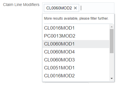
Note- It is not possible for a user to add values that are not part of the list.
In the view mode only the title property with sequence 1 is shown for each of the selected values.
Multi Value
View Mode
Individual attributes adhere to the single value/reference property design. These attributes are displayed horizontally on the same line.
The labels are displayed inline. OHI recommends to show upto a maximum of three properties with two sets, and a maximum of five with single sets defined
For a reference property, if there are any nested properties, then they are not shown.
Edit Mode
The list is displayed on separate lines. An empty row is shown by default in the edit mode. Subsequently, if a value is populated on the last row for at least one of the displayed attributes, an empty line is automatically added to the list and a delete button is placed next to the row that has just been populated. The delete button is never placed on the last (empty) list entry.
_Example: Policy contract as multilist

Note that single value non time valid dynamic record is considered as multi value property. The following exception applies: new empty (additional) row is not available in edit mode .
Multi Value Property and Quick Search Component
It is necessary to specify the exact attribute of the property (nested property) on which the search must be performed. Attribute "display type" is ignored by the quick search component.
Multi Value Property and Advanced Search Component
In advanced search, if multiple properties of a multi value property are included, then each property forms a search criterion and are shown based on their type. Refer single value property/reference property section for details.
Example:
{  "name":"claimPendReasonList",
   "sequence": 5,
    "properties": [
      {  "name":"pendReason"
          "sequence": 1,
          "refType": "codeDescr"
      },
      {  "name":""resolved",
          "sequence": 2,
          "label": "GEN_RESOLVED"
       }
     ]
}
This configuration will result into advanced search with two search criteria displayed as:
Label for pend reason in ClaimPendReason entity |
LOV on pend reason |
Label for Indicator resolve on pend reason |
Yes/No dropdown |
Properties and Validation
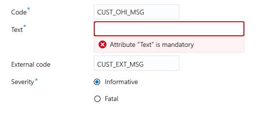
Field level validations are applicable in the edit mode when a property is a form field, for example when used in the Region Component. Field validations (client side) are triggered when a user action is performed e.g. action save. Messages resulting from field validation routines are shown directly on the associated form field. A validation can be placed on the attribute field giving immediate feedback to the user with a focus on the related attribute field. The message disappears when the user takes a action on the field - for example, adds a value to a mandatory field - or if the user executes an action in his current workflow (e.g. cancel, save).
Example:
Field validation is displayed when the user tries to save an object with one or more mandatory field values not being populated. Each of the mandatory attribute fields that do not have a value populated will raise an error.
