Table
The table component displays an object list in a table view and has the following structure:
"table":{
  "actions": [
    "add"
  ],
  row:{
    "actions": [
      "remove",
      "view"
     ],
    "labels": [{
      ...
    }],
    "columns":{
      "flexColumns":true|false,
      "download":true|false,
      "properties": [{
        ...
     }],
    "region":{
    ...
    },
  }
}
The component has the following sub-settings:
| Setting | Description |
|---|---|
actions |
Add The events that follow the Add action are floor-plan specific. The respective floor-plan provides the subsequent possible object state when an action is carried out. See the "Floor Plan Templates" section under References in the Developer Guide for more details. |
row.actions |
Remove or View The events that follow the Remove or View action are floor-plan specific. The respective floor-plan provides the subsequent possible object state when an action is carried out. See the "Floor Plan Templates" section under References in the Developer Guide for more details. |
row.columns |
In the table, each property forms a column. The column header displays the property’s label. See Properties for more details. A multi-value property is not supported as a column property. FlexColumns is set to Setting download to |
row.region |
A Region component displays depend on the template used. If it is an editable table, the region set displays on the right side, and if it is a non-editable table, a collapsible overflow area is displayed. |
row.labels |
The label component is displayed as an extra column in the table. |
This component supports the following features:
-
Column resize
-
Horizontal or vertical scrollbar to support responsiveness
-
Editable rows
-
Possibility to add a new row
UI Specifications
-
Table component:
-
The table supports view and edit modes for the properties.
-
The property representation in the view and edit mode follows the standards described in the "Properties" section under References in the Developer Guide for more details.
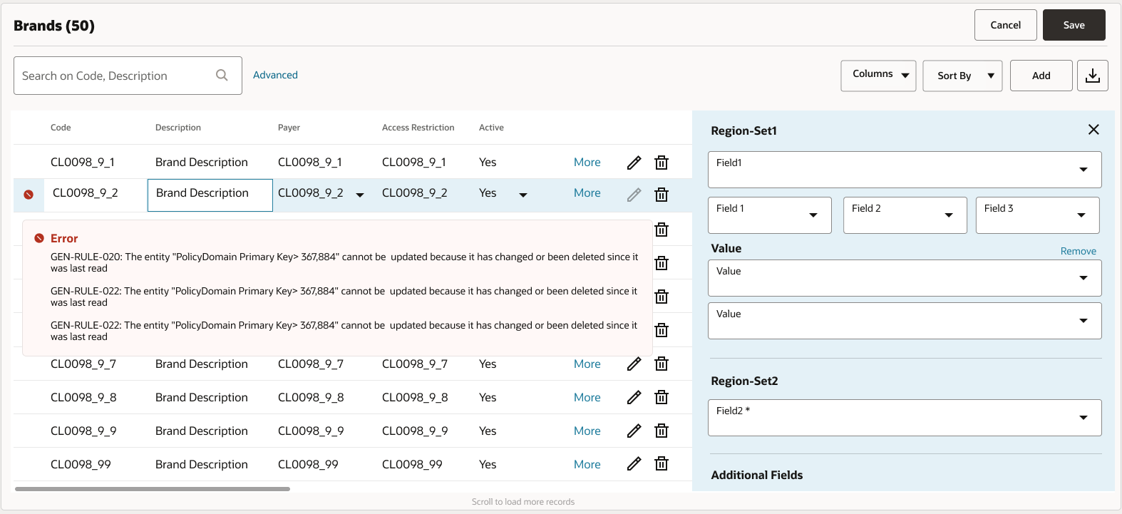
-
Displays the page-level error an error icon in the table’s first column for the rows with an error. Users can view an error description in a pop-up when the mouse hovers over the table-error icon.
-
-
Column:
-
The column headers and the Add button are always displayed.
-
The column headers and their values are left-aligned. Header columns for numbers and amounts and their values are right-aligned.
-
Users can modify the column width in the floor plan by specifying the percent sign (%) for the minColWidth property.
-
Users can restrict the column width in the floor plan by specifying the percent sign (%) for the minColWidth property.
-
-
Row:
-
Users can edit only one row at any given time.
-
Users can click Edit to put the row and the region set fields to edit mode and disable Edit.
-
Users can click outside the table to convert the table to read-only mode, and changes made are persisted.
-
Users can perform the add action to add an empty row to the table, and any row in edit mode converts to the view mode.
-
-
Region component:
-
Users can click More to view the region expand on the right-hand side of the table, and click X to close.
-
Users can click More to view the region sets, which expand on the right-hand side of the table if the region component is configured, and click X to close.
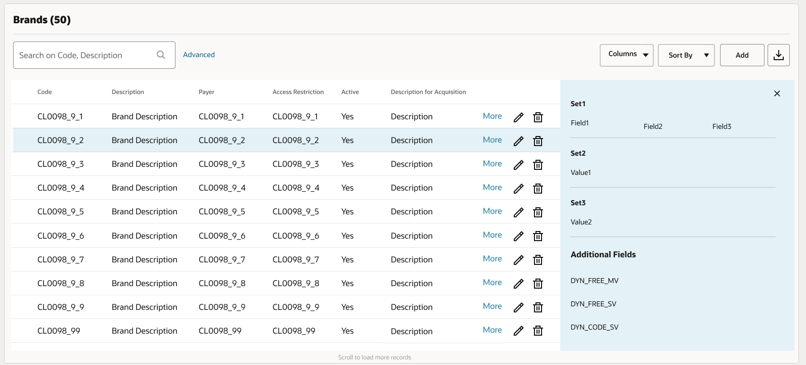
-
The region sets are placed vertically with records. The sequence of the region is first and field order as set1, set2, and set3, followed up by the extensibility field (if auto-extensibility is set to
true). -
Users can click X in the region set to see the view-only mode and to close the region set. See [Figure-2] for detailed information.
-
Users can click More or Edit on another row to display the respective view of the selected row from the current row.
-
-
For widgets:
-
Shows the overflow area with an expandable arrow when the region component is configured.
-
-
Label:
-
If a label component is present, then it appears as a non-editable field.
-
If multiple labels are defined for a row, then each label is displayed as a separate column.
-
If a label is set as any of the existing column properties and any change to that column property value (while in edit mode), also change the value of the label component on tab out.
-
The object record is removed from the table when a user performs the action remove.
-
No Results
If no rows are found, see No Results for more information.