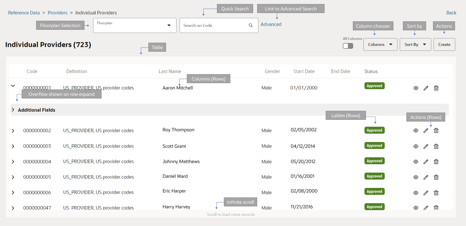
Search Object - Table View
This template describes a search page with a table and filter options.
Use Cases
This search page can be used when
-
The expected size of the resource list is large (1000+ results)
-
Individual objects gets displayed on a separate page
-
Few attributes are required for the search page (10 or less) and the majority of the rows have a value
The result list is composed of operational results without explicit unique keys.
Few examples of pages that currently use this template:
-
Exchange Search (Oracle Insurance Gateway)
-
Event Search (Oracle Insurance Gateway)
-
Activity Type Search (Policies)
-
Individual Provider Search (Policies)

Presentation Configuration
A customer can change certain aspects of a page by changing or updating the floor plans and its properties. This is done by customizing the components within floor plan’s JSON payload.
For more details refer ui-presentation-configuration/presentation-configuration/floor-plan-configuration.adoc page.
JSON Template (Payload Structure)
The following JSON outlines the structure of the page template:
{
  "resource":
  "floorplan_search_tableview":{
    "action":[
      "add"
    ],
    "externalLinks":[],
    "autoFetch":false,
    "preFilter":"",
    "quickSearch":{
      ..
    },
    "advancedSearch":{
    },
    "filters":{
    ..
    },
    "sort":{
    ..
    },
    "table":{
     ...
    },
    "pagination":{
     "pageSize":"",
    }
  }
}
Components
Pages using Search Object - Table View template has the following components:
Entity Name and Results Count
-
Non-configurable, default functionality
-
The entity name plural is displayed above the table. The total count is displayed next to it
-
The count is displayed only when the user has performed a search
-
If no results match the search criteria, the results component displays the message 'no rows were found'.
Floor Plan Selection
-
Non-configurable, default functionality
-
Search Object - Table View template supports multiple floor plans for the same page
-
The user can switch context with a drop-down button located next to the quick search input
Actions
-
Optional component
-
By default no action is available unless specified in the floor plan
-
Only 'Add' available at page level, action link 'Create' is displayed when defined
-
Re-directs user to the create object page (recursive) in create object mode
-
When more than one view and edit object plans are evaluated by the system, then they are all displayed as available options in the drop-down. A user selects one of the options and the create object page is displayed using the selected floor plan
-
If only one plan is evaluated, then the drop-down is not displayed and on selecting the action 'Create', system immediately opens the create object page using the evaluated template
-
For details on floor plan evaluation refer to the chapter "Presentation Configuration" in the Developer Guide.
-
Create as drop-down list - The floor plan description is displayed. The options are ordered based on the floor plan code ascending. Selecting a plan from the list, opens the create object page for the resource using the selected template
-
Example use case: To make a search table page view only, no actions are defined at page and results level
External Links
-
Optional Component
-
Links are placed next to create object action for pages where widgets are not supported.
-
Links are placed in card (tile), on the pages that support widgets.
-
For more details refer ui-presentation-configuration/components/links.adoc component
Pre-filters
-
Optional component
-
The setting 'preFilter' takes in criteria that is executed for all the searches as 'and' condition
-
This limits the result set on which the search is performed
-
The filter conditions can be set using HTTP Query API grammar; for example, setting preFilter to integration.code.eq("PROVIDER_EXTRACT") for exchanges search page, will show exchanges having integration code equal to 'PROVIDER_EXTRACT'
-
Example use case: To limit the results based on the value of a field within the resource in case if multiple search table floor plans are defined
Quick Search
-
Optional component
-
Center aligned
-
Can be customized to search on multiple attributes including flex codes, reference fields
-
For more details refer ui-presentation-configuration/components/quick-search.adoc component
Advanced Search
-
Optional component
-
Displayed as a hyperlink which displays the advanced search dialog
-
Enables search on a combination of attributes
-
For more details refer ui-presentation-configuration/components/advanced-search-component.adoc component
Sort
-
Optional component
-
Displayed next to Actions when defined
-
Can have only the default or multiple sort criteria
-
For more details refer ui-presentation-configuration/components/sort-component.adoc component page
Filter
-
Optional component
-
Filter criteria is defined to give users option to further filter the search results
-
A filter entry is used to restrict the search query, not to compose a new query
-
Example use case: Filter defined on a resource which can have multiple statues like completed, in-progress, started etc.
-
For more details refer ui-presentation-configuration/components/filter-component.adoc component page
Table
-
Required component
-
Used to display the search results in form of a table
If no results match the search criteria, the results component displays the message 'no rows were found'.
Table component consists of the following sub-components:
Rows
-
All table properties are defined under rows and rows are configured with the following components:
Actions:
-
'View', 'Edit' and 'Remove' are displayed for each row when configured
-
Action 'Remove', deletes the object from the list.
-
A dialog seeking user confirmation 'Delete this record?' with 'Ok' and 'Cancel' is displayed when this action is selected. Selecting 'Ok' deletes the record. When deletion of the record is successful, a success confirmation message '{object name singular} deleted ' is displayed as specified in the section "Indicating Success" of the Response Messages chapter in the Developer Guide.
-
If any messages are returned from the server other than success; then they are displayed on the UI
-
Action 'View' opens the 'View and Edit' object page in the view mode and the action 'Edit' opens it in the edit mode.
-
3 Dots menu is shown with additional actions, when more than 3 actions are configured for a row
Labels
-
It is used to display property values in form of a label and can take in exactly one property per label
-
Multiple labels can be added to the results
Region
-
Used if additional properties need to be displayed in the row overflow region
-
Hidden by default, a user is required to click the expand arrow to display the overflow area
-
Set 1 and Set 2: Sets are used to display multiple properties as a set. Each result can have up to 2 sets. It is recommended to use only Set 1 when using the filter component on the page.
For more details refer ui-presentation-configuration/components/table-component.adoccomponent page