Enhance Data in Visualizations with Statistical Analytics
Statistical Analytics enable you to highlight clusters or outliers, add forecasts, and show trend and reference lines in your workbooks.
Before You Start with Statistical Analytics
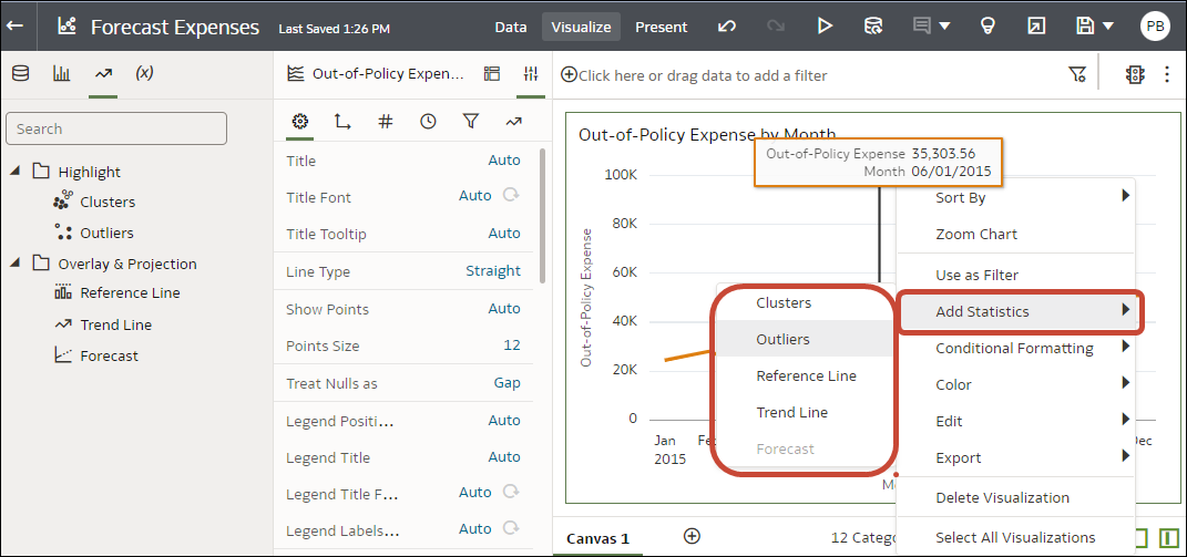
To add statistical analytics to your workbooks such as forecasts, outliers, and trend lines, you can either use ready-to-use analytics on the Analytics pane of the Data Panel, or use functions in expression builder if you need more control over the configuration.
Oracle Analytics enables you to add a range of statistical analytics from the Analytics pane of the Data Panel, which come fully configured so that you don't need to be a statistical expert to achieve results. 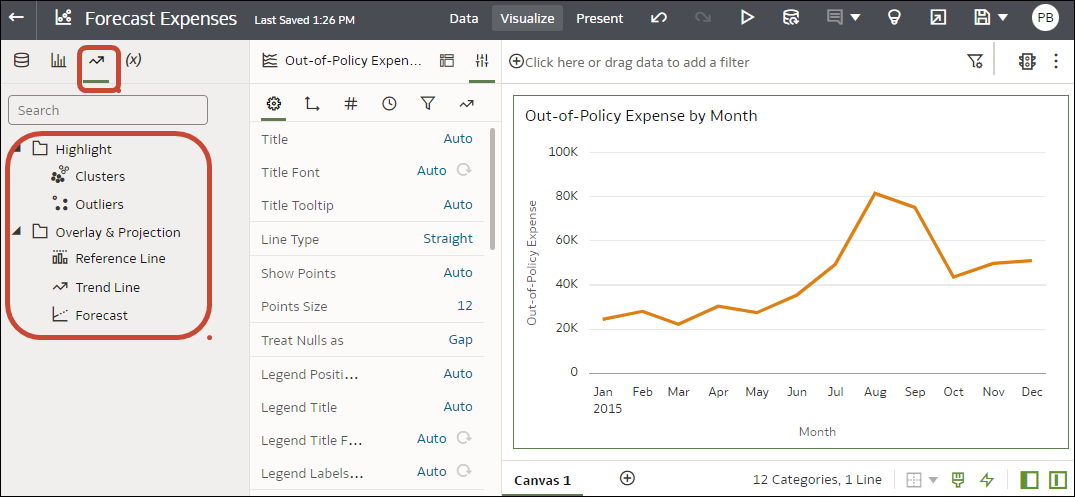
Description of the illustration stat_analytics-png.png
If you need more control over statistical settings, or you want to use the analytic in other visualizations, consider adding a calculation and use the expression builder to define the equivalent function. (From the Data pane on the Data Panel, click Add (+), then Create Calculation to display the expression builder.) For example, you might use the FORECAST() function.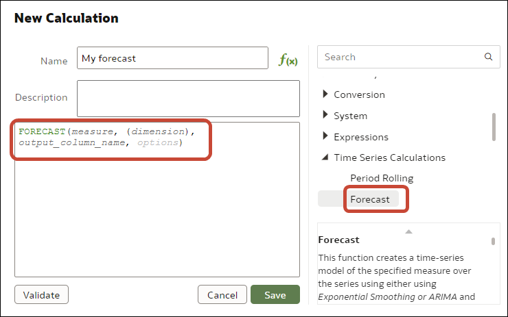
Description of the illustration stat-analytics4-png.png
See Create a Calcuated Data Element.
You can also create a calculation based on a cluster or outlier that is stored in My Calculations, which enables you to resuse the calculation in other canvases in a workbook. See Create a Calculation Based on a Cluster or Outlier.
What Statistical Analytics Can I Add to Visualizations?
Add these statistical analytics to your visualizations to achieve better insights into your data. 
Description of the illustration stat_analytics-png.png
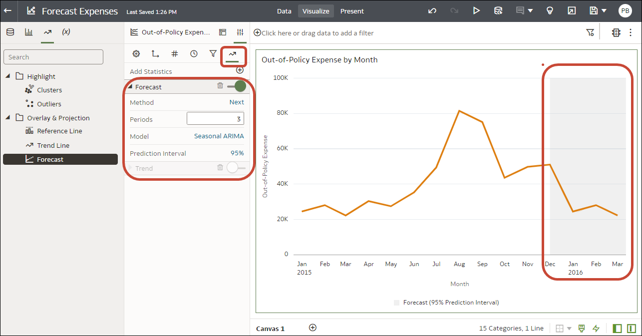
Forecast
The forecast function uses linear regression to predict future values based on existing values along a linear trend.
You can set a number of time periods in the future for which you want to predict the value, based on your existing time series data. See Add Statistical Analytics to Visualizations.
Oracle supports these forecast model types:
- Auto-Regressive Integrated Moving Average (ARIMA) - Use if your past time series data is nonseasonal but provides enough observations (at least 50, but preferably more than 100 observations) to explain and project the future.
- Seasonal ARIMA - Use if your data has a regular pattern of changes that repeat over time periods. For example, seasonality in monthly data might be when high values occur during summer months and low values occur during winter months.
- Exponential Triple Smoothing (ETS) - Use to analyze repetitive time series data that doesn't have a clear pattern. This model type produces an exponential moving average that takes into account the tendency of data to repeat itself in intervals over time.
Alternatively, create a custom calculation using the FORECAST function to have more control over settings, or if you want to use the forecast in other visualizations. See Time Series Functions.
Clusters
The cluster function groups a set of objects in such a way that objects in the same group show more coherence and proximity to each other than to objects in other groups. For example, you can use colors in a scatter chart to show clusters of different groups. See Add Statistical Analytics to Visualizations.
- K-means clustering - Use to partition "n" observations into "k" clusters in which each observation belongs to the cluster with the nearest mean, serving as a prototype of the cluster.
- Hierarchical clustering - Use to create a hierarchy of clusters built using either an agglomerative (bottom-up) approach, or a divisive (top-down) approach.
Alternatively, create a custom calculation using the CLUSTER function to have more control over settings, or if you want to use the cluster in other visualizations. See Analytics Functions.
Outliers
The outliers function displays data records that are located the furthest away from the average expectation of individual values. For example, extreme values that deviate the most from other observations fall into this category. Outliers can indicate variability in measurement, experimental errors, or a novelty. If you add outliers to a chart that already has clusters, then the outliers are depicted as different shapes.
Outliers can use K-means clustering or hierarchical clustering. See Add Statistical Analytics to Visualizations.
Alternatively, create a custom calculation using the OUTLIER function to have more control over settings, or if you want to use the outlier in other visualizations. See Analytics Functions.
Reference Lines
The reference lines function defines horizontal or vertical lines in a chart that correspond to the X-axis or Y-axis values. See Add Reference Lines to Visualizations.
- Line - You can choose to compute the line between average, minimum, or maximum. For example, in the airline industry, if passenger turnout is plotted against time, the reference line can show whether passenger turnout for a particular month is above or below average.
- Band - A band represents upper and lower range of data points. You can choose a custom option or a standard deviation function, and between average, maximum, and minimum. For example, if you're analyzing sales by month and you use a custom reference band from average to maximum, you can identify months where sales are above average, but below the maximum.
Trend Lines
The trend line function indicates the general course of the metric in question. A trend line is a straight line connecting a number of points on a graph. A trend line helps you analyze the specific direction of a group of value sets in a visualization. See Add Statistical Analytics to Visualizations.
- Linear - Use with linear data. Your data is linear if the pattern in its data points resembles a line. A linear trend line shows that your metric is increasing or decreasing at a steady rate.
- Polynomial - Use this curved line when data fluctuates. It's useful, for example, for analyzing gains and losses over a large dataset.
- Exponential - Use this curved line when data values rise or fall at increasingly higher rates. You can't create an exponential trend line if your data contains zero or negative values.
Alternatively, create a custom calculation using the TRENDLINE function to have more control over settings, or if you want to use the trend line in other visualizations. See Analytics Functions.
Add Statistical Analytics to Visualizations
Statistical analytics enable you to highlight clusters or outliers, add forecasts, and show trend and reference lines in your workbooks.
Before you can use analytic functions in visualizations, you must do the following:
-
Install DVML.
On Windows go to Start, browse to and expand your system's Oracle folder, and click Install DVML.
On Mac, go to Applications and click Oracle Analytics Desktop Configure Python.
-
Create a workbook or visualization that you can apply one or more analytic functions to.
Add Reference Lines to Visualizations
Reference lines enable you to identify averages, medians, percentiles, and similar information in a visualization.
- On the Home page, hover over a workbook, click Actions
 , then select
Open.
 - In the Data Panel, click the
Analytics icon
 .
. - Click Add Statistics
 , and select Reference Line.
 - Use Column to select a measure, date, or non-date attribute.
- In the Analytics pane select properties to update.
- Click Save.
