Creating a Look and Feel for Portals
Work with page templates and skins to create the look and feel for a portal and learn to optimize the design for display on mobile devices.
Permissions: This chapter is intended for web developers who want to utilize WebCenter Portal features to create a compelling look and feel to the portals in their organization.
To work with the features that control the look and feel of portals, you must have the application-level Create, Edit and Delete permission on the appropriate assets. Users with the Application Specialist role automatically have these permissions. For more information about application-level permissions, see About Application Roles and Permissions in Administering Oracle WebCenter Portal.
Topics
About Creating a Look and Feel
One of the roles of a web developer is to create a compelling corporate look and feel that can be applied across all portals to provide a consistent, branded appearance for an organization’s web presence.
There are several technologies involved with creating a look and feel:
-
HyperText Markup Language (HTML) is the main language for displaying web pages and other information that can be displayed in a web browser.
-
Cascading Style Sheets (CSS) provide a simple mechanism for ensuring a consistent look and feel or adding style, such as fonts, colors, and spacing, to web documents. CSS allows you to separate content from presentation, improving accessibility, and allowing you to easily render content for different situations (for example, for mobile phones or screen reader devices).
-
JavaScript is a scripting language commonly implemented as part of a web browser in order to create enhanced user interfaces and dynamic web sites.
-
Oracle Application Development Framework (ADF) provides a range of technologies aimed at making Java EE application development faster and simpler for developers while at the same time taking advantage of proven software patterns to ensure that the developed application is scalable, performant, and the like.
-
Expression Language (EL) provides a shorthand way of working with web application data by providing operators for retrieving and manipulating application data residing in a Java EE web container.
WebCenter Portal provides the following features that utilize these technologies to control the look and feel of the application, individual portals, pages, components, and content:
-
Page Templates define the structure and layout of pages. A page template typically includes a header on top of the page; a navigation structure at the top of the page or in a sidebar to link to important targets; a content area; and footer at the bottom of the page.
For more information on page templates, see Working with Page Templates.
-
Navigation provides links to access content in a portal or external resources. For example, a portal might include a series of tabs or menus along the top of each page, a tree structure or list of links on the side of each page, or a trail of breadcrumbs showing the path a user has taken to reach the current location in a portal.
For more information on navigation, see Customizing Portal Navigation and Adding Navigation to a Page Template.
-
Skins define colors, fonts, and other aspects to give individual portals or the entire WebCenter Portal application a distinct personality or to provide specific branding.
For more information on skins, see Working with Skins.
-
Page Styles describe the layout of a newly created page and may also dictate the type of content the page supports. For example, the Wiki page style provides an instant wiki; a Blank page style has few restrictions on the types of content users can add to the pages that are based on it.
For more information on page styles, see Working with Page Styles.
-
Content Presenter Display Templates define the style and layout for the selected content.
For more information on Content Presenter display templates, see Working with Content Presenter Display Templates.
Tips on Defining Skins
When skinning WebCenter Portal, you can look at it from coarse-grain and fine-grain standpoint. At the coarse-grain level many large elements on the page, such as the background and the center of the page, can use very basic styling techniques to impart a look and feel to particular corporate brand with very little effort. At the fine-grain level you can apply the styling to specific components and controls within the page. The most efficient way to develop your skin is to start by defining the coarse-grain elements and then use fine-grain styling to tune your overall look and feel to be inline with your corporate brand.
In many cases a hybrid model of styling works very well. Taking the coarse-grained elements (page background, main portion of the body, and so on) and using traditional CSS approaches with those, but then getting specific using the ADF skinning, will work together to generate the overall appearance for WebCenter Portal.
Expression Language (EL) allows you to access the various objects for navigation within your template design. Looping in EL is simple and coding is done inline with the page template. You can mix regular HTML directly into the looping markup.
Static Assets
When using coarse-grained techniques in addition to ADF styling, it is often helpful to hold various styling assets outside of WebCenter Portal. To do this you can use Content Server to manage all of the unstructured assets for WebCenter Portal. They can include things like CSS and images that you want manage within your environment and provides revision control and workflow. This is a best practice if you want to allow design teams to access and work with WebCenter Portal without involving the development team for each and every change
About Optimizing Portals for Mobile Devices
Responsive Web Design allows web pages to flexibly adapt to different form factors. It has caught fire in the web world as one approach to delivering web content to desktop browsers, tablets, and smart phones.
These techniques enable you to rapidly go from HTML/CSS markup to a portal with similar look and feel. They also improve the experience of using a portal when viewed from mobile devices.
To make WebCenter Portal accessible via smart phones and tablets you can take several approaches:
-
The simplest solution is to leverage your existing WebCenter Portal application with a browser-based option that requires no changes other than ensuring that WebCenter Portal renders within the native browsers of devices. However, this solution might not provide the best user experience.
-
You can leverage your existing WebCenter Portal application by generating HTML based on device profiles, and configuring device-specific templates and pages. This solution might provide a slightly better user experience.
-
For the best user experience, you can create native applications developed using ADF Mobile or native iOS or Android SDK. Although this provides the best user experience, it also requires more up-front development time and more support.
You can use adaptive programming techniques, designing applications to adjust to the available viewport.
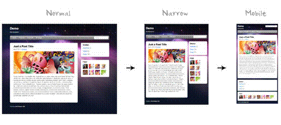
When you design a portal, design for a tablet, then scale up the design for the desktop. You should create a separate design for smart phones. Achieve these designs through page templates.
The two most important things to do when designing for mobile devices are:
-
Set the
viewportmeta tag, which causes mobile browsers to set a good initial zoom.Set the
viewportparameter in the parameters section of your page template's page definition as follows:<parameter id="viewport" value="width=device-width, initial-scale=1.0"/>For information about how to edit the source code of a page template, see Editing the Source Code of an Asset.
The value of the
viewportparameter is used as the value for thecontentattribute of theviewportmeta tag, so if you set it the recommended value of"width=device-width, initial-scale=1.0", then the following meta tag is added to the page:<meta name="viewport" content="width-device, initial-scale=1.0"/> -
Set
max-widthon images, which causes images to fit nicely on mobile browsers.Add the following code to your CSS:
img, object {
     max-width: 100%;
}
ADF skins can work with portlets to achieve a common look and feel, but they insert a lot of styles into your HTML, so make sure to create a Reset skin and use the -tr-inhibit property.
Your Reset skin should look like the following:
body {
     color: inherit;
     font: inherit;
}
af|document {
     -tr-inhibit: all;
}
af|commandLink {
     -tr-inhibit: all;
}
af|goLink {
     -tr-inhibit: all;
}
af|inputText::content {
     font: inherit;
}
Set the Reset skin to inherit settings from V1.2 ADF skins as shown in Figure 56-1.
Figure: Reset Skin Inheritance Setting
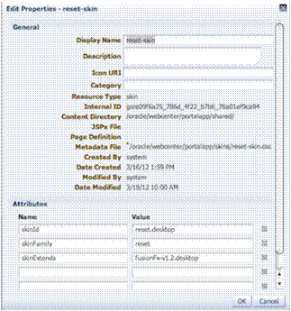
Description of the illustration lnf_resetskin.gif
CSS3 media queries allow you to write CSS rules specifically for certain situations, such as adapting to small screens or adjusting for orientation. Here is an example of a CSS3 media query:
@media only screen and (max-width: 480px) {
     #content {
          margin: 0;
     }

     #navbarright {
          display: none;
     }
}
ADF Rich Faces provides the following mobile support:
-
Supports iPad
-
DVT components render via HTML
-
Touch gesture support
-
Page size reduced by up to 20%
Although adaptive techniques allow web and tablet design to work, you need to refine your design for phones. Focus on specific smart phone use cases. Build a separate site and separate templates, then build in code to detect smart phones and redirect them to the appropriate design.
Here is an example of a simple JavaScript redirect that can be added to WebCenter Portal’s index.md:
<script>
     car Browser = navigator.userAgent;

     if (Browser.indexOf('iPad') > 0)
     {
          location.replace('http://<host>/CustomerAccount/faces/pages_home');
     }
     else if (Browser.indexOf('iPhone') > 0)
     {
          location.replace('http://<host>/CustomerAccount/faces/PhonePage.jspx');
     }
     else {
          location.replace('http://<host>/CustomerAccount/faces/pages_home');
     }
</script>
Here is an example of a manual redirect within the application that displays a message providing a link to the mobile version of WebCenter Portal’s welcome page:
{requestContext.agent.platformName=='windows' ? '' :
'Click <A HREF="http://<host>/myApp/faces/PhoneWelcome.jspx">here</A> to view the mobile site.' }
Here is an example of a redirect within the application that automatically redirects a mobile device to the mobile version of WebCenter Portal:
{requestContext.agent.platformName=='windows' ? '' :
'<META HTTP-EQUIV="Refresh" CONTENT="0; URL=http://<host>/myApp/faces/PhoneWelcome.jspx">' }
See Also: For information about how to create alternative pages designed for display on mobile devices, see Creating a Page Variant for a Device Group.
About Design Tools
Using visualization and inspection features in Google Chrome and Firefox, you are able to work very quickly through the CSS needed to style your work. In addition, CSS3 is very powerful for providing visualizations that previously required images to achieve. For example, you can use a CSS3 generator to expedite designs such as drop shadows and gradients. Finally, using a tool like JQuery you can manipulate the Document Object Model to achieve any change using client-side technology.
Figure 56-2 shows an example of inspection within Google Chrome. As you hover over the Login link in the upper right-hand corner, you can get a good sense of which styles are being applied to this particular element of the page. This makes it easy to go back and adjust your skin for a particular component. This is an example of fine-grained skinning.
Figure: Google Chrome Inspection
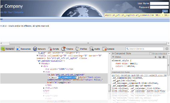
Description of the illustration lookfeel_chromeinspection.png