For every attribute collected on a screen, you have several choices when defining your screen as to how the user can input their answer:
Default (creates radio buttons for boolean attributes and a text box for all other attribute types)
Checkbox (only selectable for booleans)
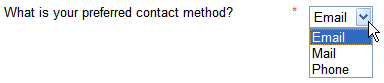
Drop Down List
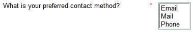
List
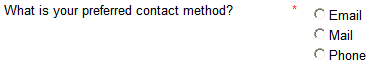
Radio Buttons (not selectable for booleans, use the Default option instead)
To specify the input type:
In your screens file, double click to open the screen containing the question.
Click on the question in the left hand pane to open it for editing in the right hand pane.
Select the Input type from the drop-down list.
Click OK.
NOTE: For booleans collected with a checkbox, checked means true and unchecked means false. As a consequence, any boolean that is collected via a checkbox will always get a value as soon as the screen is submitted. It also means that the concept of mandatory is meaningless, so all boolean checkbox inputs will always be rendered without the mandatory flag.
Specify individual date and time edits
For inputs for date, time and date/time variables, you can choose whether to display a single text entry edit, or individual edits for the components of the attribute (date/time/year/month/day/hour/minute/second components, depending on the attribute).
In your screens file, double click to open the screen containing the date, time or date/time question.
Click on the question in the left hand pane to open it for editing in the right hand pane.
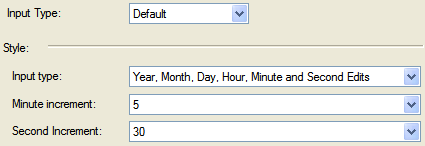
The Input type must be set to Default to use individual edits.
Under the Style section, select the appropriate Input Type option. All controls have the Single Edit option, which produces a single text entry box for the user to type freely into. Additional options are:
Date variables have an option for individual Year, Month and Day Edits.
Time variables have the option of either individual Hour, Minute and Second Edits or individual Hour and Minute Edits.
Date/time variables have options for individual Date and Time Edits, or individual Year, Month, Day, Hour, Minute and Second Edits or individual Year, Month, Day, Hour and Minute Edits.
Additionally, you may specify the minimum Minute increment and Second increment for time and date/time variables, in common increments. (Note that Second increment is disabled if the input type chosen does not include seconds.)
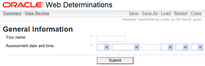
Most of these individual edits are displayed as drop down lists, allowing users to select from valid options. Year/date/time edits are displayed as text entry fields.
Note that if the Single Edit option is chosen for a date/time or time variable, the user can omit seconds and these will be set to 00 by default.
Specify the values for a restrictive input control
When collecting data, particularly variable data, you may want to limit the set of possible answers a user may provide using a restrictive input control (ie list boxes, drop down lists or radio buttons). For example,
TIP: Where a variable can only take on one of a fixed list of values, use a drop down list to collect the value from the user. Use this variable in interpretive rules to infer a number of separate boolean attributes, one for each possible value. Then use these boolean attributes in source rules. Do not use the variable value directly in source rules.
Once you have defined the restrictive input control (see Specify the type of input above), you need to specify the range of possible values for it. To do this:
In your screens file, double click to open the screen containing the question.
Click on the question in the left hand pane to open it for editing in the right hand pane.
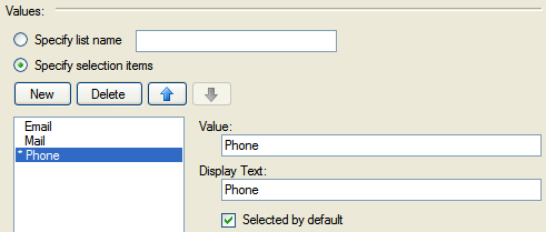
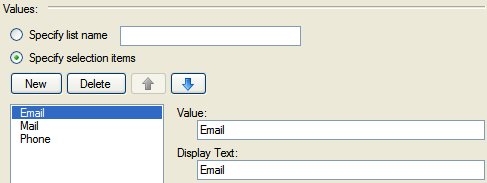
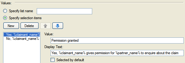
In the Values section, select the Specify selection items option.
Click the New button.
Change the values in the Value and Display Text text boxes from "new" to the values you want in the control. Ensure the values you enter are in the correct format.
NOTE: Value is the actual value passed to the Oracle Determinations Engine, whilst Display Text is what the user sees on the screen. Sometimes it is appropriate for these two values to be different. Display Text is a text value and will always be shown in the form you specify here; it will not be formatted according to the rulebase regional settings.
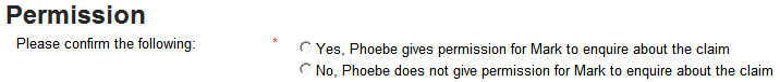
TIP: You can use attribute substitution in the Display Text. For example:
This would appear in Oracle Web Determinations as:
For attributes of input type "List Box", "Drop Down
List" or "Radio Buttons", it is possible to source attribute values from an external
XML file.
To source list contents from an external file, do the following:
Create a new folder \Development\include\lists\<session locale>.
Create an XML file in this directory. Note: The name of the XML file should be related to the list it will be used for (for example, JobIndustry.xml).
In the XML file, add XML nodes for the various list options. For example, to create list options for a Job Industry list input, with Finance and IT as the list options:
<?xml version="1.0" encoding="utf-8"?>
<list>
<option text="Finance" value="Finance" />
<option text="IT" value="IT" />
</list>
Save the XML file using UTF-8 encoding.
In Oracle Policy Modeling, open your screens file and double click to open the screen containing the question.
Click on the question in the left hand pane to open it for editing in the right hand pane.
In the Values section, select the Specify list name option.
In the text field, enter the name of the XML file (eg JobIndustry).
Click OK.
If there are any problems with this file at runtime (for example, the file doesn't exist or uses the wrong XML structure), the static list options are used (if they exist for the list control).
NOTE: This xml list implementation does not currently support visibility or default values, but it does support the use of attribute substitution in option text.
Specify a dynamic default for an input
It is possible for controls to have a dynamic default value, that is, a default value that is derived from the value of another attribute. During a Web Determinations interview, the default value for the control will be set to the value of the attribute that it is based on if it is known, or it will default to the user specified value if the dynamic default value is unknown.
To specify a dynamic default value for an attribute control:
In your screens file, double click to open the screen containing the question that you want to add the dynamic default to.
Click on the question in the left hand pane to open it for editing in the right hand pane.
In the Dynamic Default Value section, click the browse button next to the Attribute field.
In the Attribute Selector, select the attribute to base the default value on, then click OK.
Click OK.
NOTE: A dynamic default attribute may be in the global entity, in the same entity as the control it is attached to, or if the control is for an entity collect, it may be in the screen entity.
Specify a default value for an input
Specifying default values for inputs speeds data collection and assessment processing. The default value is the value that will be selected/shown when the input control is displayed.
To specify a default value for an input:
In your screens file, double click to open the screen containing the question.
Click on the question in the left hand pane to open it for editing in the right hand pane.
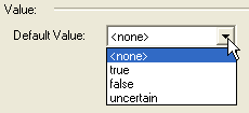
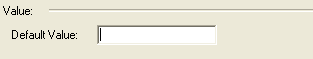
If the attribute has an input type of Default, then in the Value section select or specify a default value for the input.
If the attribute has an input type of List Box, Drop Down List or Radio Buttons, then in the Value section select the value in the list that you want as the default, and then click the Selected by default checkbox.
Make an input mandatory
The rulebase will not necessarily need answers other than uncertain to any or all the questions on a screen. When designing screens you should therefore consider which answers should be mandatory and which ones should allow uncertainty. For more information, see Decide whether to allow uncertainty in user answers.
To specify that an input control can allow uncertainty (ie allow a user to enter an uncertain value for the input control):
In your screens file, double click to open the screen containing the question.
Click on the question in the left hand pane to open it for editing in the right hand pane.
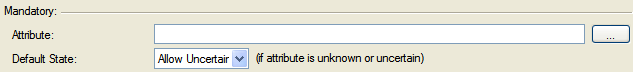
In the Mandatory section, select the Allow Uncertain option from the drop-down list for Default State.
Click OK.
This will mean that the input will always allow an uncertain option.
To specify that an input control can only allow uncertainty in some situations, then you need to create an attribute (and associated rules) to control in which circumstances the question will be mandatory. For example,
the pregnancy question should be mandatory if
the pregnancy question should be displayed
the pregnancy question should not be displayed if
there is not a female in the household who is aged 10 to 60 years (inclusive)
To add this attribute to the input control:
In the Mandatory section, click the browse button next to the Attribute field.
In the Attribute Selector, select the attribute to base the value on, then click OK. TIP: The mandatory control attribute is expected to be boolean – a value of true means mandatory, a value of false means not mandatory (ie optional) so a wording for the control attribute such as "x should be mandatory" is recommended. NOTE: A mandatory attribute may be in the global entity, in the same entity as the control it is attached to, or if the control is for an entity collect, it may be in the screen entity. The value of the mandatory attribute can not be temporal.
Select the Default State for the input control (ie Mandatory or Allow Uncertain). This is the state that the attribute will appear in if the mandatory control attribute is unknown or uncertain.
Click OK.
The rules relating to the use of Allow Uncertain are as follows:
For inputs where Allow Uncertain is not selected (that is, mandatory inputs), a blank string will be treated as not having supplied a value for this input and will therefore trigger an error.
For inputs where Allow Uncertain is selected, a blank string:
Will be treated as the value Uncertain for all inputs except text inputs.
In the case of text inputs, a blank string will be treated as blank string and the text 'uncertain' will be treated as setting the input to the string value Uncertain.
For boolean checkbox inputs, the concept of mandatory is meaningless, so these inputs will always be rendered without the mandatory flag.