Using JavaFX Charts
1 Introduction to JavaFX Charts
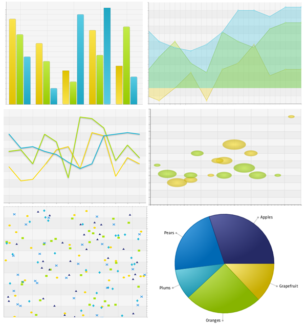
This chapter provides an overview of the JavaFX charts available in the javafx.scene.chart package. The types of charts in Figure 1-1 are currently supported: bar, area, line, bubble, scatter, and pie
With the JavaFX SDK you can build such charts in your application by adding just a few lines of code.
Chart Data
When you define the data model for a particular chart, you must distinguish between two-axis charts and charts that do not use axes to display data.
The XYChart class, a super class for all two-axis charts, provides basic capabilities for building area, line, bar, scatter, and bubble charts. Use the XYChart.Data class to specify the data model for these types of charts. The xValue property defines the value of a chart element to be plotted on the X axis, and the yValue property defines the value for the Y axis. You can also set the extra value for each chart element. This value can be plotted in any way the chart needs, or it can be used to store additional information about the chart element. For example, it can be used to define a radius for bubble charts.
Unlike a two-axis chart, the pie chart does not require defining values for x and y axes. You use the PieChart.Data class to specify values for each slice in the pie.
Series of Data
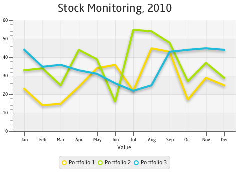
For two-axis charts, you can define several series of data by using the XYChart.Series class. For example, the line chart shown in Figure 1-2 has three series of data to demonstrate the changes dynamic in three different stock portfolios.
Figure 1-2 Line Chart with Three Series of Data

Description of "Figure 1-2 Line Chart with Three Series of Data"
Use the XYChart.Series class to define as many sets of data as you need to represent on your graph. You can also assign a particular name to each series to display in the chart legend.
Chart Settings
For each chart, you can specify the title and its position relative to the graph. The title can be located on the top, right, left, or bottom of the graph. Similarly, you can specify the position of the chart legend.
For a two-axis graph, you can manage the appearance of the chart plot, the chart area where the graphical symbols corresponding to data values are rendered. You can set alternative columns and rows as well as horizontal and vertical grid lines and zero lines.
Axis Settings
You can alter the default appearance of each chart by defining the following settings:
-
The axis label
-
The axis position relative to the chart plot
-
The upper and lower boundaries of the axis range
-
The minimum and maximum tick marks, tick units, the gap between two tick marks, and tick labels
You can also specify that any changes to the axis and its range will be animated, or you can enable the axis to automatically determine its range from the data.
Processing Events for Chart Elements
All chart classes in the JavaFX SDK API extend the Node class and inherit all methods and properties of that class, which let you apply visual effects or handle mouse and key events. If you need to handle events for a particular chart element that is not a Node object, for example, for a slice of a pie chart, then use the node property and the setNode and getNode methods to associate a particular Node object with an element of the chart. You can process events for this chart element in the way you handle events for any other node: user interface control or shape. Example 1-1 demonstrates a code pattern to process events for a two-axis chart.
Animated Charts
With the JavaFX SDK, you can make your chart change dynamically as the data changes. Use the animated property and the setAnimated method of the Chart class to toggle this functionality for the chart. You can use the animated property and the setAnimated method of the Axis class to animate any changes to either axis and its range.
Styling Charts
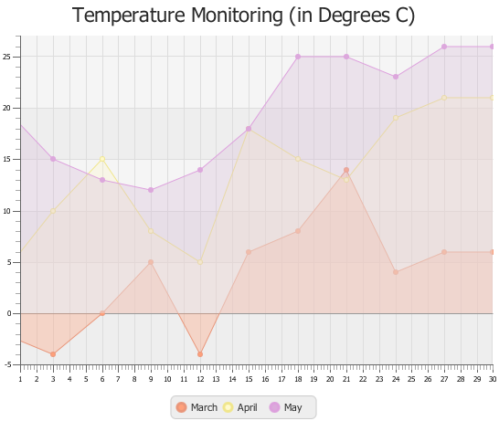
The colors of the chart elements are defined by the implementation of each particular chart class. However, you can alter these colors as well as chart symbols by applying CSS styles. Figure 1-3 shows an area chart with the modified colors of its areas, lines, and symbols.
The CSS file with the corresponding styles are shown in Example 1-2.
Example 1-2 Area Chart Styles
.default-color0.chart-area-symbol { -fx-background-color: #e9967a, #ffa07a; }
.default-color1.chart-area-symbol { -fx-background-color: #f0e68c, #fffacd; }
.default-color2.chart-area-symbol { -fx-background-color: #dda0dd, #d8bfd855; }

.default-color0.chart-series-area-line { -fx-stroke: #e9967a; }
.default-color1.chart-series-area-line { -fx-stroke: #f0e68c; }
.default-color2.chart-series-area-line { -fx-stroke: #dda0dd; }

.default-color0.chart-series-area-fill { -fx-fill: #ffa07a55; }
.default-color1.chart-series-area-fill { -fx-fill: #fffacd55; }
.default-color2.chart-series-area-fill { -fx-fill: #d8bfd855; }
Find the complete list of the JavaFX CSS properties in JavaFX CSS Reference Guide.
Custom Chart
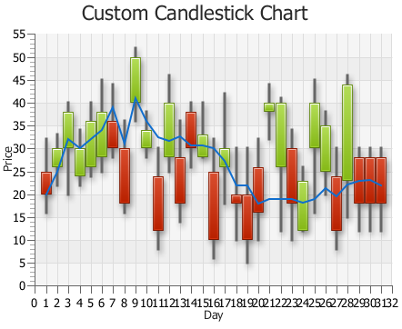
You can invent your own type of chart by extending the Chart class or the XYChart class. Figure 1-4 shows a custom implementation of the candlestick chart.
To create a custom chart, you must override the methods of the Chart or XYChart classes that are necessary to enable specific chart capabilities. You also must create a new Node object to represent a single data item.
See the Charts section of the Ensemble application available on the product site to evaluate the implementation details.
 Alla is a technical writer for Oracle. She lives in St. Petersburg, Russia, and develops tutorials and technical articles for Java and JavaFX technologies. Prior to her assignment at Oracle, she worked as a technical writer in different IT companies.


