14 Working with Resource Catalog Components on a Page
This chapter describes how to add a component from the resource catalog to a page, how to customize and set properties on components, and how to delete a component.
For conceptual information about the different types of pages in WebCenter Portal, see Section 1.3.7, "What Are Pages?"
This chapter includes the following topics:
Permissions:
To perform the tasks in this chapter, you need the portal-level permissionBasic Services: Edit Page Access, Structure, and Content (standard permissions) or the Pages: Edit Pages (advanced permissions). A portal moderator has this permission by default.
For more information about permissions, see Section 29.1, "About Roles and Permissions for a Portal."
14.1 Accessing the Resource Catalog
Resource catalogs are portal assets that expose components and connections that you can add to a portal. You can use a resource catalog to populate pages, page templates, and task flows. The items listed in a resource catalog are collectively referred to as resources. For more information, see Chapter 23, "Working with Resource Catalogs."
The resource catalog available to you as you edit a page, page template, or task flow is established by the portal administration settings, and may be a built-in resource catalog or a custom resource catalog. For more information, see Section 7.3.5, "Changing the Resource Catalogs for Pages and the Page Template for a Portal."
When you edit a page, the resource catalog is available either inline (in Design view and Select view), by clicking the Add Content button when you hide the inline resource catalog (in Design view), or by clicking the Add content into the selected component icon in Structure view. For more information, see Section 14.2, "Adding a Component to a Page."
Note:
If your portal is based on a portal (space) template from a release prior to WebCenter Portal release 11.1.1.8.0 and you have not upgraded it to release 11.1.1.8.0 or later (for example, if you simply imported a space from a pre-11.1.1.8.0 release), you will see a view similar to Figure 6-7. Note that there is no support for hierarchical pages (subpages), page variants, or device preview, and the portal administration does not include a Device Settings page. Refer to the WebCenter Portal Documentation on OTN for working with a page in a space for the pre-11.1.1.8.0 release athttp://www.oracle.com/technetwork/middleware/webcenter/portal/documentation/index.html.
If your portal is based on a portal template from WebCenter Portal release 1.1.1.8.0 or later, either an out-of-the-box template (see Table 3-1, "Out-of-the-Box Portal Templates and Categories") or a custom template, continue with the steps in this section.
14.2 Adding a Component to a Page
The method for adding a component to a page is the same for every resource in the resource catalog. You can add a component to a page in any of the page editor views:
-
Section 14.2.1, "Adding a Component to a Page in Design View"
-
Section 14.2.2, "Adding a Component to a Page in Select View"
-
Section 14.2.3, "Adding a Component to a Page in Structure View"
Notes:
-
When you add a component to a page, you must wait for the application status indicator to finish processing before taking additional action.
-
The content of the resource catalog varies according to the services that are integrated with the portal, the location from which the catalog is opened, and the resources provided by your administrator. For example, the components that appear in the catalog when you open it from the Home portal differ from those that appear when you open it from a portal. For more information, see Section 23.1, "About Resource Catalogs."
-
For a full list of all components available in WebCenter Portal, you can refer to the Resource Registry (see Section 23.2, "About the Resource Registry"). If the component you want is not present in the resource catalog that has been made available to the page, you may need to add it. For more information, see Section 23.5.1, "Adding a Resource to a Resource Catalog" and Section 7.3.5, "Changing the Resource Catalogs for Pages and the Page Template for a Portal."
14.2.1 Adding a Component to a Page in Design View
To add a component to a page in Design view (see Section 12.4.1.1, "About Design View in Composer"):
-
Open the page in edit mode (see Section 12.4.3, "Opening a Page in the Page Editor (Composer)").
Note:
By default, the view switcher is set to and Composer displays the page in Design view showing the inline resource catalog (Figure 14-1).
Figure 14-1 Inline Resource Catalog in Design View
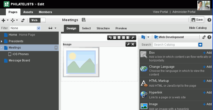
Description of ''Figure 14-1 Inline Resource Catalog in Design View''
-
(Optional) To hide the inline resource catalog, and instead show each area of the page with an Add Content button to help you identify where you can add components, click Hide Catalog (Figure 14-2). When you click an Add Content button, the standalone resource catalog opens. The standalone resource catalog does not support drag-and-drop of components to the page.
Click Show Catalog to expose the inline resource catalog again.
Figure 14-2 Add Content Button in Design View
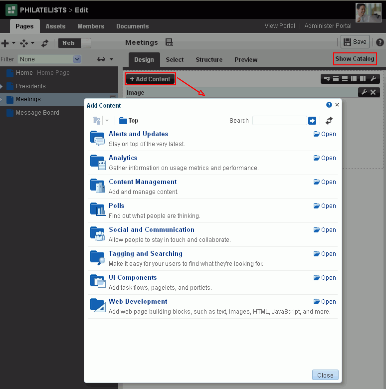
Description of ''Figure 14-2 Add Content Button in Design View''
-
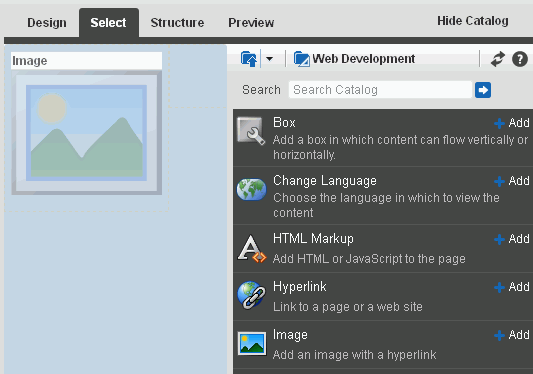
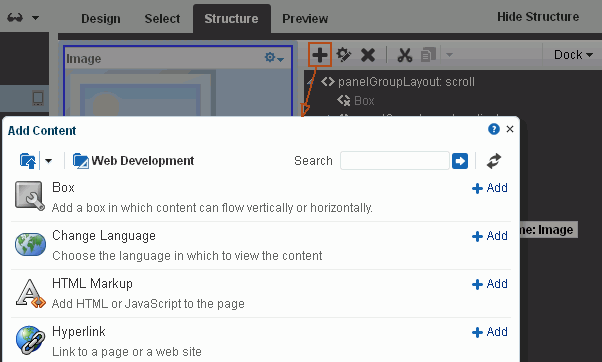
In the resource catalog, navigate to the component you want to add to the page by clicking Open next to folders to drill down to related components, or search for it. As an example, Figure 14-3 shows the components available in the Web Development folder in the inline resource catalog.
Note:
For a description of the components available in the default resource catalogs, see Section 23.1, "About Resource Catalogs." The resource catalog available to the current page may be customized to include fewer or more components than the default resource catalogs.If the component that you want to add to the page is not included in the resource catalog used by the page, you can create a new version of the resource catalog that includes the components you need, and assign that resource catalog to the page. See Chapter 23, "Working with Resource Catalogs," specifically Section 23.5.1, "Adding a Resource to a Resource Catalog."
Figure 14-3 Web Development Components in Resource Catalog
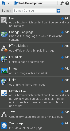
Description of ''Figure 14-3 Web Development Components in Resource Catalog''
-
Add new components to the page in the following ways:
-
Click Add next to a component in the resource catalog to add the component to the top of the page by default.
Note:
If an existing component has previously been selected on the page in Select view, then the new component will be added after the selected component. -
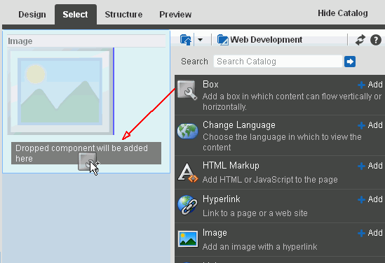
(Inline resource catalog only) Drag the icon of a component from the inline resource catalog to a target location on the page (Figure 14-4).
Figure 14-4 Adding a Component to a Page in Design View Using the Inline Resource Catalog
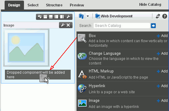
Description of ''Figure 14-4 Adding a Component to a Page in Design View Using the Inline Resource Catalog''
-
-
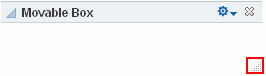
To move components on the page, click the Actions icon in the component header to move the component up or down, or click the component header and drag it to a new position.
-
Click Save to save your changes.
14.2.2 Adding a Component to a Page in Select View
To add a component to a page in Select view (see Section 12.4.1.2, "About Select View in Composer"):
-
Open the page in edit mode (see Section 12.4.3, "Opening a Page in the Page Editor (Composer)").
-
Click the view switcher to
and click the Select tab to display the page in Select view showing the inline resource catalog (Figure 14-5). -
(Optional) To hide the inline resource catalog, click Hide Catalog. Unlike Design view, Select view does not display Add Content buttons when you hide the inline resource catalog.
Tip:
To target the location of new components in Select view, as Add Content buttons do in Design view, you can select an existing layout container (such as a Box or Movable Box component) in Select view, then click Add next to a component in the resource catalog to add the component inside the selected layout container.Click Show Catalog (Figure 14-6) to expose the inline resource catalog again.
Figure 14-6 Hidden Inline Resource Catalog in Select View
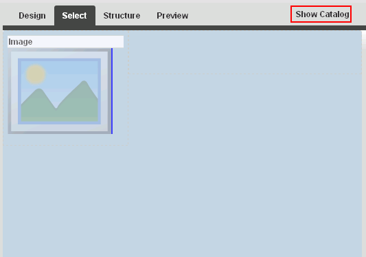
Description of ''Figure 14-6 Hidden Inline Resource Catalog in Select View''
-
In the resource catalog, navigate to the component you want to add by clicking Open next to folders to drill down to related components, or search for it.
Note:
For a description of the components available in the default resource catalogs, see Section 23.1, "About Resource Catalogs." The resource catalog available to the current page may be customized to include fewer or more components than the default resource catalogs.If the component that you want to add to the page is not included in the resource catalog used by the page, you can create a new version of the resource catalog that includes the components you need, and assign that resource catalog to the page. See Chapter 23, "Working with Resource Catalogs," specifically Section 23.5.1, "Adding a Resource to a Resource Catalog."
-
Add new components to the page in the following ways:
-
Click Add next to a component in the resource catalog to add the component to the top of the page by default.
-
Select an existing layout container (such as a Box or Movable Box component) on the page, then click Add next to a component in the resource catalog to add the component inside the selected layout container.
-
Select any other component that is not a layout container, then click Add next to a component in the resource catalog to add the component below the selected component.
-
Drag the icon of a component from the inline resource catalog to a target location on the page (Figure 14-7).
Figure 14-7 Adding a Component to a Page in Select View
Description of ''Figure 14-7 Adding a Component to a Page in Select View''
-
-
Click Save to save your changes.
14.2.3 Adding a Component to a Page in Structure View
To add a component to a page in Structure view (see Section 12.4.1.3, "About Structure View in Composer"):
-
Open the page in edit mode (see Section 12.4.3, "Opening a Page in the Page Editor (Composer)").
-
Click the view switcher to
and click the Structure tab to display the page in Structure view (Figure 14-8).Figure 14-8 Structure View of Page Editor
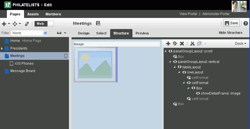
Description of ''Figure 14-8 Structure View of Page Editor''
-
In the hierarchical list of page components, select the component in which to place content.
Tip:
You can also select a component by clicking it in the WYSIWYG section of the page. A selected component is outlined in blue. -
Click the Add content into the selected component icon to open the resource catalog (Figure 14-9).
Figure 14-9 Displaying Resource Catalog in Structure View of Page Editor
Description of ''Figure 14-9 Displaying Resource Catalog in Structure View of Page Editor''
-
In the resource catalog, navigate to the component you want to add by clicking Open next to folders to drill down to related components, or search for it, then click the Add link next to it. The resource catalog dialog does not support drag-and-drop.
-
Click Save to save your changes.
14.3 Modifying Component Properties
The components that you can add to a page from the resource catalog have configurable properties that control the appearance and behavior of the component. The properties available differ from component to component.
This section describes how to customize and set properties on page components:
14.3.1 About Component Properties
You can use component properties to adjust the appearance and behavior of a component instance and to wire components to each other and to page parameters and page definition variables.
The Component Properties dialog for a component is divided into multiple tabs:
-
Parameters—Settings, unique to the component type, that can control such things as the source of the component's content. See Section 14.3.3, "Working with Component Parameters."
-
Display Options—Settings for determining content orientation, hiding and showing a header, selecting a display method for an actions menu, and the like. See Section 14.3.4, "Working with Component Display Options."
-
Child Components—A list of all the components contained in the parent component. See Section 14.3.5, "Working with Child Components."
-
Style—Font, color, and dimension settings on the component that override such values on the parent component, the page, and the application. Style values affect component content and the elements that surround the content, but may or may not be exposed depending on whether or not the component elements (such as the skin) support modifications to these settings. See Section 14.3.6, "Working with Style and Content Style Properties."
-
Content Style—Font, color, and dimension settings on component content that override such values specified for Style. These settings may or may not be exposed depending on whether or not the component elements (such as the skin) support modifications to these settings. See Section 14.3.6, "Working with Style and Content Style Properties."
-
Events—Contextual events and event handlers for all the components on the current page that can be consumed by the currently selected component. Events are defined occurrences within the current context, and event handlers are the engines that drive the results of that occurrence. See Section 14.3.7, "Working with Component Contextual Events."
14.3.2 Setting Properties on a Component
This section outlines the general steps for setting properties on any page component.
See Also:
For information about properties associated with a particular component, see the section that covers that component. For example, see Section 15.3.2, "Setting Box Component Properties" for information about properties associated with the Box component.You can access the Component Properties dialog for a component from any view of the page editor:
-
Section 14.3.2.1, "Setting Component Properties in Design View"
-
Section 14.3.2.2, "Setting Component Properties in Select View"
-
Section 14.3.2.3, "Setting Component Properties in Structure View"
Notes:
-
When you enter most types of property values in the Component Properties dialog and then click Apply, the dialog remains open. With values other than expected value types, the dialog closes, and the page is refreshed to reflect the new value. For example, if a component takes a
java.util.ArrayListofjava.awt.Colorclasses, then the Component Properties dialog closes after you add the value, and the page refreshes with the new properties. -
In addition to entering literal text (
value), you can also enter an Expression Language (EL) expressions (#{value}). If you need EL assistance, an application developer can provide an EL expression; see the "Expression Language Expressions" appendix in Developing Portals with Oracle WebCenter Portal and Oracle JDeveloper. -
When you enter EL on the generic Display Options tab in the Component Properties dialog, the parser reports an error only if it detects invalid syntax, such as a missing closing bracket. Validation is performed only on syntax, not on the expression value. Generic Display Options are those cataloged in Table 14-1, "Display Options Properties".
EL validation is not performed on non-generic display options.
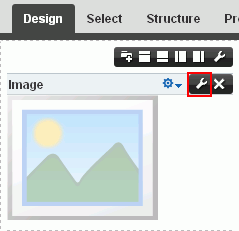
14.3.2.1 Setting Component Properties in Design View
To set properties of a component on a page in Design view:
-
Open the page in edit mode (see Section 12.4.3, "Opening a Page in the Page Editor (Composer)").
Note:
By default, the view switcher is set to and Composer displays the page in Design view showing the inline resource catalog (Figure 14-1). -
Click the Edit icon (Figure 14-10) on the component to open the Component Properties dialog.
-
In the Component Properties dialog, click the tabs to view and edit the component properties. For more information about the categories, see:
component properties, then click OK to close the Component Properties dialog.
Tip:
Click the Help icon in the Component Properties dialog to navigate to property descriptions for the current component. -
In the Component Properties dialog, click the tabs to view and edit the component properties.
Tip:
Click the Help icon in the Component Properties dialog to navigate to property descriptions for the current component.For more information about the different categories of component properties, see:
-
Click OK to close the properties dialog.
14.3.2.2 Setting Component Properties in Select View
To set properties of a component on a page in Select view:
-
Open the page in edit mode (see Section 12.4.3, "Opening a Page in the Page Editor (Composer)").
-
Click the view switcher to
and click the Select tab to display the page in Select view. -
Click the component on the page to select it (it is highlighted with a blue border), then select from the popup menu (Figure 14-11).
-
Edit Component to open the Component Properties dialog for the component.
-
Edit Parent Component to open the Component Properties dialog for the containing parent component.
Figure 14-11 Setting Component Properties in Select View
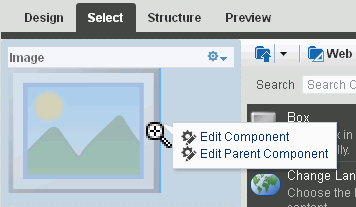
Description of ''Figure 14-11 Setting Component Properties in Select View''
-
-
In the Component Properties dialog, click the tabs to view and edit the component properties.
Tip:
Click the Help icon in the Component Properties dialog to navigate to property descriptions for the current component.For more information about the different categories of component properties, see:
-
Click OK to close the properties dialog.
14.3.2.3 Setting Component Properties in Structure View
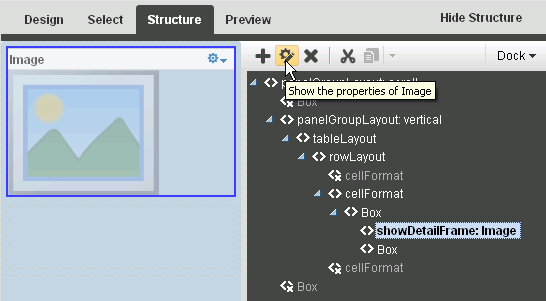
To set properties of a component on a page in Structure view:
-
Open the page in edit mode (see Section 12.4.3, "Opening a Page in the Page Editor (Composer)").
-
Click the view switcher to
and click the Structure tab to display the page in Structure view. -
Select the component by clicking it in the WYSIWYG pane, or clicking its entry in the hierarchical list pane.
-
Click the Show the properties of component name icon above the hierarchical list pane (Figure 14-12) to open the Component Properties dialog.
-
In the Component Properties dialog, click the tabs to view and edit the component properties.
Tip:
Click the Help icon in the Component Properties dialog to navigate to property descriptions for the current component.For more information about the different categories of component properties, see:
-
Click OK to close the properties dialog.
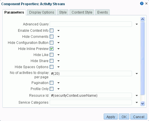
14.3.3 Working with Component Parameters
Component parameters appear on the Parameters tab of the Component Properties dialog (Figure 14-13).
Figure 14-13 Component Parameters: Activity Stream Task Flow
Description of ''Figure 14-13 Component Parameters: Activity Stream Task Flow''
Component parameters vary from component to component. For example, on some components they provide the opportunity to specify the source and range of task flow content; on other components they present read-only, application-generated identifiers that are used in maintaining a task flow instance's association with its customizations. Parameters descriptions are provided in the sections of this guide that describe each component. Additionally, the online help available in the Parameters dialog provides access to detailed parameter descriptions.
Enter parameter values, or click the  icon next to a parameter field to select and open the Expression Language (EL) Editor. If you need EL assistance, an application developer can provide an EL expression; see the "Expression Language Expressions" appendix in Developing Portals with Oracle WebCenter Portal and Oracle JDeveloper.
The editor provides a means of entering an expression when a value is discoverable, but otherwise unknown, for example, when you want a parameter value to be the name of the current user or the current application skin.
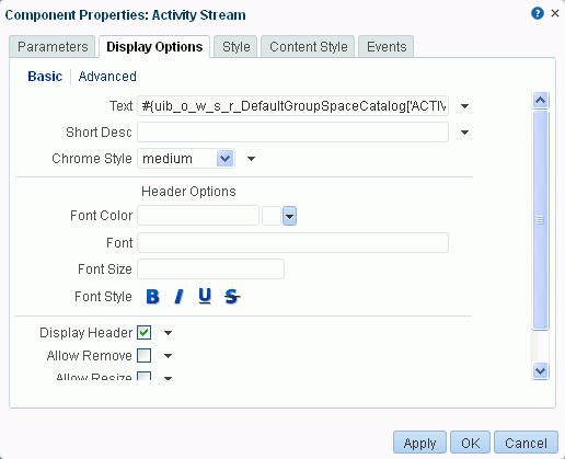
14.3.4 Working with Component Display Options
The Display Options tab in the Component Properties dialog provides access to properties that control a range of display-related behaviors on a given component instance (Figure 14-14).
Figure 14-14 Component Display Options; Basic Properties
Description of ''Figure 14-14 Component Display Options; Basic Properties''
For example, use the display options on an Image component to specify the image source URL and its optional link target. Use the display options on the Announcement Manager task flow to hide or show a header and enable or disable menus and other options on the header.
Several components have a Display Options tab that is divided into two subtabs: Basic and Advanced.
This provides a means of separating an otherwise long list of display options into more manageable and relevant groups. Though it is not obvious in Design view of the page editor, the showDetailFrame component is usually wrapped around the task flows provided by the various services. Consequently, the Display Options properties for task flows, and any other component wrapped in a showDetailFrame, have Basic and Advanced subtabs on their Display Options tab.
Another consequence of being wrapped in a showDetailFrame is commonality of properties on the Display Options tab. Task flows and any other components that are wrapped in a showDetailFrame share the same Display Options properties.
For many of the properties on the Display Options tab, an Expression Editor is available for entering custom values, such as text strings and Expression Language (EL) expressions. Click the icon next to a property field (Figure 14-15), then select Expression Builder to open the editor. If you need EL assistance, an application developer can provide an EL expression; see the "Expression Language Expressions" appendix in Developing Portals with Oracle WebCenter Portal and Oracle JDeveloper.
Figure 14-15 Edit Icon for Expression Editor
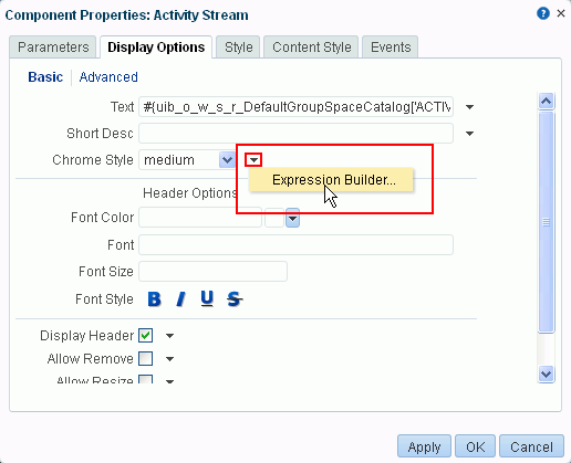
Description of ''Figure 14-15 Edit Icon for Expression Editor''
Note:
When you enter EL on the generic Display Options tab in the Component Properties dialog, the parser reports an error only if it detects invalid syntax, such as a missing closing bracket. Validation is performed only on syntax, not on the expression value. Generic Display Options are those cataloged in Table 14-1, "Display Options Properties".EL validation is not performed on non-generic display options.
Typically, the Display Options tab presents settings that affect the display elements surrounding component content (that is, its chrome). Chrome includes the header, the Actions menu, Expand and Collapse icons, and the like.
Table 14-1 lists and describes the Display Options properties that generally apply to most components. Where there are variations, they are noted in the chapters covering the specific components.
Table 14-1 Display Options Properties
| Property | Description |
|---|---|
|
|
Select whether to show the minimize action on the component header (that is, a Collapse icon on the component chrome).
The minimize action collapses the component like a window shade, leaving only its header on view.
When a component is minimized, the icon toggles to an Expand icon, which you can use to restore the full component to view. |
|
|
Select whether to enable users to move the component on the page. Choose from:
|
|
|
Select whether to show the Remove icon on the component header (that is, the component chrome) when the page is in view mode. Choose from:
Note that after you select to remove a component in this way in page view mode, you can restore the component only by editing the page and adding another component instance. As a page author, you may not wish to allow end users to remove a component when viewing the page. Users authorized to edit the page can remove the component in edit mode. |
|
|
Select whether to show a window resizer on a component instance. The window resizer enables you to increase the component height.
Note: Selecting this property fixes the height of a |
|
|
Select to specify a shade for the component background. Enter:
|
|
|
Select this check box to show a header on the component instance.
|
|
|
Select to render a shadow behind the component instance. |
|
|
Specify the font to use for text appearing in the component header. Enter one or more fonts. Separate multiple values with a comma (,), for example |
|
|
Select a color for the text appearing in the component header. Select a color using one of the following techniques:
|
|
|
Specify the size of text appearing in the component header. Enter a value using one of the following types of values:
|
|
|
Select an option for applying a font style to the text in a component header. Choose from:
|
|
|
Provide tooltip text for the component instance. When users roll their mouse pointers over the component instance, the text you enter here pops up. |
|
|
Select to show actions when users hover their mouse pointers over the component header.
|
|
|
Option for hiding or showing the component instance on the page
Once you hide a component in this way, you can show it again using controls available in Composer Structure view. In Structure view, right-click the hidden component, and select Show Component from the resulting context menu. |
|
|
Enter text to appear in the component header. If you select to hide the header, the value you enter here is ignored. |
14.3.5 Working with Child Components
The Child Components tab in the Component Properties dialog (Figure 14-16) provides controls for hiding, showing, and rearranging the components that are contained within the current (parent) component.
Figure 14-16 Child Components Tab in Component Properties Dialog
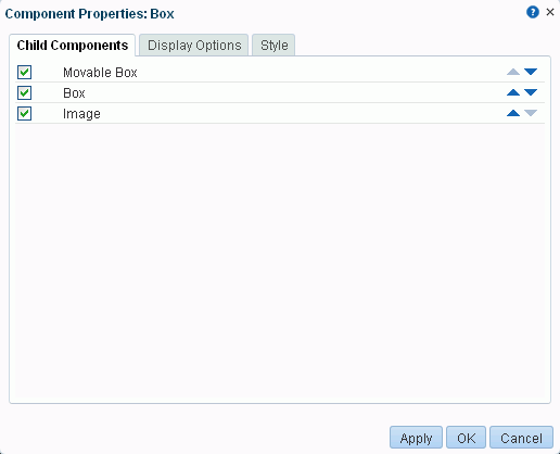
Description of ''Figure 14-16 Child Components Tab in Component Properties Dialog''
The changes you make through the Child Components tab are customizations that affect every user's view of the component instance.
This section provides information about working with the Child Components tab:
14.3.5.1 Customizing the Display Name of Child Components
When multiple child components are of the same type, they may be indistinguishable from each other in the list of child components. For example, a panelGroupLayout component uses the value of its layout attribute (for example, vertical) as the display name, so multiple panelGroupLayout components may all have the same name in the list of child components, as illustrated in Figure 14-17 in Structure view.
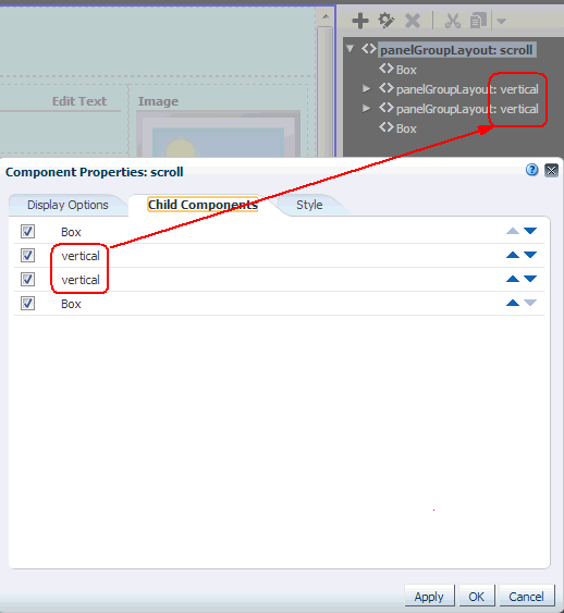
If you need to identify and work with a specific child component, you can edit the source code of a page to specify a unique display name for any component to make it easily distinguishable. This display name is shown in hint text and the Component Properties dialog. This is a developer task, described in the "Customize the Display Name of Child Components" section of Developing Portals with Oracle WebCenter Portal and Oracle JDeveloper.
14.3.5.2 Hiding and Showing Child Components
Hiding is useful for keeping a component instance out of general view while still maintaining its presence on the page. When you hide a child component through the Component Properties dialog, it is hidden in everyone's view of the page. When you are ready to show the component instance, it is a simple matter to reselect the component to show through the Child Components tab.
To hide or show child components:
-
On the Child Components tab, either:
-
Deselect the check box to the left of any components you want to hide.
-
Select the check box to the left of any components you want to show.
-
-
Click OK to exit the dialog.
-
Click Save to save your changes.
14.3.5.3 Rearranging Child Components
The Child Components tab provides a convenient and efficient way to rearrange the content within a particular container, such as a Box component. When you rearrange child components through the Component Properties dialog, they are rearranged on everyone's view of the page.
Tip:
You can also rearrange page components in everyone's view by clicking the component header and dragging it to a new position in Composer.Note:
When you use Box controls to split a Box, the rearrange capability is disabled in the Component Properties dialog on the Child Components tab. You can still rearrange content in such boxes by dragging and dropping on the page itself.To rearrange a child component:
-
On the Child Components tab, click the up or down arrows next to the component you want to move.
Tip:
The direction that a child component is moved depends on the orientation of its parent container. For example, if the container is oriented vertically, child components move up (up arrow) or down (down arrow); if the container is oriented horizontally, child components move right (up arrow) or left (down arrow). -
Click OK to exit the dialog.
-
Click Save to save your changes.
14.3.6 Working with Style and Content Style Properties
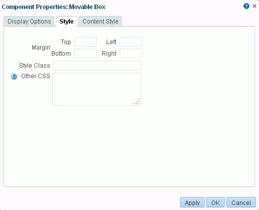
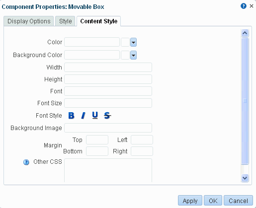
The Style and Content Style tabs in the Component Properties dialog (Figure 14-18 and Figure 14-18) provide an opportunity to fine-tune your application look-and-feel at the component level. Enter values for Style and Content Style properties, or specify your own values through the Other CSS property that appears on both tabs.
Figure 14-18 Style Tab in Component Properties Dialog
Description of ''Figure 14-18 Style Tab in Component Properties Dialog''
Figure 14-19 Content Style Tab in Component Properties Dialog
Description of ''Figure 14-19 Content Style Tab in Component Properties Dialog''
This section describes the Style and Content Style properties, including the Other CSS property:
14.3.6.1 Style and Content Style Properties
Style settings on a component override the style settings on hierarchically superior components, such as the component's parent container, the page, and the application. Content Style settings override Style settings. For example, in a Movable Box component, Style settings control the look and feel of the Movable Box; Content Style settings control the look and feel of the components contained within the Movable Box. This look and feel may, in turn, be overridden by the Style settings set on those individual components.
Note, however, that Content Style properties set for a container, such as a Movable Box, may not take effect if the component inside the container overrides the container Content Style properties by a means other than the component's own Content Style properties. For example, the background color set for a Movable Box that contains a task flow may not take effect if, at design time, instead of being set to inherit from the container, the task flow background color was set with a hard-coded value.
Additionally, the Style and Content Style settings may or may not be exposed depending on whether or not the component elements (such as the skin) support modifications to these settings.
Thus, while you can set Style and Content Style properties for a component as described inTable 14-2, these settings may not take effect due to other settings that apply to the component.
Table 14-2 Style and Content Style Properties (may be overridden by other settings)
| Property | Description |
|---|---|
|
|
Select a component background color. If you specify a background color for Content Style, then the background color specified for the Style property is not applied. |
|
|
Enter the URL to an image you want to render in the component background. Use standard CSS syntax. For example:
|
|
|
Select a default color for any text included in the component instance. For example, imagine that you have added a Text component to a Box component. When you set Box Style properties, the default text color you apply to the Box is also automatically applied to the Text component, unless you also define a Color value for the Text component. Select a color using one of the following techniques:
|
|
|
Specify the font to use for text appearing in the component header. Enter one or more fonts. Separate multiple values with a comma (,), for example |
|
|
Enter the size of component text relative to either your browser's default font size or the font size of the parent element. Enter one value from the following types of values:
|
|
|
Select the style for the component fonts. Choose from:
The font style you select here applies to any text inside the component. |
|
|
Specify the height of component content. Set a fixed height for component content. You can use any standard CSS unit of measure, such as Never express a Height value as a percentage. Because of differences between browsers and between layout containers, percentages do not work as you expect. If you want your component to take up 100% of a page, consider creating a page using the Stretch page style and adding the component to it (for more information, see Section 25.1, "About Page Styles"). The Height property works with the |
|
|
Specify the border of space to draw around the component. Enter one of the following types of values:
|
|
|
Specify additional CSS for the component. Add any other CSS encoding you care to that is not covered by the other Style or Content Style properties. You must use standard CSS syntax for this value to be valid (for more information about Other CSS, see "Using the Other CSS Property"). For example, a setting of Compare this with the description of Style Class. |
|
|
Specify the CSS style class to use for this component. For example, you can use this property to target specific skin settings on an individual Box component. The style class may be defined in your jspx or skinning CSS file. Note: Style classes are a set of styles bundled together and given a name. In contrast, values entered for This property appears only on the Style tab. |
|
|
Specify the width of component content. Set a fixed width for component content. You can use any standard CSS unit of measure, such as |
14.3.6.2 Using the Other CSS Property
The Other CSS field on the Style and Content Style tabs allows you to apply CSS styles that are not covered by other properties. Use standard CSS syntax (see http://www.w3.org/TR/CSS2/propidx.html), separating multiple entries with a semicolon (;). Use the Style Class property to specify the CSS style class to use for the component (see Table 14-2).
For example:
background: #00FF00 url(http://www.google.com/intl/en_ALL/images/logo.gif) no-repeat fixed top; font-size: xx-small
Note:
Some CSS styles are not supported by popular browsers. Moreover, some styles are specific to one browser and may not work correctly in another browserTable 14-3 provides a few examples of CSS you can use in the Other CSS field.
Table 14-3 Example Values for Other CSS (may be overridden by other settings)
| Value | Description and Examples |
|---|---|
|
|
Size of component text relative to either your browser's default font size or the font size of the parent element. Syntax:
where
|
|
|
Starting position of a background image. Syntax:
|
|
Typically, you enter two values. Except where noted, if you specify only one value, the second value is interpreted as
For example:
|
|
|
|
Repetition value for the background image. Syntax:
where
|
|
|
White space (or clear space) around a component. Enter up to four values. Express values in a specific length or as a percentage of the closest element, using any standard CSS unit of measure, such as
|
|
|
White space (or clear space) below of the element. Express values in a specific length or as a percentage of the closest element. For example: |
|
|
White space (or clear space) at the left side of the element. Express values in a specific length or as a percentage of the closest element. For example: |
|
|
White space (or clear space) at the right side of the element. Express values in a specific length or as a percentage of the closest element. For example: |
|
|
White space (or clear space) above the element. Express values in a specific length or as a percentage of the closest element. For example: |
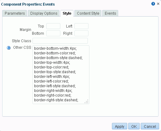
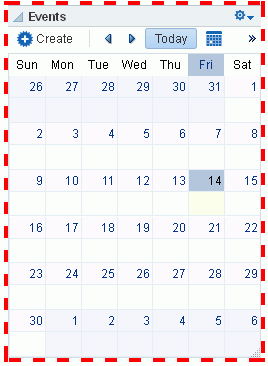
14.3.6.3 Other CSS Property Example
One example application of the Other CSS property is to provide a variety of borders on task flows, portlets, and some web development components.
For example, Figure 14-20 depicts a Recent Activity task flow without borders.
To create borders around the task flow, access its properties (see Section 14.3.2, "Setting Properties on a Component") and add CSS encoding in the Other CSS field on the Style tab in the Component Properties dialog, as shown in Figure 14-21:
Figure 14-21 Adding CSS Encoding to a Component
Description of ''Figure 14-21 Adding CSS Encoding to a Component''
Figure 14-22 illustrates the result.
Figure 14-22 A Border Created Through the Other CSS Property
Description of ''Figure 14-22 A Border Created Through the Other CSS Property''
14.3.7 Working with Component Contextual Events
Events are defined occurrences within the current context. Event handlers are the engines that drive the results of that occurrence.
For example, imagine two components: one is the producer of some kind of content (a payload) and the other consumes the content. When you wire these components to each other, you can use events to specify that when an event is triggered on the producer, the producer broadcasts a contextual event with a payLoad parameter, which the consumer component consumes through an event handler.
The Events tab in the Component Properties dialog provides a means of wiring a contextual event to an action handler to enable the passing of values from a producer component to a consumer component when the event is triggered on the producer (Figure 14-23).
Figure 14-23 Events Tab in the Component Properties Dialog
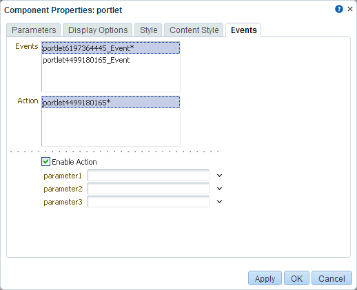
Description of ''Figure 14-23 Events Tab in the Component Properties Dialog''
Note:
Contextual events differ from the business events that can be raised by ADF Business Components. Additionally, contextual events differ from events raised by UI components. Contextual events can be used in association with UI events. In this case, an action listener that is invoked due to a UI event can, in turn, invoke a method action binding that then raises the event.See Also:
For information about business events, see Web User Interface Developer's Guide for Oracle Application Development Framework.Not all components support contextual events because not all components were created to include them; therefore, the Events tab does not appear for all components. For events to be available at runtime, event capability must be included in a component when the component is developed.
Table 14-4 lists and describes the properties presented on an Events tab.
Table 14-4 Properties on the Events Tab
| Property | Description |
|---|---|
|
|
A list of all contextual events associated with components on the current page. An event describes the type of action that triggers another action, such as the passing of a value. The listed events were built in to the component when the component was created. All components do not include events; therefore, all components are not intrinsically capable of being wired to other components. |
|
|
A list of action handlers associated with the selected consumer component The listed actions vary according to which consumer component is selected. Actions enable you to associate an event with an event handler, which specifies what should happen when the triggering event occurs. The listed actions were built in to the component when the component was created. |
|
|
A check box for enabling or disabling the selected event and action. When you select this check box, a list of selected action handler parameters appears. |
|
List of selected action handler parameters |
Fields for entering values to use to deliver the payload from the producer component to the consumer component whenever the event occurs Parameter fields appear only when the |
For information about wiring components, see Chapter 19, "Wiring Pages, Task Flows, Portlets, and ADF Components."
14.4 Deleting a Component from a Page
The controls for deleting a component are located on the component itself in Design view and on the header of the hierarchical list pane in Structure view. This section describes how to delete components in both Design view and Structure view (you cannot delete a component in Select view):
14.4.1 Deleting a Component in Design View
To delete a component from a page in Design view:
-
Open the page in edit mode (see Section 12.4.3, "Opening a Page in the Page Editor (Composer)").
Note:
By default, the view switcher is set to and Composer displays the page in Design view showing the inline resource catalog. -
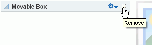
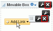
Click the Remove icon on the component header or, if no header is shown, on the component's floating palette (Figure 14-24).
Figure 14-24 Remove Icon on a Links Component
Description of ''Figure 14-24 Remove Icon on a Links Component''
-
In the resulting confirmation dialog, click Delete.
The component is permanently removed from the page. If the component had any child components, those child components are deleted as well.
-
Click Save to save your changes.
14.4.2 Deleting a Component in Structure View
To delete a component from a page in Structure view:
-
Open the page in edit mode (see Section 12.4.3, "Opening a Page in the Page Editor (Composer)").
-
Click the view switcher to
and click the Structure tab to display the page in Structure view. -
In the list of components, select the component to delete.
-
Click the Delete icon on the list header (Figure 14-25).
Figure 14-25 Delete Icon in Structure View
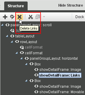
Description of ''Figure 14-25 Delete Icon in Structure View''
-
In the resulting confirmation dialog, click Delete.
The component is permanently removed from the page. If the component had any child components, those child components are deleted as well.
-
Click Save to save your changes.