30 Using Map Components
map and thematicMap components to display data in geographic and thematic maps using simple UI-first development. The chapter defines the data requirements, tag structure, and options for customizing the look and behavior of the components.If your application uses the Fusion technology stack, then you can also use data controls to create geographic map themes and thematic map area and point data layers to display data. For more information, see the "Creating Databound Geographic and Thematic Map Components" chapter of Developing Fusion Web Applications with Oracle Application Development Framework.
This chapter includes the following sections:
30.1 About Map Components
An ADF DVT Geographic Map represents business data in one or more interactive layers of information (known as themes), superimposed on a single map. An ADF DVT Thematic Map represents business data as patterns in stylized areas or associated markers.
Geographic maps require a configuration that contains a URL to a remote Oracle Application Server (AS) MapViewer service, and optionally, a geocoder service if address data will have to be converted to longitude and latitude.
Thematic maps do not require a connection to an Oracle MapViewer service. Thematic maps focus on data without the geographic details in a geographic map.
30.1.1 Map Component Use Cases and Examples
ADF Data Visualization components provide extensive graphical and tabular capabilities for visually displaying and analyzing business data. Each component needs to be bound to data before it can be rendered since the appearance of the components is dictated by the data that is displayed.
Both geographic and thematic maps are designed to display data. Geographic maps focus on data that is best displayed with details such as roads or rivers. and requires configuration to an Oracle MapViewer service and optionally, a geocoder service. Thematic maps focus on data trends or patterns without the visual clutter of geographic details and do not require configuration to an Oracle MapViewer or geocoder service.
Geographic maps support a variety of map themes, each of which must be bound to a data collection. The following kinds of map themes are available:
-
Color: Applies to regions. For example, a color theme might identify a range of colors to represent the population in the states of a region or the popularity of a product in the states of a region. A geographic map can have multiple color themes visible at different zoom levels. For example, a color theme at zoom levels 1 to 5 might represent the population of a state, and the county median income at zoom levels 6 to 10.
-
Point: Displays individual latitude/longitude locations in a map. For example, a point theme might identify the locations of warehouses in a map. If you customize the style of the point that is displayed, you might choose to use a different image for the type of inventory (electronics, housewares, garden supplies) in a set of warehouses to differentiate them from each other.
-
Graph: Creates any number of pie graph themes and bar graph themes. However, only one graph theme can be visible at a given time. You select the desired theme from the View menu of the map toolbar. Graph themes can show statistics related to a given region such as states or counties. For example, a graph theme could display the sales values for a number of products in a state.
Figure 30-1 displays a geographic map with color, point, and graph themes.
Figure 30-1 Geographic Map of Southwest US with Color, Point, and Pie Graph Themes
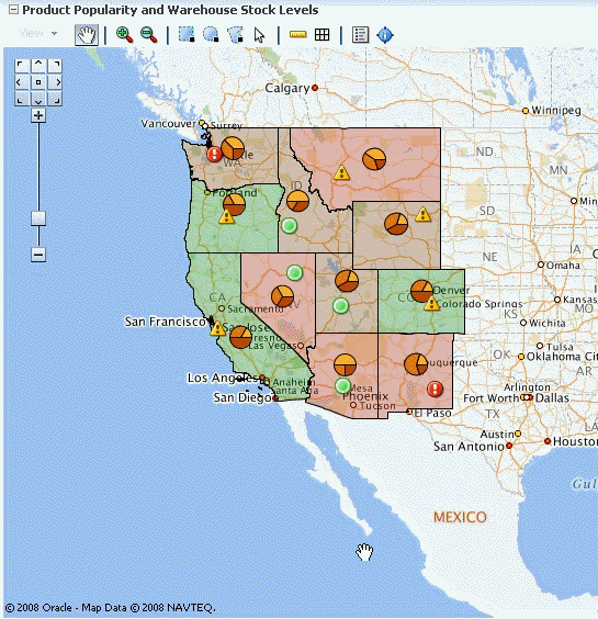
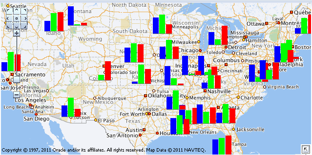
Figure 30-2 shows a geographic map with a customized bar graph theme.
Figure 30-2 Geographic Map with Custom Bar Graph Theme
Thematic maps display trends or patterns in data associated with a geographic location. Data is stylized by region, for example, using a fill color based on data values, associating a marker with the region, or both.
Figure 30-3 shows a thematic map that displays unemployment rates by states in the US. The map displays multiple selection of the states with an employment rate of 2.0-4.0 percent.
Figure 30-3 Thematic Map of Unemployment Rates in the US
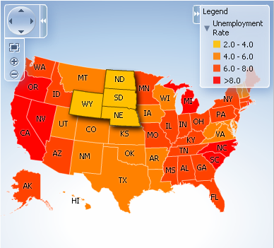
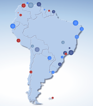
Figure 30-4 shows a thematic map that displays a graduated symbol for the size of the major cities in South America.
Figure 30-4 Thematic Map with City by Size in South American
30.1.2 End User and Presentation Features of Maps
The ADF Data Visualization map and thematic map components provides a range of features for end users, such as panning and zooming and legend display. It also provides a range of presentation features, such as state management.
30.1.2.1 Geographic Map End User and Presentation Features
To understand how geographic maps are used and can be customized, it may be helpful to review these elements and features:
-
Viewport: The container for the geographic map and its presentation features. The default size is 600px by 375px and is customizable.
-
Base map: The background geographic data, zoom levels, and the appearance and presence of items such as countries, cities, and roads. By default, geographic maps use based maps from the remote Oracle MapViewer service. The base map can be any image that can be configured using a map viewer and map builder, for example, the floor maps of office buildings.
-
Zoom control: Pan icons and a zoom slider that render in the upper left-hand corner of the map. Figure 30-5 shows a map zoom control that is zoomed out all the way (that is, the zoom level is set to 0). At zero, the entire map is displayed.
You can customize the location and the initial setting of the zoom control in the
mapcomponent. The View menu in the map toolbar lets you determine the visibility of the zoom control. By default, the initial zoom level for a map is set to 0.Figure 30-5 Zoom Control of a Map

-
Pan icons: Icons (with arrows that point north, south, east, west, northeast, northwest, southeast, and southwest) at the top of the zoom control. You can use these icons to move the entire map in specific directions.
-
Zoom slider: Slider with a thumb for large scale zooming and icons for zooming a single level. You can use the plus icon to zoom in and the minus icon to zoom out one level at a time. When the thumb is at the bottom of the slider, the zoom level is zero.
-
-
Scale: Two horizontal bars that display in the lower left-hand corner of the map below the information panel and above the copyright. Figure 30-6 shows the scale. The top bar represents miles (mi) and the bottom bar represents kilometers (km). Labels appear above the miles bar and below the kilometers bar in the format: [distance] [unit of measure]. The length and distance values of the bars change as the zoom level changes and as the map is panned.
Figure 30-6 Map Information Panel, Scale, and Copyright

-
Information panel: Displays latitude and longitude in the lower left-hand corner above the scale. Figure 30-6 shows the information panel. By default, the information panel is not visible. You can display this panel from the View menu or by clicking the Information button on the toolbar.
-
Measurement panel: Displays either distance, area, or radius depending on which tools in the toolbar are currently in use. Text appears in the following format: [label] [value] [unit of measure] to the right of the information panel. Figure 30-7 shows the measurement panel with a distance measurement. Area measurement and radius measurement appear in a similar manner with the appropriate labels.
Figure 30-7 Map Measurement Panel Beside the Information Panel

The following tools provide information in the measurement panel:
-
Area measurement: Appears only when the Area, Rectangular Selection, or Multi-Point Selection tools are active.
-
Distance measurement: Appears only when the Distance tool is active.
-
Radius measurement: Appears only when the Circular Selection tool is active.
-
-
Copyright: Appears in the lower left-hand corner of the map and contains text that you can customize in the
mapcomponent. -
Overview map: Consists of a miniature view of the main map as shown in Figure 30-8. This map appears in the lower right-hand corner of the main map and lets you change the viewable region of the main map without having to use the pan tool or the pan icons.
Figure 30-8 Overview Map
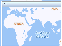
The following items are part of the overview map:
-
Reticule: Appears in a small window that you can move across a miniature view of the main map. The position of the reticule in the miniature map determines the viewable area of the main map. As you move the reticule, the main map is updated automatically.
-
Show/Hide icon: Appears in the upper left-hand corner when the overview map is displayed. When you click the Show/Hide icon, the overview map becomes invisible and only the icon can be seen in the lower right corner of the main map.
-
-
Toolbar: Appears in association with the map to provide user controls to adjust the display of the map and map themes.
The toolbar contains the following elements in the sequence listed:
-
View menu: Lets the user control which themes are visible, select a specific theme for display, and determine the visibility of the zoom control, information panel, and the legend. Figure 30-9 show a sample View menu.
Figure 30-9 Map View Menu
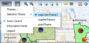
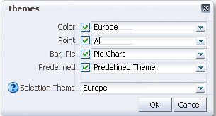
The Themes option on the View menu provides a dialog to configure a geographic map when multiple themes are available. Figure 30-10 shows a sample map themes dialog.
-
Toolbar buttons: Provides user controls to interact with the geographic map including:
-
Pan: Use to pan the map by drag and drop operation within the view
-
Zoom: Use to zoom in or out in the map view
-
Selection: Use to select shaped (rectangle, circle, or polygon) areas or points on the map. The themes within the selection will be highlighted
-
Measurement: Use to hide or show the map distance and area measurements tools
-
Legend: Use to hide or show the map legend
-
Information panel: Use to hide or show the map information panel
Figure 30-11 shows the features supported by the map toolbar buttons
Figure 30-11 Map Toolbar Button Features

-
-
30.1.2.2 Thematic Map End User and Presentation Features
To understand how thematic maps are used and can be customized, it may be helpful to review these elements and features:
-
Viewport: The container for the thematic map and its presentation features. The default size is 600px by 375px and is customizable.
-
Base map: The background geographic area. Each base map includes several sets of regions and one fixed set of cities referred to as points. A set of regions or cities is referred to as a layer. Only one base map and one layer may be displayed at a time, with the exception of enabled drilling. The base maps prebuilt for the thematic map include:
-
United States
-
United States and Canada
-
World
-
Africa
-
Asia
-
Europe
-
North America
-
Latin America
-
South America
-
APAC (Asia Pacific)
-
EMEA (Europe, Middle East, and Africa)
-
World Regions
Note:
The thematic map component supports custom base maps For more information, see Defining Thematic Map Base Maps.
-
-
Area layers and labels: Each base map includes several regions that represent levels in a geographical hierarchy. For example, in the United States map the hierarchy is country > states > counties. The hierarchical relationship supports drilling in the region. When displayed, the cities associated with the base map will appear as data points. By default, each region in an area layer displays a label that can be customized.
Thematic maps support one or more custom area layers, a named group of regions based on either an existing area layer or another custom region. A custom region fits naturally into the geographical hierarchy of the base map. For example, a custom area layer based on the Counties layer would appear between the US States and US Counties layers in the hierarchy.
-
Data layers: Each thematic map data layer is bound to a data collection and represents the data as an area, or a marker, or both. A map layer may display only one data layer at a time, whereas multiple data markers may appear at the same time. There are two types of data layers:
-
Area data layers: Area definitions associated with a geographic area, or by points associated with a map position as in longitude and latitude, or x an y coordinates. Data is stylized with color and pattern fills, or a data marker, or both.
-
Point data layers: Point locations associated with a map position as in longitude and latitude, or x and y coordinates. Data is represented by a marker or image using shapes available with the
thematicMapcomponent, custom shapes, or graphic files.
-
-
Control panel: Optional tool that allows user to control the following operations:
-
Pan and zoom control: Use to pan the map, and zoom and center the map within the view.
-
Zoom to fit: Use to center and fit the full view of the map within the viewport.
-
Zoom buttons: Use to zoom in or out on the view of the thematic map.
-
Show/hide control panel button: Use to show or hide the control panel.
-
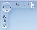
Reset button: Available when drilling is enabled for the thematic map. Use to reset map to display with no drilling in regions.
-
Drill buttons: Available when drilling is enabled for the thematic map. Use arrows pointing up or down to drill up or down in a map region.
Figure 30-12 shows the control panel with drilling enabled in the map.
Figure 30-12 Control Panel with Drilling Enabled
-
-
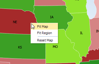
Context menus: By default, thematic maps display context menus for the viewport background, map regions, and data markers. Custom context menu items can be added to the default menus.
Figure 30-13 shows the default context menu for the map viewport. The same menu items are available for data markers.
Figure 30-13 Map Viewport Background Context Menu
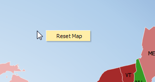
Description of "Figure 30-13 Map Viewport Background Context Menu"Figure 30-14 shows the context menu for a map region.
-
State management: By default, display changes made to a thematic map such as center, zoom, selection, and drill state persist across sessions, and carry over to printing.
-
Image formats: By default, thematic maps will display in the best output format supported by the client browser. If the best output format is not available on the client, the application will default to an available format. Thematic maps support the following image formats: HTML5, Flash, and Portable Network Graphics (PNG). All image formats support locales with right-to-left display.
-
Printing: Thematic maps are printed using a PNG output format, maintaining any zoom or pan state in the map.
-
Animation: By default, thematic maps are animated upon initial rendering of the map, when the data associated with the map changes, and when a region is drilled in the map.
-
Drilling: When enabled, drilling of the next layer in the geographical hierarchy is displayed. For example, the counties within a US state are displayed when the user double-clicks a state region. Drilling icons are added to the Control Panel when drilling is enabled.
-
Drag and drop: Maps can be configured to support these operations:
-
Drag selected map regions or data markers to another page component.
-
Move data markers from one location to another on the map.
-
Drag data elements from another page component to a map region or data marker.
-
-
Disable features: End user features including map zoom, zoom-to-fit, and pan can be disabled for a thematic map. When disabled, the controls are removed from the control panel.
-
Tooltips: By default, thematic maps use tooltips to orient the user to the map location and associated data when moving the cursor over the map.
-
Zooming: Thematic maps can be configured to scale markers on zoom, to fit data on initial zoom, and to isolate data layer zooming.
30.1.3 Additional Functionality for Map Components
You may find it helpful to understand other ADF Faces features before you implement your map component. Additionally, once you have added a map component to your page, you may find that you need to add functionality such as validation and accessibility.
Following are links to other functionality that map components can use:
-
Partial page rendering: You may want a map to refresh to show new data based on an action taken on another component on the page. For more information, see Rerendering Partial Page Content.
-
Personalization: When enabled, users can change the way the map displays at runtime, and those values will not be retained once the user leaves the page unless you configure your application to allow user customization. For information, see Allowing User Customization on JSF Pages.
-
Accessibility: By default, geographic and thematic map components are accessible. You can make your application pages accessible to screen readers. For more information, see Developing Accessible ADF Faces Pages.
-
Skins and styles: You can customize the appearance of gauge components using an ADF skin that you apply to the application or by applying CSS style properties directly using a style-related property (
styleClassorinlineStyle). For more information, see Customizing the Appearance Using Styles and Skins. -
Content Delivery: You can configure your thematic map area and point data layers to fetch a certain number of rows from your data source using the
contentDeliveryattribute. For more information, see Content Delivery. -
Automatic data binding: If your application uses the Fusion technology stack, then you can create automatically bound maps based on how your ADF Business Components are configured. For more information, see the "Creating Databound Geographic and Thematic Map Components" chapter of Developing Web User Interfaces with Oracle ADF Faces.
Note:
If you know the UI components on your page will eventually use ADF data binding, but you need to develop the pages before the data controls are ready, then you should consider using placeholder data controls, rather than manually binding the components. Using placeholder data controls will provide the same declarative development experience as using developed data controls. For more information, see the "Designing a Page Using Placeholder Data Controls" chapter of Developing Fusion Web Applications with Oracle Application Development Framework.
Additionally, data visualization components share much of the same functionality, such as how data is delivered, automatic partial page rendering (PPR), image formats, and how data can be displayed and edited. For more information, see Common Functionality in Data Visualization Components.
30.2 Using the Geographic Map Component
When you create an ADF DVT Geographic map, you are prompted to select a base map that an administrator has already configured using the Map Builder tool of Oracle Spatial. During configuration, the map administrator defines the zoom levels that the map supports. These levels also determine the zoom capability of the geographic map.
Administrators also have the option of creating predefined map themes using the Map Builder tool. For example, a predefined theme might use specific colors to identify regions. In the geographic map component, you can select such a predefined map theme, but you cannot modify it because this theme is part of the base map.
The base map becomes the background on which you build interactive themes of information using the geographic map component. You can create as many themes as you wish, but you must define at least one map theme.
Geographic maps have the following data requirements:
-
Map configuration requirements:
-
Map Viewer URL: You must provide a URL for the location of the Oracle Application Server MapViewer service. This service is required to run the base map that provides the background for the layers in the ADF geographic map component. OracleAS MapViewer is a programmable tool for rendering maps using spatial data managed by Oracle Spatial. The URL is:
http://elocation.oracle.com/mapviewer
-
Geocoder URL: If you want to convert street addresses into coordinates, then you must provide the URL for the Geocoder for the geographic map. A Geocoder is a Web service that converts street addresses into longitude and latitude coordinates for mapping. The URL is:
http://elocation.oracle.com/geocoder/gcserver
-
-
Base map: You must have a base map created by the Map Builder tool in OracleAS MapViewer. This base map must define polygons at the level of detail that you require for your map themes to function as desired. For example, if you have a map pie graph or bar graph theme that you want to use for creating graphs in each state of a certain region, then you must have a base map that defines polygons for all these states at some zoom level. You can display only one graph in a polygon.
-
Map themes: Each map theme must be bound to a data collection. The data collection must contain location information that can be bound to similar information in the base map.
30.2.1 Configuring Geographic Map Components
The geometric map has parent components, map child components, and components that modify map themes. The prefix dvt: occurs at the beginning of each map component name indicating that the component belongs to the ADF Data Visualization Tools (DVT) tag library. You can configure the following map components:
-
Map (
map): The main map component. Unlike other data visualization components, the map component is not bound to data. Instead, all the map theme child components are bound individually to data collections. The map component contains general information about the map including the identification of the base map, the URL for the remote server that is running Oracle Application Server MapViewer service and the URL for the Geocoder Web service that converts street addresses into longitude and latitude coordinates for mapping.The map component supports the following map child components:
-
Color theme (
mapColorTheme): Map layer that you bind to a data collection. The color theme can be used to identify regions on a base maps. -
Point theme (
mapPointTheme): Map layer that you bind to a data collection. The point theme identifies individual locations on a map.Optionally, you can use child map point style components (
mapPointStyleItem) if you want to customize the image that represents points that fall in a certain data value range. To define multiple images, create a component for each image and specify the associated data value range and image. -
Bar graph theme (
mapBarGraphTheme): Map layer that you bind to a data collection. This theme displays a bar graph at points to represent multiple data values related to that location. For example, this tag might be used to display a graph that shows inventory levels at warehouse locations.Optionally, use the map bar graph series set component (
mapBarSeriesSet) to wrap map bar graph series components (mapBarSeriesItem) if you want to customize the color of the bars in a map bar graph. Each map bar graph component customizes the color of one bar in a map bar graph. -
Pie graph theme (
mapPieGraphTheme): Map layer that you bind to a data collection. This theme displays a pie graph at specific points to represent multiple values at that location. For example, this tag might be used to display a graph that shows inventory levels at warehouse locations.Optionally, use the map pie slice set component (
mapPieSliceSet) to wrap map pie slice components (mapPieSliceItem) if you want to customize the color of the slices in a map pie graph. Each map pie slice component customizes the color of one slice in a map pie graph. -
Predefined graph theme (
predefinedTheme): Map layer defined using the Map administrator tool stored along with the map metadata in the database. The predefined theme tag is used when you have your own custom Oracle AS MapViewer instance and need to display large datasets that can be rendered directly by the map viewer. -
Map legend (
mapLegend): Created automatically when you create a map. Use this component to customize the map legend. -
Overview map (
mapOverview): Created automatically when you create a map. Use this tag to customize the overview map that appears in the lower right-hand corner of the map.
-
-
Toolbar (
mapToolbar): A parent component that allows the map toolbar to be placed in any location on a JSF page that contains a map. This toolbar contains amapIDattribute that points to the map associated with the toolbar. The toolbar lets you perform significant interaction with the map at runtime including the ability to display the map legend and to perform selection and distance measurement. The map toolbar tag has no child components.
30.2.2 How to Add a Geographic Map to a Page
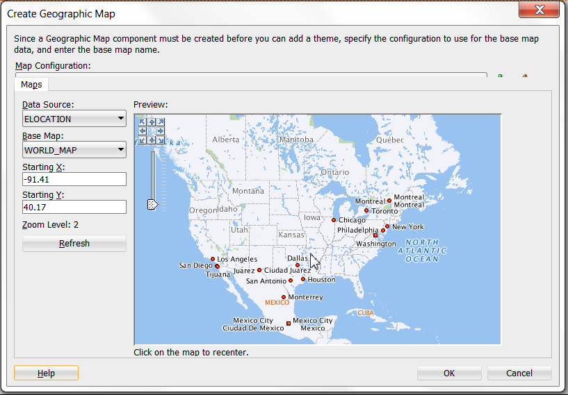
When you are designing your page using simple UI-first development, you use the Components window to add a geographic map to a JSF page. When you drag and drop a geographic map component onto the page, you are prompted to configure the an Oracle MapViewer service, and optionally a geocoder service.
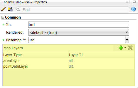
Once you complete the configuration, and the geographic map is added to your page, you can use the Properties window to configure additional display attributes for the map.
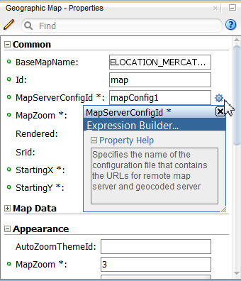
In the Properties window you can use the dropdown menu for each attribute field to display a property description and options such as displaying an EL Expression Builder or other specialized dialogs. Figure 30-15 shows the dropdown menu for a thematic map component mapServerConfigId attribute.
Figure 30-15 Geographic Map MapServerConfigId Attribute Dropdown Menu
Note:
If your application uses the Fusion technology stack, then you can use data controls to create a geographic map and the binding will be done for you. For more information, see the "Creating Databound Geographic Maps" chapter of Developing Fusion Web Applications with Oracle Application Development Framework.
Before you begin:
It may be helpful to have an understanding of how geographic map attributes and geographic map child components can affect functionality. For more information, see Configuring Geographic Map Components.
You may also find it helpful to understand functionality that can be added using other ADF Faces features. For more information, see Additional Functionality for Map Components.
You must complete the following tasks:
-
Create an application workspace as described in Creating an Application Workspace.
-
Create a view page as described in Creating a View Page.
To add a geographic map to a page:
30.2.3 What Happens When You Add a Geographic Map to a Page
When you use a Components window to add a geographic map to a page, JDeveloper adds code to the JSF page. The example below shows the code added to the JSF page.
<dvt:map startingY="46.06" startingX="-78.67" mapZoom="1"
                         mapServerConfigId="mapConfig2"
                         baseMapName="ELOCATION_MERCATOR.WORLD_MAP"
                         inlineStyle="width:600px; height:375px;" id="m2">
  <f:facet name="rtPopup"/>
  <f:facet name="popup"/>
</dvt:map>
Note:
JDeveloper automatically inserts two popup facets. The rtPopup facet supports a single child component for a right-click af:menu. The popup facet supports a single child component for a left click af:dialog or af:noteWindow. For more information about configuring popup components, see Using Popup Dialogs, Menus, and Windows.
You can then configure the geographic map to display data in color, point, pie graph or bar graph themes using the ADF Data Controls panel and the theme binding dialogs. For information about configuring geographic maps to display data, see the "Creating Databound Geographic and Thematic Maps" chapter of Developing Fusion Web Applications with Oracle Application Development Framework.
30.2.4 What You May Need to Know About Active Data Support for Map Point Themes
Geographic map point themes support Active Data Support (ADS) by sending a Partial Page Refresh (PPR) request when an active data event is received.
The PPR response updates the point theme values as follows:
-
For update events, the point will update to the new values. If there is a latitude/longitude change, the point will animate to its new location.
-
For removal events, the point will be removed from the point theme.
-
For insert events, a new point corresponding to the latitude/longitude sent in the change data will be created and visible on the base map.
For additional information about using the ADS, see Using the Active Data Service with an Asynchronous Backend.
30.3 Customizing Geographic Map Display Attributes
You can customize the geographic display attributes of the ADF DVT Geographic Map component, such as the size of the map, how the map centers and zoom the map size, zoom strategy, the appearance of selected regions, and the display of the map legend.
30.3.1 How to Adjust the Map Size
You can control the width and height of the map by using the inlineStyle attribute in the dvt:map tag.
Before you begin:
It may be helpful to have an understanding of how map attributes and map child tags can affect functionality. For more information, see Configuring Geographic Map Components.
You should already have a map on your page. If you do not, follow the instructions in this chapter to create a map. For information, see How to Add a Geographic Map to a Page.
To adjust the size of a map:
30.3.2 How to Specify Strategy for Map Zoom Control
You can customize how the geographic map display attributes for the initial zoom level, starting location, initial map theme, and zoom strategy.
Before you begin:
It may be helpful to have an understanding of how map attributes and map child tags can affect functionality. For more information, see Configuring Geographic Map Components.
You should already have a map on your page. If you do not, follow the instructions in this chapter to create a map. For information, see How to Add a Geographic Map to a Page.
You should have already configured at least one map color, point, pie graph, or bar graph theme to display data on the map.
To control the initial zoom and starting location on a map:
30.3.3 How to Customize and Use Map Selections
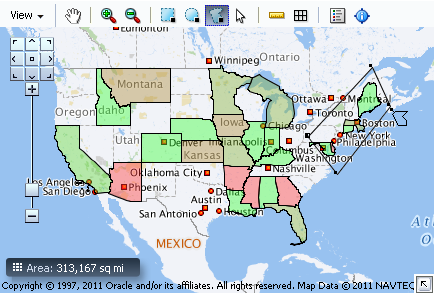
The geographic map provides selection tools for map areas displaying data in color, pie graph, and bar graph themes. By default, the selection tools are available on the map toolbar and include options for rectangular, circular, polygonal, or point selection.
Figure 30-17 show the use of the polygon tool to select an area in a map with a color theme.
Figure 30-17 Polygon Selection Tool in Map
You can customize the attributes used by the selection tools when users make selection on a colorTheme, barGraphTheme, and pieGraphTheme, using the rectangle tool, circle tool, polygon tool or point tool on the mapToolbar.
Before you begin:
It may be helpful to have an understanding of how map attributes and map child tags can affect functionality. For more information, see Configuring Geographic Map Components.
You should already have a map on your page. If you do not, follow the instructions in this chapter to create a map. For information, see How to Add a Geographic Map to a Page.
You should have already configured at least one map color, point, pie graph, or bar graph theme to display data on the map.
To customize map selection tool attributes:
-
In the Structure window, right-click the dvt:map component and choose Go to Properties.
-
In the Properties window, expand the Appearance section. Use this section to set the following attributes:
-
SelectionFillColor: Use to specify the fill color for the selected region. Valid values are RGB hexadecimal. For example,
color="#000000"for black. The default value is #49E0F6. -
SelectionStrokeColor: Use to specify the stroke color for the selected region. Valid values are RGB hexadecimal. For example,
color="#000000"for black, the default color. -
SelectionOpacity: Use to specify the opacity of the fill color for the selected region. Valid values range from 0 to 100, where 0 is 100% transparent, and 100 is opaque. The default value is 40.
-
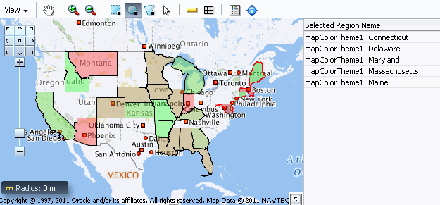
When an end user clicks on a selection tool and uses the tool to highlight an area on the map, the data values in that area can be displayed in another UI element such as a table, or totalled in the information panel, by using a selection listener.
Figure 30-18 shows a map with the states selected in the area outlined in the color red. The related information about the area is displayed in an associated table.
Figure 30-18 Selected Map Area with Table Data Display
You can provide a selection listener that totals the values associated with a map area selected with one of the map selection tools such as the rectangular selection tool. The total is displayed in an area under the map. You must provide a class that takes MapSelectionEvent as an argument in a backing bean method. The example below shows sample code for a backing bean.
package view;
import java.util.Iterator;
import oracle.adf.view.faces.bi.component.geoMap.DataContent;
import oracle.adf.view.faces.bi.event.MapSelectionEvent;
public class SelectionListener {
    private double m_total = 0.0;
    public SelectionListener() {
    }
    public void processSelection(MapSelectionEvent mapSelectionEvent) {
        // Add event code here...
        m_total = 0.0;
        Iterator selIterator = mapSelectionEvent.getIterator();
        while (selIterator.hasNext())
        {
            DataContent dataContent = (DataContent) selIterator.next();
            if (dataContent.getValues() != null)
            {
                Double allData[] = dataContent.getValues();
                m_total += allData[0];
            }
        }
    }
    public double getTotal () {
        return m_total;
    }
    public void setTotal (double total) {
        m_total = total;
    }
}
To provide a selection listener to total map selection values:
30.3.4 How to Customize the Map Legend
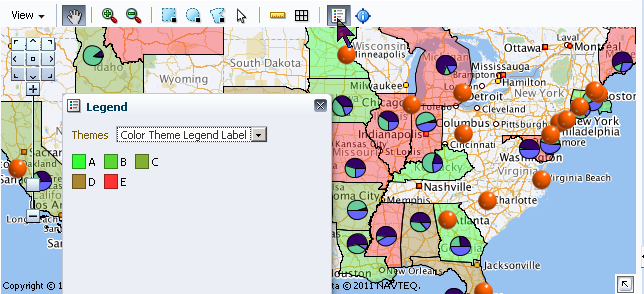
The map legend provides an explanation of the map theme data in symbol and label pairs. The legend displays by default in a popup upon initial display of the map, and when a map toolbar is added and configured, the map legend can display in a window when the user clicks the legend toolbar button.
When multiple themes are configured, a dropdown list is available to display the legend for each theme. Figure 30-19 shows a map displaying the legend for one of its multiple themes.
Figure 30-19 Geographic Map Theme Legend Display
Note:
In order for the legend toolbar button to be available, you must add and configure a toolbar to the map. For more information, see Adding a Toolbar to a Geographic Map.
Before you begin:
It may be helpful to have an understanding of how map attributes and map child tags can affect functionality. For more information, see Configuring Geographic Map Components.
You should already have a map on your page. If you do not, follow the instructions in this chapter to create a map. For information, see How to Add a Geographic Map to a Page.
You should have already configured at least one map color, point, pie graph, or bar graph theme to display data on the map.
To customize a map legend:
30.3.5 What You May Need to Know About Skinning and Customizing the Appearance of Geographic Maps
For the complete list of geographic map skinning keys, see the Oracle Fusion Middleware Documentation Tag Reference for Oracle Data Visualization Tools Skin Selectors. To access the list from JDeveloper, from the Help Center, choose Documentation Library, and then Fusion Middleware Reference and APIs. For additional information about customizing your application using skins, see Customizing the Appearance Using Styles and Skins.
30.4 Customizing Geographic Map Themes
Each of the ADF DVT Geographic Map themes, color, point, pie chart, and bar chart, can be customized using one or more of the following: the map theme binding dialogs, the attributes of the theme tag, or the child tags of the theme tag.
30.4.1 How to Customize Zoom Levels for a Theme
For all map themes, you must verify that the theme specifies zoom levels that match the related zoom levels in the base map. For example, if the base map shows counties only at zoom levels 6 through 8, then a theme that displays points or graphs by county should be applied only at zoom levels 6 through 8.
Before you begin:
It may be helpful to have an understanding of how map attributes and map child tags can affect functionality. For more information, see Configuring Geographic Map Components.
You should already have a map on your page. If you do not, follow the instructions in this chapter to create a map. For information, see How to Add a Geographic Map to a Page.
You should have already configured at least one map color, point, pie graph, or bar graph theme to display data on the map.
To customize the zoom levels of a map theme:
- In the Structure window, right-click the dvt:mapColorTheme, dvt:mapPointTheme, dvt:mapBarGraphTheme, or dvt:mapPieGraphTheme component that you want to customize, and choose Go to Properties.
- In the Properties window, expand the Appearance section. For the MinZoom and MaxZoom attribute, enter the desired low and high zoom values, respectively.
30.4.2 How to Customize the Labels of a Map Theme
By default, the Id attribute of a map theme is used as the label when that theme is displayed in the legend or in the View menu, Theme Selection dialog. You can customize map theme labels using shortLabel and menuLabel attributes to create meaningful labels that identify both the theme type (color, point, bar graph, or pie graph) and the data (such as population, sales, or inventory) so that users can easily recognize the available themes.
Use these attributes to create meaningful labels that identify both the theme type (color, point, bar graph, or pie graph) and the data (such as population, sales, or inventory) so that users can easily recognize the available themes.
Before you begin:
It may be helpful to have an understanding of how map attributes and map child tags can affect functionality. For more information, see Configuring Geographic Map Components.
You should already have a map on your page. If you do not, follow the instructions in this chapter to create a map. For information, see How to Add a Geographic Map to a Page.
You should have already configured at least one map color, point, pie graph, or bar graph theme to display data on the map.
To customize the labels of a map theme:
30.4.3 How to Customize Color Map Themes
When you create a color map theme, you can customize the colors used for the coloring of the background layer. You can specify the colors associated with the minimum and maximum ranges, and then specify the number of color ranges for the theme. For example, if the colors relate to the population on the map, the least populated areas display the minimum color and the most populated areas display the maximum color. Graduated colors between the minimum and maximum color are displayed for ranges between these values.
Before you begin:
It may be helpful to have an understanding of how map attributes and map child tags can affect functionality. For more information, see Configuring Geographic Map Components.
You should already have a map on your page. If you do not, follow the instructions in this chapter to create a map. For information, see How to Add a Geographic Map to a Page.
You should have already configured a map color theme to display data on the map.
To customize the colors of a color map theme:
Alternatively, you can specify the color for each bucket. To specify colors for multiple buckets, for the ColorList attribute of mapColorTheme, bind a color array to the attribute or use a semicolon-separated string. Color can be specified using RGB hexadecimal.
For example, if the value is colorList="#ff0000;#00ff00;#0000ff", then the value of the first bucket is red, the second bucket is green, and the third bucket is blue.
30.4.4 How to Customize Point Images in a Point Theme
A map point theme uses a default image to identify each point. However, you can specify multiple custom images for a point theme and identify the range of data values that each image should represent, using a mapPointStyleItem component for each custom image you want to use in a map point theme.
Before you begin:
It may be helpful to have an understanding of how map attributes and map child tags can affect functionality. For more information, see Configuring Geographic Map Components.
You should already have a map on your page. If you do not, follow the instructions in this chapter to create a map. For information, see How to Add a Geographic Map to a Page.
You should have already configured a map point theme to display data on the map.
To customize the images for points in a map point theme:
30.4.5 What Happens When You Customize the Point Images in a Map
When you use the point style item components to specify a custom image representing a range of data values for a point theme, a child mapPointStyleItem tag is defined inside the parent mapPointTheme tag.
The initial point style setting (ps0) applies to values that do not exceed 500. This point style displays an image for very low inventory and provides corresponding tooltip information.
The second point style setting (ps1) applies to values between 500 and 1000. This point style displays an image for low inventory and provides corresponding tooltip information.
The final point style setting (ps2) applies to values between 1000 and 1600. This point style displays an image for high inventory and provides corresponding tooltip information.
The example below shows the code generated on a JSF page for a map point theme that has three custom point images that represent ranges of inventory at each warehouse point.
<dvt:map id="map1"
...
  <dvt:mapPointTheme id="mapPointTheme1"
     shortLabel="Warehouse Inventory"
     value="{bindings.WarehouseStockLevelsByProduct1.geoMapModel}">
    <dvt:mapPointStyleItem id="ps0" minValue="0"
         maxValue="500"
         imageURL="/images/low.png"
         selectedImageURL="/images/lowSelected.png"
         shortLabel="Very Low Inventory"/>
    <dvt:mapPointStyleItem id="ps1" minValue="500"
         maxValue="1000"
         imageURL="/images/medium.png"
         selectedImageURL="/images/mediumSelected.png"
         shortLabel="Low Inventory"/>
    <dvt:mapPointStyleItem id="ps2" minValue="1000"
         maxValue="1600"
         imageURL="/images/regularGreen.png"
         selectedImageURL="/images/regularGreenSelected.png"
         shortLabel="High Inventory"/>
  </dvt:mapPointTheme>
</dvt:map>
30.4.6 How to Customize the Bars in a Bar Graph Theme
When you create a map bar graph theme, default colors are assigned to the bars in the graph. You can customize the colors of the bars. Use one mapBarSeriesSet tag to wrap all the mapBarSeriesItem tags for a bar graph theme and insert a mapBarSeriesItem tag for each bar in the graph.
Before you begin:
It may be helpful to have an understanding of how map attributes and map child tags can affect functionality. For more information, see Configuring Geographic Map Components.
You should already have a map on your page. If you do not, follow the instructions in this chapter to create a map. For information, see How to Add a Geographic Map to a Page.
You should have already configured a map bar graph theme to display data on the map.
To customize the color of the bars in a map bar graph theme:
30.4.7 What Happens When You Customize the Bars in a Map Bar Graph Theme
When you use the Edit Bar Graph Map Theme Binding dialog to customize the bars in a map bar graph theme, the sequence of the bars reflect the sequence of the entries in the Series Attribute column in the dialog.
The example below shows sample source code generated on the JSF page when you customize the bars in a map bar graph.
<dvt:map
...
  <dvt:mapBarGraphTheme
  ...
    <dvt:mapBarSeriesSet>
      <dvt:mapBarSeriesItem color="#333399" id="bar1"/>
      <dvt:mapBarSeriesItem color="#0000ff" id="bar2"/>
    </dvt:mapBarSeriesSet>
  </dvt:mapBarGraphTheme>
</dvt:map>
30.4.8 How to Customize the Slices in a Pie Graph Theme
When you create a map pie graph theme, default colors are assigned to the slices in the graph. You can customize the colors of the slices. Use one mapPieSliceSet tag to wrap all the mapPieSliceItem tags for a pie graph theme and insert a mapPieSliceItem tag for each slice in the graph.
Before you begin:
It may be helpful to have an understanding of how map attributes and map child tags can affect functionality. For more information, see Configuring Geographic Map Components.
You should already have a map on your page. If you do not, follow the instructions in this chapter to create a map. For information, see How to Add a Geographic Map to a Page.
You should have already configured a map pie graph theme to display data on the map.
To customize the color of the slices in a map pie graph theme:
30.4.9 What Happens When You Customize the Slices in a Map Pie Graph Theme
When you use the Edit Pie Graph Map Theme Binding dialog to customize the slices in a map pie graph theme, the sequence of the slices reflect the sequence of the entries in the Pie Slices Attribute column of the dialog.
The example below shows sample code generated in a JSF page when you customize the slices in a map pie graph.
<dvt:map
...
  <dvt:mapPieGraphTheme
  ...
    <dvt:mapPieSliceSet>
      <dvt:mapPieSliceItem color="#ffffff" id="slice1"/>
      <dvt:mapPieSliceItem color="#ffff00" id="slice2"/>
      <dvt:mapPieSliceItem color="#ff0000" id="slice3"/>
    </dvt:mapPieSliceSet>
  </dvt:mapPieGraphTheme>
</dvt:map>
30.5 Adding a Toolbar to a Geographic Map
When you create an ADF DVT Geographic Map, you can also add and configure a map toolbar to display the legend and information panel, select themes (if you have multiple themes of the same type) or use any of the distance measurement, area measurement, or selection tools.
Figure 30-20 shows a map toolbar.
Figure 30-20 Geographic Map Toolbar
For more information about toolbar functionality, see Geographic Map End User and Presentation Features.
30.5.1 How to Add a Toolbar to a Map
The map toolbar is a separate component and can be positioned on the JSF page above or below the map.
Before you begin:
It may be helpful to have an understanding of how map attributes and map child tags can affect functionality. For more information, see Configuring Geographic Map Components.
You should already have a map on your page. If you do not, follow the instructions in this chapter to create a map. For information, see How to Add a Geographic Map to a Page.
To add and configure a map toolbar:
30.5.2 What Happens When You Add a Toolbar to a Map
When you add a toolbar to a map, the following occurs:
-
A toolbar appears in the JSF page above or below the map as specified. By default, the toolbar contains all the tools unless you change the visibility of one or more tools.
-
Source code is generated and appears in the JSF page above or below the code for the map.
The example below shows sample code for a toolbar that is associated with a map with the ID of map_us. The example shows the location of the code for the map.
<af:form>
  <dvt:mapToolbar mapId="map_us" id="T1"/>
  <dvt:map  id="map_us"
   ...
  </dvt:map>
</af:form>
30.6 Using Thematic Map Components
To display data in ADF DVT thematic maps, a named data collection is required. A data collection represents a set of data objects (also known as a row set) in the data model. Each object in a data collection represents a specific structured data item (also known as a row) in the data model.
30.6.1 Configuring Thematic Maps
The thematic map has a parent component that specifies the geographic base map and child components that are used to style map regions with colors, patterns, or markers, or both, or to add a legend to the map. The prefix dvt: occurs at the beginning of each thematic map component name indicating that the component belongs to the ADF Data Visualization Tools (DVT) tag library.
You can configure the following map components:
-
Thematic map component (
thematicMap): The main thematic map component used to specify the base map upon which data is displayed. The thematic map is packaged with prebuilt base maps including a USA base map, a world base map, as well as base maps for continents and regions of the world such as EMEA and APAC. The thematic map component does not require a map service to display a base map. -
Layer (
areaLayer): Use to specify the layers in the base map that are displayed. EachareaLayercomponent references a single layer, for example, Country, or States in the USA base map, and only the map layers for which anareaLayertag is present will be displayed. Data is then associated with a layer by nesting a data layer within the layer. TheareaLayerchild tags are area data layer (areaDataLayer) and point data layer (pointDataLayer). -
Area Data Layer (
areaDataLayer): Use to associate map layers with a data collection. Using stamping, each row of data in the data model can be identified by a style, for example a color or pattern; a marker, for example a circle or square; or an image.Note:
When you use stamping, child components are not created for every area, marker, or image in a thematic map. Rather, the content of the component is repeatedly rendered, or stamped, once per data attribute, such as the rows in a data collection.
Each time a child component is stamped, the data for the current component is copied into a
varproperty used by the data layer component in an EL Expression. Once the thematic map has completed rendering, thevarproperty is removed, or reverted back to its previous value.The location of the data layer is identified by its immediate child, the
areaLocationtag. This component specifies the location of the named region or area in the map layer. The three types of data that can be stylized in a child tag to theareaLocationtag include:-
Area (
area): Use to stamp out stylistic attributes such as fill colors, patterns, or opacity onto the geographical regions of the map. -
Marker (
marker): Use to stamp out built-in or custom shapes associated with data points on the map. Markers can be customized with different stylistic attributes such as colors and patterns based on their underlying data. -
Images (
af:image): Use to stamp out an image associated with geographical regions of the map.
Note:
Instead of directly specifying the style attributes for the
areaormarkertags, you can use a childattributeGroupstag to generate the style attribute type automatically based on categorical definitions of the data set. If the same style attribute is set in both theareaormarkertags, and by anattributeGroupstag, theattributeGroupsstyle type will take precedence.Note:
You can format a numerical value represented in the
areaormarkertag, for example, apply a currency format, by using anaf:convertNumbertag. For more information, see How to Format Numeric Data Values in Area and Marker Labels.The basic tag structure for configuring a data layer in a thematic map is illustrated as follows:
<dvt:thematicMap basemap="usa"...> <dvt:areaLayer layer="states"> <dvt:areaDataLayer value="#{mydata.collectionModel}" var="row"> <dvt:areaLocation name="#{row.State}"> <dvt:area> OR <dvt:marker> OR <af:image> <dvt:attributeGroups> OR <af:convertNumber> </dvt:attributeGroups> OR </af:convertNumber> </dvt:area> OR </dvt:marker> OR </af:image> </dvt:areaLocation> </dvt:areaLayer> </dvt:areaLayer> <dvt:areaLayer layer="counties"/> </dvt:thematicMap> -
-
Point data layer (
pointDataLayer): Use to associate a map with a specific data point or a map layer with a data collection. The data point can be specified by a named point in a map layer, for example, cities in the USA map, or by longitude and latitude. Using stamping, each point in the data model can be identified by a marker, for example a circle or square, or an image.Note:
When you use stamping, child components are not created for every marker or image in a thematic map. Rather, the content of the component is repeatedly rendered, or stamped, once per data attribute, such as the rows in a data collection.
Each time a child component is stamped, the data for the current component is copied into a
varproperty used by the point layer component in an EL Expression. Once the thematic map has completed rendering, thevarproperty is removed, or reverted back to its previous value.The location of the point layer is identified in its immediate child, a
pointLocationtag. You can configure the location to specify longitude and latitude, or by the location of the named area in the map layer. The two types of data that can be stylized in a child tag to thepointLocationtag include:-
Marker (
marker): Use to stamp out built-in or custom shapes associated with data points on the map. Markers can be customized with different stylistic attributes such as colors and patterns based on their underlying data. -
Images (
af:image): Use to stamp out an image associated with geographical regions of the map.
Note:
Instead of directly specifying the style attributes for the
markertag, you can use a childattributeGroupstag to generate the style attribute type automatically based on categorical definitions of the data set. If the same style attribute is set in both themarkertags, and by anattributeGroupstag, theattributeGroupsstyle type will take precedence.Note:
You can format a numerical value represented in the
markertag, for example, apply a currency format, by using anaf:convertNumbertag. For more information, see How to Format Numeric Data Values in Area and Marker Labels.The basic tag structure for configuring a point data layer in a thematic map is illustrated as follows:
<dvt:thematicMap basemap="usa"...>
  <dvt:areaLayer layer="states">
    <dvt:pointDataLayer id="pdl1" value="#{bean.pointData" var="row">
      <dvt:pointLocation type="pointXY"
                         pointX="#{row.longitude}"
                         pointY="#{row.latitude}">
        <dvt:marker> OR <af:image>
          <dvt:attributeGroups> OR <af:convertNumber>
          </dvt:attributeGroups> OR </af:convertNumber>
        </dvt:marker> OR </af:image>
      </dvt:pointLocation>
    </dvt:pointDataLayer>
  </dvt:areaLayer>
</dvt:thematicMap>
When a point data layer is configured as a direct child of the thematic map component, the data points are always displayed as a global point layer. If the point layer is nested inside a map layer, the data points are only displayed when that map layer is displayed.
The tag structure for nesting point data layers is illustrated following. In the illustration, point data layer
pd1is only displayed when thestateslayer is displayed. Point data layerpd2is always displayed.<dvt:thematicMap basemap="usa"...> <dvt:areaLayer layer="states"> <dvt:areaDataLayer.../> <dvt:pointDataLayer id="pdl1" ...> </dvt:areaLayer> <dvt:areaLayer layer="counties"/> <dvt:pointDataLayer id="pdl2"...'> </dvt:thematicMap> -
-
Custom layer (
customAreaLayer): Use to create a new map layer from independent region data and insert the newly created layer into the layer hierarchy. The custom layer is created by extending a predefined map layer and aggregating the lower level regions to form the new regions in the custom layer. After defining a custom map layer, it is used in the same way as any other map layerUse the child
customAreacomponent to specify the regions from the predefined base map that will be aggregated to form the new area. -
Categorical attributes (
attributeGroups): Use to generate stylistic attribute values such as colors or shapes based on categorical data values in a data set.An alternative to configuring a default stamp across all areas or markers in the thematic map, you use an
areaormarkercomponent childattributeGroupstag to generate the style attribute type automatically based on categorical groups in the data set. If the same style attribute is set in both theareaormarkertag, and by anattributeGroupstag, theattributeGroupsstyle type will take precedence.Based on the attribute representing the column in the data model to group by, the
attributeGroupscomponent can generate style values for each unique value, or group, in the data. Thetypeproperty of theattributeGroupstag specifies the type of stylistic attribute for which values are produced. Supported types forareacomponents arecolor,pattern, andopacity. Supported types formarkercomponents arecolor,shape,pattern,opacity,scaleX, andscaleY. These types can be combined in a space-delimited list to generate multiple stylistic properties for each unique data value.The default style values that are generated are defined using CSS style properties in the ADF skin. Each
attributeGroupstype has a default ramp defined in the ADF skin that can be customized by setting the index-based selectors to the desired values.To achieve a finer level of detail in the display of data, the grouping rules specified in the
attributeGroupscomponent can be overridden by two types of rules defined in these child components:-
Matching rule (
attributeMatchRule): Use to substitute an attribute when the data matches a certain value. -
Exception rule (
attributeExceptionRule): Use to replace an attribute value with another when a particular boolean condition is met.
Note:
The
attributeMatchRuleandattributeExceptionRuletags use a childf:attributetag to define the override values, where thenameproperty defines the type of attribute (such as color or shape), and thevalueproperty defines the override value to use (such as red or square). When thevalueproperty of theattributeGroupstag overrides the value in the group property of theattributeMatchRule, then the style value in the childf:attributewill be assigned to that group of data instead of the next value from the default ramp.The
f:attributetagnameproperty must match one of the attributes listed in the type of theattributeGroupstag grouping rules. If the value provided by an override also happens to be in the prebuilt ramp returned by theattributeGroups, then that value will only be used by the overrides and will be skipped in the prebuilt ramp. -
-
Legend (
legend): Use to display an explanatory table of the map's styled data in symbol and label pairs. Legend components support symbols for color, shape, custom shape, fill pattern, opacity, and images.-
Legend section (
legendSection): Use one or more to point to a thematic maparea,marker,attributeGroups, oraf:imagecomponents stamped to style the data displayed in the map. Legend items sourced from theattributeGroupscomponent split area or marker attribute types into different sections. -
Legend group (
showLegendGroup): Use to create a disclosable section that contains legend section components.
-
30.6.2 Using the Layer Browser
JDeveloper provides a Layer Browser as a tool to ease the development of structuring map layers, data layers, and styling areas and markers to display data in a thematic map. The Layer Browser displays on top of the thematic map in the visual editor and can be repositioned and resized. If not visible, right-click in the map and choose Open Layer Browser.
The Layer Browser visually represents the logical structure of the thematic map and its hierarchical map layers and components. Selection of a component in the Layer Browser is coordinated with selection in the Properties window, Structure window, and page source code.
The Layer Browser toolbar provides controls for the following operations:
-
Add: Provides a dropdown menu for opening a create map layer, data layer, area, or marker dialog to add and configure the component and add source code to the thematic map. The menu choices are provided to maintain the correct structure of the thematic map
-
Edit: Open a data layer, area, or marker binding dialog to modify the settings for the component and change the thematic map source code.
-
Delete: Remove a selected map layer, data layer, area or marker from the thematic map structure and source code.
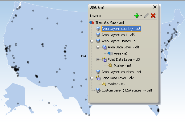
The Layer Browser displays the Id for each component represented in the hierarchical structure. Components are automatically assigned a unique, consecutively numbered id value. Map layers (areaLayer) are assigned al1, al2, al3, and so on. Custom layers (customAreaLayer) are assigned cal1, cal2, cal3, and then referenced by an areaLayer component within the consecutive order. Data layers including area (areaDataLayer) and point (pointDataLayer) components are assigned dl1,dl2, dl3, and so on. When a point layer (pointDataLayer) is added as a direct child of the thematic map, it is a global point layer and always displayed in the thematic map. Markers (marker) are assigned m1, m2, m3 and so on. Areas (area) are assigned a1, a2, a3, and so on.
Figure 30-21 shows a Layer Browser displaying the hierarchical structure of a thematic map.
Figure 30-21 Thematic Map Layer Browser
30.6.3 How to Add a Thematic Map to a Page
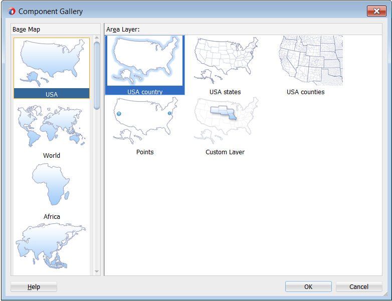
When you are designing your page using simple UI-first development, you use the Components window to add a thematic map to a JSF page. When you drag and drop a thematic map component onto the page, the Component Gallery displays available base maps, prebuilt regional layers, and a custom layer option to provide visual assistance when creating thematic maps.
Figure 30-22 show the Component Gallery for thematic maps with the United States base map and states layer selected.
Figure 30-22 Component Gallery for Thematic Maps
Description of "Figure 30-22 Component Gallery for Thematic Maps"
Once you complete the dialog, and the thematic map is added to your page, you can use the Properties window to specify data values and configure additional display attributes for the map.
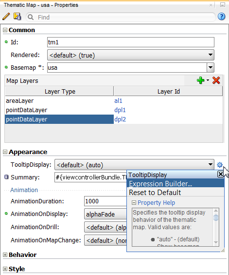
In the Properties window you can use the dropdown menu for each attribute field to display a property description and options such as displaying an EL Expression Builder or other specialized dialogs. Figure 30-23 shows the dropdown menu for a thematic map component tooloTipDisplay attribute.
Figure 30-23 Thematic Map ToolTipDisplay Attribute Dropdown Menu
Note:
If your application uses the Fusion technology stack, then you can use data controls to create a thematic map and the binding will be done for you. See the "Creating Databound Thematic Maps" section in Developing Fusion Web Applications with Oracle Application Development Framework.
Before you begin:
It may be helpful to have an understanding of how thematic map attributes and thematic map child components can affect functionality. See Configuring Thematic Maps.
You may also find it helpful to understand functionality that can be added using other ADF Faces features. See Additional Functionality for Map Components.
You must complete the following tasks:
-
Create an application workspace as described in Creating an Application Workspace.
-
Create a view page as described in Creating a View Page.
To add a thematic map to a page:
You can also use the Layer Browser to add map layers to the thematic map. See Using the Layer Browser.
Customizing Thematic Map Display Attributes describes additional ways of customizing the map.
How to Configure Animation Effects described how to use animation attributes.
30.6.4 What Happens When You Add a Thematic Map to a Page
When you use the Components window to create a thematic map, JDeveloper inserts code in the JSF page. The example below shows the code inserted in the JSF page.
<dvt:thematicMap basemap="usa" id="tm1">
  <dvt:areaLayer layer="states" id="al1"/>
</dvt:thematicMap>
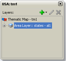
The Layer Browser displays the hierarchical structure of the thematic map. Figure 30-25 shows the Layer Browser after using the Components window to create a thematic map.
Figure 30-25 Thematic Map Layer Browser
You can then configure the thematic map to display data in stylized areas or markers using the ADF Data Controls panel and the thematic map binding dialogs. For information about configuring thematic maps to display data, see the "Creating Databound Thematic Maps" section in Developing Fusion Web Applications with Oracle Application Development Framework.
30.6.5 What You May Need to Know About Thematic Map Image Formats
Thematic maps support the following image formats: HTML5, Flash, and Portable Network Graphics (PNG). All image formats support locales with right-to-left display. By default, thematic maps will display in the best output format supported by the client browser.
If the best output format is not available on the client, the application will default to an available format. For example, if the client does not support HTML5, the application will use:
-
Flash, if the Flash Player is available
You can control the use of Flash content across the entire application by setting a
flash-player-usagecontext parameter inadf-config.xml. For more information, see Configuring Flash as Component Output Format. -
PNG output format
Although static rendering, such as maintaining pan and zoom state of the Flash display, is fully supported when using the printable PNG output format, certain interactive features are not available including:
-
Animation
-
Context menus
-
Drag and drop gestures
-
Popup support
-
Selection
-
30.7 Defining Thematic Map Base Maps
The ADF DVT thematic map component support the use of an extensive set of prebuilt base maps with layers that represent a set of regions. You can also define a custom base map for your thematic map using a set of mapProvider APIs or configuring an XML metadata file to identify data points on an image file.
30.7.1 Using Prebuilt Base Maps
Each base map provided for the thematic map component has two or more prebuilt map layers that represent a set of regions. For example, the world base map includes a map layer for continents and another layer for countries.
The regions in the lower level map layers are aggregated to make up the next level in the geographical hierarchy. The map layer is specified in the layer attribute of the areaLayer component. Each base map includes several sets of regions and one fixed set of cities.
Table 30-1 shows the valid map layers for each base map.
Table 30-1 Prebuilt Base Maps and Layers
| Base Map | Layers |
|---|---|
|
|
|
|
|
|
|
|
|
|
|
|
|
|
|
When you are binding your data collection to a thematic map, you must provide a column in the data model that specifies the location of the area or point data using the map location Ids of the regions from the base map for which the data is being displayed. Area locations are specified in the name attribute of the areaLocation component, and point locations are specified in the pointName attribute for the pointLocation component when its type attribute is set to pointName.
You can download a comma-separated value (CSV) file for each of the prebuilt map layers with a complete listing of all the thematic map base map location Ids. Find these links in the tag documentation for the areaLocation component, name attribute. To access tag documentation for the data visualization components, select the component in the Structure window and click the help button in the Properties window.
For more information, see the "What You May Need to Know About Base Map Location Ids" section in the Developing Fusion Web Applications with Oracle Application Development Framework.
30.7.2 Defining a Custom Base Map Using Map Provider APIs
In addition to using the prebuilt base maps, thematic maps can be configured to retrieve geographic data from any data source including a database or an eLocation service such as Oracle MapViewer or geocoder service using any file type. The thematic map component mapProvider attribute requires an object of type oracle.adf.view.faces.bi.component.thematicMap.mapProvider.MapProvider. The MapProvider APIs allow the custom base map to be configured and used like a prebuilt base map with the same functionality including drilling, labels, custom region support, and point layers.
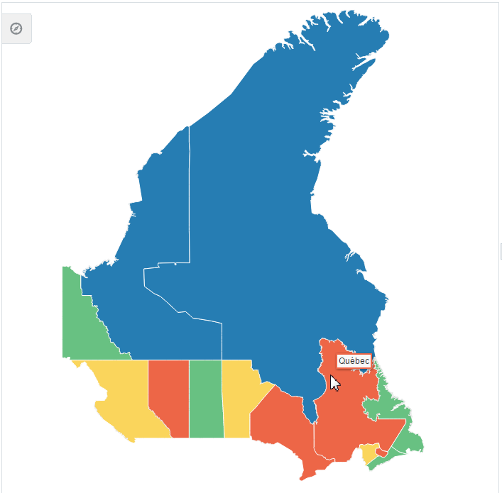
For example, Figure 30-26 displays a custom Canada base map that uses the mapProvider attribute to retrieve geographic data from a GeoJSON formatted zip file.
Figure 30-26 Thematic Map Custom Base Map
Use these abstract and utility classes to configure a custom basemap:
-
oracle.adf.view.faces.bi.component.thematicMap.mapProvider.MapProvider: Abstract class that provides the APIs to render a custom basemap. Use an EL Java callback to pass an implementation of this class to themapProviderattribute ondvt:thematicMap.To view an implementation of the
mapProviderclass for the Canada custom base map example, see Sample Code for Thematic Map Custom Base Map. -
oracle.adf.view.faces.bi.component.thematicMap.mapProvider.utils.MapProviderUtils: Utility class that provides APIs for converting Java 2D objects to a SVG path command. -
oracle.adf.view.faces.bi.component.thematicMap.mapProvider.LayerArea: Abstract class that provides APIs to get the data that the thematic map component requires to render advt:areaLayerand is used by thegetLayerAreas()andgetChildAreas()methods on the abstractMapProviderclass.To view an implementation of the
layerAreaclass for the Canada custom base map example, see Sample Code for Thematic Map Custom Base Map Area Layer. -
oracle.adf.view.faces.bi.component.thematicMap.mapProvider.Projection: If required, abstract class that provides an API for projecting points from thedvt:pointDataLayerfor a custom base map and is used by thegetProjection()method on the abstractMapProviderclass. An identity projection class (oracle.adf.view.faces.bi.component.thematicMap.mapProvider.IdentityProjection)will be provided and returned by default by theMapProviderclass if no point projections need to be performed.
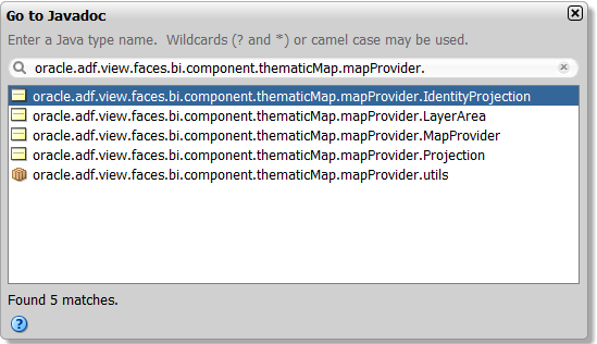
You can view the complete Javadoc for these classes in JDeveloper. From the toolbar select Navigate > Go to Javadoc and enter the class name in the search field. Figure 30-27 shows the search dialog.
Figure 30-27 Custom Base Map APIs in Javadoc
On the JSF page, the code for the thematic map using the Canada custom base map is as follows:
<dvt:thematicMap id="tm1" summary="Map Provider" basemap="canada"
                 mapProvider="#{mapProviderBean.callback}" initialZooming="auto">
  <af:transition transition="auto" triggerType="display"/>
    <dvt:areaLayer layer="territories" id="al1" labelDisplay="off">
      <dvt:areaDataLayer selectionMode="none" id="adl1"
                         value="#{mapProviderBean.territories}" var="row"
                         varStatus="rowStatus">
        <dvt:areaLocation id="l1" name="#{row.id}">
          <dvt:area id="a1" value="#{row.value}">
            <dvt:attributeGroups id='ag1' type="color"
                                  value="#{row.categories[0]}"
                                  label="#{row.categories[0] == 'Group 1' ?
                                  'Territory C' :
                                  (row.categories[0] == 'Group 2' ?
              'Territory A' :  'Territory B')}"/>
          </dvt:area>
        </dvt:areaLocation>
      </dvt:areaDataLayer>
    </dvt:areaLayer>
</dvt:thematicMap>
30.7.3 Defining a Custom Base Map Using Image Files
The thematic map component also supports the definition of a custom base map using an XML metatdata file to define data points on an associated image.
For example, the thematic map in Figure 30-28 shows a custom base map of an office floor plan with points defined for each office location. In the example, a tooltip identifies if the office space is occupied or available.
Figure 30-28 Custom Base Map with Defined Point Layer
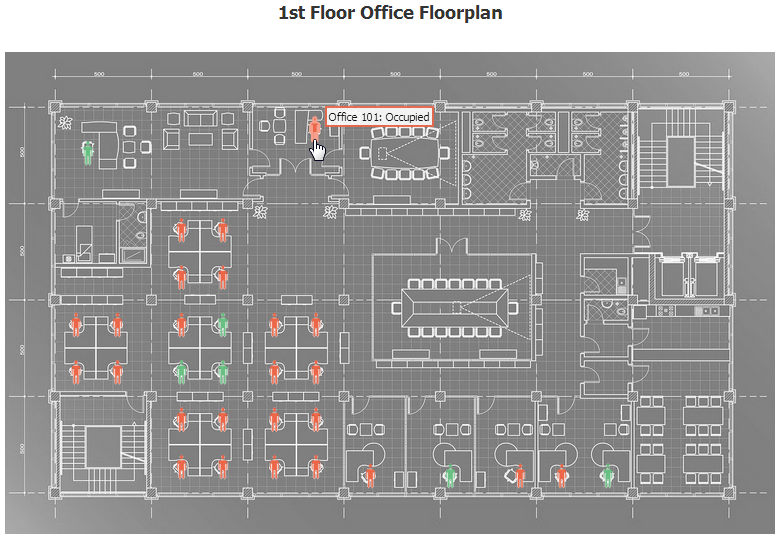
To define a custom base map using an image file, you must create an xml metadata file that defines the image to use for the map and add the file to your project source. In the office floor plan example, a static points for each office is specified by number, as shown in the example below.
<basemap id='floorplan'>
  <layer id='floor1'>
        <image height='813' width='1300'
           source='/resources/images/thematicMap/floorplan.jpg'/>
  </layer>
  <points>
    <point x='140' y='170' name='100' longLabel='Office 100'/>
    <point x='523' y='130' name='101' longLabel='Office 101'/>
    <point x='298' y='300' name='102' longLabel='Office 102'/>
    <point x='368' y='300' name='103' longLabel='Office 103'/>
    <point x='298' y='380' name='104' longLabel='Office 104'/>
    <point x='368' y='380' name='105' longLabel='Office 105'/>
    <point x='120' y='460' name='106' longLabel='Office 106'/>
    <point x='190' y='460' name='107' longLabel='Office 107'/>
    <point x='120' y='540' name='108' longLabel='Office 108'/>
    <point x='190' y='540' name='109' longLabel='Office 109'/>
    <point x='298' y='460' name='110' longLabel='Office 110'/>
    <point x='368' y='460' name='111' longLabel='Office 111'/>
    <point x='298' y='540' name='112' longLabel='Office 112'/>
    <point x='368' y='540' name='113' longLabel='Office 113'/>
    <point x='455' y='460' name='114' longLabel='Office 114'/>
    <point x='525' y='460' name='115' longLabel='Office 115'/>
    <point x='455' y='540' name='116' longLabel='Office 116'/>
    <point x='525' y='540' name='117' longLabel='Office 117'/>
    <point x='298' y='620' name='118' longLabel='Office 118'/>
    <point x='368' y='620' name='119' longLabel='Office 119'/>
    <point x='298' y='700' name='120' longLabel='Office 120'/>
    <point x='368' y='700' name='121' longLabel='Office 121'/>
    <point x='455' y='620' name='122' longLabel='Office 122'/>
    <point x='525' y='620' name='123' longLabel='Office 123'/>
    <point x='455' y='700' name='124' longLabel='Office 124'/>
    <point x='525' y='700' name='125' longLabel='Office 125'/>
    <point x='617' y='715' name='126' longLabel='Office 126'/>
    <point x='752' y='715' name='127' longLabel='Office 127'/>
    <point x='870' y='715' name='128' longLabel='Office 128'/>
    <point x='940' y='715' name='129' longLabel='Office 129'/>
    <point x='1018' y='715' name='130' longLabel='Office 130'/>
  </points>
</basemap>
In the thematic map component you then specify an area layer which points to the definition in the metadata file using the basemap attribute.You can then define an area layer with a specify an area layer with named points, as shown in the example below.
<dvt:thematicMap id="tm1" summary="Custom Base Map" basemap="floorplan"
                 animationOnDisplay="none"
                 source="/resources/images/thematicMap/offices.xml"
                 inlineStyle="background-color:transparent;height:540px;
                              width:810px;"
                 controlPanelBehavior="hidden" panning="none" zooming="none">
  <dvt:areaLayer layer="floor1" id="al1">
    <dvt:pointDataLayer id="pdl1" selectionMode="single" partialTriggers="::::t1"
                        value="#{officesBean.currentFloor.offices}" var="row"
                        animationOnDataChange="alphaFade" varStatus="rowStatus">
      <dvt:pointLocation id="pl1" pointName="#{row.id}" type="pointName">
        <dvt:marker id="m1" shape="human" opacity="1" gradientEffect="none"
                    fillColor="#{row.color}" scaleX="3" scaleY="3"
                    shortDesc="#{row.categories[0]}"/>
      </dvt:pointLocation>
    </dvt:pointDataLayer>
  </dvt:areaLayer>
</dvt:thematicMap>
In the metadata file you can also specify different images for different screen resolutions and display directions. The thematic map component chooses the correct image for the layer based on the screen resolution and direction. The display direction can be either left-to-right or right-to-left. The default direction for the image is left-to-right, which you can change to right-to-left by setting the dir attribute of the image component to rtl. The example below shows sample code for a metadata file with images for a custom base map at different screen resolutions.
<basemap id="car" >
   <layer id="exterior" >
      <image source="/maps/car-800x800.png"
             width="2560"
             height="1920" />
      <image source="/maps/car-800x800-rtl.png"
             width="2560"
             height="1920"
             dir="rtl" />
      <image source="/maps/car-200x200.png"
             width="640"
             height="480" />
      <image source="/maps/car-200x200-rtl.png"
             width="640"
             height="480"
             dir="rtl" />
   </layer>
</basemap>
You can define an area layer with a point data layer, or define the point data layer as a direct child of the thematic map component. If the point layer is nested inside a map layer, the data points are only displayed when that map layer is displayed. When a point data layer is configured as a direct child of the thematic map component, the data points are always displayed as a global point layer. The example below shows sample code for a thematic map with a point data layer defined for an area layer.
<dvt:thematicMap id="tm1" basemap="car" source="customBasemaps/map1.xml" >
   <dvt:areaLayer id="al1" layer="exterior" >
      <dvt:pointDataLayer id="pdl1"
                          var="row"
                          value="{bindings.thematicMapData.collectionModel}" >
         <dvt:pointLocation id="pl1"
                            type="pointXY"
                            pointX="#{row.x}"
                            pointY="#{row.y}" >
            <dvt:marker id="m1" fillColor="#FFFFFF" shape="circle" />
        </dvt:pointLocation>
      </dvt:pointDataLayer>
   </dvt:areaLayer>
</dvt:thematicMap>
The example below shows sample code for a thematic map with a point data layer as a direct child of the thematic map component.
<dvt:thematicMap id="demo1" basemap="car" source="customBasemaps/map1.xml" >
   <dvt:areaLayer id="al1" layer="exterior" />
   <dvt:pointDataLayer id="pdl1"
                       var="row"
                       value="{bindings.thematicMapData.collectionModel}" >
      <dvt:pointLocation id="pl1"
                         type="pointXY"
                         pointX="#{row.x}"
                         pointY="#{row.y}" >
         <dvt:marker id="m1" fillColor="#FFFFFF" shape="circle" />
      </dvt:pointLocation>
   </dvt:pointDataLayer>
</dvt:thematicMap>
30.8 Customizing Thematic Map Display Attributes
You can customize the display attributes of ADF DVT thematic maps labels, including prebuilt map layer labels and labels for area and marker components that stamp out the data values for the thematic map. You can also configure tooltips to display data when the user moves the cursor over the map.
Data values that require special formatting, for example, currency or percentages, can be configured to display special symbols and decimal points.
30.8.1 How to Customize Thematic Map Labels
By default, each region in each map layer for a prebuilt base map has a label with a short and long type, for example, BRA and Brazil in the countries layer of the world base map.
The map layer is specified by the areaLayer component in the layer attribute, for example:
<dvt:areaLayer id="al1" layer="countries">
Note:
Labels are only displayed when they fit within the named region of the map layer. When a label does not fit inside the region, it is not displayed unless leader lines determining the alternate label location are provided for that layer in the base map. Only the prebuilt usa map provides leader lines for labels outside the states layer.
Figure 30-29 shows the default labels for the europe and usa base maps.
Figure 30-29 Default Labels for Europe and USA Base Maps
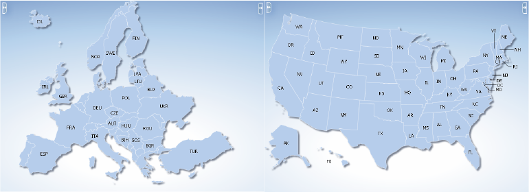
You can customize the default labels provided by the base map for display and style.
Before you begin:
It may be helpful to have an understanding of how thematic map attributes and thematic map child components can affect functionality. For more information, see Configuring Thematic Maps.
You should already have a thematic map on your page. If you do not, follow the instructions in this chapter to create a thematic map. For more information, see How to Add a Thematic Map to a Page.
To customize a map layer label:
-
In the Structure window, right-click the dvt:areaLayer component representing the map layer for which you wish to customize the label, and choose Go to Properties.
-
In the Properties window, expand the Appearance section, and set the following attributes:
-
LabelDisplay: Use the dropdown list to select how the prebuilt base map labels for the layer are to be displayed. Valid values are: auto (default) to display the label if there is sufficient space in the region; on to display the base map labels for all regions of this layer; and off to disable the display of labels.
-
LabelStyle: Enter the font-related CSS styles to use for the label font.
-
LabelType: Use the dropdown list to select the prebuilt base map labels to display. Valid values are short (default) to display the short labels defined in the base map, for example,
TX, and long to display the long labels defined in the base map, for example,Texas.
-
You can also override the default labels in the base map by specifying attributes for the area components that stamp out stylistic attributes such as fill colors, patterns, or opacity onto the geographic regions of the map, and for marker components that stamp out built-in or custom shapes associated with data points on the map.
To customize area and marker labels:
30.8.2 How to Configure Tooltips to Display Data
By default, thematic maps automatically display tooltips using map layer labels when the user moves the cursor over the map. If data is available, the map layer label is concatenated with the value from the area or marker component stamp. You can also configure the tooltip to only display available data.
Before you begin:
It may be helpful to have an understanding of how thematic map attributes and thematic map child components can affect functionality. For more information, see Configuring Thematic Maps.
You should already have a thematic map on your page. If you do not, follow the instructions in this chapter to create a thematic map. For more information, see How to Add a Thematic Map to a Page.
To configure tooltips to display data:
- In the Structure window, right-click the dvt:thematicMap component and choose Go to Properties.
- In the Properties window, expand the Appearance section. For the TooltipDisplay attribute choose auto to display the label concatenated with the value of the area or marker stamp, or shortDesc to only display the value.
- In the Structure window, right-click the dvt:area component or dvt:marker component representing the stamp for which you wish to display data in the tooltip, and choose Go to Properties.
- In the Properties window, expand the Other section. For the ShortDesc attribute enter the value you want to display in the tooltip. For example, if an area component
valueattribute is#{row.data}, use that same value for theshortDescattribute.
30.8.3 How to Format Numeric Data Values in Area and Marker Labels
Thematic map area and marker components can display numeric data values in labels, for example a dollar value, or a percentage. Area and marker labels are specified in the value attribute of the component.
You can format numeric data values by adding a standard ADF converter, af:convertNumber, as a child of the area or marker component, or by specifying a converter through an EL Expression directly on the component. If both a converter and a child af:convertNumber tag are specified, then the properties of the child tag take precedence.
Before you begin:
It may be helpful to have an understanding of how thematic map attributes and thematic map child components can affect functionality. For more information, see Configuring Thematic Maps.
You should already have a thematic map on your page. If you do not, follow the instructions in this chapter to create a thematic map. For more information, see How to Add a Thematic Map to a Page.
You should already have configured an area or marker label in your thematic map. If you do not, follow the instructions in this chapter to customize an area or marker label. For more information, see How to Customize Thematic Map Labels.
To format numeric data values in area or maker labels:
- In the Structure window, right-click the dvt:area or dvt:marker component representing the stamp you wish to format, and choose Insert Inside Area or Insert Inside Marker > Convert Number.
- In the Properties window, specify values for the attributes of the af:convertNumber component to produce numeric formatting. Use the help button to display the complete tag documentation for the
af:convertNumbercomponent.
The example below shows sample code for formatting numeric data values for an area and a marker label.
...
<dvt:area id="a2" labelDisplay="on" value="#{mapBean.value}" >
  <af:convertNumber id="cn1" type="currency"/>
</dvt:area>
<dvt:marker id="m2" labelDisplay="on" value="#{mapBean.value}" >
  <af:convertNumber id="cn1" type="currency"/>
</dvt:marker>
...
Alternatively, specify a converter through an EL expression directly on the area or marker component. For example:
<dvt:marker id="m1" labelDisplay="on" value="#{mapBean.value}"
       converter="#{mapBean.myConverter}"/>
30.8.4 How to Configure Thematic Map Data Zooming
Thematic maps support customized data zooming features. You can configure the initial zoom of a thematic map to fit the rendered area and point data layers without displaying the entire base map. You can also configure a thematic map to render and zoom on an isolated data area.
For example, the thematic map in Figure 30-30 displays area and point data layers for US states. In the example, data is not rendered for all states in the US base map. The initial zoom fits to the boundaries of the data layers.
Figure 30-30 Thematic Map with Initial Zoom on Data Layers
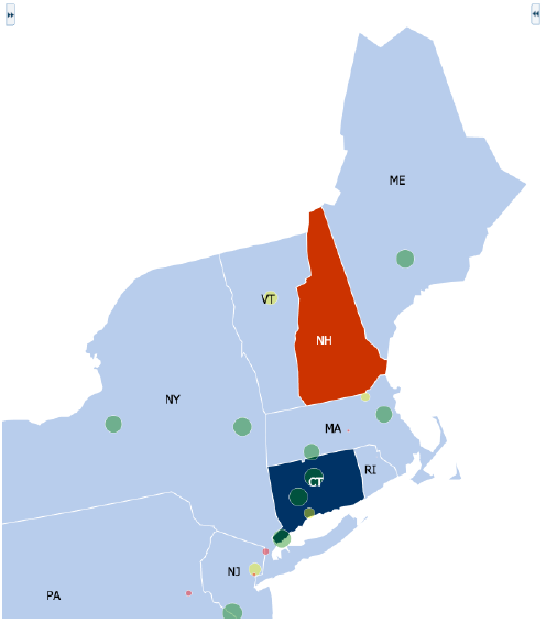
To set the initial zoom to fit rendered data layers, on the dvt:thematicMap component, set the initalZooming property to auto.
Before you begin:
It may be helpful to have an understanding of how thematic map attributes and thematic map child components can affect functionality. For more information, see Configuring Thematic Maps.
You should already have a thematic map with a defined data layer on your page. If you do not, follow the instructions in this chapter to create a thematic map. For more information, see How to Add a Thematic Map to a Page.
To configure the initial zoom:
-
In the Structure window, right-click the dvt:thematicMap component, and choose Go to Properties.
-
In the Properties window, expand the Behavior section, and set the InitalZooming property to
autoto automatically focus the zoom on the rendered data layers. The default value isnone.Use the help button to display the complete tag documentation for the
dvt:thematicMapcomponent.
The thematic map in Figure 30-31 shows the 2012 presidential election results by county for the state of Florida. In the example, an isloatedRowKey property on the dvt:areaDataLayer is set to isolate the state of Florida on the states area layer and US base map. The disclosedRowKey attribute on the dvt:areaDataLayer is set to show Florida drilled down to the counties area layer and stylized with color to represent the winning candidate's color for each county.
Figure 30-31 Thematic Map of 2012 Presidential Election Results for Florida
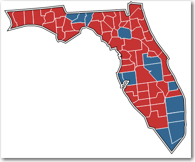
To configure zoom on an isolated data area:
- In the Structure window, right-click the dvt:areaDataLayer component, and choose Go to Properties.
- In the Properties window, expand the Behavior section, and set the IsolatedRowKey property to the area corresponding to the isolated row key for which you wish to display data.
- For the DisclosedRowKey property, specify the row keys for the disclosed regions of the data layer. Each entry in the set is a row key.
The example below shows the code for configuring the thematic map in Figure 30-31.
<dvt:thematicMap id="thematicMap" basemap="usa" drilling="off"
                 animationOnDisplay="alphaFade"
                 controlPanelBehavior="hidden" summary="presidential map"
                 inlineStyle="background-color:transparent;
                 width:400px;border:none;">
  <dvt:areaLayer id="al1" layer="states">
    <dvt:areaDataLayer id="adl1"
                       disclosedRowKeys="#{electionBean.disclosedRowKey}"
                       contentDelivery="lazy"
                       isolatedRowKey="#{electionBean.isolatedRowKey}"
                       value="#{electionBean.state}" var="row"
                       varStatus="rowStatus">
      <dvt:areaLocation id="loc1" name="#{row.id}">
        <dvt:area id="a1" fillColor="#{row.color}"/>
      </dvt:areaLocation>
    </dvt:areaDataLayer>
  </dvt:areaLayer>
    <dvt:areaLayer id="al2" layer="counties">
      <dvt:areaDataLayer id="adl2" value="#{electionBean.counties}" var="row"
                         varStatus="rowStatus"
                         selectionMode="single" contentDelivery="lazy">
      <dvt:areaLocation id="loc2" name="#{row.id}">
        <dvt:area id="a2" fillColor="#{row.color}">
        </dvt:area>
      </dvt:areaLocation>
    </dvt:areaDataLayer>
  </dvt:areaLayer>
</dvt:thematicMap>
30.8.5 How to Configure Invisible Area Layers
By design, thematic maps focus on data within a defined geographic location. In some instances you may wish to display your data without showing the default background color or boundaries of the area layer.
For example, the thematic map in Figure 30-32 displays global GDP (gross domestic product) per capita by country in millions of US dollars using markers scaled by size and label font. In the example, displaying background colors or boundaries of the countries represented by markers do not contribute to an understanding of the data and may in fact, distract from the overall display.
Figure 30-32 Thematic Map Displaying Global GDP Per Capita
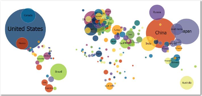
You can override the default area layer color and border display without using a skinning key by setting the areaStyle property CSS attributes for background-color and border-color to transparent on the dvt:areaLayer component.
Before you begin:
It may be helpful to have an understanding of how thematic map attributes and thematic map child components can affect functionality. For more information, see Configuring Thematic Maps.
You should already have a thematic map with a defined area layer on your page. If you do not, follow the instructions in this chapter to create a thematic map. For more information, see How to Add a Thematic Map to a Page.
To configure invisible area layers:
The thematic map in Figure 30-32 uses scaled markers and associated labels to represent a country's GDP per capita. In the example, a minimum GDP value is set to not show labels on smaller markers. The example below shows the code for configuring the markers and labels.
<dvt:marker id="m1" scaleX="#{(5 + row.categories[0]/25)}"
            value="#{row.categories[2]}"
            labelStyle="font-size:#{row.categories[0]/25 + 30}px;" opacity="0.75"
            labelDisplay="#{row.categories[0]/25 le 20 ? 'off' : 'on'}"
            gradientEffect="none"
            scaleY="#{(5 + row.categories[0]/25)}"
            shortDesc="\$#{row.categories[1]} Million">
  <dvt:attributeGroups id="ag1" type="color" value="#{row.id}"/>
</dvt:marker>
Note:
To maintain the relative size of the scaled markers and labels to the thematic map when it is zoomed in or out, set the dvt:thematicMap component markerZoomBehavior property to zoom.
For detailed information about configuring markers to represent thematic map data, see the "Styling Areas, Markers, and Images to Display Data" section of Developing Fusion Web Applications with Oracle Application Development Framework.
30.8.6 What You May Need to Know About Skinning and Customizing the Appearance of a Thematic Map
Thematic maps also support skinning to customize the color and font styles for thematic map layers, areas, and markers. In addition, you can use skinning to define the styles for a thematic map area when the user hovers the mouse over or selects it.
The example below shows the skinning key for a thematic map area configured to show the border color in red when the user selects it.
af|dvt-area:sekected
  {
    -tr-border-color:#0000FF;
  }
For the complete list of thematic map skinning keys, see the Oracle Fusion Middleware Documentation Tag Reference for Oracle Data Visualization Tools Skin Selectors. To access the list from JDeveloper, from the Help Center, choose Documentation Library, and then Fusion Middleware Reference and APIs. For additional information about customizing your application using skins, see Customizing the Appearance Using Styles and Skins.
30.9 Adding Interactive Features to Thematic Maps
ADF DVT Thematic maps include support for interaction features including selection and action events, drilling, popups, animation, and drag and drop operations.
30.9.1 How to Configure Selection and Action Events in Thematic Maps
You can configure your thematic map components to allow users to select one or more areas or markers across multiple data layers. By default, selection is not enabled. You configure selection on areaDataLayer and pointDataLayer components to allow selection of one or multiple area or marker stamps.
Once selection is enabled, you can configure an area or marker stamp with an action listener to specify and handle a custom event such as displaying output text or navigating to another page. For more information about ADF action events, see Handling Events.
Figure 30-33 shows a thematic map configured to display output text when a human marker is clicked, and navigate to another JSF page when a circle marker is clicked.
Figure 30-33 Thematic Map Action Events
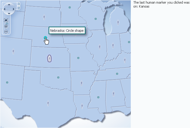
Before you begin:
It may be helpful to have an understanding of how thematic map attributes and thematic map child components can affect functionality. For more information, see Configuring Thematic Maps.
You should already have a thematic map on your page. If you do not, follow the instructions in this chapter to create a thematic map. For more information, see How to Add a Thematic Map to a Page.
You should have already configured a data layer with an area or marker to display data on your thematic map.
To configure selection and action events:
The example below shows sample code for configuring markers to fire action events.
<f:facet name="center">
  <dvt:thematicMap id="thematicMap"
                   imageFormat="flash" basemap="usa"
                   inlineStyle="width:98%;height:95%;"
                   summary="Thematic map showing action events">
    <dvt:areaLayer id="areaLayer" layer="states"
                   labelDisplay="off">
      <dvt:areaDataLayer id="dataLayer"
                         contentDelivery="immediate"
                         value="#{tmapBean.colorModel}"
                         var="row"
                         varStatus="rowStatus"
                         selectionMode="single">
        <dvt:areaLocation id="dataLoc"
                          name="#{row.name}">
          <dvt:marker id="marker1"
                      shape="human" scaleX="3"
                      scaleY="3"
                      fillColor="#666699"
                      actionListener="#{tmapEventBean.processClick}"
                      rendered="#{row.category == 'category1'}"
                      shortDesc="Human shape"/>
          <dvt:marker id="marker2"
                      shape="circle"
                      scaleX="2" scaleY="2"
                      fillColor="#006666"
                      action="mapAction"
                      rendered="#{row.category == 'category2'}"
                      shortDesc="Circle shape"/>
        </dvt:areaLocation>
      </dvt:areaDataLayer>
    </dvt:areaLayer
  </dvt:thematicMap>
</f:facet>
<f:facet name="end">
  <af:outputText value="#{tmapEventBean.clickString}"
                 id="ot1"
                 partialTriggers="thematicMap:areaLayer:dataLayer:marker1"/>
</f:facet>
You can also configure an area or point data layer with a selection listener for declarative master-detail processing, for example, to display the thematic map associated data in another UI component on the page such as a table. For more information, see the "What You May Need to Know About Configuring Master-Detail Relationships" section in Developing Fusion Web Applications with Oracle Application Development Framework.
30.9.2 How to Add Popups to Thematic Map Areas and Markers
Thematic map area and marker components can be configured to display popup dialogs, windows, and menus that provide information or request input from end users. Using the af:popup component with other ADF Faces components, you can configure functionality to allow your end users to show and hide information in secondary windows, input additional data, or invoke functionality such as a context menu.
With ADF Faces components, JavaScript is not needed to show or hide popups. The af:showPopupBehavior tag provides a declarative solution, so that you do not have to write JavaScript to open a popup component or register a script with the popup component. For more information about these components, see Using Popup Dialogs, Menus, and Windows.
For example, you may want to associate a popup to display information in a dialog or note window with thematic map areas or markers. Figure 30-34 shows a thematic map area (Texas) clicked to display a dialog of data about voting results, and the cursor hovered over marker (human) displaying a note window of data about a specific location.
Figure 30-34 Area Dialog and Marker Note Window
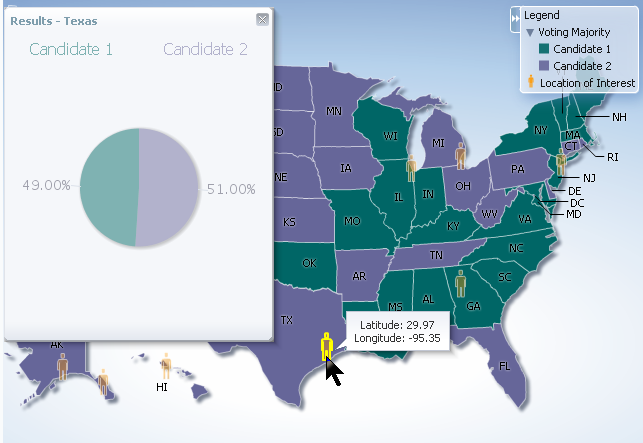
Before you begin:
It may be helpful to have an understanding of how thematic map attributes and thematic map child components can affect functionality. For more information, see Configuring Thematic Maps.
You should already have a thematic map on your page. If you do not, follow the instructions in this chapter to create a thematic map. For more information, see How to Add a Thematic Map to a Page.
You should already have created the popup components for the thematic map area or marker components to reference. The example below shows sample code for the dialog to be referenced when an area stamp is clicked.
<af:popup id="pop1" contentDelivery="lazyUncached" launcherVar="source"
                  eventContext="launcher">
  <af:setPropertyListener from="#{tmapPopupBean.colorModel.rowData}"
                  to="#{tmapPopupBean.source}"
                  type="popupFetch"/>
    <af:dialog id="nw1" modal="false" type="none"
                  title="Results - #{tmapPopupBean.source.fullName}">
      <af:panelGroupLayout id="pgl6">
      <af:panelGroupLayout id="pgl7" layout="horizontal"
                  halign="center">
        <af:outputText value="Candidate 1" id="ot2"
                  inlineStyle="color:#{tmapPopupBean.strColor2};
                  font-size:medium;"/>
        <af:spacer width="50" height="10" id="spacer1"/>
        <af:outputText value="Candidate 2" id="ot1"
                  inlineStyle="color:#{tmapPopupBean.strColor1};
                  font-size:medium;"/>
      </af:panelGroupLayout>
      <af:panelGroupLayout id="pgl5" layout="horizontal"
                  halign="center">
        <dvt:pieGraph id="graph1" subType="PIE"
                  inlineStyle="height:250.0px;width:250.0px"
                  tabularData="#{tmapPopupBean.graphData[tmapPopupBean.source]}"
                  imageFormat="PNG">
          <dvt:background fillTransparent="true"/>
          <dvt:graphPieFrame fillTransparent="true"/>
            <dvt:seriesSet>
              <dvt:series index="0" color="#{tmapPopupBean.color1}"/>
              <dvt:series index="1" color="#{tmapPopupBean.color2}"/>
            </dvt:seriesSet>
              <dvt:sliceLabel rendered="true">
              <dvt:graphFont id="graphFont1" size="14"/>
              </dvt:sliceLabel>
              <dvt:pieLabel rendered="false"/>
              <dvt:legendArea rendered="false"/>
        </dvt:pieGraph>
      </af:panelGroupLayout>
    </af:panelGroupLayout>
  </af:dialog>
</af:popup>
The example below shows sample code for the note window to be referenced when the user hovers the mouse over a marker stamp.
<af:popup id="pop2" contentDelivery="lazyUncached" launcherVar="source"
                  eventContext="launcher">
  <af:setPropertyListener from="#{tmapPopupBean.pointModel.rowData}"
                  to="#{tmapPopupBean.noteSource}"
                  type="popupFetch"/>
  <af:noteWindow id="nw2">
    <af:panelGroupLayout id="pgl8" halign="center" layout="vertical">
      <af:outputText value="Latitude: #{tmapPopupBean.noteSource.latitude}"
                  id="ot4"/>
      <af:outputText value="Longitude: #{tmapPopupBean.noteSource.longitude}"
                  id="ot5"/>
    </af:panelGroupLayout>
  </af:noteWindow>
</af:popup>
For more information about popup components, see Using Popup Dialogs, Menus, and Windows.
To add a popup to an area or marker:
The example below shows sample code for adding popup components to the area and marker stamps in a thematic map.
<dvt:thematicMap id="thematicMap" imageFormat="flash
                 basemap="usa" summary="Thematic map showing voting data in US">
  <dvt:legend label="Legend">
    <dvt:showLegendGroup label="Voting Majority">
      <dvt:legendSection source="areaLayer:dataLayer:area1"/>
    </dvt:showLegendGroup>
  <dvt:legendSection source="areaLayer:pointLayer:marker1"/>
</dvt:legend>
<dvt:areaLayer id="areaLayer" layer="states">
  <dvt:areaDataLayer id="dataLayer" contentDelivery="immediate"
                 value="#{tmapPopupBean.colorModel}"
                 var="row" varStatus="rowStatus">
    <dvt:areaLocation id="areaLoc" name="#{row.name}">
      <dvt:area id="area1"
                 fillColor="#{row.value > 50 ? tmapPopupBean.color1 :
                 tmapPopupBean.color2}"
        <f:attribute name="legendLabel" value="#{row.value > 50 ? 'Candidate 2' :
                 'Candidate 1'}" />
        <af:showPopupBehavior triggerType="click"
                 popupId="::::pop1"
                 alignId="area1"
                 align="endAfter"/>
      </dvt:area>
    </dvt:areaLocation>
  </dvt:areaDataLayer>
  <dvt:pointDataLayer id="pointLayer"
                 value="#{tmapPopupBean.pointModel}" var="row"
                 varStatus="rowStatus"
                 contentDelivery="immediate">
    <dvt:pointLocation id="pointLoc" type="pointXY"
                 pointX="#{row.longitude}"
                 pointY="#{row.latitude}">
      <dvt:marker id="marker1" shape="human" fillColor="#FF9900"
                 scaleX="3" scaleY="3"
        <f:attribute name="legendLabel" value="Location of Interest" />
        <af:showPopupBehavior triggerType="mouseHover"
                  alignId="marker1"
                  popupId="::::pop2"
                  align="endAfter"/>
      </dvt:marker>
    </dvt:pointLocation>
   </dvt:pointDataLayer>
  </dvt:areaLayer>
</dvt:thematicMap>
30.9.3 How to Configure Animation Effects
By default, thematic maps are animated upon initial rendering of the map, when the data associated with the map changes, and when a region is drilled in the map. You can customize the default setting of each animation event.
Before you begin:
It may be helpful to have an understanding of how thematic map attributes and thematic map child components can affect functionality. For more information, see Configuring Thematic Maps.
You should already have a thematic map on your page. If you do not, follow the instructions in this chapter to create a thematic map. For more information, see How to Add a Thematic Map to a Page.
To customize animation effects in a thematic map:
30.9.4 How to Add Drag and Drop to Thematic Map Components
The ADF Faces framework provides the ability to drag and drop items from one place to another on a page. For thematic maps, area and marker components can be used as a drag source by adding and configuring a child af:dragSource component, and areaLayer components can be used as a drop target by adding and configuring a child af:dropTarget component.
For example, you could drag an area representing the population for a state in a USA map and drop it into a table to display the data.
Before you begin:
It may be helpful to have an understanding of how thematic map attributes and thematic map child components can affect functionality. For more information, see Configuring Thematic Maps.
You should already have a thematic map on your page. If you do not, follow the instructions in this chapter to create a thematic map. For more information, see How to Add a Thematic Map to a Page.
To use an area or marker as a drag source:
-
In the Structure window, right-click the
areaormarkercomponent you are configuring as a drag source, and choose Insert Inside Area or Insert Inside Marker > Drag source. -
In the Properties window, specify the actions attribute.
The example below shows sample code for adding and configuring an area as a drag source.
<dvt:area id="area" fillColor="#{tmapTargetActualBean.colorObj}"
             shortDesc="#{tmapTargetActualBean.tooltip}">
  <af:dragSource actions="COPY" discriminant="DnDDemoModel"/>
</dvt:area>
To use a map layer as a drop target:
- In the Structure window, right-click the
areaLayercomponent you are configuring as a drop target, and choose Insert Inside Area Layer > Drop Target. - Enter an expression for the
dropListenerthat evaluates to a method on a managed bean that will handle the event. - In the managed bean referenced in the EL expression created in Step 2 for the
dropListenerattribute, create the event handler method (using the same name as in the EL expression) that will handle the drag and drop functionality.
The example below shows sample code for adding and configuring a map layer as a drop target.
<dvt:areaLayer id="areaLayer" layer="states">
  <af:dropTarget actions="COPY"
                    dropListener="#{TestDropHandler.handleCollectionFireDrop}">
    <af:dataFlavor flavorClass="java.util.Collection"/>
  </af:dropTarget>
</dvt:areaLayer>
For more information about adding drag and drop functionality, see Adding Drag and Drop Functionality for Components.
