16 Using Popup Dialogs, Menus, and Windows
This chapter includes the following sections:
16.1 About Popup Dialogs, Menus, and Windows
The ADF Faces popup component provides a popup window as a secondary window. Using the popup component along with the other components, you can allow users to submit input values or provide additional information to them.
You can use the popup component with a number of other ADF Faces components to create a variety of dialogs, menus, and windows that provide information or request input from end users. Using these components, you can configure functionality to allow your end users to show and hide information in secondary windows, input additional data, or invoke functionality. The capabilities offered by these components allow you to render content or functionality that is supplemental to the content rendered on the primary interface and, as a result, develop uncluttered and user friendly interfaces.
The popup component is an invisible layout control, used in conjunction with other components to display inline (that is, belonging to the same page) dialogs, windows, and menus. The popup component is invoked from within the primary interface and the application manages the content that renders in the popup component like content in the primary interface without interference from popup blockers. It is recommended that the content type you render in a popup component be HTML. Other types of content, such as Flash or PDF files, may not render appropriately in a popup component.
Figure 16-1 shows examples where the popup component works with other ADF Faces components to render secondary windows.
Figure 16-1 ADF Faces Components for Dialogs, Menus, and Windows
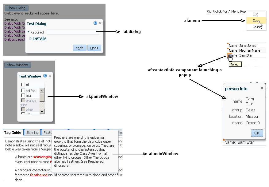
Description of "Figure 16-1 ADF Faces Components for Dialogs, Menus, and Windows"
To provide support for building pages for a process displayed separate from the parent page, ADF Faces provides a dialog framework. This framework supports multiple dialog pages with a control flow of their own. For example, say a user is checking out of a website after selecting a purchase and decides to sign up for a new credit card before completing the checkout. The credit card transaction could be launched using the dialog framework in an external browser window. The completion of the credit card transaction does not close the checkout transaction on the original page.
This dialog framework can also be used inline as part of the parent page. This can be useful when you want the pages to have a control flow of their own, but you do not want the external window blocked by popup blockers.
If your application uses the full Fusion technology stack, note that this dialog framework is integrated with ADF Controller for use with ADF task flows. See Running a Bounded Task Flow in a Modal Dialog in Developing Fusion Web Applications with Oracle Application Development Framework.
Using a context parameter named LAST_WINDOW_SESSION_TIMEOUT in your application's web.xml file, you can specify the maximum inactive period of time before session timeout when an application has only one open window. The maximum inactive period of time that you specify for the context parameter should be less than the value you specify for session timeout. If you enable this feature and there is only one window open in a session, the session timeout is set to the value that you specify for this context parameter. The following example shows how to set the value of the LAST_WINDOW_SESSION_TIMEOUT context parameter in a web.xml file to 1800 seconds.
For more information about configuring your application's web.xml file, see Configuration in web.xml.
<!-- Sets the session timeout to 1800 seconds when there is only one window open
in the session and 1800 seconds is smaller then the original session timeout. This
gives your application the option to end the session when an end user closes the
last window. Specify a value in seconds. A negative value disables this feature.
The default value is -1. -->
   <context-param>
     <param-name>LAST_WINDOW_SESSION_TIMEOUT</param-name>
     <param-value>1800</param-value>
   </context-param>
16.1.1 Popup Dialogs, Menus, Windows Use Cases and Examples
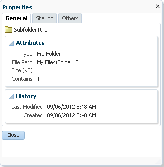
You can place a dialog component as a child to a popup component and render a dialog in a popup at runtime. The dialog component must be the only immediate child component of the popup component. At runtime, end users can view or enter information (for example, search criteria) and use the dialog component's default buttons to invoke a dialogEvent when clicked. Figure 16-2 shows an example where an end user can dismiss the dialog by clicking the Close button.
Figure 16-2 af:dialog Component
You can also use components within a popup to display contextual information related to another component. When so configured, the related component displays a small square. When moused over, the icon grows and also displays a note icon, as shown in Figure 16-3.
Figure 16-3 With Mouseover, Larger Icon with Note Is Displayed

When the user clicks the note icon, the associated popup displays its enclosed content.
16.1.2 Additional Functionality for Popup Dialogs, Menus, and Windows
You may find it helpful to understand other ADF Faces features before you use a popup component to create dialogs, menus, and windows. Additionally, once you have added a popup component (or related components) to your page, you may find that you need to add functionality such as accessibility and localization. Following are links to other functionality that these components can use.
-
Using parameters in text: You can use the ADF Faces EL format tags if you want the text displayed in a component to contain parameters that will resolve at runtime. See How to Use the EL Format Tags.
-
Events: The
dialogcomponent renders ADF Facesbuttoncomponents. You can also use abuttoncomponent in conjunction with theshowPopupBehaviortag to launch a popup. Thebuttoncomponent used in conjunction with theshowPopupBehaviortag deliversActionEventevents when activated. For information about how to handle events on the server as well as on the client, see Handling Events. -
Messages: Popup dialogs and secondary windows are frequently used to provide different levels of help information for users. For information about how to display messages to users, see Displaying Tips, Messages, and Help.
-
Localization: Instead of directly entering text for labels in the popup dialogs, menus, and windows that you create, you can use property files. These files allow you to manage translation of the text strings. See Internationalizing and Localizing Pages.
-
Skins: You can change the look and feel of the components that you use to create popup dialogs, menus, and windows by changing the skin. See Customizing the Appearance Using Styles and Skins.
-
Accessibility: You can make your popup dialogs, menus, and windows accessible. See Developing Accessible ADF Faces Pages.
-
Dialog framework: If your application uses the full Fusion technology stack, note that the dialog framework is integrated with ADF Controller for use with ADF task flows. See Using Dialogs in Your Application in Developing Fusion Web Applications with Oracle Application Development Framework.
-
Touch Devices: ADF Faces components may behave and display differently on touch devices. See Creating Web Applications for Touch Devices Using ADF Faces.
-
Drag and Drop: You can configure your components so that the user can drag and drop them to another area on the page. See Adding Drag and Drop Functionality.
16.2 Declaratively Creating Popups
ADF Faces provides a showPopupBehavior tag that allows you to declaratively create popup along with action events on buttons in the components. You can use different components in a popup component.
The dialog, panelWindow, menu, and noteWindow components can all be used inside the popup component to display inline popups, as shown in Table 16-1. When no child component exists for the popup component, a very simple inline popup appears.
Table 16-1 Components Used with the popup Component
| Component | Displays at Runtime |
|---|---|
|
|
Displays its children inside a dialog and delivers events when the 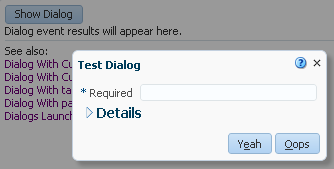 |
|
|
Displays its children in a window that is similar to a dialog, but does not support events. See How to Create a Panel Window. 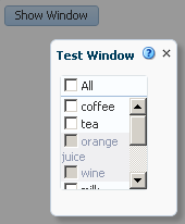 |
|
|
Displays a context menu for an associated component. See How to Create a Context Menu.  |
|
|
Displays read-only information associated with a particular UI component. Note windows are used to display help and messages and are commonly shown on mouseover or on focus gestures. See How to Create a Note Window. 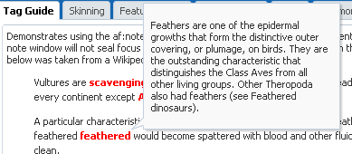 |
|
|
Displays content inline.
 |
Both the dialog and panelWindow components support definition help, content displayed when a user moves the cursor over a help icon (a blue circle with a question mark). The dialog and panelWindow components do not support instruction help. See Displaying Tips, Messages, and Help.
Typically, you use a button component in conjunction with the showPopupBehavior tag to launch a popup. You associate the showPopupBehavior tag with the component it should launch. This tag also controls the positioning of the popup (when needed).
In addition to being used with action events on button components, the showPopupBehavior tag can be used with other events, such as the showDetail event and the selection event. See Declaratively Invoking a Popup.
As an alternative to using the showPopupBehavior tag with an action component, you can launch, cancel, or hide a popup by writing a backing bean method. The backing bean method you write takes the actionEvent returned by the action component as an argument. For more information about this alternative, see Programmatically Invoking a Popup.
By default, the content of the popup is not sent from the server until the popup is displayed. This represents a trade-off between the speed of showing the popup when it is opened and the speed of rendering the parent page. Once the popup is loaded, by default the content will be cached on the client for rapid display.
You can modify this content delivery strategy by setting the contentDelivery attribute on the popup component to one of the following options:
-
lazy- The default strategy previously described. The content is not loaded until you show the popup once, after which it is cached. -
immediate- The content is loaded onto the page immediately, allowing the content to be displayed as rapidly as possible. Use this strategy for popups that are consistently used by all users every time they use the page. -
lazyUncached- The content is not loaded until the popup displays, and then the content reloads every time you show the popup. Use this strategy if the popup shows data that can become stale or outdated.
If you choose to set the popup component's contentDelivery attribute to lazy, you can further optimize the performance of the popup component and the page that hosts it by setting another popup component attribute (childCreation) to deferred. This defers the creation of the popup component's child components until the application delivers the content. The default value for the childCreation attribute is immediate.
16.2.1 How to Create a Dialog
Create a dialog when you need the dialog to raise events when dismissed. Once you add the dialog component as a child to the popup component, you can add other components to display and collect data.
By default, the dialog component can have the following combination of buttons:
-
Cancel
-
OK
-
OK and Cancel
-
Yes and No
-
Yes, No, and Cancel
-
None
These buttons launch a dialogEvent when clicked. You can add other buttons to a dialog using the buttonBar facet. Any buttons that you add do not invoke the dialogEvent. Instead, they invoke the standard actionEvent. To make sure that the actionEvent invokes only on components within the dialog, set the partialSubmit attribute of any button that you add to true. However, you can add buttons and set their partialSubmit attribute to false if you set the af:popup component's autoCancel property's value to disabled. Choosing this latter option (partialSubmit set to false) results in increased wait times for end users because your application reloads the page and reinitializes components on the page before it restores the popup component's visibility (and by extension, the dialog component). Note that you must set the button's partialSubmit attribute to true if the af:popup component's autoCancel property's value is set to enabled (the default value). For information about the use of the af:popup component's autoCancel property, see Controlling the Automatic Cancellation of Inline Popups.
Before you begin:
It may be helpful to understand how the dialog component's attributes and other components affect the functionality of inline dialogs. See Declaratively Creating Popups.
You may also find it helpful to understand functionality that can be added using other ADF Faces features. See Additional Functionality for Popup Dialogs, Menus, and Windows.
To create an inline dialog:
16.2.2 How to Create a Panel Window
The panelWindow component is similar to the dialog component, but it does not allow you to configure the buttons or to add buttons to a facet. If you need to invoke logic to handle data in the panelWindow, you need to create a listener for the popup component's cancel event.
The popup component that contains the panelWindow component must be contained within a form component.
Tip:
If you are using the panelWindow as an inline popup in an application that uses the Fusion technology stack, and you want to emulate the look of a dialog, place the panelWindow component in the center facet of a panelStretchLayout component, and place button components in the bottom facet.
Before you begin:
It may be helpful to understand how the panelWindow component's attributes affect the functionality of inline windows. See Declaratively Creating Popups.
You may also find it helpful to understand functionality that can be added using other ADF Faces features. See Additional Functionality for Popup Dialogs, Menus, and Windows.
To create an inline window:
16.2.3 How to Create a Context Menu
You create a context menu by using menu components within the popup component. You can then invoke the context menu popup from another component, based on a given trigger. If instead, you want toolbar buttons in a toolbar to launch popup menus, then see Using Toolbars.
Before you begin:
It may be helpful to understand how the popup component's attributes and other components affect the functionality of context menus. See Declaratively Creating Popups.
You may also find it helpful to understand functionality that can be added using other ADF Faces features. See Additional Functionality for Popup Dialogs, Menus, and Windows.
To create an inline context menu:
16.2.4 How to Create a Note Window
Use the noteWindow component to display read-only text. The popup component that contains the noteWindow component must be contained within a form component.
Before you begin:
It may be helpful to understand how the noteWindow component's attributes and other components affect functionality. See Declaratively Creating Popups.
You may also find it helpful to understand functionality that can be added using other ADF Faces features. See Additional Functionality for Popup Dialogs, Menus, and Windows.
To create an inline window:
-
In the Components window, from the Layout panel, in the Secondary Windows group, drag a Popup and drop it onto the page.
Tip:
It does not matter where the popup component appears on the page, as the position is driven by the component used to invoke the popup. However, the
popupcomponent must be within aformcomponent. -
In the Properties window, expand the Common section and set the following attributes.
-
ContentDelivery: Determines how the content is delivered to the component in the popup.
-
Animate: Configure animation for the note window. See What You May Need to Know About Animation and Popups.
-
LauncherVar: Enter a variable to be used to reference the launch component. This variable is reachable only during event delivery on the
popupor its child components, and only if the EventContext is set tolauncher. -
EventContext: Select launcher if the popup is shared by multiple objects, for example if the window within the popup will display information for the selected row in a table. Setting this attribute to
launchermakes the row clicked current before the event listener is called, and returns only data for that row. See What Happens at Runtime: Popup Component Events. -
PopupCancelListener: Set to an EL expression that evaluates to a handler with the logic that you want to invoke when the window is dismissed.
-
Optionally, select a value from the AutoCancel dropdown list to determine the automatic cancel behavior. See Controlling the Automatic Cancellation of Inline Popups.
-
-
In the Components window, from the Layout panel, in the Secondary Windows group, drag and drop a Note Window as a direct child to the
popupcomponent. -
To enter the text to display in the window:
-
Click the Source tab to view the page source code.
-
Remove the closing slash (/) from the
af:noteWindowtag. -
Below the
af:noteWindow tag, enter the text to display, using simple HTML tags, and ending with a closedaf:noteWindow tag.
The following example shows text for a note window.
<af:popup id="popupHead" contentDelivery="lazyUncached">
  <af:noteWindow inlineStyle="width:200px" id="nw3">
    <p>In anatomy, the head of an animal is the rostral part (from
    anatomical position) that usually comprises the brain, eyes,
    ears, nose, and mouth (all of which aid in various sensory
    functions, such as sight, hearing, smell, and taste). Some very
    simple animals may not have a head, but many bilaterally
    symmetric forms do.</p>
  </af:noteWindow>
</af:popup>
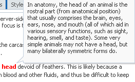
Figure 16-4 shows how the note would display.
Figure 16-4 Text Displayed in a Note Window
Description of "Figure 16-4 Text Displayed in a Note Window" -
-
Optionally, in the Properties window, expand the Behavior section and specify a number of seconds in the AutoDismissalTimeout field. The value you specify determines the time in seconds that the note window displays before the application automatically dismisses it. Any value you specify overrides the default automatic dismissal behavior. This override is revoked if the end user moves the mouse over the content of the note window because this gesture reverts the automatic dismissal behavior back to the default automatic dismissal behavior for the note window. The default automatic dismissal behavior is to dismiss the note window when focus changes from the launching source or from the content of the popup.
Note:
The feature enabled by this property is not accessible friendly because a mouse over triggers the timeout cancellation period and there is no keyboard equivalent.
-
Add logic on the parent page to invoke the popup and note window. See Declaratively Invoking a Popup.
16.2.5 What Happens at Runtime: Popup Component Events
When content is delivered to the popup, and the contentDelivery attribute is set to either lazy or lazyUncached, the popupFetch server-side event is invoked. This event has two properties, eventContext and launcherVar. The eventContext property determines the context from which the event is delivered, either from the context of the popup (self) or from the component that launched the popup (launcher). Setting the context to launcher can be very useful if the popup is shared by multiple components, because the framework will behave as though the component that launched the popup had launched the event, and not the popup. The launcherVar property is used to keep track of the current launcher, similar to the way in which variables are used to stamp out rows in a table.
For example, say you have a column in a table that displays a person's first name using a link component. When the link component is hovered over, a popup noteWindow is invoked that shows the person's full name. Because this noteWindow will be used by all rows in the table, but it needs to display the full name only for the row containing the link component that was clicked, you need to use the eventContext property to make sure that the context is that row, as shown in the following example.
<af:popup id="noteWindow" contentDelivery="lazyUncached" eventContext="launcher"
          launcherVar="source">
  <af:noteWindow>
    <af:outputText value="#{testBean.fullName}"/>
  </af:noteWindow>
</af:popup>
<af:table var="person" value="#{testBean.people}">
  <af:column id="firstName">
    <af:link text="#{person.firstName}">
      <af:showPopupBehavior popupId="::noteWindow" triggerType="mouseHover"/>
    </af:link>
  </af:column>
</af:table>
Using the variable source, you can take values from the source and apply them, or you can set values. For example, you could get the full name value of the people object used in the table, and set it as the value of the testBean's fullName property used by the window, using a setPropertyListener and clientAttribute tag, as shown in the following example.
<af:popup id="noteWindow" contentDelivery="lazyUncached" eventContext="launcher"
          launcherVar="source">
  <af:noteWindow>
    <af:outputText value="#{testBean.fullName}"/>
  </af:noteWindow>
  <af:setPropertyListener from="#{source.attributes.fullName}"
                          to="#{testBean.fullName}" type="popupFetch"/>
</af:popup>
<af:table var="person" value="#{testBean.people}">
  <af:column id="firstName">
    <f:facet name="header">
      <af:outputText value="First Name"/>
    </f:facet>
    <af:link text="#{person.firstName}">
      <af:showPopupBehavior popupId="::noteWindow" triggerType="mouseHover"/>
      <af:clientAttribute name="fullName" value="#{person.fullName}"/>
    </af:link>
  </af:column>
</af:table>
In this example, the launcherVar property source gets the full name for the current row using the popupFetch event. For information about using the setPropertyListener tag, see How to Use the pageFlowScope Scope Without Writing Java Code. For information about using client attributes, see Using Bonus Attributes for Client-Side Components. For information about the showPopupBehavior tag, see Declaratively Invoking a Popup.
Popups also invoke the following client-side events:
-
popupOpening: Fired when the popup is invoked. If this event is canceled in a client-side listener, the popup will not be shown. -
popupOpened: Fired after the popup becomes visible. One example for using this event would be to create custom rules for overriding default focus within the popup. -
popupCanceled: Fired when a popup is unexpectedly dismissed by auto-dismissal or by explicitly invoking the popup client component's cancel method. This client-side event also has a server-side counterpart. -
popupClosed: Fired when the popup is hidden or when the popup is unexpectedly dismissed. This client-side event also has a server-side counterpart.
When a popup is closed by an affirmative condition, for example, when the Yes button is clicked, it is hidden. When a popup is closed by auto-dismissal, for example when either the Close icon or the Cancel button is clicked, it is canceled. Both types of dismissals result in raising a popupClosed client-side event. Canceling a popup also raises a client-side popupCanceled event that has an associated server-side counterpart. The event will not be propagated to the server unless there are registered listeners for the event. If it is propagated, it prevents processing of any child components to the popup, meaning any submitted values and validation are ignored. You can create a listener for the popupCanceled event that contains logic to handle any processing needed when the popup is canceled.
If you want to invoke some logic based on a client-side event, you can create a custom client listener method. See Listening for Client Events. If you want to invoke server-side logic based on a client event, you can add a serverListener tag that will invoke that logic. See Sending Custom Events from the Client to the Server.
16.2.6 What You May Need to Know About Dialog Events
The dialog component raises a dialogEvent when the end user clicks the OK, Yes, No or Cancel buttons. A dialog component automatically hides itself when the end user clicks the OK, Yes or No buttons provided that no message with a severity of error or greater exists on the page. An end user selecting the Cancel button or close icon cancels the parent popup component and raises a popup canceled event.
You can configure a dialogListener attribute to intercept the dialogEvent returned by the OK, Yes, No, and Cancel buttons. Only the dialogEvent returned by the OK, Yes and No buttons get propagated to the server. The dialogEvent returned by the Cancel button, the ESC key, and close icon queue a client dialog event and do not get propagated to the server.
If you configure an actionListener for the action component that invokes a dialog component to carry out an action (for example, update an inputText component) after the dialog component returns, you also need to call resetValue() on the inputText component if the action component's immediate value is set to true.
For information about the events raised by the dialog and popup components, see the Tag Reference for Oracle ADF Faces.
16.2.7 What You May Need to Know About Animation and Popups
The dialog, panelWindow, menu, and noteWindow components that render inside the popup component to display popups can use animation when rendering. You enable animation for these components in an application by setting the <animation-enabled> element to true in the application's trinidad-config.xml file, as described in Animation Enabled.
You can further customize or disable the animation of these components by writing values for the -tr-animate and -tr-open-animation-duration ADF skin properties in the application's ADF skin. The following example demonstrates how you can permit animation for menu components in an application while you disable animation for dialog components.
/** Animate menu components and specify 10 seconds as the duration to open a menu or a popup menu */
af|menu {
    -tr-open-animation-duration: 10000;
    -tr-animate: true;
}

/** Disable animation for dialog components */
af|dialog {
    -tr-animate: false;
}
The animation behavior of specific instances of a popup component can be configured by setting the appropriate value for the popup component's animate property, as described in the following list:
-
default: The
<animation-enabled>element in the application'strinidad-config.xmlfile and ADF skin properties in the application's ADF skin determine the animation behavior of the popup component. -
false: Turns off animation for the popup regardless of the animation settings that you have configured for the application in the
trinidad-config.xmlfile or the application's ADF skin. For example, assume that you set this value for apopupcomponent that displays amenucomponent. Animation is disabled for this specific popup menu despite an application enabling animation and containing the ADF skin properties formenucomponents, as shown in the previous code example.. -
true: Overrides an
-tr-animate: falseentry in an application's ADF skin. For example, if you set theanimateproperty totruefor apopupcomponent that renders adialogcomponent, the popup dialog uses animation when rendering despite the ADF skin properties configured fordialogcomponents, as shown in the previous code example..
For information about the ADF skin properties for animation, see Tag Reference for Oracle ADF Faces Skin Selectors.
16.3 Controlling Display Behavior of Popups
You can allow either the users to dismiss a popup or control the behavior of a popup by modifying the properties of the ADF Faces popup component. Use the AutoDismissalTimeout, Pinning, Stealing Focus, and Positioning properties to control the popup behavior.
You can control how the popups should display, how much time a popup component should be visible before it is automatically dismissed, where the focus should be either in the main window or popup window, and where the popup component should be aligned in a screen. You can modify these behavior by modifying the properties of the components:
-
AutoDismissalTimeout This the number of seconds that a
popupcomponent displays before the application automatically dismisses it. The default automatic dismissal behavior is to dismiss the component when focus changes from the launching source or from the content of the popup.For information about specifying the time for a
popupcomponent, see How to Dismiss a Popup Component Automatically.Note:
The AutoDismissalTimeout attribute innoteWindowtakes precedence if you specify this attribute forpopupcomponent as well asnoteWindow. -
Pinning A new pin icon is available in the header of dialog if you have specified any valid value for the AutoDismissalTimeout property. When you click the pin icon, the auto dismissal behavior will be revoked and will not be re-enabled until you change the value in the Behaviour section again.
Note:
This feature is available only fordialogandpanelwindowcomponents. -
Stealing Focus A new property InitialFocus is available for which you can set the value either as Auto or None. If you specify none, the focus remains in the main page when a dialog is opened. If you specify auto, the focus changes to the dialog from main. The default value is auto.
Note:
-
This feature is available only for
dialogandpanelwindowcomponents. -
This property is valid only for non-modal dialogs.
-
You can use the
Ctrl + Alt + Wkey combination to toggle focus between windows.
-
-
Positioning By default, the
popupcomponents display in the middle of the screen. If you specify a value for the AlignId property, the component is placed relative to the component.
16.3.1 How to Dismiss a Popup Component Automatically
The application, by default, automatically dismisses a popup component when focus changes from the launching source or from the content of the popup. However, you can also specify the time in seconds that a popup component should display before the application automatically dismisses it.
Before you begin:
You may also find it helpful to understand functionality that can be added using other ADF Faces features. See Additional Functionality for Popup Dialogs, Menus, and Windows.
To specify time for a popup component:
- In the Structure window, right-click the
af:popupcomponent for which you want to specify time and choose Go to Properties. - In the Properties window, expand the Behavior section and specify the number of seconds in the AutoDismissalTimeout property.
16.3.2 What Happens When a Popup Component is Automatically Dismissed
When an inline popup is dismissed automatically after the specified time in the AutoDismissalTimeout attribute, the system raises an AdfPopupClosedEvent client-only event. This event is not synchronized back to the server. To send any custom data back to the server, create a new listener tag as given in the example below that leverages the existing af:serverListener tag and bind it to the af:clientListener tag without any JavaScript code needed:
<af:popup id="test" contentDelivery="lazyUncached">
   <af:dialog title="test">
      <af:inputText id="testInput" label="test" binding="#{mybean.testInput}"/>
   </af:dialog>
   <af:clientServerListener method="#{mybean.clientDelegateListener}" immediate="true" triggerType="click"/>
</af:popup>
16.4 Declaratively Invoking a Popup
You can use the default behavior of a popup to open a popup component or use the ADF Faces showPopupBehavior tag to control its behavior.
With ADF Faces components, JavaScript is not needed to show or hide popups. The showPopupBehavior tag provides a declarative solution, so that you do not have to write JavaScript to open a popup component or register a script with the popup component. For information about client behavior tags, see Using ADF Faces Client Behavior Tags.
The showPopupBehavior tag listens for a specified event, for example the actionEvent on an action component, or the disclosureEvent on a showDetail component. However, the showPopupBehavior tag also cancels delivery of that event to the server. Therefore, if you need to invoke some server-side logic based on the event that the showPopupBehavior tag is listening for, then you need to use either JavaScript to launch the popup, or programmatically launch the popup component, as described in Programmatically Invoking a Popup.
16.4.1 How to Declaratively Invoke a Popup Using the af:showPopupBehavior Tag
You use the showPopupBehavior tag in conjunction with the component that invokes the popup, for example a button component that invokes a dialog, or an inputText component that, when right-clicked, will invoke a context menu.
Before you begin:
It may be helpful to have an understanding of the configuration options available to you if you want to invoke a popup component declaratively. See Declaratively Invoking a Popup.
You may also find it helpful to understand functionality that can be added using other ADF Faces features. See Additional Functionality for Popup Dialogs, Menus, and Windows.
You will need to complete this task:
- Create the type of popup that you want to invoke declaratively, as described in Declaratively Creating Popups, and create the component that invokes the popup.
To use the showPopupBehavior tag:
16.4.2 What Happens When You Use af:showPopupBehavior Tag to Invoke a Popup
At design time, JDeveloper generates the corresponding values in the source files that you selected in the Properties window. The following example shows sample code that displays some text in the af:popup component with the id attribute "popup2" when the button "Show Popup" is clicked.
<af:button text="Click me" clientComponent="true" id="popupButton2">
    <showPopupBehavior popupId="popup2" alignId="popupButton2" align="afterStart"/>
</af:button>
...
<af:popup id="popup2">
   <af:panelGroupLayout layout="vertical">
      <af:outputText value="Some"/>
      <af:outputText value="popup"/>
      <af:outputText value="content"/>
   </af:panelGroupLayout>
</af:popup>
The code in the example tells ADF Faces to align the popup contents with the button identified by the id attribute, and to use the alignment position of afterStart, which aligns the popup underneath the button, as shown in Figure 16-5.
Figure 16-5 Button and Popup Contents

The tail attribute when used with af:showPopupBehavior tag displays the popup window with a triangle. It has valid values none or simple or any custom value. The default value of the tail attribute is none except for the notewindow popup type that has the default value simple. The following example shows sample code that displays some text in the af:button component with the id attribute launchElement and tail attribute is set to simple when the button Show Popup is clicked.
<af:button id="launchElement" text="Show Popup" clientComponent="true">
    <af:showPopupBehavior popupId="popup" align="afterCenter" alignId="launchElement" triggerType="action" tail="simple"/>
</af:button>
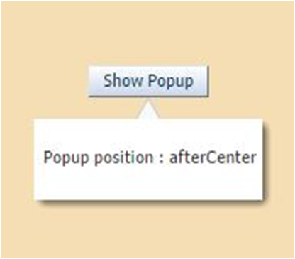
The code in the example tells ADF Faces to align the popup contents with the button identified by the id attribute, and to use the alignment position of afterCenter which aligns the popup after the button, as shown in Figure 16-6
Figure 16-6 Popup with Tail Attribute
16.5 Programmatically Invoking a Popup
You can programmatically invoke a popup in ADF Faces components to deliver the results of an actionEvent to the server or you can show, hide, or cancel a popup as a result of the server-side response.
You can programmatically show, hide, or cancel a popup in response to an actionEvent generated by an action component. Implement this functionality if you want to deliver the actionEvent to the server immediately so you can invoke server-side logic and show, hide, or cancel the popup in response to the outcome of invoking the server-side logic.
Programmatically invoking a popup as described here differs to the method of invoking a popup described in Declaratively Invoking a Popup where the showPopupBehavior tag does not deliver the actionEvent to the server immediately.
You create the type of popup that you want by placing one of the components (dialog, panelWindow, menu, or noteWindow) inside the popup component as described in Declaratively Creating Popups. Make sure that the popup component is in the right context when you invoke it. One of the easier ways to do this is to bind it to the backing bean for the page, as in the following example.
<af:popup
  id="p1"
  binding="#{mybean.popup}"
  ...
/>
Once you have done this, you configure an action component's actionListener attribute to reference the popup component by calling an accessor for the popup binding.
Write code for the backing bean method that invokes, cancels, or hides the popup. The following example shows a showPopup backing bean method that uses the HINT_LAUNCH_ID hint to identify the action component that passes the actionEvent to it and p1 to reference the popup on which to invoke the show method.
public void showPopup(ActionEvent event) {
{
   FacesContext context = FacesContext.getCurrentInstance();
   UIComponent source = (UIComponent)event.getSource();
   String alignId = source.getClientId(context);
   RichPopup.PopupHints hints = new RichPopup.PopupHints();
      hints.add(RichPopup.PopupHints.HintTypes.HINT_ALIGN_ID,source)
      .add(RichPopup.PopupHints.HintTypes.HINT_LAUNCH_ID,source)
      .add(RichPopup.PopupHints.HintTypes.HINT_ALIGN,
      RichPopup.PopupHints.AlignTypes.ALIGN_AFTER_END);
   p1.show(hints);
}
Example 16-1 shows a backing bean method that cancels a popup in response to an actionEvent while Example 16-2 shows a backing bean method that hides a popup in response to an actionEvent. The p1 object in the following examples refers to an instance of the RichPopup class from the following package:
oracle.adf.view.rich.component.rich.RichPopup
For information about RichPopup, see Java API Reference for Oracle ADF Faces.
Example 16-1 Backing Bean Method Canceling a Popup
public void cancelPopupActionListener(ActionEvent event) {
   FacesContext context = FacesContext.getCurrentInstance();
   p1.cancel();
  }
Example 16-2 Backing Bean Method Hiding a Popup
public void hidePopupActionListener(ActionEvent event) {
   FacesContext context = FacesContext.getCurrentInstance();
   p1.hide();
 }
16.5.1 How to Programmatically Invoke a Popup
You configure the action component's actionListener attribute to reference the backing bean method that shows, cancels or hides the popup.
Before you begin:
It may be helpful to have an understanding of the configuration options available to you if you want to invoke a popup component programmatically. See Programmatically Invoking a Popup.
You may also find it helpful to understand functionality that can be added using other ADF Faces features. See Additional Functionality for Popup Dialogs, Menus, and Windows.
You will need to complete this task:
- Create the type of popup that you want the server-side method to invoke, as described in Declaratively Creating Popups.
To programmatically invoke a popup:
16.5.2 What Happens When You Programmatically Invoke a Popup
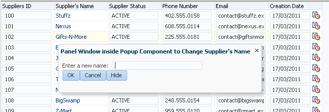
At runtime, end users can invoke the action components you configure to invoke the server-side methods to show, cancel, or hide a popup. For example, Figure 16-7 shows a panelWindow component that renders inside a popup component. The panelWindow component exposes two buttons (Cancel and Hide) that invoke the cancel and hide methods respectively. End users invoke a link component rendered in the SupplierName column of the table component in the underlying page to show the popup.
Figure 16-7 Popup Component Invoked by a Server-Side Method
16.6 Displaying Contextual Information in Popups
The ADF Faces contextInfo component allows you to display additional information to the users in a popup window. Using this component, you can display a message, a warning, a hint, and other additional information to the users when they right-click the component.
There may be cases when you think the user may need more information to complete a task on a page, but you don't want to clutter the page with information that may not be needed each time the page is accessed, or with multiple buttons that might launch dialogs to display information. While you could put the information in a popup that a user launches when they right-click a component, the user would have no way of knowing the information was available in a popup.
The contextInfo component allows you to display additional information in a popup and also notifies users that additional information is available. When you place the contextInfo component into the context facet of a component that supports contextual information, a small orange square is shown in the upper left-hand corner of the component, as shown in Figure 16-8.
Figure 16-8 contextInfo Displays a Square

When the user places the cursor over the square, a larger triangle with a note icon and tooltip is displayed, indicating that additional information is available, as shown in Figure 16-9.
Figure 16-9 contextInfo Component Indicates Additional Information Is Available

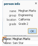
Because a showPopupBehavior tag is a child to the contextInfo component, the referenced popup displays when the user clicks the information icon, as shown in Figure 16-10.
Figure 16-10 Dialog launched From contextInfo Component
16.6.1 How to Create Contextual Information
You use the showPopupBehavior component as a child to the contextInfo component, which allows the popup component to align with the component that contains the contextInfo component.
Before you begin:
-
Create the component that will be the parent to the
contextInfocomponent. The following components support thecontextInfocomponent:-
column -
link -
inputComboboxListOfValues -
inputListOfValues -
inputText -
outputFormatted -
outputText -
selectOneChoice
-
-
Create the popup to display, as documented in Declaratively Creating Popups.
-
You may also find it helpful to understand functionality that can be added using other ADF Faces features. See Additional Functionality for Popup Dialogs, Menus, and Windows.
To use a contextInfo component:
16.7 Controlling the Automatic Cancellation of Inline Popups
The inline popup is automatically cancelled by the ADF web application; however, you can control this default behavior by disabling the automatic cancellation of an inline popup component.
You can use the popup component with a number of other components to create inline popups. That is, inline windows, dialogs, and context menus. These other components include the:
-
Dialog component to create an inline dialog
-
panelWindowcomponent to create an inline window -
Menu components to create context menus
-
noteWindowcomponent to create a note window
By default, a Fusion web application automatically cancels an inline popup if the metadata that defines the inline popup is replaced. Scenarios where this happens include the following:
-
Invocation of an action component that has its
partialSubmitproperty set tofalse. The Fusion web application renders the entire page after it invokes such an action component. In contrast, an action component that has itspartialSubmitproperty set totruecauses the Fusion web application to render partial content. For information about page rendering, see Rerendering Partial Page Content. -
A component that renders a toggle icon for end users to display or hide content hosts the
popupcomponent. Examples include theshowDetailItemandpanelTabbedcomponents. For information about the use of components that render toggle icons, see Displaying and Hiding Contents Dynamically. -
Failover occurs when the Fusion web application displays an inline popup. During failover, the Fusion web application replaces the entire page.
You can change the default behavior described in the previous list by disabling the automatic cancellation of an inline popup component. This means that the Fusion web application does not automatically cancel the inline popup if any of the above events occur. Instead, the Fusion web applications restores the inline popup.
16.7.1 How to Disable the Automatic Cancellation of an Inline Popup
You disable the automatic cancellation of an inline popup by setting the popup component's autoCancel property to disabled.
Before you begin:
It may be helpful to understand how other components can affect functionality. See Controlling the Automatic Cancellation of Inline Popups.
You may also find it helpful to understand functionality that can be added using other ADF Faces features. See Additional Functionality for Popup Dialogs, Menus, and Windows.
To control the automatic cancellation of inline popups:
- In the Structure window, right-click the
af:popupcomponent for which you want to configure the automatic cancellation behavior and choose Go to Properties. - In the Properties window, expand the Common section and select disabled from the AutoCancel dropdown list.
16.7.2 What Happens When You Disable the Automatic Cancellation of an Inline Popup
JDeveloper sets the af:popup component autoCancel property's value to disabled, as shown in the following example. At runtime, the Fusion web application restores an inline popup after it rerenders a page if the inline popup displayed before invocation of the command to rerender the page.
<af:popup id="p1" autoCancel="disabled">
  ...
</af:popup>
16.8 Resetting Input Fields in a Popup
The ADF Faces resetListener component is a declarative way to reset input component values triggered from any server-side event. Using this component, you can allow end users to reset input values in an input field.
You can use the resetListener component with a popup component to allow end users to reset input values in an input field. Example use cases where you may want to implement this functionality for input components that render in a popup component include:
-
Permitting end users to reset an incorrect value that they previously entered
-
Removing values where the
popupcomponent invokes apopupCanceledEventbefore the application submits the values to the server that an end user entered.End user gestures that invoke a
popupCancelEventinclude clicking a button (for example, a button labelled Close), the cancel icon in the title bar of a popup dialog or pressing the Esc key.Depending on how you configure the
popupcomponent, data may be cached on the client. For example, if you set thepopupcomponent'scontentDeliveryattribute toimmediate, the application always caches data on the client.
For information about how the setting that you choose for the contentDelivery attribute determines the content delivery strategy for your popup component, see Declaratively Creating Popups and What Happens at Runtime: Popup Component Events.
Declaratively Invoking a Popup shows the metadata for a popup component where the contentDelivery attribute is set to immediate and the user's popup renders a dialog component with preconfigured controls that raise dialogEvents, as described in How to Create a Dialog. In this scenario, data that the end user entered is cached on the client. The application does not submit data that you want to reset to the server. Also, the preconfigured controls rendered by the dialog component may prevent the popup from closing if they encounter validation errors.
For information about using the resetListener component independently of a popup component, see How to Use an Action Component to Reset Input Fields.
Note:
Setting the resetListener component's type attribute to popupCanceled provides the same functionality as setting the popup component's resetEditableValues attribute to whenCanceled. For information about setting the resetEditableValues attribute of the popup component, see How to Create a Dialog.
Example 16-3 The resetListener Tag on the Popup Component
<af:popup id="popup" contentDelivery="immediate">
  <af:resetListener type="popupCanceled"/>
</af:popup>
16.8.1 How to Reset the Input Fields in a Popup
You enable end users to reset the data in a popup's input fields to null by setting the resetListener component's type attribute to popupCanceled.
Before you begin:
It may be helpful to understand the use cases for which you can configure this functionality in a popup component. See Resetting Input Fields in a Popup.
You may also find it helpful to understand functionality that can be added using other ADF Faces features. See Additional Functionality for Popup Dialogs, Menus, and Windows.
To reset the input fields in a popup:
16.8.2 What Happens When You Configure a Popup to Reset Its Input Fields
JDeveloper writes entries similar to those shown in Example 16-4 when you configure a popup component and a resetListener component to allow end users to reset the input field(s) in the popup component to null.
At runtime, an end user gesture that raises a popupCanceled event results in the resetListener component resetting values in the input fields of the popup component to null, as illustrated in Figure 16-11.
Figure 16-11 Popup Component Resetting Input Fields

Description of "Figure 16-11 Popup Component Resetting Input Fields"
Example 16-4 Popup Component Configured to Reset Input Fields Using Reset Listener
<af:popup id="popupDialog" contentDelivery="lazyUncached"
  popupCanceledListener="#{demoInput.resetPopupClosed}">
    <af:dialog title="Enter an Incorrect Value">
      <af:inputText id="it2" label="Always-incorrect Value" value="#{demoInput.value}">
        <f:validator binding="#{demoInput.obstinateValidator2}"/>
      </af:inputText>
    </af:dialog>
    <af:resetListener type="popupCanceled"/>
</af:popup>