9 Organizing Content on Web Pages
This chapter includes the following sections:
9.1 About Organizing Content on Web Pages
A new web application that you create in this release uses the Alta skin by default. To get the full benefit of the Oracle Alta UI system, Oracle recommends that you go beyond simply using the Alta skin and design your application around the Oracle Alta UI Design Principles. Designing your application using these principles enables you to make use of the layouts, responsive designs and components the Oracle Alta UI system incorporates to present content to your end users in a clean and uncluttered way. For information about the Oracle Alta UI system and the Oracle Alta UI Design Principles, see http://www.oracle.com/webfolder/ux/middleware/alta/index.html and for information about Oracle Alta UI Patters, see http://www.oracle.com/webfolder/ux/middleware/alta/patterns/index.html.
If you are using a skin other than Alta, ADF Faces provides a number of layout components that can be used to arrange other components on a page. Usually, you begin building your page with these components. You then add components that provide other functionality (for example rendering data or rendering buttons) either inside facets or as child components to these layout components.
Tip:
You can create page templates that allow you to design the layout of pages in your application. The templates can then be used by all pages in your application. See Creating and Reusing Fragments, Page Templates, and Components.
In addition to layout components that simply act as containers, ADF Faces also provides interactive layout components that can display or hide their content, that provide transitions between its child components, or that provide sections, lists, or empty space. Some layout components also provide geometry management functionality, such as stretching their contents to fit the browser windows as the window is resized, or the capability to be stretched when placed inside a component that stretches. ADF Faces Layout Components describes each of the layout components and their associated geometry management capabilities. For information about stretching and other geometry management functionality of layout components, see Geometry Management and Component Stretching.
9.1.1 ADF Faces Layout Components
Table 9-1 briefly describes each of the ADF Faces layout components.
Table 9-1 ADF Faces Layout Components
| Component | Description | Can Stretch Children | Can Be Stretched |
|---|---|---|---|
|
Page Management Components |
|||
|
|
Creates each of the standard root elements of an HTML page: |
X |
|
|
|
Creates an HTML |
||
|
Page Layout Containers |
|||
|
|
Used in conjunction with |
X (when the |
X (when the |
|
|
Contains |
X |
X (when the |
|
|
Divides a region into two parts ( |
X |
X (when the |
|
|
Provides a columnar display of child components (usually |
X |
X (when the |
|
|
Provides a dynamically-sized grid of child components. See Displaying Content in a Dynamic Grid Using a masonryLayout Component |
X |
|
|
|
Can have child components, which are placed in its center, and also contains 12 facets along the border where additional components can be placed. These will surround the center. See Arranging Page Contents in Predefined Fixed Areas. |
||
|
|
Positions input form controls, such as |
||
|
Components with Show/Hide Capabilities |
|||
|
|
Can hide or display contents below the header. Often used as a child to the |
X (if the |
X (if the |
|
|
Used to hold the content for the different panes of the |
X (if it contains a single child component and its |
|
|
|
Titled box that can contain child components. Has a toolbar facet. See Displaying and Hiding Contents Dynamically. |
X (if it is being stretched or if the |
X |
|
|
Used in conjunction with |
X (when the |
|
|
|
Used in conjunction with If you want the tabs to be used in conjunction with navigational hierarchy, for example each tab is a different page or region that contains another set of navigation items, you may instead want to use a |
X (when the |
|
|
|
Used in conjunction with |
X |
|
|
|
Used in conjunction with |
X |
|
|
|
Hides or displays content through a toggle icon. See Displaying and Hiding Contents Dynamically. |
||
|
Miscellaneous Containers |
|||
|
|
Provides animated transitions between its child components, using the |
X |
X |
|
|
Contains child components and provides a header that can include messages, toolbars, and help topics. See Displaying Items in a Static Box. |
X (if the |
X (if the |
|
|
Used in conjunction with collection components such as |
X (only a single table, tree, or tree table) |
X |
|
|
Creates a container component whose facets use style themes to apply a bordered look to its children. This component is typically used as a container for the |
X (in the Center facet) |
X (when the |
|
|
Creates an inline |
X |
|
|
|
Creates a series of navigation items representing one level in a navigation hierarchy. See Using Navigation Items for a Page Hierarchy. |
X (if configured to display tabs) |
|
|
|
Renders each child component as a list item and renders a bullet next to it. Can be nested to create hierarchical lists. See Displaying a Bulleted List in One or More Columns. |
||
|
|
Displays child components inside a popup window. See Declaratively Creating Popups. |
||
|
|
Displays child toolbar and menu components together. See Using Toolbars. |
||
|
Grouping Containers |
|||
|
|
Groups child components either vertically or horizontally. For JSP pages, used in facets when more than one component is to be contained in a facet (Facelet pages can handle multiple children in a facet). See Grouping Related Items. |
X (only if set to scroll or vertical layout) |
|
|
|
Groups child components without regard to layout unless handled by the parent component of the group. For JSP pages, used in facets when more than one component is to be contained in a facet (Facelet pages can handle multiple children in a facet). See Grouping Related Items. |
||
|
Spacing Components |
|||
|
|
Creates a horizontal line between items. See Separating Content Using Blank Space or Lines. |
||
|
|
Creates an area of blank space. See Separating Content Using Blank Space or Lines. |
||
9.1.2 Additional Functionality for Layout Components
Once you have added a layout component to your page, you may find that you need to add functionality such as responding to events. Following are links to other functionality that layout components can use.
-
Templates: Once you create a layout, you can save it as a template. When you make layout modifications to the template, all pages that consume the template will automatically reflect the layout changes. See Using Page Templates.
-
Themes: Themes add color styling to some of layout components, such as the
panelBoxcomponent. For information about themes, see Customizing the Appearance Using Styles and Skins -
Skins: You can change the icons and other properties of layout components using skins. See Customizing the Appearance Using Styles and Skins.
-
Localization: Instead of entering values for attributes that take strings as values, you can use property files. These files allow you to manage translation of these strings. See Internationalizing and Localizing Pages.
-
Accessibility: You can make your input components accessible. See Developing Accessible ADF Faces Pages.
-
Using parameters in text: You can use the ADF Faces EL format tags if you want text displayed in a component to contain parameters that will resolve at runtime. See How to Use the EL Format Tags.
-
Events: Layout components fire both server-side and client-side events that you can have your application react to by executing some logic. See Handling Events.
-
User customization: Some of the components have areas that can be expanded or collapsed, such as the
showDetailHeadercomponent. You can configure your application so that the state of the component (expanded or collapsed) can be saved when the user leaves the page. See Allowing User Customization on JSF Pages.
9.2 Starting to Lay Out a Page
JSF pages that use ADF Faces components must have the document tag enclosed within a view tag. All other components that make up the page then go in between <af:document> and </af:document>. The document tag is responsible for rendering the browser title text, as well as the invisible page infrastructure that allows other components in the page to be displayed. For example, at runtime, the document tag creates the root elements for the client page. In HTML output, the standard root elements of an HTML page, namely, <html>, <head>, and <body>, are generated.
By default, the document tag is configured to allow capable components to stretch to fill available browser space. You can further configure the tag to allow a specific component to have focus when the page is rendered, or to provide messages for failed connections or warnings about navigating before data is submitted. See How to Configure the document Tag.
Typically, the next component used is the ADF Faces form component. This component creates an HTML form element that can contain controls that allow a user to interact with the data on the page.
Note:
Even though you can have multiple HTML forms on a page, you should have only a single ADF Faces form tag per page. See Defining Forms.
JDeveloper automatically inserts the view, document, and form tags for you, as shown in the following example. See Creating a View Page.
<?xml version='1.0' encoding='UTF-8'?>
<!DOCTYPE html>
<f:view xmlns:f="http://java.sun.com/jsf/core"
        xmlns:af="http://xmlns.oracle.com/adf/faces/rich">
  <af:document title="untitled1.jsf" id="d1">
    <af:form id="f1"></af:form>
  </af:document>
</f:view>
Once those tags are placed in the page, you can use the layout components to control how and where other components on the page will render. The component that will hold all other components is considered the root component. Which component you choose to use as the root component depends on whether you want the contained components to display their contents so that they stretch to fit the browser window, or whether you want the contents to flow, using a scrollbar to access any content that may not fit in the window. For information about stretching and flowing, see Geometry Management and Component Stretching.
Tip:
Instead of creating your layout yourself, you can use JDeveloper's quick layout templates, which provide correctly configured components that will display your page with the layout you want. See Using Quick Start Layouts.
9.2.1 Geometry Management and Component Stretching
Geometry management is the process by which the user, parent components, and child components negotiate the actual sizes and locations of the components in an application. For example, a component might be resized when it's first loaded into a browser, when the browser is resized, or when a user explicitly resizes it.
By default, if there is only a single effective visual root component, that root component will stretch automatically to consume the browser's viewable area, provided that component supports geometry management. Examples of geometry management components are panelGridLayout and panelSplitter. If the root component supports stretching its child components (and they in turn support being stretched), the size of the child components will also recompute, and so on down the component hierarchy until a flowing layout area is reached; that is, an area that does not support stretching of its child components. You do not have to write any code to enable the stretching.
Note:
The framework does not consider popup dialogs, popup windows, or non-inline messages as root components. If a form component is the direct child component of the document component, the framework will look inside the form tag for the visual root. For information on sizing a popup, see Using Popup Dialogs, Menus, and Windows.
As shown in Table 9-1, the panelGridLayout, panelStretchLayout, panelSplitter, and panelDashboard components are components that can be stretched and can also stretch their child components. Additionally, when the showDetailItem component is used as a direct child of the panelAccordion or panelTabbed component, the contents in the showDetailItem component can be stretched. Therefore, the panelStretchLayout, panelSplitter, panelDashboard, panelAccordion with a showDetailItem component, and a panelTabbed with a showDetailItem component, are the components you should use as root components when you want to make the contents of the page fill the browser window.
For example, Figure 9-1 shows a table placed in the center facet of the panelStretchLayout component. The table stretches to fill the browser space. When the entire table does not fit in the browser window, scrollbars are added in the data body section of the table.
Figure 9-1 Table Inside a Component That Stretches Child Components
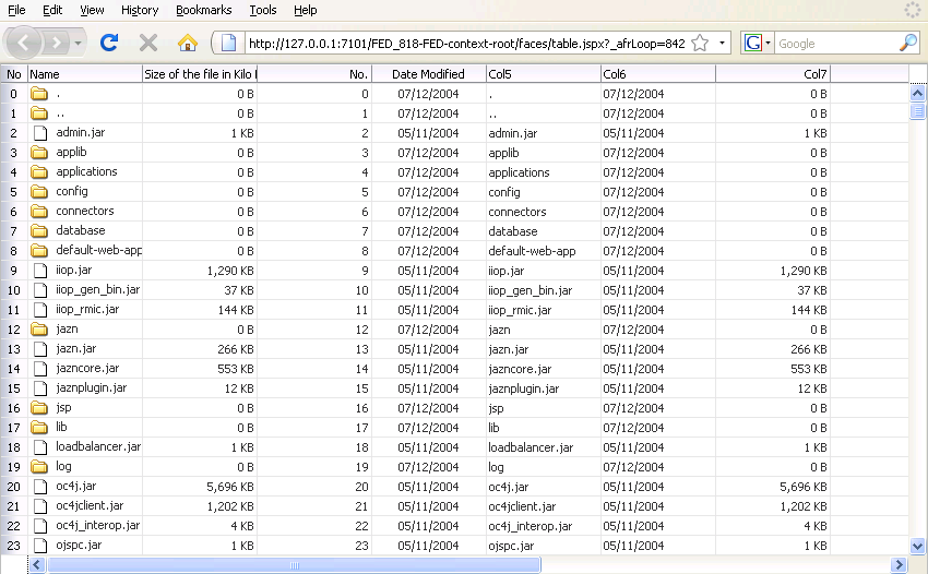
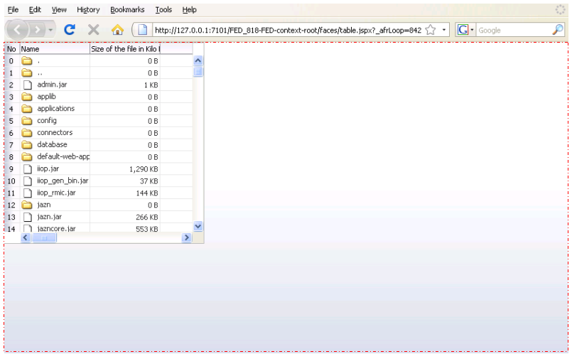
Figure 9-2 shows the same table, but nested inside a panelGroupLayout component, which cannot stretch its child components (for clarity, a dotted red outline has been placed around the panelGroupLayout component). The table component displays only a certain number of columns and rows, determined by properties on the table.
Figure 9-2 Table Inside a Component That Does Not Stretch Its Child Components
Performance Tip:
The cost of geometry management is directly related to the complexity of child components. Therefore, try minimizing the number of child components that are under a parent geometry-managed component.
9.2.2 Nesting Components Inside Components That Allow Stretching
Even though you choose a component that can stretch its child components, only the following components will actually stretch:
-
decorativeBox(when configured to stretch) -
deck -
inputText(when configured to stretch) -
panelAccordion(when configured to stretch) -
panelBox(when configured to stretch) -
panelCollection -
panelDashboard(when configured to stretch) -
panelGridLayout(when configured to stretch) -
panelGroupLayout(with thelayoutattribute set toscrollorvertical) -
panelHeader(when configured to stretch) -
panelSplitter(when configured to stretch) -
panelStretchLayout(when configured to stretch) -
panelTabbed(when configured to stretch) -
region -
showDetailHeader(when configured to stretch) -
table(when configured to stretch) -
tree(when configured to stretch) -
treeTable(when configured to stretch)
The following layout components cannot be stretched when placed inside a facet of a component that stretches its child components:
-
panelBorderLayout -
panelFormLayout -
panelGroupLayout(with thelayoutattribute set todefaultorhorizontal) -
panelLabelAndMessage -
panelList -
showDetail -
tableLayout(MyFaces Trinidad component)
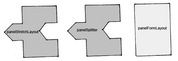
One interesting way to think about geometry management and resizing is to think of components as being one of four types of puzzle pieces, as shown in Figure 9-3.
Figure 9-3 Four Categories of Components for Geometry Management

Description of "Figure 9-3 Four Categories of Components for Geometry Management"
You can only place components that can be stretched inside components that stretch their children. If you want to use a component that does not stretch, within the facet of component that stretches its child components, you must wrap it in a transition component. Transition components can be stretched but do not stretch their children. Transition components must always be used between a component that stretches its children and a component that does not stretch. If you do not, you may see unexpected results when the component renders.
For example, suppose you want to have a form appear in one side of a panelSplitter component. Say your root component is the panelStretchLayout, and so is the first component on your page. You add a panelSplitter component (configured to default settings) as a child to the panelStretchLayout component, and to the first facet of that component, you add a panelFormLayout component. Figure 9-4 shows how those components would fit together. Notice that the panelFormLayout component cannot "fit" into the panelSplitter component because the panelSplitter can stretch its children and so will attempt to stretch the panelFormLayout, but the panelFormLayout cannot be stretched.
Figure 9-4 Order of Components in One Layout Scenario
Description of "Figure 9-4 Order of Components in One Layout Scenario"
When a component does not "fit" into a component that stretches children, you may get unexpected results when the browser attempts to render the component.
To have a valid layout, when you want to use a component that does not stretch in a component that stretches its children, you must use a transition component. To fix the panelFormLayout example, you could surround the panelFormLayout component with a panelGroupLayout component set to scroll. This component stretches, but does not stretch its children, as shown in Figure 9-5.
Figure 9-5 Order of Components in Second Layout Scenario

Description of "Figure 9-5 Order of Components in Second Layout Scenario"
In this case, all the components fit together. The panelGroupLayout component will not attempt to stretch the panelFormLayout, and so it will correctly render. And because the panelGroupLayout component can be stretched, the layout will not break between the components that can and cannot stretch.
Tip:
Do not attempt to stretch any of the components in the list of components that cannot stretch by setting their width to 100%. You may get unexpected results. Instead, surround the component to be stretched with a component that can be stretched.
The panelGroupLayout component set to scroll is a good container for components that cannot stretch, when you want to use those components in layout with components that do stretch.
Tip:
If you know that you always want your components to stretch or not to stretch based on the parent's settings, then consider setting the oracle.adf.view.rich.geometry.DEFAULT_DIMENSIONS parameter to auto. See Geometry Management for Layout and Table Components.
9.2.3 Using Quick Start Layouts
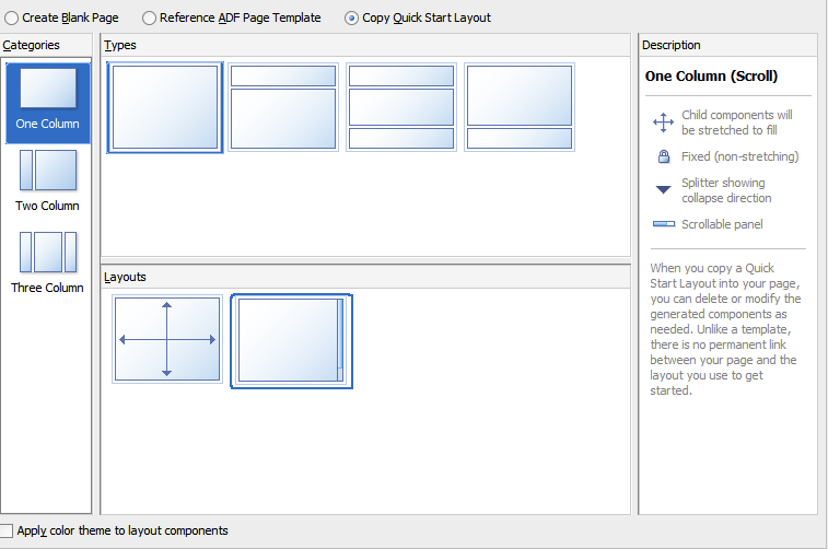
When you use the New Gallery Wizard to create a JSF page (or a page fragment), you can choose from a variety of predefined quick start layouts. When you choose one of these layouts, JDeveloper adds the necessary components and sets their attributes to achieve the look and behavior you want. In addition to saving time, when you use the quick layouts, you can be sure that layout components are used together correctly to achieve the desired geometry management.
You can choose from one-, two-, and three-column formats. Within those formats, you can choose how many separate panes will be displayed in each column, and if those panes can stretch or remain a fixed size. Figure 9-6 shows the different layouts available in the two-column format.
Along with adding layout components, you can also choose to apply a theme to the chosen quick layout. These themes add color styling to some of the components used in the quick start layout. To see the color and where it is added, see Quick Start Layout Themes. For information about themes, see Customizing the Appearance Using Styles and Skins
For information about creating pages using the quick layouts, see Creating a View Page.
9.2.4 Tips for Using Geometry-Managed Components
To ensure your page is displayed as expected in all browsers, use one of the quick layouts provided by JDeveloper when you create a page. These layouts ensure that the correct components are used and configured properly. See Using Quick Start Layouts.
Best Practice:
Use quick start layouts to avoid layout display issues.
However, if you wish to create your layout yourself, follow these tips for creating a layout that includes both stretched and flowing components:
-
Place the page contents inside a root component that performs geometry management, either
panelStretchLayout,panelGridLayoutwithgridRowandgridCellcomponents,panelSplitter,panelAccordionwith ashowDetailItem, orpanelTabbedwith ashowDetailItem. -
Never specify a height value with percent units. Instead, build a component structure out of components that support being stretched and that stretch their child components. See Nesting Components Inside Components That Allow Stretching.
-
Inside this stretchable structure, create islands of nonstretched or flowing components by using transition components, such as the
panelGroupLayoutcomponent with thelayoutattribute set toscroll. This component will provide the transition between stretched and flowing components because it supports being stretched but will not stretch its child components. -
Never try to stretch something vertically inside a nonstretched or flowing container because it will not act consistently across web browsers.
-
For components contained in a parent flowing component (that is, a component that does not stretch its children), do not set widths greater than 95%. If you do, you may get unexpected results.
-
If the parent component is 768 pixels or greater, set the
styleClassattribute on the component to be stretched toAFStretchWidth. This style will stretch the component to what appears to be 100% of the parent container, taking into account different browsers and any padding or borders on the parent. -
If the parent component is 768 pixels or less, set the
styleClassattribute on the component to be stretched toAFAuxiliaryStretchWidth. This style will stretch the component to what appears to be 100% of the parent container, taking into account different browsers and any padding or borders on the parent.Note:
The two different styles are needed due to how Microsoft Internet Explorer 7 computes widths inside scrolling containers (this has been resolved in Internet Explorer 8). Unless you can control the version of browser used to access your application, you should use these styles as described.
-
-
Never use the
positionstyle. -
Ensure that the
maximizedattribute on thedocumenttag is set totrue(this is the default). For information about setting the attribute, see How to Configure the document Tag.
The remainder of this chapter describes the ADF Faces layout components and how they can be used to design a page. You can find information about how each component handles stretching in the respective "What You May Need to Know About Geometry Management" sections.
9.2.5 How to Configure the document Tag
The document tag contains a number of attributes that you can configure to control behavior for the page. For example, you can configure the icon that the browser may insert into the address bar (commonly known as a favicon). Figure 9-7 shows the Oracle icon in the address bar of the Firefox browser.
Figure 9-7 Small Icon Configured on the document Tag
Description of "Figure 9-7 Small Icon Configured on the document Tag"
You can also configure the tag for the following functionality:
-
Focus: You can set which component should have focus when the page is first rendered.
-
Uncommitted data: You can have a warning message display if a user attempts to navigate off the page and the data has not been submitted.
-
State saving: You can override the settings in the
web.xmlfile for an individual page, so that the state of the page should be saved on the client or on the server.
To configure the document tag:
9.3 Arranging Content in a Grid
Use the panelGridLayout component to arrange content in a grid area on a page (similar to an HTML table) and when you want the content to be able to stretch when the browser is resized. The panelGridLayout component provides the most flexibility of the layout components, while producing a fairly small amount of HTML elements. With it, you have full control over how each individual cell is aligned within its boundaries.
The panelGridLayout component uses child gridRow components to create rows, and then within those rows, gridCell components that form columns. You place components in the gridCell components to display your data, images, or other content.
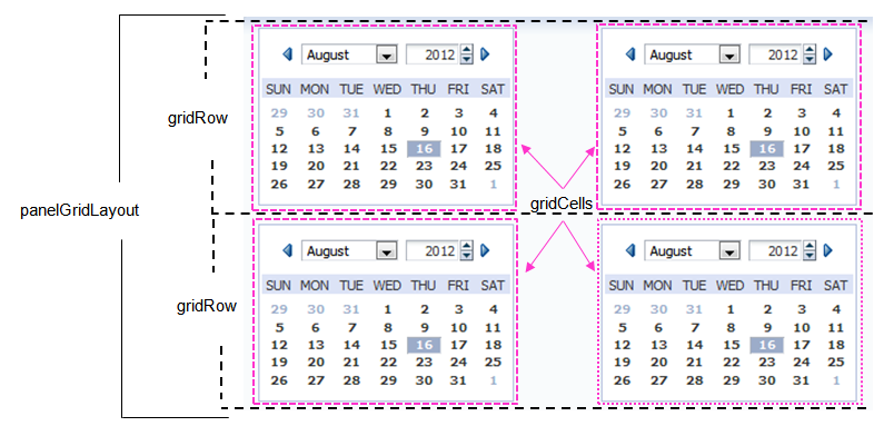
Figure 9-9 shows a panelGridLayout component that contains two gridRow components. Each of the gridRow components contain two gridCell components. Each of the gridCell components contain one chooseDate component.
Figure 9-9 Simple Grid Layout with Two Rows Each with Two Cells
Description of "Figure 9-9 Simple Grid Layout with Two Rows Each with Two Cells"
You can nest panelGridLayout components. In some cases, it is not safe to nest panelGridLayout. For example, if you set up parent panelGridLayout such that a cell automatically determines its size from the dimensions of the cell contents and additionally set up the contents to use a percentage size of the cell (a circular dependency), then this structure might not render properly in some browsers. Also if you set dimensions of both the parent and one or more nested grids to automatic, then the overall layout structure would not get stabilized, because the nested grid impacts the size of the parent panelGridLayout.
If you want to have the grid stretch its contents to fill up all available browser space, the following must be true:
-
There is only one component inside of the
gridCell -
The cell's
halignandvalignattributes are set tostretch -
The effective width and effective height of the cell are not set to be automatically determined by other cells or rows, as that would result in a circular dependency.
Each cell will then attempt to anchor the child component to all sides of the cell. If it can't (for example if the child component cannot be stretched), then the child component will be placed at the start and top of the cell. Figure 9-10 shows a more complicated layout created with a parent panelGridLayout component (whose background is set to pink).
Figure 9-10 Complex Grid Layout Created with Nested panelGridLayout Components
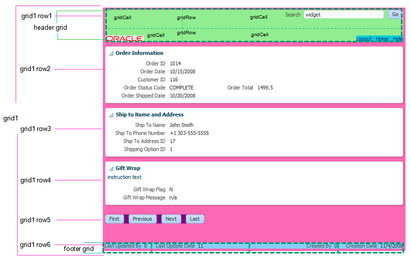
The first gridRow component of this panelGridLayout contains one gridCell component. This gridCell component contains another panelGridLayout component for the header. This header grid contains two gridRow components, each with two gridCell components. The top right gridCell contains the components for search functionality, while the bottom left gridCell contains the Oracle logo.
The next four gridRows of the parent panelGridLayout component contain just one gridCell component each that holds form components and buttons. The last gridRow component contains one gridCell component that holds another panelGridLayout component for the footer. This footer is made up of one gridRow component with four gridCell components, each holding an inputText component.
When placed in a component that stretches it children, by default, the panelGridLayout stretches to fill its parent container. However, whether or not the content within the grid is stretched to fill the space is determined by the gridRow and gridCell components.
By default, the child contents are not stretched. The gridRow component determines the height. By default, the height is determined by the height of the tallest child component in the row's cells. The gridCell component determines the width. By default, the width of a cell is determined by the width of other cells in the column. Therefore, you must set at least one cell in a column to a determined width. You can set it to determine the width based on the component in the cell, to a fixed CSS length, or to a percentage of the remaining space in the grid.
9.3.1 How to Use the panelGridLayout, gridRow, and gridCell Components to Create a Grid-Based Layout
JDeveloper provides a dialog that declaratively creates a grid based on your input. You create a grid manually by placing a certain number of gridRow components into a panelGridLayout component. You then add gridCell components into the gridRow components, and place components that contain the actual content in the gridCell components. If you want to nest panelGridLayout components, you place the child panelGridLayout component into a gridCell component.
Before you begin:
It may be helpful to have an understanding of how the attributes can affect functionality. See Arranging Content in a Grid.
You may also find it helpful to understand functionality that can be added using other ADF Faces features. See Additional Functionality for Layout Components.
To create and use the panelGridLayout, gridRow, and gridCell components:
9.3.2 What You May Need to Know About Geometry Management and the panelGridLayout Component
The panelGridLayout component can stretch its child components and it can also be stretched. The following components can be stretched inside the panelGridLayout component:
-
decorativeBox(when configured to stretch) -
deck -
calendar -
inputText(when configured to stretch) -
panelAccordion(when configured to stretch) -
panelBox(when configured to stretch) -
panelCollection -
panelDashboard(when configured to stretch) -
panelGridLayout(whengridRowandgridCellcomponents are configured to stretch) -
panelGroupLayout(only with thelayoutattribute set toscrollorvertical) -
panelHeader(when configured to stretch) -
panelSplitter(when configured to stretch) -
panelStretchLayout(when configured to stretch) -
panelTabbed(when configured to stretch) -
region -
showDetailHeader(when configured to stretch) -
table(when configured to stretch) -
tree(when configured to stretch) -
treeTable(when configured to stretch)
The following components cannot be stretched when placed inside the panelGridLayout component:
-
panelBorderLayout -
panelFormLayout -
panelGroupLayout(only with thelayoutattribute set todefaultorhorizontal) -
panelLabelAndMessage -
panelList -
showDetail -
tableLayout(MyFaces Trinidad component)
You cannot place components that cannot stretch into a component that stretches its child components. Therefore, if you need to place a component that cannot be stretched into a gridCell of a panelGridLayout component, then you must configure the panelGridLayout, gridRow, and gridCell components so that they do not stretch their children.
9.3.3 What You May Need to Know About Determining the Structure of Your Grid
When you are given a mock-up of a page, you may not know how to break it down into a grid. Follow these tips to help determine your columns, rows, and grid separations for consecutive grids.
To design your grid:
-
Either print out the design on a piece of paper or open it up in a graphics program where you will be able to draw colored lines on top of the design.
-
Draw vertical lines representing potential column divisions in one color (for example, in red).
-
Draw horizontal lines for potential row divisions in another color, (for example, in green).
-
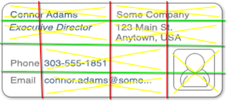
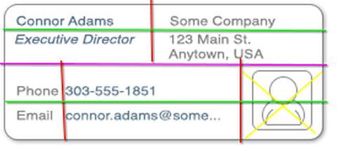
Now that you have a basic grid structure, use a third color (for example, yellow) to draw X marks where you see cells that need to span multiple columns or rows.
Figure 9-11 shows a design that might be broken down into four columns, four rows, and multiple places where column spans are needed.
Figure 9-11 Lines Show Potential Columns, Rows, and Spans
Description of "Figure 9-11 Lines Show Potential Columns, Rows, and Spans" -
After your first attempt, you may find that your column lines really don't make sense. For example, in Figure 9-11, the two middle columns contained cells that needed to span into a nearby column. This is an indication that there should instead be two separate grids.
Use a fourth color (for example, magenta) to draw a line where the division makes sense and repeat the process again.
Figure 9-12 shows the same design but using two consecutive grids, one on top of the other.
Figure 9-12 Consecutive Grids to Simplify Column Spanning
Description of "Figure 9-12 Consecutive Grids to Simplify Column Spanning" -
Now that you can visually see where the content goes and where you need to use span columns or rows, you can code your
gridRowandgridCellcomponents. You can also accurately specify the sizes for your cells, as well as the horizontal and vertical alignments of your cells.Tip:
When you see in your grid that fields with labels span columns, instead of using the built-in labels, configure the fields to hide those labels (usually using the
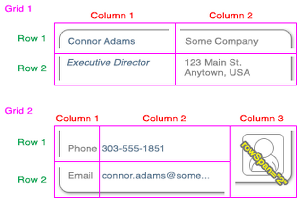
simpleattribute), and instead use a separateoutputLabelcomponent for the label.For example, in Figure 9-12, the labels for the Phone and Email field are in the first column, while the fields themselves are in the second column. To create this layout, instead of using the labels in the corresponding
inputTextcomponent, you would:-
Place the
inputTextcomponents for the phone and email fields in the second column. -
Set the
simpleattribute on those components totrue, so the built-in labels don't display. -
Add new
outputLabelcomponents to the first column for the labels.
Figure 9-13 shows the final grid design. There are two vertically stacked grids. The top grid contains two columns and two rows. The bottom grid contains three columns and two rows, with the last column spanning the two rows.
Figure 9-13 Final Grid Design
-
Best Practice Tip:
You should not have more than three layers of panelGridLayout components.
9.3.4 What You May Need to Know About Determining Which Layout Component to Use
The panelGridLayout component provides the most flexibility of the layout components, while producing a fairly small amount of HTML elements. With it, you have full control over how each individual cell is aligned within its boundaries. Conversely, the panelGroupLayout provides very little control over how individual children of the structure are presented, and the panelStretchLayout only produces a small number of grid structures, often requiring the nesting of multiple panelStretchLayout components. Nesting multiple components means more HTML elements are needed, and also that the code will be more difficult to maintain. Therefore, for complex layouts, use the panelGridLayout component.
Use the panelGroupLayout for simple structures where you don't need fine control over alignment, for example to align a series of button components. If you find yourself nesting multiple panelGroupLayout components, this is an indication that panelGridLayout would be more appropriate.
9.4 Displaying Contents in a Dynamic Grid Using a masonryLayout Component
The masonryLayout component displays its contents in a grid that has dynamic rendering capabilities. It can take any ADF Faces component as a child, respectively called a tile. Tiles can span columns and rows. When the UI is provided, users can insert, delete, reorder and resize the tiles.
When the masonryLayout component renders, each tile is processed in the order that it occurs in the code and is positioned in the first location that accommodates it. The location is determined using the reading direction of the client browser (left-to-right or right-to-left), and then top-to-bottom. If the next available location is not large enough for the tile, a gap will be left and the tile placed in the next available space. A subsequent tile that fits may be placed in the gap. If no tiles fit, then the gap remains. When the window size changes, if necessary, the masonryLayout renders a different numbers of rows or columns, based on the size of the tiles. The size of the tiles does not change.
For example, Figure 9-14 shows a masonryLayout component with three columns and two rows.
Figure 9-14 masonryLayout Displaying Three Columns

Description of "Figure 9-14 masonryLayout Displaying Three Columns"
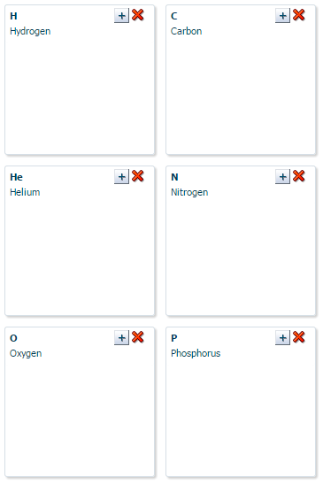
As the display area width is reduced, the masonryLayout reduces the number of columns to two, and the number of rows to three, while increasing the number of rows to three. The tiles remain the same size, as shown in Figure 9-15.
Figure 9-15 masonryLayout Displaying the Same Tiles in a Smaller Space
Description of "Figure 9-15 masonryLayout Displaying the Same Tiles in a Smaller Space"
If you want a set number of columns, you set a fixed width or maximum width on the layout. If you want to limit the height of the layout, you set a fixed height or maximum height on the layout and enable scrolling to handle any overflow.
You set the size of a tile using the AFMasonryTileSize style classes on the tile component. For example, if you use a panelBox as a tile, and you want it to span two columns and 1 row, you would set the style class on the panelBox to AFMasonryTileSize2x1 (all available style classes are noted in How to Use a masonryLayout Component).
Listeners are available on the masonryLayout component to handle resizing, reordering, inserting and deleting tiles. You need to create the code to handle these actions, as well as the UI to initiate the actions. The masonryLayout component doesn’t fire the events - the components that render the tiles do. You need to add these components to the page and have the masonryLayout component listen for their events.
Instead of creating those components and wiring them to the layout, you can use the masonryLayoutBehavior tag. This tag provides a declarative way to use a command component to initiate the layout changes. It also renders visual changes to the layout before the component tree is actually modified. Because this opening up of space happens before the action event is sent to the server, the user will see immediate feedback while the listener for the command component modifies the component tree.
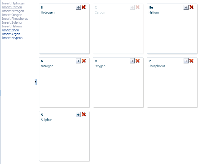
For example, Figure 9-16 shows a masonryLayout component used in the right panel of a panelSplitter component. In the left panel, list items displayed as links represent each panelBox tile in the masonryLayout. When all tiles are displayed, the links are all inactive. However, if a user deletes one of the tiles, the corresponding link becomes active. The user can click the link to reinsert the tile. By using the masonryLayoutBehavior tag with the commandLink component, the user sees the movement of the tiles and the space for the inserted tile much sooner.
Figure 9-16 Links to Add Tiles Use the masonryLayoutBehavior tag
Description of "Figure 9-16 Links to Add Tiles Use the masonryLayoutBehavior tag"
You do not have to use this tag to provide any insert, delete, resize, or reordering. The tag simply provides visual feedback more quickly. Without it, users would not see the visual changes until the new content is retrieved from the server.
The masonryLayout component will stretch if the parent component allows stretching of its child. If the parent does not stretch its children then the size of the masonryLayout component will be based on the contents of its child components.
9.4.1 How to Use a masonryLayout Component
After you add a masonryLayout to a page, if you want to allow insertion, deletion, reordering, or resizing of child components, you need to implement a method to handle each of those actions, as well as the components to initiate those actions. You then add any child components as tiles to the layout. If you want to allow rearranging the child components, you need to add a componentDragSource tag to the child components. You can also use the masonryLayoutBehavior tag to make the masonryLayout component appear more responsive to the layout changes.
To use the masonryLayout component:
9.5 Achieving Responsive Behavior Using matchMediaBehavior Tag
The matchMediaBehavior tag is a declarative way to define properties for a component for different @media rules. It uses the standard media queries and matches them with the rules specified by each of the behavior tags. Once the rule matches, it applies the property defined through the behavior tag on the component and refreshes the component to display the intended change. If the media query does not match any rules, a default value is used.
The matchMediaBehavior tag enables you to create a responsive user interface where components align themselves to the available width and height of the device. This behavior can be added under layout components or components that are capable of realigning on Partial Page Rendering (PPR). The matchMediaBehavior tag gives you more control over component level attributes unlike masonryLayout component, which deals with overall layout. The usage of matchMediaBehavior tag is explained in the following example.
In the Figure 9-17 example, the content is displaying horizontally across the page width.
Figure 9-17 matchMediaBehavior — Horizontal Layout
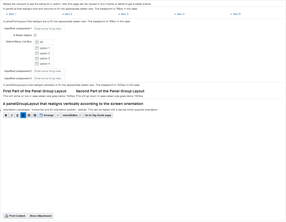
Description of "Figure 9-17 matchMediaBehavior — Horizontal Layout"
In the Figure 9-18, the content is displayed vertically when the page is viewed in a smaller screen area. In this case, the components under panelListLayout and panelFormLayout realigns themselves vertically when the screen area is below 786 pixels and the components under panelGroupLayout realigns themselves vertically when the screen area is below 1024 pixels.
Figure 9-18 matchMediaBehavior — Vertical Layout
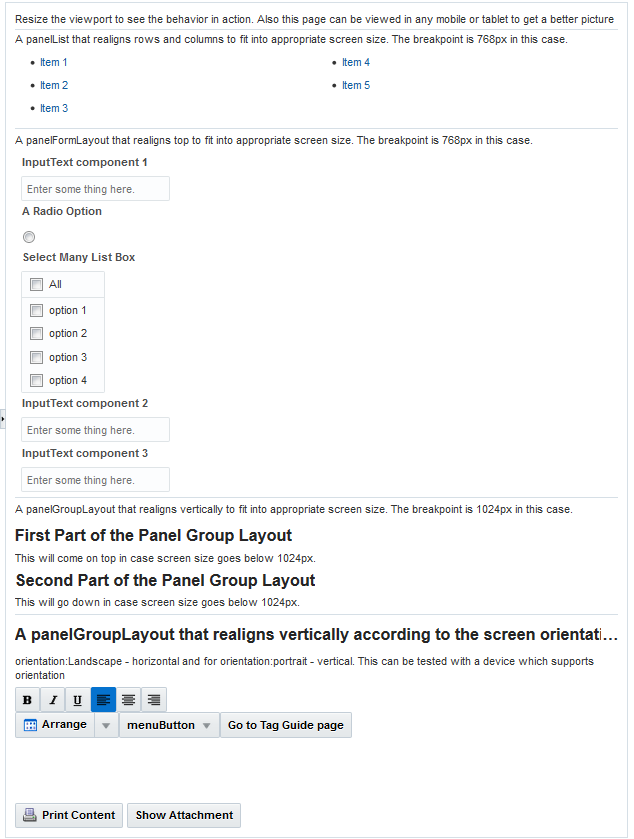
Description of "Figure 9-18 matchMediaBehavior — Vertical Layout"
The following code example describes the usage of matchMediaBehavior tag.
<af:outputText value="A panelList that realigns rows and columns to fit into appropriate screen size.
                      The breakpoint is 768px in this case." id="ot2"/>
              <af:panelList maxColumns="5" id="pl1" shortDesc="Links" rows="1" inlineStyle="text-align:left;">
                <af:matchMediaBehavior propertyName="maxColumns" matchedPropertyValue="2"
                                       mediaQuery="screen and (max-width: 768px)"/>
                <af:matchMediaBehavior propertyName="rows" matchedPropertyValue="3"
                                       mediaQuery="screen and (max-width: 768px)"/>
                <af:commandLink id="link_id_1">Item 1</af:commandLink>
                <af:commandLink id="link_id_2">Item 2</af:commandLink>
                <af:commandLink id="link_id_3">Item 3</af:commandLink>
                <af:commandLink id="link_id_4">Item 4</af:commandLink>
                <af:commandLink id="link_id_5">Item 5</af:commandLink>
              </af:panelList>
<af:outputText value="A panelFormLayout that realigns top to fit into appropriate screen size.
                      The breakpoint is 768px in this case." id="ot3"/>
              <af:panelFormLayout id="pfl1" clientComponent="true" labelAlignment="start">
                <af:matchMediaBehavior propertyName="labelAlignment" matchedPropertyValue="top"
                                       mediaQuery="screen and (max-width: 768px)"/>
                <af:inputText label="InputText component 1" placeholder="Enter some thing here." id="it0"/>
                <af:selectBooleanRadio id="rb" group="rbGroup" shortDesc="shortDesc text" label="A Radio Option"/>
                <af:selectManyListbox id="rs" label="Select Many List Box" shortDesc="Select Option">
                  <af:selectItem label="option 1" id="si5"/>
                  <af:selectItem label="option 2" id="si6"/>
                  <af:selectItem label="option 3" id="si7"/>
                  <af:selectItem label="option 4" id="si8"/>
                </af:selectManyListbox>
                <af:inputText label="InputText component 2" placeholder="Enter some thing here." id="it1"/>
                <af:inputText label="InputText component 3" placeholder="Enter some thing here." id="it2"/>
                <f:facet name="footer"></f:facet>
              </af:panelFormLayout>
<af:outputText value="A panelGroupLayout that realigns vertically to fit into appropriate screen size.
                      The breakpoint is 1024px in this case." id="ot4"/>
              <af:panelGroupLayout id="pgl5" clientComponent="true" layout="horizontal">
                <af:matchMediaBehavior propertyName="layout" matchedPropertyValue="vertical"
                                       mediaQuery="screen and (max-width: 1024px)"/>
                <af:panelStretchLayout id="psl1" dimensionsFrom="children">
                  <f:facet name="center">
                    <af:panelGroupLayout id="pgl3">
                      <af:panelHeader text="First Part of the Panel Group Layout" id="ph7" headerLevel="6"></af:panelHeader>
                      <af:outputText value="This will come on top in case screen size goes below 1024px." id="ot5"/>
                    </af:panelGroupLayout>
9.6 Arranging Contents to Stretch Across a Page
Use the panelStretchLayout component to arrange content in defined areas on a page and when you want the content to be able to stretch when the browser is resized. The panelStretchLayout component is one of the components that can stretch components placed in its facets. Figure 9-19 shows the component's facets: top, bottom, start, end, and center.
Figure 9-19 Facets in the panelStretchLayout Component
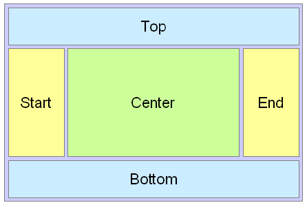
Description of "Figure 9-19 Facets in the panelStretchLayout Component"
Note:
Figure 9-19 shows the facets when the language reading direction of the application is configured to be left-to-right. If instead the language direction is right-to-left, the start and end facets are switched.
When you set the height of the top and bottom facets, any contained components are stretched up to fit the height. Similarly, when you set the width of the start and end facets, any components contained in those facets are stretched to that width. If no components are placed in the facets, then that facet does not render. That is, that facet will not take up any space. If you want that facet to take up the set space but remain blank, insert a spacer component. See Separating Content Using Blank Space or Lines. Child Components components in the center facet are then stretched to fill up any remaining space. For information about component stretching, see Geometry Management and Component Stretching.
Instead of setting the height of the top or bottom facet, or width of the start or end facet to a dimension, you can set the height or width to auto. This allows the facet to size itself to use exactly the space required by the child components of the facet. Space will be allocated based on what the web browser determines is the required amount of space to display the facet content.
Performance Tip:
Using auto as a value will degrade performance of your page. You should first attempt to set a height or width and use the auto attribute sparingly.
The File Explorer application uses a panelStretchLayout component as the root component in the template. Child components are placed only in the center and bottom facets. Therefore, whatever is in the center facet stretches the full width of the window, and from the top of the window to the top of the bottom facet, whose height is determined by the bottomHeight attribute. The following example shows abbreviated code from the fileExplorerTemplate file.
<af:panelStretchLayout
    bottomHeight="#{attrs.footerGlobalSize}">
  <f:facet name="center">
    <af:panelSplitter orientation="vertical" ...>
.
.
.
    </af:panelSplitter
  </f:facet>
  <f:facet name="bottom">
    <af:panelGroupLayout layout="vertical">
.
.
.
    </af:panelGroupLayout>
  </f:facet>
</af:panelStretchLayout>
The template uses an EL expression to determine the value of the bottomHeight attribute. This expression resolves to the value of the footerGlobalSize attribute defined in the template, which by default is 0. Any page that uses the template can override this value. For example, the index.jspx page uses this template and sets the value to 30. Therefore, when the File Explorer application renders, the contents in the panelStretchLayout component begin 30 pixels from the bottom of the page.
9.6.1 How to Use the panelStretchLayout Component
The panelStretchLayout component cannot have any direct child components. Instead, you place components within its facets. The panelStretchLayout is one of the components that can be configured to stretch any components in its facets to fit the browser. You can nest panelStretchLayout components. See Nesting Components Inside Components That Allow Stretching.
Before you begin:
It may be helpful to have an understanding of how the attributes can affect functionality. See Arranging Contents to Stretch Across a Page.
You may also find it helpful to understand functionality that can be added using other ADF Faces features. See Additional Functionality for Layout Components.
To create and use the panelStretchLayout component:
-
In the Components window, from the Layout panel, drag and drop a Panel Stretch Layout onto the JSF page.
-
In the Properties window, expand the Common section and set the attributes as needed.
When there are child components in the
top,bottom,start, andendfacets, these components occupy space that is defined by thetopHeight,bottomHeight,startWidth, andendWidthattributes. For example,topHeightattribute specifies the height of thetopfacet, andstartWidthattribute specifies the width of thestartfacet. Child components intopandbottomfacets are stretched up to the height set bytopHeightandbottomHeightattributes, respectively, and child components instartandendfacets are stretched up to the width set bystartWidthandendWidthattributes, respectively. Instead of setting a numeric dimension, you can set thetopHeight,bottomHeight,startWidthandendWidthattributes toautoand the browser will determine the amount of space required to display the content in the facets.Note:
If you set a facet to use
autoas a value for the width or height of that facet, the child component does not have to be able to stretch. In fact, it must use a stable, standalone width that is not dependent upon the width of the facet.For example, you should not use
autoon a facet whose child component can stretch their children automatically. These components have their own built-in stretched widths by default which will then cause them to report an unstableoffsetWidthvalue, which is used by the browser to determine the amount of space.Additionally, you should not use
autoin conjunction with a child component that uses a percentage length for its width. The facet content cannot rely on percentage widths or be any component that would naturally consume the entire width of its surrounding container.If you do not explicitly specify a value, by default, the value for the
topHeight,bottomHeight,startWidth, andendWidthattributes is 50 pixels each. The widths of thetopandbottomfacets, and the heights of thestartandendfacets are derived from the width and height of the parent component ofpanelStretchLayout.Tip:
If a facet does not contain a child component, it is not rendered and therefore does not take up any space. You must place a child component into a facet in order for that facet to occupy the configured space.
-
The
panelStretchLayoutcomponent can be configured to stretch to fill available browser space, or if you want to place thepanelStretchLayoutcomponent inside a component that does not stretch its children, you can configure thepanelStretchLayoutcomponent to not stretch.You configure whether the component will stretch or not using the
dimensionsFromattribute.Note:
The default value for the
dimensionsFromattribute is handled by theDEFAULT_DIMENSIONSweb.xml parameter. If you always want the components whose geometry management is determined by thedimensionsFromattribute to stretch if its parent component allows stretching of its child, set the DEFAULT_DIMENSIONS parameter toauto, instead of setting thedimensionsFromattribute. Set the dimensionsFrom attribute when you want to override the global setting.By default, DEFAULT_DIMENSIONS is set so that the value of
dimensionsFromis based on the component's default value, as documented in the following descriptions. See Geometry Management for Layout and Table Components.Set DimensionsFrom to one of the following:
-
children: Instead of stretching, thepanelStretchLayoutcomponent will get its dimensions from its child component.Note:
If you use this setting, you cannot use a percentage to set the height of the
topandbottomfacets. If you do, those facets will try to get their dimensions from the size of thispanelStretchLayoutcomponent, which will not be possible, as thepanelStretchLayoutcomponent will be getting its height from its contents, resulting in a circular dependency If a percentage is used for either facet, it will be disregarded and the default50pxwill be used instead.Additionally, you cannot set the height of the
panelStretchLayoutcomponent (for example through theinlineStyleorstyleClassattributes) if you use this setting. Doing so would cause conflict between thepanelStretchLayoutheight and the child component height. -
parent: the size of thepanelStretchLayoutcomponent will be determined in the following order:-
From the
inlineStyleattribute. -
If no value exists for
inlineStyle, then the size is determined by the parent container (that is, thepanelStretchLayoutcomponent will stretch). -
If the parent container is not configured or not able to stretch its children, the size will be determined by the skin.
-
-
auto: If the parent component to thepanelStretchLayoutcomponent allows stretching of its child, then thepanelStretchLayoutcomponent will stretch to fill the parent. If the parent does not stretch its children then the size of thepanelStretchLayoutcomponent will be based on the size of its child component.
-
-
To place content in the component, drag and drop the desired component into any of the facets. If you want the child component to stretch, it must be a component that supports being stretched. See What You May Need to Know About Geometry Management and the panelStretchLayout Component.
Because facets on a JSP or JSPX accept one child component only, if you want to add more than one child component, you must wrap the child components inside a container, such as a
panelGroupLayoutorgroupcomponent. Facets on a Facelets page can accept more than one component. Child components must also be able to be stretched in order for all contained components to stretch.Tip:
If any facet is not visible in the visual editor:
-
Right-click the
panelStretchLayoutcomponent in the Structure window. -
From the context menu, choose Facets - Panel Stretch Layout >facet name. Facets in use on the page are indicated by a checkmark in front of the facet name.
-
9.6.2 What You May Need to Know About Geometry Management and the panelStretchLayout Component
The panelStretchLayout component can stretch its child components and it can also be stretched. The following components can be stretched inside the facets of the panelStretchLayout component:
-
decorativeBox(when configured to stretch) -
deck -
calendar -
inputText(when configured to stretch) -
panelAccordion(when configured to stretch) -
panelBox(when configured to stretch) -
panelCollection -
panelDashboard(when configured to stretch) -
panelGroupLayout(only with thelayoutattribute set toscrollorvertical) -
panelHeader(when configured to stretch) -
panelSplitter(when configured to stretch) -
panelStretchLayout(when configured to stretch) -
panelTabbed(when configured to stretch) -
region -
showDetailHeader(when configured to stretch) -
table(when configured to stretch) -
tree(when configured to stretch) -
treeTable(when configured to stretch)
The following components cannot be stretched when placed inside a facet of the panelStretchLayout component:
-
panelBorderLayout -
panelFormLayout -
panelGroupLayout(only with thelayoutattribute set todefaultorhorizontal) -
panelLabelAndMessage -
panelList -
showDetail -
tableLayout(MyFaces Trinidad component)
You cannot place components that cannot stretch into facets of a component that stretches its child components. Therefore, if you need to place a component that cannot be stretched into a facet of the panelStretchLayout component, wrap that component in a transition component that can stretch.
For example, if you want to place content in a panelBox component (configured to not stretch) within a facet of the panelStretchLayout component, you could place a panelGroupLayout component with its layout attribute set to scroll in a facet of the panelStretchLayout component, and then place the panelBox component in that panelGroupLayout component. See Nesting Components Inside Components That Allow Stretching.
9.7 Using Splitters to Create Resizable Panes
When you have groups of unique content to present to users, consider using the panelSplitter component to provide multiple panes separated by adjustable splitters. The ADF Faces Components Demo application uses a panelSplitter to separate the component demo area from the editor area, as shown in Figure 9-20. Users can change the size of the panes by dragging the splitter, and can also collapse and restore the panel that displays the editor. When a panel is collapsed, the panel contents are hidden; when a panel is restored, the contents are displayed.
Figure 9-20 ADF Faces Components Demo Application Uses panelSplitter to Separate Contents
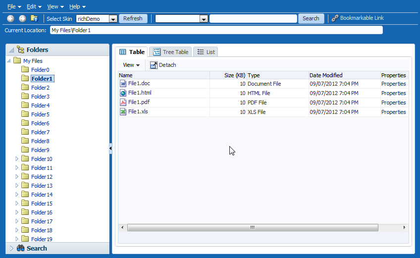
The panelSplitter component lets you organize contents into two panes separated by an adjustable splitter. The panes can either line up on a horizontal line (as does the splitter shown in Figure 9-20) or on a vertical line. The ADF Faces Components Demo application uses another panelSplitter component to separate the application's global menu from the main body of the page. Figure 9-21 shows the panelSplitter component expanded to show the menu, which includes access to the documentation and source.
Figure 9-21 panelSplitter with a Vertical Split Expanded
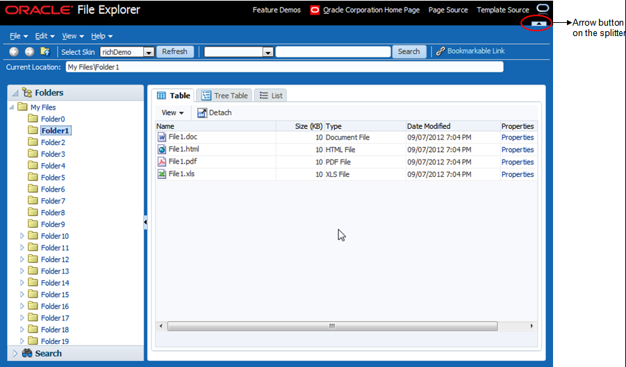
Clicking the arrow button on a splitter collapses the panel that holds the global menu, and the menu items are no longer shown, as shown in Figure 9-22.
Figure 9-22 panelSplitter with a Vertical Split Collapsed
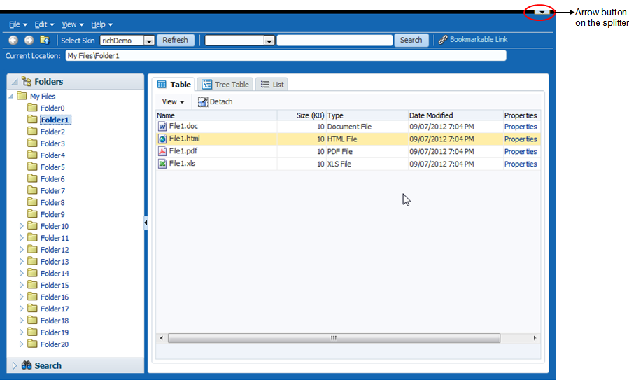
You place components inside the facets of the panelSplitter component. The panelSplitter component uses geometry management to stretch its child components at runtime. This means when the user collapses one panel, the contents in the other panel are explicitly resized to fill up available space.
Note:
While the user can change the values of the splitterPosition and collapsed attributes by resizing or collapsing the panes, those values will not be retained once the user leaves the page unless you configure your application to use change persistence. For information about enabling and using change persistence, see Allowing User Customization on JSF Pages.
9.7.1 How to Use the panelSplitter Component
The panelSplitter component lets you create two panes separated by a splitter. Each splitter component has two facets, namely, first and second, which correspond to the first panel and second panel, respectively. Child components can reside inside the facets only. To create more than two panes, you nest the panelSplitter components.
Before you begin:
It may be helpful to have an understanding of how the attributes can affect functionality. See Using Splitters to Create Resizable Panes.
You may also find it helpful to understand functionality that can be added using other ADF Faces features. See Additional Functionality for Layout Components.
To create and use the panelSplitter component:
-
In the Components window, from the Layout panel, drag and drop a Panel Splitter onto the JSF page.
-
In the Properties window, expand the Common section.
-
Set Orientation to
verticalto create two vertical panes (one on top of the other). By default, the value ishorizontal, which means horizontal panes are placed left-to-right (or right-to-left, depending on the language reading direction). -
Set SplitterPosition and PositionedFromEnd to determine the initial placement of the splitter. By default, the value of the
splitterPositionattribute is 200 pixels, and thepositionedFromEndattribute isfalse. This setting means that ADF Faces measures the initial position of the adjustable splitter from the start or top panel (depending on theorientationattribute value). For example, if theorientationattribute is set tohorizontal, thesplitterPositionattribute is200and thepositionedFromEndattribute isfalse(all default values), then ADF Faces places the splitter 200 pixels from the start panel, as shown in Figure 9-23.Figure 9-23 Splitter Position Measured from Start Panel
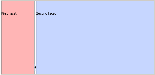
If the
positionedFromEndattribute is set totrue, then ADF Faces measures the initial position of the splitter from the end (or bottom panel, depending on theorientationvalue). Figure 9-24 shows the position of the splitter measured 200 pixels from the end panel.Figure 9-24 Splitter Position Measured from End Panel
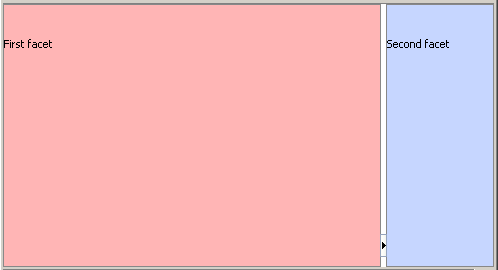
-
Set collapsed to determine whether or not the splitter is in a collapsed (hidden) state. By default, the
collapsedattribute isfalse, which means both panes are displayed. When the user clicks the arrow button on the splitter, thecollapsedattribute is set totrueand one of the panes is hidden.ADF Faces uses the
collapsedandpositionedFromEndattributes to determine which panel (that is, the first or second panel) to hide (collapse) when the user clicks the arrow button on the splitter. When thecollapsedattribute is set totrueand thepositionedFromEndattribute isfalse, the first panel is hidden and the second panel stretches to fill up the available space. When thecollapsedattribute istrueand thepositionedFromEndattribute istrue, the second panel is hidden instead. Visually, the user can know which panel will be collapsed by looking at the direction of the arrow on the button: when the user clicks the arrow button on the splitter, the panel collapses in the direction of the arrow. -
By default, the
panelSplittercomponent stretches to fill available browser space. If you want to place thepanelSplitterinto a component that does not stretch its children, then you need to change how thepanelSplittercomponent handles stretching.You configure whether the component will stretch or not using the
dimensionsFromattribute.Note:
The default value for the
dimensionsFromattribute is handled by theDEFAULT_DIMENSIONSweb.xml parameter. If you always want the components whose geometry management is determined by thedimensionsFromattribute to stretch if its parent component allows stretching of its child, set the DEFAULT_DIMENSIONS parameter toauto, instead of setting thedimensionsFromattribute. Set the dimensionsFrom attribute when you want to override the global setting.By default, DEFAULT_DIMENSIONS is set so that the value of
dimensionsFromis based on the component's default value, as documented in the following descriptions. See Geometry Management for Layout and Table Components.In the Properties window, set DimensionsFrom to one of the following:
-
children: Instead of stretching, thepanelSplittercomponent will get its dimensions from its child component.Note:
If you use this setting and you set the
orientationattribute tovertical, then the contents of the collapsible panel will not be determined by its child component, but instead will be determined by the value ofsplitterPositionattribute. The size of the other pane will be determined by its child component.Additionally, you cannot set the height of the
panelSplittercomponent (for example through theinlineStyleorstyleClassattributes) if you use this setting. Doing so would cause conflict between thepanelSplitterheight and the child component height. -
parent: The size of thepanelSplittercomponent will be determined in the following order:-
From the
inlineStyleattribute. -
If no value exists for
inlineStyle, then the size is determined by the parent container. -
If the parent container is not configured or not able to stretch its children, the size will be determined by the skin.
-
-
auto: If the parent component to thepanelSplittercomponent allows stretching of its child, then thepanelSplittercomponent will stretch to fill the parent. If the parent does not stretch its children then the size of thepanelSplittercomponent will be based on the size of its child component.
-
-
To place content in the component, drag and drop the desired component into the
firstandsecondfacets. When you have the orientation set to horizontal, thefirstfacet is the left facet. When you have the orientation set to vertical, thefirstfacet is the top facet. If you want the child component to stretch, it must be a component that supports stretching. See What You May Need to Know About Geometry Management and the panelSplitter Component.Because facets on a JSP or JSPX accept one child component only, if you want to add more than one child component, you must wrap the child components inside a container, such as a
panelGroupLayoutorgroupcomponent. Facets on a Facelets page can accept more than one component.Tip:
If any facet is not visible in the visual editor:
-
Right-click the
panelSplittercomponent in the Structure window. -
From the context menu, choose Facets - Panel Splitter >facet name. Facets in use on the page are indicated by a checkmark in front of the facet name.
-
-
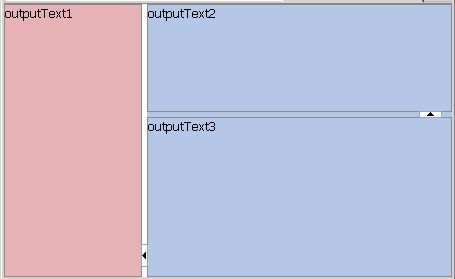
To create more than two panes, insert another Panel Splitter component into a facet to create nested splitter panes, as shown in Figure 9-25.
Figure 9-25 Nested panelSplitter Components
Description of "Figure 9-25 Nested panelSplitter Components"The following example shows the code generated by JDeveloper when you nest splitter components.
<af:panelSplitter ...> <f:facet name="first"> <!-- first panel child components components here --> </f:facet> <f:facet name="second"> <!-- Contains nested splitter component --> <af:panelSplitter orientation="vertical" ...> <f:facet name="first"> <!-- first panel child components components here --> </f:facet> <f:facet name="second"> <!-- second panel child components components here --> </f:facet> </af:panelSplitter> </f:facet> </af:panelSplitter> -
If you want to perform some operation when users collapse or expand a panel, attach a client-side JavaScript using the
clientListenertag for thecollapsedattribute and apropertyChangeevent type. For information about client-side events, see Handling Events.
9.7.2 What You May Need to Know About Geometry Management and the panelSplitter Component
The panelSplitter component can stretch its child components and it can also be stretched. The following components can be stretched inside the first or second facet of the panelSplitter component:
-
decorativeBox(when configured to stretch) -
deck -
calendar -
inputText(when configured to stretch) -
panelAccordion (when configured to stretch) -
panelBox(when configured to stretch) -
panelCollection(when configured to stretch) -
panelDashboard(when configured to stretch) -
panelGroupLayout(only with thelayoutattribute set toscrollorvertical) -
panelHeader(when configured to stretch) -
panelSplitter(when configured to stretch) -
panelStretchLayout(when configured to stretch) -
panelTabbed(when configured to stretch) -
region -
showDetailHeader(when configured to stretch) -
table(when configured to stretch) -
tree(when configured to stretch) -
treeTable(when configured to stretch)
The following components cannot be stretched when placed inside a facet of the panelSplitter component:
-
panelBorderLayout -
panelFormLayout -
panelGroupLayout(only with thelayoutattribute set todefaultorhorizontal) -
panelLabelAndMessage -
panelList -
showDetail -
tableLayout(MyFaces Trinidad component)
You cannot place components that cannot stretch into facets of a component that stretches its child components. Therefore, if you need to place one of the components that cannot be stretched into a facet of the panelSplitter component, wrap that component in a transition component that does not stretch its child components.
For example, if you want to place content in a panelBox component and have it flow within a facet of the panelSplitter component, you could place a panelGroupLayout component with its layout attribute set to scroll in a facet of the panelSplitter component, and then place the panelBox component in that panelGroupLayout component. See Nesting Components Inside Components That Allow Stretching.
9.8 Arranging Page Contents in Predefined Fixed Areas
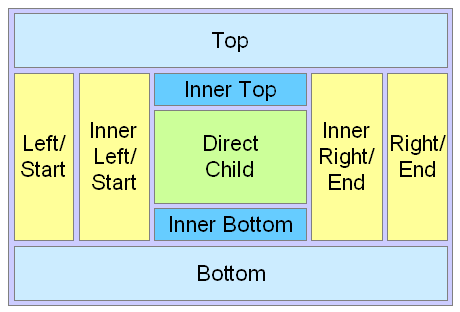
The panelBorderLayout component uses facets to contain components in predefined areas of a page. Instead of a center facet, the panelBorder layout component takes 0 to n direct child components (also known as indexed children), which are rendered consecutively in the center. The facets then surround the child components.
Figure 9-26 shows the facets of the panelBorderLayout component: top, inner top, bottom, inner bottom, start, inner start, end, and inner end.
The 12 supported facets of the panelBorderLayout component are:
-
top: Renders child components above the center area. -
bottom: Renders child components below the center area. -
start: Supports multiple reading directions. This facet renders child components on the left of the center area betweentopandbottomfacet child components, if the reading direction of the client browser is left-to-right. If the reading direction is right-to-left, it renders child components on the right of the center area. When your application must support both reading directions, this facet ensures that the content will be displayed on the proper side when the direction changes. If you do not need to support both directions, then you should use either theleftorrightfacet. -
end: Supports multiple reading directions. This facet renders child components on the right of the center area betweentopandbottomfacet child components, if the reading direction of the client browser is left-to-right. If the reading direction is right-to-left, it renders child components on the left of the center area. When your application must support both reading directions, this facet ensures that the content will be displayed on the proper side when the direction changes. If you do not need to support both directions, then you should use either theleftorrightfacet. -
left: Supports only one reading direction. This facet renders child components on the left of the center area betweentopandbottomfacet child components. When the reading direction is left-to-right, theleftfacet has precedence over thestartfacet if both theleftandstartfacets are used (that is, contents in thestartfacet will not be displayed). If the reading direction is right-to-left, theleftfacet also has precedence over theendfacet if bothleftandendfacets are used. -
right: Supports only one reading direction. This facet renders child components on the right of the center area betweentopandbottomfacet child components. If the reading direction is left-to-right, therightfacet has precedence over theendfacet if bothrightandendfacets are used. If the reading direction is right-to-left, therightfacet also has precedence over thestartfacet, if bothrightandstartfacets are used. -
innerTop: Renders child components above the center area but below thetopfacet child components. -
innerBottom: Renders child components below the center area but above thebottomfacet child components. -
innerLeft: Renders child components similar to theleftfacet, but renders between theinnerTopandinnerBottomfacets, and between theleftfacet and the center area. -
innerRight: Renders child components similar to therightfacet, but renders between theinnerTopfacet and theinnerBottomfacet, and between therightfacet and the center area. -
innerStart: Renders child components similar to theinnerLeftfacet, if the reading direction is left-to-right. Renders child components similar to theinnerRightfacet, if the reading direction is right-to-left. -
innerEnd: Renders child components similar to theinnerRightfacet, if the reading direction is left-to-right. Renders child components similar to theinnerLeftfacet, if the reading direction is right-to-left.
The panelBorderLayout component does not support stretching its child components, nor does it stretch when placed in a component that stretches its child components. Therefore, the size of each facet is determined by the size of the component it contains. If instead you want the contents to stretch to fill the browser window, consider using the panelStretchLayout component instead. See Arranging Contents to Stretch Across a Page.
9.8.1 How to Use the panelBorderLayout Component to Arrange Page Contents in Predefined Fixed Areas
There is no restriction to the number of panelBorderLayout components you can have on a JSF page.
Before you begin:
It may be helpful to have an understanding of how the attributes can affect functionality. See Arranging Page Contents in Predefined Fixed Areas.
You may also find it helpful to understand functionality that can be added using other ADF Faces features. See Additional Functionality for Layout Components.
To create and use the panelBorderLayout component:
-
In the Components window, from the Layout panel, drag and drop a Panel Border Layout onto the JSF page.
-
From the Components window, drag and drop the component that will be used to display contents in the center of the window as a child component to the
panelBorderLayoutcomponent.Child components are displayed consecutively in the order in which you inserted them. If you want some other type of layout for the child components, wrap the components inside the
panelGroupLayoutcomponent. See Grouping Related Items. -
To place contents that will surround the center, drag and drop the desired component into each of the facets.
Because facets on a JSP or JSPX accept one child component only, if you want to add more than one child component, you must wrap the child components inside a container, such as a
panelGroupLayoutorgroupcomponent. Facets on a Facelets page can accept more than one component.Tip:
If any facet is not visible in the visual editor:
-
Right-click the
panelBorderLayoutcomponent in the Structure window. -
From the context menu, choose Facets - Panel Border Layout >facet name. Facets in use on the page are indicated by a checkmark in front of the facet name.
-
9.9 Arranging Content in Forms
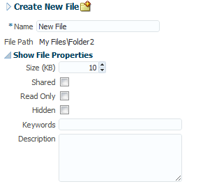
The panelFormLayout component lets you lay out multiple components such as input fields and selection list fields in one or more columns. The File Explorer application uses a panelFormLayout component to display file properties. The component is configured to have the labels right-aligned, as shown in Figure 9-27.
Figure 9-27 Right-Aligned Labels and Left-Aligned Fields in a Form
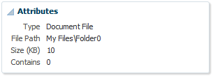
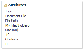
Figure 9-28 shows the same page with the component configured to display the labels above the fields.
Figure 9-28 Labels Above Fields in a Form
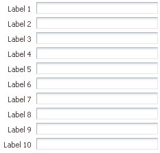
You can configure the panelFormLayout component to display the fields with their labels in one or more columns. Each field in the form is a child component of the panelFormLayout component. You set the desired number of rows, and if there are more child components than rows, the remaining child components are placed in a new column. The following example shows a panelFormLayout component with 10 inputText child components.
<af:panelFormLayout id="pfl1" rows="10">
  <af:inputText label="Label 1" id="it1"/>
  <af:inputText label="Label 2" id="it2"/>
  <af:inputText label="Label 3" id="it3"/>
  <af:inputText label="Label 4" id="it4"/>
  <af:inputText label="Label 5" id="it5"/>
  <af:inputText label="Label 6" id="it6"/>
  <af:inputText label="Label 7" id="it7"/>
  <af:inputText label="Label 8" id="it8"/>
  <af:inputText label="Label 9" id="it9"/>
  <af:inputText label="Label 10" id="it10"/>
</af:panelFormLayout>
Because the panelFormLayout's row attribute is set to 10, all 10 inputText components appear in one column, as shown in Figure 9-29.
Figure 9-29 All inputText Components Display in One Column
However, if the row attribute were to be set to 8, then the first 8 inputText components display in the first column and the last two appear in the second column, as shown in Figure 9-30.
Figure 9-30 Components Displayed in Two Columns
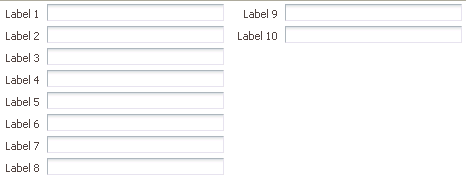
However, the number of rows displayed in each is not solely determined by the configured number of rows. By default, the panelFormLayout component's maxColumns attribute is set to render no more than three columns (two for PDA applications). This value is what actually determines the number of rows. For example, if you have 25 child components and you set the component to display 5 rows and you leave the default maximum number of columns set to 3, then the component will actually display 9 rows, even though you have it set to display 5. This is because the maximum number of columns can override the set number of rows. Because it is set to allow only up to 3 columns, the component must use 9 rows in order to display all child components. You would need to set the maximum number of columns to 5 in order to have the component display just 5 rows.
ADF Faces uses default label and field widths, as determined by the standard HTML flow in the browser. You can also specify explicit widths to use for the labels and fields. Regardless of the number of columns in the form layout, the widths you specify apply to all labels and fields. You specify the widths using either absolute numbers in pixels or percentage values. If the length of a label does not fit, the text is wrapped.
Tip:
If your page will be displayed in languages other than English, you should leave extra space in the labels to account for different languages and characters.
9.9.1 How to Use the panelFormLayout Component
You can use one or more panelFormLayout components on a page to create the desired form layout.
Before you begin:
It may be helpful to have an understanding of how the attributes can affect functionality. See Arranging Content in Forms.
You may also find it helpful to understand functionality that can be added using other ADF Faces features. See Additional Functionality for Layout Components.
To create and use panelFormLayout:
9.9.2 What You May Need to Know About Using the group Component with the panelFormLayout Component
While the group component itself does not render anything, when it used to group child components in the panelFormLayout component, by default, visible separators can be displayed around the child components of each group component. For example, you might want to group some of the input fields in a form layout created by the panelFormLayout component. You can also choose to display a title for the group using its title attribute.
Note:
If the group title is not horizontally longer than the width of the current panelFormLayout column, the panelFormLayout will stretch horizontally to accommodate the title.
The startBoundary attribute controls whether or not the separator lines display at the top of the group, while the endBoundary attribute controls whether or not the separator lines display at the bottom of the group. If you want the line to display, set the attribute to show. If you don't ever want to have the lines display, set the attribute to hide. In two adjacent groups, if you don't want the line to display, the adjoining attributes must both be set to hide, or one must be set to hide and the other to dontCare. By default, these attributes are set to dontCare, which means the parent component (in this case the panelFormLayout component) will display the lines.
The following example shows sample code that groups three sets of child components inside a panelFormLayout component. The first group is set to hide the separator lines. However, because the second group is configured to display a separator at the start of the group, the lines will display. The second group is also set to display a title and a line at the end of the group. Because the third group has the startBoundary attribute set to dontCare, the line at the bottom of the second group displays.
<af:panelFormLayout maxColumns="1" labelWidth="75" id="pfl4">
  <af:group id="g1" startBoundary="hide" endBoundary="hide">
    <af:selectOneChoice label="Prompt" value="option1" id="soc4">
      <af:selectItem label="Option 1" value="option1" id="si30"/>
      <af:selectItem label="Option 2" value="option2" id="si31"/>
     </af:selectOneChoice>
     <af:selectOneChoice label="Prompt" value="option1" id="soc5">
       <af:selectItem label="Option 1" value="option1" id="si32"/>
       <af:selectItem label="Option 2" value="option2" id="si33"/>
     </af:selectOneChoice>
     <af:panelLabelAndMessage label="Prompt" id="plam6" for="it6">
       <af:panelGroupLayout layout="horizontal" id="pgl4">
         <af:inputText simple="true" contentStyle="width: 100px;"
           label="inputText" id="it6"/>
         <af:button partialSubmit="true" text="Browse..." id="cb3"/>
       </af:panelGroupLayout>
     </af:panelLabelAndMessage>
   </af:group>
   <af:group id="g2" title="Grouped Set of Forms" startBoundary="show"
             endBoundary="show">
     <af:selectManyListbox label="Prompt" contentStyle="width: 100px"
                           id="sml3">
       <af:selectItem label="Option 1" value="option1" id="si34"/>
      <af:selectItem label="Option 2" value="option2" id="si35"/>
      <af:selectItem label="Option 3" value="option3" id="si36"/>
      <af:selectItem label="Option 4" value="option4" id="si37"/>
    </af:selectManyListbox>
  </af:group>
  <af:group id="g3" startBoundary="dontCare" endBoundary="dontCare">
    <af:selectManyCheckbox label="Prompt" id="smc3">
      <af:selectItem label="Value 1" value="value1" id="si38"/>
      <af:selectItem label="Value 2" value="value2" id="si39"/>
      <af:selectItem label="Value 3" value="value3" id="si40"/>
    </af:selectManyCheckbox>
  </af:group>
</af:panelFormLayout>
At runtime the panelFormLayout component renders separator lines before and after the second group of child components, along with a title, as shown in Figure 9-31.
Figure 9-31 Grouped Components in panelFormLayout
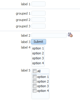
Description of "Figure 9-31 Grouped Components in panelFormLayout"
As described in Arranging Content in Forms, the panelFormLayout component uses certain component attributes to determine how to display its child components (grouped and ungrouped) in columns and rows. When using the group component to group related components in a panelFormLayout component that will display its child components in more than one column, the child components of any group component will always be displayed in the same column, that is, child components inside a group component will never be split across a column.
In JSP pages, facets can only contain one child component (Facelet pages do not have that restriction). Therefore, when you use the group component to group child components in the footer facet of the panelFormLayout component, you must place all the group components and other ungrouped child components in one root group component, as shown in the following example.
<af:panelFormLayout ...>
  <f:facet name="footer">
    <af:group id="g2">
      <af:inputText rows="2" label="footer item 1" id="it10"/>
        <af:group id="g3">
          <af:inputText columns="5" label="footer group item 1"
                        id="it11"/>
          <af:inputText columns="5" label="footer group item 2"
                        id="it12"/>
          <af:inputText columns="5" label="footer group item 3"
                        id="it13"/>
        </af:group>
      <af:panelGroupLayout layout="horizontal" id="pgl2">
        <f:facet name="separator">
          <af:spacer width="10" id="s2"/>
        </f:facet>
        <af:button text="Page 1" partialSubmit="true"
                          id="cb3"/>
        <af:button text="Page 2" partialSubmit="true"
                          id="cb4"/>
      </af:panelGroupLayout>
    </af:group>
  </f:facet>
  .
  .
  .
</af:panelFormLayout>
Like grouped child components in a panelFormLayout component, at runtime, by default the panelFormLayout component renders separator lines around the child components of each group component in the footer facet, as shown in Figure 9-32.
Figure 9-32 Footer in panelGroupLayout with Grouped Components
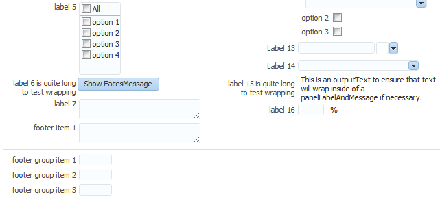
Description of "Figure 9-32 Footer in panelGroupLayout with Grouped Components"
Note:
In JSP pages, the footer facet in the panelFormLayout component supports only two levels of grouped components, that is, you cannot have three or more levels of nested group components in the footer facet. For example, the following code is not valid:
<f:facet name="footer">
  <!-- Only one root group -->
  <af:group id-"g1">
    <af:outputText value="Footer item 1" id="ot1"/>
    <!-- Any number of groups at this level -->
    <af:group id="g2">
      <af:outputText value="Group 1 item 1" id="ot2"/>
      <af:outputText value="Group 1 item 2" id="ot3"/>
      <!-- But not another nested group. This is illegal. -->
      <af:group id="g3">
        <af:outputText value="Nested Group 1 item 1" id="ot4"/>
        <af:outputText value="Nested Group 1 item 2" id="ot5"/>
      </af:group>
    </af:group>
    <af:outputText value="Another footer item" id="ot6"/>
  </af:group>
</f:facet>
When a group component is first in a column of a panelFormLayout, a separator line will not display at the top, even when startBoundary is set to show. The same is true for the last group component in a column; no separator line will display at the bottom, even if the endBoundary attribute is set to show.
9.10 Arranging Contents in a Dashboard
The panelDashboard component allows you to arrange its child components in rows and columns, similar to the panelForm component. However, instead of text components, the panelDashboard children are panelBox components that contain content, as shown in Figure 9-33.
Figure 9-33 panelDashboard with panelBox Child Components
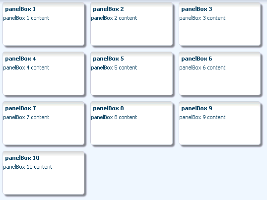
Description of "Figure 9-33 panelDashboard with panelBox Child Components"
When you add a panelDashboard component, you configure the number of columns it will contain, along with the height of each row. The dashboard stretches its children to fill up the configured space. If all the child components do not fit within the specified number of columns and row height, then the panelDashboard component displays a scroll bar.
When placed in a component that stretches it children, by default, the panelDashboard stretches to fill its parent container, no matter the number of children. This could mean that you may have blank space in the dashboard when the browser is resized to be much larger than the dashboard needs.
For example, say you have set the panelDashboard to inherit its size from its parent by setting the dimensionsFrom attribute to parent. You set columns to 1 and the rowHeight to 50px. You then add two panelBox components. Because columns is set to 1, you will have 2 rows. Because the parent component is a panelStretchLayout, the panelDashboard will stretch to fill the panelStretchLayout, no matter the height of the boxes, and you end up with extra space, as shown in Figure 9-34 (the color of the dashboard has been changed to fuchsia to make it more easy to see its boundaries).
Figure 9-34 panelDashboard Stretches to Fill Space
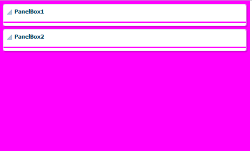
If instead you don't want the dashboard to stretch, you can place it in a component that does not stretch its children, and you can configure the panelDashboard to determine its size based on its children (by setting the dimensionsFrom attribute to children). It will then be as tall as the number of rows required to display the children, multiplied by the rowHeight attribute.
In the previous example, if instead you place the dashboard in a panelGroupLayout set to scroll, because the rowHeight is set to 50, your panelDashboard will always be just over 100px tall, no matter the size of the browser window, as shown in Figure 9-35.
Figure 9-35 panelDashboard Does Not Stretch
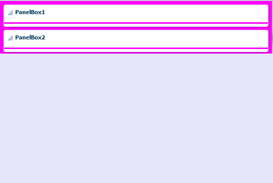
The panelDashboard component also supports declarative drag and drop behavior, so that the user can rearrange the child components. As shown in Figure 9-36, the user can for example, move panelBox 10 between panelBox 4 and panelBox 5. A shadow is displayed where the box can be dropped.
Figure 9-36 Drag and Drop Capabilities in panelDashboard
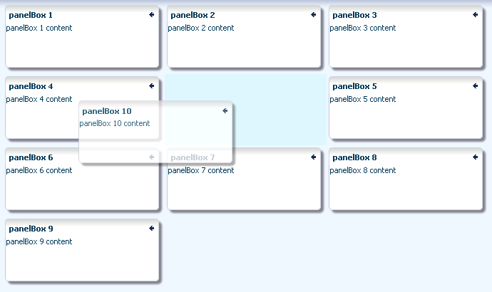
Note:
You can also configure drag and drop functionality that allows users to drag components into and out of the panelDashboard component. See Adding Drag and Drop Functionality Into and Out of a panelDashboard Component.
Along with the ability to move child components, the panelDashboard component also provides an API that you can access to allow users to switch child components from being rendered to not rendered, giving the appearance of panelBoxes being inserted or deleted. The dashboard uses partial page rendering to redraw the new set of child components without needing to redraw the entire page.
You can use the panelDashboardBehavior tag to make the rendering of components appear more responsive. This tag allows the activation of a command component to apply visual changes to the dashboard before the application code modifies the component tree on the server. Because this opening up of space happens before the action event is sent to the server, the user will see immediate feedback while the action listener for the command component modifies the component tree and prepares the dashboard for the optimized encoding of the insert.
For example, Figure 9-37 shows a panelDashboard component used in the right panel of a panelSplitter component. In the left panel, list items displayed as links represent each panelBox component in the panelDashboard. When all panelBox components are displayed, the links are all inactive. However, if a user deletes one of the panelBox components, the corresponding link becomes active. The user can click the link to reinsert the panelBox. By using the panelDashboardBehavior tag with the commandLink component, the user sees the inserted box drawing.
Figure 9-37 commandLink Components Use panelDashboardBehavior Tag
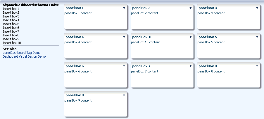
If you decide not to use this tag, there will be a slight delay while your action listener is processing before the user sees any change to the dashboard structure.
Figure 9-38 shows a practical example using a panelDashboard component. Selecting one of the links at the top of the page changes the panelBoxes displayed in the dashboard. The user can also add panelBoxes by clicking the associated link on the left-hand side of the page.
Figure 9-38 Practical Example of panelDashboard
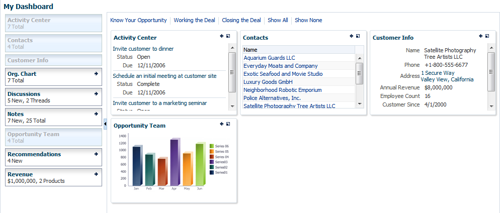
Description of "Figure 9-38 Practical Example of panelDashboard"
9.10.1 How to Use the panelDashboard Component
After you add a panelDashboard to a page, you can configure the dashboard to determine whether or not it will stretch. Then, add child components, and if you want to allow rearrangement the components, also add a componentDragSource tag to the child component. If you want to allow insertion and deletion of components, implement a listener to handle the action. You can also use the panelDashboardBehavior tag to make the panelDashboard component appear more responsive to the insertion.
Before you begin:
It may be helpful to have an understanding of how the attributes can affect functionality. See Arranging Contents in a Dashboard.
You may also find it helpful to understand functionality that can be added using other ADF Faces features. See Additional Functionality for Layout Components.
To use the panelDashboard component:
9.10.2 What You May Need to Know About Geometry Management and the panelDashboard Component
This component organizes its children into a grid based on the number of columns and the rowHeight attribute. The child components that can be stretched inside of the panelDashboard include:
-
inputText(when therowsattribute is set to greater than one, and thesimpleattribute is set totrue) -
panelBox -
region(when configured to stretch) -
table(when configured to stretch)
If you try to put any other component as a child component to the panelDashboard component, then the component hierarchy is not valid.
9.11 Displaying and Hiding Contents Dynamically
Sometimes you want users to have the choice of displaying or hiding content. When you do not need to show all the functionality of the user interface at once, you can save a lot of space by using components that enable users to show and hide parts of the interface at will.
The showDetail component creates a label with a toggle icon that allows users to disclose (show) or undisclose (hide) contents under the label. When the contents are undisclosed (hidden), the default label is Show and the expand icon is displayed. When the contents are disclosed (shown), the default label is Hide, and the collapse icon is displayed.
For example, the newFileItem page of the File Explorer application uses a showDetail component to hide and display file properties. The component is configured to hide the properties when the page is displayed, as shown in Figure 9-39.
Figure 9-39 Collapsed showDetail
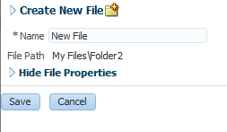
When the user clicks the toggle icon, the properties are displayed, as shown in Figure 9-40.
If you want to use something more complex than an outputText component to display the disclosed and undisclosed text, you can add components to the showDetail component's prompt facet. When set to be visible, any contents in the prompt facet will replace the disclosed and undisclosed text values. To use the showDetail component, see How to Use the showDetail Component.
Like the showDetail component, the showDetailHeader component also toggles the display of contents, but the showDetailHeader component provides the label and toggle icon in a header, and also provides facets for a menu bar, toolbar, and text. Additionally, you can configure the showDetailHeader component to be used as a message for errors, warnings, information, or confirmations.
Tip:
The showDetailHeader component is the same as a panelHeader component, except that it handles disclosure events. For information about the panelHeader component, see Displaying Items in a Static Box.
When there is not enough space to display everything in all the facets of the title line, the showDetailHeader text is truncated and displays an ellipsis, as shown in Figure 9-41.
Figure 9-41 Text for the showDetailHeader Is Truncated
When there is more than enough room to display the contents, the extra space is placed between the context facet and the toolbar, as shown in Figure 9-42.
Figure 9-42 Extra Space Is Added Before the Toolbar
The contents of the showDetailHeader component are undisclosed or disclosed below the header. For example, the newFileItem page of the File Explorer application uses a showDetailHeader component to display help for creating a new file. By default, the help is undisclosed, as shown in Figure 9-40. When the user clicks the toggle icon in the header, the contents are disclosed, as shown in Figure 9-43.
Figure 9-43 showDetailHeader Component Used to Display Help
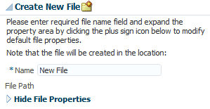
You can also use the showDetailHeader component in conjunction with the panelHeader component to divide a page into sections and subsections, where some contents can be hidden. For information about the panelHeader component, see Displaying Items in a Static Box.
You can nest showDetailHeader components to create a hierarchy of content. Each nested component takes on a different heading style to denote the hierarchy. Figure 9-44 shows three nested showDetailHeader components, and their different styles.
Figure 9-44 Nested showDetailHeader Components Create a Hierarchy
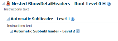
Note:
Heading sizes are determined by default by the physical containment of the header components. That is, the first header component will render as a heading level 1. Any header component nested in the first header component will render as a heading level 2, and so on. You can manually override the heading level on individual header components using the headerLevel attribute.
Use the panelBox component when you want information to be able to be displayed or hidden below the header, and you want the box to be offset from other information on the page. The File Explorer application uses two panelBox components on the properties.jspx page to display the attributes and history of a file, as shown in Figure 9-45.
Figure 9-45 Two panelBox Components
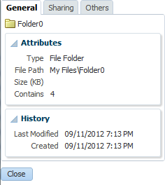
Figure 9-46 shows the same page, but with the History panelBox component in an undisclosed state.
Figure 9-46 Undisclosed panelBox Component
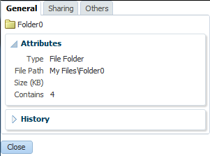
You can set the background color on a panelBox component so that the contents are further delineated from the rest of the page. Two color combinations (called ramps) are offered, and each combination contains four levels of color: none, light, medium, and dark. Figure 9-47 shows the same panel boxes as in Figure 9-45, but with the bottom panelBox component configured to show the medium tone of the core ramp.
Figure 9-47 Panel Boxes Using a Background Color
You can set the size of a panelBox component either explicitly by assigning a pixel size, or as a percentage of its parent. You can also set the alignment of the title, and add an icon. In addition, the panelBox component includes the toolbar facet that allows you to add a toolbar and toolbar buttons to the box.
You can control when the contents of an undisclosed component are sent and rendered to the client using the contentDelivery attribute. When set to immediate delivery, any undisclosed content is fetched during the initial request. With lazy delivery, the page initially goes through the standard lifecycle. However, instead of fetching the undisclosed content during that initial request, a special separate partial page rendering (PPR) request is run, and the undisclosed content is then returned. Because the page has just been rendered, only the Render Response phase executes for the undisclosed content, allowing the corresponding data to be fetched and displayed. You can configure it so that the contents are not rendered to the client until the first request to disclose the content and the contents then remain in the cache (lazy), or so that the contents are rendered each time there is a request to disclose them (lazyUncached).
For all three of these components, you can use the childCreation attribute. This attribute affects JSP tag in determining when the UIComponent children are actually created. By default, all child components are created when the parent component is created. If you configure the component to use lazy or lazyUncached, the child components are not created when the parent tag is certain that a rendered instance of the component will be created. If there will be a large number of children, to improve performance you can configure these components so that they create the child components only when they are disclosed, or so that they create the child components only when they are disclosed the first time, and from that point on they remain created.
Note:
The childCreation attribute only attempts to delay creation of the child components. When EL is used as the value for the disclosed attribute or the disclosure component is being stamped (inside of an iterator for example), the children will always be created, regardless of the childCreation attribute value.
The showDetailHeader and the panelBox components both can be maximized to display in the full browser window. You can also configure an icon to display that allows the user to maximize and then restore the component to normal size. Figure 9-48 shows the demo application with the panelBox component at its normal size. Notice the maximize icon in the header.
Figure 9-48 panelBox Demo with panelBox at Normal Size
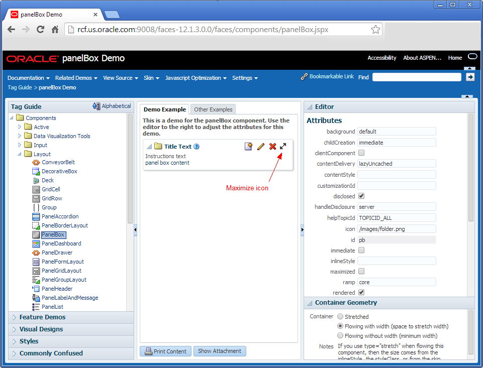
Description of "Figure 9-48 panelBox Demo with panelBox at Normal Size"
When a user clicks the maximize icon, the panelBox is redrawn to take up the entire browser window, as shown in Figure 9-49. The user can click the restore icon to return the component to its normal size.
By default, the component is configured to only show the maximize icon on tablet devices. One desktops, no icon is visible. You can also configure the component so that the icon is always displayed or never displayed. Additionally, you can create a listener that can be used to determine when to maximize the component.
If you want to show and hide multiple large areas of content, consider using the panelAccordion and panelTabbed components. See Displaying or Hiding Contents in Panels.
9.11.1 How to Use the showDetail Component
Use the showDetail component to show and hide a single set of content.
Before you begin:
It may be helpful to have an understanding of how the attributes can affect functionality. See Displaying and Hiding Contents Dynamically.
You may also find it helpful to understand functionality that can be added using other ADF Faces features. See Additional Functionality for Layout Components.
To create and use the showDetail component:
9.11.2 How to Use the showDetailHeader Component
Use the showDetailHeader component when you want to display a single set of content under a header, or when you want the content to be used as messages that can be displayed or hidden. You can also use the showDetailHeader component to create a hierarchy of headings and content when you want the content to be able to be hidden.
Before you begin:
It may be helpful to have an understanding of how the attributes can affect functionality. See Displaying and Hiding Contents Dynamically.
You may also find it helpful to understand functionality that can be added using other ADF Faces features. See Additional Functionality for Layout Components.
To create and use the showDetailHeader component:
9.11.3 How to Use the panelBox Component
You can insert any number of panelBox components on a page.
Before you begin:
It may be helpful to have an understanding of how the attributes can affect functionality. See Displaying and Hiding Contents Dynamically.
You may also find it helpful to understand functionality that can be added using other ADF Faces features. See Additional Functionality for Layout Components.
To create and use a panelBox component:
-
In the Components window, from the Layout panel, drag and drop a Panel Box onto the JSF page.
-
In the Properties window, expand the Appearance section, and for Ramp, select the ramp you wish to use.
The
coreramp uses variations of blue, while thehighlightramp uses variations of yellow. You can change the colors used by creating a custom skin. See What You May Need to Know About Skinning and the panelBox Component. -
Set Background to one of the following values:
light,medium,dark, ordefault. The default background color is transparent. -
Set Text to the text string you want to display as the title in the header portion of the container.
-
Set Icon to the URI of the icon image you want to display before the header text.
Note:
If both the
textandiconattributes are not set, ADF Faces does not display the header portion of thepanelBoxcomponent.Note:
Because alternative text cannot be provided for this icon, in order to create an accessible product, use this icon only when it is purely decorative. You must provide the meaning of this icon in some accessible manner.
-
Set TitleHalign to one of the following values:
center,start,end,left, orright. The value determines the horizontal alignment of the title (including any icon image) in the header portion of the container. -
Expand the Behavior section and set DisclosureListener to a
disclosureListenermethod in a backing bean that you want to execute when the user shows or hides the component's contents.For information about disclosure events and listeners, see What You May Need to Know About Disclosure Events.
-
To add toolbar buttons, in the Components window, from the Layout panel, in the Menus and Toolbar Containers group, drag and drop a Toolbar into the
toolbarfacet. Then insert the desired number of button components into thetoolbarcomponent. For information about usingtoolbarand button components, see Using Toolbars.Tip:
If any facet is not visible in the visual editor:
-
Right-click the
panelBoxcomponent in the Structure window. -
From the context menu, choose Facets - Panel Box >Toolbar. Facets in use on the page are indicated by a checkmark in front of the facet name.
-
-
To change the width of the
panelBoxcomponent, set theinlineStyleattribute to the exact pixel size you want. Alternatively, you can set theinlineStyleattribute to a percentage of the outer element that contains thepanelBoxcomponent. The following example shows the code you might use for changing the width.<af:panelBox inlineStyle="width:50%;" ...> <!-- child contents here --> </af:panelBox>
-
You can configure when the child components will be created using the
childCreationattribute. To do so, expand the Other section, and set ChildCreation to one of the following:-
immediate: All child components are created when thepanelBoxcomponent is created. -
lazy: The child components are created only when they are disclosed. Once disclosed and the associated child components are rendered, they remain created in the component tree. -
lazyUncached: The child components are created only when they are disclosed. Once the components are hidden, they are destroyed.
-
-
You can configure when content of undisclosed children will be sent to the client using the
contentDeliveryattribute. To do so, expand the Other section, and set ContentDelivery to one of the following:-
immediate: All undisclosed content is sent when thepanelBoxcomponent is created. -
lazy: The undisclosed content is sent only when the content is first disclosed. Once disclosed and the content is rendered, it remains in memory. -
lazyUncached: The undisclosed content is created every time it is disclosed. If the content is subsequently hidden, it is destroyed.
-
-
If you want users to be able to maximize the
panelBoxcomponent so that it renders in the full browser window, in the Other section, set ShowMaximized to one of the following:-
always: The maximize icon is always displayed. -
never: The maximize icon is never displayed -
auto: The maximize icon is displayed only on mobile devices. This is the default.
You can also programmatically set the
panelBoxcomponent to be maximized. You can use an EL expression as the value of themaximizedattribute to resolve totrue, or you can create a listener method that sets that attribute and listen for it using themaximizeListenerattribute. -
-
To add contents to the container for display, insert the desired components as child components to the
panelBoxcomponent.Typically, you would insert one child component into the
panelBoxcomponent, and then insert the contents for display into the child component. The child component controls how the contents will be displayed, not the parentpanelBoxcomponent.
9.11.4 What You May Need to Know About Disclosure Events
The disclosed attribute specifies whether to show (disclose) or hide (undisclose) the contents under its header. By default, the disclosed attribute is true, that is, the contents are shown. When the attribute is set to false, the contents are hidden. You do not have to write any code to enable the toggling of contents from disclosed to undisclosed, and vice versa. ADF Faces handles the toggling automatically.
When the user clicks the toggle icon to show or hide contents, by default, the components deliver a org.apache.myfaces.trinidad.event.DisclosureEvent event to the server. The DisclosureEvent event contains information about the source component and its state: whether it is disclosed (expanded) or undisclosed (collapsed). The isExpanded() method returns a boolean value that determines whether to expand (disclose) or collapse (undisclose) the node. If you only want the component to disclose and undisclose its contents, then you do not need to write any code.
However, if you want to perform special handling of a DisclosureEvent event, you can bind the component's disclosureListener attribute to a disclosureListener method in a backing bean. The disclosureListener method will then be invoked in response to a DisclosureEvent event, that is, whenever the user clicks the disclosed or undisclosed icon.
The disclosureListener method must be a public method with a single disclosureEvent event object and a void return type, like the following:
public void some_disclosureListener(DisclosureEvent disclosureEvent) {
// Add event handling code here
}
By default, DisclosureEvent events are usually delivered in the Invoke Application phase, unless the component's immediate attribute is set to true. When the immediate attribute is set to true, the event is delivered in the earliest possible phase, usually the Apply Request Values phase.
If you want to have a disclosureListener method and you also want to react to the event on the client, you can use the AdfDisclosureEvent client-side event. The event root for the client AdfDisclosureEvent event is set to the event source component: only the event for the panel whose disclosed attribute is true gets sent to the server. For information about client-side events and event roots, see Handling Events.
The value of the disclosed attribute can be persisted at runtime, that is, when the user shows or hides contents, ADF Faces can change and then persist the attribute value so that it remains in that state for the length of the user's session. See Allowing User Customization on JSF Pages.
Note:
Any ADF Faces component that has built-in event functionality, as the showDetail, showDetailHeader, and panelBox components do, must be enclosed in the form component.
9.11.5 What You May Need to Know About Skinning and the showDetail Component
In the default skin used by ADF Faces, child components of the showDetail component are indented. You can control the indentation using the child-container skinning key. For example:
af|showDetail {  -tr-layout: flush;}
af|showDetail::child-container {
  padding-left: 10px;
}
9.11.6 What You May Need to Know About Skinning and the showDetailHeader Component
Also by default, the style used for heading sizes for the showDetailHeader component are controlled by the skin. Heading sizes above 2 will be displayed the same as size 2. That is, there is no difference in styles for sizes 3, 4, or 5–they all show the same style as size 2. You can change this by creating a custom skin.
9.11.7 What You May Need to Know About Skinning and the panelBox Component
The core ramp of the panelBox component uses variations of blue, while the highlight ramp uses variations of yellow. You can change the colors by creating a custom skin and configuring various panelBox skinning style selectors.
These style selectors are all augmented by the two pseudo-classes. The first pseudo-class is ramp which can have values of :core or :highlight. The second pseudo-class is background which can have the values of :default, :light, :medium, or :dark. For example, if you want the background color to be lime green on the content area when the panelBox ramp attribute is set to core and background is set to default, you could do the following:
af|panelBox::content:core:default {background-color: lime; border: none;}
You can also use the aliases to change the header and content. For example, .AFPanelBoxContentCoreMedium:alias is included in the af|panelBox::content:core:medium selector. So if you want to change the background color of the core medium panelBox content area, you can use the .AFPanelBoxContentCoreMedium:alias instead of using multiple pseudo-classes.
9.12 Displaying or Hiding Contents in Panels
When you need to display multiple areas of content that can be hidden and displayed, you can use the panelAccordion, the panelTabbed, panelDrawer, or panelSpringboard components. These components use the showDetailItem component to display the actual contents.
The panelAccordion component creates a series of expandable panes. You can allow users to expand more than one panel at any time, or to expand only one panel at a time. When more than one panel is expanded, the user can adjust the height of the panel by dragging the header of the showDetailItem component.
When a panel is collapsed, only the panel header is displayed; when a panel is expanded, the panel contents are displayed beneath the panel header (users can expand the panes by clicking either the panelAccordion component's header or the expand icon). The File Explorer application uses the panelAccordion component to display the Folders and Search panes, as shown in Figure 9-51.
Figure 9-51 panelAccordion Panes
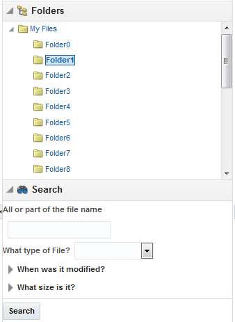
At runtime, when available browser space is less than the space needed to display expanded panel contents, ADF Faces automatically displays overflow icons that enable users to select and navigate to those panes that are out of view. Figure 9-52 shows the overflow icon (a chevron) displayed in the lower right-hand corner of the Folders panel of the File Explorer application, when there is not enough room to display the Search panel.
Figure 9-52 Overflow Icon In panelAccordion
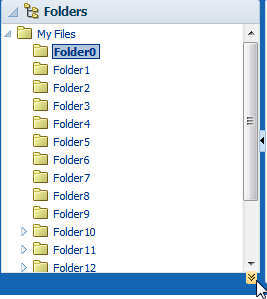
When the user clicks the overflow icon, ADF Faces displays the overflow popup menu (as shown in Figure 9-53) for the user to select and navigate to.
Figure 9-53 Overflow Popup Menu in panelAccordion
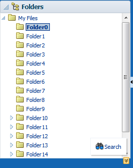
You can also configure the panelAccordion so that the panes can be rearranged by dragging and dropping, as shown in Figure 9-54.
Figure 9-54 Panes Can Be Reordered by Dragging and Dropping
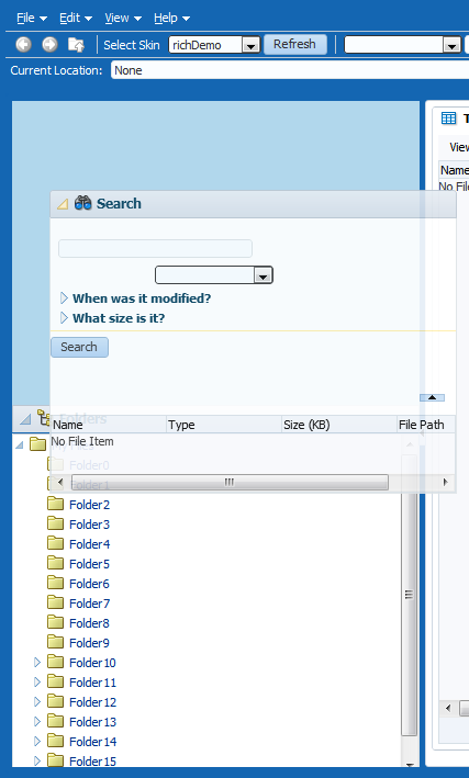
When the order is changed, the displayIndex attribute on the showDetailItem components also changes to reflect the new order.
Note:
Items in the overflow cannot be reordered.
To use the panelAccordion component, see How to Use the panelAccordion Component.
The panelTabbed component creates a series of tabbed panes. Unlike the panelAccordion panes, the panelTabbed panes are not collapsible or expandable. Instead, when users select a tab, the contents of the selected tab are displayed. The tabs may be positioned above, below, above and below (both), to the left, or to the right of the display area.
By default, the width of a tab is determined by the text displayed as the label. You can configure the tabs so that instead, the size of the tab is a certain minimum or maximum width. In cases where the text will not fit, you can set an ellipsis to display after the truncated text.
You can configure a panelTabbed component so that the individual tabs can be removed (closed). You can have it so that all tabs can be removed, all but the last tab can be removed, or no tabs can be removed.
You can configure when the showDetailItem components that contain the contents for each of the tabs will be created. When you have a small number of tabs, you can have all the showDetailItem components created when the panelTabbed component is first created, regardless of which tab is currently displayed. However, if the panelTabbed component contains a large number of showDetailItem components, the page might be slow to render. To enhance performance, you can instead configure the panelTabbed component to create a showDetailItem component only when its corresponding tab is selected. You can further configure the delivery method to either destroy a showDetailItem once the user selects a different tab, or to keep any selected showDetailItem components in the component tree so that they do not need to be recreated each time they are accessed.
The File Explorer application uses the panelTabbed component to display the contents in the main panel, as shown in Figure 9-55.
Tip:
If you want the tabs to be used in conjunction with navigational hierarchy, for example, each tab is a different page or region that contains another set of navigation items, you may want to use a navigation panel component to create a navigational menu. See Using Navigation Items for a Page Hierarchy.
The panelTabbed component also provides overflow support for when all tabs cannot be displayed. How the overflow is handled depends on how you configure the -tr-layout-type skinning key. See What You May Need to Know About Skinning and the panelTabbed Component.
Note:
Overflow is only supported when the position attribute is set to above, below, or both.
Performance Tip:
The number of child components within a panelTabbed component, and the complexity of the child components, will affect the performance of the overflow. Set the size of the panel components to avoid overflow when possible.
To use the panelTabbed component, see How to Use the panelTabbed Component.
The panelDrawer component renders tabs attached to the side of a container component. By default, the drawer aligns to the parent of the panelDrawer, but you can choose another close ancestor. It can align to either the start or end of the associated component. When the user clicks a tab, the drawer opens and the content of the child showDetailItem becomes visible. Figure 9-56 shows the panelDrawer with the drawers closed.
Figure 9-56 panelDrawer Component with Drawers Closed
Description of "Figure 9-56 panelDrawer Component with Drawers Closed"
When the user clicks one of the tabs, the associated drawer opens, as shown in Figure 9-57.
Figure 9-57 panelDrawer Component with the Last Drawer Opened
Description of "Figure 9-57 panelDrawer Component with the Last Drawer Opened"
How wide the drawer opens depends on how you set the width attribute. If there is no value for the width attribute, the size of the open drawer is determined by the content contained in child the showDetailItem component. Otherwise, you can set the width attribute to a percentage of the component the panelDrawer is aligned to.
The panelSpringboard component represents its contents as a set of icons that display in either a grid fashion or in a strip. When you click on an icon, the child showDetailItem component associated with the clicked icon displays its contents below the strip.
For example, Figure 9-58 shows a panelSpringboard component that contains 10 child showDetailItem components, configured to display the associated icons in a grid.
Figure 9-58 panelSpringboard Component in Grid Mode
Figure 9-59 shows the same panelSpringboard component after clicking the Team icon. The panelSpringboard icons move to the top, into a strip, and the content associated with the selected icon is displayed.
Figure 9-59 panelSpringboard Component in Strip Mode
Tip:
In strip view, you can navigate the icon strip using the provided arrow buttons. In a mobile application, swiping across the content box navigates to the next (left swipe) or previous (right swipe) icon’s content.Like the panelSpringboard component, the panelAccordion, panelTabbed, and panelDrawer components use a showDetailItem component to provide the contents for each panel. For example, if you want to use four panes, insert four showDetailItem components inside the panelAccordion, panelTabbed, or panelDrawer components, respectively. To use the showDetailItem component, see How to Use the showDetailItem Component to Display Content . You can add a toolbar to the toolbar facet of the showDetailItem component, and the toolbar will be shown whenever the showDetailItem is disclosed. Figure 9-55 shows the toolbar used by the showDetailItem component in the File Explorer application.
The child showDetailItem component can also display a badge, used to denote some type of information about that item. For example, in the panelSpringboard shown in Figure 9-58, badges are used to display a number of items for the Home showDetailItem.
For each of these components except the panelDrawer, you can configure when the child showDetailItem components will be created. When you have a small number of showDetailItem components, you can have all of them created when the parent component is first created. However, if the parent component contains a large number of showDetailItem components, the page might be slow to render. To enhance performance, you can instead configure the parent component to create a showDetailItem component only when it is disclosed (for example, when a tab is selected). You can further configure the delivery method to either destroy a showDetailItem once the user discloses a different one, or to keep any selected showDetailItem component in the component tree so that they do not need to be recreated each time they are accessed.
The panelAccordion and panelTabbed components can be configured to be stretched, or they can be configured to instead take their dimensions from the currently disclosed showDetailItem child. The panelSpringboard component will stretch if the parent component allows stretching of its child. If the parent does not stretch its children then the size of the panelSpringboard component will be based on the contents of its child showDetailItem component.The panelDrawer component will open to the size of its contained components, unless a specific width is set.
When you configure a panel component to stretch, then you can also configure the showDetailItem component to stretch a single child as long as it is the only child of the showDetailItem component.
9.12.1 How to Use the panelAccordion Component
You can use more than one panelAccordion component in a page, typically in different areas of the page, or nested. After adding the panelAccordion component, insert a series of showDetailItem components to provide the panes, using one showDetailItem for one panel. Then insert components into each showDetailItem to provide the panel contents. For procedures on using the showDetailItem component, see How to Use the showDetailItem Component to Display Content .
Before you begin:
It may be helpful to have an understanding of how the attributes can affect functionality. See Displaying or Hiding Contents in Panels.
You may also find it helpful to understand functionality that can be added using other ADF Faces features. See Additional Functionality for Layout Components.
To create and use the panelAccordion component:
9.12.2 How to Use the panelTabbed Component
Using the panelTabbed component to create tabbed panes is similar to using the panelAccordion component to create accordion panes. After adding a panelTabbed component, you insert a series of showDetailItem components to provide the tabbed panel contents for display.
Before you begin:
It may be helpful to have an understanding of how the attributes can affect functionality. See Displaying or Hiding Contents in Panels.
You may also find it helpful to understand functionality that can be added using other ADF Faces features. See Additional Functionality for Layout Components.
To create and use the panelTabbed component:
9.12.3 How to Use the panelDrawer Component
Using the panelDrawer component to create tabbed panes is similar to using the panelTabbed component to create tabbed panes. After adding a panelDrawer component, you insert a series of showDetailItem components to provide the drawer contents for display. You can also control the closing behavior of the panel drawer.
Before you begin:
It may be helpful to have an understanding of how the attributes can affect functionality. See Displaying or Hiding Contents in Panels.
You may also find it helpful to understand functionality that can be added using other ADF Faces features. See Additional Functionality for Layout Components.
To create and use the panelDrawer component:
9.12.4 How to Use the panelSpringboard Component
The panelSpringboard contains a series of showDetailItem components, similar to the other panel components. Each showDetailItem is represented by an icon. You insert components into each showDetailItem to provide the panel contents. The panelSpringboard supports swiping gestures in mobile applications. For procedures on using the showDetailItem component, see How to Use the showDetailItem Component to Display Content .
Before you begin:
It may be helpful to have an understanding of how the attributes can affect functionality. See Displaying or Hiding Contents in Panels.
You may also find it helpful to understand functionality that can be added using other ADF Faces features. See Additional Functionality for Layout Components.
To create and use the panelSpringboard component:
9.12.5 What You May Need to Know About Switching Between Grid and Strip Mode
By default, the panelSpringboard renders the first time in grid mode. When a user clicks an icon, the panelSpringboard fires a SpringboardChangeListener event and changes to strip mode. If you want to be able to switch between the two modes, you need to listen for that event, determine the source (the panelSpringboard), and set the displayMode attribute to the desired mode.
For example, to set the display mode to grid, you might use the JavaScript shown in the following example.
<af:resource type="javascript">
function backToGrid(actionEvent)
{
  actionEvent.cancel();
  var eventSource = actionEvent.getSource();
  var object_navigator = eventSource.findComponent("panelSpringboardId");
  object_navigator.setProperty(AdfRichPanelSpringboard.DISPLAY_MODE, "grid",
    true);
}
You might then call that code from a link:
<af:link id="logo" text="Back to Grid">
  <af:clientListener type="click" method="backToGrid"/>
</af:link>
For information about using JavaScript on a page, see Using ADF Faces Client-Side Architecture .
9.12.6 How to Use the showDetailItem Component to Display Content
The showDetailItem components are used as child components to the panelAccordion, panelTabbed, panelDrawer, or panelSpringboard component only. Each showDetailItem component corresponds to one panel. Dialogs for the panelAccordion, panelTabbed, and panelDrawer components create the showDetailItem components for you. You need to add the showDetailItem components to the panelSpringboard component manually. You can also add more showDetailItem components into the other parent components as needed. You then insert the child components for display into the showDetailItem components.
The disclosed attribute on a showDetailItem component specifies whether to show (disclose) or hide (undisclose) the corresponding panel contents. When the disclosed attribute is false, the contents are hidden (undisclosed). When the attribute is set to true, the contents are shown (disclosed). You do not have to write any code to enable the toggling of contents from disclosed to undisclosed, and vice versa. ADF Faces handles the toggling automatically.
The following procedure assumes you have already added a panelAccordion, panelTabbed, panelDrawer, or panelSpringboard component to the JSF page, as described in How to Use the panelAccordion Component, How to Use the panelTabbed Component, How to Use the panelDrawer Component, and How to Use the panelSpringboard Component, respectively.
Before you begin:
It may be helpful to have an understanding of how the attributes can affect functionality. See Displaying or Hiding Contents in Panels.
You may also find it helpful to understand functionality that can be added using other ADF Faces features. See Additional Functionality for Layout Components.
To add panel contents using a showDetailItem component:
9.12.7 What You May Need to Know About Geometry Management and the showDetailItem Component
The panelAccordion, panelTabbed, panelDrawer and panelSpringboard components can be configured to stretch when they are placed inside a component that uses geometry management to stretch its child components. However, by default, the showDetailItem will not stretch its children.
For the panelAccordion component, the showDetailItem component will stretch only if the discloseMany attribute on the panelAccordion component is set to true (that is, when multiple panes may be expanded to show their inflexible or flexible contents), the showDetailItem component contains only one child component, and the showDetailItem component's stretchChildren attribute is set to first.
For the other panel components, the showDetailItem component will allow stretching if:
-
It contains only a single child
-
Its
stretchChildrenattribute is set tofirst -
The child has no width, height, border, and padding set
-
The child must be capable of being stretched
When all of the preceding bullet points are true, the showDetailItem component can stretch its child component. The following components can be stretched inside the showDetailItem component:
-
decorativeBox (when configured to stretch) -
deck -
calendar -
inputText(when configured to stretch) -
panelAccordion(when configured to stretch) -
panelBox -
panelCollection(when configured to stretch) -
panelDashboard(when configured to stretch) -
panelGroupLayout(only when thelayoutattribute is set toscrollorvertical) -
panelLabelAndMessage(when configured to stretch) -
panelSplitter(when configured to stretch) -
panelStretchLayout(when configured to stretch) -
panelTabbed(when configured to stretch) -
region -
table(when configured to stretch) -
tree(when configured to stretch) -
treeTable(when configured to stretch)
The following components cannot be stretched when placed inside a showDetailItem component:
-
panelBorderLayout -
panelFormLayout -
panelGroupLayout(only when thelayoutattribute is set todefaultorhorizontal) -
panelHeader -
panelList -
tableLayout(MyFaces Trinidad component)
You cannot place components that cannot stretch as a child to a component that stretches its child components. Therefore, if you need to place one of the components that cannot be stretched as a child of a showDetailItem component, you need to wrap that component in different component that does not stretch its child components.
For example, if you want to place content in a panelList component and have it be displayed in a showDetailItem component, you might place a panelGroupLayout component with its layout attribute set to scroll as the chid of the showDetailItem component, and then place the panelList component in that component. See Geometry Management and Component Stretching.
9.12.8 What You May Need to Know About showDetailItem Disclosure Events
The showDetailItem component inside of panel components supports queuing of disclosure events so that validation is properly handled on the server and on the client.
In general, for any component with the disclosed attribute, by default, the event root for the client AdfDisclosureEvent is set to the event source component: only the event for the panel whose disclosed attribute is true gets sent to the server. However, for the showDetailItem component that is used inside of panelAccordion, panelTabbed, or panelDrawer component, the event root is that panel component (that is, the event source parent component, not the event source component). This ensures that values from the previously disclosed panel will not get sent to the server.
For example, suppose you have two showDetailItem components inside a panelTabbed component with the discloseMany attribute set to false and the discloseNone attribute set to false. Suppose the showDetailItem 1 component is disclosed but not showDetailItem 2. Given this scenario, the following occurs:
-
On the client:
-
When a user clicks to disclose
showDetailItem2, a client-only disclosure event gets fired to set thedisclosedattribute tofalsefor theshowDetailItem1 component. If this first event is not canceled, another client disclosure event gets fired to set thedisclosedattribute totruefor theshowDetailItem2 component. If this second event is not canceled, the event gets sent to the server; otherwise, there are no more disclosure changes.
-
-
On the server:
-
The server disclosure event is fired to set the
disclosedattribute totrueon theshowDetailItem2 component. If this first server event is not canceled, another server disclosure event gets fired to set thedisclosedattribute tofalsefor theshowDetailItem1 component. If neither server event is canceled, the new states get rendered, and the user will see the newly disclosed states on the client; otherwise, the client looks the same as it did before.
-
For the panelAccordion component with the discloseMany attribute set to false and the discloseNone attribute set to true, the preceding information is the same only when the disclosure change forces a paired change (that is, when two disclosed states are involved). If only one disclosure change is involved, there will just be one client and one server disclosure event.
For the panelAccordion component with the discloseMany attribute set to true (and any discloseNone setting), only one disclosure change is involved; there will just be one client and one server disclosure event.
For additional information about disclosure events, see What You May Need to Know About Disclosure Events.
9.12.9 What You May Need to Know About Skinning and the panelTabbed Component
You can use the -tr-layout-type skinning key to configure how the panelTabbed component handles overflow when its parent container is too small to display all the tabs. This compressed layout can display either overflow button(s) or can roll to show hidden tabs, similar to a conveyor belt.
Note:
Overflow is only supported when the position attribute is set to above, below, or both.
Figure 9-60 shows the overflow compressed layout. When the user clicks the overflow icon a popup displays showing the items that are hidden.
Figure 9-60 Overflow Compressed Layout

The following example shows how you use the skinning key to display an overflow layout.
af|panelTabbed {
  -tr-layout-type: overflow;
}
Figure 9-61 shows the conveyor compressed layout. When the user clicks the overflow icon, the tabs that were hidden slide into place, similar to a conveyor belt. Accordingly, tabs on the other end are hidden.
Figure 9-61 Conveyor Belt Compressed Layout

The following example shows how you can use the skinning key to use a conveyor belt layout.
af|panelTabbed {
  -tr-layout-type: conveyor;
}
Note:
In order for the panelTabbed component to support a compressed layout, its parent component must either stretch its children or be a set width.
Therefore, the following layout configurations are not supported:
-
Using a parent container that does not stretch its children.
-
Using a parent container that displays multiple children horizontally without explicit sizes for each child. For example, a
panelGroupLayoutwithlayout='horizontal' would be invalid, butpanelSplitteris valid because it has an explicitly set splitter position. -
Setting the compressed layout component with a
styleClassorinlineStylethat assigns a percentage width value. Note that this includes assigningstyleClass='AFStretchWidth'on a compressed layout component.
For information about skins, see Customizing the Appearance Using Styles and Skins.
9.13 Adding a Transition Between Components
When you want to provide a slide show-like transition between content, you use the deck component as a parent container, and then place other layout components as children to the deck component. The content in the child layout components will then transition between each other. You use the transition tag to determine the type of transition.
Note:
The deck component is simply a container component that keeps track of which child component to display. The transition tags handle the animation between the components. You will need to create the navigation controls to handle the actual transition.
For example, say you want to transition between content in two panelGroupLayout components. You can wrap them both in a deck component and insert two transition tags to handle the transition animation going forward and backward, as shown in the following example.
<af:deck id="deck1" displayedChild="pg10">
  <af:transition triggerType="backNavigate" transition="flipEnd"/>
  <af:transition triggerType="forwardNavigate" transition="fade"/>
    <af:panelGroupLayout id="pg1" layout="scroll">
      <af:panelBox text="PanelBox1" id="pb1" background="light">
        <f:facet name="toolbar"/>
        <af:panelGroupLayout id="pgl1" layout="scroll">
          <af:outputText id="ot1" value="Card 1"/>
          <af:image source="/images/icons-large/horizontalBarGraph.png"
                                id="i1"/>
        </af:panelGroupLayout>
      </af:panelBox>
    </af:panelGroupLayout>
    <af:panelGroupLayout id="pgl2" layout="scroll">
      <af:outputText id="ot2" value="Card 2"/>
    </af:panelGroupLayout>
  </af:deck
9.13.1 How to Use the Deck Component
The deck component acts as a container and handles determining which component to display. The transition tag determines the animation to use when going forward or backward.
To use the deck component:
9.13.2 What You May Need to Know About Geometry Management and the deck Component
The deck component can stretch child components and it can also be stretched. The following components can be stretched inside the deck component:
-
inputText(when configured to stretch) -
decorativeBox(when configured to stretch) -
panelAccordion(when configured to stretch) -
panelBox -
panelCollection -
panelDashboard -
panelGridLayout(whengridRowandgridCellcomponents are configured to stretch) -
panelGroupLayout(only with thelayoutattribute set toscrollorvertical) -
panelSplitter(when configured to stretch) -
panelStretchLayout(when configured to stretch) -
panelTabbed(when configured to stretch) -
region -
table(when configured to stretch) -
tree(when configured to stretch) -
treeTable(when configured to stretch)
The following components cannot be stretched when placed inside a facet of the deck component:
-
panelBorderLayout -
panelFormLayout -
panelGroupLayout(only with thelayoutattribute set todefaultorhorizontal) -
panelHeader -
panelLabelAndMessage -
panelList -
showDetail -
showDetailHeader -
tableLayout(MyFaces Trinidad component)
You cannot place components that cannot stretch as a child to a component that stretches its child components. Therefore, if you need to place one of the components that cannot be stretched as a child to the deck component, wrap that component in a transition component that does not stretch its child components.
For example, if you want to place content in a deck component and have it flow, you could place a panelGroupLayout component with its layout attribute set to scroll in the deck component, and then place child components in that panelGroupLayout component. See Nesting Components Inside Components That Allow Stretching.
9.14 Displaying Items in a Static Box
You can use the panelHeader component when you want header type functionality, such as message display or associated help topics, but you do not have to provide the capability to show and hide content.
You can use the decorativeBox component when you need to transition to a different look and feel on the page. The decorativeBox component uses themes and skinning keys to control the borders and colors of its different facets. See What You May Need to Know About Skinning and the decorativeBox Component.
The panelHeader component offers facets for specific types of components and the ability to open a help topic from the header. The following are the facets supported by the panelHeader component:
-
context: Displays information in the header alongside the header text. -
help: Displays help information. Use only for backward compatibility. Use thehelpTopicIdattribute on thepanelHeadercomponent instead. -
info: Displays information beneath the header text, aligned to the right. -
legend: If help text is present, displays information to the left of the help content and under theinfofacet's content. If help text is not present, the legend content will be rendered directly under the header. -
toolbar: Displays a toolbar, before the menu bar. -
menuBar: Displays a menu bar, after the toolbar.
Figure 9-62 shows the different facets in the panelHeader component.
Figure 9-62 panelHeader and Its Facets

When there is not enough space to display everything in all the facets of the title line, the panelHeader text is truncated and displays an ellipsis. When the user hovers over the truncated text, the full text is displayed in a tooltip, as shown in Figure 9-63.
Figure 9-63 Text for the panelHeader Is Truncated

When there is more than enough room to display the contents, the extra space is placed between the context facet and the toolbar, as shown in Figure 9-64.
Figure 9-64 Extra Space Is Added Before the Toolbar
You can configure panelHeader components so that they represent a hierarchy of sections. For example, as shown in Figure 9-65, you can have a main header with a subheader and then a heading level 1 also with a subheader.
Figure 9-65 Creating Subsections with the panelHeader Component
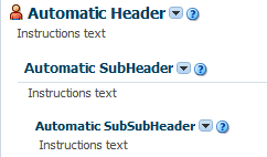
Create subsections by nesting panelHeader components within each other. When you nest panelHeader components, the heading text is automatically sized according to the hierarchy, with the outermost panelHeader component having the largest text.
Note:
Heading sizes are determined by default by the physical containment of the header components. That is, the first header component will render as a heading level 1. Any header component nested in the first header component will render as a heading level 2, and so on. You can manually override the heading level on individual header components using the headerLevel attribute.
For information about using the panelHeader component, see How to Use the panelHeader Component.
The decorativeBox component provides styling capabilities using themes. It has two facets, top and center. The top facet provides a noncolored area, while the center facet is the actual box. The height of the top facet depends on whether or not a component has been put into the top facet. When the facet is set, the topHeight attribute is used to specify the size the content should occupy.
The color of the box for the center facet depends on the theme and skin used. Figure 9-66 shows the different themes available by default.
Figure 9-66 Themes Used in a decorativeBox Component

Description of "Figure 9-66 Themes Used in a decorativeBox Component"
By default, the decorativeBox component stretches to fill its parent component. You can also configure the decorativeBox component to inherit its dimensions from its child components. For example, Figure 9-67 shows the dark-theme decorativeBox configured to stretch to fill its parent, while the medium-theme decorativeBox is configured to only be as big as its child outputText component.
Figure 9-67 decorativeBox Can Stretch or Not
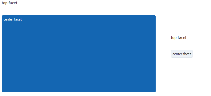
9.14.1 How to Use the panelHeader Component
You can use one panelHeader component to contain specific information, or you can use a series of nested panelHeader components to create a hierarchical organization of content. If you want to be able to hide and display the content, use the showDetailHeader component instead. See How to Use the showDetailHeader Component.
Before you begin:
It may be helpful to have an understanding of how the attributes can affect functionality. See Displaying Items in a Static Box.
You may also find it helpful to understand functionality that can be added using other ADF Faces features. See Additional Functionality for Layout Components.
To create and use a panelHeader component:
-
In the Components window, from the Layout panel, drag and drop a Panel Header onto the page.
-
In the Properties window, expand the Appearance section.
-
Set Text to the label you want to display for this panel.
-
To add an icon before the label, set Icon to the URI of the image file to use.
Note:
Because alternative text cannot be provided for this icon, in order to create an accessible product, use this icon only when it is purely decorative. You must provide the meaning of this icon in some accessible manner.
-
If you are using the header to provide specific messaging information, set MessageType to one of the following values:
-
confirmation: The confirmation icon (represented by a note page overlaid with a green checkmark) replaces any specified icon image.
-
error: The error icon (represented by a red circle with an "x" inside) replaces any specified icon image. The header label also changes to red.
-
info: The info icon (represented by a blue circle with an "I" inside) replaces any specified icon image.
-
none: Default. No icon is displayed.
-
warning: The warning icon (represented by a yellow triangle with an exclamation mark inside) replaces any specified icon image.
Figure 9-68 shows the icons used for the different message types.
Figure 9-68 Icons for Message Types
Note:
Because alternative text cannot be provided for this icon, in order to create an accessible product, use this icon only when it is purely decorative. You must provide the meaning of this icon in some accessible manner.
-
-
To display help for the header, enter the topic ID for HelpTopicId. For information about creating and using help topics, see Displaying Help for Components.
-
To override the heading level for the component, set headerLevel to the desired level, for example
H1,H2, etc. throughH6.The heading level is used to determine the correct page structure, especially when used with screen reader applications. By default, headerLevel is set to -1, which allows the headers to determine their size based on the physical location on the page. In other words, the first header component will be set to be a H1. Any header component nested in that H1 component will be set to H2, and so on.
Note:
Screen reader applications rely on the HTML header level assignments to identify the underlying structure of the page. Make sure your use of header components and assignment of header levels make sense for your page.
When using an override value, consider the effects of having headers inside disclosable sections of the page. For example, if a page has collapsible areas, you need to be sure that the overridden structure will make sense when the areas are both collapsed and disclosed.
-
If you want to change just the size of the header text, and not the structure of the heading hierarchy, set the
sizeattribute.The
sizeattribute specifies the number to use for the header text and overrides the skin. The largest number is0, and it corresponds to an H1 header level; the smallest is5, and it corresponds to an H6 header.By default, the
sizeattribute is-1. This means ADF Faces automatically calculates the header level style to use from the topmost, parent component. When you use nested components, you do not have to set thesizeattribute explicitly to get the proper header style to be displayed.Note:
While you can force the style of the text using the
sizeattribute, (where 0 is the largest text), the value of thesizeattribute will not affect the hierarchy. It only affects the style of the text.In the default skin used by ADF Faces, the style used for sizes above 2 will be displayed the same as size 2. You can change this by creating a custom skin. See What You May Need to Know About Skinning and the panelHeader Component.
-
If you want to control how the
panelHeadercomponent handles geometry management, expand the Appearance section and set Type to one of the following. For information about geometry management, see Geometry Management and Component Stretching.-
flow: The component will not stretch or stretch its children. The height of the
panelHeadercomponent will be determined solely by its children. -
stretch: The component will stretch and stretch its child (will only stretch a single child component).
-
default: if you want the parent component of the
panelHeadercomponent to determine geometry management.
-
-
To add toolbar buttons to a panel, insert the
toolbarcomponent into thetoolbarfacet. Then, insert the desired number of button components into thetoolbarcomponent. For information about usingtoolbarand buttons, see Using Toolbars.Note:
Toolbar overflow is not supported in
panelHeadercomponents. -
To add menus to a panel, insert menu components into the
menuBarfacet. For information about creating menus in a menu bar, see Using Menus in a Menu Bar.Tip:
You can place menus in the
toolbarfacet and toolbars (and toolboxes) in themenufacet. The main difference between these facets is location. Thetoolbarfacet is before themenufacet. -
Add contents to the other facets as needed.
Tip:
If any facet is not visible in the visual editor:
-
Right-click the
panelHeadercomponent in the Structure window. -
From the context menu, choose Facets - Panel Header >facet name. Facets in use on the page are indicated by a checkmark in front of the facet name.
-
-
To add contents to the panel, insert the desired child components into the
panelHeadercomponent.
9.14.2 How to Use the decorativeBox Component
You use the decorativeBox component to provide a colored area or box in a page. This component is typically used as a container for the navigationPane component that is configured to display tabs. See Using Navigation Items for a Page Hierarchy.
To create and use a decorativeBox component:
9.14.3 What You May Need to Know About Geometry Management and the decorativeBox Component
The decorativeBox component can stretch child components in its center facet and it can also be stretched. The following components can be stretched inside the center facet of the decorativeBox component:
-
inputText(when configured to stretch) -
deck -
decorativeBox(when configured to stretch) -
panelAccordion(when configured to stretch) -
panelBox -
panelCollection(when configured to stretch) -
panelDashboard -
panelGroupLayout(only with thelayoutattribute set toscrollorvertical) -
panelLabelAndMessage(when configured to stretch) -
panelSplitter(when configured to stretch) -
panelStretchLayout(when configured to stretch) -
panelTabbed(when configured to stretch) -
region -
table(when configured to stretch) -
tableLayout(when configured to stretch. Note that this is a MyFaces Trinidad component) -
tree(when configured to stretch) -
treeTable(when configured to stretch)
The following components cannot be stretched when placed inside a facet of the decorativeBox component:
-
panelBorderLayout -
panelFormLayout -
panelGroupLayout(only with thelayoutattribute set todefaultorhorizontal) -
panelHeader -
panelList -
showDetail -
showDetailHeader
You cannot place components that cannot stretch into facets of a component that stretches its child components. Therefore, if you need to place one of the components that cannot be stretched into a facet of the decorativeBox component, wrap that component in a transition component that does not stretch its child components.
For example, if you want to place content in a panelBox component and have it flow within a facet of the decorativeBox component, you could place a panelGroupLayout component with its layout attribute set to scroll in the facet of the decorativeBox component, and then place the panelBox component in that panelGroupLayout component. See Nesting Components Inside Components That Allow Stretching.
9.14.4 What You May Need to Know About Skinning and the panelHeader Component
The panelHeader component uses styles specified in the application’s skin to determine its heading sizes. Heading sizes above 2 will be displayed the same as size 2. That is, there is no difference in styles for sizes 3, 4, or 5–they all show the same style as size 2. You can change this by creating a custom skin.
9.14.5 What You May Need to Know About Skinning and the decorativeBox Component
A decorativeBox component that renders using the Skyros skin uses themes and skinning keys to control the borders and colors of its different facets. For example, if you use the default theme, the decorativeBox component body is white and the border is blue, and the top-left corner is rounded. If you use the medium theme, the body is a medium blue.
Note:
If you use the simple boarders feature of the Skyros skin, then certain border elements, such as corners, are not rendered at all.
You can further control the style of the decorativeBox component using skins. Skinning keys can be defined for the following areas of the component:
-
top-start
-
top
-
top-end
-
start
-
end
-
bottom-start
-
bottom
-
bottom-end
The Alta skin does not use themes. See Customizing the Appearance Using Styles and Skins.
9.15 Displaying a Bulleted List in One or More Columns
The panelList component is a layout element for displaying a vertical list of child components with a bullet next to each child, as shown in Figure 9-69. Only child components whose rendered attribute is set to true and whose visible attribute is set to true are considered for display by in the list.
Note:
To display dynamic data (for example, a list of data determined at runtime by JSF bindings), use the selection components, as documented in Using Selection Components. If you need to create lists that change the model layer, see Using List-of-Values Components.
Figure 9-69 PanelList Component with Default Disc Bullet

Description of "Figure 9-69 PanelList Component with Default Disc Bullet"
By default, the disc bullet is used to style the child components. There are other styles you can use, such as square bullets and white circles. You can also split the list into columns when you have a very long list of items to display.
9.15.1 How to Use the panelList Component
Use one panelList component to create each list of items.
Before you begin:
It may be helpful to have an understanding of how the attributes can affect functionality. See Displaying a Bulleted List in One or More Columns.
You may also find it helpful to understand functionality that can be added using other ADF Faces features. See Additional Functionality for Layout Components.
To create and use the panelList component:
Note:
By default, ADF Faces displays all rendered child components of a panelList component in a single column. For details on how to split the list into two or more columns and for information about using the rows and maxColumns attributes, see Arranging Content in Forms. The concept of using the rows and maxColumns attributes for columnar display in the panelList and panelFormLayout components are the same.
9.15.2 What You May Need to Know About Creating a List Hierarchy
You can nest panelList components to create a list hierarchy. A list hierarchy, as shown in Figure 9-70, has outer items and inner items, where the inner items belonging to an outer item are indented under the outer item. Each group of inner items is created by one nested panelList component.
Figure 9-70 Hierarchical List Created Using Nested panelList Components
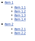
Description of "Figure 9-70 Hierarchical List Created Using Nested panelList Components"
To achieve the list hierarchy as shown in Figure 9-70, use a group component to wrap the components that make up each group of outer items and their respective inner items. The following example shows the code for how to create a list hierarchy that has one outer item with four inner items, and another outer item with two inner items.
<af:panelList>
  <!-- First outer item and its four inner items -->
  <af:group>
    <af:commandLink text="item 1"/>
    <af:panelList>
      <af:commandLink text="item 1.1"/>
      <af:commandLink text="item 1.2"/>
      <af:commandLink text="item 1.3"/>
      <af:commandLink text="item 1.4"/>
    </af:panelList>
   </af:group>
  <!-- Second outer item and its two inner items -->
  <af:group>
    <af:commandLink text="item 2"/>
    <af:panelList>
      <af:commandLink text="item 2.1"/>
      <af:commandLink text="item 2.2"/>
    </af:panelList>
   </af:group>
</af:panelList>
By default, the outer list items (for example, item 1 and item 2) are displayed with the disc bullet, while the inner list items (for example, item 1.1 and item 2.1) have the white circle bullet.
For information about the panelGroupLayout component, see Grouping Related Items.
9.16 Grouping Related Items
To keep like items together within a parent component, use either the group or panelGroupLayout component. The group component aggregates or groups together child components that are related semantically. Unlike the panelGroupLayout component, the group component does not provide any layout for its child components. Used on its own, the group component does not render anything; only the child components inside of a group component render at runtime.
You can use any number of group components to group related components together. For example, you might want to group some of the input fields in a form layout created by the panelFormLayout component.
The following example shows sample code that groups two sets of child components inside a panelFormLayout component.
<af:panelFormLayout>
  <af:inputDate label="Pick a date"/>
  <!-- first group -->
  <af:group>
    <af:selectManyCheckbox label="Select all that apply">
      <af:selectItem label="Coffee" value="1"/>
      <af:selectItem label="Cream" value="1"/>
      <af:selectItem label="Low-fat Milk" value="1"/>
      <af:selectItem label="Sugar" value="1"/>
      <af:selectItem label="Sweetener"/>
    </af:selectManyCheckbox>
    <af:inputText label="Special instructions" rows="3"/>
  </af:group>
  <!-- Second group -->
  <af:group>
    <af:inputFile label="File to upload"/>
    <af:inputText label="Enter passcode"/>
  </af:group>
  <af:inputText label="Comments" rows="3"/>
  <af:spacer width="10" height="15"/>
  <f:facet name="footer"/>
</af:panelFormLayout>
The panelGroupLayout component lets you arrange a series of child components vertically or horizontally without wrapping, or consecutively with wrapping, as shown in Figure 9-71. The layout attribute value determines the arrangement of the child components.
Figure 9-71 panelGroupLayout Arrangements
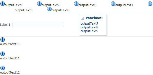
Description of "Figure 9-71 panelGroupLayout Arrangements"
In all arrangements, each pair of adjacent child components can be separated by a line or white space using the separator facet of the panelGroupLayout component. See Separating Content Using Blank Space or Lines.
When using the horizontal layout, the child components can also be vertically or horizontally aligned. For example, you could make a short component beside a tall component align at the top, as shown in Figure 9-72.
Figure 9-72 Top-Aligned Horizontal Layout with panelGroupLayout

Unlike the panelSplitter or panelStretchLayout components, the panelGroupLayout component does not stretch its child components. Suppose you are already using a panelSplitter or panelStretchLayout component as the root component for the page, and you have a large number of child components to flow, but are not to be stretched. To provide scrollbars when flowing the child components, wrap the child components in the panelGroupLayout component with its layout attribute set to scroll, and then place the panelGroupLayout component inside a facet of the panelSplitter or panelStretchLayout component.
When the layout attribute is set to scroll on a panelGroupLayout component, ADF Faces automatically provides a scrollbar at runtime when the contents contained by the panelGroupLayout component are larger than the panelGroupLayout component itself. You do not have to write any code to enable the scrollbars, or set any inline styles to control the overflow.
For example, when you use layout components such as the panelSplitter component that let users display and hide child components contents, you do not have to write code to show the scrollbars when the contents are displayed, and to hide the scrollbars when the contents are hidden. Simply wrap the contents the be displayed inside a panelGroupLayout component, and set the layout attribute to scroll.
In the File Explorer application, the Search Navigator contains a panelSplitter component used to hide and show the search criteria. When the search criteria are hidden, and the search results content does not fit into the area, a scrollbar is rendered, as shown in Figure 9-73.
Figure 9-73 Scrollbars Rendered Using panelGroupLayout
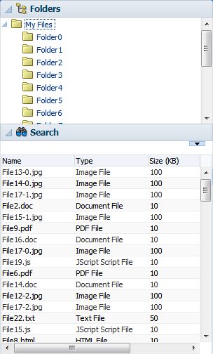
Description of "Figure 9-73 Scrollbars Rendered Using panelGroupLayout"
Note:
If you include thePanelGroupLayout component while creating an emailable page, remove the <td width="100%"></td> entry within the <table>… </table> element in the html source. Otherwise, the footer row will not render properly in the email client. See Creating Emailable Pages.9.16.1 How to Use the panelGroupLayout Component
Any number of panelGroupLayout components can be nested to achieve the desired layout.
Before you begin:
It may be helpful to have an understanding of how the attributes can affect functionality. See Grouping Related Items.
You may also find it helpful to understand functionality that can be added using other ADF Faces features. See Additional Functionality for Layout Components.
To create and use the panelGroupLayout component:
9.16.2 What You May Need to Know About Geometry Management and the panelGroupLayout Component
While the panelGroupLayout component cannot stretch its child components, it can be stretched when it is the child of a panelSplitter or panelStretchLayout component and its layout attribute is set to either scroll or vertical.
9.17 Separating Content Using Blank Space or Lines
You can incorporate some blank space in your pages, to space out the components so that the page appears less cluttered than it would if all the components were presented immediately next to each other, or immediately below each other. The ADF Faces component provided specifically for this purpose is the spacer component.
You can include either or both vertical and horizontal space in a page using the height and width attributes.
The height attribute determines the amount of vertical space to include in the page. The following example shows a page set up to space out two lengthy outputText components with some vertical space.
<af:panelGroupLayout layout="vertical">
  <af:outputText value="This is a long piece of text for this page..."/>
  <af:spacer height="10"/>
  <af:outputText value="This is some more lengthy text ..."/>
</af:panelGroupLayout>
Figure 9-75 shows the effect the spacer component has on the page output as viewed in a browser.
Figure 9-75 Vertical Space Viewed in a Browser

Description of "Figure 9-75 Vertical Space Viewed in a Browser"
The width attribute determines the amount of horizontal space to include between components. The following example shows part of the source of a page set up to space out two components horizontally.
<af:outputLabel value="Your credit rating is currently:"/>
<af:spacer width="10"/>
<af:outputText value="Level 8"/>
Figure 9-76 shows the effect of spacing components horizontally as viewed in a browser.
Figure 9-76 Horizontal Space Viewed in a Browser
Description of "Figure 9-76 Horizontal Space Viewed in a Browser"
The separator component creates a horizontal line. Figure 9-77 shows the properties.jspx file as it would be displayed with a separator component inserted between the two panelBox components.
Figure 9-77 Using the separator Component to Create a Line
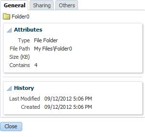
Description of "Figure 9-77 Using the separator Component to Create a Line"
The spacer and separator components are often used in facets of other layout components. Doing so ensures that the space or line stays with the components they were meant to separate.
9.17.1 How to Use the spacer Component
You can use as many spacer components as needed on a page.
Before you begin:
It may be helpful to have an understanding of how the attributes can affect functionality. See Separating Content Using Blank Space or Lines.
You may also find it helpful to understand functionality that can be added using other ADF Faces features. See Additional Functionality for Layout Components.
To create and use the spacer component:
9.17.2 How to Use the Separator Component
You can use as many separator components as needed on a page.
Before you begin:
It may be helpful to have an understanding of how the attributes can affect functionality. See Separating Content Using Blank Space or Lines.
You may also find it helpful to understand functionality that can be added using other ADF Faces features. See Additional Functionality for Layout Components.
To create and use the separator component:
- In the Components window, from the Layout panel, drag and drop a Separator onto the JSF page.
- In the Properties window, set the properties as needed.
