A.9 Viewer
The viewer is used to display documents and annotations you have permissions to see. It is accessed from a Search Form Criteria and Search Results Table by clicking the icon in the MIME Type column, or selecting a document from the search results and clicking Open in the Search Results Toolbar. Additionally, all metadata associated with a document is displayed in the Properties panel of the viewer, and all actions taken on a document are displayed in the History panel.
The viewer can switch between a basic mode, used to view documents and annotations, and an advanced mode, which additionally allows you to add and edit annotations, provided you have the security permissions to do so. You can specify which mode to use by default in the Preferences Page.
Note:
The Oracle Imaging viewer makes use of memory made available to it by the client system. Viewing larger and more complex documents, multiple documents, and manipulating document views by zooming in and out require larger amounts of memory to be available to the viewer. If you are uncertain if you have enough memory on your system, or are having difficulty viewing documents, contact your system administrator.
If an out of memory error occurs, close one or more documents in the viewer until the viewer is able to respond. If still unable to function properly, close the viewer to reset the amount of memory available and re-open the document you need to view, then contact your system administrator to increase memory allocation in the Java plug-in. {REMOVED FOR PS5 PER DISCUSSION WITH ANUP THAT ANY MEMORY ALLOCATION CONFIGURATION SET BY A USER OR ADMIN WILL BE OVER-WRITTEN BY IMAGING CODE. -bas Added back in per bug 13646115 CODE WAS FIXED.}
This section covers the following topics:
A.9.1 Viewer Menus
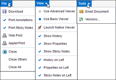
In addition to viewing a document, the viewer can be used to print, download, or e-mail documents. The following menus and options are available in the viewer above the document tabs.
The following table describes the elements available on the page.
| Element | Description |
|---|---|
|
File |
Use the File menu to download, print, or close displayed documents. It has the following options:
|
|
View |
The View menu allows you to change viewer modes and show or hide document history and properties. It has the following options:
|
|
Tools |
The Tools menu allows you to e-mail a displayed document or view a list of previous versions of a document.
|
A.9.2 Properties Panel
The properties panel displays all metadata associated with a document, and provides the option to update metadata. Clicking Update displays the Update Document Page within the properties panel. The properties panel can alternately be displayed or hidden dynamically by selecting the View menu then enabling or disabling Show Properties. Similarly, placement of the properties panel can be alternated between the left side and the bottom of the page by selecting the View menu then enabling or disabling Properties on Left. The entire bottom or left pane can dynamically resized by clicking on the pane border and dragging the border to the desired location. A default size can be specified in the Viewer Settings Section of the Preferences Page. Also, the entire bottom or left pane can be collapsed by clicking the Collapse pane icon, or expanded by clicking the Restore pane icon. See the section "Icons" to see an image of the icons.
A.9.3 History Panel
Each action performed on a document in Imaging is tracked and displayed in the history panel. The following events are tracked:
-
When a document is created
-
When a document is copied
-
When a document is moved
-
When a new version of document is made
-
When document metadata is updated
-
When a document has annotations added or modified
The history panel can alternately be displayed or hidden dynamically, resized, or collapsed in the same manner as the properties panel. See the Properties Panel section for details.
A.9.4 Sticky Notes Panel
Displays a list of all sticky note annotations to which you have access on a document. Sticky Note annotations are numbered and listed numerically in the list. Clicking the icon to the left of the sticky note number in the panel expands the panel and displays the text of the sticky note. (Note that the icon may change depending on the skin choice selected on the Preferences Page.) {PS5: PER Bug 13254901 - ERROR OPENING TWO DOCUMENTS WITH STICKY NOTES - FUNCTIONALITY HAS CHANGED. THERE IS NO LONGER AN ICON TO EXPAND THE TEXT. THE TEXT IS NOW LISTED IN A SEPARATE COLUMN. -bas} Text formatting is retained, but any inserted graphics are stripped from display in the list. Inserted graphics are maintained in the actual annotation.
The sticky notes panel can alternately be displayed or hidden dynamically, resized, or collapsed in the same manner as the properties panel. See the Properties Panel section for details.
A.9.5 Viewer Toolbar
Several icons are used throughout the viewer user interface without explicit identification. These icons provide functionality when clicked. Identifying text is displayed when hovering your cursor over an icon. Options on the viewer toolbar change depending on if you are using the basic or advanced mode. This section details both the Basic Viewer Toolbar Options and the Advanced Viewer Toolbar Options.
Note:
Using browser navigation such as Forward, Back, and Refresh does not provide navigation within a document, a document's panels, or between document tabs open in the viewer. Instead, browser controls navigate outside of the Imaging viewer. When viewing a document, it is recommended that all navigation within the viewer be done using the navigation controls in the viewer toolbar. {ADDRESSES BUG 12432507 -bas}
A.9.5.1 Basic Viewer Toolbar Options
The basic viewer toolbar offers options to zoom and rotate documents as well as navigate multiple pages.
| Name | Icon | Function |
|---|---|---|
|
Rotate Left 90 Degrees |
|
Rotates the current page 90 degrees counter clockwise. Once rotated, clicking the Save the Current Page Annotations icon on the Advanced Viewer Toolbar saves the rotated orientation for display the next time you view the document. |
|
Rotate Right 90 Degrees |
|
Rotates the current page 90 degrees clockwise. Once rotated, clicking the Save the Current Page Annotations icon on the Advanced Viewer Toolbar saves the rotated orientation for display the next time you view the document. |
|
Zoom In |
|
Enlarges the current page in predefined increments in the viewer page region. Predefined increments go from 25% to 200%, increasing by 25% each time the icon is clicked. Note that if the current page is at a zoom level that is not a predefined increment, clicking this icon enlarges the current page to the closest predefined level. For example, if clicking the Zoom to Fit the Height icon displays the current page at a 43% zoom level, then clicking the Zoom In icon once enlarges the current page to a 50% zoom level. |
|
Zoom Out |
|
Reduces the current page in predefined increments in the viewer page region. Predefined increments go from 200% to 25%, decreasing by 25% each time the icon is clicked. Note that if the current page is at a zoom level that is not a predefined increment, clicking this icon reduces the current page to the closest predefined level. For example, if clicking the Zoom to Fit the Height icon displays the current page at a 43% zoom level, then clicking the Zoom Out icon once reduces the current page to a 25% zoom level. |
|
Restore default size |
|
Returns the current page size to 100 percent of the original size. |
|
Zoom to Best Fit |
|
Enlarges or reduces the current page to fit into the viewer page region. |
|
Zoom to Fit the Height |
|
Enlarges or reduces the current page to fit the height of the current page in the viewer page region. |
|
Zoom to Fit the Width |
|
Enlarges or reduces the current page to fit the width of the current page in the viewer display area. |
|
Start Rubberband Zoom Mode |
|
Enlarges the selected area of the current page to fit in the viewer page region. |
|
Go to First Page |
|
Click to view the first page of a multi-page document. |
|
Go to Previous Page |
|
Click to view the page preceding the current page of a document. |
|
Go to Page Number |
|
Select a page to go to of a multi-page document. A scroll bar in the menu allows you to scroll to the required page number. {ADDRESSES BUG 12685196 -bas} |
|
Go to Next Page |
|
Click to view a page following the current page of a document. |
|
Go to Last Page |
|
Click to view the last page of a multi-page document. |
| Launch Advanced Viewer |
|
Click to launch the Advanced Viewer window. Note that you can decide a placement and size for the Advanced Viewer window. Drag the window to the desired position on the screen and resize it according to your requirement. The next time you launch the Advanced Viewer window, the previous placement and size is registered and the window opens in the same size at the same position. |
| Refresh Image |
|
Click to refresh the page. |
|
Help |
|
Click call up the product help. When in basic mode, clicking the icon displays the Viewer help in a separate window. When in advanced mode, clicking the icon enables a question mark cursor to position over an existing annotation or other toolbar icon. Using the question mark cursor to click on an existing annotation or toolbar icon displays contextual help about the item in a separate window. |
A.9.5.2 Advanced Viewer Toolbar Options
In addition to the display and navigation options available on the basic viewer toolbar, the advanced viewer toolbar adds options to add and edit annotations if you have rights to do so, as well as open and print documents.
| Name | Icon | Function |
|---|---|---|
|
Open a Local File |
|
Displays a standard dialog box to open a local file. This also allows for opening files in networked directories if the networked directory is mapped as a local drive letter. Note that this option is only available when the viewer is opened from the Upload Document Page. {Bug 9220905 - REG20: OPEN A LOCAL FILE BUTTON BEHAVIOR CHANGED -bas REMOVED AS OPTION TO OPEN DOCUMENT FROM UPLOAD PAGE IS NO LONGER VALID 5/18/12 -bas} |
|
Show/Hide Annotations |
|
Click to switch between showing and hiding annotations. Printing a document when viewing in advanced mode with the annotations hidden causes the document to print without the annotations. |
|
Cursor |
|
Enables the user to select an existing annotation in the viewer page region. |
|
Text |
|
Select then drag on document to display the Edit Annotation Content dialog box to add a text annotation. |
|
Highlight |
|
Select then drag on the current page to highlight a portion of the current page. Opacity and color are controlled by the accompanying toolbar. |
|
Line |
|
Select then drag on the current page to add a line notation for underlining or striking through a word or image on the current page. Color and inclusion of arrowheads are controlled by the accompanying toolbar. |
|
Sticky note |
|
Select then click the current page to display the Rich Text Editor for adding a sticky note annotation to the current page. Note color is controlled by the accompanying toolbar. |
|
Redaction |
|
Select then drag on the current page to cover a portion of the current page. |
|
Stamp |
|
Select then click the current page to add a predefined watermark annotation to the current page. There are four default stamp options:
The stamp message, size, orientation, and opacity are controlled by the accompanying toolbar. |
|
Save the Current Page Annotations |
|
Click to save modifications to the current page annotations. If the icon has a lock on it, the document is locked by someone else and saving the annotations may fail unless you first contact them and have them unlock the document. |
|
Help |
|
Click call up the product help. When in basic mode, clicking the icon displays the Viewer help in a separate window. When in advanced mode, clicking the icon enables a question mark cursor to position over an existing annotation or other toolbar icon. Using the question mark cursor to click on an existing annotation or toolbar icon displays contextual help about the item in a separate window. |
A.9.6 Annotations
Permissions are assigned for the different levels of annotations: standard, restricted and hidden as described in the section Assigning Annotation Security Level. If you need a permission level you do not have, talk to the person who manages security for Imaging. If you have the proper permissions to do so, you can annotate documents and view or edit the annotations made by others, as well as view when and by whom an annotation was created and last modified using the Creator/Last Modifier Icon and Dialog. You can create the following annotations:
-
Sticky Note annotations, as described in Sticky Note Annotation Rich Text Editor and Sticky Note Annotation Toolbar
A.9.6.1 Assigning Annotation Security Level
You must assign each annotation a security level. After you create an annotation, a toolbar appears listing the security options to which you have access for the annotation. Only security permissions assigned to you are listed. For example, if you are assigned only the standard security level, only the standard security level will be listed in the menu as an option for you to assign. To assign a security level to an annotation, select the security level from the toolbar menu. Note that Redaction annotations cannot be marked Hidden.
The following table describes the elements available on the page.
| Element | Description |
|---|---|
|
Standard |
Standard annotations appear on the document page for all users. They may be applied and changed by users granted permission to Standard annotations. |
|
Restricted |
Restricted annotations appear to all users but cannot be modified by users who have not been granted permission to Restricted annotations. When viewing, exporting, or rendering, restricted annotations will be burned into the image if the user does not have Restricted permission. |
|
Hidden |
Hidden annotations appear to users who have been granted permission to view Hidden annotations. Redaction annotations cannot be marked Hidden. |
A.9.6.2 Creator/Last Modifier Icon and Dialog
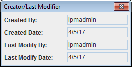
When selected, all annotation toolbars have an icon to the right of the security level in the toolbar menu. Clicking the icon displays when and by whom the annotation was first created and last modified.
The following table displays the Creator/Last Modifier icon and describes its function.
| Icon | Description |
|---|---|
|
|
Click to display the Creator/Last Modifier dialog with details on the annotation history. |
A.9.6.3 Text Annotation
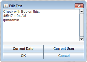
Text annotations allow you to leave notes on a document. To add a text annotation, select the text tool, then click and drag the mouse in the Viewer to define the size, shape, and position of the annotation. After releasing the mouse button, the Edit Text dialog box is displayed. ibsmith 12/11: Screenshot needs to be updated.
The following table describes the elements available on the page.
| Element | Description |
|---|---|
|
Current Date |
Click to insert the current date into the text field. |
|
Current User |
Click to insert your name in the text field. |
|
OK |
Click to save changes to the text annotation. |
|
Cancel |
Click to cancel creation of a new text annotation or changes to an existing text annotation. |
Once created, a text annotation can be selected by clicking on it in the document in the Viewer. Selecting a text annotation displays the bounding box defining the size of the annotation, which you can use to move, resize, or delete it. Selecting a text annotation also displays the Text Annotation Toolbar that enables you to format text within the text annotation.
A.9.6.3.1 Text Annotation Toolbar
The following table describes the elements available on the toolbar.
| Icon | Description |
|---|---|
|
|
Click to display the Color Palette from which to choose the background color of the selected text annotation. |
|
|
Click to display the Color Palette from which to choose the border color of the selected text annotation. |
|
|
Click to display the Color Palette from which to choose the font color of the selected text annotation. |
|
|
Click to display the Edit Annotation Content dialog box to add or edit text in the selected text annotation. |
|
|
Click the font name to choose from a list of available fonts for the text in the selected text annotation. Click the number to select the point size of the text. |
|
|
Click and drag to move the text annotation to another location on the document. |
|
|
Click and drag to resize the text annotation. |
A.9.6.3.2 Color Palette
The following table describes the elements available on the page.
| Element | Description |
|---|---|
|
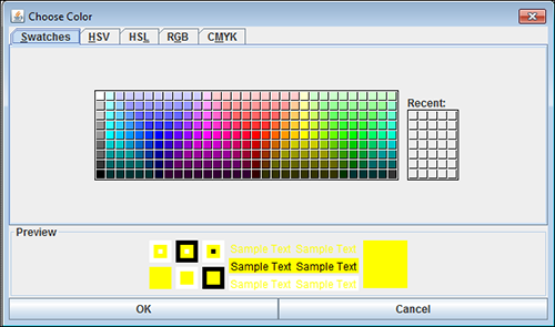
Palette Tabs |
Used to define the color being used. Depending on the context used to display the color palette, it controls the color of text, backgrounds, notes, borders, and lines. Colors can be defined using several methods, one for each tab:
|
|
Preview Area |
Displays an example of how the selected setting will display. |
|
OK |
Click to save the settings. |
|
Cancel |
Click to cancel changes made and return to previous settings. |
A.9.6.4 Highlight Annotation
Highlight annotations overlay a translucent highlight to an area of a document. They are added by selecting the highlight tool, then clicking and dragging over the document in the Viewer to create a highlight annotation. Doing so displays the Highlight Annotation Toolbar.
The following table describes the elements available on the toolbar.
| Icon | Element |
|---|---|
|
|
Click to display the Color Palette from which to choose the background color of the selected highlight annotation. |
|
|
Click and drag to change the opacity of the selected highlight annotation. Moving the slider to the left makes the highlight more translucent. Moving the slider to the right makes the highlight more opaque. |
|
|
Click and drag to move the highlight annotation to another location on the document. |
|
|
Click and drag to resize the highlight annotation. |
A.9.6.5 Line Annotation
Line annotations draw a line on a document. Lines can be used to underline, strike through, or point to text or other objects in a document. They are added by selecting the line tool, then clicking and dragging over the document in the Viewer to create a line. Doing so displays the Line Annotation Toolbar.
The following table describes the elements available on the toolbar.
| Icon | Description |
|---|---|
|
|
Click to display the Color Palette from which to choose the line color of the selected line. |
|
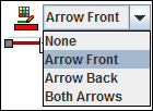
|
Click to select an option for terminating the line annotation with an arrowhead.
|
|
|
Click and drag to move the highlight annotation to another location on the document. |
|
|
Click and drag to resize the highlight annotation. |
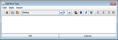
A.9.6.6 Sticky Note Annotation Rich Text Editor
Sticky note annotations can be longer than text annotations and allow more formatting options. In addition to being placed on a document, they are also displayed in the Sticky Notes Panel in the Viewer. You add them by selecting the sticky note tool, then clicking on the document in the Viewer. Doing so displays the Rich Text Editor. After a note is created, clicking on it displays the Sticky Note Annotation Toolbar.
The following table describes the elements available on the toolbar.
| Item | Description |
|---|---|
|
Edit |
Enables selected text to be moved around a note.
|
|
Style |
Enables the appearance of selected text to be modified.
|
|
Insert |
Enables insertion of additional objects.
|
A.9.6.6.1 Rich Text Editor Toolbar
The Rich Text Editor lets you quickly and easily select text formatting options.
The following table describes the elements available on the toolbar.
| Icon | Description |
|---|---|
|
|
Deletes the selected text and copies it to memory for insertion at another point in the note. |
|
|
Copies the selected text to memory for use at another point in the note. |
|
|
Inserts text that was either cut or copied into memory at the cursor position in the note. |
|
|
Click the font name to choose from a list of available fonts for the selected text. Click the number to select the point size of the text. |
|
|
Displays the Color Palette from which to choose the color of the selected text. |
|
|
Makes the selected text appear bold. |
|
|
Displays the selected text in italics. |
|
|
Underlines the selected text. |
|
|
Justifies the text to the left of the note. |
|
|
Center the text in the note. |
|
|
Justifies the text to the right of the note. |
|
|
Spaces the text so that text is justified to both the left and right sides of the note. |
A.9.6.7 Sticky Note Annotation Toolbar
The Sticky Note Annotation Toolbar lets you open the color palette and the Rich Text Editor, allowing you to edit and format the rich text content of the annotation. Sticky Note annotations are placed after clicking one time on the document surface.
The following table describes the elements available on the toolbar.
| Icon | Description |
|---|---|
|
|
Click to display the Color Palette from which to choose the color of the selected note. |
|
|
Click to display the Rich Text Editor. |
|
|
Click and drag to move the note to another location on the document. |
A.9.6.8 Redaction Annotation
Redaction annotations behave like highlight annotations, except that they are completely opaque and cannot be brightened or darkened. They are used to cover up sensitive information in a document or another annotation. They are added by selecting the redaction tool, then clicking and dragging over the document in the Viewer to create an opaque redaction annotation. Doing so displays the Redaction Annotation Toolbar. If you have rights to modify a redaction annotation, it becomes transparent when you select it in the advanced viewer mode. If you do not have rights to modify the annotation, you cannot select it. The security level for redaction annotations cannot be designated as hidden.
| Icon | Description |
|---|---|
|
|
Click and drag to move the redaction annotation to another location on the document. |
|
|
Click and drag to resize the redaction annotation. |
A.9.6.9 Stamp Annotation
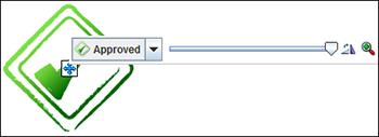
Stamp annotations allow you to overlay and save predefined watermarks on a viewed document page. They are added by selecting the stamp tool, then clicking on the document in the Viewer to apply the selected watermark. The Stamp Annotation Toolbar displays which you use to manipulate the watermark.
The following table describes the elements available on the toolbar.
| Icon | Description |
|---|---|
|
|
Click to select which watermark to use. There are four stamp options:
|
|
|
Slide pointer left and right to lighten and darken the opacity of the watermark. |
|
|
Click to rotate watermark 45 degrees clockwise. Repeat as many times as necessary to orient the watermark in 45 degree increments. |
|
|
Click to cycle through three different size options for the watermark. |
|
|
Click and drag to move the watermark to another location on the document. |

