The MobileCommerce Xcode project represents the UI of CRS-IUA. It makes extensive use of iOS UI components but also provides some customized UI controls to enable the UI design to be fully implemented. Customized controls are located within the UI Widgets directory of the MobileCommerce Xcode project. Note that if your implementation requires a particularly complex customization of any of these UI controls, it is best to create a new widget as a separate file in the UI Widgets directory. We will now explore these custom controls in some detail.
Validatable Input
The ATGValidatableInput UI widget adds the ability to configure an input field that can validate its contents against a pre-defined set of rules or constraints to UIView. If the input entered for the field is not valid based on these constraints, an appropriate error message can be displayed next to the input field (inline).
This custom widget is created for the UI design goal of only displaying required fields on the device to conserve the limited screen space. Displaying only required fields frees the implementer from the need to indicate which fields are required. The ability to display an error message inline frees the implementer from the need for extra screen space above or below the inputs to display that error message.
The following illustration shows an ATGValidatableInput displaying an inline error to indicate that the user has omitted information from a required field.
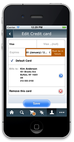
Additionally, ATGValidatableDropdown extends ATGValidatableInput to add similar functionality for dropdown controls. The following illustration shows an ATGValidatableDropdown in which the user has entered a date occurring in the past as the credit card expiration date.
Each ATGValidatableInput or subclass can have several validators that apply the necessary rules or constraints to determine whether the input is valid. Each validator must conform to the ATGInputValidator protocol that defines a single method:
-(NSError *) validateValue:(id) value;
This method receives a value to be validated, returns nil if there is no validation error and returns an NSError if there is a validation error.
The iOS 6 Keyboard Toolbar
CRS-IUA’s iOS application presents the user with the iOS standard keyboard most appropriate keyboard for the task at hand, as shown in the following illustration.
In the previous figure, the phone number being edited is the last view on the current screen and therefore ATGKeyboardToolbar’s button reads “Done” rather than “Next.” The illustration that follows, shows the toolbar on a dropdown menu.
In the previous figure the state picker is not the last view on the screen and therefore ATGKeyboardToolbar’s button reads “Next” rather than “Done.” When the Next or Done button is pressed, it notifies the first responder that the keyboard is about to be dismissed, then closes it.
Prefix Label
The standard UILabel allows simple messages to be displayed on the UI. In the case of the CRS-IUA shopping cart view however, a name and value pairing of information was needed. To simplify the display of such name/value pairs, a custom ATGPrefixLabel was created.
ATGPrefixLabel maintains two strings:
Prefix - the name
Text - the value
It then implements a custom drawing procedure to display these strings. It uses all available space when rendering the prefix, and the prefix is always left aligned. The corresponding text is then right aligned. ATGPrefixLabel also allows the color to be customized and provides a means to display strikethrough text.
ATGPrefixLabel displays such information as items, discount, store credit and shipping, as shown in the following illustration.
