13 Creating Mobile Websites
WebCenter Sites: Mobility enables you to create websites for mobile devices. This chapter describes how to create, copy, and edit the assets and site navigations of your mobile websites, as well as how to preview and approve your mobile websites for various devices. It includes the following sections:
-
Section 13.3, "Editing Assets in the Context of a Mobile Device"
-
Section 13.4, "Previewing Assets in the Context of a Mobile Device"
13.1 Introduction to WebCenter Sites: Mobility
Mobility enables you to create mobile websites for various mobile devices such as iPhone, iPad, Samsung Galaxy, and Blackberry. You can create a brand new mobile website in the same manner as you create a default website for desktop/laptop computers. To help reduce your effort and site delivery time, WebCenter Sites also lets you copy the assets of any existing website for your mobile website. You can preview your mobile website so you know how your site will look on the screens of mobile devices when it is published.
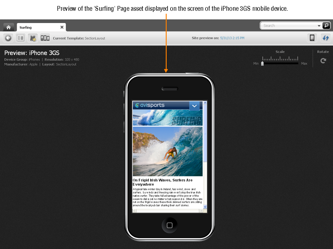
For example, Figure 13-1 shows the preview of the "Surfing" Page asset for the avisports sample site displayed on the screen of the iPad 3GS mobile device (represented by a Device asset) as it would look on the screen of an actual iPad 3GS if the Page was published.
Figure 13-1 Preview of the 'Surfing' Page Asset Displayed on the Screen of a Mobile Device
Description of "Figure 13-1 Preview of the 'Surfing' Page Asset Displayed on the Screen of a Mobile Device"
13.1.1 How Are Mobile Websites Represented in the Contributor Interface?
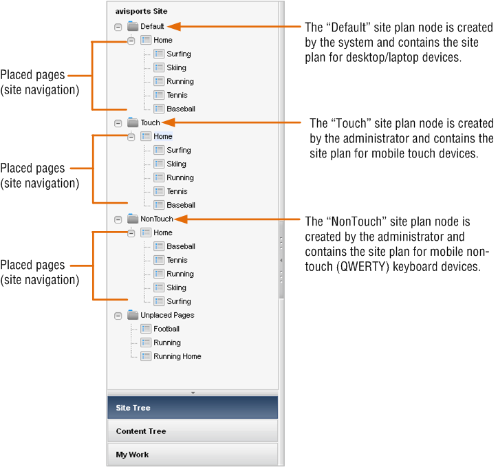
A mobile website, like your Default website for viewing on desktop/laptop devices, is represented by a site plan node in the Site Tree of the WebCenter Sites Contributor interface. For example, Figure 13-2 shows the Site Tree in the avisports sample site.
Figure 13-2 Site Plans and Navigation for the avisports Sample Site
Description of "Figure 13-2 Site Plans and Navigation for the avisports Sample Site"
At the top of Figure 13-2 is the Default site plan node for desktop and laptop devices, which was created by default when the site was created. Below are the mobile site plan nodes named Touch and NonTouch. Those nodes were created by an administrator who then assigned them to Device Groups, that is a group of devices with similar features, such as a group of touchscreen phones.
In Figure 13-2, the Touch site plan node is assigned to Device Groups for mobile touchscreen devices. The NonTouch site plan node is assigned to Device Groups for mobile devices with a QWERTY keypad. Under each site plan node is a set of placed Pages which represent the site navigation. Whereas administrators create the site plans, contributors place the Pages. Placed Pages can be viewed and edited in the context of a mobile device.
13.1.2 How Do I Create Mobile Websites?
To create mobile websites, you create a mobile site plan (site navigation) under a mobile site plan node by placing Pages. You can either create new content assets and Pages or copy and edit existing content assets and Pages. For more information, see Section 13.2, "Creating a Mobile Website."
13.1.3 How Do I Edit Mobile Websites?
You can edit the Page and content assets of your mobile website just as you would for the Default website in Form Mode and Web Mode. In addition, you have the option to edit Pages and content assets in the context of a mobile device, as described in Section 13.3, "Editing Assets in the Context of a Mobile Device."
13.1.4 How Do I Preview Mobile Websites?
You can preview the Page and content assets of your mobile website in the context of either a single mobile device or multiple mobile devices (associated with the same device group), as described in Section 13.4, "Previewing Assets in the Context of a Mobile Device."
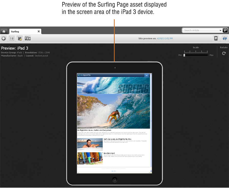
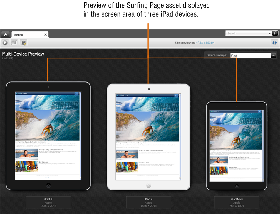
Figure 13-3 shows the preview of the Surfing Page displayed on a single mobile device (represented by a Device asset). Figure 13-4 shows the preview of the Surfing Page displayed on multiple mobile devices (associated with the same Device Group).
Figure 13-3 Preview of a Page Asset Displayed on a Single Device
Description of "Figure 13-3 Preview of a Page Asset Displayed on a Single Device"
Figure 13-4 Preview of a Page Asset Displayed on Multiple Devices
Description of "Figure 13-4 Preview of a Page Asset Displayed on Multiple Devices"
13.1.5 How Do I Approve Mobile Websites for Publishing?
To make a mobile website available for publishing, you must approve its site plan (SitePlan asset), content assets, placed Pages, and Device Groups. Since Device Groups are dependent on one another, when you approve one Device Group, you must approve them all. If you want to publish the mobile website to a management system, you must also approve all Device assets associated with that mobile website For more information, see Section 13.5, "Approving a Mobile Site Plan for Publishing."
13.2 Creating a Mobile Website
Creating a mobile website's navigation is much like creating the navigation for a default website, for viewing on desktop/laptop devices. First, you either create new assets and Pages or copy and edit existing assets and Pages for your mobile website. You then, create the mobile website's navigation by either placing the desired Pages under the mobile site plan or copying the navigation under one site plan and pasting it under the desired mobile site plan.
The following sections provide information about creating a mobile website:
-
Section 13.2.1, "Create or Copy the Content for the Mobile Website"
-
Section 13.2.2, "Create or Copy the Navigation for the Mobile Website"
13.2.1 Create or Copy the Content for the Mobile Website
To create the content for your mobile website, you can:
-
Create new content assets and Pages. For instructions, see Section 3.1, "Creating Assets in Form Mode" and Section 4.2, "Creating Assets in Web Mode."
-
Copy existing content assets and Pages, and then edit those assets to be specific to the mobile website you are creating. For instructions on copying assets, see Section 3.1.3, "Creating Assets by Copying Existing Assets."
13.2.2 Create or Copy the Navigation for the Mobile Website
The navigation of your mobile website is determined by the placement of the "Page" assets under a site plan in the Site Tree of the Contributor interface. You can either place the desired Pages under the mobile site plan from the Unplaced Pages node, or copy the navigation under one site plan and paste it under the mobile site plan. For instructions, see Chapter 10, "Creating a Website's Navigation."
Note:
WebCenter Sites offers multiple ways to create a website's navigation. Your site design determines the way in which your website's navigation is created. In this section, we assume that your site design is configured to allow you to create your website's navigation using the Site Tree in the WebCenter Sites Contributor interface. For information about how the navigation for your website is created, see your site developers.
13.3 Editing Assets in the Context of a Mobile Device
Editing an asset in the context of a mobile device is the same as editing an asset in Web Mode, with one difference; your asset is displayed on a Device asset representing a mobile device. When you edit the asset in the context of a mobile device, you can edit its content, change the web page layout, change the content layout of a slot, and edit the asset's associations.
Note:
You can also edit the assets of a mobile website in Form Mode and Web Mode just as you would for an asset of your Default website. For instructions, see Section 3.3, "Editing Assets in Form Mode" and Section 4.4, "Editing Assets in Web Mode."
To edit an asset in the context of a mobile device
-
Log in to WebCenter Sites, select the site you want to work with and then select the icon for the WebCenter Sites Contributor interface.
-
Find and open the asset you want to edit on a device. Depending on the type of asset you wish to edit, do one of the following:
-
(For any asset) Use the Contributor interface's Search feature:
-
In the Search field, enter search criteria identifying the asset and click the magnifying glass button.
For more information and instructions about searching for assets, see Chapter 6, "Finding and Organizing Assets."
-
In the list of search results, right-click the desired asset's name and select Edit from the context menu.
A tab opens displaying the asset's Edit view in either Form Mode or Web Mode.
-
-
(For placed Page assets only) Use the Site Tree in the navigation pane:
-
In the navigation pane, click the Site Tree bar.
The navigation pane displays the Site Tree.
-
In the Site Tree, expand the site plan associated with the type of mobile device on which you wish to edit the asset.
-
In the expanded site plan, right-click the desired asset and select Edit from the context menu.
A tab opens displaying the Page asset's Edit view in the context of a mobile device associated with the site plan.
-
-
-
Select the device on which you wish to edit the asset's content:
-
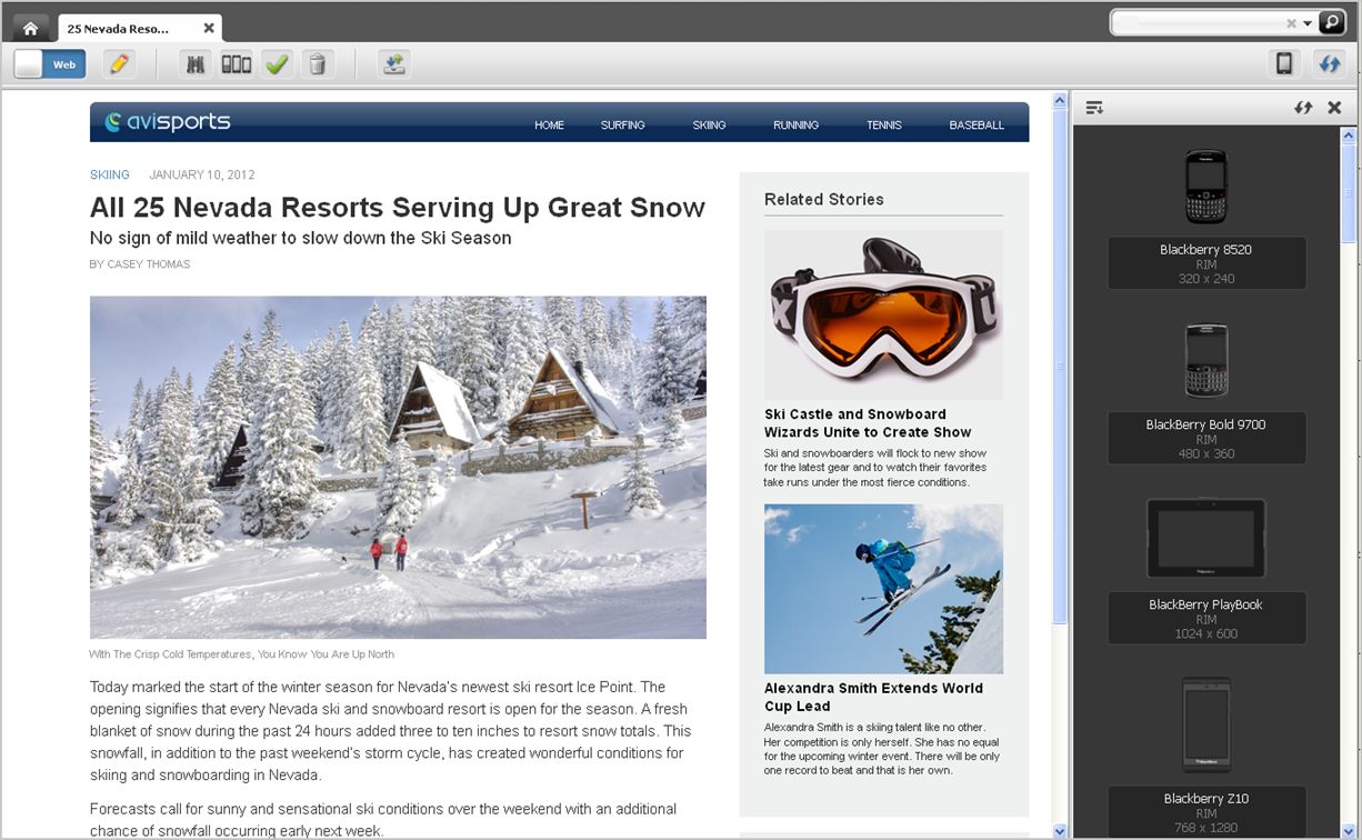
In the asset's toolbar, click the Show/Hide Devices icon.
The device selection panel opens to the right of the asset (as shown in Figure 13-5).
Figure 13-5 Device Selection Panel Open to the Right of an Asset
Description of "Figure 13-5 Device Selection Panel Open to the Right of an Asset"
-
In the device selection panel, select the device on which you wish to edit the asset.
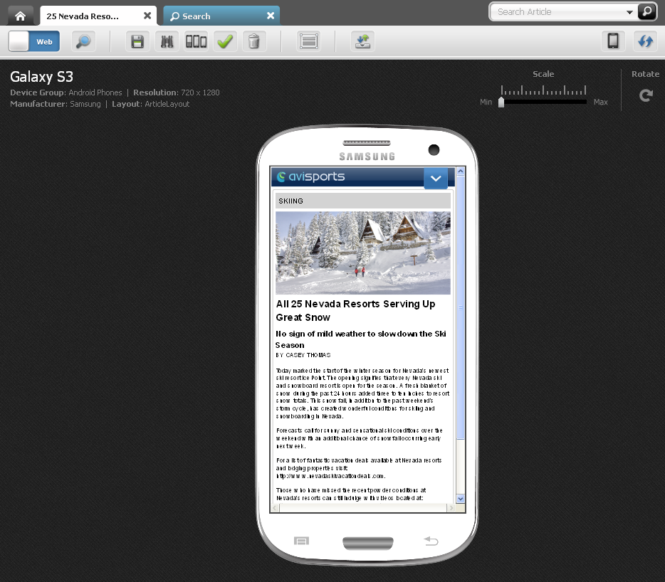
The Edit view of the asset is displayed on the screen of the selected device.
Figure 13-6 Asset Displayed on the Screen of a Mobile Device
Description of "Figure 13-6 Asset Displayed on the Screen of a Mobile Device"
At this point, you can edit the asset as you would an asset for your Default website.
-
-
Edit the asset:
-
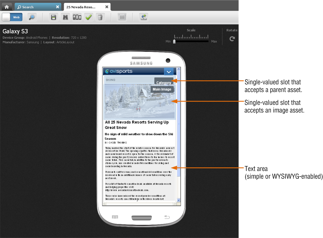
Point to the different areas of the asset's Edit view to determine which areas contain modifiable content. Areas that support drag and drop functionality and other content management actions will be highlighted when you point to them.
Note:
The types of editable areas you will see and how those areas are displayed when you edit an asset in the context of a mobile device are determined by how your developers have coded the asset's web page layout (template). For information about web page layout, see Section 4.4.2, "Changing Web Page Layout."
Figure 13-7 Asset Displayed on a Device – Areas that Accept Content
Description of "Figure 13-7 Asset Displayed on a Device – Areas that Accept Content"
For information about the different types of editable areas you can work with, see step 7 in Section 4.2.3, "Creating a New Asset in Web Mode."
-
Edit the content of the asset by clicking in a text area to display either a simple text field or a WYSIWYG-enabled text field. Then, modify the content displayed in the field. For information about WYSIWYG-enabled fields, see Section 3.5.1, "Working with the CKEditor."
-
Change the asset's web page layout. For instructions, see step 5 in Section 4.4.2, "Changing Web Page Layout."
-
Change the content layout of a slot. For instructions, see step 5 in Section 4.4.4.2, "Editing the Content of an Associated Asset."
-
Edit the asset's associations:
-
Add or replace an associated asset. For instructions, see steps 4 – 6 in Section 4.4.4.1, "Adding or Replacing an Association."
-
Edit the content of an associated asset. For instructions, see steps 5 – 6 in Section 4.4.4.2, "Editing the Content of an Associated Asset."
-
Remove an asset from a slot. For instructions, see step steps 5 – 6 in Section 4.4.4.3, "Removing Associations."
-
Reposition the assets displayed in a multi-valued slot. For instructions, see steps 5 – 9 in Section 4.4.4.4, "Changing the Position of Content Displayed in a Multi-Valued Slot."
-
-
-
Save your changes. Do one of the following:
-
In the asset's toolbar, click the Save icon.
-
In the menu bar, select Content, then select Save.
-
-
Inspect the asset. Do one of the following:
-
In the asset's toolbar, click the Inspect icon.
-
In the menu bar, select Content, then select Inspect.
-
-
Preview the asset in the context of a mobile device. For instructions, see Section 13.4, "Previewing Assets in the Context of a Mobile Device."
13.4 Previewing Assets in the Context of a Mobile Device
Previewing an asset in the context of a mobile device is much like previewing an asset as it would look on a desktop/laptop device, with one difference; the preview of the asset is displayed on a single Device asset or multiple Device assets which represent actual mobile devices. In addition, you can rotate the device to view the preview of the asset in landscape mode and zoom into and out of the asset's preview.
You can access an asset for preview on a mobile device the same way as you would for an asset of your Default website. The only difference being when you use the Site Tree to access a Page asset under a mobile site plan, the Page is automatically displayed in a mobile device associated with that site plan. For more information about accessing an asset's preview, see Chapter 7, "Previewing Assets."
To preview an asset in the context of a mobile device
-
Log in to WebCenter Sites, select the site you want to work with and then select the icon for the WebCenter Sites Contributor interface.
-
Access the asset you want to preview on a mobile device. For instructions, see step 2 in Section 13.3, "Editing Assets in the Context of a Mobile Device."
-
Preview the asset on the desired mobile device:
-
In the asset's toolbar, click the Preview icon.
The preview of the asset is displayed.
-
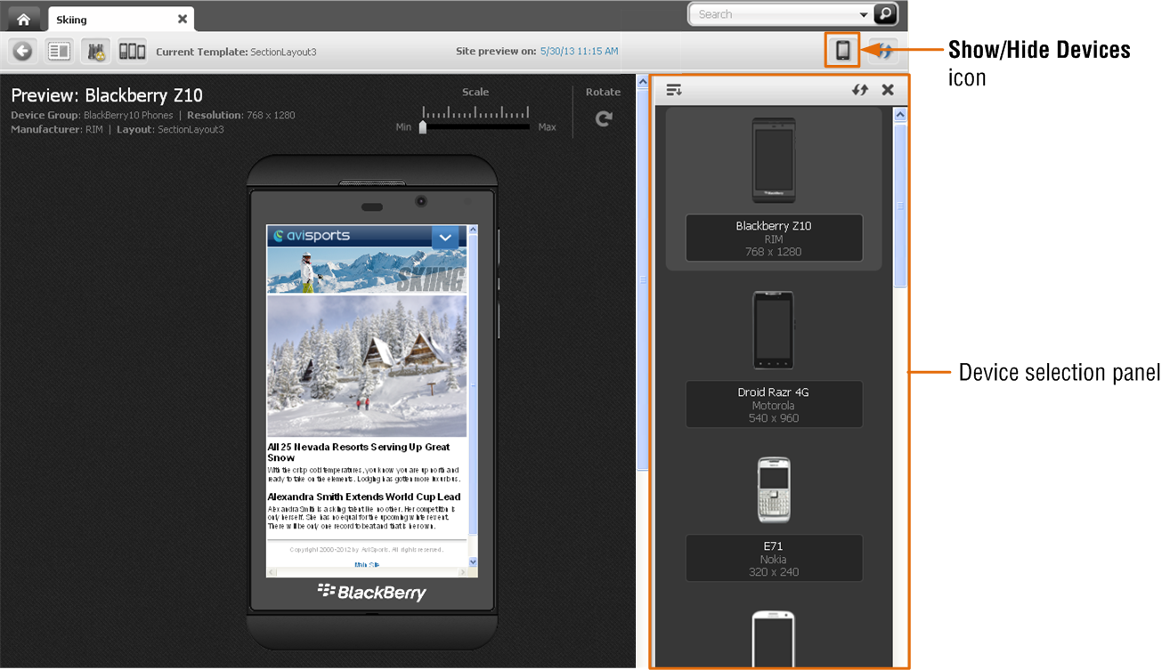
In the asset's toolbar, click the Show/Hide Devices icon.
The device selection panel opens to the right of the asset (shown in Figure 13-8).
Figure 13-8 Device Panel Displayed to the Right of an Asset
Description of "Figure 13-8 Device Panel Displayed to the Right of an Asset"
-
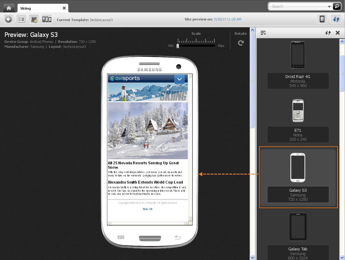
In the device selection panel, navigate to and select the device on which you wish to preview the asset.
Note:
If you accessed the asset via the Search function or the Content Tree, the panel displays a list of devices from all available Device Groups on your system. If you accessed a Page asset from the Site Tree, the panel displays only the devices associated with the site plan under which that Page is placed.
The preview of the asset is displayed in the context of the device you selected:
Figure 13-9 Preview of an Asset Displayed on the Selected Device
Description of "Figure 13-9 Preview of an Asset Displayed on the Selected Device"
-
(Optional) Click the Show/Hide Devices icon to close the device selection panel.
-
-
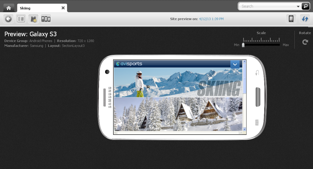
To rotate the preview, click Rotate.
The preview of the asset is displayed on the mobile device in landscape mode.
Figure 13-10 Asset Preview Displayed on a Device in Landscape Mode
Description of "Figure 13-10 Asset Preview Displayed on a Device in Landscape Mode"
-
To preview the asset at different sizes, use the Scale tool to zoom into and out of the asset's preview.
-
To preview how the asset would look on the screen of a different mobile device:
-
If the device selection panel is not displayed, click the Show/Hide Devices icon to open it.
The device selection panel is displayed to the right of the asset.
-
In the device selection panel, select the desired mobile device.
The preview of the asset is displayed on the screen of the selected mobile device.
-
-
To preview the asset in a new window, in the menu bar, select View, then select Preview in New Window.
A new browser window opens displaying the preview of the asset in the exact pixel ratio that is configured for the device asset. For example, the Samsung Galaxy S3 device asset is configured with a 720x1280 pixel ratio. Therefore, the preview of the asset in the browser window is displayed at the exact same pixel ratio.
Figure 13-12 Preview of an Asset Displayed in a New Browser Window

Description of "Figure 13-12 Preview of an Asset Displayed in a New Browser Window"
-
To preview the asset on multiple devices:
-
Do one of the following:
-
In the asset's toolbar, click the Multi-Device Preview icon.
-
In the menu bar, select View, and then select Multi-Device Preview.
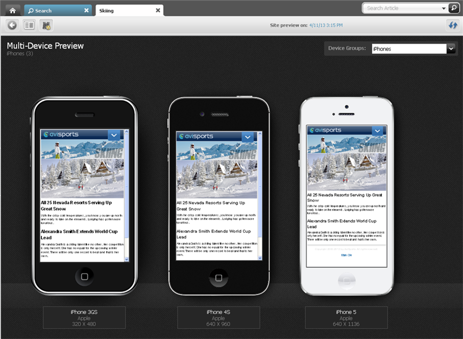
The tab displays the "Multi-Device Preview" screen.
Figure 13-13 Asset's Preview Displayed in the Context of All iPhone Devices
Description of "Figure 13-13 Asset's Preview Displayed in the Context of All iPhone Devices"
The devices that you see belong to the same device group (iPhones device group in this example). If you first previewed the asset on a single device, the "Multi-Device Preview" screen shows the preview of the asset in the context of all devices belonging to the same device group as that single device.
-
-
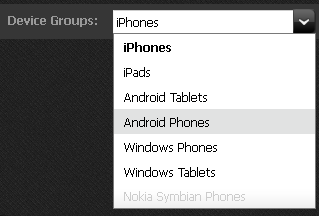
Preview the asset on the devices of a different device group. In the Device Groups drop-down field, click the down-arrow icon and then select the desired device group.
The "Mulit-Device Preview" screen displays the devices associated with the selected device group. In this example, we selected the "Android Phones" device group (shown in Figure 13-15):
Figure 13-15 Asset's Preview Displayed in the Context of All Android Phone Devices
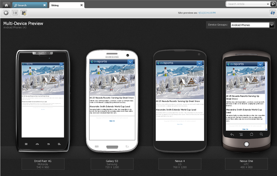
Description of "Figure 13-15 Asset's Preview Displayed in the Context of All Android Phone Devices"
-
For more information about previewing assets, such as previewing an asset as it will look on the website at a future date, previewing an asset with a different page layout, or previewing an asset with segments, see Chapter 7, "Previewing Assets."
13.5 Approving a Mobile Site Plan for Publishing
Approving a mobile site plan for publishing is the same as approving a site plan for your Default website. Before a mobile website can be published, its SitePlan asset must be approved for publishing along with its placed Pages (site navigation) and associated content assets. Approving a mobile website also requires you to approve all the Device Groups on your system. Device Groups are dependent on one another – when you approve one Device Group, you must approve them all. If you are approving the mobile site plan for publishing to a management system, you must also approve the Device assets associated with that mobile site plan. For instruction on approving a mobile site plan, see Section 14.2.2, "Approving a Site Plan for Publishing."

