You can define a group by selecting attribute elements from a visualization on a dashboard, to combine multiple elements into one. In a Grid visualization, an element group combines rows of data into one row; in a bar graph, an element group combines multiple bars into one bar riser; in a Network visualization, an element group combines multiple nodes into one node; and so on. The selected elements are no longer displayed on the visualization.
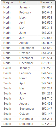
For example, if your Grid visualization displays revenue data from each month on separate rows, you can group the months into seasons. Combine January, February, and March into a group named Winter; group April, May, and June into Spring; and so on. The image below shows this Grid visualization before the groups were created:
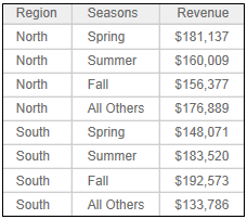
The same Grid visualization is displayed after the Seasons groups are created. The month elements have been replaced by the groups.
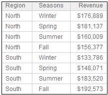
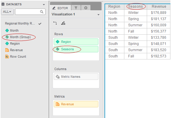
By default, the Month column is renamed to Month (Group) on the visualization to indicate that a group has been created on the Month attribute. In this example, the grouped attribute has been renamed to Seasons. (This is also referred to as the group’s display name.)
The grouped attribute (Seasons, in this case) replaces the attribute
(in this case, Month) on the visualization’s Editor panel. The grouped
attribute is added to the Datasets panel, but does not replace the attribute
in the dashboard. Grouped attributes are displayed on the Datasets panel
and the Editor panel with this icon: 
When you create a group, any attribute elements not used in the group are grouped together. By default, these elements are displayed individually, but you can choose to consolidate the remaining elements into a group.
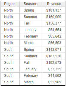
In this example, all of the Month attribute’s elements are used in the Seasons groups, and the element groups replace the attribute elements, so there are no unused elements. If you delete the Winter group, the months that made up the group are displayed on the Grid visualization, as shown below:
If you choose to display the unused elements as a consolidated group instead of individual items, a single row is displayed for the group. By default, the consolidated group is named All Others, as shown below, although you can change the name:
You can create groups on different attributes, but each group can contain elements from only one attribute. If this Grid visualization contained more regions, for example, you could create separate groups for the northern regions, southern regions, and central regions. You can create groups on different attributes, but each group can contain elements from only one attribute. You can group elements of an attribute imported from your data sources, or of a derived attribute that you created on the dashboard. For steps to create a derived attribute, and general information about them, see Creating an attribute based on existing objects: Derived attributes.
Although these examples use Grid visualizations to make it easier to see the data, you can create groups on other types of visualizations. For example, you can select multiple nodes on a Network visualization, and attribute elements or data points on a Graph visualization or Heat Map visualization. If your Graph visualization displays revenue data from each month in separate bar risers, you can group the months into seasons. Combine January, February, and March into a group named Winter; group April, May, and June into Spring; and so on. Bar risers for each month are no longer displayed; the visualization contains bar risers for the seasons instead.
To define a single group, you can select attribute elements on a visualization and quickly create the group. For steps, see To quickly define a single group of attributes.
To define multiple groups at the same time, you can select an attribute on a visualization, and select the elements for each group using the Group Editor. For steps, see To define multiple attribute groups at the same time.
Once you have defined a group, you can change which elements are used in the group, rename the group, rename the grouped attribute, or delete the group. Once you have defined multiple groups, you can rearrange the order of the groups and choose whether to display elements not in the group as individual elements or a single consolidated group. For steps, see Renaming, rearranging, and removing groups on a dashboard.
You have created the dashboard to add the group to. For steps, see Creating a dashboard.
You have created the visualization to add the group to. For steps, see About visualizations.
To quickly define a single group of attributes:
Click the name of the dashboard to run it.
Click the visualization to add the group to.
In the visualization, select each attribute element to add to the group.
Right-click the selected elements and select Group. The New Group dialog box opens.
If you point to Group and a Base On list opens, you have selected elements from multiple attributes (for example, by using a lasso on a Heat Map visualization). A group can contain elements from a single attribute. Select the attribute to group from the list. The New Group dialog box opens.
In the Name field, type a name for the group.
Click Save. The group is created and displayed in the visualization, replacing the attribute elements that you selected.
By default, the grouped attribute is renamed AttributeName (Group), where AttributeName is the attribute that you selected elements from. You can rename the grouped attribute by right-clicking it in the Editor panel, selecting Rename, and typing the new name.
You can continue to create groups by repeating these steps, if you want to group more elements in the attribute. Any attribute elements not used in the group are still displayed on the visualization. You can display the unused attribute elements as a group, by consolidating them. For steps, see Consolidating unused elements into a group on a dashboard.
To define multiple attribute groups at the same time:
Click the name of the dashboard to run it.
Click the visualization to add the groups to.
In the visualization’s Editor panel, right-click the attribute to group and select Create Groups. The Group Editor opens.
If the Editor panel is not displayed, from the View menu, ensure that Editor Panel is selected. If the Editor panel is hidden behind another panel, click the Editor icon to display the Editor panel.
By default, the grouped attribute is renamed AttributeName (Group), where AttributeName is the selected attribute. To rename it, in the Attribute Name field, type a name for the group.
In the field under Group, type a name for the new group. This name is displayed on the visualization.
Select the attribute elements to include in the group. From the Available list, double-click each attribute element to include.
To search for a specific attribute element, type its name in the search field.
To remove all attribute elements from the selected list, click Clear All.
Click the Apply
icon  to apply your changes. The new group is created and added to the list
of groups.
to apply your changes. The new group is created and added to the list
of groups.
To add another group, click the Add a Group, then repeat the previous steps, beginning at To create a group
To save the groups:
After you have added all the groups that you need, click Save. The groups are created and displayed in the visualization, replacing the attribute elements that you selected to create the groups.
Any attribute elements not used in the group are still displayed on the visualization. You can display the unused attribute elements as a group, by consolidating them. For steps, see Consolidating unused elements into a group on a dashboard. You can also modify the groups to rearrange the order that the groups are displayed, rename the group, delete the group, and so on. For steps, see Renaming, rearranging, and removing groups on a dashboard.
Grouping attribute elements in a dashboard
Consolidating unused elements into a group on a dashboard
Renaming, rearranging, and removing groups on a dashboard
_____________________________
Copyright © 2019, Oracle and/or its affiliates. All rights reserved.
Legal Notices