1 Screen Layout and Navigation
This section describes the layout and navigation used across most STA screens. The following topics are discussed:
General Screen Layout
All STA screens follow the same general structure and layout. The main parts are illustrated and described below.
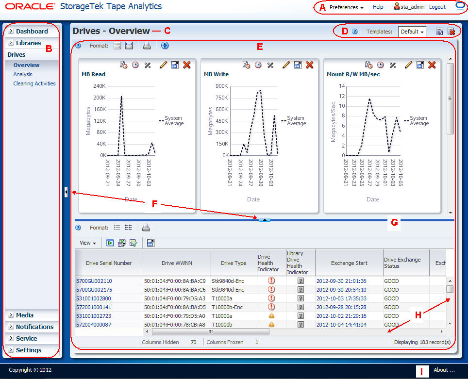
Description of the illustration ''if_genllayoutnotes.jpg''
| Item | Name | Description |
|---|---|---|
| A | Main Toolbar | Provides direct access to frequently used screen-independent commands. See "Main Toolbar" for details. |
| B | Navigation Bar | Primary navigation tool for STA. Provides direct access to all STA screens. See "Navigation Bar" for details. |
| C | Screen Title | Name of the screen. Corresponds to the screen link in the Navigation Bar. |
| D | Templates Toolbar | Provides access to the most frequently used commands for using templates. See the STA User's Guide for details. |
| E | Main Window | Main focus of the screen, where the STA content is displayed. See "Main Window" for details. |
| F | Collapse Pane icon | Indicates that the pane can be collapsed or resized, either vertically or horizontally. See "Collapse and Restore the Graphics Area" for details. |
| G | Resize control bar | Indicates that the pane can be resized, either vertically or horizontally. Appears when you move the mouse over the space between two resizable screen areas. See "Resize the Graphics and Table Areas" for details. |
| H | Scrollbars | Allow you to scroll vertically or horizontally to display more data. Appear dynamically whenever the screen area is not large enough to display all the data at once. |
| I | About | Displays detailed software version information. See the STA User's Guide for details. |
Main Toolbar
The Main Toolbar is located at the top of all STA screens. It provides direct access to frequently used screen-independent commands.
Description of the illustration ''in_mastmenu.jpg''
| Icon | Name | Description |
|---|---|---|
 |
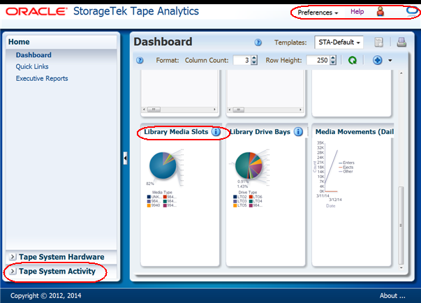
Preferences | Menu provides options for you to modify display settings for STA screens and templates.
Related Topic: "User Preferences" |
 |
Help | Link displays help for the current screen.
Related Topic: STA User's Guide |
 |
STA Username | Displays the STA username currently logged in.
Related Topic: STA User's Guide |
 |
Logout | Link logs you out of STA.
Related Topic: STA User's Guide |
 Idle Idle
and
|
Progress Indicator | Indicates whether the screen has finished or is in the process of loading. |
 Loading
Main Window
STA provides the following types of screens:
-
Dashboard
-
Overview
-
Analysis
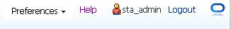
In Overview and Analysis screens, the Main Window is divided into a Graphics Area at the top and a Table Area at the bottom. The border between the two areas is marked by the Collapse Pane icon and the Resize control bar, as shown in the following example.
Description of the illustration ''if_mainwindownotes.jpg''
Screen Display Features
This section describes the following features common to all STA screens.
Cursor Shapes
The cursor changes shape as you move the mouse over different areas of the STA screen. Understanding the meaning of the different cursors assists you in using the STA user interface.
The following cursors appear on all STA screens.
The following cursors appear in tables only.
Tooltips
A tooltip (also called hover text) is a small popup window that displays descriptive text. Tooltips are available for most STA screen icons, buttons, graphic images, and text items. Move the mouse over an item to display the tooltip.
Description of the illustration ''if_tooltipfield.jpg''
Object Selection
You can select most STA objects—items in dialog box lists, table columns, and table rows, for example. In addition, the STA interface supports multi-select for many object types. The STA documentation identifies when multi-select is supported and when it is not.
The following examples use the Reorder Columns dialog box, which appears when you select View, then Reorder Columns from the List Table Toolbar.
-
Click an object to select it.
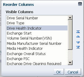
Description of the illustration ''if_select.jpg''
Multi-select
-
Shift-click to select a range of objects.
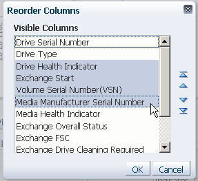
Description of the illustration ''if_shiftselect.jpg''
-
Ctrl-click to select multiple non-contiguous objects.
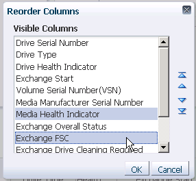
Description of the illustration ''data_reorderdselect.png''
Deselect
-
Ctrl-click an already selected object to deselect it.
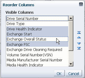
Description of the illustration ''data_reorderddeselect.jpg''
Navigation Methods
Note:
You should not use your browser's Forward and Back (or Next and Previous) buttons for navigating through the STA screens. The use of these buttons could produce unpredictable results, as the data you see may be stale or out of sync with the data on the STA server. To navigate, you should always use the methods provided by STA: the Navigation Bar and text links, described in the sections that follow.Navigation Bar
The Navigation Bar is located on the left side of the STA screen. It consists of a series of vertical tabs that expand and collapse according to your selections. The vertical tabs provide a visual map of the STA screen hierarchy. The number of screens listed under each tab varies. You can expand only one tab at a time.
Description of the illustration ''if_navbar.jpg''
The Navigation Bar serves as the primary means of navigation, and all STA screens are accessible through it. Additional navigation options are offered through text links. See "Text Link Navigation" for details.
Text Link Navigation
The Navigation Bar is the primary navigation tool for STA, allowing you direct access to all STA screens (see "Navigation Bar" for details). Text links provide an additional means of navigation, especially for drilling down to detailed information about resources.
The following types of text links are available:
When you click a text link, you are taken to a screen displaying additional detail for the item(s), and the Navigation Bar is updated to reflect your current location within the screen hierarchy.
In addition, by clicking a link, you apply filter criteria to the resulting screen, and these criteria remain active as you navigate to other screens. This is an important point in understanding the full power of STA. See the STA User's Guide for full details.
Links appear on the screen in underlined blue text.
Resource ID Links
Resource ID links appear in List View Tables and Detail View screens. For example, the following identifiers are usually active links:
-
Media IDs: Usually Volume Serial Number (VSN or volser)
-
Drive IDs: Usually Drive World Wide Node Name (WWNN) or Drive Serial Number
-
Exchange IDs: Usually Exchange Start
Occasionally, these identifiers are not active links, either because the information about the resource is incomplete, or the resource has been removed from the tape library system. In such cases, the resource IDs appear on the screen in dimmed gray text. See the STA User's Guide for additional details.
Clicking a resource ID link takes you to the corresponding Detail View screen, which provides complete details for that resource. The Detail View screen may, in turn, provide links for related resources; you can click any of them to display detail about these resources.
Note:
In most cases, resource IDs are unique, but in some cases they may not be, such as duplicate volsers in a library or library complex.Aggregate Count Links
The cells within pivot tables contain aggregate counts of resources or events that meet specific criteria (see "Pivot Tables" for details).
Clicking an aggregate count takes you to the corresponding Overview screen, which provides additional detail for the resources included in the count. If the aggregate count is "1", only one resource is displayed on the Overview screen. If the aggregate count is "0", clicking the link displays the message: "There is no data to display."
Note:
Aggregate count links also apply filter criteria to the data displayed in the table. See the STA User's Guide for details.Best Practices for Using the STA Screen Display
This section provides tips for using the STA screens and navigation. See the STA User's Guide for related login session tips.
- Navigating forward and backward
-
Do not use your browser's Forward and Back (or Next and Previous) buttons for navigating through the STA screens. Using these buttons could have unpredictable results, as the data you see may be stale or out of sync with the data on the STA server. To navigate, you should always use the methods provided by STA: the Navigation Bar and text links.
- Using browser zoom
-
STA supports browser zoom, but zooming in too far may cause screen elements to be truncated. In the sample Dashboard below, the screen has been zoomed in so far that the Logout link has been truncated from the Main Toolbar, the toolbars on the Dashboard graph portlets have been truncated horizontally, and the Navigation Bar has been truncated vertically.
Description of the illustration ''if_dashzoomtoofar.png''
If you notice any of these kinds of conditions, you can try the following corrective actions:
-
Increase the size of the browser window, if you can. This may restore the truncated toolbar items.
-
If this does not work, or if you do not have room on your screen to increase the size of the browser window, then close the browser session and log in again. This will restore the default zoom, and you can then zoom in to a lesser degree.
-
- Tooltips
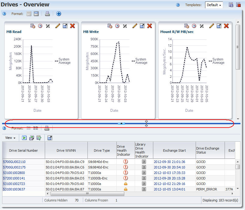
-
Also called hover text. STA makes wide use of hover text to provide detail about text, icons, graphs, and parts of graphs. Try hovering the mouse over screen elements that interest you to display the detail.
See "Tooltips".
- "Clickable" screen components
-
Many screen elements are selectable. Typically anything that is either a specific identifier (drive ID or media volser, for example) or a count of a specific group of items (total drives in a library or 30-day alerts count, for example) is selectable and will take you to a screen displaying detail for the associated items.
Screen Arrangement Tasks
Resize the Navigation Bar
Use this procedure to resize the Navigation Bar and Main Window relative to one another.
-
Move the mouse over the space between the Navigation Bar and the Main Window, until the vertical Resize control bar and Resize object cursor appear.
Description of the illustration ''if_navresize.jpg''
-
Click and drag the control bar until the Navigation Bar and Main Window are the sizes you want, and then release the control bar.
Collapse and Restore the Navigation Bar
Use this procedure to hide the Navigation Bar and then restore it.
-
Click the Collapse Pane icon in the space between the Navigation Bar and the Main Window.
Description of the illustration ''if_navcollapse.jpg''
The Navigation Bar is collapsed, and the Main Window is expanded horizontally across the entire screen.
-
To restore the Navigation Bar to its original width, click the Restore Pane icon on the left side of the window.
Description of the illustration ''if_navrestore.jpg''
Resize the Graphics and Table Areas
Use this procedure to resize the Graphics and Table Areas relative to one another.
-
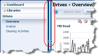
Move the mouse over the space between the Graphics and Table Areas until the Resize Control Bar and Resize object cursor appear.
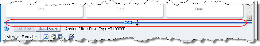
Description of the illustration ''if_arearesize.jpg''
Note:
If the Resize Control Bar does not appear, it could be the Graphics Area has been collapsed, as indicated by the Restore Pane down-arrow icon at the top of the screen. If this is the case, see "Collapse and Restore the Graphics Area" for instructions. -
Click and drag the Resize Control Bar until the two areas are the sizes you want, and then release the mouse. The Collapse Pane icon remains in the up-arrow position indicating the Graphics Area has been resized, not collapsed.
Collapse and Restore the Graphics Area
Use this procedure to hide the Graphics Area and then restore it. Collapsing the Graphics Area provides more space in the Main Window for you to view table data.
-
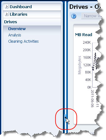
Click the Collapse Pane icon in the space between the Graphics and Table Areas.
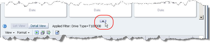
Description of the illustration ''if_areacollapse.jpg''
The Graphics Area is hidden, and the Table Area expands vertically over the entire Main Window. The icon changes to the Restore Pane down-arrow icon.
-
To restore the Graphics Area to the size it was before it was collapsed, click the Restore Pane icon at the top of the Main Window.
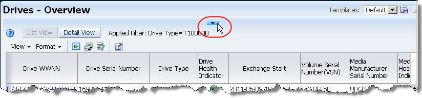
Description of the illustration ''if_arearestore.jpg''
Navigation Tasks
Use the Navigation Bar to Access Screens
Use this procedure to display screens through the Navigation Bar.
-
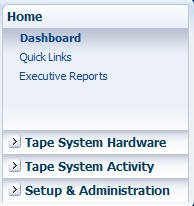
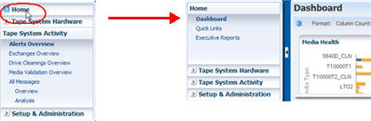
Click a collapsed tab in the Navigation Bar.
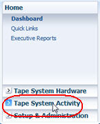
Description of the illustration ''if_navselect.jpg''
The tab is expanded, displaying links to all the screens in the tab.
Description of the illustration ''if_navopen.jpg''
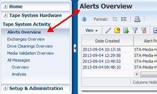
At the same time, the first screen listed under the tab is automatically displayed in the Main Window. The screen title, at the top left of the Main Window (Alerts Overview in this example) corresponds to your selection in the Navigation Bar.
-
You can navigate to other screens by doing either of the following:
-
Click a screen link within the currently expanded tab to display that screen.
Description of the illustration ''if_navwithintab.jpg''
-
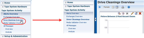
Click any collapsed tab to expand it and display links to its screens.
Description of the illustration ''if_navoutsidetab.jpg''
-
Use Links to Navigate
This procedure is an example of using resource ID links to display detail about an individual drive and other resources related to it.
-
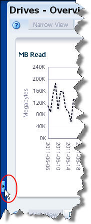
In the Navigation Bar, click Drives to display the Drives – Overview screen.
The Drive Serial Number column displays text links for all drives.
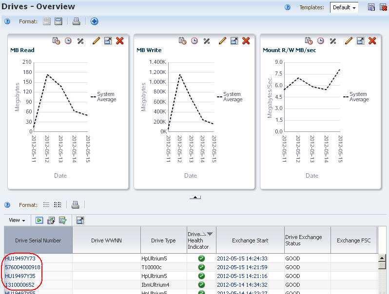
Description of the illustration ''if_linkresourceclick.jpg''
-
Click one of the drive links.
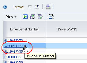
Description of the illustration ''if_linkresourceselect.jpg''
You are taken to the Drives –Overview, Detail View screen, which displays full detail for the selected drive.
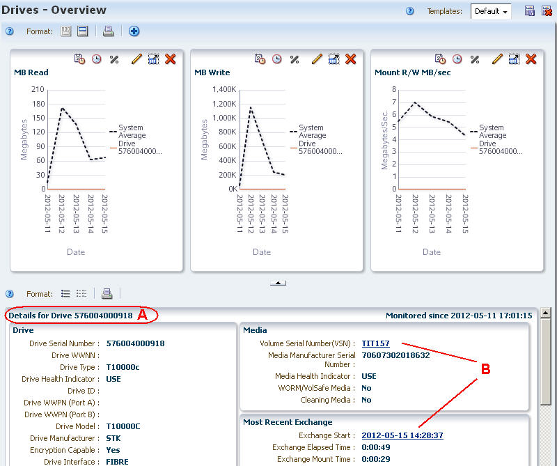
Description of the illustration ''if_linkresourcedetail.jpg''
-
A – Detail View header identifies the drive displayed.
-
B – Related resource ID links appear on the screen.
-
-
Click the Volume Serial Number link.
You are taken to the Media –Overview, Detail View screen, which displays full detail for the selected media record.
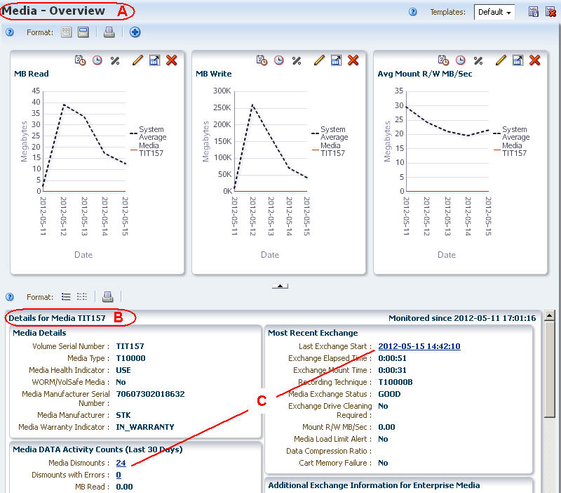
Description of the illustration ''if_linkresource2detail.jpg''
-
A – Screen title identifies the current screen.
-
B – Detail View header identifies the media record displayed.
-
C – Additional resource ID links appear on the screen. You can click any of these links to continue navigation.
-
Use Aggregate Count Links to Navigate
This procedure is an example of how to use aggregate count links to drill down to additional detail about a group of drives included in an aggregate count.
-
In the Navigation Bar, click the Drives tab and then the Analysis link to display the Drives – Analysis screen.
The screen includes a pivot table. In this example, the aggregate count "3" in the highlighted cell represents three StorageTek drives in library "1", within complex "A-SL8500", that all have a health indicator of "MONITOR".
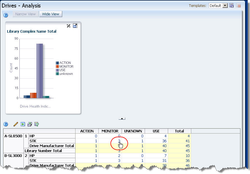
Description of the illustration ''if_linkaggclick.jpg''
-
Click the highlighted link.
You are taken to the Drives – Overview screen, which displays additional detail for the three drives.
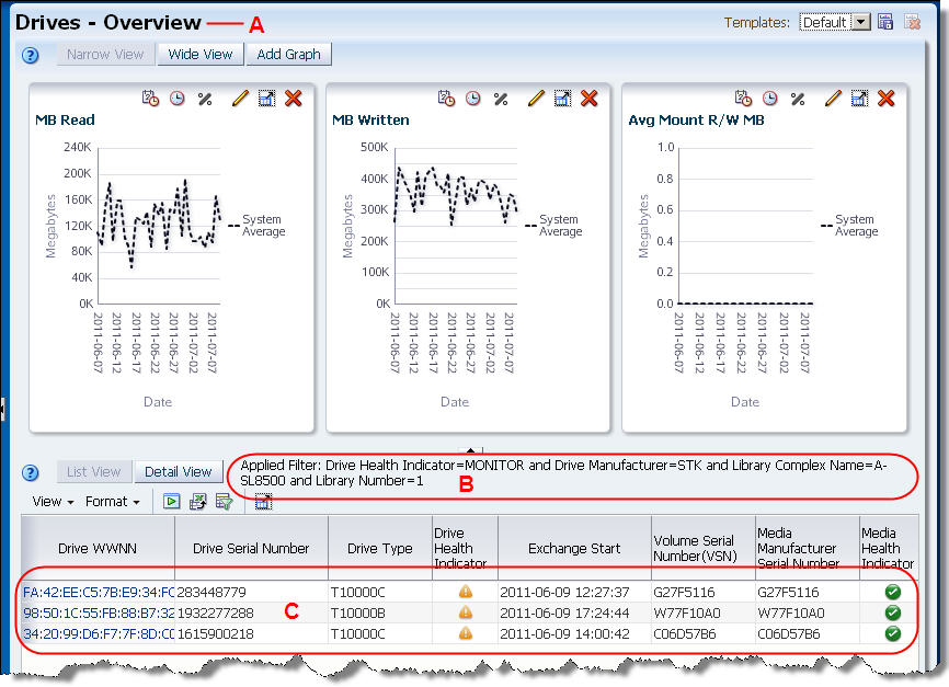
Description of the illustration ''if_linkaggdetail.jpg''
-
A – Screen title identifies the current screen.
-
B – Table filter description is updated to reflect the filter criteria represented by the aggregate count on the Drives – Analysis screen. See the STA User's Guide for details on the table filter description.
-
C – The three drives included in the aggregate count are shown in the data table.
-
-
Click any of the text links in the Drive WWNN column to display complete details for an individual drive. At this point, see "Use Links to Navigate" for sample instructions.