Creating a Chart Using the Chart Class
This section demonstrates how to create a simple chart based on the Chart class. This chart is meant to be used to demonstrate basic principles of creating charts and give an opportunity to experiment with different chart types. It is not typical of how a chart is used in PeopleSoft applications.
The first six steps also apply to creating charts using the Gantt class, the OrgChart class, and the RatingBoxChart class.
The steps to create a chart are:
-
Place a chart control on a page.
-
Associate the chart control with a record field.
-
Create the chart data record.
-
Add PeopleCode to instantiate a chart object.
-
Set the data source.
-
View the page in the browser.
-
Add data for the chart.
-
Specify the series data.
-
Specify chart colors.
-
Add text elements.
-
Review the complete program.
Placing a Chart Control on a Page
In Application Designer, create a new page.
Select Insert, Chart and draw a rectangle to represent the area the chart will occupy. The chart can be any size, and you can have more than one chart on a page.
Place the page on a component and register the component.
Associating the Chart Control with a Record Field
Each chart on a component must be associated with a unique field. Double-click the chart control to access the Chart Properties dialog box and enter a record name and field name.
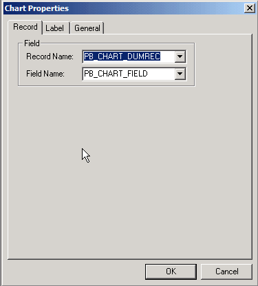
The chart field has no special requirements. Its only purpose is to provide a reference to the field in PeopleCode.
This sample chart uses a derived/work record named DOC_CHRT_WRK that is dedicated to this purpose.
Creating the Chart Data Record
The chart needs either a record or a rowset to serve as the data source. This sample chart uses a record. See the Chart class SetData method for details about using a rowset.
See SetData method: Chart class.
At a minimum, the record must have fields for the x-axis data and the y-axis data. Optionally, the record can have fields for series data, chart color, and glyph size.
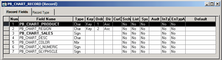
The record must be available in the component buffer at runtime. You can use a database record that is already part of your application or you can use a derived/work record or a component rowset that you populate at runtime. For greatest control, you will normally populate your record or rowset at runtime.
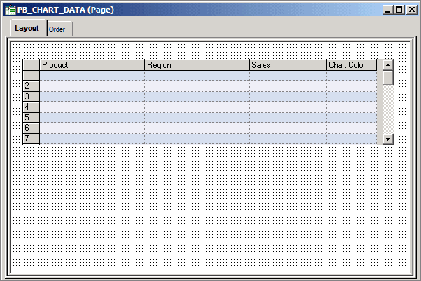
For the sample chart, place the record on a grid on a second page on the sample component. This placement gives you the opportunity to experiment with the data.
Your chart data record must be placed at level 1 on the same component as the chart so that the data is available in the component buffer at runtime. In your application, you can hide the grids or scroll areas that hold the records. For the sample chart, you will keep the grid visible so you can enter sample data.
Adding PeopleCode to Instantiate a Chart Object
This example instantiates a chart object using the Chart class, so it can be used to create bar charts, line charts, pie charts, and so on. Other examples in this section demonstrate how to create charts based on the Gantt class, OrgChart class, and RatingBoxChart class.
See Creating a Gantt ChartCreating a Gantt Chart, Creating a Rating Box Chart.
Add this PeopleCode to the Activate event on the page:
/* Declare and instantiate a chart object */
Component Chart &cChart;

&cChart = GetChart(DOC_CHRT_WRK.DOC_CHRT_FLD);
Chart PeopleCode is commonly placed on the Activate event, but it can be placed on any appropriate event. You could, for instance, execute the chart PeopleCode from a FieldChange event associated with a push button.
Setting the Data Source
The SetData method takes either a record or a rowset as an argument. In general, specify a record or component rowset when building a chart from page data and a standalone rowset when building a chart using an iScript.
In this example, the PeopleCode sets Product as the series data and sets Region to the x-axis, so that in a bar chart products will be grouped along the x-axis by region. In a line chart, each series is represented by a line. Sales figures are charted on the y-axis.
Note:
SetData, SetDataXAxis, and SetDataYAxis are Chart class methods. The other charting classes provide equivalent methods to specify data sources.
/* Set the chart data record and specify x-axis, y-axis, and series data */

&cChart.SetData(Record.DOC_CHRT_SLSREC);
&cChart.SetDataXAxis(DOC_CHRT_SLSREC.DOC_CHRT_RGN);
&cChart.SetDataYAxis(DOC_CHRT_SLSREC.DOC_CHRT_SALES);
See SetData method: Chart class, SetDataSeries method: Chart class, SetDataXAxis method: Chart class, SetDataYAxis method: Chart class, Creating a Chart Using an iScript.
Viewing the Page in the Browser
This is the most basic Chart class chart. It has no data and only the default y-axis.
Adding Data for the Chart
Add the following data to the chart:
| Region | Sales |
|---|---|
|
Arizona |
60 |
|
California |
55 |
|
Oregon |
50 |
|
Washington |
45 |
This bar chart is generated by the example code and data:
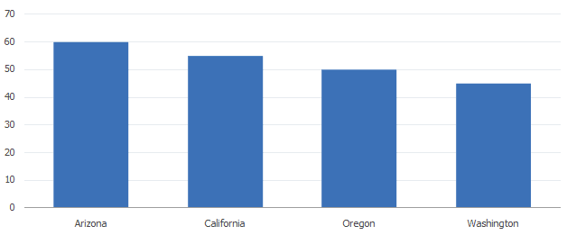
This chart graphs sales on the y-axis (the vertical axis) and regions on the x-axis (the horizontal axis).
When the data for the chart is grouped according to values, a set of data representing a single value is called a series. For instance, if a chart shows sales for different products in each region, then the set of data for each product is a series.
At this point, the chart has only one series, so you do not need to set the series record field.
Specify the Series Data
If you want to graph more than one product on your chart, you need to specify the source of the series data.
For example, add the products shown in this table to your data:
| Product | Region | Sales |
|---|---|---|
|
Footballs |
Arizona |
60 |
|
Rackets |
Arizona |
50 |
|
Shoes |
Arizona |
42 |
|
Tents |
Arizona |
35 |
|
Footballs |
California |
55 |
|
Rackets |
California |
46 |
|
Shoes |
California |
30 |
|
Tents |
California |
35 |
|
Footballs |
Oregon |
50 |
|
Rackets |
Oregon |
40 |
|
Shoes |
Oregon |
30 |
|
Tents |
Oregon |
25 |
|
Footballs |
Washington |
45 |
|
Rackets |
Washington |
30 |
|
Shoes |
Washington |
20 |
|
Tents |
Washington |
15 |
Add this PeopleCode to set the series record field:
&cChart.SetDataSeries(DOC_CHRT_SLSREC.DOC_CHRT_PRDCT);The resulting chart is a default 2D bar chart with bars for each region grouped by series:
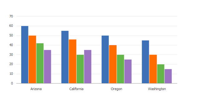
The chart has four series:
-
Footballs
-
Rackets
-
Shoes
-
Tents
Each series shows four regions along the x-axis:
-
Arizona
-
California
-
Oregon
-
Washington
Sales values appear against the y-axis as bar height.
The chart uses the default colors.
Specifying Chart Colors
If you do not want to use the default colors, you need a column containing the colors for each bar. Typically, the bars in a series are colored alike.
| Product | Region | Sales | Chart Color |
|---|---|---|---|
|
Footballs |
Arizona |
60 |
1 |
|
Footballs |
California |
55 |
1 |
|
Footballs |
Oregon |
50 |
1 |
|
Footballs |
Washington |
45 |
1 |
|
Rackets |
Arizona |
50 |
13 |
|
Rackets |
Oregon |
46 |
13 |
|
Rackets |
Washington |
40 |
13 |
|
Rackets |
California |
30 |
13 |
|
Shoes |
Arizona |
42 |
5 |
|
Shoes |
California |
30 |
5 |
|
Shoes |
Oregon |
30 |
5 |
|
Shoes |
Washington |
20 |
5 |
|
Tents |
Arizona |
35 |
15 |
|
Tents |
California |
35 |
15 |
|
Tents |
Oregon |
25 |
15 |
|
Tents |
Washington |
15 |
15 |
Add the following PeopleCode to your program to set the colors for your chart:
/* Associate color field with chart */
&cChart.SetDataColor(DOC_CHRT_SLSREC.DOC_CHRT_COLOR);
Adding Text Elements
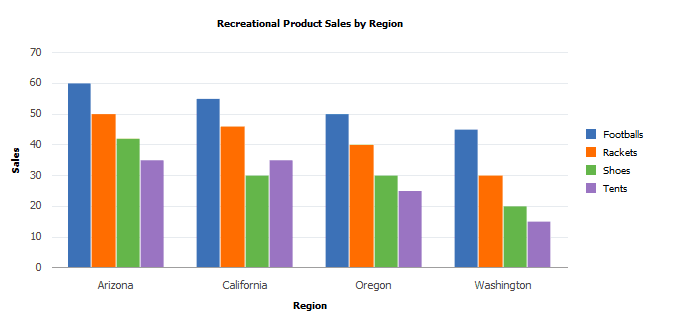
The following PeopleCode adds these elements to your chart:
-
Title
-
Legend
-
Y-axis title
-
X-axis title
/* Set title and legend properties */
&cChart.MainTitle = "Recreational Product Sales by Region";
&cChart.HasLegend = True;
&cChart.LegendPosition = %ChartLegend_Right;

/* Set axis text properties */
&cChart.XAxisTitle = "Region";
&cChart.YAxisTitle = "Sales";
This is the resulting chart:
Reviewing the Complete Program
The PeopleCode for this bar chart has been presented in snippets. Here is the complete program that produced the chart:
/* Declare and instantiate a chart object */
Component Chart &cChart;

&cChart = GetChart(DOC_CHRT_WRK.DOC_CHRT_FLD);

/* Set the chart data record and specify x-axis, y-axis, and series
data */

&cChart.SetData(Record.DOC_CHRT_SLSREC);
&cChart.SetDataXAxis(DOC_CHRT_SLSREC.DOC_CHRT_RGN);
&cChart.SetDataYAxis(DOC_CHRT_SLSREC.DOC_CHRT_SALES);
&cChart.SetDataSeries(DOC_CHRT_SLSREC.DOC_CHRT_PRDCT);

/* Associate color field with chart */
&cChart.SetDataColor(DOC_CHRT_SLSREC.DOC_CHRT_COLOR);

/* Set title and legend properties */
&cChart.MainTitle = "Recreational Product Sales by Region";
&cChart.HasLegend = True;
&cChart.LegendPosition = %ChartLegend_Right;

/* Set axis text properties */
&cChart.XAxisTitle = "Region";
&cChart.YAxisTitle = "Sales";
Other Modifications
The remainder of this section shows the effects of modifying other aspects of your chart.
Changing X-Axis and Series Values
&cChart2.SetDataXAxis(DOC_CHRT_SLSREC.DOC_CHRT_PRDCT);
&cChart2.SetDataSeries(DOC_CHRT_SLSREC.DOC_CHRT_RGN);

&cChart2.MainTitle = "Recreational Product Sales by Product";
&cChart2.XAxisTitle = "Product";
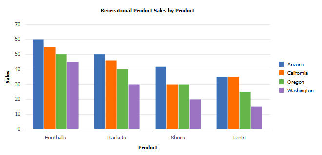
To group sales by product instead of by region, switch the series and the x-axis. You will also need to reorder colors to correspond to regions instead of products:
Axis Properties
If your chart has negative values, the bars automatically extend below the x-axis:
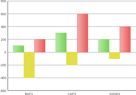
If you want to remove the tick marks from the x- or y-axis, you need to specify an empty array for the SetXAxisLabels or SetYAxisLabels methods.
The following example removes the tick marks from the y-axis:
Local array of string &Arr;

&Arr = CreateArray("");
&Chart.SetYAxisLabels(&Arr);
If you set the x-axis labels to an empty array to remove the ticks, you must be plotting a single series on the chart because labels are automatically generated for each series if you do not provide them.
See SetXAxisLabels method: Chart class, SetYAxisLabels method: Chart class.
You can also use the XAxisMin, XAxisMax, YAxisMin, YAxisMax, and other axis properties to control the appearance of the axes.
See XAxisLabelOrient property: Chart class, YAxisLabelOrient property: Chart class, YAxisMax property: Chart class, YAxisMin property: Chart class
Chart Class Chart Types
Use the Type property to set the chart type.
2D Bar Chart
&cChart.Type=%ChartType_2DBar;The default Chart class chart type is a 2D bar chart:
The following examples show the various chart types using the same data. Each example gives the PeopleCode snippet that creates that chart type.
For a complete list of all Chart class chart types, see Chart class Type property.
See Type property: Chart class.
The Charting Examples section provides other examples of PeopleCode for charts using Gantt class, OrgChart class, and RatingBoxChart class at the end of the chapter.
See Creating a Gantt ChartCreating a Gantt Chart, Creating a Rating Box Chart.
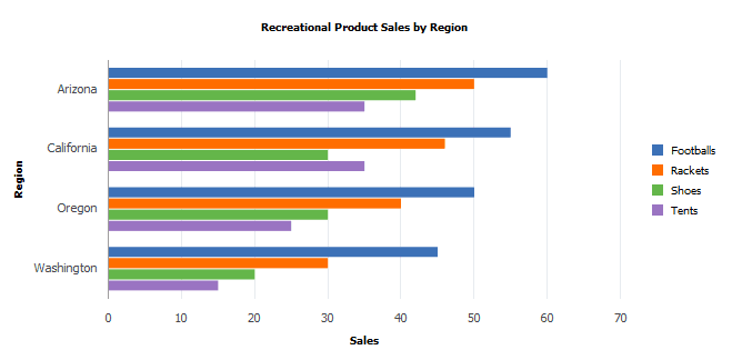
Horizontal Bar Chart
Use this line of code to specify a horizontal bar chart:
&cChart.Type = %ChartType_2DHorizBar;This example illustrates a horizontal bar chart:
Stacked Bar Chart
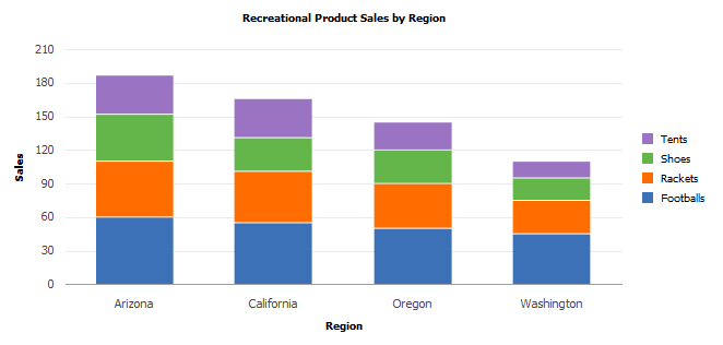
With a the stacked bar chart, you can place a different emphasis on the same data. The stacked column shows total sales per region as well as the product segments that contribute to the total.
Use this line of code to specify a stacked bar chart:
&cChart.Type = %ChartType_2DStackedBar;This example illustrates a stacked bar chart:
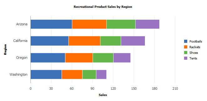
Horizontal Stacked Bar Chart
Use this line of code to specify a horizontal stacked bar chart:
&cChart.Type = %ChartType_2DHorizStackedBar;This example illustrates a horizontal stacked bar chart:
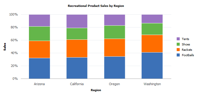
Percent Bar Chart
A percent bar is similar to a stacked bar, but the segments of each bar add up to 100. The segments show the proportional contribution of each product to total sales.
Note:
Negative values cannot be displayed in any type of percent bar chart.
Use this line of code to specify a stacked percent bar chart:
&cChart.Type = %ChartType_2DPercentBar;This example illustrates a percent bar chart:
Horizontal Percent Bar Chart
Note:
Negative values cannot be displayed in any type of percent bar chart.
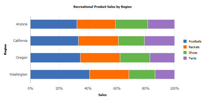
Use this line of code to specify a horizontal percent bar chart:
&cChart.Type = %ChartType_2DHorizPercentBar;This example illustrates the fields and controls on a horizontal percent bar chart:
Line Chart
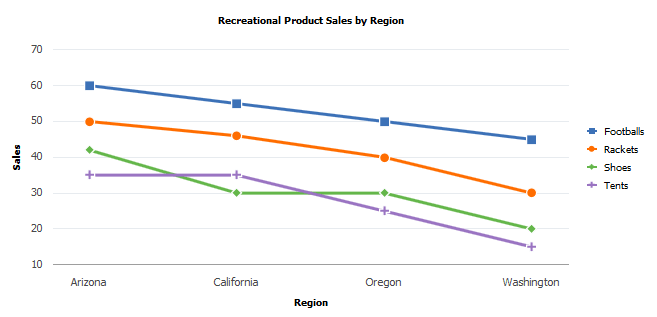
A line chart is useful for showing changes and trends over time or across categories.
Use this line of code to specify a line chart:
&cChart.Type = %ChartType_2DLine;This example illustrates a line chart:
Overlay Chart
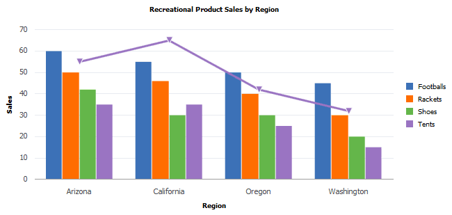
You can overlay one chart on top of another to compare two different but related sets of data. The following chart uses a second set of data, showing average temperature for each region.
Use the OLType property to specify whether the overlay is a line chart or a histogram.
Add this PeopleCode to the PeopleCode for your bar chart to create 2D line chart overlay:
/* Create Overlay */
&cChart3.SetOLData(Record.DOC_CHRT_OLREC);
rem &cChart.SetOLDataSeries(DOC_CHRT_OLREC.SC_CHART_SERIES);
&cChart3.SetOLDataXAxis(DOC_CHRT_OLREC.DOC_CHRT_RGN);
&cChart3.SetOLDataYAxis(DOC_CHRT_OLREC.DOC_CHRT_SALES);
&cChart3.OLType = %ChartType_2DLine;
This example illustrates a 2D line chart overlay on a vertical bar chart:
Scatter Chart
Use this line of code to specify a scatter chart:
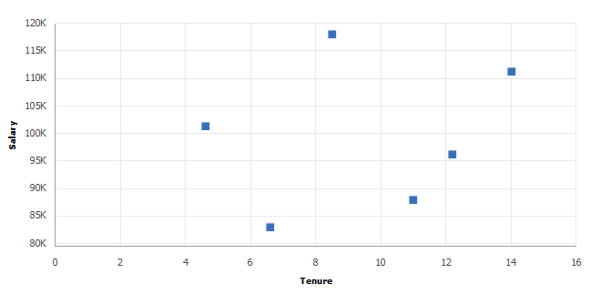
&cChart.Type = %ChartType_2DScatter;A scatter chart compares number pairs. Each pair is plotted against the horizontal x-axis and the vertical y-axis. The data values are scattered across the chart. XY scatter charts are good for showing comparisons of numbers, such as scientific or statistical data, where several measurements need to be plotted on a single chart.
A scatter chart is a true XY chart, meaning that the x-axis is numeric. The IsTrueXY property is automatically set to True.
For example, this sample data could be used to make an XY scatter chart:
| Tenure | Salary |
|---|---|
|
11 |
88000 |
|
12.2 |
96200 |
|
4.6 |
101300 |
|
6.6 |
83000 |
|
14 |
111200 |
|
8.5 |
118000 |
You use this code snippet to make a scatter chart:
&cChart5.Type = %ChartType_2DScatter;
&cChart5.SetData(Record.DOC_CHRT_XYDATA);
&cChart5.SetDataXAxis(DOC_CHRT_XYDATA.DOC_CHRT_X);
&cChart5.SetDataYAxis(DOC_CHRT_XYDATA.DOC_CHRT_Y);
This example illustrates the scatter chart for the preceding data:
Note:
If you have only one point of data, that is, only one x and y pair, use a scatter chart. You may have unexpected results if you use a line chart with only one point.
Bubble Chart
A bubble chart is a special type of scatter chart.
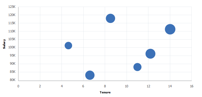
If you add a third data set, the z-axis, to a scatter chart, you can create a bubble chart, which uses the size of the markers to represent a third dimension of numeric data.
You can also set annotations for scatter charts and bubble charts.
This chart example uses Age to determine the size of the bubble markers on the chart and Name to set the annotations:
| Tenure | Salary | Age | Name |
|---|---|---|---|
|
11 |
88000 |
39 |
Joyce |
|
12.2 |
96200 |
55 |
Tolstoy |
|
4.6 |
101300 |
32 |
Shelley |
|
6.6 |
83000 |
48 |
Tolkien |
|
14 |
111200 |
59 |
Dickens |
|
8.5 |
118000 |
49 |
Hemingway |
&cChart6.Type = %ChartType_2DBubble;
&cChart6.SetData(Record.DOC_CHRT_XYDATA);
&cChart6.SetDataXAxis(DOC_CHRT_XYDATA.DOC_CHRT_X);
&cChart6.SetDataYAxis(DOC_CHRT_XYDATA.DOC_CHRT_Y);
&cChart6.SetDataZAxis(DOC_CHRT_XYDATA.DOC_CHRT_AGE);
&cChart6.SetDataAnnotations(DOC_CHRT_XYDATA.DOC_CHRT_LASTNAME);
This example illustrates the bubble chart for the preceding data:
Pie Chart
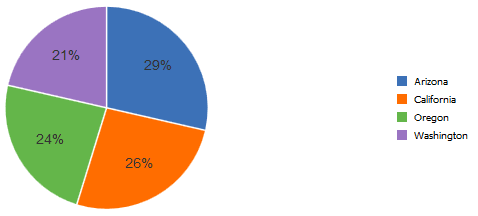
A pie chart shows comparisons within a single set of values, and it shows how parts contribute to a whole. It is an ideal chart type to display the contribution of each region to an annual sales total.
A pie chart ignores the series and only plots x-axis data against y-axis values. Our original bar chart has four regions times four products, resulting in 16 XY pairs. A pie chart with all of those slices would be confusing and not helpful. Instead, suppose you want to show just the data for tents, which are in rows 13–16. You can use a combination of the DataWidth and DataStartRow properties to select which rows to display.
You can make a pie chart showing only rows 13–16 by adding this snippet of code:
&cChart.DataWidth = 4;
&cChart.DataStartRow = 13;
&cChart.Type = %ChartType_2DPie;
This example illustrates a 2D pie chart generated from a portion of the rowset:
Exploded Pie Chart
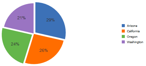
Use the SetExplodedSectorsArray Chart class method to specify the sectors to explode. Sectors correspond to rows of data used by the pie chart. Sector 1 is the first row of data, or the row specified with the DataStartRow chart class property, if it is used, and so on.
The following snippet of code explodes sectors 1 and 3:
Local array of number &ExplodedArray;
&ExplodedArray = CreateArray(1,3);
&cChart.SetExplodedSectorsArray(&ExplodedArray);
This example illustrates an exploded pie chart:
See the SetExplodedSectorsArray method: Chart class property.
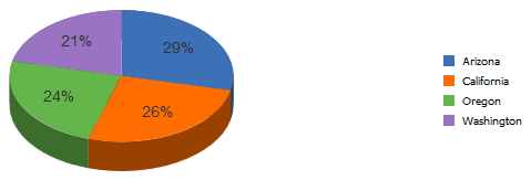
3D Pie Chart
Use this line of code to specify a 3D pie chart:
&cChart.Type = %ChartType_3DPie;This example illustrates a 3D pie chart.
Adding Drilldown
If you set the property IsDrillable to True and add FieldChange PeopleCode to your chart, your user can get more information by clicking a chart data element—a bar, line segment, data point, or pie slice.
For a simple example, add this PeopleCode to the FieldChange event on the y-axis field:
MessageBox(0, "", 0, 0, "Sales for " | DOC_CHRT_SLSREC.DOC_CHRT_PRDCT | " in " | DOC_CHRT_SLSREC.DOC_CHRT_RGN | " = " | DOC_CHRT_SLSREC.DOC_CHRT_SALES | "");And add this code to the page Activate event for your pie chart:
&cChart.IsDrillable = True;When the user clicks the Arizona slice of the pie chart, this message appears:
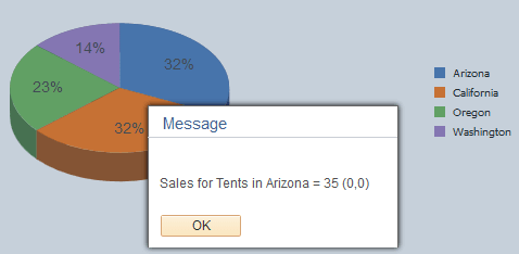
Current context provides the values for fields in the current row in the component buffer. You can use drilldown with your chart data fields along with any other data in the component buffer to accomplish anything FieldChange PeopleCode is capable of.
If the bars on a bar chart are too narrow, a user may not be able to click them. Sometimes, a few bars on a chart are affected, sometimes all of the bars cannot be clicked. The workaround is to put fewer bars on your chart or to make your chart bigger so that each bar is wider.
Using the Other Charting Classes
In addition to the all the charts you can create with the Chart class, you can create specialized charts using the Gantt class, the OrgChart class, and the RatingBoxChart class.
You follow the same initial steps to create these specialized charts as you do for the Chart class chart types. The PeopleCode programs to set the data and properties are similar as well, but Gantt charts, organization charts, and rating box charts use data differently and interact with the user in different ways than do the Chart class charts.
See Creating a Gantt ChartCreating a Gantt Chart, Creating a Rating Box Chart.