Settings for Graph Visualization
The Settings modal lets you specify options that control how graph data is displayed when it is visualized.
You can invoke the settings modal by clicking the settings icon as shown highlighted in the following figure:
The Settings modal contains the following tabs that group the options according to their scope:
General
The General tab contains the general settings that affect the entire visualization, including search-related options. This tab comprises the following sections:
Customization
These are visualization settings that affect the visual aspects of the display.
Customization settings include the following options:
| Option | Description |
|---|---|
| Height | Height of the visualization. Setting the value to 0 will take the default height. |
| Theme | Toggles the visualization between light and dark theme (useful for presentations). |
| Similar Edges | Similar edges can be collected when this button is checked. Toggled edges give no overview of specific edges but a generalized tooltip. |
| Edge Marker | Determines if the outgoing edges have an arrow to show the flow direction. |
| Display Graph Legend | The graph legend will be displayed when this toggle is enabled. |
Caption
The Caption section is displayed as shown:
Caption settings include the following options:
| Option | Description |
|---|---|
| Vertex Caption Orientation | Determines where the selected property will be displayed. Options are: Bottom, Center, Top, Right, Left. |
| Vertex Captions | A configurable list of captions based on vertex labels and their associated properties. You can add or remove captions, and the selected properties will be displayed on the corresponding vertices in the graph. |
| Edge Captions | A configurable list of captions based on edge labels and their associated properties. You can add or remove captions, and the selected properties will be displayed on the corresponding edges in the graph. |
| Maximum Visible Caption Length | Maximal char length of a truncated
caption.
|
| Truncate Captions | If enabled, captions will be truncated at a specific length as specified in the previous option. |
| Show Caption on Hover | If enabled, full captions will appear as a tooltip when hovering over a vertex. |
Format Numeric Values
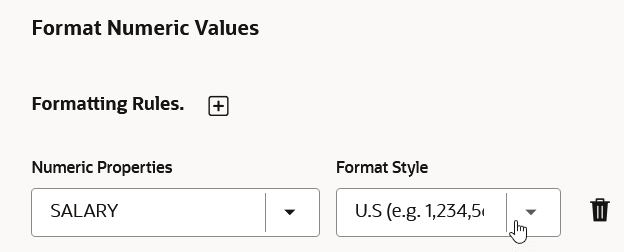
You can customize the display of numeric properties in a graph by applying various formatting styles for better readability. This section is displayed only if the graph contains numeric properties.
As seen in the preceding figure, you can add or delete a format style for a numeric property.
To add a formatting rule for a numeric property, click the + icon and configure the following options:
- Numeric Properties: Determines the numeric property to be
formatted.
Note that only unformatted numeric properties are listed in this drop-down.
- Format Style: Determines the display style for the selected numeric property.
Layouts
Graph Studio supports different graph layouts. Each layout has its own algorithm, which computes the positions of the vertices and affects the visual structure of the graph.
The following graph layout options are supported:
| Option | Description |
|---|---|
| Random Layout | Positions the vertices in random positions within the viewport. |
| Grid Layout | Positions the vertices in a well-spaced grid. It
supports the following configurable property:
|
| Circle Layout | Positions vertices in a circle. It supports the
following configurable property:
|
| Concentric Layout | Positions vertices in concentric circles. It
supports the following configurable property:
|
| Force Layout | Attempts to create an aesthetically-pleasing graph
based on the structure of the graph, with the goal of positioning
the vertices in the viewport so that all the edges are of
approximately equal length and there are as few crossing edges as
possible. It has the following configurable properties:
|
| Hierarchical Layout | Organizes the graph using a DAG (Directed Acyclic
Graph) system. It is especially suitable for DAGs and trees. It
supports the following configurable properties:
|
| Radial Layout | Displays the dependency chain of a graph by using
an outwards expanding tree structure. It can be especially useful if
the graph data has a hierarchical structure and contains many
children for each parent vertex. It has the following configurable
properties:
|
| Geographical Layout | Enables you to overlay the graph on a map, given
that latitude and longitude coordinates exist as graph properties on
the graph's vertices. It has the following configurable
properties:
Also, note the following when visualizing a graph on a map:
|
Slider
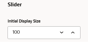
You can configure the Initial Display Size parameter to customize the total number of graph elements to be shown in the graph visualization.
See Also: Manage the Graph Display Size
Live Search
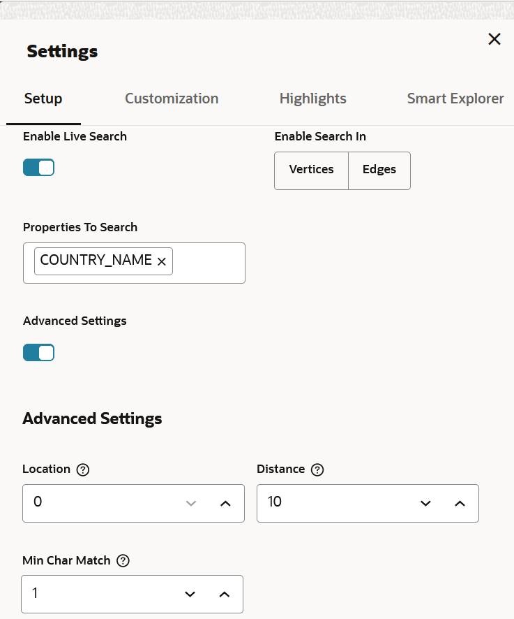
The Live Search section appears as shown:
You can enable Live Search to search the displayed graph. Live fuzzy search score is added to each item and you can create a Style which visually shows the results of the search in the graph immediately. See Use Live Search in Graph Visualization for more information.
Graph Exploration
The Graph Exploration tab appears as shown in the following figure:
The Graph Exploration tab comprises the following sections:
Graph exploration
- Number of Hops: You can specify the number of hops for graph manipulation.
Visible graph sharing
- Enable Visible Graph Mode: You can enable or
disable the visible graph mode.
See Enable Visible Graph Mode for more information.
Network Evolution
- Enable Network Evolution: Enables you to visualize the evolution of a graph over time.
See Visualize a Dynamic Graph for more information.
Styles
The Styles tab allows you to customize the appearance of vertices and edges based on search criteria. It allows you to modify collectively styling such as color, size, or icons for vertices or edges that match the search criteria.
- View the list of existing styles for vertices and edges.
- Filter the list of styles based on an input string or applicable tags.
- Drag and reorder the items on the list.
- Create custom vertex or edge styles.
- Edit an existing style.
- Enable or disable a style.
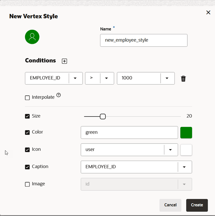
The following describes the properties and operations when creating a new style:
- Name: Name of the style. This adds a text in
the graph legend for elements where this style applies. This field is mandatory
for styles creation. Style value can be either constant or interpolation based
on some property value. Interpolation settings include:
- The property of the element
- The minimum or maximum value (If not specified, the minimum or maximum property value from all matched elements will be used, and the highlight will be applied proportionally between the selected minimum and maximum values of the specified property.)
- Conditions The search condition lets you
define how vertices or edges that are influenced by a style are filtered. To
configure a search criteria, you must specify the element type to search for
(vertex or edge), search conditions, condition operator (match all or
any). Each condition includes the property of the given element, the
operator you want to apply (
=,<,<=,>,>=,!=,~,*), the property value that needs to be fulfilled for the operator. It uses numeric comparison if the property value is convertible to number and lexicographic comparison otherwise. - The following options apply to highlight the vertices or edges that
match the search criteria:
- Size: Sets the size of the vertex or edge to the specific value. If interpolation is selected, the slider will have two ends and the size of the vertex or edge is interpolated based on the result of the search criteria.
- Color: Sets the color of the vertex or edge. If interpolation is selected, the combobox will allow to add multiple colors. All vertices or edges are interpolated between these colors based on the result of the search criteria.
- Icon: Sets an icon to the vertex (not applicable to edges). If interpolation is selected, multiple icons can be selected.
- Caption: Sets the caption to the vertex or edge.
- Image: Sets an image to the vertex
based on an
hrefproperty (not applicable to edges). - Animations: Allows to set certain
animation
cssclasses to vertices and edges (such as flashing, dotted-line, animated dotted-line, pulsating) and duration of an animation cycle.
Smart Explorer
The Smart Explorer tab supports the following actions:
- Smart Expands: Allows you to expand vertices based on the specified conditions for properties of navigation and destination vertices or edges. See Expand Vertices Using Smart Expand for more information.
- Smart Groups: Allows you to group vertices based on specified conditions. See Group Vertices Using Smart Group for more information.


