Fatigue Analysis Dashboard
Important: Effective June 12, 2025, Oracle Eloqua's Advanced Intelligence (AI) features are available for all customers. To enable Eloqua's classic and Generative AI (Gen AI) functionality, open a service request with Oracle Support. Please review our product notice for more information.
The Fatigue Analysis dashboard gives you an overview of the state of fatigue and engagement in your Oracle Eloqua instance. With this dashboard, you can view fatigue analysis data from the last 180 days, such as contact fatigue levels across all contacts and email send volume by fatigue group.
In this topic, learn about the different sections of the Fatigue Analysis dashboard:
To navigate to the Fatigue Analysis Dashboard:
- Navigate to Analytics
 , then click Dashboards.
 - Click the Fatigue Analysis tile.
Fatigue alerts
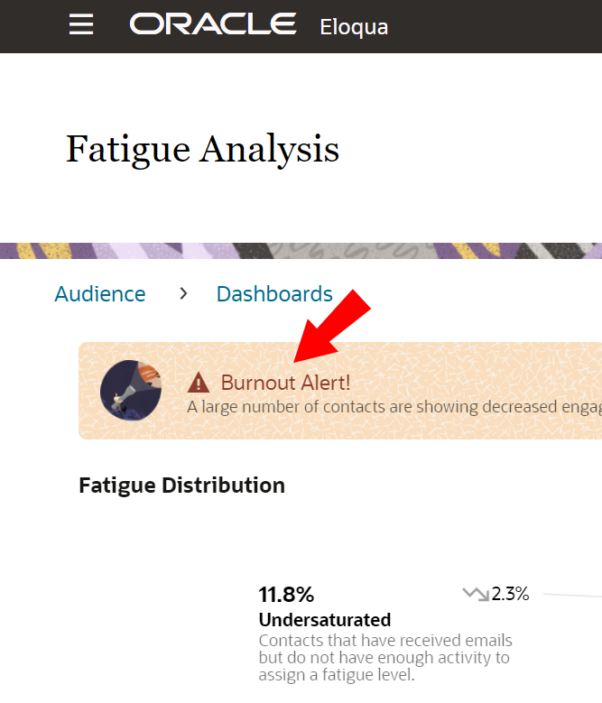
Different messages will display at the top of your dashboard based on the fatigue level breakdown of your Eloqua instance:
Note: The percentages in the fatigue alerts offer high level guidance, but the breakdown of your contacts into fatigue levels may vary instance by instance, based on how the instance is used and the number of total contacts. To get the best view of your instance, practice good data hygiene, including managing unsubscribed and invalid contacts.
- Burnout Alert!
More than 50% of total contacts are Saturated or Oversaturated.
- More please!
More than 80% of contacts are Inactive.
- Good job!
Undersaturated and Just Right are 20% or higher of all contacts, and Saturated and Undersaturated are under 50%.
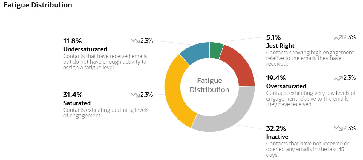
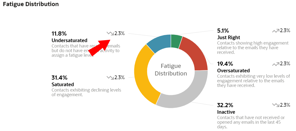
Fatigue distribution chart
Use this distribution chart to evaluate how all of your contacts are distributed across the five Fatigue Levels. For example, are a majority of your contacts in the Saturated and Oversaturated groups, and is your dashboard displaying a Burnout alert? In this case, consider sending either highly personalized or fewer emails. Do you have a high number of Inactive and Undersaturated contacts? Consider engaging this group with relevant content and campaigns.
This chart updates every week when the fatigue model refreshes. You can see the last refresh date in the upper right corner to clearly understand what data is shown.
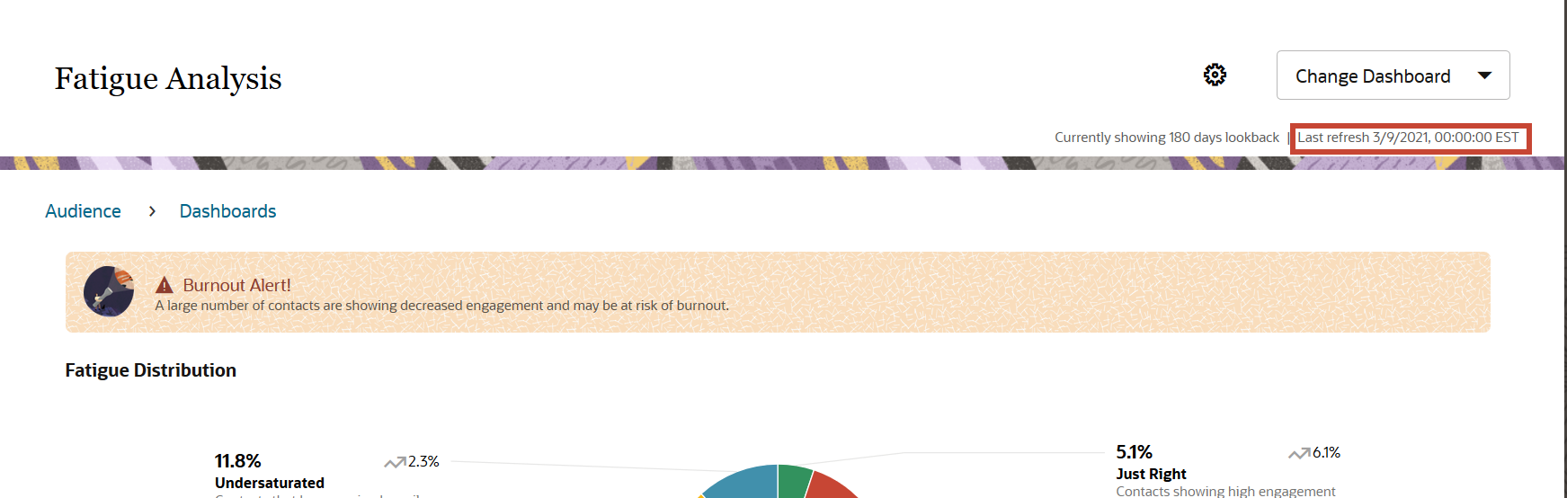
Each Fatigue Level displays a trending arrow icon and a percentage. The icon and percentage indicate how the percentage of contacts in a certain Fatigue Level has changed month over month, or every 2 training cycles.
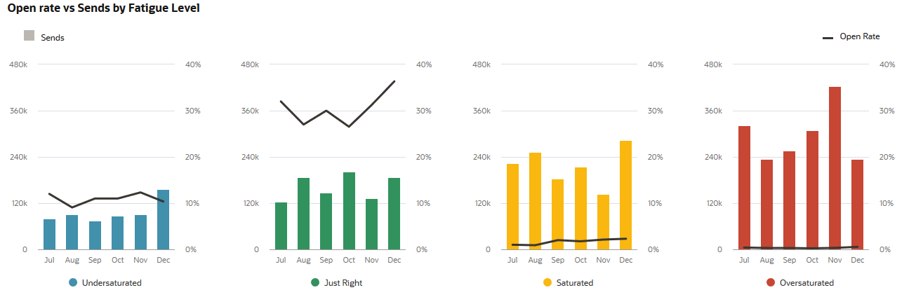
Send and open rate correlation chart
Note: This chart only begins collecting data once the Eloqua Advanced Intelligence Cloud Service is enabled for your account, and only displays data as it is collected. Therefore, the first bar in the bar chart and line in the line graph display one month and seven days after the chart is enabled.
This chart displays the relationship between the email sends and the total open rate for each Fatigue Level, allowing you to evaluate rates of engagement. Each Fatigue Level has a line graph (representing the Fatigue Level's relative total open rate for the past six months, excluding bounces) and a bar graph (representing the Fatigue Level's total sends for the past six months).
The chart represents data for the past six months. If you are viewing this chart in the month of January, then you will be able to view data for the months of July, August, September, October, November, and December. The chart is updated at the end of every month.
You can see the values that correspond to a graph on the sides of the graph. The open rate corresponds to the percentages on the right-hand side, and the sends correspond to the values on the left-hand side.
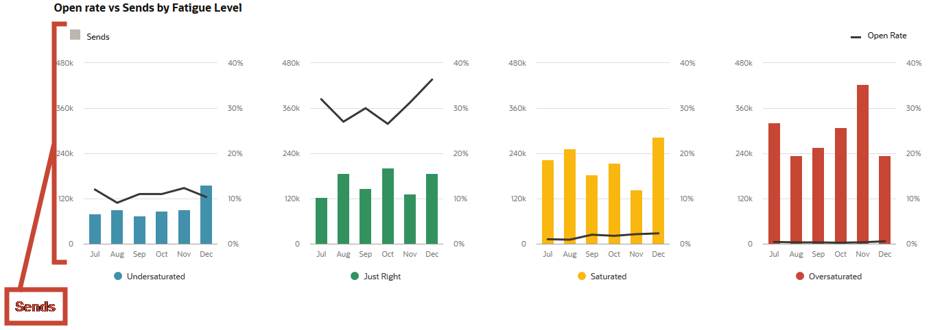
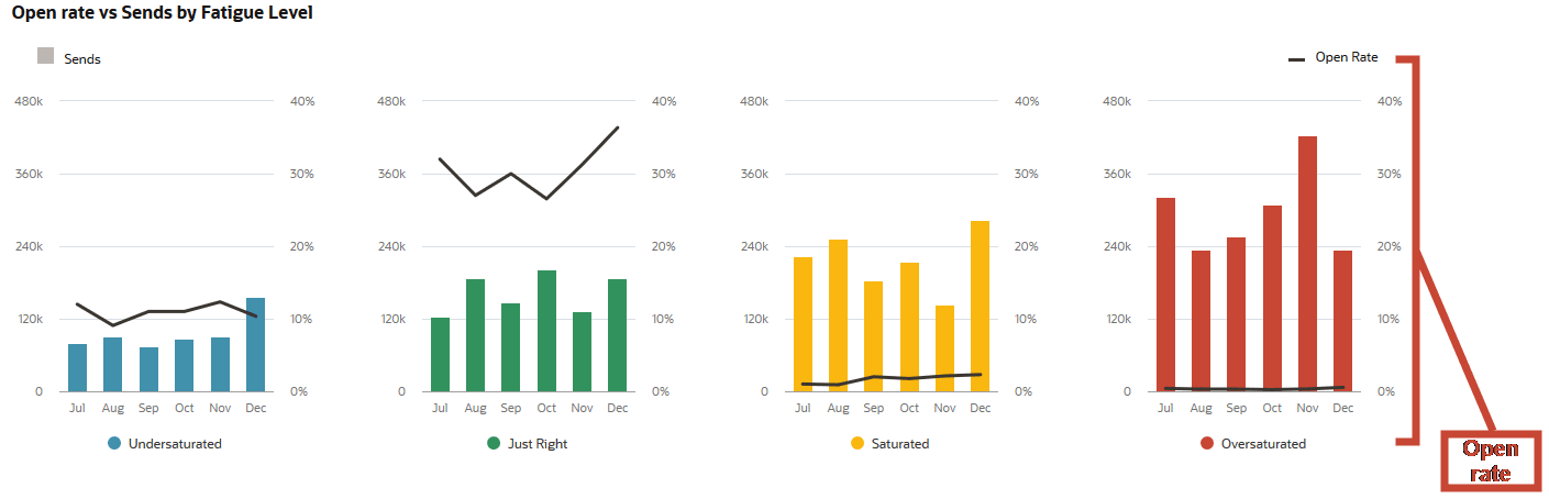
Use this chart to compare each Fatigue Level's relative open rate to its total number of sends, and to compare both metrics across Fatigue Levels. For instance, you can see the rate at which Saturated members open your emails, and compare it to the amount of emails they receive. And how do those numbers compare to the Just right Fatigue Level?
It's expected that Oversaturated and Saturated contacts have much lower open rates than Just Right and Undersaturated. As you try to reduce emails sent to Oversaturated contacts, you can check that progress in this chart.