Record Pages Monitor Charts
You can interact with performance data visualizations by showing or hiding data, and using quick links to drill down for more details.
To see the charts that appear when you click a record tile, see:
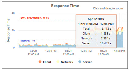
Response Time Chart
The Response Time chart shows median response time of record pages over time. Use it to see changes in request speed and its impact on users.
Each color shows time used by client, network, or server. The graph helps you see which component used most of the response time.
Throughput Chart
The Throughput chart shows the number of record instances and users over time. Use it to spot heavy usage and consider offloading traffic during peaks.

User Event and Workflow Chart
The User Event and Workflow chart shows how long user event scripts and workflows took to run. Use it to spot customization impact and bottlenecks.

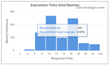
Execution Time Distribution Chart
TThe Execution Time Distribution chart is a histogram that groups record instances by response time. Use it to see if high response times were anomalies.