Viewing Key Performance Indicator Data
After you have added a Key Performance Indicators portlet to a dashboard and set up the KPIs on the Set Up Key Performance Indicators page, you can perform the following functions from within the portlet or on the dashboard.
View comparisons of data from different periods
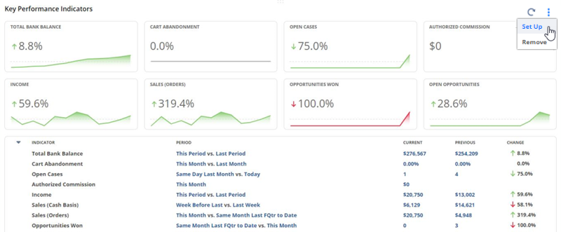
If you have defined time ranges for comparisons in the Set Up Key Performance Indicators page, you can view percentage changes for KPIs. An arrow shows the direction of each change-green for positive, red for negative. For instructions for setting up comparisons, see Setting Up KPI Comparisons.
View highlighted data
If you have defined goal amounts as thresholds for KPIs in the Set Up Key Performance Indicators page, you may notice that some KPIs appear in bold text with red flags because they have either exceeded or fallen short of goals. For more information, see Highlighting KPIs.
Drill down to underlying data
Each standard KPI's data is based on a snapshot of a NetSuite report. Each custom KPI's data is based on a saved search. The Key Performance Indicators portlet provides multiple links for each KPI that you can click to open its underlying report or saved search. You can find one of these links by moving your cursor over a KPI and clicking when you see a pointing hand and underlined text.
For KPIs based on financial and sales reports, totals are always rounded to the nearest whole number currency amount. You can drill down to the report to view the exact totals for that report.
View trend graphs
For any KPI with a time-based comparison, click its Trend Graph icon to open a popup trend graph. You can change the time period graphed by clicking options in the graph's popup window or change the graph's layout options in the Set Up Key Performance Indicators popup. For more information, see Trend Graphs.
Move the Key Performance Indicators portlet
You can drag the Key Performance Indicators portlet to move it to a different place on the dashboard.
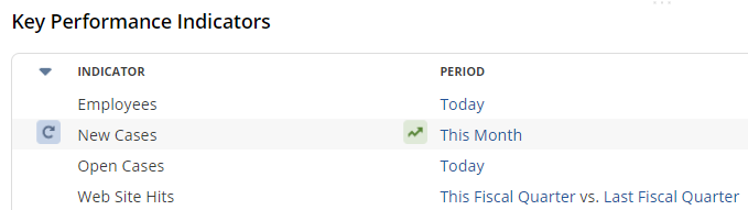
If you place the KPI portlet in a narrow column, the individual Refresh icons are not available due to the compact format of the narrow column. However, you can collapse and expand the list of KPIs as needed, and you can also see the KPIs displayed as headlines. Note that trend graphs are not displayed for KPI headlines. To view the popup trend graph, click the Trend Graph icon next to a KPI in the list of KPIs, if available. This option is enabled by default. For a fuller display with these options, move the portlet to the wide column.
Minimize the Key Performance Indicators portlet
You can minimize the Key Performance Indicators portlet so that its data is not loaded immediately when a page opens, avoiding a lot of waiting for slow-loading KPI data. To minimize the portlet, click its title bar. When the page is loaded, you can click the portlet's title bar again to display KPI data as needed.
Change KPI data setup
You can click Set Up in the portlet menu at any time to open the Set Up Key Performance Indicators popup and change the contents and layout of the portlet.