Tour the dashboard
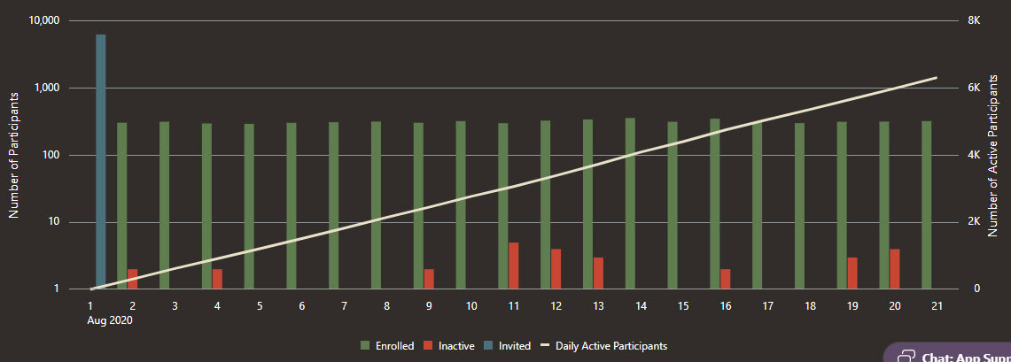
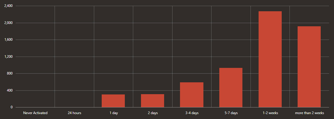
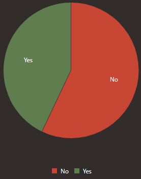
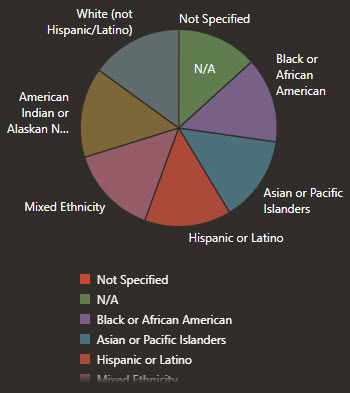
The dashboard provides several pages of robust visualizations, including time series charts, pie charts, and map charts, which help you understand participant engagement, locations, symptoms, and more.
You have several options for learning more about a chart:
- Click the triangle button that appears before the
chart's heading. Descriptions of each chart appear below the
heading.

- See Dashboard charts.
Main Dashboard
The Main Dashboard contains time series charts that help you understand participant engagement and symptoms.
All-Time Dashboard
The All-Time Dashboard contains metrics about your system since day 1.
Participant Breakdown
The Participant Breakdown charts provide an at-a-glance understanding of the populations that you're monitoring. Each pie chart corresponds to a filter on the left.
Map Dashboard
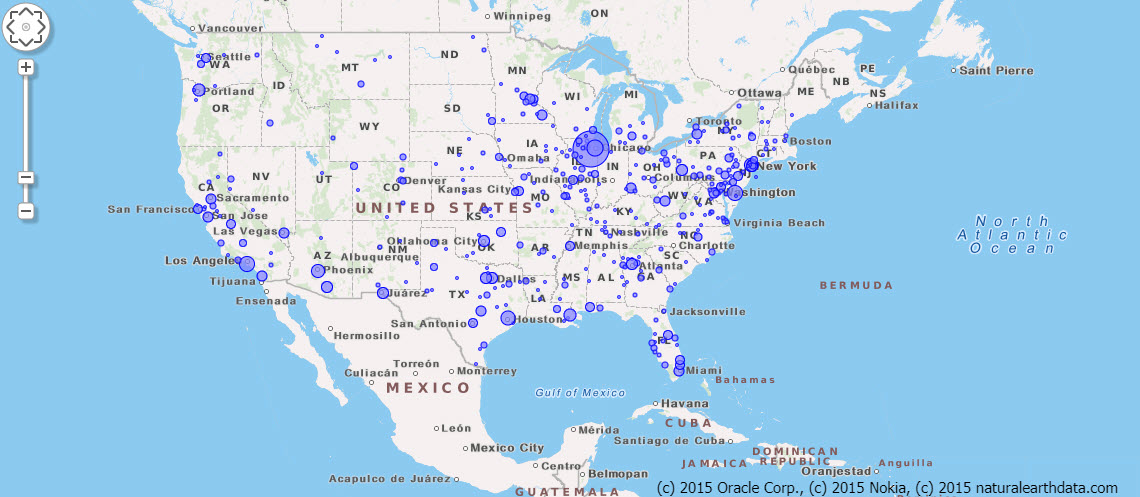
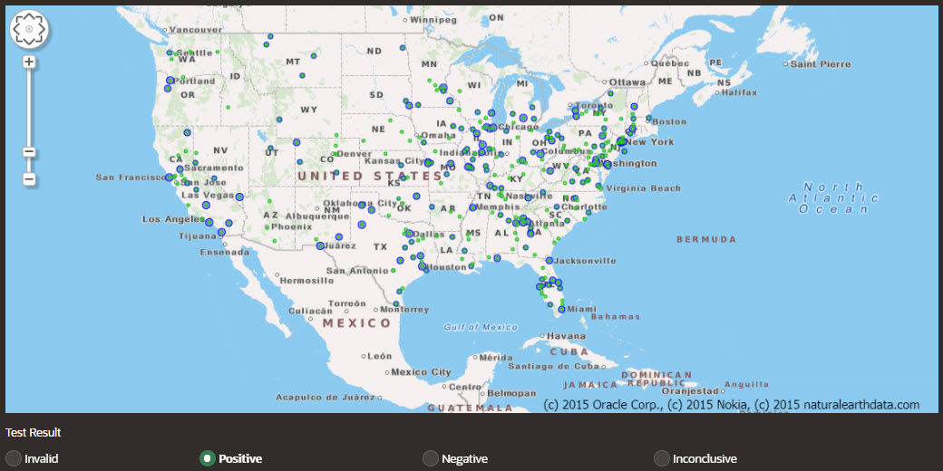
The Map Dashboard charts show you the locations of your participants as well as their test results and symptoms, all on map-based charts.
Testing Dashboard
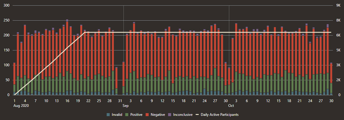
The Testing Dashboard charts contains time series charts that help you understand participant testing information, including volume of tests, test types, and test results.

Parent topic: Learn more