Foldout
This floor plan template is used to view a business object
Use Cases
This template is commonly used for large objects to show information categorized over various panels
Few examples of pages that use this template:
-
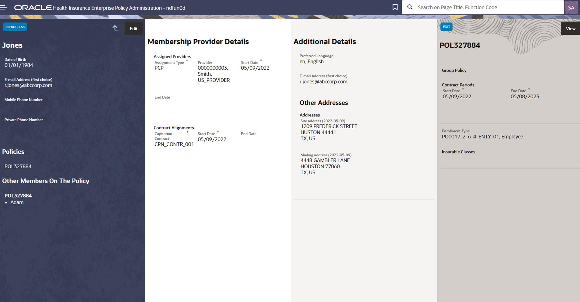
Membership view
Page Layout and Components
Foldout
Presentation Configuration
A customer can change certain aspects of a page by changing or updating the floor plans and their properties. This is done by customizing the components within the floor plan’s JSON payload.
For more details refer Floor Plan Configuration page.
- JSON Template (Payload Structure)
-
The following JSON outlines the structure of the foldout template
{
  "floorplan_foldout":{
     "folds":[{
       "title":{
       },
       "labels":[{
       }],
      "sections":[{
       "resource":{
          "properties":[{}],
          "resourceName": ""
        },
       "region":{}
      }]
    }]
  }
}
Components
This template can have the following components
Title
-
Optional Component
-
Shown as the main title for the fold
-
"label" specifies boilerplate key and its value shows up as title
Labels
-
Optional Component
-
Labels are right aligned and appears below the title
-
They display property values in form of a label and can take in exactly one property per label
-
A fold can have multiple labels
-
Section 2 in the above image shows the placeholder for labels.
-
For more details refer Label
Section
-
The section is used to display an array of properties together
-
The sections are placed below the labels
-
Section may specify resource property of type list, this is needed when attributes of its sub-resources (list properties) are to be shown.
-
Whenever a resource is specified, the set configuration is repeated for each record in the list.
-
The attributes of the "resource" ( list property defined in the above step) can be set up in "set-tiles" (region) for display purposes.
-
resourceName specifies the generic api resource linked to the list property
-