Working with Web Development Components on a Page
Add web development components to a portal page to include dynamic content such as images, HTML, links, and provide areas for users to add or work with content.
Permissions: To perform the tasks in this chapter, you must be a portal manager or a portal member with the portal-level permission
Basic Services: Edit Page Access, Structure, and Content(standard permissions) orPages: Edit Pages(advanced permissions).
For more information about permissions, see About Roles and Permissions for a Portal.
Topics
About Web Development Components
Web development components add dynamic content to a page, such as images, HTML, and links, as well as components that end users can modify at runtime, such as language selection and areas to add their own content. You can use these components to boost company branding (Image), provide a mission statement (Text), direct users to related information (Links and Hyperlink), and provide areas for users to add or work with content (Box).
Note:
The Text and Image components are available in the default resource catalog under the Content Management folder. See Adding a Text Component to a Page Style or Page and Adding an Image Component to a Page Style or Page for more information on how to add a Text or Image component to a page style or page.
Adding a Web Development Component to a Page
The process of adding a web development component to a page is the same as the process for any resource catalog component, as described in Adding a Component to a Page.
To add a web development component to a page:
-
From the resource catalog in the page editor, click the Open link next to Web Development to display a selection of web development components.
Figure: Web Development Components in Resource Catalog
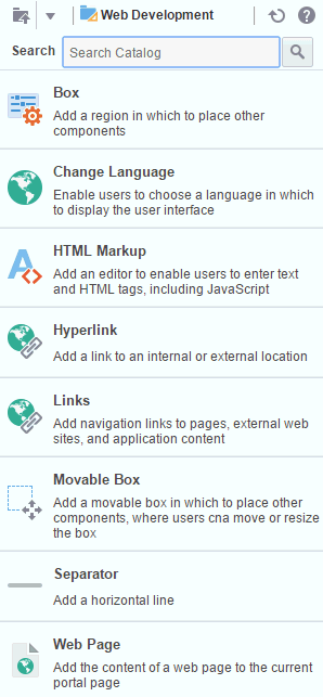
Description of the illustration wcsug_lay_webdevcomps.gif
-
Click Add next to the component that you want to add to the page.
-
Set properties for the new component:
Tip: Some components are provided as part of the page infrastructure and are not obviously exposed in the resource catalog. An example of this is the
spacercomponent. Although you cannot add more of them to a page, you can configure their properties. For more information, see Working with Layout Components.
Working with the Box Component
The Box component is a content area that you can use to place other components on the page. Unlike its counterpart, Movable Box, a Box cannot be moved around the page at application runtime. The Box component is the landing place for the task flows, portlets, and other components that you add to a page.
In the page editor, a Box is rendered simply as a rectangle comprised of dashed lines, where a user can click Add Content to open the resource catalog and add a component.
Figure: Box Component Above a Movable Box Component
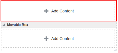
Description of the illustration wcsug_lay_box.gif
Working with the Change Language Component
You can add the Change Language task flow to any page (in the Home portal, in a portal, or a business role page) to allow users to choose the language in which to display the UI.
For more information, see Adding a Change Language Task Flow to a Page.
Working with the HTML Markup Component
This section provides an overview of the HTML Markup component and lists and describes its associated properties. It also provides a sample use case for embedding a YouTube video onto a page.
This section includes the following subsections:
About the HTML Markup Component
The HTML Markup component is a simple editor for entering raw text and HTML tags, including JavaScript embedded in HTML <script> tags.
Figure: An HTML Markup Component

Description of the illustration wcsug_lay_htmlmarkup.gif
Enter markup through the editor’s component properties:
-
Enclose JavaScript in the appropriate HTML markup. The HTML must be valid XHTML.
For example:
<script type="text/javascript"> document.write("Welcome to the club"); </script> -
If you need to enter non-XHTML, then it must be bracketed appropriately (that is, wrapped in CDATA). For example:
<![CDATA[non-conforming HTML]]>. -
JavaScript will execute only when the page is rendered with a full URL page request. If you navigate to the page from a tab in your portal, the JavaScript will not execute. You can work around this limitation by creating a page style to execute JavaScript when it loads. >Warning: This component must be used with caution as it can cause pages to break if not used properly. If necessary to resolve errors, you can log out and log in again to reset the page editor.
The editor’s header appears in the page editor, but does not appear in page view mode. This enables you to place an individualized message on a page, for example, Welcome #{securityContext.userName}, without cluttering the message with the component header.
Tip: If you enter an EL expression, such as
#{securityContext.userName}, the output is the value of the expression; in this case, the name of the current user.
Setting HTML Markup Component Properties
You can set Display Options and Style properties on a HTML Markup component.
To set HTML Markup component properties:
- Open the page in the page editor.
- In the HTML Markup component toolbar, click the View Actions menu and select the properties you want to set:
-
Display Options properties.
-
Style properties are common to many other components. See Table 10-2. The styles you set here override the styles that would otherwise govern the component's appearance. These include styles set on the component's parent container, the current page, and the portal skin.
-
- Save your changes.
HTML Markup Component Display Options
The following table lists and describes HTML Markup component display options.
Table 11-1 HTML Markup Component Display Options
| Property | Description |
|---|---|
|
|
A check box for enabling or disabling literal evaluation of special characters. Use this property to make the output safe or not safe. Safe means that any tags, such as
|
|
|
A check box for enabling or disabling text wrapping.
|
|
|
A field for entering tooltip text for the HTML Markup component. When users roll their mouse pointers over the component, this text appears as a tooltip. |
|
|
A field for specifying the content that this component renders. In addition to text, this property also accepts JavaScript, Expression Language (EL) expressions, and HTML to publish video, music, Google Gadgets, and other types of content to your application pages. For example: <object width="640" height="385"> <param name="movie" value="http://www.youtube.com/v/cAYw2zcSIPw?fs=1&hl=en_US" /> <param name="allowFullScreen" value="true" /> <param name="allowscriptaccess" value="always" /> <embed src="http://www.youtube.com/v/cAYw2zcSIPw?fs=1&hl=en_US" type="application/x-shockwave-flash" allowscriptaccess="always" allowfullscreen="true" width="640" height="385" /> </object> After you save your changes and close the page editor, the HTML Markup component shows the evaluated value of the markup. |
See Also: Display Options properties additionally provide access to an Expression Language (EL) editor, which you can use to enter and test EL values. If you need EL assistance, an application developer can provide an EL expression; see Expression Language Expressions in Developing for Oracle WebCenter Portal.
Working with the Hyperlink Component
This section provides an overview of the Hyperlink component and lists and describes its unique properties. It includes the following subsections:
About the Hyperlink Component
Use the Hyperlink component to add a link to a page. The Hyperlink can point to a location that is either internal or external to the application.
A Hyperlink component is comprised of two elements: the link text and the link URL, both of which are added through component properties.
Figure: Hyperlink Component
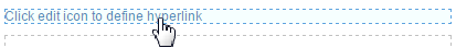
Description of the illustration wcsug_lay_hyperlink.gif
Hyperlinks can take both internal and external link targets. For an internal target, you can use a relative directory path. For an external target (a target outside of the portal), always use the full URL.
Note:
For an external URL to be found valid by WebCenter Portal, the system administrator must add it to the list of valid URLs in the
valid-link-url.xmlfile. See Adding a List of Valid External URLs in Administering Oracle WebCenter Portal. If an external URL is not listed in the file, the following error message appears:
The URL entered is not available in the list of valid URLs. Contact your system administrator for the list of valid URLs.
Tip: An easy way to obtain the relative directory path of a portal page is to navigate to the target page and go through the motions of adding it as a Favorite. By default, the Add Favorite dialog provides the relative URL of the current page. Simply copy this information, and use it to define the Hyperlink target. For information about adding a Favorite to the portal, see Managing Your Favorites in Using Portals in Oracle WebCenter Portal.
An easy way to obtain the direct URL to a portal page is to access its page information settings. For more information, see Viewing and Modifying Page Settings.
Setting Hyperlink Component Properties
You can set Display Options and Style properties on a Hyperlink component.
To set Hyperlink component properties:
- Open the page in the page editor (see Opening a Page in the Page Editor).
- In the Hyperlink component toolbar, click the View Actions menu and select the properties you want to set:
-
Display Options properties are described in Hyperlink Component Display Options.
-
Style properties are common to many other components, as described in Table 10-2. The styles you set here override the styles that would otherwise govern the component's appearance. These include styles set on the component's parent container, the current page, and the portal skin.
-
- Save your changes.
Hyperlink Component Display Options
The following table lists and describes Hyperlink component display options.
Table 11-2 Hyperlink Component Display Options
| Property | Description |
|---|---|
|
|
A field for specifying hyperlink text Enter a word or phrase to use as link text. |
|
|
A field for entering the hyperlink target URL. Enter the web address of the page to link to. |
|
|
Option for determining link target open behavior.
|
Show Component |
Select (default) to show the component on the page. Deselect to hide the component from view. |
See Also: Display Options properties additionally provide access to an Expression Language (EL) editor, which you can use to enter and test EL values. If you need EL assistance, an application developer can provide an EL expression; see Expression Language Expressions in Developing for Oracle WebCenter Portal.
Working with the Links Component
This section provides information about the Links component, how to set it up, and how to configure its properties. It includes the following subsections:
-
From the resource catalog in the page editor, click the Open link next to Web Development to display a selection of web development components.
Figure: Web Development Components in Resource Catalog
Description of the illustration wcsug_lay_webdevcomps.gif
-
Click Add next to the component that you want to add to the page.
-
Set properties for the new component:
About the Links Component
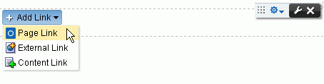
To add a Links component to a page click the Open link next to Web Development ** from the resource catalog to display a selection of web development components. Click **Add next to the Links Component.
Use the Links component to add a navigation instance to a page. Links component navigation can include links to pages, external web sites, and portal content. A browse capability is available to simplify the process of locating link targets. An advanced search feature is also available to assist in locating application objects, such as a file.
The Links component enables you to add a navigation links to a page, outside the more formal structure of your portal’s navigation.
Figure: Links Component
Description of the illustration wcsug_lay_links.gif
The links component is associated with the page or template on which it is placed. When you put a links component on a page and add some links, those links are associated with the page. That is, the lifecycle of the links component respects the lifecycle of the page or template on which it is placed. For example:
-
From the resource catalog in the page editor, click the Open link next to Web Development to display a selection of web development components.
Figure: Web Development Components in Resource Catalog
Description of the illustration wcsug_lay_webdevcomps.gif
-
Click Add next to the component that you want to add to the page.
-
Set properties for the new component:
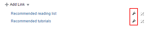
There are also controls on each link for configuring a given link’s properties and deleting the link.
Figure: Controls on Individual Links
Description of the illustration wcsug_lay_linkscontrols.gif
The Links component’s Add Link, Edit Link, and Delete Link actions are available only in page view mode. Users with Edit Page permission can add, modify, or delete links. Users without Edit Page permission can see the added navigation links, but cannot add, modify, or delete them.
The Links component’s properties provide opportunities for controlling the behavior and look and feel of a Links component instance.
Warning: The Links component ParametersNavigationandStart Pathare preconfigured and must not be changed. Changing these parameters can result in breaking the page.
Adding Navigation Links Using the Links Component
To add portal navigation links using the Links component:
-
From the resource catalog in the page editor, click the Open link next to Web Development to display a selection of web development components.
Figure: Web Development Components in Resource Catalog
Description of the illustration wcsug_lay_webdevcomps.gif
-
Click Add next to the component that you want to add to the page.
-
Set properties for the new component:
To add a Page Link:
-
From the resource catalog in the page editor, click the Open link next to Web Development to display a selection of web development components.
Figure: Web Development Components in Resource Catalog
Description of the illustration wcsug_lay_webdevcomps.gif
-
Click Add next to the component that you want to add to the page.
-
Set properties for the new component:
To add an External Link:
-
From the resource catalog in the page editor, click the Open link next to Web Development to display a selection of web development components.
Figure: Web Development Components in Resource Catalog
Description of the illustration wcsug_lay_webdevcomps.gif
-
Click Add next to the component that you want to add to the page.
-
Set properties for the new component:
To add a Content Link:
-
From the resource catalog in the page editor, click the Open link next to Web Development to display a selection of web development components.
Figure: Web Development Components in Resource Catalog
Description of the illustration wcsug_lay_webdevcomps.gif
-
Click Add next to the component that you want to add to the page.
-
Set properties for the new component:
Configuring an Advanced Search for Content Links
The Links component’s Advanced Search feature provides controls for specifying additional search criteria and filters for Content Links searches. In the Select Document dialog (Figure 11-11), click Advanced to open the Advanced Search dialog (Figure 11-12).
Figure: Advanced Search Dialog
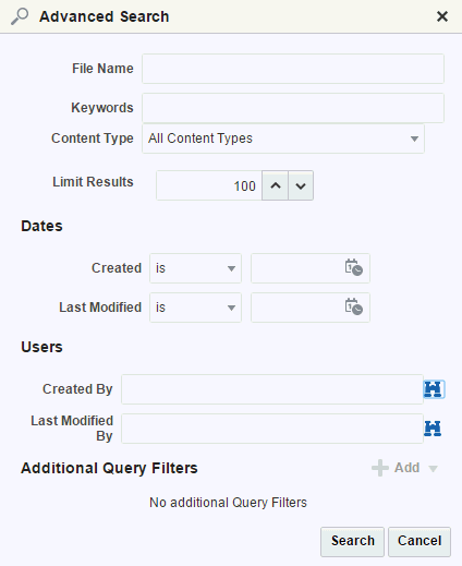
Description of the illustration wcsug_lay_advsearch.gif
Configuring a Link in the Links Component
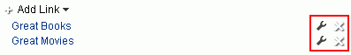
A user with permission to edit a page can configure a link on the page to revise the link’s name and target. If you can see the Configure icon to the right of a link, you are authorized to configure links (Figure 11-13).
Figure: Configure Icon on a Link
Description of the illustration wcsug_lay_configlink.gif
To configure a link:
-
From the resource catalog in the page editor, click the Open link next to Web Development to display a selection of web development components.
Figure: Web Development Components in Resource Catalog
Description of the illustration wcsug_lay_webdevcomps.gif
-
Click Add next to the component that you want to add to the page.
-
Set properties for the new component:
Reordering Navigation Links
To reorder navigation links in a Links component in the page editor or when viewing a page:
-
From the resource catalog in the page editor, click the Open link next to Web Development to display a selection of web development components.
Figure: Web Development Components in Resource Catalog
Description of the illustration wcsug_lay_webdevcomps.gif
-
Click Add next to the component that you want to add to the page.
-
Set properties for the new component:
Deleting a Link from the Links Component
Authorized users can access a delete control on a given link to remove the link from the Links component. If you can see the Delete icon to the right of each link, you are authorized to delete links.
Figure: Delete Icon on a Link
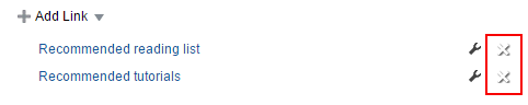
Description of the illustration wcsug_lay_deletelink.gif
To delete a link from the Links component:
-
From the resource catalog in the page editor, click the Open link next to Web Development to display a selection of web development components.
Figure: Web Development Components in Resource Catalog
Description of the illustration wcsug_lay_webdevcomps.gif
-
Click Add next to the component that you want to add to the page.
-
Set properties for the new component:
Setting Links Component Properties
You can set Display Options and Style properties on a Links component.
To set Links component properties:
Working with the Movable Box Component
This section provides an overview of the Movable Box component. It includes the following subsections:
About the Movable Box Component
To add a Movable Box component to a page, click the Open link next to Web Development ** from the resource catalog to display a selection of web development components. Click **Add next to the Movable Box Component.
A Movable Box is a container wrapped around a Box that not only enables the placement of content on a page, but also provides a means of moving all of that content at once in both the page editor and view mode.
Figure: Movable Box Component Below Box Component
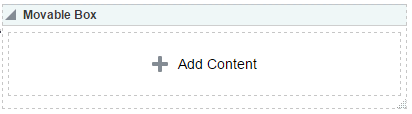
Description of the illustration wcsug_lay_movablebox.gif
In the page editor, or when viewing a page, you can click on a Movable Box header and drag it and all of its content to a new position on a page. Movable Boxes can also be resized.
Tip: Avoid adding a portlet to a Movable Box component. Doing so creates an unnecessary and potentially error-prone redundancy.
Setting Movable Box Component Properties
You can set Display Options and Style properties on a Movable Box component.
By default, each Movable Box encloses a Box component.
To set Movable Box component properties:
Working with the Separator Component
This section provides an overview of the Separator component and lists and describes its associated properties. It includes the following subsections:
About the Separator Component
To add a Separator component to a page, click the Open link next to Web Development ** from the resource catalog to display a selection of web development components. Click **Add next to the Separator Component.
The Separator component provides a visual break, in the form on a horizontal line, on a page.
Figure: Separator Component Between Two Text Components

Description of the illustration wcpaa_lay_sep.png
Setting Separator Component Properties
You can set Display Options and Style properties on a Separator component.
To set Separator component properties:
Working with the Web Page Component
This section provides an overview of the Web Page component and lists and describes its associated properties. It includes the following subsections:
About the Web Page Component
To add a Web Page component to a page, click the Open link next to Web Development **from the resource catalog to display a selection of web development components. Click **Add next to the Web Page Component.
The Web Page component opens a view onto another web page within the context of a portal page.
Figure: Web Page Component
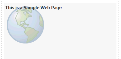
Description of the illustration wcsug_lay_webpage.gif
The content exposed through a Web Page component retains all of the controls associated with the exposed web page. For example, the componet allows users to control the volume of a video, edit a wiki,, or post an entry to a blog, depending on the type of content you expose.
You can use internal and external link targets for a Web Page. For an internal target, you can use a relative directory path.
Tip: In the portal, an easy way to obtain the relative directory path of an application page is to navigate to the target page and go through the motions of adding it as a Favorite. By default, the Add Favorite dialog provides the relative URL of the current page. Simply copy this information, and use it to define the Web Page target.
For more information, see Managing Your Favorites in Using Portals in Oracle WebCenter Portal.
The Web Page component provides a variation on the built-in Web Page page style (for more information, see Table 18-1). The Web Page page style is useful for offering the full external web page experience. In contrast, the Web Page component is useful for including web page content along with other content types on a page.
Setting Web Page Component Properties
You can set Display Options and Style properties on a Web Page component.
To set Web Page component properties:
Web Page Component Display Options
The following table lists and describes Web Page component display options.
Table 11-3 Web Page Component Display Options
| Property | Description |
|---|---|
|
|
A display name for the Web Page component. |
|
|
A field for entering Note that, for the Web Page component, the padding-top:30px; |
|
|
A field for entering the fully qualified URL to the source Web content to render in the Web Page area. For example: http://www.oracle.com Note that Note: Use the component's Style properties to adjust the width and height of the display area (for more information, see Setting Style and Content Style Properties). If you plan to display the content of another portal page, you can use a relative address. For more information, see About the Web Page Component |
See Also: Display Options properties additionally provide access to an Expression Language (EL) editor, which you can use to enter and test EL values. If you need EL assistance, an application developer can provide an EL expression; see Expression Language Expressions in Developing for Oracle WebCenter Portal.