7 Using the Document Panel
This chapter describes the Document panel of the JavaFX Scene Builder tool.
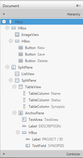
The Document panel, shown in Figure 7-1, is located at the lower left side of the tool's window. It is comprised of the Hierarchy and Controller sections. You can hide the Document panel by selecting View from the Main menu and then selecting Hide Document, or Hide Left Side Panel to hide it along with the Library panel.
Hierarchy Section
The Hierarchy section shows all the GUI elements that comprise your FXML layout, including those that are not visible in the Content panel. You can use the Hierarchy panel to focus on one specific GUI element, whether it is a parent node or a leaf node. After the element is isolated, you can use the Content panel or the Inspector panel to focus your work on that particular element and its properties. The path from the root of the FXML layout to a particular GUI element is displayed in the Path and Selection bar when a GUI element is isolated in the Hierarchy panel. The selected GUI object is highlighted in the Hierarchy panel and in the Content panel.
You can also add a new GUI element to your FXML layout by dragging it from the Library panel to the desired location in the Hierarchy panel. This is especially helpful when adding a Popup control, such as a Tooltip or ContextMenu. For example, to add a Tooltip to a Button element, drag the Tooltip control from the Library panel to the target Button element in the Hierarchy panel. The Tooltip becomes a child of that Button element.
You can rearrange the position of a GUI element in your layout by dragging it in and out of containers within the Hierarchy panel. You can select multiple elements at once in the Hierarchy panel and drag and drop them into a single location.
The Hierarchy panel is also useful for adding a graphic element to a GUI element that has the graphic property, per its API. For example, you can add a graphic element to a Button element, but not to a GridPane element. Use the following steps to add a Circle graphic element to a Button element using the Hierarchy panel:
-
From the Library panel, drag a Circle element to the target Button layer in the Hierarchy panel.
-
Without releasing the mouse cursor, hover over the Button layer for a second and you will notice a new sub-layer is created for the Circle.
-
Release your mouse cursor and the Circle appears in the Content panel, with its default radius of size 100.
-
In the Layout section of the Inspector panel, reduce the circle's radius size to 6 so that it fits more appropriately in the Button.
You can only have one graphic element added to a Button element at any one time. To add a new graphic, you must first delete the existing one. If the element is a container, then it can contain any number of graphical elements.
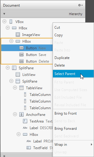
Right-clicking an element in the Content panel or a specific element layer in the Hierarchy panel displays a contextual menu of commands that you can use for the selected element, as shown in Figure 7-2. These commands are a subset of the commands that are available from the Menu Bar. You can click on the right side of the row for the GUI element listed in the Hierarchy panel to activate the inline property editor.
Figure 7-2 Hierarchy Panel with Drop-down List of Commands

Description of "Figure 7-2 Hierarchy Panel with Drop-down List of Commands"
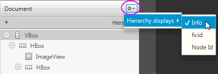
When you click the drop-down arrow, which is circled on the top right corner in Figure 7-3, and select Hierarchy displays, you can select Info, fx:id, or Node Id to display next to each of the elements listed in the Hierarchy panel. The default display mode is Info, which displays any related information for the element, or the text property value if the element has a text property. The fx:id display mode shows the value of each element's fx:id property, which is used by the application controller class. When you select Node Id, the Hierarchy panel shows the same node names used in the Selection bar for each element.
Figure 7-3 Hierarchy Display Menu in Document Panel

Description of "Figure 7-3 Hierarchy Display Menu in Document Panel"
Controller Section
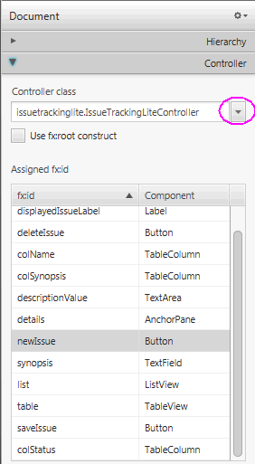
The Controller section, shown in Figure 7-4, enables you to manage the controller class you want to use with your FXML document. The controller class provides the logic to handle the behavior of the objects in your FXML layout. In the Controller class text field, you set the fully qualified Java class name of the controller class file you want to use. This file must be in the same folder, a sub-folder, or a parent folder in which the FXML file is also located. If the controller class file already exists in the same folder as the FXML file you are working with, you can select the controller class from the drop-down list by clicking the down arrow that is circled in Figure 7-4. If you are using NetBeans IDE with JavaFX Scene Builder and your FXML file is located in a NetBeans project, then the Controller class java file can be located in any java package inside your NetBeans project's src folder.
The list of all the fx:id values used in the FXML document is listed in a table view. Also included in the Controller section is the fx:root construct checkbox that creates a reference to a previously defined root element. To learn more about the <fx:root> element, refer to the JavaFX API document.
Figure 7-4 Controller Section of the Document Panel

Description of "Figure 7-4 Controller Section of the Document Panel"


