9 Defining Properties in the Inspector Panel
This chapter describes the JavaFX Scene Builder tool's Inspector panel, including its Properties, Layout, and Code sections.
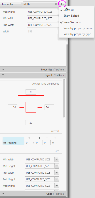
On the right side of the Content panel is the Inspector panel, as shown in Figure 9-1 with the Layout section expanded and the Inspector menu displayed. The Inspector panel is also referred to as the Right Side panel. It contains an Accordion container with multiple sections. The top section contains a Search text field, which you can use to quickly locate the properties you would like to edit. The search results are displayed in the top section, as shown in Figure 9-1. You can directly modify the properties by using the Search Results section. You can display the Inspector menu by clicking the drop-down arrow at the top right corner, which is circled in Figure 9-1. By default, the Show All and View Sections modes are chosen. selecting the Show Edited mode displays only the properties that appears explicitly in the FXML file. For example, only the Text, LayoutX, and LayoutY properties are displayed in the Inspector panel when a Button element is dropped from the Library panel. selecting the View by property name or the View by property type modes display all the properties in a single tabbed section, ordered either by name or type.
The Properties, Layout, and Code sections give you access to properties for the selected GUI element. Each displayed property name shown in the sections is a representation of the corresponding given property name in the JavaFX API. For example, minWidth property in the JavaFX API is displayed in the Inspector panel as Min Width. When you click on the property name, a browser window is opened and displays the corresponding JavaFX API name for the property and its description.
You can hide the Inspector panel by selecting View from the Main menu and then selecting Hide Right Side Panel. This feature enables you to have more room for the Content panel. Select View and then Show Right Side Panel to make the panel visible again.
Figure 9-1 Inspector Panel with the Search Results Displayed and Layout Section Opened
Description of "Figure 9-1 Inspector Panel with the Search Results Displayed and Layout Section Opened"
Properties Section
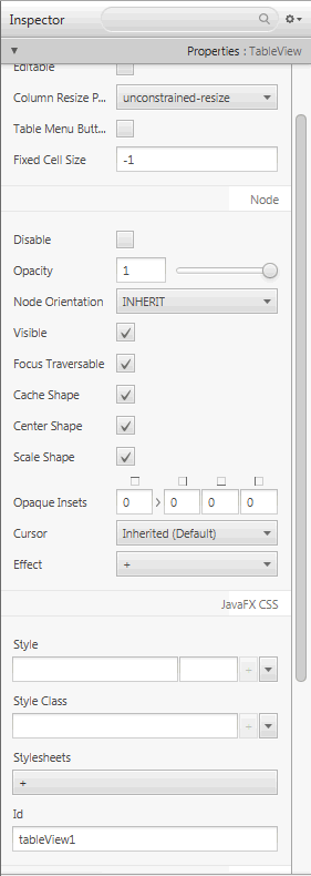
The Properties section of the Inspector panel, shown in Figure 9-2, enables you to define the style of the selected element in the Hierarchy panel or the Content panel.
Figure 9-2 Properties Section of the Inspector Panel
Description of "Figure 9-2 Properties Section of the Inspector Panel"
When the fx:id value is assigned for the selected GUI element via the Code Section, that same value is also assigned to the Id field in the CSS subsection of the Properties section only if that Id field is null.
The Style, Style Class, and Stylesheets text areas in the JavaFX CSS subsection enable you to specify the style rule and style sheet to use for a particular GUI component and all of its children components. You can add, delete, and put in order the style sheets that will be applied. See the Styling with CSS and the CSS Analyzer chapter in this document for additional information.
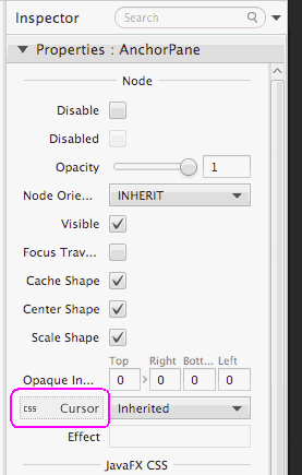
A property value can be overridden by a CSS styling defined in a CSS file or in the Style property. A CSS icon is added to the left side of the affected property whose property value is overridden by a CSS file definition, as shown in Figure 9-3. You can navigate to the CSS file or Style property by clicking the property field.
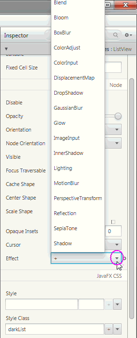
You can go from one property to another by pressing the Tab key. A new value for a property is saved when you press Enter or when you move to another property field. You can manipulate the look of the selected GUI element by directly changing the value of its properties that are available and editable. For example, you can define the effects of a selected list view element by clicking the down arrow button to display the menu of available effects, as shown in Figure 9-4. From the list of effects available, you can select one or more effects to apply to the selected GUI element.
Figure 9-4 Effects Menu in the Properties Section of the Inspector Panel
Description of "Figure 9-4 Effects Menu in the Properties Section of the Inspector Panel"
The remaining properties displayed on the Properties section of the Inspector panel depend on the type of GUI element that is selected in either the Content panel or in the Hierarchy panel. For example, if you select a radio button, toggle button, or radio menu item in the Content panel, the Properties section shows the Toggle Group property. You can use this property to assign the same ToggleGroup id for each toggle control that you want to add to a toggle group.
When an invalid value is entered for a property, a dialog window appears and prompts you to select one of these commands: Fix the Value or Revert to Previous Value. The focus returns to the text field with the invalid property value if you select the Fix the Value command.
If a property is allowed to have a value list assigned to it, a single empty item is initially shown by default. To add an item, click the + button and enter or select the value. Click the down arrow to display the menu that allows you to remove, move up or move down an item for the value list.
When multiple objects of the same type (for example, two button elements) are selected in the Content panel or the Hierarchy panel, and if any of the properties have a different value, the minus sign (-) is displayed in the text field for that property. If a new value is entered, then the new value is set for all the selected objects.
If multiple objects of different types are selected in the Content or Hierarchy panel, the properties which are common to all objects are displayed.
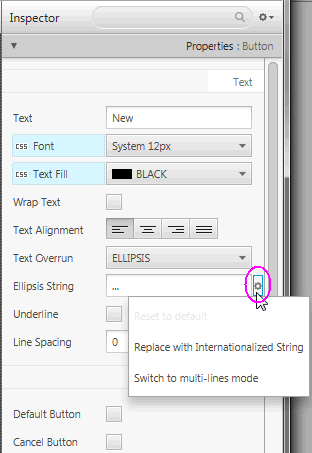
There are some properties that have a cog menu that appears on the right side of the property field when the mouse hovers over the property value editor, as shown in Figure 9-5. The cog menu provides specific actions that can be used for that editor. For example, you can reset the current property value to the default value in the JavaFX API by selecting Reset to default command. Figure 9-5 shows actions available for an Ellipsis String.
Figure 9-5 Cog Menu for Property Value Editors
Description of "Figure 9-5 Cog Menu for Property Value Editors"
Any numeric value can be increased or decreased using the Up or Down arrow keys, respectively. Using the Shift-Up and Shift-Down keys increase and decrease the number value by 10, respectively.
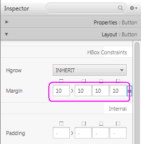
The editor for the Insets, Margins, and Padding properties allows you to enter the first value (Top) and set the same value to the remaining three text fields (Right, Bottom, Left) using the following steps:
-
Enter the value in the first property text field.
-
Press the Tab key and the focus is placed on the link button.
-
Press the Enter key to apply the property value you just entered to the remaining three property text fields.
Figure 9-6 illustrates the uniform values assigned to the Margin property for the Buttons in an HBox.
Auto Suggest editors are available for all properties that have predefined values. When you click in the property's text field, a list of suggested values are displayed. The list is filtered as you start typing in the text field.
Some property values require paths to external resource files, such as image files or CSS files. You can specify the file paths using one of the formats listed in Table 9-1.
Table 9-1 File Path Formats for External Resource Files
| File Format Types | Example |
|---|---|
|
Absolute path |
|
|
Path relative to the current FXML document's location |
|
|
Path relative to the class or resource file location |
|
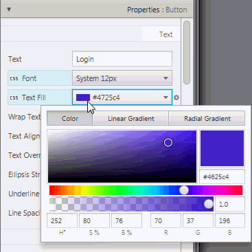
A Paint Editor is available for properties that can have color for its value. When you click on the property value field, the Paint Editor window appears. In Figure 9-7 the Paint Editor window is displayed for the Text Fill color property of the selected Button element. You can change the color value for the GUI element by moving the cursor along the color palette.
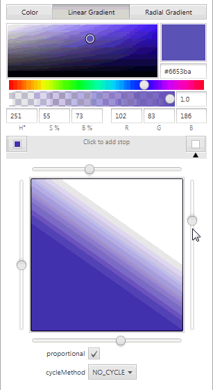
When you click on the Linear Gradient or Radial Gradient tab, the Text Fill property value is changed accordingly to Linear Gradient or Radiant Gradient. The Linear or Radial editor section of the Paint Editor is displayed. Figure 9-8 shows the Linear section for the Text Fill property. From that section, you can adjust the gradient values by moving the available sliders on sides until you see the desired color hues you are trying to achieve. Values for additional properties are displayed and can be edited from the editor as well.
As you adjust the color, linear gradient, or radiant gradient for the particular GUI element, the adjustments are also simultaneously reflected on the GUI element that is displayed in the Content panel.
Layout Section
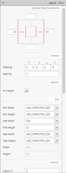
The Layout section of the Inspector panel, shown in Figure 9-9, helps you to specify the runtime behavior of the layout when the application's window is resized. It also enables you to change the size (such as, Pref Width and Pref Height) and position (such as, Layout X and Layout Y) of the selected element. Some of the information displayed in the Layout section pertains to the selected element itself (such as Min Width, Max Height, or Pref Width), and some of the information depends on the type of the container element. If the selected element is contained in an AnchorPane container, then an AnchorPane section is present in the Layout section. If the selected element is contained in a Grid Pane container, then there is a Grid Pane subsection in the Layout section of the Inspector panel. Some containers, however, do not have any associated contextual information, and so no contextual container subsection appears in the Layout section.
The AnchorPane Constraints subsection only appears when a selected element has an AnchorPane as its most immediate container. For example, in Figure 9-9, the selected HBox element's container is an AnchorPane. You can use either the diagram or the text fields in the AnchorPane Constraint subsection to manage the anchor pane's anchors. The anchors help you manage the behavior of the selected GUI element when you resize the window. You can click the anchor lines to specify whether the object's size changes as the application's window is adjusted. The lines change from solid black lines to solid red lines when you click them. You can also specify the numerical values in the fields around the diagram. A grayed out numerical value means the anchor is disabled. You can use the Tab key to navigate between the anchor fields.
If the HBox element's most immediate container is a StackPane element, then the top subsection of the Layout section will be labeled as StackPane Constraints and different editable properties will be displayed.
The Transforms subsection enable you to define settings for different types of transformations, such as rotation, scaling, and translation.
Figure 9-9 Layout Section of the Inspector Panel
Description of "Figure 9-9 Layout Section of the Inspector Panel"
Code Section
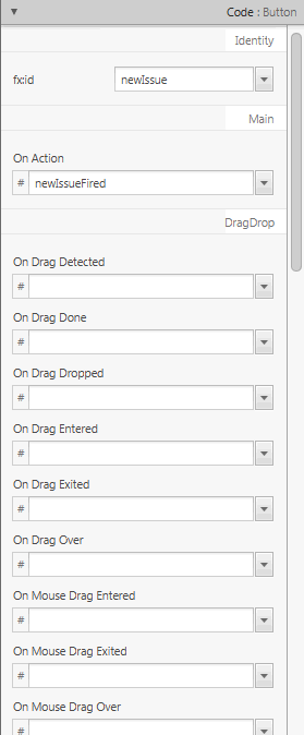
Figure 9-10 displays the opened Code section when the New button element is selected in the Hierarchy panel. In the fx:id field, you can assign a unique value for the selected GUI element. You can select from the drop-down list of available variables if you already assigned the controller source class to use with your FXML layout.
Figure 9-10 Code Section of the Inspector Panel When the New Button is Selected
Description of "Figure 9-10 Code Section of the Inspector Panel When the New Button is Selected"
The Code section enables you to specify the action that should be taken when a drag-and-drop, keyboard, mouse, or any other event occurs on the selected element. From the drop-down list on the event text field, select the corresponding command that should be executed when a specific event or events occur for that GUI element. The given command is a call to the controller method event handler. It is specified by a leading number sign (#), which is already added by default, followed by the name of the handler method. The method is expected to conform to the signature of a standard event handler, which means that it takes a single argument of a type that extends the javafx.event.Event class and should return void. For example, Figure 9-10 shows that when the OnAction event occurs on the button, the newIssueFired() controller method is executed.
When you click View from the Menu bar and then select Show Sample Controller Skeleton, a text editor window appears and displays the source file example of what the method should look like in your controller source code. You can copy the contents of the skeleton source file to customize as you please.
