8 Designing GUI with the Library Panel
This chapter describes JavaFX Scene Builder's Library panel and the JavaFX GUI objects that are accessible from it. Information is provided about working with some of the container elements available. Also discussed in this chapter is how to import custom GUI objects into JavaFX Scene Builder.
The Library panel, shown in Figure 8-1, is located on the left side of the Main window. You can hide the Library panel by selecting View from the Main menu and then selecting Hide Library or Hide Left Side Panel to hide it along with the Document panel. The Library panel is comprised of collapsible sections for Containers, Controls, Menus, Shapes, Charts, 3D, and Miscellaneous elements that are available for your use to build your FXML layout. These GUI elements are the same JavaFX GUI elements that are delivered with the Java SE release. To locate the GUI components, such as TextFlow, SwingNode, and 3D objects, that were introduced with the JDK 8 release, type FX8 in the Library panel's Search text field.
There is also a Custom section, which lists the custom GUI components that have been imported into the Library. Custom type elements are those GUI components that were not delivered with the JavaFX API libraries in JDK 8. See Managing Custom GUI Elements for more information on how to import your own or third-party custom GUI components.
Support for 3D GUI elements is limited. You can open FXML files that contain 3D objects, but you can only edit some of their properties via the Inspector panel and you can not directly manipulate the objects in the Content panel. Pre-defined 3D shapes (Box, Sphere, and Cylinder) that are available in the JavaFX API are provided in the Shapes section of the Library panel. In the 3D section are objects related to lights and cameras. These are available in the Library so that you can edit their properties and add their fx:id so that they can be referenced from your controller source code.
When you open a new FXML layout in Scene Builder, it is an empty file. You start building your layout by selecting the top root container from the Containers section and adding it to the Content or Hierarchy panel. You can then add into that root container as many containers or GUI elements that are needed for your FXML layout.
To add one of the GUI elements from the Library panel, do one of the following:
-
Select an item from the list on the Library panel and drag it onto the Content panel or the Hierarchy panel.
-
Select an item from the Library panel and press the Enter key.
-
Double-click a selected item in the Library panel and it gets added to the Content panel.
-
Click the Insert command on the Menu bar and select one of the available GUI elements from the drop-down list. If the layout is currently empty, the element is added as the root element. If a root element already exists and nothing is currently selected in the Hierarchy or Content panel, the element is added inside the root element. Otherwise, it is added next to the currently selected element.
Use the Search text field, located at the top of the panel, to filter the list of GUI elements available in the Library. For example, typing button in the Search field displays all the GUI elements with the button in its name.
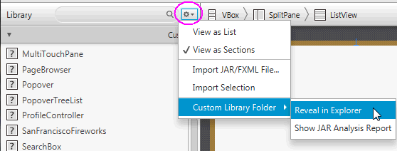
To the right of the Library panel's Search text field is a menu button which when clicked displays a menu of commands, as shown in Figure 8-2. The commands help you manage how the Library contents are to be displayed: as a long list, or as groups of elements listed in separate sections, which is the default. Also available are commands that allow you to import custom GUI components into the Library. See Managing Custom GUI Elements for more information.
Selecting the Custom Library Folder menu item displays a sub-menu that includes Reveal in native file manager and the Show JAR Analysis Report commands. Selecting the Reveal in native file manager command (where native file manager is Finder for the Mac OS platform, Explorer for the Windows platform, and Desktop for the Linux platform) opens your system's file manager at the location of the folder containing the custom component JAR and/or FXML files. The command is disabled if the Custom Library folder is empty.
Selecting the Show JAR Analysis Report command allows you to view an analysis report for the JAR file(s) located in the Custom Library Folder. This report will list all of the Java classes which were inspected and determined as custom components that are unsuitable to be added to the Library. Also provided is an indication of the failed criteria, such as the fact that the class is not a JavaFX Node, or Scene Builder failed to instantiate the class. In the latter case, the Java exception is also listed.
Figure 8-2 Library Panel's Sub-menu of Commands
Description of "Figure 8-2 Library Panel's Sub-menu of Commands"
The following sections discuss some of the container elements that are available in the Library panel and how to maximize their usage in the JavaFX Scene Builder tool. Also described is how to manage custom types. To learn more about all the other GUI elements offered with the JavaFX SDK platform, see the JavaFX API documentation.
Managing Custom GUI Elements
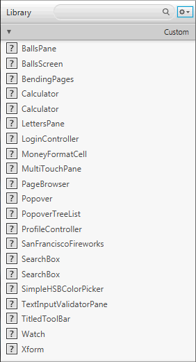
The first section displayed in the Library panel is the Custom section, as shown in Figure 8-3,. It lists all the custom GUI elements that are not part of the JavaFX 8 API libraries, but are available for your use in your GUI layout. A custom GUI element is a Java class that has been created by the user or by a third party, and added to the Library of available components you can use in your FXML layout.
Figure 8-3 Custom Section of the Library Panel
Description of "Figure 8-3 Custom Section of the Library Panel"
Adding Custom Components to the Library
You can import customized GUI components by using the Library panel's Import command. You can add any simple or complex graphical object from the Hierarchy or Content panel into the Library, and make it a reusable component available from the Library panel. You can also import a graphical component from an FXML document, or import a JAR file and select a subset of the custom components it contains, to make them re-usable components permanently available in the Library.
-
To import custom GUI components from a JAR or FXML file:
-
Select Import JAR/FXML file command from the Library panel's menu, or drag the JAR or FXML file directly from your system's native file manager (Explorer or Finder) and drop it into the Library panel
-
In the Open dialog window, navigate to the location of the JAR or FXML file that you want to import.
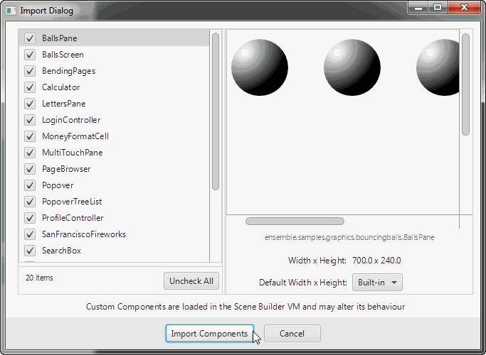
The Import Dialog, similar to what is shown in Figure 8-4, is displayed. The JAR file's contents are inspected and all the Java classes that are determined as being suitable custom components are displayed in the dialog window. The FXML file's contents are parsed to make sure that the component being added is valid and self-contained. -
From the Import dialog window, select or unselect items from the list of items that you are able to import.
-
Click Import Components.
Imported items are added to the Custom section of the Library panel. They can be used immediately and they persist in the Library even after Scene Builder is restartedFigure 8-4 Dialog Window for Importing JAR/FXML File
Description of "Figure 8-4 Dialog Window for Importing JAR/FXML File"
-
-
To add custom GUI objects from your current layout to the Library panel:
-
Using the Hierarchy or Content panel, select the self-contained component in your current layout.
-
From the Library panel's menu, select the Import Selection command. Alternatively, drag the selected component from the Content or Hierarchy panel and drop it in the Library panel.
The selected item is inspected and if there are issues encountered, an error dialog similar to Figure 8-5 is displayed. If no errors are encountered, the custom component is added to the Library and a message is displayed in the Message bar. The name of the FXML file created for the imported selection is based on the name of the root element. For example, if in your selection the root element is of the
Buttonclass, then the file created when you import the element for the first time isButton_1.fxml.You can also import multiple selections made in the Content or Hierarchy panel. For example, you can select a
Buttonand aCheckBoxelement in the Content panel, and drag and drop both elements into the Library. Two rows for the imported elements appear in the Custom section of the Library panel: one namedButton_1and the other namedCheckBox_1. Both are stored into corresponding FXML files,Button_1.fxmlandCheckBox_1.fxml, respectively and are created in the Custom Library folder.Figure 8-5 Sample Error Message When Importing GUI Objects into the Library
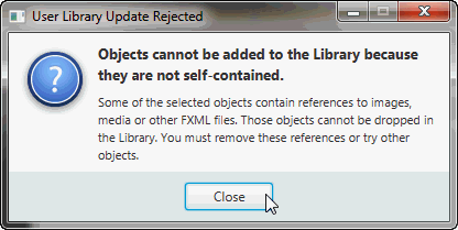
Description of "Figure 8-5 Sample Error Message When Importing GUI Objects into the Library"
-
When you import the same JAR or FXML file at another time, the newly imported version of that file replaces the previously imported version. If you import the same self-contained GUI element from the Content or Hierarchy panel at another time, then the FXML file created is named with a version number. For example, if a selection with a Button element as its root has been previously imported, then when it is imported a second time, the new FXML file created for the custom element is named Button_2.fxml.
If you decide you no longer need the custom GUI components, you can directly remove the JAR and FXML files from your Custom Library folder, or delete the whole folder. This can be safely done even as the Scene Builder tool is running. The Scene Builder tool periodically checks the content of the Custom Library folder and will update the content of the Library accordingly.
To work with the Custom Library folder, open the Library panel's menu, click Custom Library Folder, and select Reveal in native file manager, where native file manager is Finder for the Mac OS platform, Explorer for the Windows platform and Desktop for the Linux platform.
Using a Grid Pane Container
The Grid Pane container enables you to create a flexible layout of GUI elements that are organized in rows and columns. Use the Grid Pane in your layout by selecting Grid Pane from the Container section of the Library panel and dragging it to the Content or Hierarchy panel. You can then add other GUI elements within the Grid Pane container, and elements are automatically arranged based on the padding, gap, and other properties.
You can also add a Grid Pane container element so that it contains the GUI elements that you have already added to your layout. Use the following steps:
-
Select Edit and then Select All from the Main menu to select all of the elements in your layout.
-
Add the Grid Pane container by selecting Arrange from the Main menu, Wrap in, and then Grid Pane from the list of containers.
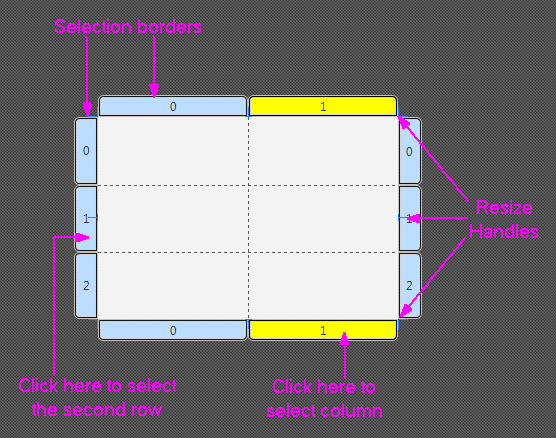
An empty and unselected grid pane is not visible in the Content panel. To make its borders visible, click the corresponding layer in the Hierarchy panel for that Grid Pane element. To work with a specific grid pane, click directly within its perimeter, but not on any of the elements that it contains. When selected, a Grid Pane is surrounded by a light blue colored border tabs and each corresponding index number is displayed, as shown in Figure 8-6. To select either a single column or row, click within the selection border tab. The tabs of a selected column or row acquires a yellow background, as shown by column 1 in Figure 8-6. You can also select multiple rows or multiple columns simultaneously so that you can edit the values for those selected items at once. You can not, however, select a combination of rows or columns at the same time.
To see the submenu of actions that you can take on a Grid Pane, do one of the following:
-
Right-click anywhere over the grid pane, select a command from the contextual menu.
-
From the Main menu, select Modify and then Grid Pane.
You can move a row up or down, and move a column left or right. You can also delete or add a row or column, and increase or decrease the span for a row or column.
The Layout section of the Inspector panel also enables you to modify the currently selected Grid Pane. The properties related to the selected row or column are displayed and can be managed in the GridPane Row or GridPane Column sections.
You can move an element from one grid cell to another existing grid cell. In the Content panel, select the element that you want to relocate, and with the mouse button pressed, drag the element to the target grid cell, as shown in Figure 8-7. Notice that the target grid cell changes to have a gray background as soon as you hover your cursor over it. When you release the mouse button, the element is moved to the target grid cell location in the Grid Pane.
Figure 8-7 Moving an Element to Another Grid Cell
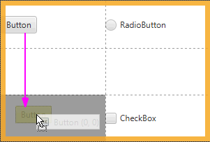
Description of "Figure 8-7 Moving an Element to Another Grid Cell"
To move an element to a new row or column that has not yet been created, select the element in the Content panel and drag it to the divider line that is between the rows or columns where you want the new row or column to be inserted. As you hover the mouse over the cell divider, the cell divider line becomes thicker and gray. When you release the cursor, the new row or column is created, and the element is dropped in the target grid cell. Figure 8-8 shows a Button element being dragged to a new grid cell on the second row of a new column that is about to be inserted.
Figure 8-8 Moving an Element to a New Row or Column
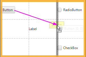
Description of "Figure 8-8 Moving an Element to a New Row or Column"
Working with a Border Pane Container
The Border Pane container enables you to layout GUI elements in the top, right, left, bottom, and center positions of the container. Use the Border Pane in your layout by selecting the BorderPane element from the Container section of the Library panel and dragging it to the Content panel. Figure 8-9 shows the Hierarchy panel after the BorderPane element is added.
Figure 8-9 Hierarchy Panel After BorderPane Container Is Added
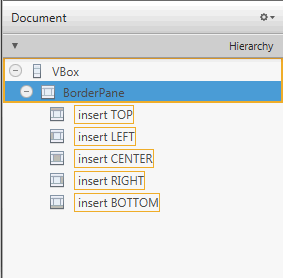
Description of "Figure 8-9 Hierarchy Panel After BorderPane Container Is Added"
You can add a GUI element to the Border Pane container by dragging the element from the Library panel onto the specific position in the Border Pane. You can also drag an element from the Library panel to the Hierarchy panel, as shown in Figure 8-10. Notice that when the element is dragged over a target layer in the Hierarchy panel, the layer's corresponding position in the Border Pane changes to a darker shade of color, as shown on the right side of Figure 8-10.
Figure 8-10 Add Menu Bar Element to the BorderPane
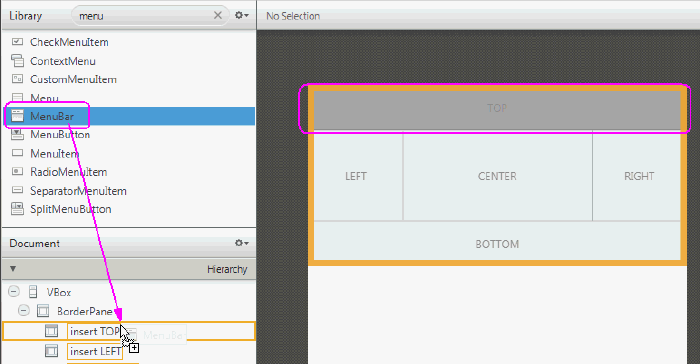
Description of "Figure 8-10 Add Menu Bar Element to the BorderPane"
You can move an element from one position to another in the Border Pane. In the Content panel or the Hierarchy panel, select the element that you want to relocate and drag the element to the target position, as shown in Figure 8-11. Notice that the background color of the target position gets darker as soon as you hover your cursor over it. When you release the mouse button, the element is moved to the target position in the Border Pane.
Figure 8-11 Moving an Element to Another Position
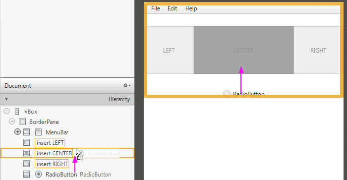
Description of "Figure 8-11 Moving an Element to Another Position"
Using a Tab Pane Container
By default, the Tab Pane comes with two Tab elements, each of which contain an Anchor Pane element, as shown in Figure 8-12.
Figure 8-12 Tab Pane Element Added in the Hierarchy Panel and Content Panel
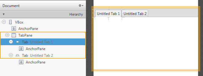
Description of "Figure 8-12 Tab Pane Element Added in the Hierarchy Panel and Content Panel"
You can change a Tab element's default title by double-clicking the tab and directly editing its Text property in the Content panel. To add another Tab element to a Tab Pane container, drag and drop a Tab element from the Library panel to the Tab Pane in the Content panel or Hierarchy panel. The new Tab element is added to the right of any existing Tab elements. To change the order of the Tab elements within the Tab Pane, use the Hierarchy panel. Drag and drop the Tab element's row in the Hierarchy panel to the target location within the Tab Pane container. You can also use the Content panel to drag its tab to the target location within the Tab Pane container.
To add GUI elements to a Tab element's Anchor Pane, click the title of the target Tab element to select it. Drag and drop the GUI element that you want to add from the Library panel to the Tab element, as shown in Figure 8-13.
Figure 8-13 Add GUI Elements from Library Panel to the Tab Element in Content Panel
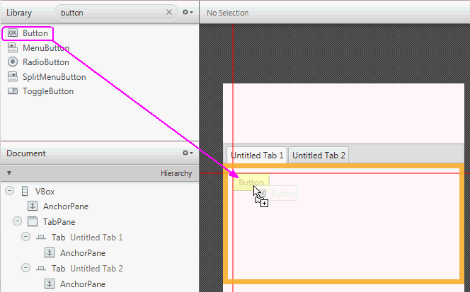
Description of "Figure 8-13 Add GUI Elements from Library Panel to the Tab Element in Content Panel"
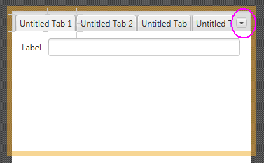
Depending on the length of each Tab element's title and the number of Tab elements in your Tab Pane container, there comes a point when some Tabs become hidden. When this occurs, a drop-down menu is automatically added to the Tab Pane container's menu bar, as shown in Figure 8-14. This drop-down menu enables the tab of choice to be selected. This menu is not active in the Content panel, but is functional when you view the layout in the Preview window. If the Tab Pane container is resized so that all the Tab elements are fully visible, the drop-down menu is automatically removed from the Tab Pane's menu bar.
Figure 8-14 Tab Pane with Multiple Tab Elements and a Drop-Down Menu
Description of "Figure 8-14 Tab Pane with Multiple Tab Elements and a Drop-Down Menu"
Working with Menu Controls
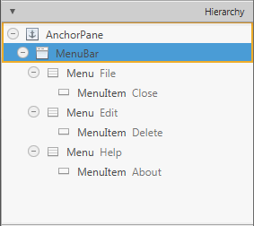
The Controls section of the Library panel contains three menu-related control elements: MenuBar, Menu Button, and Split Menu Button. When you drag and drop a MenuBar from the Library panel onto the Content panel, it comes populated with Menu elements that are labeled File, Edit, and Help. By default, each of these Menu elements contains one Menu Item element, as shown in Figure 8-15.
Figure 8-15 Menu Bar and Its Contents Displayed in the Hierarchy Panel
Description of "Figure 8-15 Menu Bar and Its Contents Displayed in the Hierarchy Panel"
The Menu and Menu Item elements do not have graphical representations that are visible in the Content panel, so you can only use the Hierarchy panel to select and manage these elements. You can change the order of how the Menu elements are displayed in the Menu bar by selecting the Menu element in the Hierarchy panel and dragging it to a new location within the Menu where you want it to appear. You can directly modify the text property of the Menu or Menu Item element by selecting it and clicking on the text area, which puts you into edit mode. You can also use the Properties section of the Inspector panel to modify the Text field.
You can add other menu-related items, such as another Menu Item or a Separator Menu Item, by dragging the element from the Library panel to the desired Menu location in the Hierarchy panel. To create a second-level menu, drop a Menu element within an already existing Menu element in the Hierarchy panel.
Use the Preview menu to see your Menu bar in action. From the Preview window, you can click a Menu item and any of its submenus.

