29 Customization of UI Controls
This chapter describes the aspects of UI control customization and summarizes some tips and tricks provided by Oracle to help you modify the appearance and behavior of UI controls.
You can learn how to customize the controls from the sample applications in the UI Control Samples project by applying Cascading Style Sheets (CSS), redefining the default behavior, and using cell factories. For more specific cases, when the task of your application requires unique features that cannot be implemented with the classes of the javafx.scene.control package, extend the Control class to invent your own control.
Applying CSS
You can change the look of UI controls by redefining the style definitions of the JavaFX modena style sheets. Skinning JavaFX Applications with CSS explains the general concepts and approaches to modifying the styles and enabling them in a JavaFX application.
Consider some of the specific tasks that are frequently requested by developers at the JavaFX forum.
Although the Tooltip class does not have any properties or methods to change the default color of the tooltip, you can modify the -fx-background-color property of the .tooltip CSS class as shown in Example 29-1.
Example 29-1 Changing the Background Color of a Tooltip
.tooltip {
    -fx-background-color: linear-gradient(#e2ecfe, #99bcfd);
}
.page-corner {
    -fx-background-color: linear-gradient(from 0% 0% to 50% 50%,#3278fa,#99bcfd);
}
The .page-corner CSS class defines the color of the right-bottom corner of the tooltip. When you add the code in Example 29-1 to the style sheets of the TooltipSample and apply the style sheets to the scene, the tooltip changes its color to blue. See Figure 29-1 to evaluate the effect.
Figure 29-1 Tooltip with the Blue Background Color
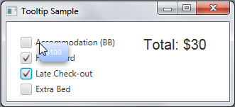
Description of "Figure 29-1 Tooltip with the Blue Background Color"
Note that when you modify the default style of a tooltip, the new look is applied to all the tooltips in your application.
Another popular design task is changing the default marks for the controls. For example, the default style of the CheckBox class defines the traditional check mark for the selected state. You can redefine the shape of the mark as well as its color as shown in Example 29-2.
Example 29-2 Alternative Mark for a Checkbox
.check-box .mark {
    -fx-shape:
"M2,0L5,4L8,0L10,0L10,2L6,5L10,8L10,10L8,10L5,6L2,10L0,10L0,8L4,5L0,2L0,0Z";
}
.check-box:selected .mark {
    -fx-background-color: #0181e2;
}
The -fx-shape property sets the new SVG path for the mark, and the -fx-background-color property defines its color. When the modified style sheets are enabled in the CheckBoxSample application, the selected checkboxes contain X marks instead of check marks, as shown in Figure 29-2.
Figure 29-2 ComboBoxSample with the Modified Checkbox Style
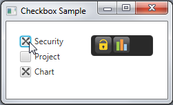
Description of "Figure 29-2 ComboBoxSample with the Modified Checkbox Style"
Many developers asked how to overcome the limitation in visual style of the TableView and ListView controls. By default, all rows in these controls are shown, whether they are empty or not. With the proper CSS settings, you can set a specific color for all empty rows. Example 29-3 implements this task for a TableView control.
Example 29-3 Setting Color for Empty Rows in a Table View
.table-row-cell:empty {
    -fx-background-color: lightyellow;
}

.table-row-cell:empty .table-cell {
    -fx-border-width: 0px;
}
The first CSS style determines that all empty rows, regardless of whether they are even or odd, should have light yellow backgrounds. When the table-row-cell is empty, the second CSS statement removes the vertical border that is painted on the right-hand side of all table cells.
When the CSS styles from Example 29-3 are enabled in the TableViewSample application, the Address Book table looks as shown Figure 29-3.
Figure 29-3 TableViewSample with Color Added to the Empty Rows
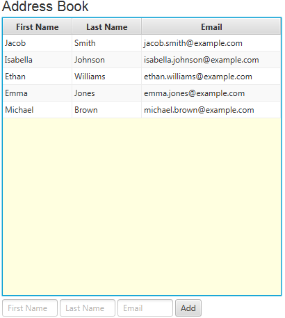
Description of "Figure 29-3 TableViewSample with Color Added to the Empty Rows"
You can even set the null value for the background color of the empty cells. The style sheets will use the default background color of the table view in this case. See Figure 29-4 to evaluate the effect.
Figure 29-4 TableViewSample with Null Background Color Added to the Empty Rows
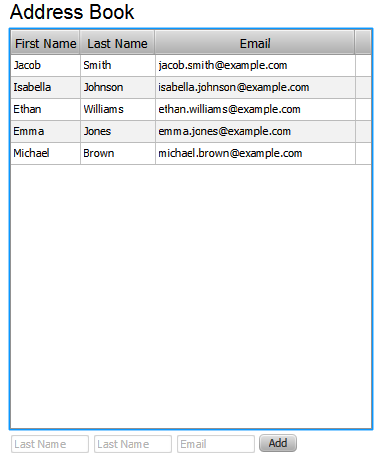
Description of "Figure 29-4 TableViewSample with Null Background Color Added to the Empty Rows"
You can set more CSS properties for UI Controls to alter their shapes, color schemes, and the applied effects. See the JavaFX CSS Reference Guide for more information about available CSS properties and classes.
Altering Default Behavior
Many developers requested a specific API to restrict input in the text field, for example, to allow only number values. Example 29-4 provides a simple application with a numeric text field.
Example 29-4 Prohibiting Letters in the Text Field
import javafx.application.Application;
import javafx.event.ActionEvent;
import javafx.geometry.Insets;
import javafx.scene.Group;
import javafx.scene.Scene;
import javafx.scene.control.*;
import javafx.scene.layout.GridPane;
import javafx.stage.Stage;

public class CustomTextFieldSample extends Application {

    final static Label label = new Label();

    @Override
    public void start(Stage stage) {
        Group root = new Group();
        Scene scene = new Scene(root, 300, 150);
        stage.setScene(scene);
        stage.setTitle("Text Field Sample");

        GridPane grid = new GridPane();
        grid.setPadding(new Insets(10, 10, 10, 10));
        grid.setVgap(5);
        grid.setHgap(5);

        scene.setRoot(grid);
        final Label dollar = new Label("$");
        GridPane.setConstraints(dollar, 0, 0);
        grid.getChildren().add(dollar);

        final TextField sum = new TextField() {
            @Override
            public void replaceText(int start, int end, String text) {
                if (!text.matches("[a-z, A-Z]")) {
                    super.replaceText(start, end, text);
                }
                label.setText("Enter a numeric value");
            }

            @Override
            public void replaceSelection(String text) {
                if (!text.matches("[a-z, A-Z]")) {
                    super.replaceSelection(text);
                }
            }
        };

        sum.setPrefColumnCount(10);
        GridPane.setConstraints(sum, 1, 0);
        grid.getChildren().add(sum);

        Button submit = new Button("Submit");
        GridPane.setConstraints(submit, 2, 0);
        grid.getChildren().add(submit);

        submit.setOnAction((ActionEvent e) -> {
            label.setText(null);
        });

        GridPane.setConstraints(label, 0, 1);
        GridPane.setColumnSpan(label, 3);
        grid.getChildren().add(label);

        scene.setRoot(grid);
        stage.show();
    }

    public static void main(String[] args) {
        launch(args);
    }
}
To redefine the default implementation of the TextField class, you must override the replaceText and replaceSelection methods inherited from the TextInputControl class.
When the user tries to enter any letter in the Sum text field, no symbols appear, and the warning message is shown. Figure 29-5 illustrates this situation.
Figure 29-5 Attempt to Enter Letter Symbols

Description of "Figure 29-5 Attempt to Enter Letter Symbols"
However, when the user attempts to enter the numeric values, they appear in the field as shown in Figure 29-6.
Implementing Cell Factories
Appearance and even behavior of four UI controls can be entirely customized by using the mechanism of cell factories. You can apply cell factories to TableView, ListView, TreeView, and ComboBox. A cell factory is used to generate cell instances, which are used to represent any single item of these controls.
The Cell class extends the Labeled class, which provides all the required properties and methods to implement the most typical use case — showing and editing text. However, when the task of your application requires showing graphical objects in the lists or tables, you can use the graphic property and place any Node in the cell (see the Cell class API specification for more information about custom cells).
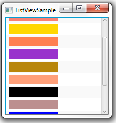
For instance, the code fragments in Example 29-5 create a cell factory for the list view and redefine the content of the cells within the updateItem method, so that the list shows rectangles of different colors.
Example 29-5 Implementing Cell Factories for the ListView Control
list.setCellFactory((ListView<String> l) -> new ColorRectCell());
...
static class ColorRectCell extends ListCell<String> {
    @Override
    public void updateItem(String item, boolean empty) {
        super.updateItem(item, empty);
        Rectangle rect = new Rectangle(100, 20);
        if (item != null) {
            rect.setFill(Color.web(item));
            setGraphic(rect);
        } else {
            setGraphic(null);
        }
    }
}
Figure 29-7 shows how this customized list looks in the ListViewSample of the UI Control Samples project.
Figure 29-7 List View with Color Rectangles
Description of "Figure 29-7 List View with Color Rectangles"
This tutorial uses the cell factory mechanism extensively to customize UI controls. You can customize these controls by using the cell factory mechanism or use the prefabricated cell editor implementations that provide specific data models underlying the visualization. Table 29-1 lists the corresponding classes available in the JavaFX API.
Table 29-1 Cell Editor Classes for the List View, Tree View, and Table View Controls
| Control | Cell Editor Classes |
|---|---|
|
List view |
|
|
Tree view |
|
|
Table view |
|
|
Tree Table View |
|
Each cell editor class draws a specific node inside the cell. For example, the CheckBoxListCell class draws a CheckBox node inside the list cell.
To evaluate more cell factory and cell editor use cases, see the Table View, Tree View, and Combo Box chapters.
Related Documentation and Resources


