26 Date Picker
This chapter provides an overview of the date data supported in JavaFX and describes the basic features of the DatePicker control.
JavaFX DatePicker is a control that enables selection of a day from the given calendar. It is used mainly on web sites or in applications that require users to enter a date. The DatePicker control consists of a combo box with a date field and a date chooser.
Working with Time Data and Date Formats
The new Date-Time API introduced in JDK 8 enables you to perform various operations with Date and Time data, including setting the calendar and local time across different time zones.
The basic package of the Date-Time API is java.time. It provides the following classes that define time in the calendar system based on the International Organization for Standardization (ISO) calendar.
-
Clock– a clock providing access to the current instant, date, and time using a time-zone -
Duration– a time-based amount of time -
Instant– an instantaneous point on the timeline -
LocalDate– a date without a time-zone in the ISO-8601 calendar system -
LocalDateTime– a date-time without a time zone in the ISO-8601 calendar system -
LocalTime– a time without time zone in the ISO-8601 calendar system -
MonthDay– a month day in the ISO-8601 calendar system -
OffsetDateTime– a date-time with an offset from Greenwich/UTC time in the ISO-8601 calendar system -
OffsetTime– a time with an offset from Greenwich/UTC time in the ISO-8601 calendar system -
Period– a date-based amount of time -
Year– a year in the ISO-8601 calendar system -
YearMonth– a year-month in the ISO-8601 calendar system -
ZonedDateTime– a date time with a time zone in the ISO-8601 calendar system -
ZoneId– a time zone ID -
ZoneOffset– a time zone offset from Greenwich/UTC time
See the Date-Time API trail of the Java Tutorials for more information about the available functionality and code samples.
Date Picker Design Overview
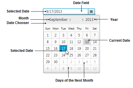
To enhance the user interfaces of JavaFX applications with the new capabilities of the JDK 8 Date-Time API, JavaFX SDK introduced the DatePicker control. The DatePicker control consists of an editable combo box (date field) and a calendar (date chooser) shown in Figure 26-1.
Figure 26-1 Example of a Date Picker Control
Description of "Figure 26-1 Example of a Date Picker Control"
Adding a Date Picker to an Application UI
Use the DatePicker class available in the javafx.scene.control package to add a date picker component to the user interface (UI) of your JavaFX application as shown in Example 26-1.
Example 26-1 Adding a Date Picker Component
import java.util.Locale;
import javafx.application.Application;
import javafx.geometry.HPos;
import javafx.scene.Scene;
import javafx.scene.control.DatePicker;
import javafx.scene.control.Label;
import javafx.scene.layout.GridPane;
import javafx.scene.layout.VBox;
import javafx.stage.Stage;

public class DatePickerSample extends Application {

    private Stage stage;
    private DatePicker checkInDatePicker;
    public static void main(String[] args) {
        Locale.setDefault(Locale.US);
        launch(args);
    }

    @Override
    public void start(Stage stage) {
        this.stage = stage;
        stage.setTitle("DatePickerSample ");
        initUI();
        stage.show();
    }

    private void initUI() {
        VBox vbox = new VBox(20);
        vbox.setStyle("-fx-padding: 10;");
        Scene scene = new Scene(vbox, 400, 400);
        stage.setScene(scene);

        checkInDatePicker = new DatePicker();

        GridPane gridPane = new GridPane();
        gridPane.setHgap(10);
        gridPane.setVgap(10);

        Label checkInlabel = new Label("Check-In Date:");
        gridPane.add(checkInlabel, 0, 0);

        GridPane.setHalignment(checkInlabel, HPos.LEFT);
        gridPane.add(checkInDatePicker, 0, 1);
        vbox.getChildren().add(gridPane);
    }
}
Example 26-1 implements a typical UI for selecting a check-in date for hotel booking. When you compile and run the application, the component shown in Figure 26-2 appears.
Figure 26-2 Initial View of a Date Picker Component

Description of "Figure 26-2 Initial View of a Date Picker Component"
Note that in the initial state the date field is empty. However, you can change this behavior and specify the date value to be shown before any date is selected. Set the value property in the DatePicker constructor or call the setValue method inherited from the ComboBox class. Example 26-2 shows several options for setting the LocalDate values.
Example 26-2 Setting Date Values
//Setting a particular date value in the class constructor
checkInDatePicker = new DatePicker(LocalDate.of(1998, 10, 8));
//Setting a particular date value by using the setValue method
checkInDatePicker.setValue(LocalDate.of(1998, 10, 8));
//Setting the minimum date available in the calendar
checkInDatePicker.setValue(LocalDate.MIN);
//Setting the maximum date available in the calendar
checkInDatePicker.setValue(LocalDate.MAX);
//Setting the current date
checkInDatePicker.setValue(LocalDate.now());
Once the initial value is set, it appears in the date field after you compile and run the application. Figure 26-3 shows a specified initial date in a date field.
Figure 26-3 Date Field with the Specified Initial Date

Description of "Figure 26-3 Date Field with the Specified Initial Date"
The DatePicker API provides several properties and methods to alter the default appearance and behavior of a date picker. In particular, you can toggle showing of the week numbers, customize date formats, and define and apply date cell factories.
Customizing the Date Picker
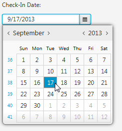
You can enable and disable showing the ISO week numbers in the calendar by using the setShowWeekNumbers method of the DatePicker class. Example 26-3 is a code line that implements this task for the checkInDatePicker.
This modification produces the date picker component with the week numbers added to the calendar element as shown in Figure 26-4.
Figure 26-4 Showing Week Numbers in the Calendar
Description of "Figure 26-4 Showing Week Numbers in the Calendar"
By default, the dates in the date field are shown in the format defined by the system locale and the ISO calendar system. Thus, the selected dates in Example 26-1 are shown in the following format: mm/dd/yyyy. Normally, you do not need to modify that default format. Still, the converter property and the setConverter method of the DatePicker class enable you to set an alternative date format when required. Setting the converter value to null restores the default date format.
In Example 26-4, you create a converter to alter the format of the date according to the following pattern: yyyy-MM-dd. It converts the input text to an object of the LocalDate type when users enter a date in the date field. It also converts the LocalDate object that corresponds to the date selected in the calendar to the text shown in the date field.
Example 26-4 Converting a Date Format
import java.time.LocalDate;
import java.time.format.DateTimeFormatter;
import java.util.Locale;
import javafx.application.Application;
import javafx.geometry.HPos;
import javafx.scene.Scene;
import javafx.scene.control.DatePicker;
import javafx.scene.control.Label;
import javafx.scene.layout.GridPane;
import javafx.scene.layout.VBox;
import javafx.stage.Stage;
import javafx.util.StringConverter;

public class DatePickerSample extends Application {

    private Stage stage;
    private DatePicker checkInDatePicker;
    private final String pattern = "yyyy-MM-dd";

    public static void main(String[] args) {
        Locale.setDefault(Locale.US);
        launch(args);
    }

    @Override
    public void start(Stage stage) {
        this.stage = stage;
        stage.setTitle("DatePickerSample ");
        initUI();
        stage.show();
    }

    private void initUI() {
        VBox vbox = new VBox(20);
        vbox.setStyle("-fx-padding: 10;");
        Scene scene = new Scene(vbox, 400, 400);
        stage.setScene(scene);
        checkInDatePicker = new DatePicker();
        StringConverter converter = new StringConverter<LocalDate>() {
            DateTimeFormatter dateFormatter =
                DateTimeFormatter.ofPattern(pattern);
            @Override
            public String toString(LocalDate date) {
                if (date != null) {
                    return dateFormatter.format(date);
                } else {
                    return "";
                }
            }
            @Override
            public LocalDate fromString(String string) {
                if (string != null && !string.isEmpty()) {
                    return LocalDate.parse(string, dateFormatter);
                } else {
                    return null;
                }
            }
        };
        checkInDatePicker.setConverter(converter);
        checkInDatePicker.setPromptText(pattern.toLowerCase());
        GridPane gridPane = new GridPane();
        gridPane.setHgap(10);
        gridPane.setVgap(10);
        Label checkInlabel = new Label("Check-In Date:");
        gridPane.add(checkInlabel, 0, 0);
        GridPane.setHalignment(checkInlabel, HPos.LEFT);
        gridPane.add(checkInDatePicker, 0, 1);
        vbox.getChildren().add(gridPane);
        checkInDatePicker.requestFocus();
    }
}
In addition to converting the date format, Example 26-4 sets the prompt text for the date field to inform users about the required date format. Figure 26-5 shows two states of the date picker with the date format converter applied. Both the prompt text and the selected date are shown in the new format.
Figure 26-5 Date Picker with the Format Converter and Prompt Text

Description of "Figure 26-5 Date Picker with the Format Converter and Prompt Text"
You can also modify the default appearance and set a specific behavior for any cell or several cells of a calendar element. To implement this task, consider a real-life use case: selecting check-in and check-out dates during hotel booking. Example 26-5 creates a typical user interface with two date pickers.
Example 26-5 Adding Two Date Picker Components
import java.time.LocalDate;
import java.util.Locale;
import javafx.application.Application;
import javafx.geometry.HPos;
import javafx.scene.Scene;
import javafx.scene.control.DatePicker;
import javafx.scene.control.Label;
import javafx.scene.layout.GridPane;
import javafx.scene.layout.VBox;
import javafx.stage.Stage;

public class DatePickerSample extends Application {

    private Stage stage;
    private DatePicker checkInDatePicker;
    private DatePicker checkOutDatePicker;

    public static void main(String[] args) {
        Locale.setDefault(Locale.US);
        launch(args);
    }

    @Override
    public void start(Stage stage) {
        this.stage = stage;
        stage.setTitle("DatePickerSample ");
        initUI();
        stage.show();
    }

    private void initUI() {
        VBox vbox = new VBox(20);
        vbox.setStyle("-fx-padding: 10;");
        Scene scene = new Scene(vbox, 400, 400);
        stage.setScene(scene);
        checkInDatePicker = new DatePicker();
        checkOutDatePicker = new DatePicker();
        checkInDatePicker.setValue(LocalDate.now());
        checkOutDatePicker.setValue(checkInDatePicker.getValue().plusDays(1));
        GridPane gridPane = new GridPane();
        gridPane.setHgap(10);
        gridPane.setVgap(10);
        Label checkInlabel = new Label("Check-In Date:");
        gridPane.add(checkInlabel, 0, 0);
        GridPane.setHalignment(checkInlabel, HPos.LEFT);
        gridPane.add(checkInDatePicker, 0, 1);
        Label checkOutlabel = new Label("Check-Out Date:");
        gridPane.add(checkOutlabel, 0, 2);
        GridPane.setHalignment(checkOutlabel, HPos.LEFT);
        gridPane.add(checkOutDatePicker, 0, 3);
        vbox.getChildren().add(gridPane);
    }
}
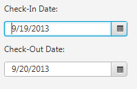
The predefined value of the checkInDatePicker in Example 26-5 is LocalDate.now(), which corresponds to the current date from the system clock. The predefined date of the checkOutDatePicker is the next date after the current date.
When you compile and run this example on September 19, 2013, it produces the output shown in Figure 26-6.
By default, all the cells in the calendar elements are available for selection. This could lead to a situation in which the check-out date precedes the check-in date, which is incorrect.
Example 26-6 creates a day cell factory for the checkOutDatePicker to disable the cell that corresponds to the date selected in the checkInDatePicker and all the cells corresponding to the preceding dates.
Example 26-6 Implementing a Day Cell Factory to Disable Some Days
import java.time.LocalDate;
import java.util.Locale;
import javafx.application.Application;
import javafx.geometry.HPos;
import javafx.scene.Scene;
import javafx.scene.control.DateCell;
import javafx.scene.control.DatePicker;
import javafx.scene.control.Label;
import javafx.scene.layout.GridPane;
import javafx.scene.layout.VBox;
import javafx.stage.Stage;
import javafx.util.Callback;

public class DatePickerSample extends Application {

    private Stage stage;
    private DatePicker checkInDatePicker;
    private DatePicker checkOutDatePicker;

    public static void main(String[] args) {
        Locale.setDefault(Locale.US);
        launch(args);
    }

    @Override
    public void start(Stage stage) {
        this.stage = stage;
        stage.setTitle("DatePickerSample ");
        initUI();
        stage.show();
    }

    private void initUI() {
        VBox vbox = new VBox(20);
        vbox.setStyle("-fx-padding: 10;");
        Scene scene = new Scene(vbox, 400, 400);
        stage.setScene(scene);
        checkInDatePicker = new DatePicker();
        checkOutDatePicker = new DatePicker();
        checkInDatePicker.setValue(LocalDate.now());
        final Callback<DatePicker, DateCell> dayCellFactory =
            new Callback<DatePicker, DateCell>() {
                @Override
                public DateCell call(final DatePicker datePicker) {
                    return new DateCell() {
                        @Override
                        public void updateItem(LocalDate item, boolean empty) {
                            super.updateItem(item, empty);

                            if (item.isBefore(
                                    checkInDatePicker.getValue().plusDays(1))
                                ) {
                                    setDisable(true);
                                    setStyle("-fx-background-color: #ffc0cb;");
                            }
                    }
                };
            }
        };
        checkOutDatePicker.setDayCellFactory(dayCellFactory);
        checkOutDatePicker.setValue(checkInDatePicker.getValue().plusDays(1));
        GridPane gridPane = new GridPane();
        gridPane.setHgap(10);
        gridPane.setVgap(10);
        Label checkInlabel = new Label("Check-In Date:");
        gridPane.add(checkInlabel, 0, 0);
        GridPane.setHalignment(checkInlabel, HPos.LEFT);
        gridPane.add(checkInDatePicker, 0, 1);
        Label checkOutlabel = new Label("Check-Out Date:");
        gridPane.add(checkOutlabel, 0, 2);
        GridPane.setHalignment(checkOutlabel, HPos.LEFT);
        gridPane.add(checkOutDatePicker, 0, 3);
        vbox.getChildren().add(gridPane);
    }
}
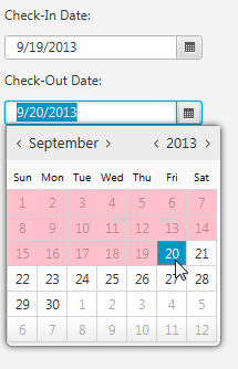
The dayCellFactory applied to the checkOutDatePicker calls the setDisable and setStyle methods on a DateCell item to protect the cells from selection and paint them with the pink color.
When you compile and run the code in Example 26-6, the DatePickerSample produces a UI with the expected behavior shown in Figure 26-7.
Figure 26-7 Disabling Cells in the Calendar Element
Description of "Figure 26-7 Disabling Cells in the Calendar Element"
Now that you have learned how to create day cell factories, you can extend the default behavior of the checkOutDatePicker and provide additional functionality for the date cells that are enabled for selection.
Example 26-7 calculates the day interval between the date selected in the checkInDatePicker and the current date cell. The result is rendered in the cell tooltip.
Example 26-7 Calculating a Time Interval
import java.time.LocalDate;
import java.time.temporal.ChronoUnit;
import java.util.Locale;
import javafx.application.Application;
import javafx.geometry.HPos;
import javafx.scene.Scene;
import javafx.scene.control.DateCell;
import javafx.scene.control.DatePicker;
import javafx.scene.control.Label;
import javafx.scene.control.Tooltip;
import javafx.scene.layout.GridPane;
import javafx.scene.layout.VBox;
import javafx.stage.Stage;
import javafx.util.Callback;

public class DatePickerSample extends Application {

    private Stage stage;
    private DatePicker checkInDatePicker;
    private DatePicker checkOutDatePicker;

    public static void main(String[] args) {
        Locale.setDefault(Locale.US);
        launch(args);
    }

    @Override
    public void start(Stage stage) {
        this.stage = stage;
        stage.setTitle("DatePickerSample ");
        initUI();
        stage.show();
    }

    private void initUI() {
        VBox vbox = new VBox(20);
        vbox.setStyle("-fx-padding: 10;");
        Scene scene = new Scene(vbox, 400, 400);
        stage.setScene(scene);
        checkInDatePicker = new DatePicker();
        checkOutDatePicker = new DatePicker();
        checkInDatePicker.setValue(LocalDate.now());
        final Callback<DatePicker, DateCell> dayCellFactory =
            new Callback<DatePicker, DateCell>() {
                @Override
                public DateCell call(final DatePicker datePicker) {
                    return new DateCell() {
                        @Override
                        public void updateItem(LocalDate item, boolean empty) {
                            super.updateItem(item, empty);
                            if (item.isBefore(
                                    checkInDatePicker.getValue().plusDays(1))
                                ) {
                                    setDisable(true);
                                    setStyle("-fx-background-color: #ffc0cb;");
                            }
                            long p = ChronoUnit.DAYS.between(
                                    checkInDatePicker.getValue(), item
                            );
                            setTooltip(new Tooltip(
                                "You're about to stay for " + p + " days")
                            );
                    }
                };
            }
        };
        checkOutDatePicker.setDayCellFactory(dayCellFactory);
        checkOutDatePicker.setValue(checkInDatePicker.getValue().plusDays(1));
        GridPane gridPane = new GridPane();
        gridPane.setHgap(10);
        gridPane.setVgap(10);
        Label checkInlabel = new Label("Check-In Date:");
        gridPane.add(checkInlabel, 0, 0);
        GridPane.setHalignment(checkInlabel, HPos.LEFT);
        gridPane.add(checkInDatePicker, 0, 1);
        Label checkOutlabel = new Label("Check-Out Date:");
        gridPane.add(checkOutlabel, 0, 2);
        GridPane.setHalignment(checkOutlabel, HPos.LEFT);
        gridPane.add(checkOutDatePicker, 0, 3);
        vbox.getChildren().add(gridPane);
    }
}
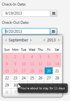
When you compile and run the modified DatePickerSample application, you can see the tooltip if you hover the mouse cursor over a date cell. Figure 26-8 captures the moment when you put a mouse cursor over the cell for September 30. The tooltip states that the time interval between September 19 and September 30 is 11 days.
Figure 26-8 Setting a Tooltip for a Date Cell
Description of "Figure 26-8 Setting a Tooltip for a Date Cell"
Altering the Calendar System
The Date-Time Java API introduced in JDK 8 enables developers to operate not only with ISO-based calendar systems but also with alternative chronologies, such as Japanese, Hijrah, Minguo, and Thai Buddhist.
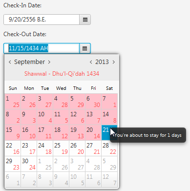
The DatePicker control also supports non-ISO calendar systems by rendering the appropriate year. For the Hijrah chronology, in which month dates do not coincide with the ISO dates, it provides an additional visual theme to distinguish between ISO and Hijrah days of the month.
Example 26-8 applies the Thai Buddhist chronology to the checkInDatePicker and the Hijrah chronology to the checkOutDatePicker.
Example 26-8 Applying Thai Buddhist and Hijrah Chronologies
import java.time.chrono.*;

checkInDatePicker.setChronology(ThaiBuddhistChronology.INSTANCE);
checkOutDatePicker.setChronology(HijrahChronology.INSTANCE);
When these lines are added to the DatePickerSample application, the date picker controls change their appearance as shown in Figure 26-9.
You can find out more details about Non-ISO Date support in the corresponding lesson of the Java Tutorials.
Related Documentation
