30 UI Controls on the Embedded Platforms
In addition to the full range of desktop features, the JavaFX Software Development Kit (SDK) introduces new operational capabilities of UI controls designed for touch-enabled devices.
This chapter describes the specific of using JavaFX UI controls in the embedded environments.
Embedded Runtime Features
Although JavaFX UI controls do not include any additional public APIs to work in the embedded environments, significant implementation changes were made to enable developers using the desktop controls in their JavaFX applications for touch-enabled devices.
Support for Touch-Enabled Devices
The JavaFX SDK introduces additional operational capabilities of UI controls for touch-enabled devices: gestures and touches. Gestures can be generated for both touchscreen and trackpad actions, but touches are delivered for touchscreen actions only. In the current release JavaFX SDK supports only a single-point touch and only swipe gestures.
See the chapter on working with events from touch-enabled devices in Handling Events for more information about handling gestures and touch events in JavaFX.
Virtual Keyboard
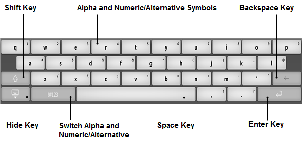
The virtual keyboard is a control that enables typing text on devices that lack a hardware keyboard. It operates the same way as any hardware keyboard except that numbers and symbols are located one tap away due to space constraints. Figure 30-1 shows an example of the virtual keyboard.
The virtual keyboard is shown automatically when a text input field is in focus. Note that the control that is associated with the keyboard remains visible when the keyboard is displayed. There is no need to push the parent stage up. The keyboard slides in from the bottom area pushing the parent stage up in order to keep the control that the keyboard is associated with visible on the screen.
When the virtual keyboard appears, users can type a character by tapping the appropriate key. After that, character that is associated with the key is sent to the control. User can type alpha, numeric, and symbol characters. To switch between the keyboards, they need to use the ABC/!#123 key and the Shift key. To access less frequently used characters, users need to press the appropriate key for longer time and choose the target key from the pop-up menu, as shown in Figure 30-2.
Figure 30-2 Typing Less Frequently Used Characters
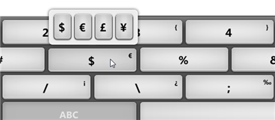
Description of "Figure 30-2 Typing Less Frequently Used Characters"
Table 30-1 lists possible navigating actions within the virtual keyboard on touch-enabled devices.
Table 30-1 Navigation Within the Virtual Keyboard
| Action | Sequence of Keys |
|---|---|
|
Type a letter. |
On the alpha keyboard: type a letter key. On the numeric/alternative keyboard: tap the "ABC" key, then type a letter key. |
|
Type a capital letter. |
On the alpha keyboard: tap the Shift key once, then type a letter key. |
|
Type capital letters. |
On the alpha keyboard: tap the Shift key twice, then tap letter keys. |
|
Type a number. |
On the numeric/alternative keyboard: type a number. On the alpha keyboard: tap the "!#123" key and type any number you want. |
|
Type an alternative symbol. |
On the numeric/alternative keyboard: type an alternative symbol. On the alpha keyboard: tap the "!#123" key and type an alternative symbol. |
|
Delete a character. |
Tap the Backspace key to delete character on the left side of the caret. |
|
Confirmed entered data. |
Tap the Enter key to confirm entered data. |
|
Hide the virtual keyboard. |
Tap a Hide button that is left-most in the lowest row of the keyboard. |
When UI interface of your application requires typing email address, URL, or only numeric symbols, you can set one of the alternative keyboard layouts. This setting is defined for a particular text control as shown in Example 30-1.
Example 30-1 Setting Email Layout for the Virtual Keyboard
final TextField emailAddress = new TextField("myEmail@example.com");
text.getProperties().put("vkType", "email");
Currently, the vkType property supports the following values: numeric, url, email, and text. The last one corresponds to the default layout.
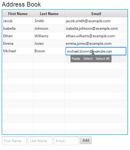
Figure 30-3 shows the email layout of the keyboard. In addition to letters, number, and alternative symbols, the layout has "@" and ".com" (".org") keys that are particularly helpful for quick typing email addresses.
Figure 30-3 Email Layout of the Virtual Keyboard

Description of "Figure 30-3 Email Layout of the Virtual Keyboard"
The URL layout of the virtual keyboard, shown in Figure 30-4, does not have the Space key. Instead, it provides capabilities to type in "www." and "http//".
Figure 30-4 URL Layout of the Virtual Keyboard

Description of "Figure 30-4 URL Layout of the Virtual Keyboard"
In some UIs, users are supposed to enter only numbers. Figure 30-5 shows a simplified numeric layout of the virtual keyboard that implements this task. No Shift key, neither alternative symbols are available in this layout.
Figure 30-5 Numeric Layout of the Virtual Keyboard

Description of "Figure 30-5 Numeric Layout of the Virtual Keyboard"
Appearance of UI Controls on Embedded Platforms
The embedded.css style sheet is designed specifically for touch-enabled platforms. It supplements the modena.css style sheet and overrides some of its styles. The UAStylesheetLoader class manages the styles of UI controls switching the CSS files when a touch-enabled platform is detected.
The embedded.css style sheet alters the appearance of the following controls:
-
ScrollBar,ScrollPane— redefines the scrolling elements -
TextArea,TextField,PasswordField,DatePicker— visualizes carets -
ContextMenu— introduces the horizontal context menu
Scrolling Controls
A scroll pane on a mobile touch platform performs scrolling as a result of touch gestures targeted on scroll view content. Scroll bars are hidden when the user is not interacting with the scroll pane, even if the content is bigger than the scroll pane. Scroll bars appear automatically after the touch gestures are performed, but only as an indicator of content size and position, not as an active control that the user uses for scrolling. When scroll bars appear, they overlap visible content and do not shift it like on the desktop platform, as shown in Figure 30-6.
Figure 30-6 Appearance of the Scroll Pane in Desktop and Embedded Environments
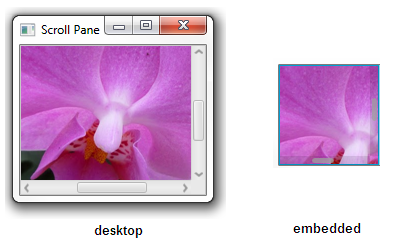
Description of "Figure 30-6 Appearance of the Scroll Pane in Desktop and Embedded Environments"
Scroll bars disappear automatically when the content stops scrolling.
Text Input Controls
On touch-enabled platforms, TextArea, TextField, and PasswordField are implemented as rectangular spaces where users can enter a single line or multiple lines of text. Interaction with text controls is similar for all platforms. However, for embedded environments, the caret is used to facilitate navigation and text selection. The virtual keyboard is used to enter characters into text controls.
Figure 30-7 shows the TextFieldSample application running on a touch-enabled platform. The caret indicates the place where a user enters the symbols with the help of the virtual keyboard. See the code at TextFieldSample.java.
Figure 30-7 Appearance of the TextField Control
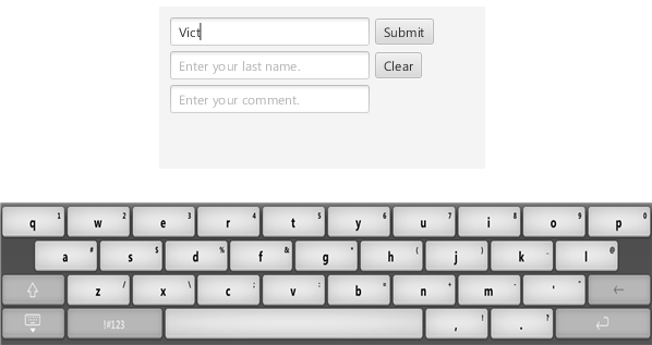
Description of "Figure 30-7 Appearance of the TextField Control"
The virtual keyboard is shown automatically when a text input field is in focus and it reacts when devices are rotated. The virtual keyboard appears when users need to enter text into TextField, TextArea, PasswordField, and other UI controls if their edit state is enabled. To hide the keyboard, users can tap a Hide button or tap outside the control.
Context Menus
The default appearance of the context menu is changed for the embedded environments to provide the horizontal layout of the menu items.
The context menu is invoked when users tap and hold. If nothing is in the clipboard, then the context menu shows Select and Select All menu items. If something is in the clipboard, then the context menu looks as shown in Figure 30-8.
If the text in the text control is selected, then the Cut, Copy, Paste, and Select All items are displayed, as shown in Figure 30-9.
Figure 30-9 Appearance of a Context Menu After Selection Is Performed
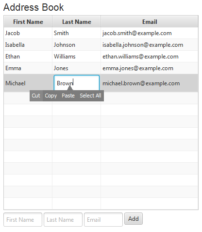
Description of "Figure 30-9 Appearance of a Context Menu After Selection Is Performed"
You can find another style sheet for the touch-enabled platforms in the JavaFX SDK. The embedded-qvga.css file defines the CSS styles for embedded devices that have QVGA screens. In particular, it specifies alternative padding for the TextField and TextArea controls.
UI Controls Features Available on the Embedded Platforms
In addition to the visual changes mentioned in the previous section, the behavior of UI controls is modified to accommodate single point touches and swipe gestures. Table 30-2 summarizes these changes.
Table 30-2 Features Specific to Embedded Runtime
| UI Control | User Action | Touch Support |
|---|---|---|
|
|
Tap. |
Activates the button. |
|
|
Tap. |
Switches the selected and deselected states of a check box. |
|
|
Tap a drop-down icon. |
Displays or hides the active list. The item that is displayed in the text field is selected when the active list is open. |
|
Tap on the text field. |
For a noneditable combo box: displays the active list. For an editable combo box: places the caret into the text field. |
|
|
Tap on an item in the list. |
Closes the active list and commits the value. |
|
|
Tap outside the list. |
Closes the list. |
|
|
Drag. |
Scrolls the content continuously following the drag gesture. |
|
|
Drop. |
Stops scrolling. |
|
|
Swipe. |
Invokes accelerated scrolling. |
|
|
|
Drag. |
Scrolls the content continuously following the drag gesture. |
|
Drop. |
Stops scrolling. |
|
|
Swipe. |
Invokes accelerated scrolling. |
|
|
Tap. |
Selects an item and activates the action associated with it. If the content is scrolling, then it stops scrolling. |
|
|
Double-tap. |
If enabled, enters inline editing mode. |
|
|
|
Tap. |
Sets the caret. |
|
Double-tap. |
Selects the content. |
|
|
Tap and hold. |
Opens a context menu. |
|
|
Swipe. |
Invokes accelerated scrolling. |
|
|
Drag . |
Scrolls the content continuously following the drag gesture. |
|
|
Drop. |
Stops scrolling. When the user "over-scrolls" the content beyond the |
|
|
|
Tap. |
If the radio button is selected, then no action is performed. If it is deselected, then the tap makes it selected and other radio buttons in the group are deselected. |
|
|
Drag. |
Scrolls the content continuously following the drag gesture. |
|
Drop. |
Stops scrolling. |
|
|
Swipe. |
Invokes accelerated scrolling. |
|
|
Tap. |
Selects an item and activates the action associated with it. If the content is scrolling, then it stops scrolling. |
|
|
|
Tap. |
Selects the cell or invokes an action if the cell is actionable. Expands or collapses the node for the tree view. |
|
Double-tap. |
Switches to editing if the selected cell supports editing. |
|
|
Drag. |
Scrolls the content continuously following the drag gesture. |
|
|
Drop. |
Stops scrolling. |
|
|
Swipe. |
Invokes accelerated scrolling of content. |
|
|
|
Short tap a color in the Color field or Custom Colors area in the Color Palette. |
Updates the color in the color chooser. Closes the color palette. Applies the color. |
|
Tap outside the palette. |
Closes the palette. |
|
|
Tap any place in the Color field of the Custom Color dialog window. |
Updates values in RGB, HSB, and Web panes. Updates New Color in the Color Preview. |
|
|
Tap any place in the Hue bar of the Custom Color dialog window. |
Updates values in RGB, HSB, and Web panes. Updates New Color in the Custom Color dialog window. |
|
|
Tap any place on the slider, or drag the sliders to the left or right. |
Dismisses the dialog window. Closes the color palette. Updates the color chooser. Applies the color. |
|
|
|
Tap a page button. |
Opens the selected page. |
|
Tap the Next button, Swipe left. |
Opens the next page. |
|
|
Tap the Previous button, Swipe right. |
Opens the previous page. |
|
|
|
Tap the date field. |
Displays caret in the field; virtual keyboard appears. |
|
Tap the calendar icon. |
Displays and hides the calendar. |
|
|
Tap the LEFT or RIGHT calendar arrows. |
Display previous or next month and year. |
|
|
Tap any date in the calendar. |
Updates the field with selected date and closes the calendar. |
|
|
Tap outside the calendar. |
Closes the calendar without updating the field. |
All the actions mentioned in Table 30-2 are enabled when the application is run on the touch-enabled platform, and they do not require any additional code.
UI Controls Features That Are Not Available on Embedded Touch Platforms
The following list shows some features of UI controls that are currently disabled on embedded platforms:
-
Column resizing, column rearranging, and data sorting in table views
-
Multi selection in list views and tree views
-
Text copy support in password fields
Other Features That Are Not Available on Embedded Touch Platforms
Fhe following JavaFX features are not supported on the embedded platforms:
-
Functionality of the
Stageclass related to desktop interaction is not available on some embedded platforms. For example, on these platforms aStagewindow will have not have a title or decorations and will not be resizable by the user. -
Web component – a user interface component that provides a web viewer and full browsing functionality through its API. See Adding HTML Content to JavaFX Applications for more information.
-
Media – media functionality available through the Java APIs for JavaFX. See Incorporating Media Assets Into JavaFX Applications for more information.
