This report is a bar chart comparing uses of the promotion within the time period, uses within the time period as a percentage of lifetime uses, and total uses to date. Hover the cursor over a data point on a bar to show the values for that point.
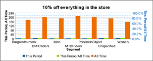
Below the chart, a table shows the data values for the following:
Promotion Name
Segment Name
Num Uses
Time Period Only Uses
Lifetime vs Time Period %
