Editing Items in a Document
There are six types of items that you can use in a web page: paragraph, questions (entry questions and choice questions), buttons, rule and line break elements, and HTML paragraphs. You can also add items from the profile elements. This section describes how to work with these items, and how to:
Build paragraphs
Build entry questions
Build choice questions
Build buttons
Add a horizontal line
Add a blank line
Add custom HTML
Add predefined profile attributes
Use prefilled fields
Format items
Note: All of the document items in this section are shown in the simple mode, where all elements and details are viewed on a single page. The functionality for each item in both modes is identical.
A paragraph allows you to add text to a web page. Paragraphs can be used as headings or as paragraphs of descriptive text.
The paragraph field in the builder allows you to enter as much text as you need. You can separate text into separate paragraphs simply by leaving a blank line between the text.
Image: Document Designer - Paragraph
This example illustrates the fields and controls on the Document Designer - Paragraph.
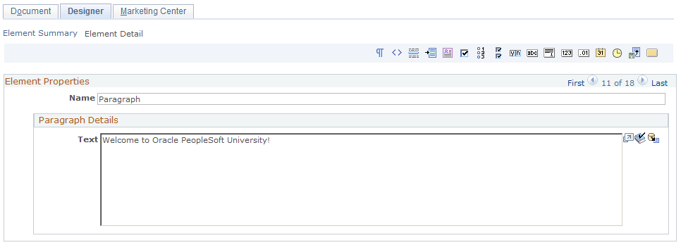
To add text to a paragraph:
Add a paragraph item to the document.
Change the paragraph's name from the default to something more descriptive.
Type the paragraph text in the Text box. You can also insert merge content into the paragraph by inserting empty brackets ({}) and clicking the Merge button.
Click the Save button to save the paragraph.
An entry question allows you to place a question on a web page, and provides a field for the respondent to enter an answer.
This section describes the steps involved in editing an entry question. It describes the following entry question types:
Text Entry
Number Entry
Decimal Entry
Date Entry
Time Entry
Text Block Entry
File Entry
You can define any entry question/answer as a hidden field by clicking the Hide Field check box. This means you can designate a default value associated with the web document being filled out (and/or the person filling it out) without that default value actually appearing on the web form for the respondent to see. For example, you could specify a default value of current date and time, so you can track in the Online Marketing database the date and time the web form was filled out. Because this field is not viewable by the respondent, it should not be designated a required field. Further, because the purpose of the field is to include a hidden, default value, it should always have a default value specified.
When designing questions, you should be aware that certain fields are needed by the system in order to properly update individual and organization profile attributes. To ensure proper updates, you should make these attributes required when designing your web pages:
When inserting a new individual into the system, the Last Name and one contact method is required. For Online Marketing, the contact method used is the Email Address. Both of these fields should be set to required (and located on the same document page) so that individuals can be properly added.
When inserting individuals with the role type Contact (as opposed to Consumer), the individual’s Company Name should be provided as well. If this is not included, the individual cannot be included in audiences. The organization information must be added to the database before the contact information (on a previous page or on the same page).
Text Entry Questions
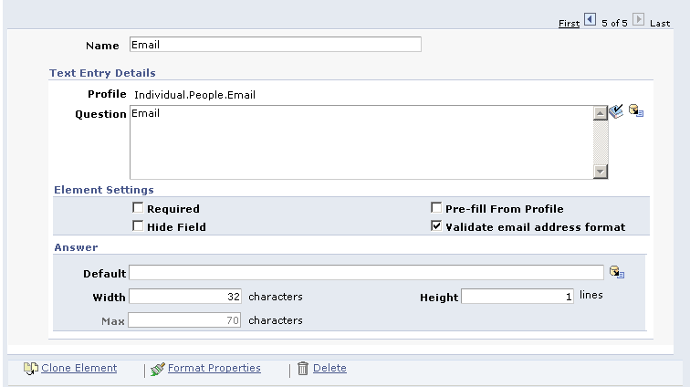
A Text Entry Box allows you to include a question with an entry field where the respondent can provide a text answer.
Image: Document Designer - Text Entry box
This example illustrates the fields and controls on the Document Designer - Text Entry box.
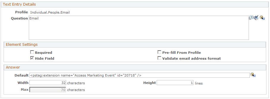
|
Field or Control |
Definition |
|---|---|
| Profile |
The name of the profile from which the question is drawn. |
| Question |
Enter the text of the question. To include merged content add empty brackets ({}) and click the Merge button. |
| Required |
Select this check box if the respondent must answer this question before being allowed to submit the form. |
| Hide Field |
Select this check box if you do not want the question to appear on the page. |
| Validate email address format |
When inserting a text entry field associated with the Individuals.People.Email or Individuals.People.Email Alternate profile into a document, you can choose to validate the email addresses that users enter into this field. By default, the Validate Email Address Format check box on the Text Entry form is selected, meaning that email addresses are validated before being entered into your database. Note: You can apply validation to any text field (for example, if you have a custom profile with an email field, you can apply it there as well). However, you should only apply it to fields that contain email addresses. To be considered valid, email addresses must be in the form username@domain, where:
The following characters cannot be included in username or subdomain: ( ) <> @ (except as a separator between the username and the subdomain) , ; : \ “ [ ] If you do not want to validate entered email addresses, clear the Validate Email Address Format check box. Note: If the Validate Email Address Format check box is selected and Required is not selected, null values are allowed in the field. You must select Required to disallow null values. |
| Default |
Specify any default text you want to have appear in the entry field. (You can also insert merge content by adding empty brackets ({}) and clicking the Merge button.) |
| Width |
Specify the width of the entry field. This value limits the number of characters on one line. The default is 32. |
| Height |
Specify the number of lines of text in the entry field. The default is 1. Note: The Height value specifies only how much text is displayed, not how much can be entered. |
| Max |
Enter the maximum number of characters that can be entered to answer the question. |
Text Block Entry
The Text Block Entry document element allows you to include text fields in your dialog that are longer than permitted in a standard text field. For example, a dialog designer might use a Text Block document element for a dialog question where an essay-type answer is required.
There is no maximum number of Text Block Entry fields that can be included in a document. You can embed them in web and email documents using the Merge Content functionality, and you can use them in the Decision Point in the dialog flow and in the Dynamic Content conditions; in these latter cases, the only valid operator is is empty/is not empty.
Image: Document Designer - Text Block Entry box
This example illustrates the fields and controls on the Document Designer - Text Block Entry box.
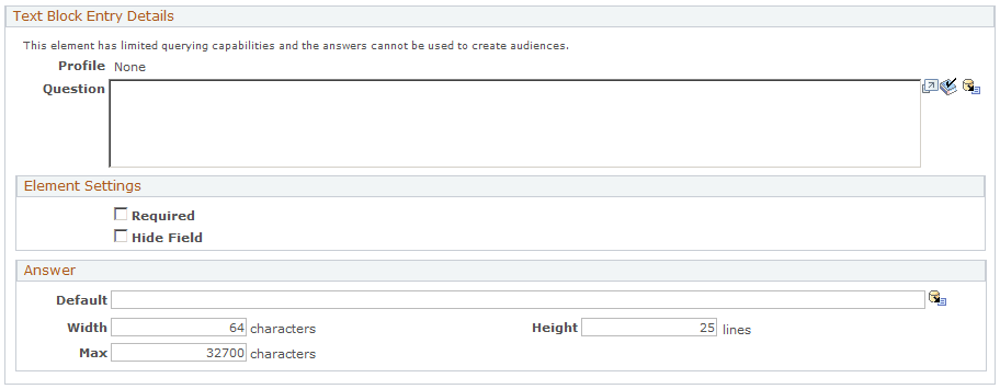
|
Field or Control |
Definition |
|---|---|
| Default |
Enter a default answer. |
| Width |
The default width is 64 characters. |
| Height |
The default height is 25 characters. |
| Max |
Text Block Entry fields can include a maximum of 32,700 characters. |
The following table shows where you can and cannot use Merge Content to include Text Block document elements:
|
Name |
Use Merge Content? |
|---|---|
|
Web document paragraph |
Yes |
|
Web document custom HTML |
Yes |
|
Web document question |
No |
|
Web document default |
No |
|
Web document button |
No |
|
Email document subject |
No |
|
Email document content |
Yes |
|
Dynamic content section content |
Yes |
|
Web link URL append |
No |
|
Dynamic content condition builder |
Yes |
|
Dynamic content section creator |
No |
|
Document Extension parameter |
Yes |
|
Dialog Designer condition builder |
Yes |
|
Dialog Designer extension parameter |
Yes |
|
Redirect URL |
No |
|
Choose email address |
Yes |
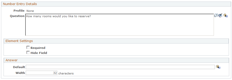
Number Entry Questions
A Number Entry Box allows you to include a question with an entry field where the respondent can enter a whole number with a maximum of 9 digits. This maximum is not configurable, though you can use the Answer Width field to limit the number of digits that the respondent can enter.
Image: Document Designer - Number Entry box
This example illustrates the fields and controls on the Document Designer - Number Entry box.
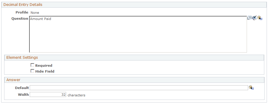
Decimal Entry Questions
A Decimal Entry Box allows you to include a question with an entry field where the respondent can enter a number with a decimal point (maximum of 19 digits, including 4 decimal places). This maximum is not configurable, though you can use the Answer Width field to limit the number of digits that the respondent can enter.
This item uses the same dialog box as the Number Entry box, shown previously.
Image: Document Designer - Decimal Entry box
This example illustrates the fields and controls on the Document Designer - Decimal Entry box.
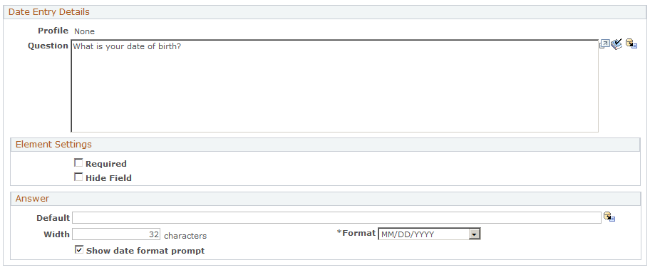
Date Entry Questions
A Date Entry Box allows you to include a question with an entry field where the respondent can enter a date.
Image: Document Designer - Date Entry box
This example illustrates the fields and controls on the Document Designer - Date Entry box.
|
Field or Control |
Definition |
|---|---|
| Show Date Format Prompt |
Select this check box to display the input date format in the document. |
| Format |
Select an input date format from the available options. |
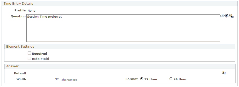
Time Entry Questions
A Time Entry Box allows you to include a question with an entry field where the respondent can enter a time.
Image: Document Designer - Time Entry box
This example illustrates the fields and controls on the Document Designer - Time Entry box.
|
Field or Control |
Definition |
|---|---|
| Format |
Specify whether the time entered is based on a 12-hour or 24-hour clock. |
The File Entry element allows you to upload external files and commit them to the system.
Image: Document Designer - File Entry element
This example illustrates the fields and controls on the Document Designer - File Entry element.
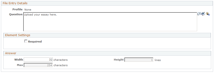
The File Entry document element includes the following features and requirements:
An unlimited number of File Entry document element fields can be applied to a web document. If different files are uploaded to the same field, the last file uploaded overwrites the previous file. If the same file is uploaded to two or more fields, each file is saved separately.
You can set the maximum file size. Maximum file size is a system-wide setting; it cannot be set for individual fields.
Note: You should consult your web server documentation when setting maximum file size, to ensure that the settings are compatible between the web server and Online Marketing. If the web server settings are significantly higher than those in Online Marketing, performance can be affected.
The default width of a File Entry element answer is 32 characters; you can configure this value.
The height of a File Entry element answer is one line; this value is not configurable.
The default maximum of a File Entry element is 254 characters; this value is not configurable.
Documents containing File Entry elements can be previewed like any other document element type.
Once a file has been uploaded, you cannot delete it.
The file name can be embedded in web and email documents using the Merge Content functionality.
Files can be referenced in the Decision Point element of a dialog flow and in Dynamic Content conditions—the only valid operator is Empty/Not Empty.
When a File Entry field is included on a dialog page, users can type in a file path and name or use a Browse button to select a file. After a file name has been supplied, the name is displayed in the File field if the value has been added as Merge Content. The user must click the Submit button (or its equivalent ) to initiate the file upload process.
The following table shows where you can and cannot use Merge Content to include File Entry document elements:
|
Name |
Use Merge Content? |
|---|---|
|
Web document paragraph |
Yes |
|
Web document custom HTML |
Yes |
|
Web document question |
Yes |
|
Web document default |
Yes |
|
Web document button |
Yes |
|
Email document subject |
Yes |
|
Email document content |
Yes |
|
Dynamic content section content |
Yes |
|
Web link URL append |
No |
|
Dynamic content condition builder |
Yes |
|
Dynamic content section creator |
No |
|
Document Extension parameter |
Yes |
|
Dialog Designer condition builder |
Yes |
|
Dialog Designer extension parameter |
Yes |
|
Redirect URL |
No |
|
Choose email address |
No |
A choice question allows the respondents to select from a list of choices. Choice questions also allow Online Marketing to provide statistics about the respondents’ answers.
This section describes the steps involved in editing a choice question. It describes the following choice question types:
Choose One
Choose One with Rating
Choose Many
Yes/No
For the Choose One and Choose One with Rating question types, the answer list is where you specify the choices that will be made available to the respondent.
Note: For all choice question types, if the item is a Profile Attribute, then you cannot change the name of the choice(s).
Dynamic Enumeration
Profile fields of type Choose One or Choose One with Rating can be set up in a parent/child hierarchy when they are defined. For example, a profile field named College might be the parent of another field named Department, which in turn is the parent of a field named Major. This allows you to design web documents in which the choices available for a child question are limited by a user's response to the question's parent. Thus, a respondent who fills out a form and specifies Engineering for College might see choices like Software Engineering or Mechanical Engineering under Department, but would not see English or Graphic Design.
You can specify up to three levels of hierarchy for profile fields. In order for the hierarchy to display properly, both the parent field and the child must appear on the same page—if they are on separate pages, they will display all possible choices regardless of relationship. Note that if both the parent and the child field appear on the same page and the Pre-fill from Profile option is selected or a default value is specified, these options will not apply (the field is not pre-filled and no default values are included in the fields).
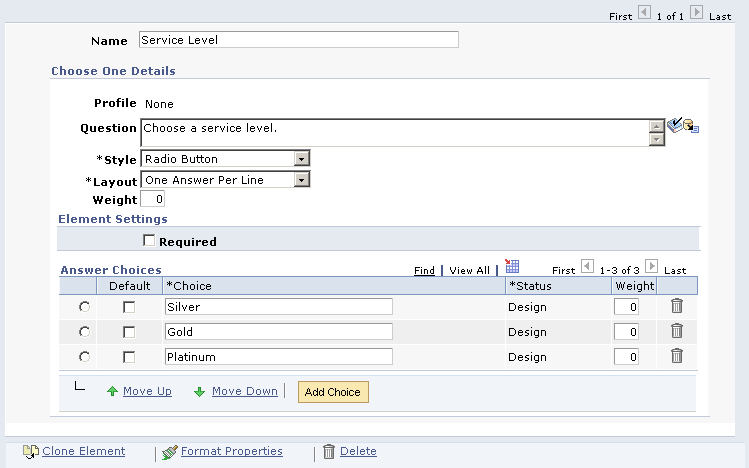
Choose One Questions
Choose One questions allow the respondent to select only one of the choices listed.
Use the Answer field to specify the choice answers from which the respondent can choose.
Image: Document Designer - Choose One
This example illustrates the fields and controls on the Document Designer - Choose One.
|
Field or Control |
Definition |
|---|---|
| Profile |
If the item is a profile attribute, the name of the profile to which the question refers appears here. If the item is not a profile attribute, None is displayed. |
| Question |
Enter the text of the question. You can include merge content for the question by adding empty brackets ({}) and clicking the Merge button. |
| Style |
Select a style in which you want the question and its answer choices to display: Radio Button or Drop Down List. |
| Show Prompt Text |
Select this check box if you want to specify a prompt to use instead of a default value. The prompt is available as the default choice for the question. This field is only active if Drop Down List is selected in the Style field. |
| Prompt Text |
If you chose Drop Down List for the style and selected the Show Prompt Text check box, enter the prompt text to be displayed. |
| Layout |
Specify how the list is laid out on the web page This field is only active if Radio Button is selected in the Style field. |
| Weight |
This field only appears if you selected the Survey Document check box on the Document page. Specify a numeric value between –99 and 99. |
| Required |
Select this check box if the respondent must answer this question before being allowed to submit the form. |
| Answer Choices |
For each answer choice, enter a unique choice name. If the choice is the default, select the Default check box. You can use the Move Up and Move Down buttons to select a row and change its location in the list. The Weight field only appears if you selected the Survey Document check box on the Document page. Specify a numeric value between –99 and 99. |
| Add Choice |
Click this button to add another answer choice row. |
| Move Up |
Move the currently selected choice up. |
| Move Down |
Move the currently selected choice down. |
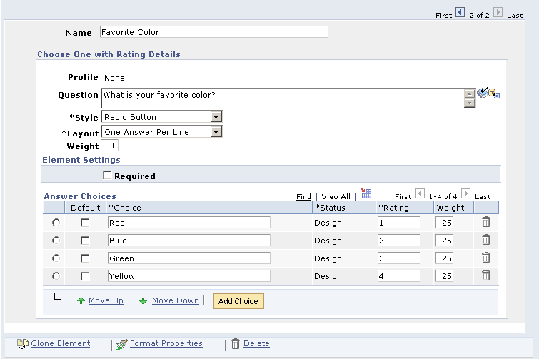
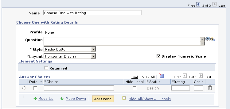
Choose One with Rating Questions
Choose One with Rating questions allow the respondent to select only one of the choices listed, and assign a numeric value to the choice. When editing the item, you specify a numeric value to be associated with the choices. These values will be saved instead of the choice value, and used in the generated results.
Use the Answer field to specify the choice answers from which the respondent can choose. In the rating column where you specify a numeric value to associate with the choices. The Default column allows you to select the default answer if none is chosen (unless you have specified a prompt for a drop-down list).
Image: Document Designer - Choose One with Rating
This example illustrates the fields and controls on the Document Designer - Choose One with Rating.
|
Field or Control |
Definition |
|---|---|
| Rating |
Specify a unique numeric value to associate with each choice. |
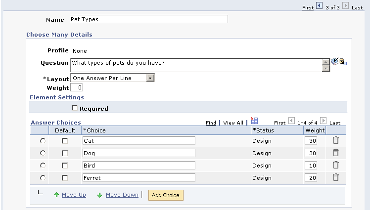
Choose Many Questions
The Choose Many item allows you to include a multiple choice question where the respondent can select any number of the choices listed.
The fields function as they do in Choose One / Choose One with Rating. The one exception is for the Answer field where, for this item, you can specify any number of choices you want “selected” by default on the web page.
Image: Document Designer - Choose Many
This example illustrates the fields and controls on the Document Designer - Choose Many.
|
Field or Control |
Definition |
|---|---|
| Default |
For Choose Many questions, you can choose more than one choice to be selected by default. |
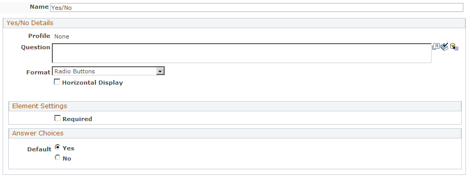
Yes/No Questions
The Yes/No item allows you to include a question where the respondent can select either Yes or No.
The Answer field is where you specify the default value for the item.
Image: Document Designer - Yes/No Question
This example illustrates the fields and controls on the Document Designer - Yes/No Question.
|
Field or Control |
Definition |
|---|---|
| Format |
Choose a format for the question: Radio Buttons or Checkbox. |
|
Field or Control |
Definition |
|---|---|
| Horizontal Display |
Select this check box if you want the question to display in a horizontal format. |
|
Field or Control |
Definition |
|---|---|
| Weight |
Specify a numeric weight value for the question, from –99 to 99. This option appears only if the Survey Document check box was selected on the Document page. |
| Default Choice |
Select Yes or No as the question's default answer choice. Note: Yes/No questions must always have a default value selected (either Yes or No). If you do not want to specify a default value, use a Choose One field with two choices—Yes and No—and do not make the field required. The Weight option appears only if only if the Survey Document check box was selected on the Document page. You can specify a numeric value between –99 and 99. |
Horizontal Display Layout Type
The Horizontal Display layout type is available for all of the choice question types, and is used in conjunction with the survey functionality (although it is also available in non-survey dialogs).
Note: The other layout types (Best Fit, Columns, and One Answer Per Line) are relatively self-explanatory, but Horizontal Display is explained separately because it includes many more options.
Image: Horizontal Display layout type
This example illustrates the fields and controls on the Horizontal Display layout type.
Choosing the Horizontal Display layout type adds some or all of the following new properties fields to each choice question:
|
Field or Control |
Definition |
|---|---|
| Horizontal Display Layout |
Determines whether to display the choice labels above the radio buttons or check boxes. This is a typical layout for a survey question. |
| Display Numeric Scale |
Determines whether to display a numeric scale heading for the question. When this check box is selected, an additional column is displayed to the right of the Choice label column, enabling the user to specify numeric values for the scale. |
| Scale |
This column contains numbers up to four digits. This heading is optional. |
| Hide Label |
Used to hide the appropriate choice label when the document is rendered. You cannot leave the choice labels blank—this value simply determines whether they are displayed in the rendered web document. |
| Hide All/Show All |
Use this choice to hide or show all choice labels at once. |
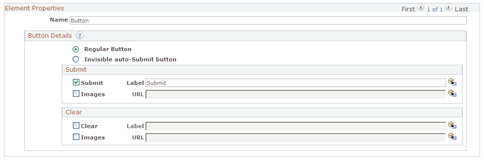
A Button item allows you to place submit and clear buttons on the web page. The submit button will submit the page to the web server, and the clear button will clear the data entered in the fields on the page. The clear button also returns all fields to their default values.
Image: Document Designer - Button
This example illustrates the fields and controls on the Document Designer - Button.
|
Field or Control |
Definition |
|---|---|
| Name |
By default, a button is named Buttonn, where n is the next unused number in the sequence for the document. You can enter a new unique name for the button. |
| Regular Button |
Selection this option if you want to display the button on the page. |
| Invisible auto-Submit button |
Select this option if you do not want the button to appear on the page, and to submit the form automatically when the page is displayed. Online Marketing and Event Management use this functionality for credit card submissions. |
| Submit |
Select the check box to include a Submit button on the page. |
| Clear |
Select the check box to include a Clear button on the page. |
| Label |
For both Submit and Clear buttons, you can enter a label to appear on the button. The defaults are Submit and Clear, respectively. Click the Merge button to use merged content (such as the current date or time) as the button's label. |
| Images |
For both Submit and Clear buttons, you can replace the default button with an image. Enter the location of the image in the field. To enter an image using merge content, enter curly braces ({}) and click the Merge button. While doing this, ensure that you do not select a multi-row profile. |
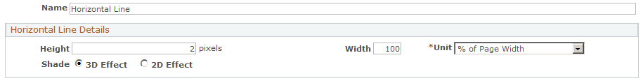
The horizontal line (<HR> or horizontal rule in HTML) tag inserts a horizontal line into your web document. You can specify the width and appearance of the line.
To insert a horizontal line into your web document, select the Horizontal Line button in the Document Designer.
Image: Document Designer - Horizontal Line
This example illustrates the fields and controls on the Document Designer - Horizontal Line.
|
Field or Control |
Definition |
|---|---|
| Name |
By default, a button is named Horizontal Linen, where n is the next unused number in the sequence for the document. You can enter a new unique name for the line. |
| Height |
Enter the line's height in pixels. The default is 2. |
| Width |
Enter a value for the line's width, either as a number of pixels or as a percentage of the page's total width, depending on the option you choose in the Horizontal Width field. |
| Unit |
Select from the available options whether the value in the Width field is a number of pixels or a percentage of the page's total width. |
| Shade |
Select 3D Effect for a shaded line, or 2D Effect for a flat, non-shaded line. |
The blank line element allows you to insert a blank line between two elements, giving you more control over the appearance of the text in the finished web page. For example, you could insert a blank line between two question elements to make them easier to read.
To insert a blank line into your web document, click the Blank Line button.
Image: Document Designer - Blank Line
This example illustrates the fields and controls on the Document Designer - Blank Line.

The Custom HTML Box allows you to enter text formatted with HTML tags into your web document. This feature permits users who are familiar with creating their own custom HTML to have greater control over the layout and appearance of the document. Online Marketing displays the text in a Custom HTML Box as it would any other HTML text.
Image: Document Designer - Custom HTML
This example illustrates the fields and controls on the Document Designer - Custom HTML.
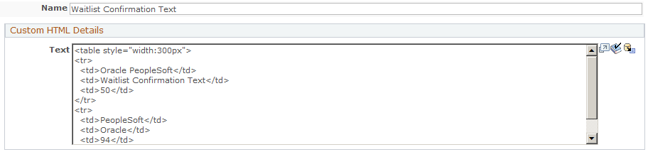
Type or paste HTML text in the text box. The text will appear in the finished web document formatted as specified in the HTML. You can change the name of the text box element or leave it as the default. To enter merge content, click the Merge button and select a field.
Note: <FORM>, <HTML>, and <BODY> tags are not allowed in Custom HTML text.
Document fields can be created based on profile fields that are marked as profile questions and have a status of Active in the profile definition. These document fields inherit all the attributes of the profile field.
All fields in the system with the exception of Many Rows per Contact or “map to existing” fields can be used in documents. When profile attributes are created, all aspects of the attribute are defined (type, size, name, and so forth), making it simple to incorporate these attributes as items in web documents. However, after adding a profile attribute to your document, you can still modify some of its attributes, such as the question and layout of the field, but you cannot change the choices (for a choice question). If you want to change the choices, you must do it in the profile itself.
By using a profile attribute in a document, you can automatically display the value that exists in the system for the respondent by selecting the Pre-fill with value from profile check box from the item builder. But more importantly, any changes made by the respondent to a profile attribute are automatically updated in the system. You can change the question for this specific document without affecting the original question and you can hide the field, but you cannot add, delete, or rename any of the choices or ratings. If the profile definition changes, it must be removed and re-added to the document before the new profile field changes will take effect.
Note: For profile fields with Choice data types (Choose One, Choose One with Rating, and Choose Many) you can click the element's Refresh button to propagate changes made to an Active profile choice list (addition and inactivation of choices) to the document.
If the document is copied and translated to a new language, the profile fields will translate to the new language if values exist in that language. If no values exist, the base language is used.
You can insert more than one profile field at the same time. The Document Designer will create new document elements for each inserted profile field, keeping them in the same order as they were in the Profile Field list from which you chose them. You can reorder them as with any other document element.
Note: Be aware that once a value has been set for a profile field, it cannot be set back to an empty (null) value by an Online Marketing user. For example, if a user has a value in an Address field and then someone else blanks the field through an Online Marketing web page, the existing address value remains in the system.
Image: Document Designer – Profile Field
This example illustrates the fields and controls on the Document Designer – Profile Field.
To add an item from profiles:
In the Document Designer, click the Profile Attribute button.
The Web Document Profile Insert page appears.
Navigate to the profile you want to insert and select it.
A list of profile fields for that profile appear. Note that if the profile you want to select is under the Individuals folder, you can search for it using the available Search box.
Select the Select check box for each desired attribute.
The Document Designer - Profile Field page appears, filled in with the information for the selected profile.
Click the Apply Selected button.
The last profile field you selected from the list appears in the Detail page. You can page through all the selected fields using the arrow buttons and the First and Last links on the top right side of the page.
You change any of the following fields in the profile attribute:
Name
Question
Style
Layout
Required
Pre-fill with value from profile
|
Field or Control |
Definition |
|---|---|
| Web Element Name |
The name of the profile field you chose. You can change the name. |
| Profile |
This read-only field shows the full name of the profile field. |
| Question |
Enter the question you want to ask for the profile field. The default value is the name of the field. |
|
Field or Control |
Definition |
|---|---|
| Required |
Select this check box if the respondent must answer this question before being allowed to submit the form. |
| Hidden |
Select this check box if you do not want the question to appear on the form. |
| Pre-fill From Profile |
Select this check box if you want the field to be pre-filled with default information from the profile. |
| Validate email address format |
Select this check box if you want the email address entered by the respondent to be validated before the form can be submitted. |
Warning! When creating a web document that will insert individuals, make sure that the Last Name field is on the web document—otherwise, the individual cannot be created as a valid person. You should also make sure other fields required for matching rules (such as Email) are included. Likewise, make sure Organization Name is a required field for inserting organizations.
You can merge content into many document fields, allowing the addition of tags that will be evaluated when the document is rendered. For example, you might use a Current Time merge content tag to display the current time on the web page, or a profile attribute to personalize a web page for a known user. You can merge content into the following document fields:
Paragraphs
Custom HTML
Entry element (Text, Time, Date, Number, Decimal) question or default answer
Choice element (Choose One, Choose One with Rating, Choose Many, Yes/No) question
Button label
To add a merge content tag to one of the allowed document fields:
Insert the field into the web document.
At the location where you want the merge content to appear, enter a pair of curly braces ({}) in the text box.
After you have entered all the tags for merge content you want to include, click the Merge button.
The Merge Content page appears. All the curly brace placeholders are replaced by merge content tags.
In Step 1: Select Tag, click the tag you want to define to select it.
In Step 2: Select Content to Merge, select a merge content type.
Enter the appropriate information about the merge content type and click Apply.
If you have entered more tags, click the next one or click the Next Tag button, then repeat steps 5 and 6 for each merge content tag.
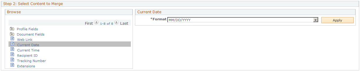
Adding a Current Date
To add a current date merge content object:
Click Current Date in the Select Content to Merge browser list.
Select a date format from the available options.
Click Apply to insert the tag syntax.
Image: Merge Content - Current Date
This example illustrates the fields and controls on the Merge Content - Current Date.
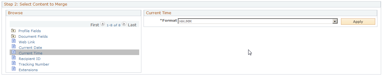
Adding a Current Time
To add a current time merge content object:
Click Current Time in the Select Content to Merge browser list.
Select a time format from the available options.
Click Apply to insert the tag syntax.
Image: Merge Content - Current Time
This example illustrates the fields and controls on the Merge Content - Current Time.
Adding a Recipient ID
To add a Recipient ID merge content object, click Recipient ID in the Select Content to Merge browser list. Recipient ID does not require any additional information, so the tag syntax is automatically inserted.
Adding a Tracking Number
To add a Tracking Number merge content object, click Tracking Number in the Select Content to Merge browser list. Tracking Number does not require any additional information, so the tag syntax is automatically inserted.
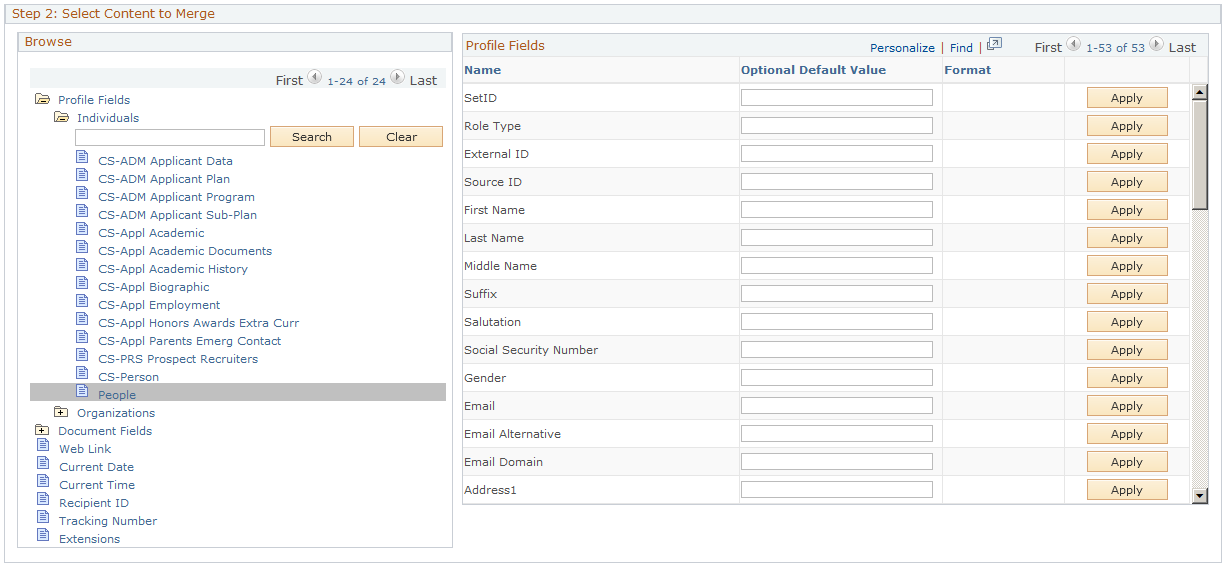
Adding a Profile Field
To add a profile field merge content object:
Click Profile Fields in the Select Content to Merge browser list.
Click the folder containing the profile from which you want to include a field. Note that if the profile you want to select is under the Individuals folder, you can search for it using the available Search box.
Click the profile name.
In the list of profile fields, select a format (if appropriate) for the field you want to include. You can also choose to include an appropriate default value in case the value for the profile field is not available. For example, as a default for the First Name profile field, you might include “Valued Customer” or “Baseball Fan.”
Click Apply.
Image: Merge content - Profile Fields
This example illustrates the fields and controls on the Merge content - Profile Fields.
Note: The following characters may not be used as any part of a profile definition including field values, profile name, or audience name: ampersand (&), apostrophe or single quote ('), double quote ("), greater than (>), less than (<), or period (.).
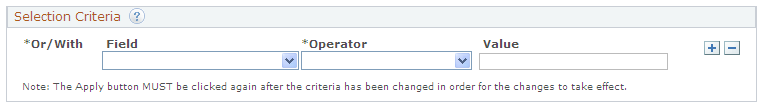
Merge Content from a Multi-row Profile
If you select a multi-row profile for merging content, the Merge content - Profile Fields page displays the Selection Criteria grid above the Profile Fields grid. This grid allows you to build a criterion for selecting the content to merge. While adding multiple fields to a criterion, you can use either Or or With condition to relate them.
Image: Document Designer - Selection Criteria group box
This example illustrates the fields and controls on the Document Designer - Selection Criteria group box.
|
Field or Control |
Definition |
|---|---|
 |
Click the Help icon to know more about how you can create a complex criterion. |
| Field |
Select the profile field to be used for creating the selection criterion. The field lists all profile fields of the multi-row profile selected. |
| Operator |
Select the operator to be used for creating the selection criterion. The field lists all operators associated with the multi-row profile. |
| Value |
Enter the value of the field selected to form the selection criterion. The options available for the Value field varies based on the operator selected. For example, if the profile field you select is a date field and the operator is Is Greater Than, the Value field includes a date prompt that helps you to choose a date easily. |
| Or/With |
When you add more than one field to the criterion, the page displays the Or/With field that allows you to connect the selected fields. By default, the field displays With. |
Note: After you create or modify a criterion, make sure to click the Apply button against each profile field in the Profile Fields grid for the criterion to take effect.
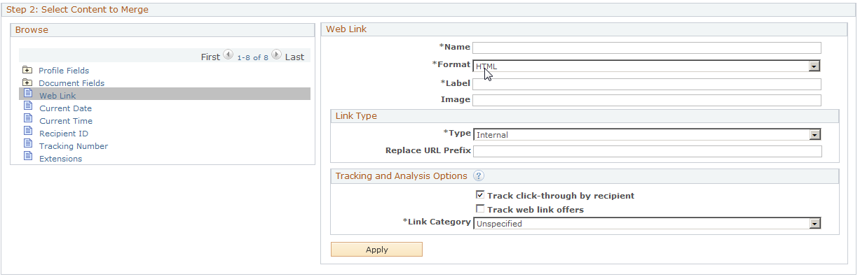
Adding a Web Link
To add a web link merge content object:
Click Web Link in the Select Content to Merge browser list.
Fill in the fields defining the web link.
Refer to the documentation on designing email documents for descriptions of these fields.
Note: The double quote (“) and period (.) characters cannot be used as part of the Web Link name.
Click Apply.
Image: Merge content - Web Link
This example illustrates the fields and controls on the Merge content - Web Link.
Adding Dynamic Content
To add a dynamic content merge content object:
Click Dynamic Content in the Select Content to Merge browser list.
Fill in the fields defining the dynamic content object.
Refer to the documentation on designing email documents for descriptions of these fields.
Note: The double quote (“) and the period (.) characters cannot be used as part of the dynamic content name.
Click Apply.
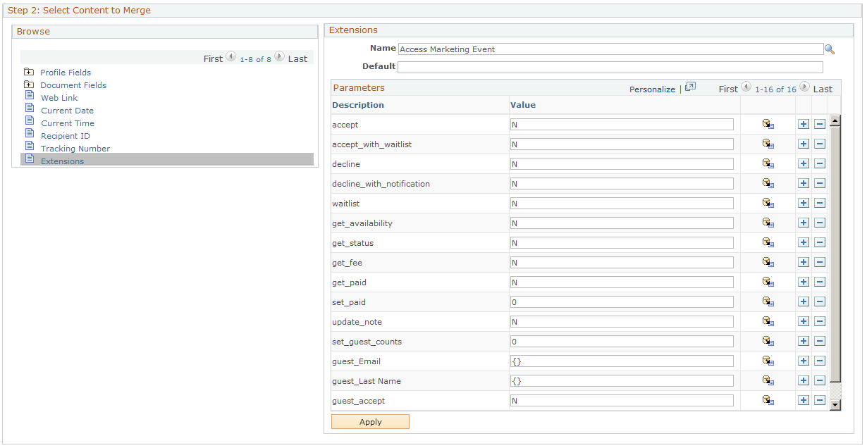
Adding an Extension
To add an Extension merge content object:
Click Extension in the Select Content to Merge browser list.
Click the magnifying glass button and select an extension from the list.
Fill in any information required by the extension.
If the extension has parameters, they will be displayed. You can add or delete parameters as well as change values for the parameters. You can also merge content into values. Only Java extensions defined as usable in documents are allowed in this field. The default value is what is displayed if the extension returns no content.
Click Apply.
Image: Merge content - Extensions
This example illustrates the fields and controls on the Merge content - Extensions.
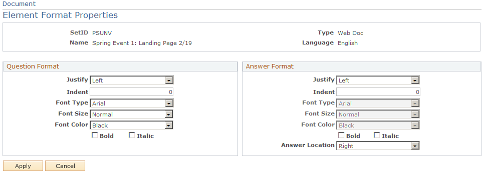
Online Marketing allows you to control some formatting characteristics of items in a web document, such as the color and size of the text, and its position on the page.
Once you have added items to your document, you can modify their formatting individually through the Element Format Properties page. On this page, you can set parameters that determine how the question and answer are positioned on the page.
Access the Element Format Properties page (Click the Format Properties link).
Image: Document Designer - Element Format Properties page
This example illustrates the fields and controls on the Document Designer - Element Format Properties page.
|
Field or Control |
Definition |
|---|---|
| Justify |
Indicates whether the question or answer is left, center, or right justified. |
| Indent |
Indicates how far, in points, that the question or answer is indented. |
| Font Type |
Select Default to use the browser's default font, or select another font from the available options. |
| Font Size |
Specifies the relative size of the text being displayed (Smallest, Smaller, Normal, Larger, and Largest). Each setting increases or decreases the size as defined by the browser. |
| Font Color |
Select the font's color from the available options. |
| Bold |
Select the check box to set the font in boldface. |
| Italic |
Select the check box to set the font in italics. |
| Answer Location |
For answers, specifies the position of the answer relative to the question (below, right, or left of question). |
After formatting the items for your page, you should preview the document to ensure you are pleased with the results.
Supported Fonts
Online Marketing supports the following fonts for document elements. Note that the font setting overrides the default set in the viewer’s browser. If the browser does not support the specified font, the default setting is used.
Arial
Arial Black
Arial Narrow
Bookman Old Style
Comic Sans MS
Courier New
Garamond
Haettenschweiler
Impact
Lucida Console
Lucida Sans Unicode
Map Symbol
Modern
Roman
Script
Tahoma
Times New Roman
Verdana
Online Marketing allows you to preview web documents. Previewing a web document allows you to see how it will appear in a browser.
Note: You should preview your document on several browsers because each browser behaves a little differently. By default, when you preview a document, it will appear in the web browser that is currently registered as your default browser. Also, any merge content in your documents is not filled in until the dialog is deployed—you will see the merge content surrounded by curly braces ({}).
It is advisable to preview your document regularly while you are designing your page.
To preview a web document, click the Preview button on the Document Designer page. This button is visible once you have attached the document to a dialog.
Note: When previewing web pages, you should configure your browser to turn off web page caching; otherwise, the preview might show the previous (cached) version of the document instead of the new version. You can also click Reload to view the new version.
Access the Marketing Center page (Marketing, Document Designer, click the Marketing Center tab.
Note: The Marketing Center tab is available only if you have enabled the Secure Prospective Students by Marketing Center option in the Higher Education Options. Refer to the CRM for Higher Education documentation for more information about this option.
Image: Document Marketing Center page
This example illustrates the fields and controls on the Document Marketing Center page.
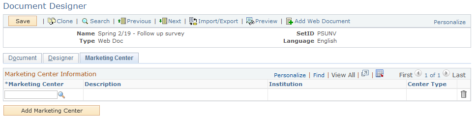
|
Field or Control |
Definition |
|---|---|
| Marketing Center |
Select a Marketing Center from the available list. |
| Add Marketing Center |
Click this button to add another Marketing Center to the grid. |
If the Secure Prospective Students by Marketing Center option is enabled, at least one Marketing Center is required to be defined for a secured document. When the document is saved, the system performs another edit check; if no Marketing Center is defined, you are directed to define at least one.