6 Evaluating Workforce Demographics
This tutorial shows you how to view and evaluate your labor force demographics.
You want to see a high level view of your workforce demographics for a particular month as well as trends over the past 12 months.
Use the sparkline tiles and reports in the HR Executive Dashboard — Global Demographics page to help you proactively develop strategies to meet diversity targets and minimize the impact of retiring workers that take key skills with them when they leave.
To view the HR Executive Dashboard — Global Demographics page:
-
Launch the OTBI Enterprise for Human Capital Management Cloud Service URL provided by your administrator.
-
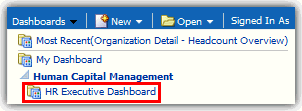
From the Dashboards menu, expand Human Capital Management, and then select HR Executive Dashboard.
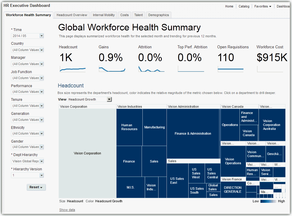
The HR Executive Dashboard — Global Workforce Health Summary page is displayed.
-
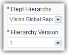
In the left pane on the dashboard page, verify that the Department Hierarchy and Hierarchy Version dashboard prompt list values are set correctly. This step ensures that the data displayed on the HR Executive Dashboard is accurate.
If you are uncertain which values to select, consult with your OTBI Enterprise for HCM Cloud Service implementer or administrator. Your implementer or administrator can set these values to default to the correct selections.
-
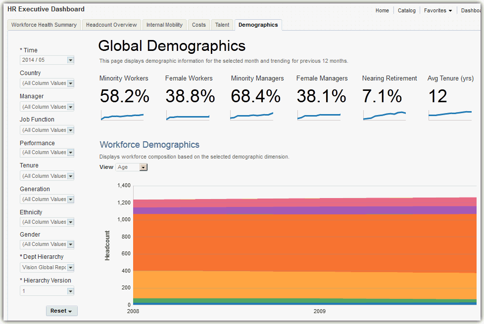
Select the Demographics tab to display the HR Executive Dashboard — Global Demographics page.
Note:
Whenever departments are displayed in graphs in OTBI Enterprise for HCM Cloud Service, you can select the department element or name in the graph to drill down to view that department in detail. On the organization detail page, you can explore the selected department and it's child departments in detail, or select the Back to Global Summary link to return to the top-level company view.
How do I read the Global Demographics Sparkline Tiles?
The Global Demographics sparkline tiles enable you to quickly assess key overall workforce demographic metrics.
The numbers within the tiles display the current data for the month you select in the Time dashboard prompt list. The sparkline graphs display data for the 12 months prior to the month you select.
This sparkline contains the following tiles:
-
Minority Workers —Percentage of employees classified as a minority.
The groups identified as minority workers are determined by a single filter located in the /shared/Human Capital Management/Human Resources - Workforce Deployment/Role Dashboards/Minority Worker Filter directory.
To select the ethnic groups identified as minority workers for your organization, you must modify this filter.
-
Female Workers — Percentage of employees that identify themselves as the female gender.
-
Minority Managers — Percentage of employees classified as a minority, and who are also supervisors.
-
Female Managers — Percentage of employees that identify themselves as the female gender, and who are also classified as supervisors.
-
Nearing Retirement — Percentage of employees assigned to the near retirement age bands (aged 55 or older).
-
Average Tenure (yrs) — Average length of service for all employees in years.

With these metrics, you can see that you have a very diverse workforce with a small percentage nearing retirement. You can use this information to create recruitment, succession, and training strategies to meet your workforce demographic needs.
How do I read the Workforce Demographics Report?
The following image shows an example of the Workforce Demographics report metrics displayed by age group. This information enables you identify specific workforce population characteristics and trends.
You can change the perspective of the data displayed in the report by selecting one of the following view types in the View list:
-
Gender — Workforce demography organized by gender.
-
Ethnicity — Workforce demography organized by ethnic classification.
-
Age — Workforce demography organized by age bands.
-
Country — Workforce demography organized by country location.
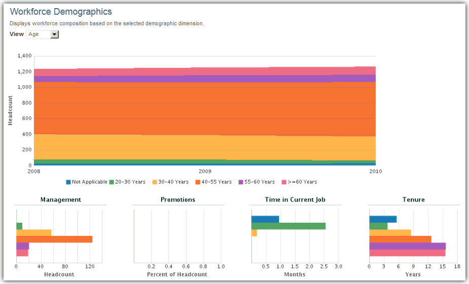
This report also displays expanded demographic details in the following sub-charts:
-
Management — Percentage of the selected demographic that are supervisors.
-
Promotions — Percentage of the selected demographic who have been promoted at least once in the past 12 months.
-
Time in Current Job — Percentage of the selected demographic displayed by time in service in months for their current position.
-
Tenure — Total time in service for the department in years.
In this example, you can see that workers in the 20-30 year age range are not managers, have been with the company for less than five years, and have been in the same job longer than other age groups. You can use this information to understand if specific age groups are at risk for higher attrition, may need more movement opportunities, and are represented by managers of their own age group.
How do I read the Workers Nearing Retirement Report?
The following image shows an example of the Workers Nearing Retirement report metrics displayed by pay grade. This information enables you to take inventory of the percentage of your workforce poised for retirement and the skill sets they will take with them when they go.
In this example, it looks like most of your workforce slated for retirement are Sales VPs. You can use this information to identify the jobs and seniority levels that most need succession planning, and begin planning recruitment and employee development initiatives to ensure key skills are not lost when employees retire.
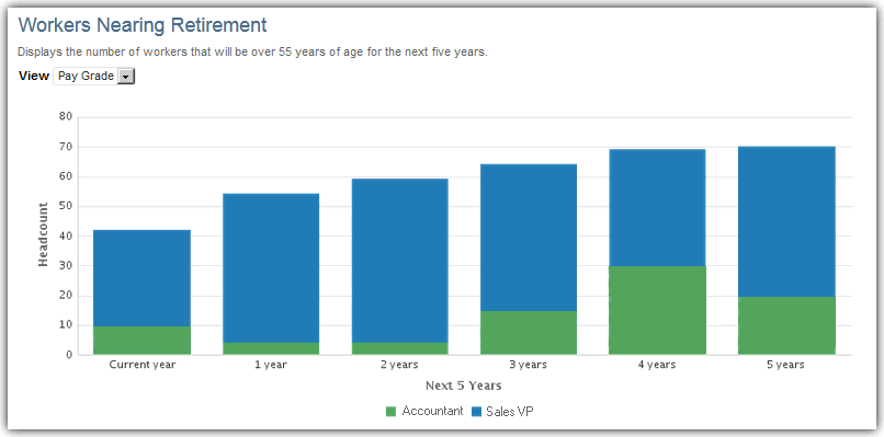
You can change the perspective of the data displayed in the report by selecting one of the following view types in the View list:
-
Job Family — Employees nearing retirement by job type.
-
Pay Grade — Employees nearing retirement by pay grade level (indicates seniority within their job).

