3 Evaluating Employee Mobility
This tutorial shows you how to view and evaluate employee mobility.
You want to see a high level view of employee transfers and the average time spent in positions for a particular month as well as trends over the past 12 months.
Use the sparkline tiles and reports in the HR Executive Dashboard — Global Internal Mobility page to help you analyze personnel movement, understand employee transfer opportunities, and determine whether employee mobility patterns are creating a positive or negative impact on your workforce.
To view the HR Executive Dashboard — Global Internal Mobility page:
-
Launch the OTBI Enterprise for Human Capital Management Cloud Service URL provided by your administrator.
-
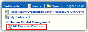
From the Dashboards menu, expand Human Capital Management, and then select HR Executive Dashboard.
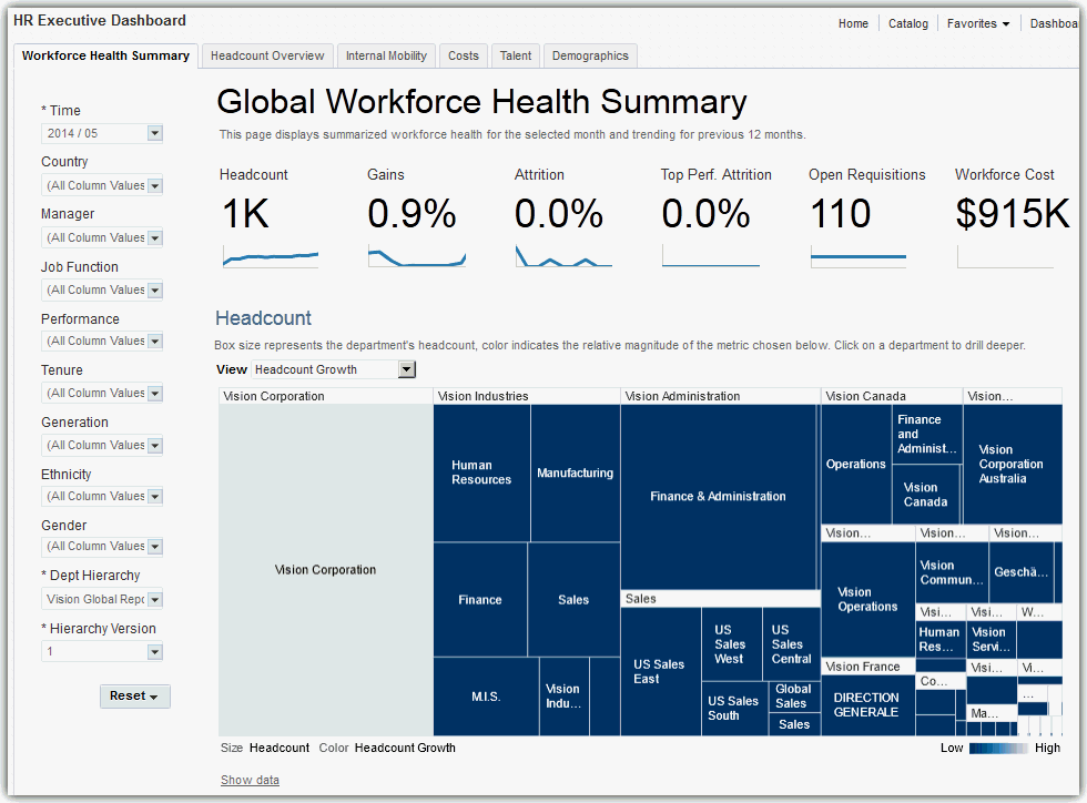
The HR Executive Dashboard — Global Workforce Health Summary page is displayed.
-
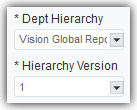
In the left pane on the dashboard page, verify that the Department Hierarchy and Hierarchy Version dashboard prompt list values are set correctly. This step ensures that the data displayed on the HR Executive Dashboard is accurate.
If you are uncertain which values to select, consult with your OTBI Enterprise for HCM Cloud Service implementer or administrator. Your implementer or administrator can set these values to default to the correct selections.
-
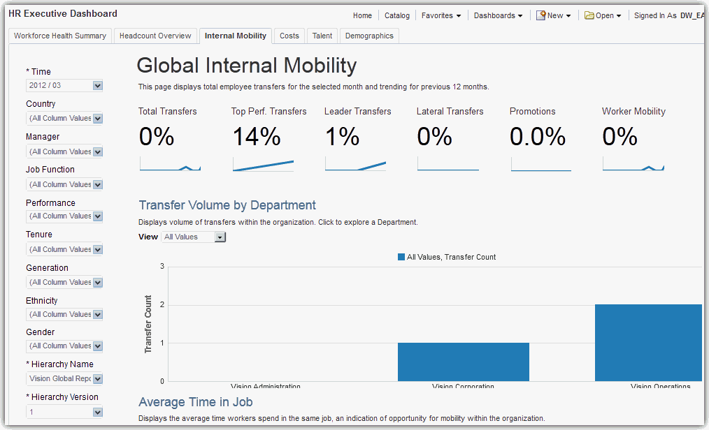
Select the Internal Mobility tab to display the HR Executive Dashboard — Global Internal Mobility page.
Note:
Whenever departments are displayed in graphs in OTBI Enterprise for HCM Cloud Service, you can select the department element or name in the graph to drill down to view that department in detail. On the organization detail page, you can explore the selected department and it's child departments in detail, or select the Back to Global Summary link to return to the top-level company view.
How do I read the Global Internal Mobility Sparkline Tiles?
The Global Internal Mobility sparkline tiles enable you to quickly assess employee mobility metrics.
The numbers within the tiles display the current data for the month you select in the Time dashboard prompt list. The sparkline graphs display data for the 12 months prior to the month you select.
This sparkline contains the following tiles:
-
Total Transfers — Percentage of the total headcount that have transferred.
-
Top Performer Transfers — Percentage of the total headcount assigned to the top performance bands that have transferred.
-
Leader Transfers — Percentage of the total headcount classified as supervisors that have transferred.
-
Lateral Transfers — Percentage of the total headcount that have transferred to a position that is different, but in the same pay grade as their previous position.
-
Promotions — Percentage of the total headcount that have transferred to a more senior level position than their previous one.
-
Worker Mobility — Calculated percentage of workers that have either transferred or have been promoted within the department. The worker mobility metric provides you with an overall indication of movement in the organization.

With these metrics, you can determine if you are providing adequate opportunities for employees to move and grow within the organization, and confirm if you are gaining high performers through transfer activity. This information is vital for creating and refining employee retention and development strategies.
How do I read the Transfer Volume by Department Report?
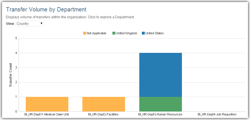
The following image shows an example of the Transfer Volume by Department report metrics displayed by country location.
In this example, it looks like the Human Resources department has recently seen a high volume of transfers in the US and UK. This information can help you to effectively evaluate employee development requirements by region, job family, or other attributes.
You can change the perspective of the data displayed in the report by selecting one of the following view types in the View list:
-
All Values — Total transfer count for the department.
-
Country — Transfer counts by country location.
-
Job Family — Transfer counts by job family classification.
-
Pay Grade — Transfer counts by pay grade.
-
Transfer Type — Transfer counts by workforce event.
To drill down for more details on a department:
-
Click in a bar, or on a bar heading label in the chart to drill down into the department details.
-
Click the Back to Global Summary link to return to the Global Workforce Health Summary page or continue to analyze this department level by the topics displayed in the tabs at the top of the HR Executive Dashboard.
How do I read the Average Time in Job Report?
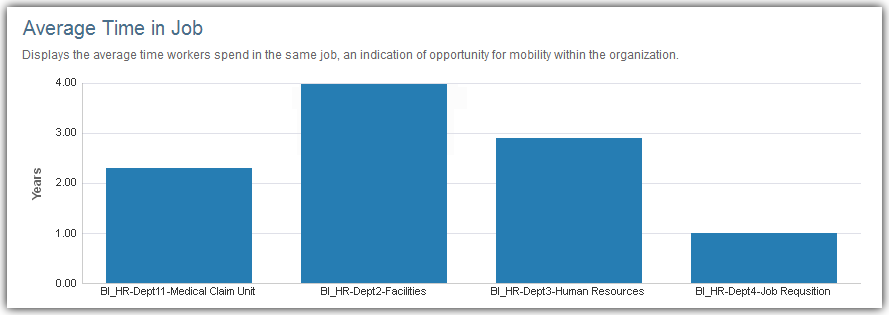
The following image shows an example of the Average Time in Job report metrics. This report enables you to see the average time that workers spend in a position as indicated by the mobility opportunities within a department.
In this example, it looks like the Facilities department employees stayed the longest in their positions for an average of four years, whereas the Job Requisition department employees only stayed in their positions for an average of one year.
When you pinpoint the average time employees remain in the same job, this helps you to better analyze employee attrition (where employees may feel there are no opportunities for growth), organization productivity (where employees with more experience may be more productive), and effectively manage succession planning (identifying organizations with experienced workers that are ready for a change).
To drill down for more details on a department:
-
Click in a bar, or on a bar heading label in the chart to drill down into the department details.
-
Click the Back to Global Summary link to return to the Global Workforce Health Summary page or continue to analyze this department level by the topics displayed in the tabs at the top of the HR Executive Dashboard.

