5 Evaluating Workforce Talent
This tutorial shows you how to view and evaluate workforce performance and department compensation.
You want to see a high level view of employee performance, compensation, and attrition for a particular month as well as trends over the past 12 months.
Use the sparkline tiles and reports in the HR Executive Dashboard — Global Talent page to help you to identify the proportion of your workforce that are high performers, determine if your compensation strategy is rewarding performance, and develop effective strategies to retain top talent.
To view the HR Executive Dashboard — Global Talent page:
-
Launch the OTBI Enterprise for Human Capital Management Cloud Service URL provided by your administrator.
-
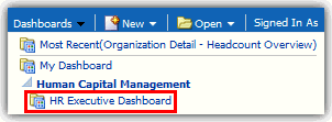
From the Dashboards menu, expand Human Capital Management, and then select HR Executive Dashboard.
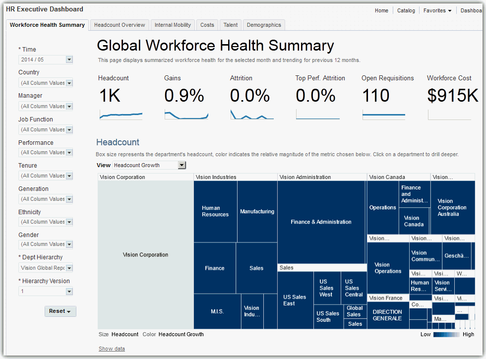
The HR Executive Dashboard — Global Workforce Health Summary page is displayed.
-
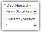
In the left pane on the dashboard page, verify that the Department Hierarchy and Hierarchy Version dashboard prompt list values are set correctly. This step ensures that the data displayed on the HR Executive Dashboard is accurate.
If you are uncertain which values to select, consult with your OTBI Enterprise for HCM Cloud Service implementer or administrator. Your implementer or administrator can set these values to default to the correct selections.
-
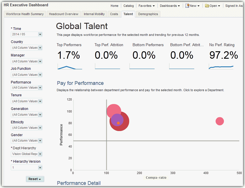
Select the Talent tab to display the HR Executive Dashboard — Global Talent page.
Note:
Whenever departments are displayed in graphs in OTBI Enterprise for HCM Cloud Service, you can select the department element or name in the graph to drill down to view that department in detail. On the organization detail page, you can explore the selected department and it's child departments in detail, or select the Back to Global Summary link to return to the top-level company view.
How do I read the Global Talent Sparkline Tiles?
The Global Talent sparkline tiles enable you to quickly assess proportion and loss of top and bottom performers, the percent of your workers that do not have a performance rating, and the number of workers that have been promoted during the selected time period.
The numbers within the tiles display the current data for the month you select in the Time dashboard prompt list. The sparkline graphs display data for the 12 months prior to the month you select.
This sparkline contains the following tiles:
-
Top Performers — Percentage of employees classified as top performers.
-
Top Performer Attrition — Percentage of terminated employees that were also classified as top performers.
-
Bottom Performers — Percentage of employees classified as bottom performers.
-
Bottom Performer Attrition — Percentage of terminated employees that were also classified as bottom performers.
-
No Performance Rating — Percentage of employees without a performance rating.
-
Promotions — Percentage of employees that have been promoted at least once during the specified time period.

With these metrics, you can see that only 1.7% of your workers are considered top performers, and no workers are classified as bottom performers. While you are not losing those top performers, the lack of performance ratings for 97% of the workforce means that there is a significant opportunity to better classify your talent with performance evaluation initiatives.
How do I read the Pay for Performance Report?
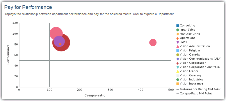
The following image shows an example of the Pay for Performance report metrics displayed by pay grade, performance levels, and department.
The bubbles in the chart represent departments within the department hierarchy. The size of the bubbles indicate the relative number of headcount in the department compared to other departments.
In this example, the Vision Corporation department has the highest headcount (red bubble), with the average performance in the organization at approximately 80%, and compensation slightly above the market mid-range. Other departments have higher performance, but lower compensation. This information enables you to see where compensation strategies are effectively paying workers for top performance, and where compensation increases may be appropriate to reward top performers and reduce attrition risk.
This report contains the following metrics:
-
Compa-ratio — Average compensation for workers in the department compared to the salary mid-range point for their job. A value of 1 indicates the average compensation in the department is equal to the salary mid-range.
-
Performance — Employee performance ratings by department.
To drill down for more details on a department:
-
In the chart, click the department bubble or department label in the legend to drill down into the department details.
-
Click the Back to Global Summary link to return to the Global Workforce Health Summary page or continue to analyze this department level by the topics displayed in the tabs at the top of the HR Executive Dashboard.
How do I read the Performance Detail Report?
The following image shows an example of the Performance Detail report metrics displayed by department level within the department hierarchy.
In this example, it looks like the Consulting department has an average employee performance rating of 100 and an average compa-ratio of just over the market mid-range point of 100%.
You can use this information to identify the departments where workers are either overpaid or underpaid compared to their performance. You can also use these metrics to effectively manage compensation planning cycles, analyze the root causes for attrition, and evaluate if compensation strategies are being applied equally across departments.
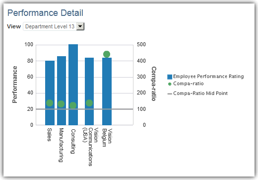
You can change the perspective of the data displayed in the report by selecting one of the following view types in the View list:
-
Department Level — Employee performance levels for a specific department level within the department hierarchy.
-
Job Family — Employee performance levels by job classification.
-
Pay Grade — Employee performance levels by pay grade.
-
Worker Type — Employee performance levels by worker type.
-
Country —Employee performance by country location.
-
Salary Basis — Employee performance by salary basis.
To drill down for more details on a department:
-
Click in a bar, or on a bar heading label in the chart to drill down into the department details.
-
Click the Back to Global Summary link to return to the Global Workforce Health Summary page or continue to analyze this department level by the topics displayed in the tabs at the top of the HR Executive Dashboard.
How do I read the Five-Year Trends Report?
The following image shows an example of the Five-Year Trends report metrics displayed with trends in workforce performance ratings within the past five years.
In this example, it looks like the average performance for new hires has been improving, while existing worker and top performer performance has remained steady. You can use this information to determine if your new hire learning and development programs are effective, and whether the company as a whole has been progressively improving performance or possibly requires new initiatives to bolster falling performance.
The report contains the following trend metrics:
-
New Hire Performance — Performance rating trends for workers employed less than or equal to one year.
-
Existing Worker Performance — Performance rating trends for workers employed one year or more.
-
Top Performers — Performance rating trends for workers classified as top performers.

How do I read the New Hire Performance By Recruitment Source Report?
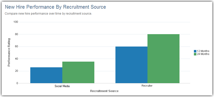
The following image shows an example of the New Hire Performance By Recruitment Source report displayed with trend metrics in new hire performance by recruitment source.
In this example, it looks like your best performing new hires come from recruiters rather than social media. It also appears that workers coming from social media take longer to show performance improvements than those sourced from recruiters. You can use this information to tailor new hire programs based on hiring source to better support the new employee learning curve.
The report contains the following trend metrics:
-
Performance Rating — New hire employee performance ratings.
-
Recruitment Source — Recruiting channels that result in accepted employment offers.
