Working with the Controls in the Fluid Banner
The fluid banner is displayed on every fluid application page and contains many of the same controls displayed on fluid homepages. However, the controls displayed within the fluid banner can vary from component to component, depending on component settings, system settings, where you navigated from, and so on. In addition, which controls are displayed in the banner varies depending on the width of the browser window. As the width decreases, controls are moved from the banner to become links in the Actions menu.
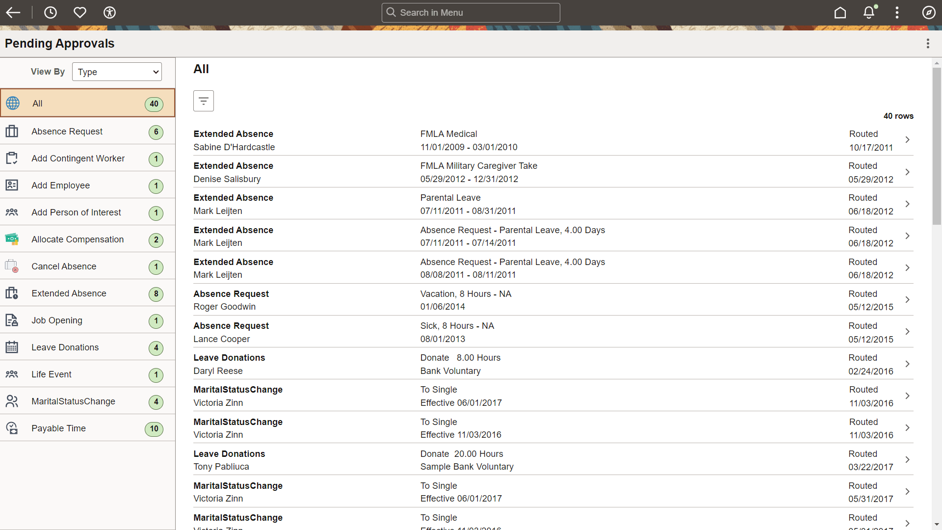
The fluid banner is displayed on all fluid homepages and application pages. The fluid banner is divided into two sections. The upper section of the banner contains controls such as the back button, quick access bar items, global search, the home and notifications buttons, the actions menu, and the Navbar. The controls displayed within the lower section of the fluid banner include the title of the content you’re viewing and the contextual actions in the More Actions menu. See Using the Actions Menu.
The title of the homepage, dashboard, component, or transaction page appears in the lower section of the banner. The title is left justified and is wrappable.
However, small factor devices display an integrated banner and a single Actions menu on the banner.
Note:
Classic pages also display a fluid-like portal header with similar buttons and controls. This fluid-like portal header creates a consistent look and feel between classic and fluid applications.
This example illustrates the fluid banner on a fluid application page. You can find definitions for the fields and controls in the banner later on this page.
| Term | Definition |
|---|---|
|
|
Back button (unlabeled). Use the Back button to navigate back to the previously visited component, homepage, activity guide, navigation collection, or WorkCenter. See Using the Back Button. |
|
|
Recently Visited button (in the quick access bar). Use the Recently Visited button to display your recently visited items in the quick access bar. See Using the Quick Access Bar and Working with Recently Visited Items. |
|
|
Favorites button (in the quick access bar). Use the Favorites button to display your favorite items in the quick access bar. See Using the Quick Access Bar and Working with Favorites. |
 |
Accessibility button (in the quick access bar). Use the Accessibility button to enable screen reader mode, display a list of keyboard shortcuts, and access information on how to enable and use the accessibility layout features within the application. See Using the Quick Access Bar and Accessibility Guide: Using the Accessibility Button in Fluid. |
|
|
Page title (display only). There is no action associated with clicking the page title. |
|
|
Home button. Use the Home button to return to your default homepage, which is the homepage that you arrive at directly upon signon. |
|
|
Global Search bar. Use the Global Search bar to perform global searches. See Working with Global Search. Note: When displayed on fluid dashboards and pages, the Global Search bar is muted and is activated when selected. |
|
|
Notifications button (displaying the new notifications indicator). Use the Notifications button to open the Notifications panel displaying any pending actions and alerts. See Using the Notifications Panel. |
|
|
Actions button. Use the Actions button to display the Actions menu. See Using the Actions Menu. |
|
|
More Actions button. Use the More Actions button to display the a list of menu items specific to the dashboard you are viewing. See Using the Actions Menu. Note: On small form factor devices, the More Actions menu does not appear and the items are integrated in the Actions menu, similar to PeopleTools 8.59. |
|
|
NavBar button. Use the NavBar button to display the NavBar (sometimes referred to as the navigation bar). See Working with the NavBar. |







